In this blog, I’m going to go over some project management insights and specifically talk about creating a Gantt chart in Power BI using matrix in Visual Studio. You may watch the full video of this tutorial at the bottom of this blog.
I’m going to show the logic behind creating this Gantt chart, which is very useful when it comes to project management.
A Gantt chart is a very common visual that shows project timelines. On top of that, it shows you a really good overview and all the details around your projects.
In this sample setup, I have a dynamic date slicer where I can easily change the date so that the project management chart will update as well. I can also filter into particular projects in the sample report. There are a lot of dynamic features that are involved to achieve this Gantt chart analysis in Power BI.
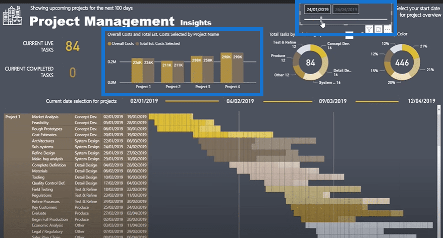
My aim for this tutorial is to highlight the logic that needs to be implemented in the matrix of Visual Studio to achieve this visualization.
Setting Up The Matrix
To set up, I need to bring a few details inside my table. I need the Project Name, Task Category, Task Name, End Date, and Start Date to visualize.

After that, I’m going to turn the table into a matrix. To make sure it’s set up correctly, I need to drill down into every level of the hierarchy.
I’ll click the symbol for Expand all down one level in the hierarchy for a few times until I get what I want.

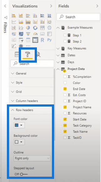
Now that it’s set, I’m going to change the layout. I need to click the formatting icon, and then go to Row Headers. Now, I’ll turn off Stepped Layout so I can have what I wanted.
The matrix that I now have is still not done because I still need the columns. I want the matrix to be dynamic. I also want the data to be based on any selection from any project and any day. That’s why I’m going to create a table and call it Days.
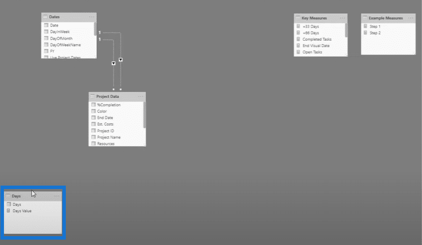
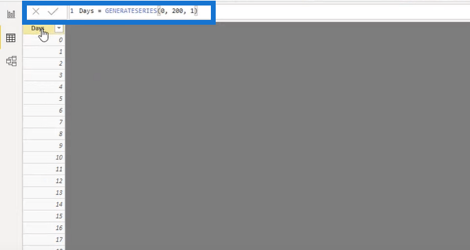
I used a very simple formula to create this table and create the values from zero up to 200.
After creating the Days table, I need to drag it inside my columns parameter so that it can get into the matrix. But when I do that without any calculations, I’m obviously going to get an error. It’s reasonable because my Days table has no relationship between the other tables. Thus, I need to establish a connection with the tables. To do this, I need to join the tables using a DAX formula.
Establishing The Table Connections In The Matrix
Here’s the formula that I’m going to use. I just named the formula as Step 1 for easy identification.

I created that formula to enable the relationship between the tables. I just got rid of the subtotals since it’s a bit meaningless. After that, this is what the matrix visual will look like.

There’s a date selector and the matrix displays the corresponding dates around that selection.
If I move the date selection to the 16th of January, I’ll just have three days of data here because the end date is on the 19th of January. Since I’ve shown the formula, I’m now going to show the logic behind this calculation.
There’s a lot to work out using this formula. First, the formula needs to look for the current date. It’s about every single individual result by itself. Secondly, it needs to work out the Project Days so the formula has to iterate through every single row between the start and end date.
For the DaysFromStartDate variable, it considers the start date as well as the selected date. Meanwhile, the DaysFromEndDate variable needs to look into both the start date and the project days. As you can see, the Start Date and End Date are very important parts of the formula.

For the numerical values, the formula will return a value if the current day is greater than or equal to the days from the start date. Additionally, the current day number has to be less than or equal to the end date. If it fits the conditions, the formula will return 1 in all the rows of the matrix. If it doesn’t fit the condition, the formula returns zero as its value.
That’s how I’m turning the dates into numbers from a selection. It’s the exact logic that is applied in the matrix.
Creating A Gannt Chart In Power BI Using The Matrix
The next technique that I want to show you involves turning this matrix into a Gantt chart. To do that, click Conditional Formatting, and then select Background Color.

In the Background Color pop-up, enter the necessary rules and conditions. First, select Rules from the Format By drop-down list. Make sure that the measure selected is Step 1, and then the value should be equal to 1. Lastly, I’m going to set this condition as a gold color. I’m going to add another condition here that says, “if it’s equal to zero, the background color is light pink”.
This conditional formatting feature is also a recent addition in Power BI. Click here if you want to explore more about the feature.

Then, the way the matrix looks will significantly change based on the formatting rules that were set up.
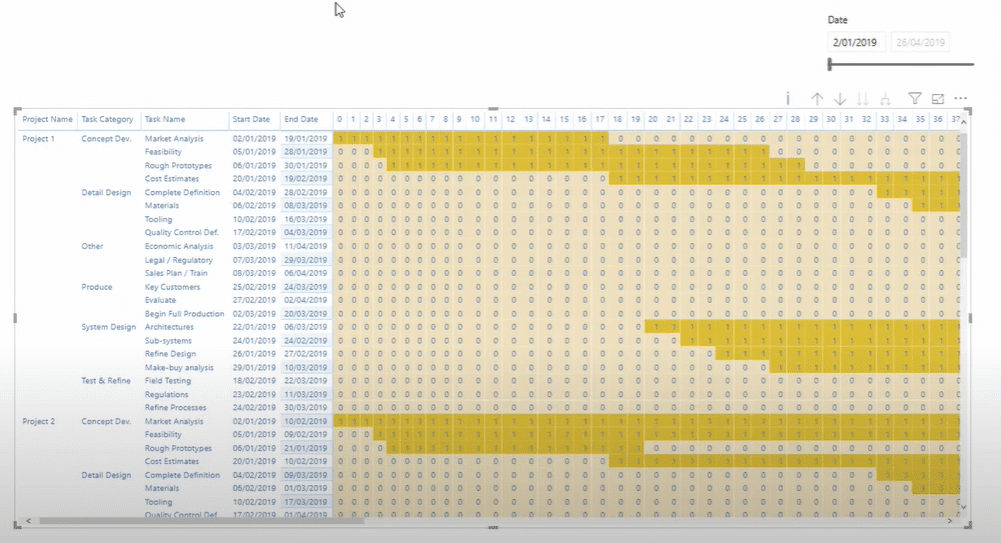
Another thing that you can apply is to change the width of every column. You can adjust all the columns to fit them on one page, but it’ll still depend on how you want the matrix to look.
This is how the final Gantt chart looks like in the report page after the setup. What I previously showcased was just stage one because I eventually made this sample Gantt chart a bit advanced.

***** Related Links *****
How To Create Compelling Reports & Dashboards In Power BI
How To Use The Built-in Analytics For Power BI Scatter Charts
Power BI Data Visualization Tips For KPI Trends Analysis
Conclusion
Today, I’ve highlighted some really cool and helpful techniques. Hopefully, you enjoyed it and learned a lot. You can check out the tutorial video that I included in the blog for more details.
In terms of what I went through during the member-only session about Project Management, I’ve added a lot more logic to the Gantt chart. I added different colors for different tasks and task categories. I also incorporated different shades for the different project percentage completion.
Good luck!
Sam
[youtube https://www.youtube.com/watch?v=SO4mk1H94OA&w=784&h=441]


