In this tutorial, I’m going to give an in-depth discussion on cluster analysis, and how to create insightful cluster visualizations in Power BI. You may watch the full video of this tutorial at the bottom of this blog.
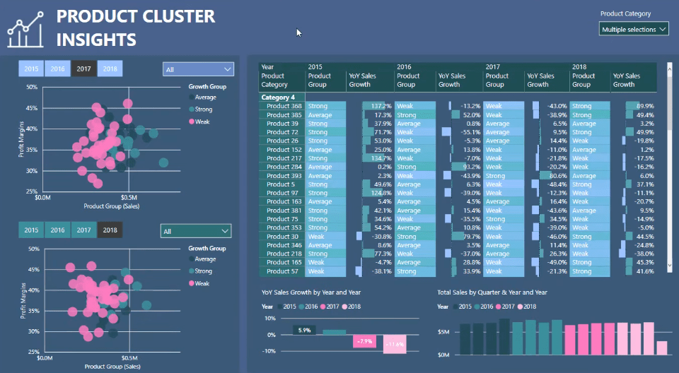
This is a quick breakout session from an Enterprise DNA learning summit.
I’ve already gone through some formula techniques around clustering before. But for this tutorial, I’m going to be more specific on the visualizations and how to make comparisons over time for clusters in Power BI.
Cluster Analysis For Product Growth
For this example, I highlighted the Growth through time.
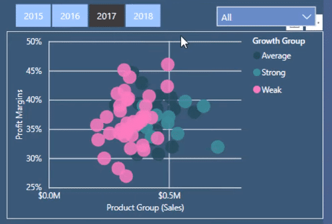
I highlighted the growth from last year to the current year for products.
If you just utilize simple visualization techniques and don’t provide additional value around the clustering in your scatter plots, your visualizations become too plain.
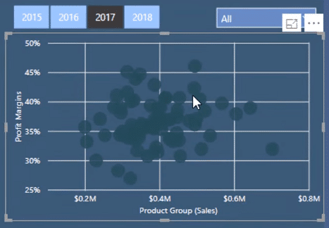
The chart shows a whole range of different products, but it doesn’t actually showcase what’s going on.
This is where you can add value to your report.
In this example, I used the dynamic grouping technique so that I can look at clusters in my data.
I can look at the comparison between the Growths of my Weak, Average, and Strong products.
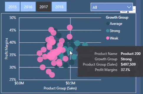
I can see that my strong products seem to be clustered within a specific Profit Margin range. This Profit Margin is around 35% to 40% and has an Average Sales of 500,000.
For this particular time frame, my weak customers are all situated on the left-hand side of the scatter plot. But they have a very wide and diverse range of Profit Margin.
These insights are extremely helpful especially when you’re in a meeting or engaging with your stakeholders.
Power BI Cluster Visualization Tips
I’ve also used a few cluster visualization techniques for this Power BI report.
1. Using Slicers
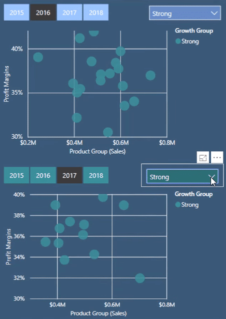
Using the same example, I want to look at one time frame. But I also want to see how things change in a different time frame. All I have to do is use the selections I’ve made for this report.
I can quickly select the information I want to see using the slicers. Then, I’ll be able to individually see how the report changes per year.
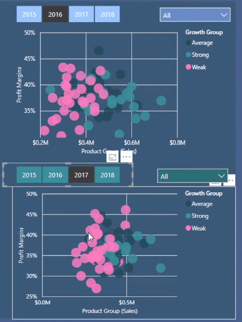
I’ve strategically utilized the Edit Interactions option.

For this report, I don’t want the slicer of the first scatter plot to change anything in the second scatter plot or in the other charts.

It’s also the same for the slicer of the second scatter plot. I don’t want it to change anything else in the report except for the visualization it’s assigned to.
The Edit Interactions option enables me to do this. I don’t need to create new formulas. The exact same formulas are used for all the visualizations.
By using the smart visualization technique of Edit Interactions, I can easily compare these things over time.
For instance, in the year 2016, I only want to see my weak customers. I want to see how they performed against my weak customers in 2017.
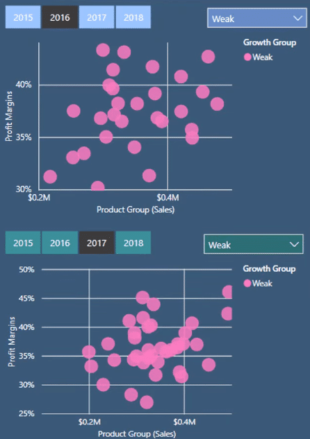
I can now see a stronger correlation or non-correlation between these two groupings in my Product Sales.
2. Creating A Custom Supporting Table
You need to remember that none of these groupings actually exist in your raw data. They’re all generated by a custom supporting table which I call Product Grouping.
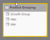
I’ve created this custom supporting table with Min and Max bounds.
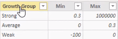
To calculate product growth, I’ve created these arbitrary groups. Weak growth is basically no growth at all. It’s been assigned the arbitrary number of 0 to -100. Average growth is 0 to 0.3. Strong growth is 30% or more.
With that simple grouping, I can then see 2016 Year on Year. I can see my strong products which have grown by over 30% in 2016 and 2017.
3. Customizing The Visualizations
You can also add more color to the visualization and add Data labels.

4. Using Groupings For Insights
Now, I want to see all my Products across all the years. I want to see what group they’re in.
For example, I want to see Product 72.
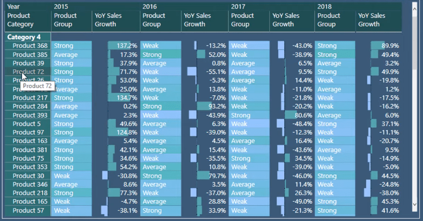
They were Strong in 2015. In 2016, they were Weak. And in 2017, they became Average.
Being able to see this movement through time for the Products from a grouping perspective can give valuable insights to the report.
This is also a very reusable technique.
I’ve created these groups based on Growth. But you can create groups based on Sales, Profits, or Profit Margins. You can basically create groups based on any criteria.
Formulas Used
For this example, I’ve used only two formulas. However, there are slightly more advanced formulas that can be used.
This is the dynamic grouping formula that I used for this report:

And this is the formula I used for the matrix:

This is working out the Growth Group of every single product. And to make that possible, you need to change the context within CALCULATE. It’s going to iterate through every single row in the Product Grouping table. Then, it’s going to work out if the Year on Year Sales Growth is greater than a Min, or less than or equal to a Max.
Only one of the rows in the Product Grouping table is going to evaluate to TRUE. When it does evaluate to TRUE, that’s when the formula returns the actual group the products are in for a certain year.
Then, all the other filtering gets done in the matrix. For this example, there’s a Product and Year context filtering.
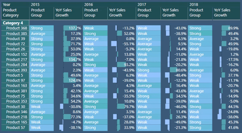
The Year on Year Sales Growth changes for every single year. This is what generates the difference in the Growth Group. This gets redone at every single year for every single product.
***** Related Links *****
How To Evaluate Clusters In Your Data Using DAX Technique In Power BI
Finding Patterns In Your Data Using Internal Logic In Power BI
How To Use The Built-in Analytics For Power BI Scatter Charts
Conclusion
In this tutorial, I wanted to highlight cluster visualization techniques and how to utilize them in Power BI.
You can generate a huge amount of insight within just one reporting page using this technique.
All the best,
Sam
***** Learning Power BI? *****
FREE COURSE – Ultimate Beginners Guide To Power BI
FREE COURSE – Ultimate Beginners Guide To DAX
FREE – 60 Page DAX Reference Guide Download
FREE – Power BI Resource
Enterprise DNA Membership
Enterprise DNA Online
Enterprise DNA Events


