Have you ever thought it would be nice to work out what the most optimal outcome is from your scenario analysis work that you’re doing inside of Power BI? In this tutorial, I show you exactly how you can discover this and also include sensitivity analysis techniques to your what-if parameter and scenario analysis work. You may watch the full video of this tutorial at the bottom of this blog.
So we go through how you can build and optimize your model through running scenarios, and then explore or run sensitivity on those scenarios.
Scenario analysis is a truly powerful way to run advanced analytics or discover advanced analytical insights within Power BI.
Incorporating sensitivity analysis and relevant visualizations to your reports enables consumers to see what would happen if multiple scenarios occurred at once versus just a singular result based on a selection.
By utilizing this technique in Power BI, you’re giving the consumer a chance to see what the most optimal outcome is based on the scenarios that could occur in your data.
Sensitivity Analysis Technique
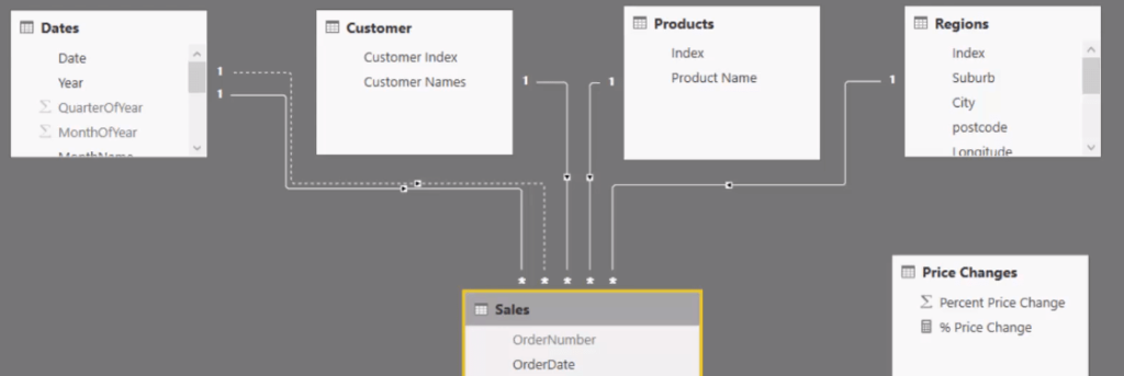
The key thing for this analysis is to set up our data model correctly. Inside our data model, we have our Lookup tables — Dates, Customers, Products, and Regions — that are related to our Sales table.
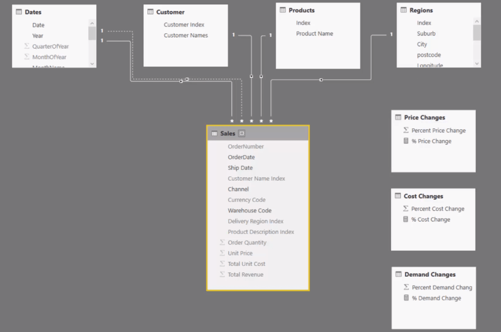
More importantly, we create these three scenario tables or scenario supporting tables. In the older version of Power BI, we had to do this manually. But now with the recent Power BI version, we can create this using the What-If parameter feature.
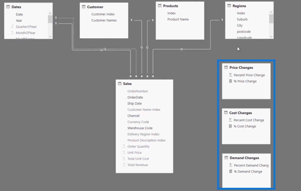
In these scenario tables, we can shock the demand, cost, and price.
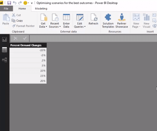
I call this multi-layering of scenarios or a multi-layered approach to scenarios because we can thread through these three variables or elements into our calculations, allowing us to run multiple scenarios.
This is how we’re going to run sensitivity analysis to then see which is the most optimized scenario in this current environment we have here in this example.
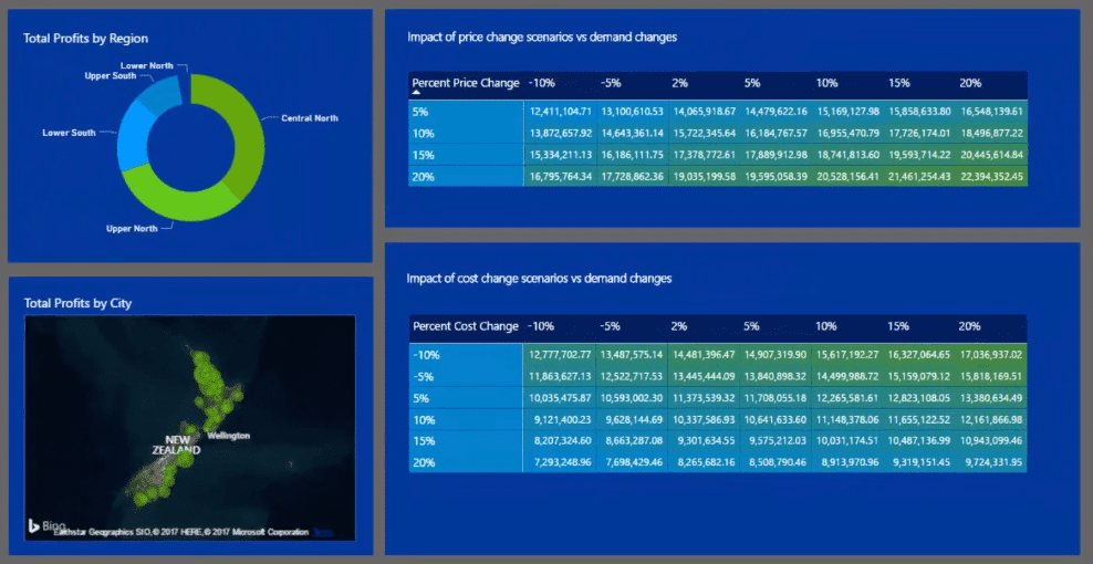
Once we have this forecast or this sort of scenario in our demand, pricing, and costs, we will then see its ultimate impact on our total profits or sales.
Working The Scenarios Through The Formula
We then thread all of our elements through our formulas. In our Scenario Profits calculation, we use iterating functions. We can isolate any element that we’re looking at in a particular row of a table.
In this case, it is the Sales table we’re iterating through every single row. And then we can shock it with the change in demand, price, and cost.

So, if you think about it, these elements or scenario tables are not even connected into anything in our model since they’re supporting tables. And, we use this formula to integrate them into our model.
Instead of just showing the overall results, we show the sensitivity. We’re using that multi-layering of scenario approach inside of iterating functions in this particular formula to then create these sensitivities.
In this chart here, we’ve brought in on the rows the Change in Price and across the top and the columns we have the Demand Changes.

In this chart, we can see what the change in demand, as well as the change in price, would actually do to our results. And then within the matrix, we can use the conditional formatting to color those in, which is another really awesome element, for a better visualization.
In this chart below, we can see the Change in Cost. So when costs decrease, for example, our demand increases.
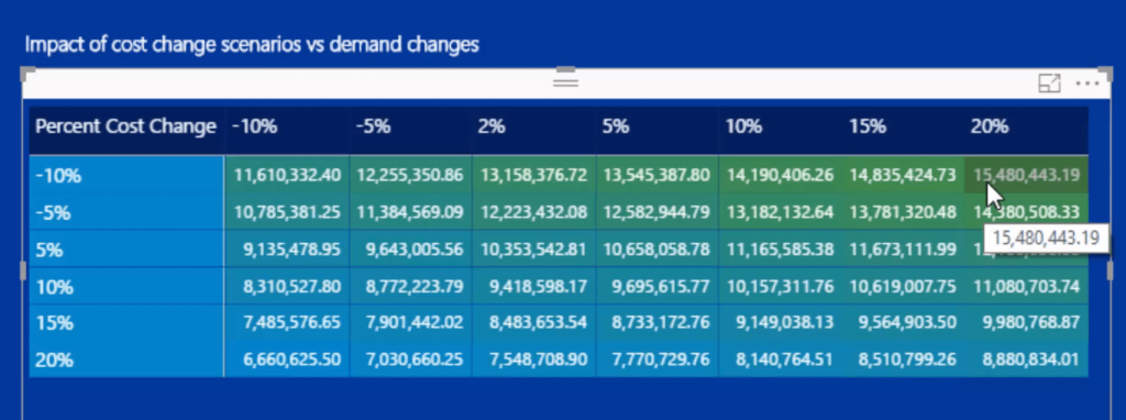
We might as well add more elements to get a more comprehensive analysis. We can put in our Dates, Regions, etc.
Other Elements For Further Analysis
We add our Dates slicer here, so we can change the time frame, which is seriously amazing. This will enable us to drill into a specific time frame, and then it will change the results we have in our charts.
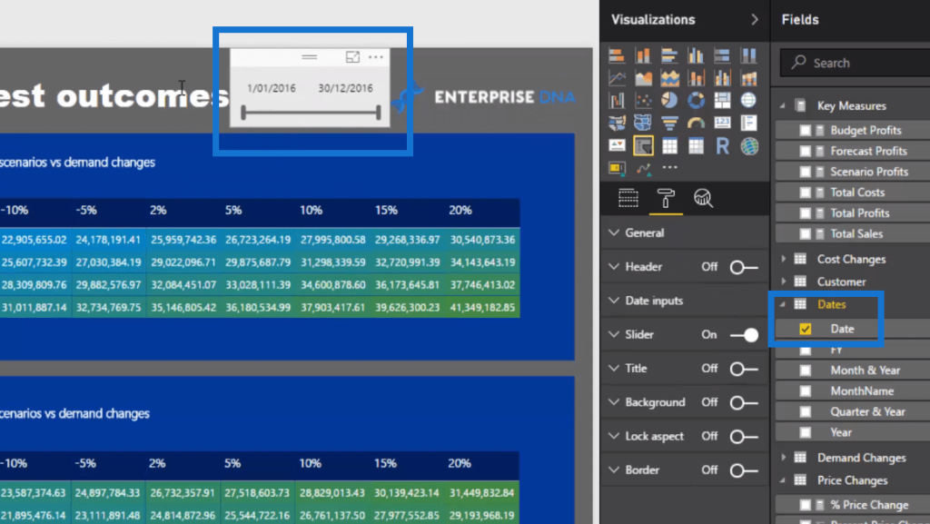
With the power of the data model, we can also include any element on any dynamic way so we can really drill into aspects of our data.
So we can utilise anything inside our model, we can filter our Customers, Products, Regions, etc.
We can still run these sensitivities in these very specific regions. Once you select a region, it will dynamically change the results as well.
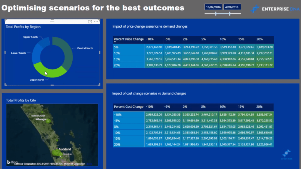
And that’s how you can optimize these scenarios. It’s basically running sensitivity analysis easily and effectively.
***** Related Links *****
Sensitivity Analysis Example In Power BI Using DAX
Using Multi-Layered Scenario Analysis In Power BI
Layering Multiple ‘What If’ Scenarios In Power BI – Advanced DAX Concepts
Conclusion
As you can see, this is really powerful stuff. This is really high quality analytical work that is going to impress anyone if you put this in front of them.
This work historically was very difficult to achieve. In Power BI, just like magic, you can create this work. You can create these insights in a really intuitive, effective and a scalable way.
I hope you can see how quickly you can do this. There are not many complex formulas involved. It just requires a really good understanding of iterating functions, and that is the key to implementing this technique.
Good luck using techniques like this in your own analysis.
Sam


