
In this tutorial, I’m going to show you how showcasing clusters in your data enables you to extract far superior insights than if you just had a scatter chart with a whole lot of information planted in there. You may watch the full video of this tutorial at the bottom of this blog.
I’m going to go through some advanced DAX techniques that you need to utilize in combination with the data model. If you use them well, the analytical opportunities open up substantially for you and you can really showcase insights in an effective way.
In this particular example, I’m trying to see if there was any reason why we’re seeing a certain clustering of our customers based on their performance.

By overlaying some logic (within a DAX formula) across a secondary table, I’m able to classify if a customer is good, okay, poor, or great.
Then by using this new dimension in my scatter chart, I can see if any clustering of outcomes appears based on the logic I just implemented.
How To Visualize Clusters In Your Data
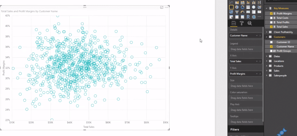
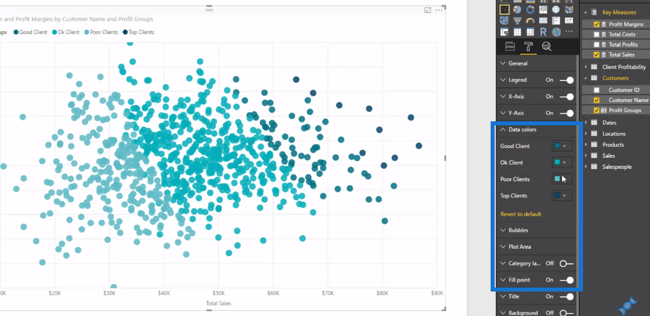
In this visualization, we’re looking at every single customer in our data set. There’s lots of customers and we’re analysing the customers based on their profit margins in their total sales. On the right-hand side, we have a cluster of high-performing customers or higher-margin clients.
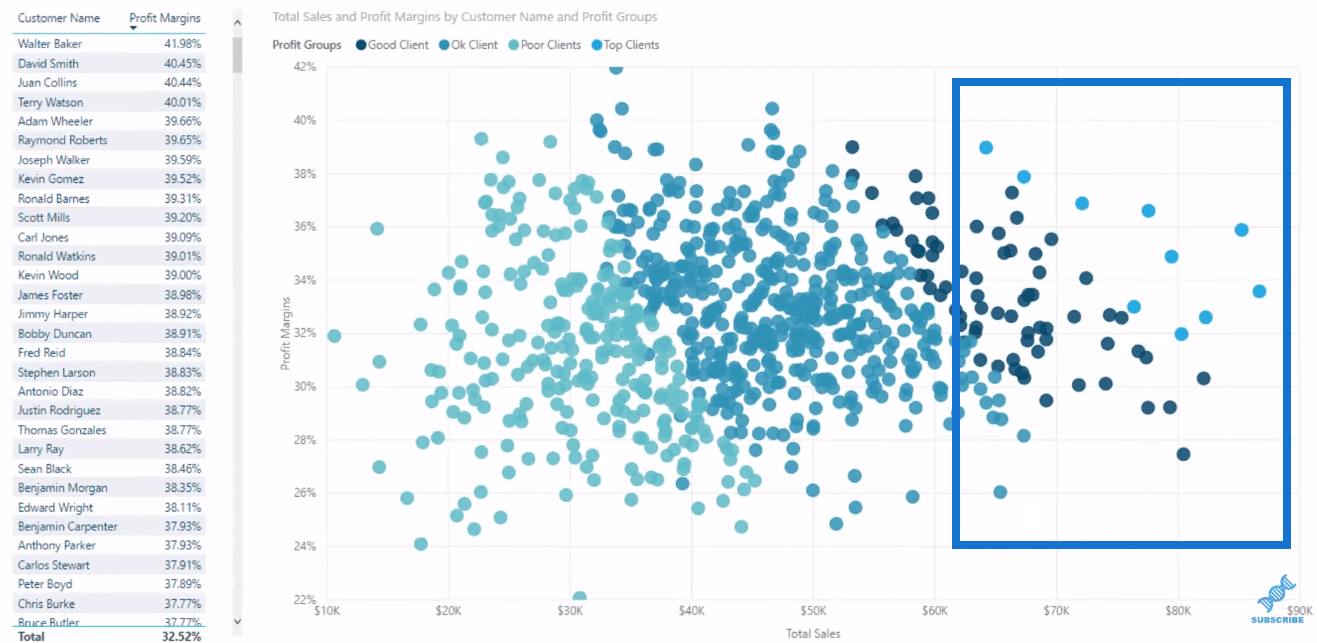
To achieve this, we need to create a logic that enables us to visualize these clusters of information and build that logic based on which profit group these customers sit in.
The key thing here is that these profit groups does not actually exist in the data model, so we need to build this logic, and then overlay it.
This example is just one of the many ways that we could do this. We could look at profit growth, margin growth, and a variety of things where we need any type of logic and bring it in here. We can then identify any pattern or cluster of information that can really extract some insight for us.
Inside The Data Model
Looking at the data model, the first thing to note is that we’ve created a supporting table here. A supporting table is generally used sometimes as a parameter table, but in this case, we’re going to use a logic that integrates the supporting table into our core model.

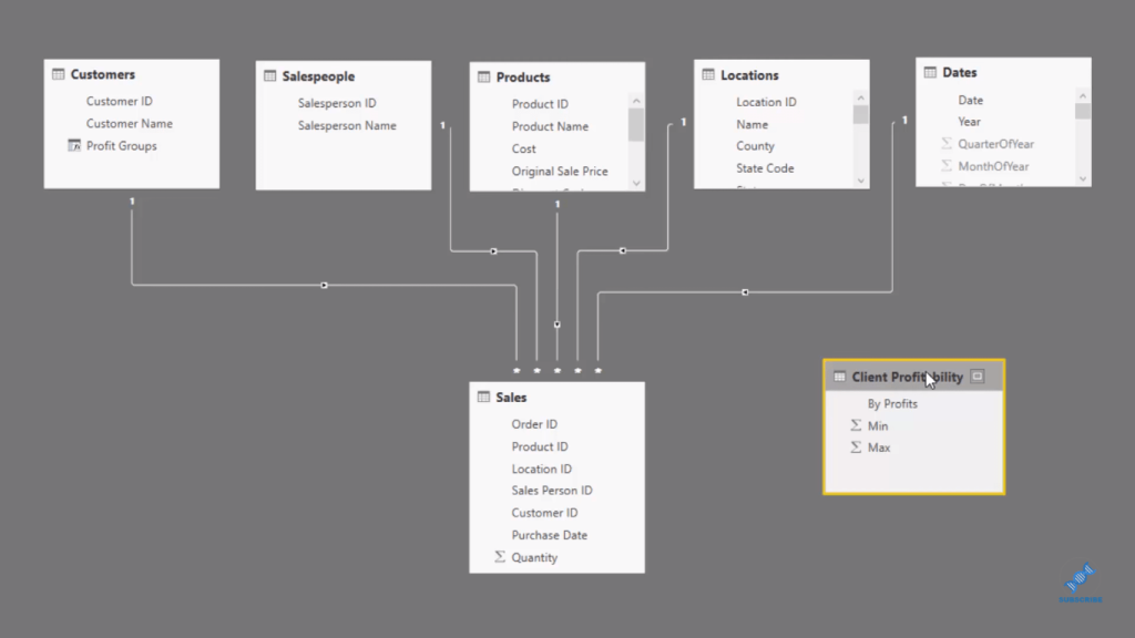
Inside our supporting table, we are analyzing which customer group based on profitability that these customers sit inside.
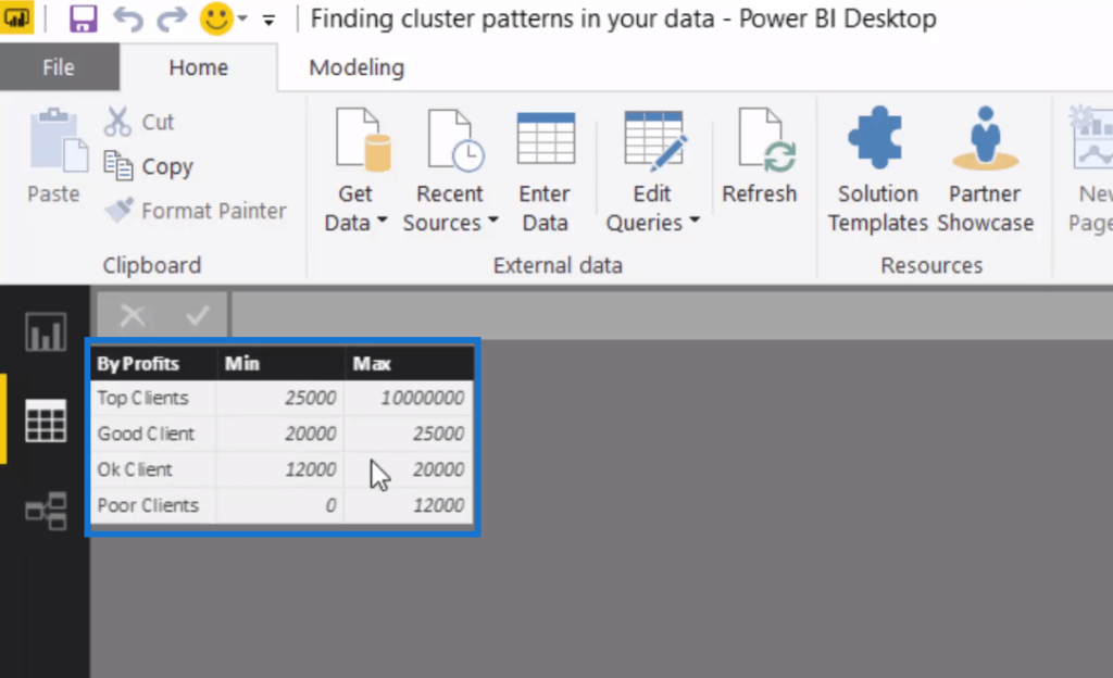
So for instance, if the customer has generated over $25,000 in profits, then they’re going to be a top client, while those between $20,000 and $25,000 are going to be a good client, so on and so forth.
Integrating Logic Into The Dimension
In the customer table, we utilise the supporting table, and then built some logic.
Some of you might think that it’s better to develop all of this logic inside this calculated column — yes, absolutely — but sometimes I find it not practical, especially when the supporting table have, say 10 different pieces of logic that you have to work through.
Yes, you could just develop a really complicated calculated column, but I think it would be so much easier to put them inside a supporting table, and then write simple logic like this, which would integrate them.
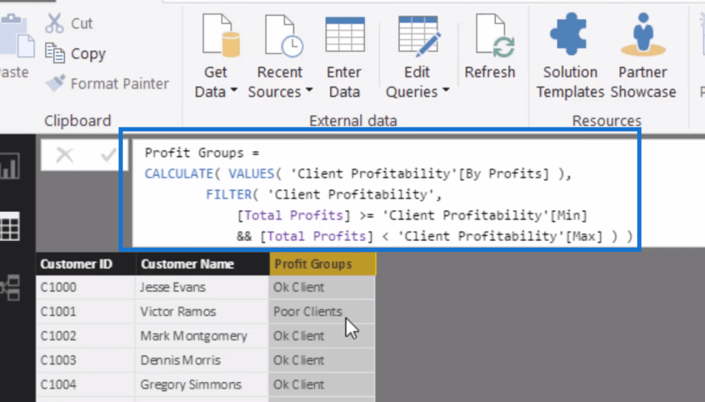
In this logic here, we CALCULATE what group does each customer sits in. The group is going to be returned by the VALUES function, and then the FILTER function is what creates iteration to iterate through the logic.
Then, for each customer here, what is the Total Profits; does it sit between the MIN and the MAX of any of our groups. If it does, then return that group. And that’s how we create this Profit Groups.
Creating The Visualization
Now that we have this dimension, we can use it inside our visualizations to identify these clusters. So we’ll create a scatter plot, then bring in our Profit Margins into the Y-axis and Sales into the X-axis.
But, if we drag in Customer Name, we’ll see here that we’ve created some information, but it doesn’t really show any value. It would showcase much better if we create clusters of information.
So to do this, we just fill the points and change a few data colors to make sure some stand out. By doing these simple adjustments, we can easily identify and extract much more information inside our visuals.
The supporting table is a really key concept to get around and to understand when using Power BI because we can integrate it in so many ways.
There are a lot ways we could identify clusters based on a variety of metrics, as there are so many different scenarios that our data might require us to analyze.
***** Related Links *****
Use DAX To Segment & Group Data In Power BI
Find Patterns In Your Data With Internal Logic using Power BI & DAX
Dynamic Segmentation: How To Segment Customers Into Groups Using Advanced DAX
Conclusion
There’s a bit to this technique, but showcasing clusters in your data using logic is really powerful, and there are so many ways that you can replicate this in other scenarios or across your own data.
That’s ultimately what I want you to extract from this tutorial I’ve created, as the analytical opportunities exponentially grow around this type of technique.

This is an advanced technique, so don’t get too concerned if it doesn’t make sense immediately but definitely try it out. You’ll quickly find that you discover some really interesting insights that you didn’t have before.
Cheers!
Sam


