Hey everyone, have I got an interesting insight for you! In this article, I’m going to go over the Pareto analysis and help you identify your top 20% customers. You may watch the full video of this tutorial at the bottom of this blog.
Not only do we want to break out the top 20% versus the bottom 80%, we also want to delve deeper into that top 20% and understand WHY they are in that category.
Perhaps, there is some peculiar customer behavior that we could identify. We can use it to replicate among other customer segments in our business with an aim to increase sales or customer revenue.
This tutorial came from a question raised in the Enterprise DNA Forum about the Pareto rule. If you’re not familiar with Pareto analysis, it’s just the other name of the 80/20 rule. This principle suggests that 80% of the company’s revenue comes from 20% of the customers or the products that you sell.
If you want to check out more about the Pareto rule, you can check this previous tutorial that relates to it.
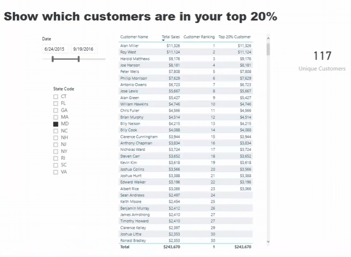
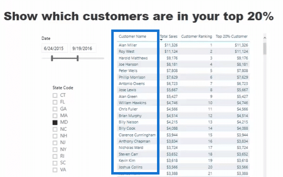
In this tutorial, I want to work out how many sales were from the top 20% customers. I also want to highlight how many customers were part of that 20%. Additionally, I’ll let you see how to break out that data and arrive at this great visualization below.

After that, I’m going to show you the dynamic customers and their sales based on any state.
Working Out The Formula For Top 20% Customers
Now, let’s work through the solution so that you can see how it actually works. Here’s the formula to achieve the top 20% customer insight.

I’m only looking for customers who purchased from us in a particular time frame. Take note that we are not looking at the entire subset of customers every single time.
Dynamically, I want to be able to change the time frame and figure out the top 20% of customers for that period in a specific state. So, I’ll just have to select any of the states in the report to find out a different customer set for other contexts.
This calculation is unique because I have to implement unique things. First, I’m dealing with the customer context. I only need the customers who have purchased from us, so I need to look at the total sales. That is the reason why I used the IF statements.

Now, this is where the real evaluation happens. This certain part of the formula removes the context for each customer.

Then, it retrieves the total unique customers and multiplies it to 0.20 (20%). If the current rank of the particular customer is less than the amount of unique customers, multiplied by 0.20, it will return Total Sales. This is the only way we can make the formula work.
To sum up, the RANKX function needs to remove the customer context and ranks everything based on the Total Sales only. Then, if the customer is less than the total unique customers plus the product times 0.20, it returns the Total Sales.

Calculating The Unique Customers For Pareto Analysis
Now, let’s quickly jump back to the formula for Unique Customers.

This formula calculates the distinct count of customers on a monthly context. Moreover, the formula evaluates each of the customers under the Customer Name column.

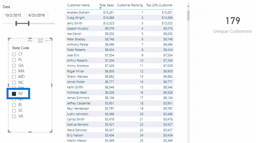
If we try to change the state, for example, NJ for New Jersey, you can see that the number of unique customers also changes dynamically.

Another useful insight is that you could change this report to the top 30% or top 50% customers. You can also make it dynamic by using a slicer for all these percentage values. Just change the number that you need to multiple into either 0.30 or 0.50.
***** Related Links *****
Implementing The Pareto (80/20) Principle in Your Power BI Analysis
Predicting When Will Your Customers Purchase Next w/ Power BI
New Customer Analysis Using Advanced DAX
Conclusion
The ability to carry out Pareto analysis in Power BI requires more advanced logic than just simple calculations you can complete.
If we can achieve the said insight, there are many areas that we can apply this to – for instance – our sales strategy or marketing strategy. That’s what this tutorial is all about.
I hope you enjoy reviewing this tutorial.
Sam


