DAX Data Analysis Expressions Language
Once you understand transformations and data modeling, you can finally start working on visualizations on your reports. This would require a deeper understanding of DAX. You may watch the full video of this tutorial at the bottom of this blog.
What Is DAX?
What is DAX and why is it important?
DAX stands for Data Analysis Expressions.
DAX is the formula language within Power BI. This is where Power BI’s true analytical power comes from. If you don’t use DAX Data Analysis Expressions Language, you would miss out on 95% of Power BI’s potential as an amazing analytical tool.
Think about working with Excel. If you don’t understand the formulas, you can’t really maximize what those spreadsheets can do. That’s the same rationale behind the importance of understanding DAX when using Power BI.
Using Power BI’s Built-In Calculation Engine
When you open up Power BI, you’re going to start off with a blank screen like this. This is where you can get started with some DAX measures.
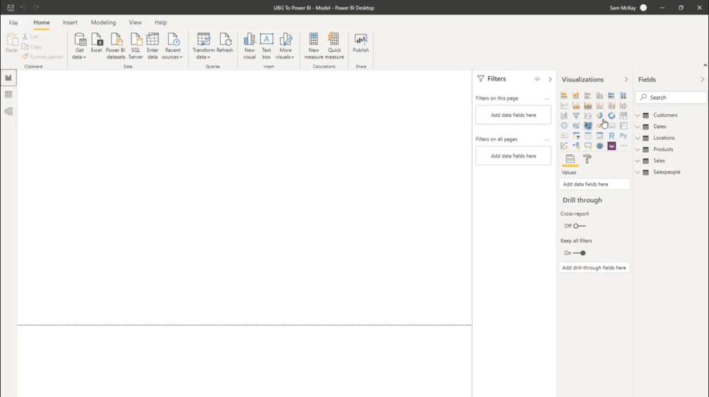
But most of the time, people start off by going into the available tables.
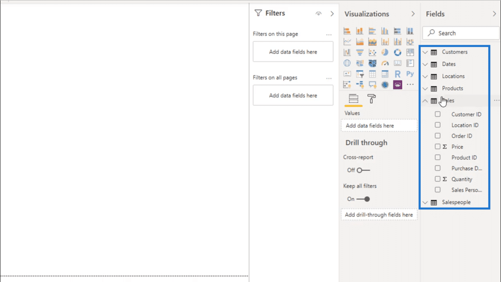
Then, they choose the column they need from any of those tables like this Quantity column below.
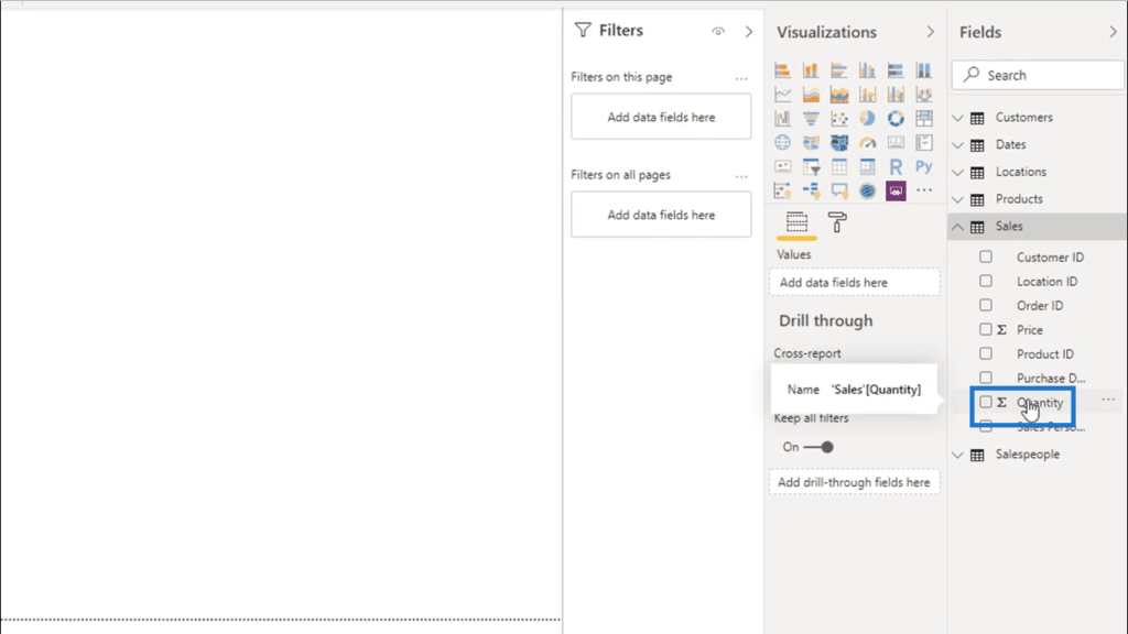
They drag that into their report and get the results they need.
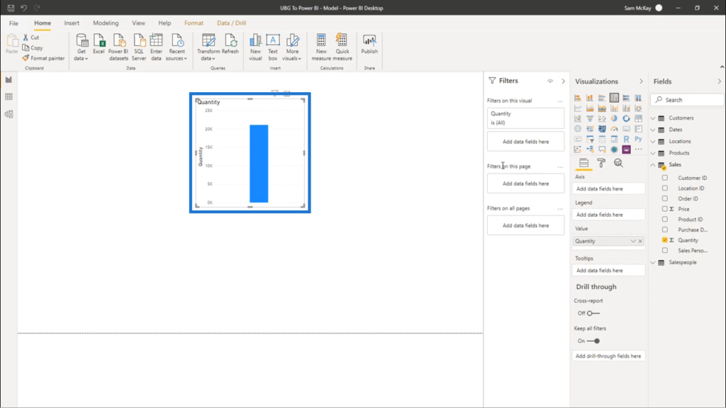
Some would also add a bit more data to get more insights. They would, for example, click on the Customers column.
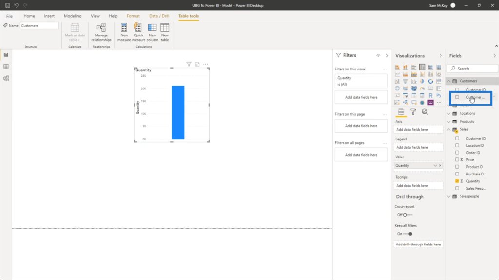
Then, they would drag and drop this to the axis.
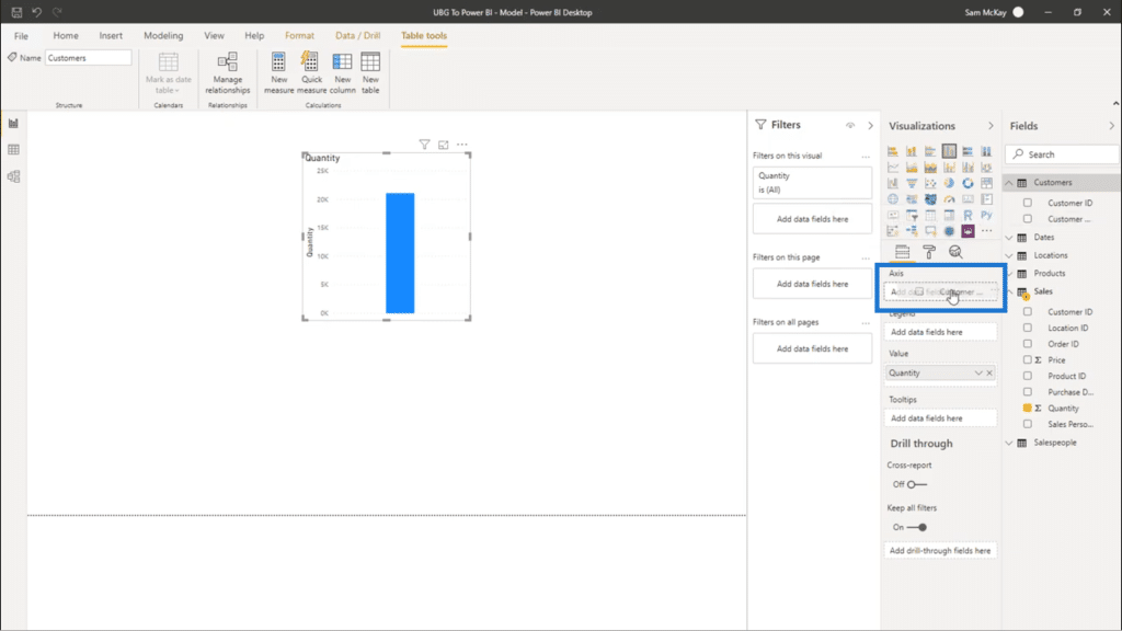
Once that’s done, they would have a visualization that shows the quantity of products sold to specific customers.
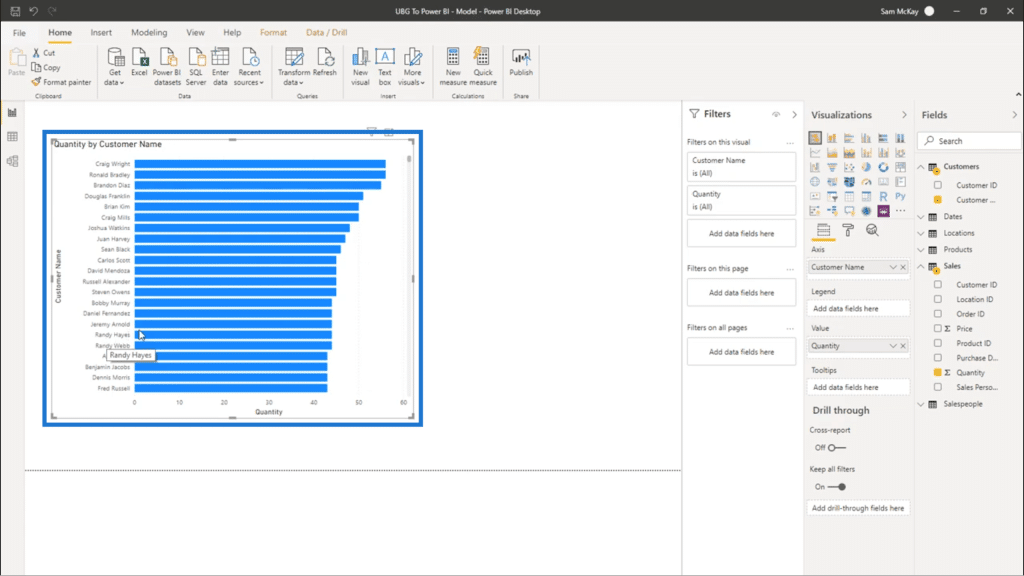
Because these steps yield calculated results, people assume that this is the best way to get insights from Power BI. But in reality, this could greatly limit what you can do.
Personally, I recommend starting off with DAX right away. The steps I showed you earlier merely use the built-in calculation engine within Power BI.
The Importance Of Using DAX Right Away
Although Power BI’s own calculation engine yields the right results at first, that’s basically all that you’re going to get. The moment you want deeper insights from your visualizations, you would still be required to create DAX measures.
This is why I always start off with DAX. It can save me the trouble of having to create new DAX measures every time I need deeper insight. If I do everything within DAX formulas, I can just pull those existing measures up to do something more advanced.
The example above, for example, is a really simple calculation. But those calculations, when done through DAX, can be eventually used once you need to jump to time intelligence calculations or formula patterns.
So if your simplest calculations and visualizations are built on DAX formulas, it’s easier to transition into something more advanced.
Measures Versus Calculated Columns
Before I show you how to create DAX measures, it’s important to understand the difference between a measure and a calculated column.
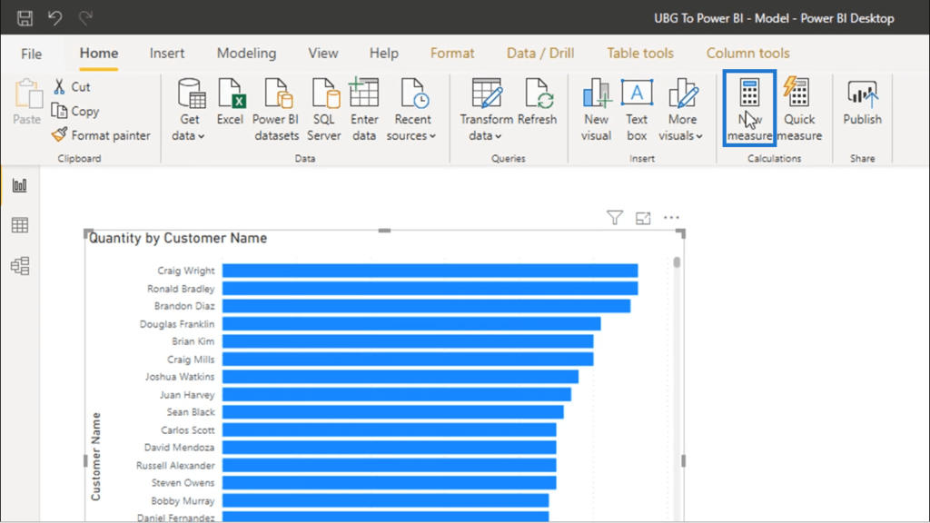
You can create a measure using this icon in the Home ribbon.
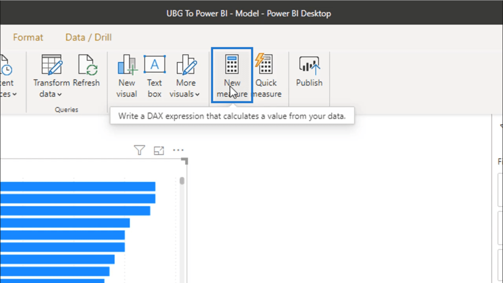
DAX measures are like virtual calculations. They only run calculations when they are used in a visualization or table.
On the other hand, calculated columns sit physically within your data table. They continuously run calculations within the table itself.
You create a new one by clicking on the New Column icon.
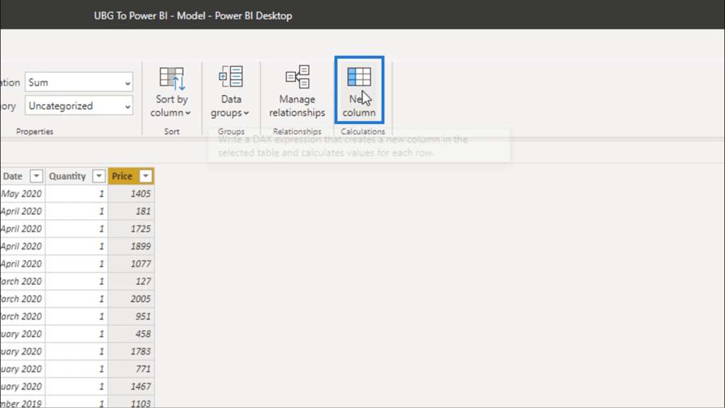
Once you click on that, it creates additional data points that may or may not add value to the analysis that you’re doing.
It’s important to create measures as much as you can. Virtual calculations will always be more optimal than having actual physical data points within your tables. These physical data points can be very restricting in terms of the insights you can potentially get.
Recreating The Given Data Within A Measure
I’m going to show you how to get the same calculated results shown earlier, but this time, by doing it within a measure.
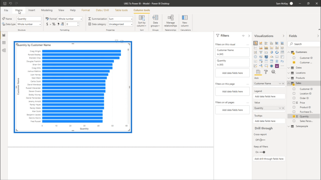
So I’m going to start by clicking on the New Measure icon.
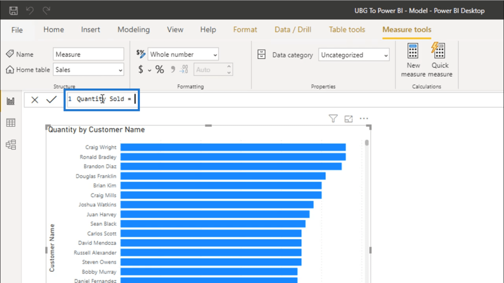
That opens up a formula bar. I’m going to start with the name of the measure. I’ll call this Quantity Sold.
SUM is one of the simplest functions available, and is very relatable for those who are transitioning from Excel to Power BI. I’m going to start off with that, then I’ll choose the column that I want to work on. A list of columns available usually shows up here.
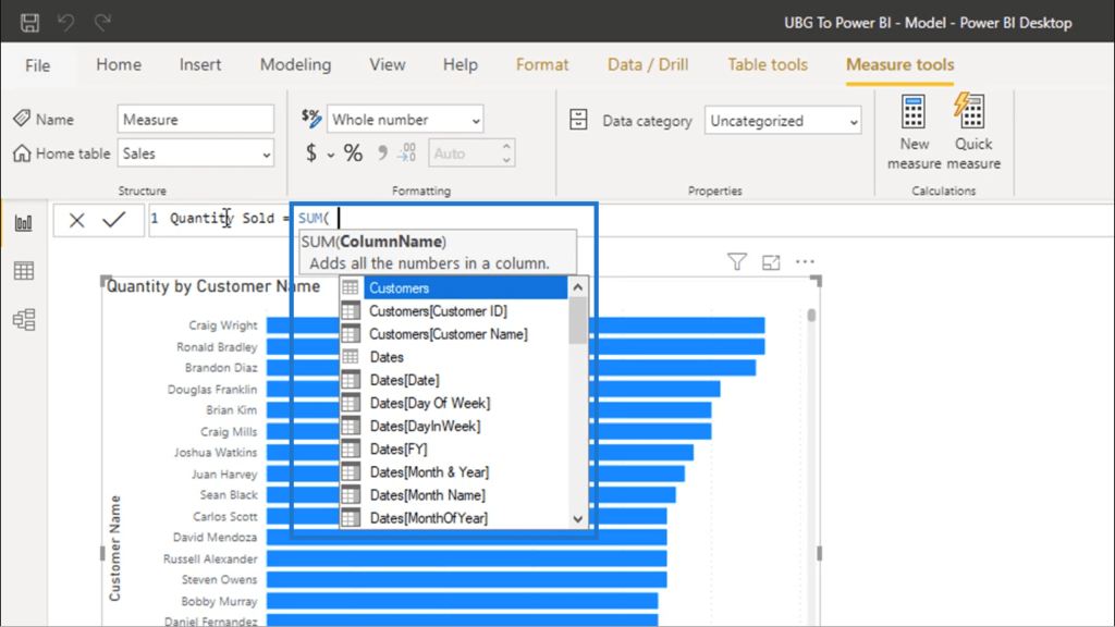
I’m choosing the Quantity column found in the Sales table, since that’s the data I want to replicate.
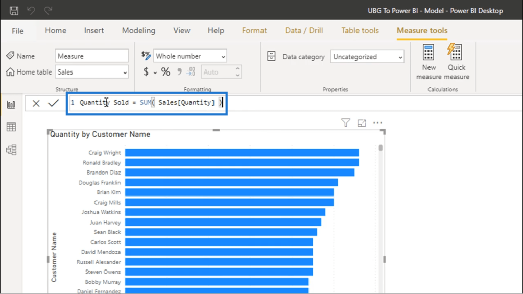
Once I hit enter, you’ll see on the right-hand side that the measure I created is now under the Sales table. That’s because measures land on whatever table you selected before creating that measure.
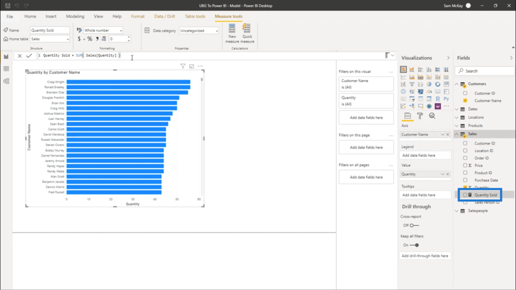
Now, I’ll show you how that new measure I created shows the exact results that the earlier visualization showed.
I’m just going to copy and paste that previous visualization.
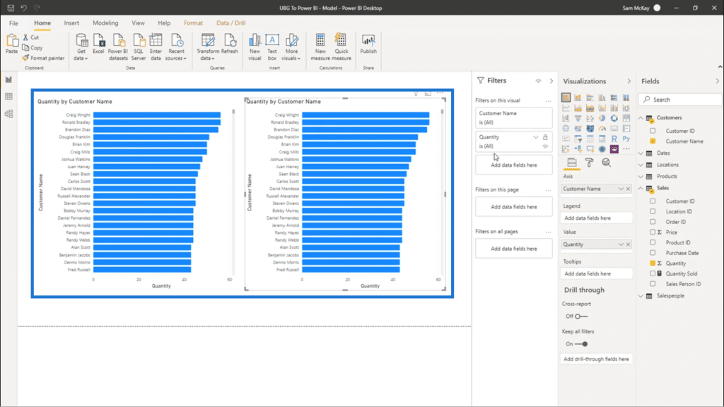
Then, I’m going to delete this Quantity column.
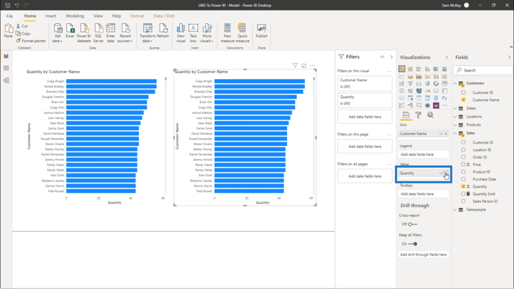
Next, I’m going to bring in Quantity Sold, which is the measure I just created. I’ll drag it into the Value field.
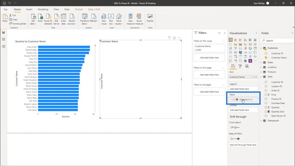
Once that’s done, the data within the visualization is updated.
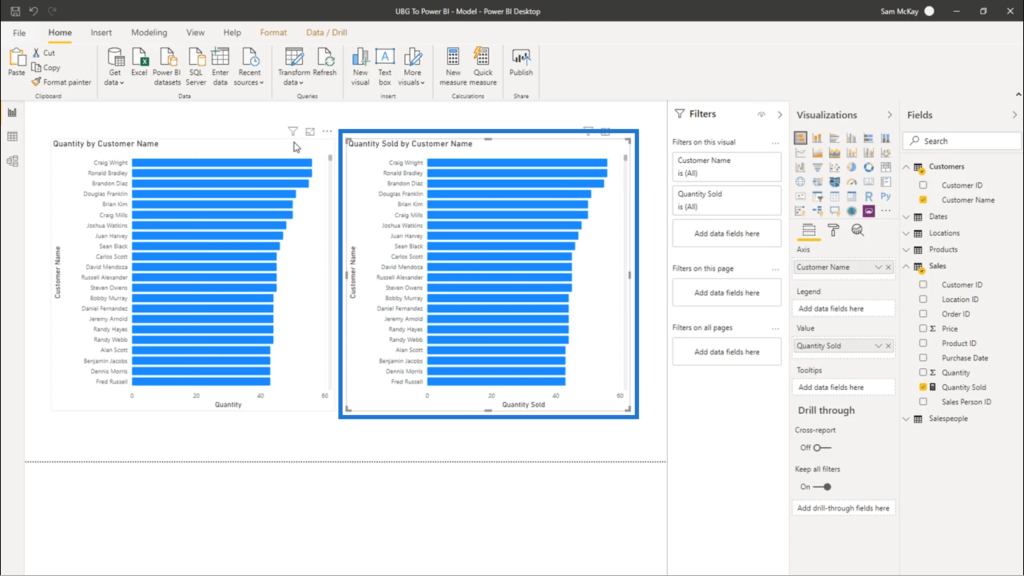
You’ll see here that the calculations are exactly the same. The only difference is, one is being done within a measure and one isn’t.
***** Related Links *****
Why Using Power BI Variables Is A Better Way To Write DAX Measures
3 Ways To Combine Values Using DAX Inside Power BI
Power BI DAX Formula Technique: Showcasing Growth Performance Effectively
Conclusion
By creating DAX measures instead of relying on calculated columns, it’s easier to move onto more advanced insights. You just have to become familiar with the way measures work.
It’s very easy to do so it’s better to get started and familiarize yourself with these DAX measures right away.
Just one final reminder – don’t forget to name your measures in an intuitive manner. In the example I created, I named the measure Quantity Sold so that anybody who looks at my visualizations would immediately know what each data point represents.
Once you combine all these best practices, you’ll start seeing the amazing analytical power that Power BI has.
All the best,
Sam


