
In a world driven by data, the ability to transform raw numbers into meaningful insights is a superpower that can drive innovation and change. But how can you wield this power?
The answer lies in the art of data visualization, a craft that enables you to tell compelling stories with data. By harnessing the power of data visualization, you can take your audience on a journey through the data, helping them understand the information, grasp its significance, and act upon it.
To master data visualization, you must:

- Understand Your Audience and the Story You Want to Tell
- Select the Right Visualization Technique
- Choose the Right Tool
- Identify the Most Important Metrics
- Use Aesthetics Wisely
- Learn the Basics of Data Visualization
In this blog, we’ll show you how to use data visualization to turn raw data into meaningful insights and unlock the potential of your data.
So, buckle up and get ready to learn a new way to communicate your findings!
What is Data Visualization?
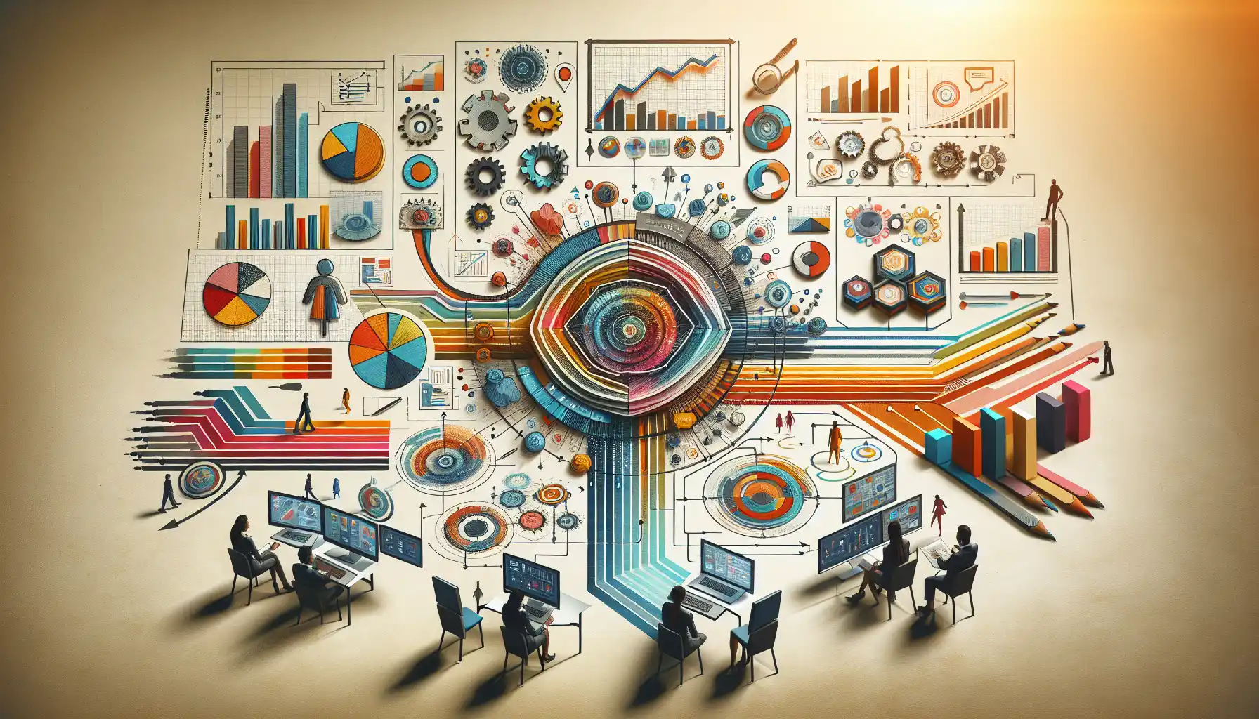
Data visualization is the process of representing data graphically to help people better understand its significance. By taking large, complex data sets and turning them into easily understood visual images, data visualization makes it much easier to identify patterns, trends, and correlations that might go undetected in text-based data.
When done right, data visualization doesn’t just present data; it tells a story. It highlights the key takeaways, making it easier for your audience to see the big picture.
How Data Visualization is a Superpower

Data visualization is a superpower because it enables you to tell stories with data. It’s like having the ability to create a picture that speaks a thousand words.
And in a world where data is everywhere, the ability to turn raw numbers into compelling narratives is invaluable.

Here are some reasons why data visualization is a superpower:
- Understand Complex Data at a Glance: With data visualization, you can take a complex data set and distill it into a single, easy-to-understand image. This makes it possible for anyone to grasp the most important information in seconds.
- Spot Trends and Patterns Quickly: Data visualization makes it easy to spot trends and patterns in your data. Whether you’re looking at sales figures, website traffic, or stock prices, the right visualization can help you identify what’s happening and why.
- Communicate Your Findings Effectively: By presenting your data visually, you make it much easier for others to understand what you’ve found. Whether you’re sharing your work with colleagues, clients, or the general public, data visualization helps you get your message across clearly.
- Make Data-Driven Decisions: When you can see your data clearly, you can make better decisions. Whether you’re planning a marketing campaign, setting sales targets, or deciding where to invest, data visualization helps you make choices based on solid evidence.
- Stand Out in a Crowded Field: In a world where everyone has access to data, data visualization sets you apart. It helps you make your case more convincingly, share your findings more effectively, and get your message across more clearly.
Data visualization is a superpower because it makes data easy to understand, helps you spot trends and patterns, lets you communicate your findings clearly, and enables you to make better decisions.
And in a world driven by data, these abilities are priceless.
Why is Data Visualization Important?

Data visualization is important because it allows you to transform raw data into meaningful insights. In a world where data is everywhere, being able to extract useful information from it is a game-changer.
By presenting data visually, you make it easier for people to understand the significance of the data and act on it. Here’s why data visualization is important:
- Helps You Understand Complex Data at a Glance: With data visualization, you can take a complex data set and distill it into a single, easy-to-understand image. This makes it possible for anyone to grasp the most important information in seconds.
- Enables You to Spot Trends and Patterns Quickly: Data visualization makes it easy to spot trends and patterns in your data. Whether you’re looking at sales figures, website traffic, or stock prices, the right visualization can help you identify what’s happening and why.
- Enables You to Communicate Your Findings Effectively: By presenting your data visually, you make it much easier for others to understand what you’ve found. Whether you’re sharing your work with colleagues, clients, or the general public, data visualization helps you get your message across clearly.
- Helps You Make Data-Driven Decisions: When you can see your data clearly, you can make better decisions. Whether you’re planning a marketing campaign, setting sales targets, or deciding where to invest, data visualization helps you make choices based on solid evidence.
- Stands Out in a Crowded Field: In a world where everyone has access to data, data visualization sets you apart. It helps you make your case more convincingly, share your findings more effectively, and get your message across more clearly.
Data visualization is important because it makes data easy to understand, helps you spot trends and patterns, lets you communicate your findings clearly, and enables you to make better decisions.
And in a world driven by data, these abilities are priceless.
How to Use Data Visualization to Tell a Story
When it comes to data visualization, the real power lies in your ability to tell a story with your data. After all, what good is a beautiful chart if it doesn’t convey a message?
Here’s a simple framework to help you create compelling data stories:
1. Understand Your Audience and the Story You Want to Tell: Who are you speaking to, and what do you want to convey? Do you want to inspire, inform, or persuade? Understanding your audience and your message is the first step to creating a compelling data story.
2. Select the Right Visualization Technique: Not all data is created equal, and not all data stories are best told with the same techniques. You might use a line chart to show trends over time, a bar chart to compare categories, or a map to illustrate geographical patterns.
3. Choose the Right Tool: There are many tools available to create data visualizations, from the simple and free (like Google Sheets) to the complex and expensive (like Tableau). Choose the tool that best fits your needs and your skill level.
4. Identify the Most Important Metrics: Not all data points are created equal. Decide which ones are most important to your story, and make sure they are the focus of your visualization.
5. Use Aesthetics Wisely: A good data story is both informative and pleasing to the eye. Pay attention to color, layout, and font choices, and make sure they enhance your story rather than detract from it.
6. Learn the Basics of Data Visualization: Just as a writer needs to understand grammar and a musician needs to understand scales, a data storyteller needs to understand the basics of data visualization. Learn about chart types, data types, and best practices to make your data stories shine.

Data visualization is a powerful tool for turning raw data into meaningful stories. By understanding your audience and your message, choosing the right visualization techniques, and using aesthetics wisely, you can create data stories that inform, inspire, and persuade.
What is Data Visualization Art?

Data visualization art is a form of creative expression that uses data as its medium. In a world awash with information, data visualization art can help us make sense of the world around us, turn complex information into something beautiful, and convey powerful messages in a way that words alone cannot.
In essence, data visualization art is about transforming raw numbers and facts into something that can be seen, felt, and understood on a deeper level.
Here are some key points about data visualization art:
- It’s About More Than Just the Data: Data visualization art isn’t just about presenting data; it’s about using data as a source of inspiration. It’s about finding the stories that data can tell, the patterns it can reveal, and the emotions it can evoke.
- It Can Take Many Forms: Data visualization art isn’t limited to bar charts and line graphs. It can take many forms, from intricate sculptures to dynamic digital displays. The only limit is your imagination.
- It Can Convey Powerful Messages: Data visualization art has the power to convey complex ideas in a way that is both accessible and memorable. It can help us understand the world around us, make better decisions, and even spark social change.
- It Requires Both Creativity and Technical Skill: Creating data visualization art requires a unique blend of creativity and technical skill. You need to be able to see the potential in raw data, and then use the right tools and techniques to bring your vision to life.
Data visualization art is a powerful tool for making sense of the world and conveying powerful messages. Whether you’re a data scientist, an artist, or simply someone who loves to explore new ideas, data visualization art has something to offer.
Final Thoughts

As you can see, data visualization is more than just pretty pictures. It’s a powerful tool that allows you to unlock the stories hidden in your data. By mastering data visualization, you can gain a deeper understanding of your data, spot trends and patterns that might otherwise go unnoticed, and make better decisions based on the evidence.
So, go forth and tell your data stories! The world is waiting to hear what your data has to say.
To learn more about data science and its latest tools, check out the Enterprise DNA YouTube channel.
Frequently Asked Questions
What are the types of data visualization?
There are many types of data visualization, each suited to different types of data and different goals. Some common types of data visualization include:
- Line graphs
- Bar charts
- Scatter plots
- Heatmaps
- Pie charts
- Tree maps
- Area charts
- Bubble charts
- Bullet graphs
How to use data visualization in storytelling?
To use data visualization in storytelling, you need to create visualizations that support the narrative you want to tell. Start by identifying the key message or insight you want to convey. Then, select the appropriate type of visualization to highlight that insight.
Enhance your visualizations with appropriate labels, colors, and annotations to make your story clear and compelling.
What is the difference between data visualization and data storytelling?
Data visualization is the process of creating visual representations of data to help viewers understand complex information. Data storytelling, on the other hand, is the practice of using data visualizations to convey a narrative or message.
While data visualization focuses on creating clear and informative visuals, data storytelling emphasizes the use of those visuals to communicate a specific story or message.
How does data visualization improve data literacy?
Data visualization helps improve data literacy by making data more accessible and understandable. Visual representations of data allow individuals to quickly grasp complex concepts and relationships.
As a result, people can make better-informed decisions and better understand the data they are presented with.
Why is data visualization important in data analysis?
Data visualization is important in data analysis because it allows analysts to identify patterns, trends, and relationships within the data more easily.
Visual representations of data can reveal insights that might be missed in raw data, helping analysts make better-informed decisions and solve problems more effectively.
How can data visualization be used for business intelligence?
Data visualization is a key component of business intelligence (BI) as it helps organizations turn data into actionable insights. By using data visualization tools, businesses can:
- Identify trends and patterns
- Make informed decisions
- Communicate complex information more effectively
- Monitor key performance indicators (KPIs)
- Identify areas for improvement
- Share insights across the organization
By using data visualization for BI, organizations can stay ahead of the competition and make data-driven decisions that drive success.


