For this post, I’ll walk you through a real-life scenario where you might find yourself in a similar situation where you’re asked for something by a stakeholder and you need to create a report quickly based on what they are asking for. This is exactly what the Power BI Accelerator data analytics challenge is all about. You can watch the full video of this tutorial at the bottom of this blog.

In this particular accelerator, Brian (our chief content officer at Enterprise DNA) has created a scenario where you can put your analytical skills to use.
With Power BI, mastery comes in understanding how you can apply certain techniques to different environments and different scenarios. To kickstart the accelerator, I’ll work through the problem and see how this turns out.
The Brief For The Data Analytics Challenge
Here’s the brief for this data analytics challenge:
Your boss comes into your office Monday morning looking stressed. She tells you that we have the opportunity to acquire one of our main competitors and that the CEO wants a briefing by COB to answer the following questions about the acquisition target:
- What were their highest and lowest sales in a given year?
- In what states were their sales high? Low?
- How many sales did they make in their top 5 products each quarter?
- Who were their top 10 salespeople in a given year, and what was the $ value of their sales?
Just by looking at this brief, I already know that we’ll be using some type of ranking formula. The ranking formula is going to be similar for all of these requirements, and we’ll just change the context.
We also have a bit of a mock-up of what the stakeholder wants to see.
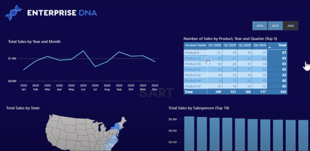
As you can see, this is a very real-world common occurrence where you’d get a quick question and you have to quickly throw something together using a mock-up and an outline.
This is exactly what we want our Accelerator program to be all about, which is a data analytics challenge where everybody can definitely jump in and get involved.
Creating A New Measure Table For The Data Analytics Challenge
The first thing I’m going to do is to create a new measure table because the model has already been built.
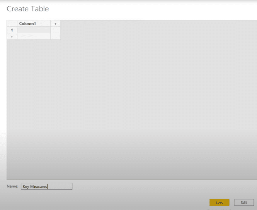
All I need to do is think about the logic to add in and decide which ranking function to use between RANKX or TOPN.
Let’s just quickly figure out where the sales are coming from in our dataset. It looks like the line sales is our revenue column.
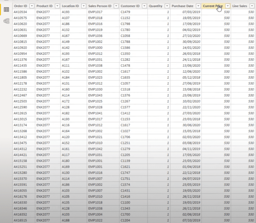
Creating The Total Sales Measure For The Data Analytics Challenge
I’m going to create a new measure.
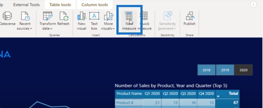
I’m going to call this measure Total Sales, and do a simple sum of the line sales column.
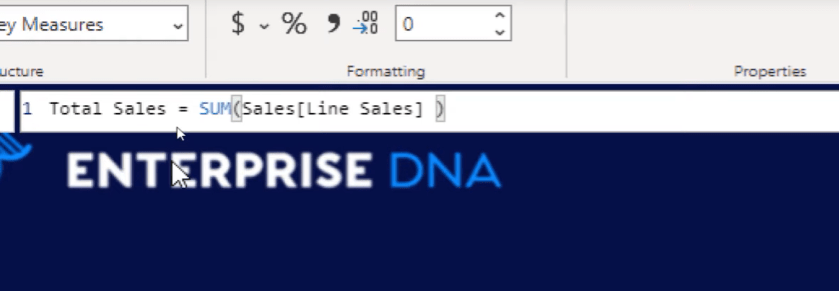
I can just get rid of the column that I don’t need, then make sure to turn the measure into a measure group. I also have my Date table all lined up in my model, which I’ll turn into a line chart, then grab my Total Sales and drag it into the values area.
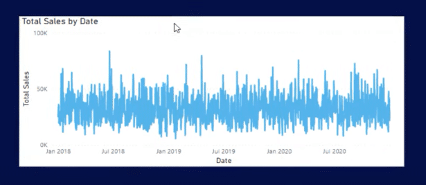
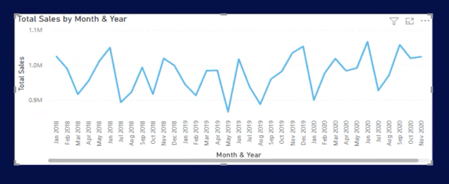
As you can see, this chart is too busy. We need to get the Month & Year to enable us to see this more clearly. I’ll be changing the context here.
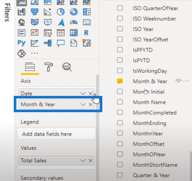
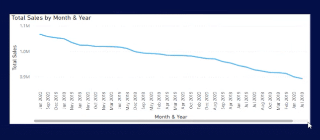
This is not sorted out correctly, so I need to go to my Date table, find my Month & Year column, and then use a supporting column called Month & Year. You can get this particular code to create a Date table from our forum or from the Analyst Hub.
The chart looks so much better now and is more like what we needed in the mock-up.
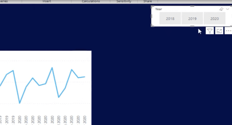
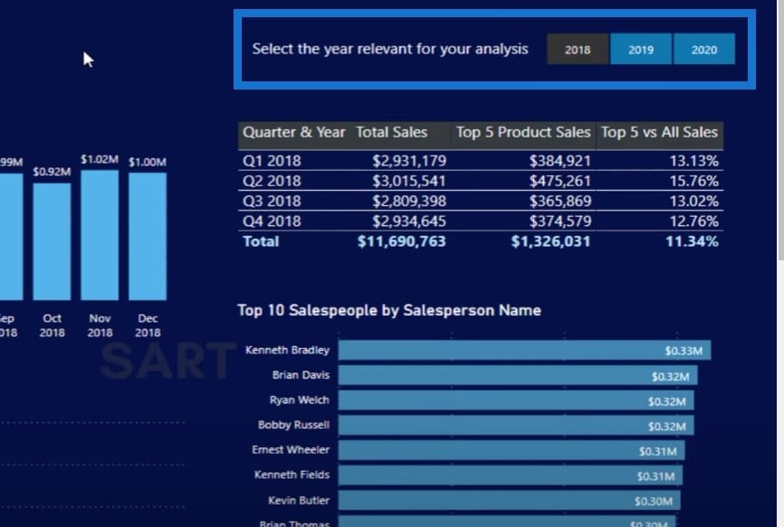
The next thing to do is to create a filter for the year because we want to be able to break it down by year. So I’m going to create a horizontal slicer and put this at the top right corner.
What States Are The Sales High Or Low?
The next question in the brief is what states are the sales high or low? We’ll need to get our states into a table so we’ll go to the Locations column, select State, and turn it into a table.
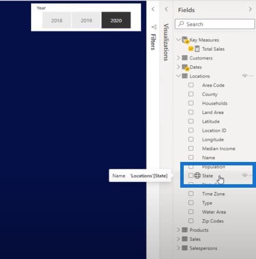
I always turn things into a table to be able to see the results I’m actually getting. I’ll also put in my Total Sales and then format the currency.
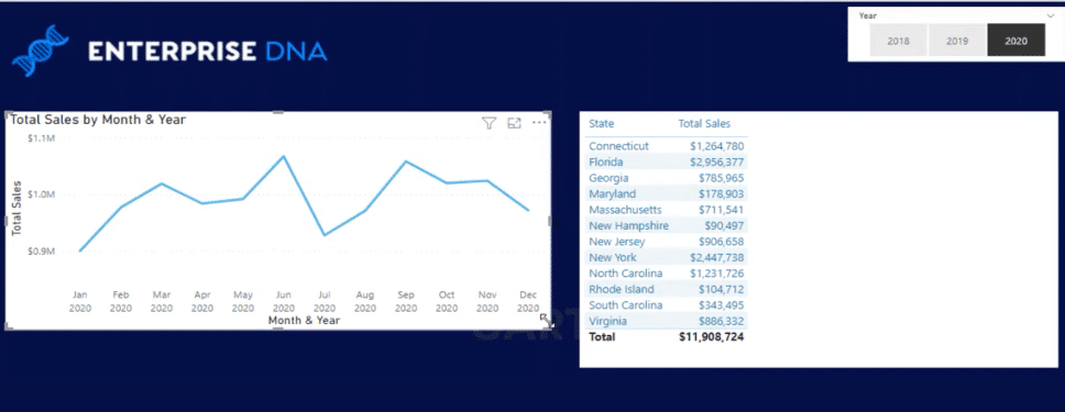
I just realized that I don’t even need to use a ranking function because I can already do the ranking here. I could turn this into a shape map, and see the highs and lows this way.
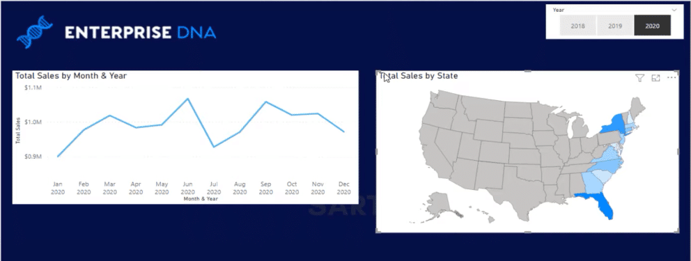
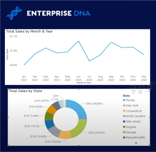
I can also use a donut chart if I want to. There are lots of ways to highlight the data, and I don’t even have to use a ranking formula at all.
How Many Sales Did The Top 5 Products Make?
The next question from the brief is how many sales did they make from their top five products each quarter? Let’s have a look at what the mock-up is asking from us.
We need to basically figure out what our top five products are, and see how many sales they make in each quarter. This one is a bit tough but definitely doable.
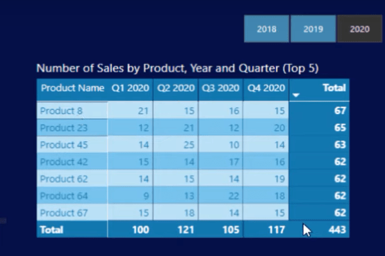
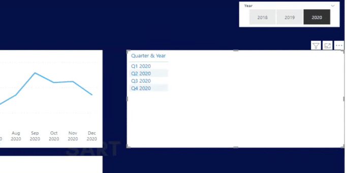
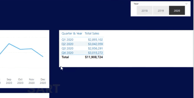
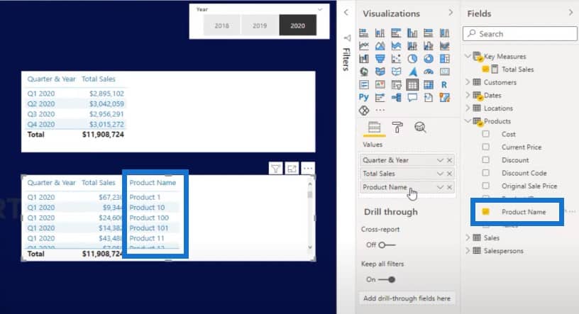
Let’s grab the Quarter & Year and bring it in to our table.
And then bring in our Total Sales for each quarter.
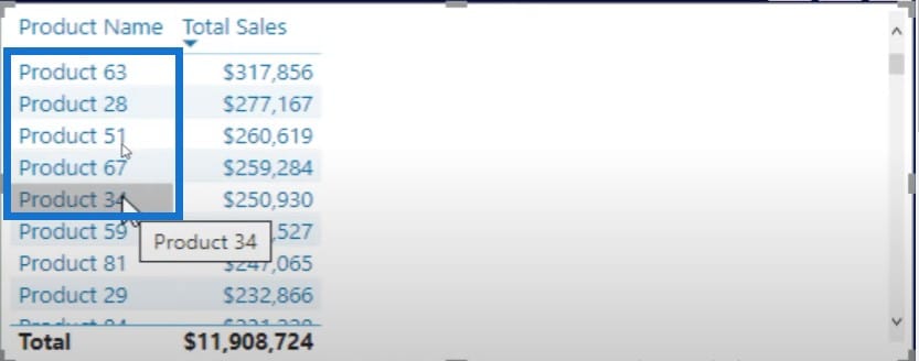
We also need to have a look at our products and see what our top ranking products are. Let’s find the products dimension.
Our top five products are 63, 28, 51, 67 and 34.
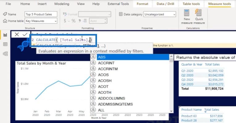
I need to isolate these top five products and then get the Total Sales of just these five using a function called TOPN. I’m going to add a formula and use the CALCULATE function, which enables me to change the context.
This is where it gets a little bit trickier and ambiguous, because are we looking at the top five products on a yearly basis, or are we looking at the top five products for each quarter?
For me, this question is asking what the top five products are for each quarter. To answer this question, I’ll need to look at all of my products, which is why I’ll put my products table in the calculation and put them in a descending order, from highest to lowest.

For each different quarter, it’s going to rank them from top to bottom, then bring the top five products based on Total Sales, and then return each product’s sales.
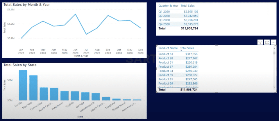
If I bring this into my table, we can see that $450,482 of the sales from Quarter 1 came from the top five products.
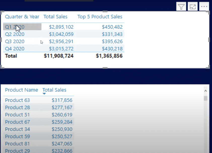
To double check, we can just click on a quarter and scan down the list. Remember that we’re not looking at the top five products over a year. We’re looking at the top five products in each individual quarter, and these products can change.
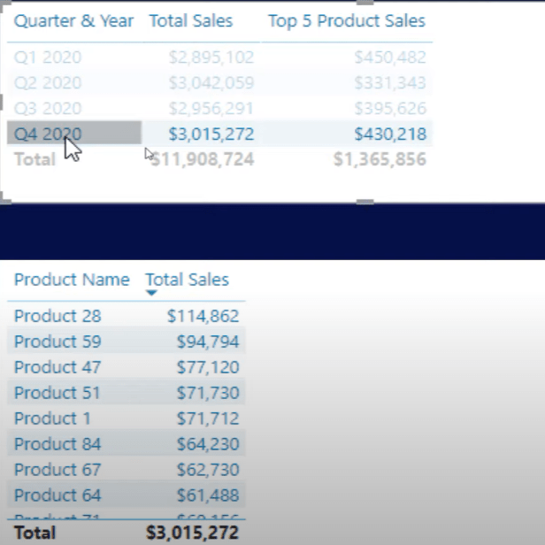
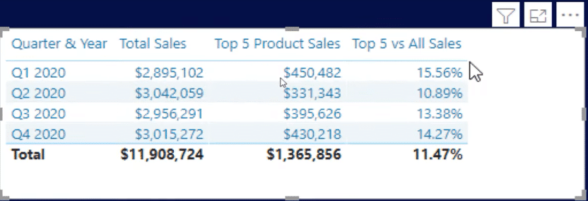
We can take this to the next level and come up with our top five versus all the sales. Simply divide the Top Five by Total Sales.

Here are our top five product sales compared to all sales.
Who Are The Top 10 Salespeople?
The next question we will tackle is who are the top 10 salespeople in any given year, and what was the dollar value of their sales? This is another interesting one. Let’s dive into salespeople.
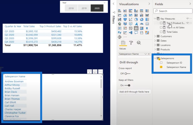
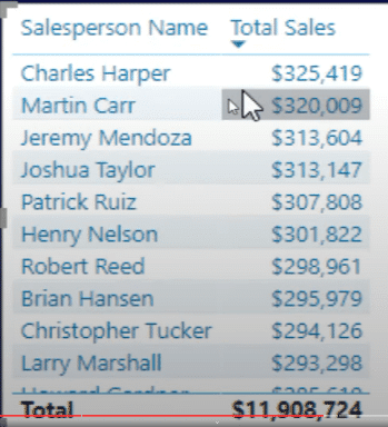
Let’s bring in our Total Sales together with Salespeople. We can see who our top 10 performing salespeople are.
But if I want to return just the top 10, I’ll need to create a ranking. I’ll name the measure Top 10 Salespeople and use RANKX. The trick here is to use ALL Salespeople so I can remove all context from the salespeople column and rank the sales against every salesperson.
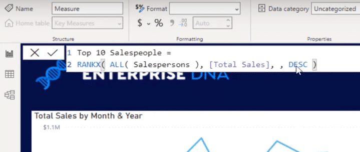
I can write an IF statement where if RANKX is less than or equal to 10, then return the Total Sales; if not, it should be equal to blank.

Now I’m going to get just the top 10 salespeople, and for everything else, it’s going to be blank.
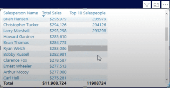
Then I’ll get rid of the Total Sales and use visualization like this:
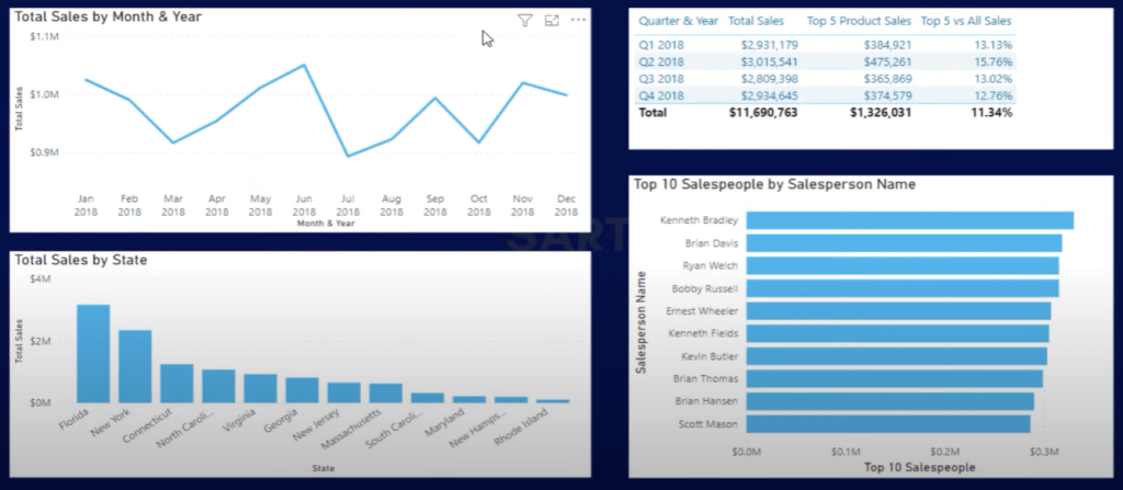
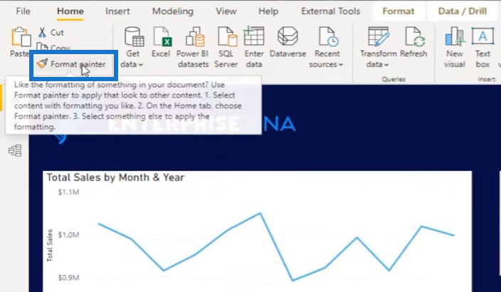
Let’s clean things up a little bit here, and use a dark and white contrast. I’ll also get rid of the word wrap for the titles on the axis, and use the format painter to make changes.
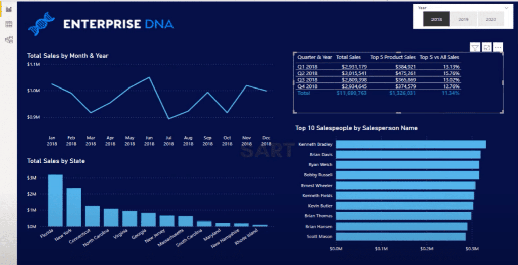
There are things we can still improve here. I will change the upper left visual into a bar chart because the line chart isn’t the greatest representation of time, add data labels, and remove the axis to make the visual cleaner.
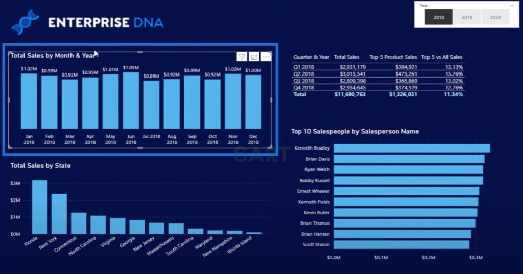
Another thing that I can do is to create some logic to really highlight the top sales and low sales. We can add data labels to the Top 10 Salespeople visual, put them inside the bars, and add a different shade of blue.
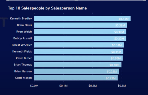
I need to change the colors a bit to make sure that this aligns with our color scheme. And then I’ll create a text box and type something like this:
This text box will make it easier to see the year slicer.
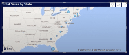
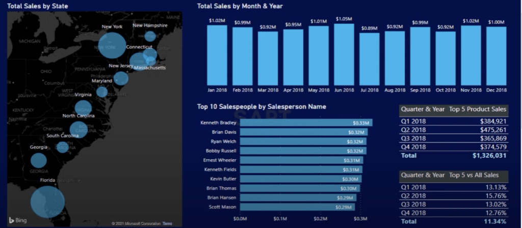
What can we do for the Total Sales by State visual? The map is not the greatest visual – honestly, I don’t love it.
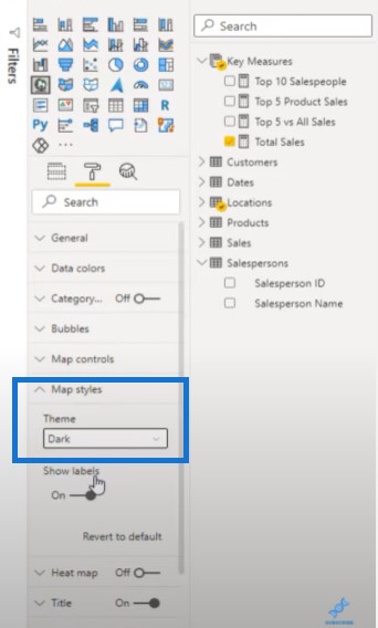
We could use a darker theme for the map to make it fit in with the rest of the report.
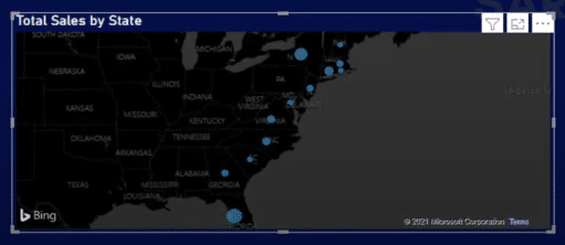
Potentially, we can also use the map bubbles and make them a little bit bigger.
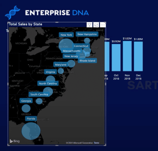
We can put our Total Sales by State on the left and rework the other tables. We can select New York as a state on the left visual and it will change the context of the other visuals.
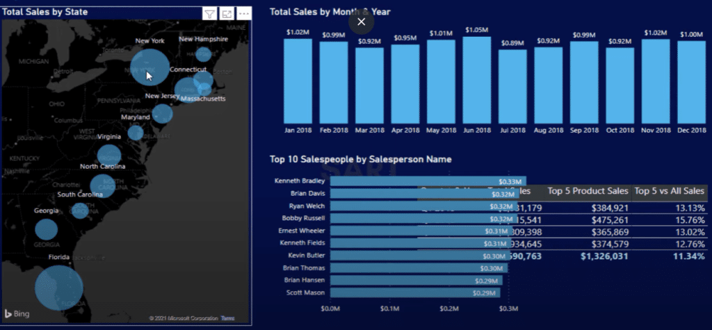
So how can we represent this data a little bit differently? Maybe we can have two tables for Quarter & Year, and then change the insight inside of the second table.
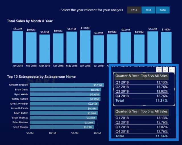
The report is now able to answer all questions from the brief, and is starting to look quite good.
Conclusion
Hopefully, you’ve enjoyed working with me through this data analytics challenge. We have a very dynamic report based on the content that was produced in the Accelerator.
It’s a matter of pulling the right techniques from your memory bank, and once you’re familiar with all the different options, you’ll be quite amazed at how quickly you can bring things together.
Watch out for the next Accelerator. This data analytics challenge is a unique initiative from Enterprise DNA. We also have a training workshop every fortnight that anyone can attend and discuss collaboratively. We also make sure that those who are just starting out become well-versed in different ways to solve their own data problems.
Sam


