In this Power BI Showcase, we’ll go through reports showing the Sales Growth analysis of a large organization. You may watch the full video of this tutorial at the bottom of this blog.
These reports use large amounts of current and historical financial data to create analysis on the sources of Revenue.
For this example, we also want to know where our Sales growth is coming from.
Using the dynamic filtering feature in Power BI, we can easily identify which reporting categories or sales representatives are going to create the future growth for our organization.
This Power BI Showcase is broken down into five reports.
Sales Budgeting Summary
The first report contains a summary of all the key metrics in our business.

We have an analysis on how we performed through time based on the Budget between the previous and current year.
This is a breakdown of the Total Revenue per Reporting Category:
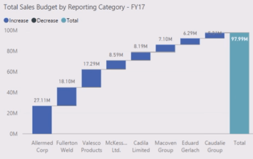
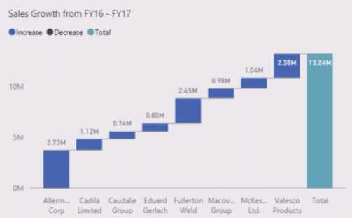
The chart beside it contains an analysis on where the growth will come from:
We can also filter by reporting category.

After making a selection, everything in the data model will automatically update the information based on the selected filters.
By multi-selecting, we can see a better status of each sales representative.

This also enables us to identify the situation of our current budget and our potential sources of growth.
We can further dive into a specific client or set of clients with the chart containing the Client Budget Data – Breakdown.
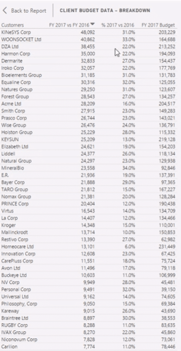
With this information, we can easily identify the percent changes between yearly Budgets. This metric can also be arranged in descending order, which makes it easier for us to see our key clients and then rule out where the bulk of our growth is going to be.
Reporting Segment
The second report focuses on the reporting segments or categories.

With this, we can easily drill down into our key reporting categories, which enables us to see our growth over time. If the growth is positive, that’s a sign that our performance is good.
This report also has an analysis on the channel where our Sales growth is most likely to come from.
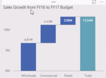
In this visualization we can see the Sales growth per sales representative:

We can see that Jerry Green has the best performance.
In this chart, we can see the correlation between the Total Budget and the potential growth for next year:

Currently, we have a positive correlation which is a highly desirable result. We want to see our highest accounts achieving the most growth in terms of dollar value.
By selecting a specific reporting category, all the charts will have an updated information based on the selection we’ve made.

Similar to the first report, we can also see how the growth has performed over time.
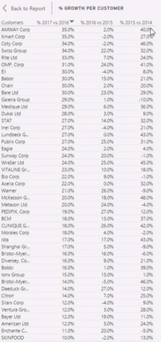
With this, we can again identify who our key clients are.
Sales Representatives
The third report highlights information specific to our sales representatives.

This report also uses a dynamic way to find out where our growth is coming from.
In the charts, we can also select a specific sales representative. This selection updates the information shown in the other visualizations. With this, we can easily identify the change year-on-year for our dollar value per sales representative.
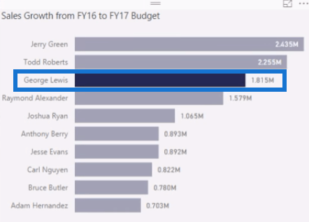

Being able to quickly navigate through specific sets of information and data is a great feature inside Power BI.
Another great thing about this software is its ability to expand our analysis. We can also export our data to other applications.
Account Details
The fourth report provides a detailed analysis on our clients in terms of location.

The key metrics are located at the right-hand side of the report.

We’re able to easily identify trends in our data because we can set the distribution of our client per sales representative or reporting category.
Using a map, we can see if our accounts are too widely distributed throughout a certain geographical area.
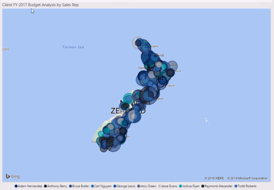
We can also identify our customer clusters.

After making selections, we can see that the biggest budget is clustered at the top of the South Island. So, there’s a potential to reorganize the client sets to make it more optimized for traveling.
Clients In The Top 20%
The last report focuses on our clients belonging to the Top 20%.

The Top 20% is where most of our Sales Revenue and Growth is coming from. By focusing on these clients, we can make a better decision on where we should allocate our resources to better serve our customers.
We can also look at our retail accounts.
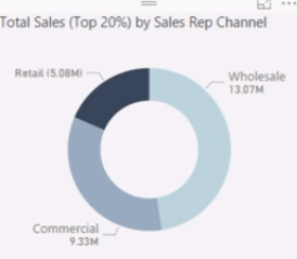
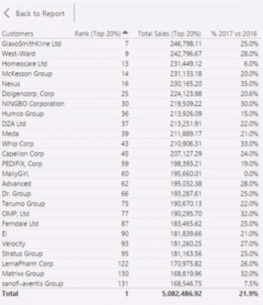
This is an important piece of analysis for budgeting because we can have deep insights into our key clients.
We can get answers to pressing questions such as, “Who’s looking after our key clients,” “Where are they based”, and “How are we going to extract the greatest revenue from those clients?”
***** Related Links *****
Learn Which Customer Groups Experienced Most Growth Through Customer Segmentation In Power BI
Use Power BI Analytics To Check If Revenue Growth Is Profitable
Discover Where Your Profit Growth Comes From: A Power BI Tutorial
Conclusion
This Power BI Showcase presented some very powerful reports showcasing an analysis on the Sales Growth of a company. Having an efficient method to identify potential sources of growth allows us to effectively allocate our resources.
The insights we can gain through these reports also give us a good overview on our performance within varying categories. With this, we can devise appropriate strategies to further improve our Total Revenue.
All the best,
Sam
[youtube https://www.youtube.com/watch?v=TJhQQtfbyPs?rel=0&w=784&h=441]


