In this tutorial, I’ll show you a number of techniques that you can apply in showcasing your report in Power BI after learning various DAX functions.
A thorough knowledge of important DAX functions can level up your data presentation.
There are different ways to showcase your report in Power BI. But there’s certainly a great advantage if you know how to combine different DAX functions and put them into one intuitive report. This is how you can improve your business analysis.
The first demo model that I’d like to show is the Sales Summary page. In this simple report, you can see the profits and total sales according to different categories, such as Profits by Channel, Total Profits by Warehouse, Total Sales by City, and Total Sales by Product Name.
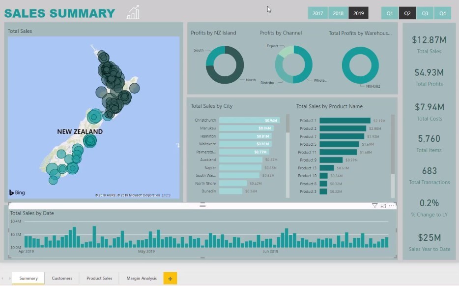
I came up with all this data just by using two main measures – this is one of the advantages of learning DAX and measure branching.
Moreover, I utilized all the available features in my model to create the additional dimensions.
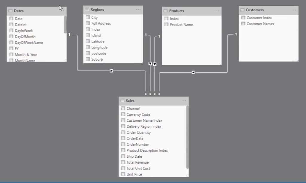
You can easily come up with this kind of report once you implement all the concepts and functions that you have learned.
Make sure you create all your calculations virtually so that it won’t take up too much memory in Power BI.
For instance, these measures under the Key Measures table can be used only for a certain report. That’s the only time that Power BI will run the said calculations.
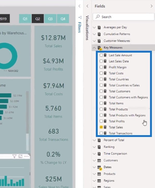
Power BI can run all the calculations quickly regardless of the page sources of the said measures. Even if you switch to a different report, even if you have measures embedded into visuals, they’re not calculating.
Using Averaging Techniques In Reports
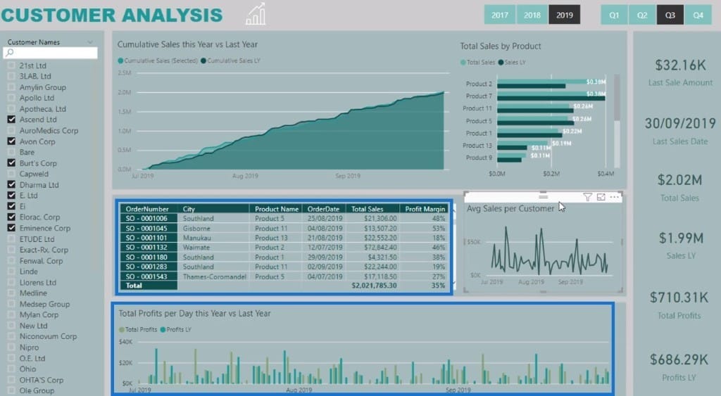
The next page that I want to show is the Customer Analysis report. I used averaging techniques for Avg Sales per Customer to see the average sales by cost per customer on different days.
In addition to that, I used cumulative totals to calculate Customer Sales this Year vs Last Year.
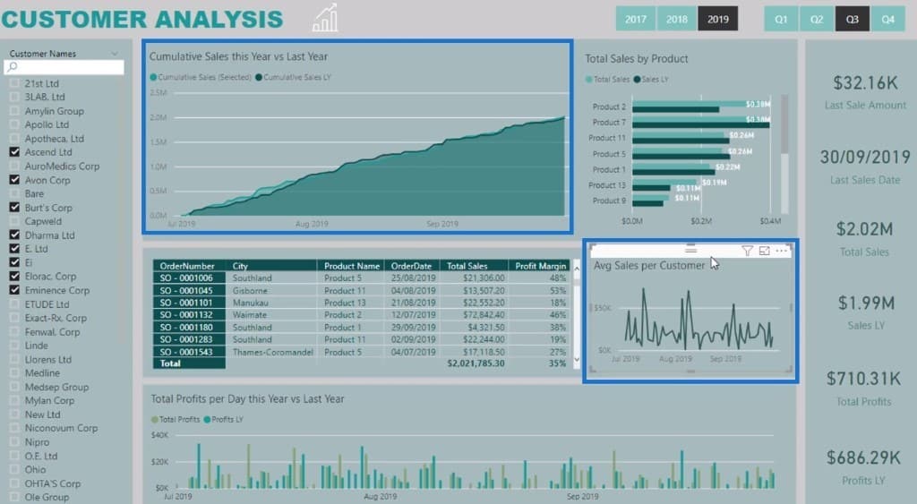
On another table, you can see the data for Total Profits per Day this Year vs Last Year. I came up with this analysis by bringing everything together in one measure.
On another sample page, Product Sales, I created an analysis that revolves around the products.
First, you can see the Sales this Year vs Same Period Last Year per Product table. Below that, I have created a comparison for Profit Margins vs Lifetime Profit Margins.
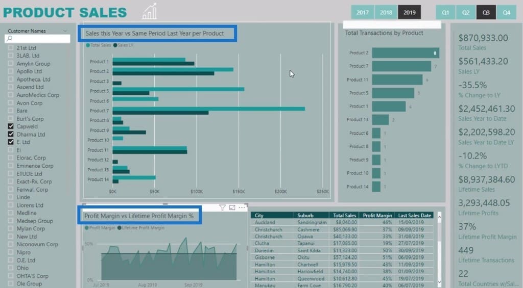
I was able to achieve the calculations by using the ALL function in getting an average over the lifetime sales. This is very helpful in knowing the target sales or profit. Also, I was able to compare between the high and low margin sales.
Lastly, there’s a report for Margin Analysis. In this example, I referenced and combined a lot of measures using the dimensions from the model.
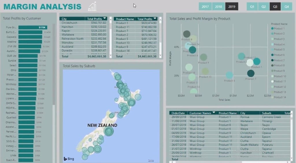
Everything that you can see in this report is easy to achieve after learning different DAX functions. Additionally, you have to learn to create additional filters and context for the calculations to work.
You can also multi-select two visualizations at once by pressing Control and then select two things at the same time.
***** Related Links *****
Optimizing Your Power BI Formula Using Advanced DAX Functions
Logistics Insights For Power BI – DAX And Data Modeling Overview
Predict Future Profitability within Power BI DAX Functions
Conclusion
Power BI offers a lot of advantages in your analyses and reports. Without Power BI, it will take you more than 40 pages in Excel to get all the necessary information for all these reports. With Power BI, it will take less effort and time to create this 4-page report.
Just make sure you apply all the concepts and calculations that I have discussed so far. In no time, you’ll be able to create and showcase your report in Power BI that will totally impress everyone in the team.
Sam


