I want to dive deeper and show you the ways of implementing some sensitivity analysis examples in your Power BI model. You may watch the full video of this tutorial at the bottom of this blog.
Sensitivity analysis is a very important financial model. It helps businesses in predicting the outcome of a certain scenario, like customer and cost changes, to the overall gains of company.
In a previous tutorial about profit prediction, I’ve went over a preview of sensitivity analysis examples. If you want to check out some great techniques in predicting profitability, feel free to click this link.
But for this tutorial here, I want to focus on and dive into some helpful sensitivity analysis examples from the Profit Predictions sample report.
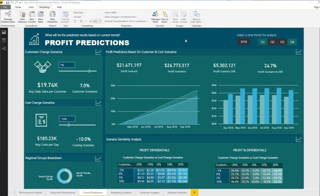
If you want to know how to do this, that’s exactly what I’m going to teach you here. You’ll also learn how to get the percentages in different axis and be able to change the results based on some calculations.
Adding New Parameters
The first thing that you need to do is to create the numbers that can affect the results inside a measure. Just so you know, this is a very important part of this analysis.
First, click New Parameter.
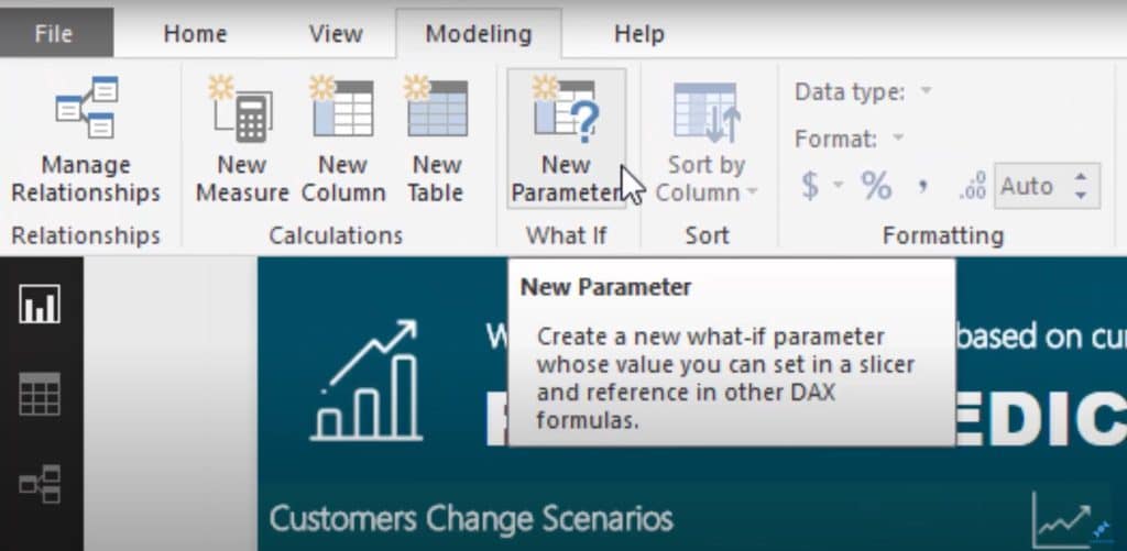
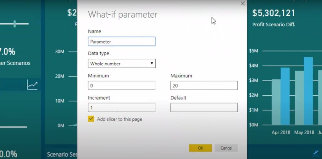
Secondly, you need to create the applicable parameters for your tables in the What-if parameter window.
After that, you can create a table similar to this one I made for Customer Change Scenarios w/ Cost Change Scenarios. This table will show the changes to the profit when there is an increase or decrease of customers and costs.
I had created that table beforehand using the formula for Cost Scenarios. It’s going to use the GENERATESERIES table function and give you the table that you specified, for instance, the costing scenarios.
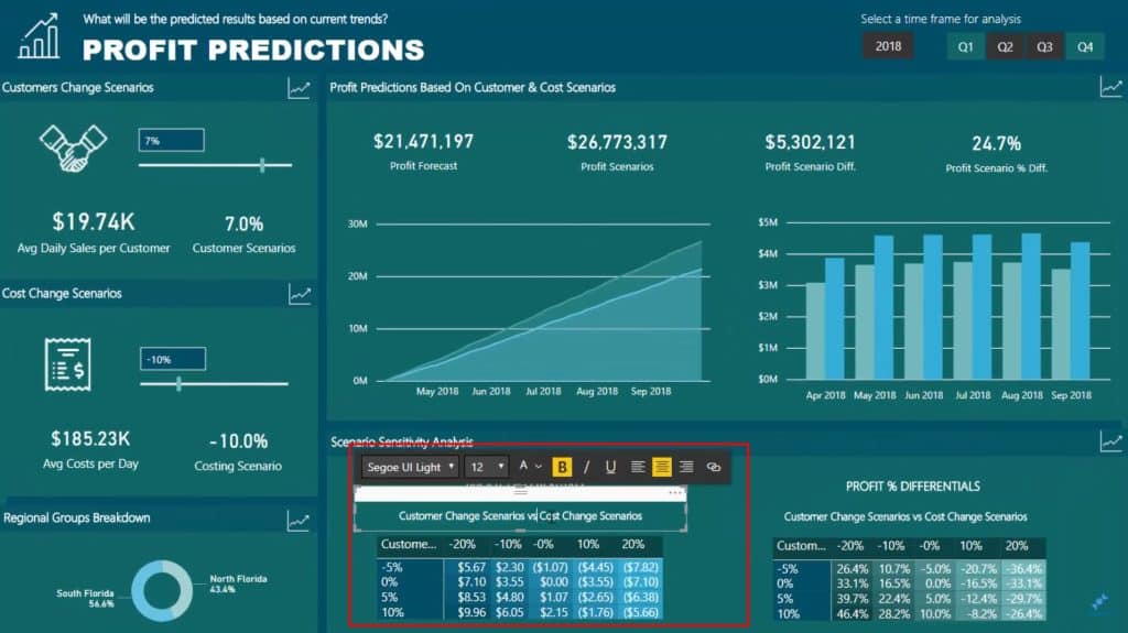
I’ve also created a table for customer scenarios that looks like this still using the GENERATESERIES function.
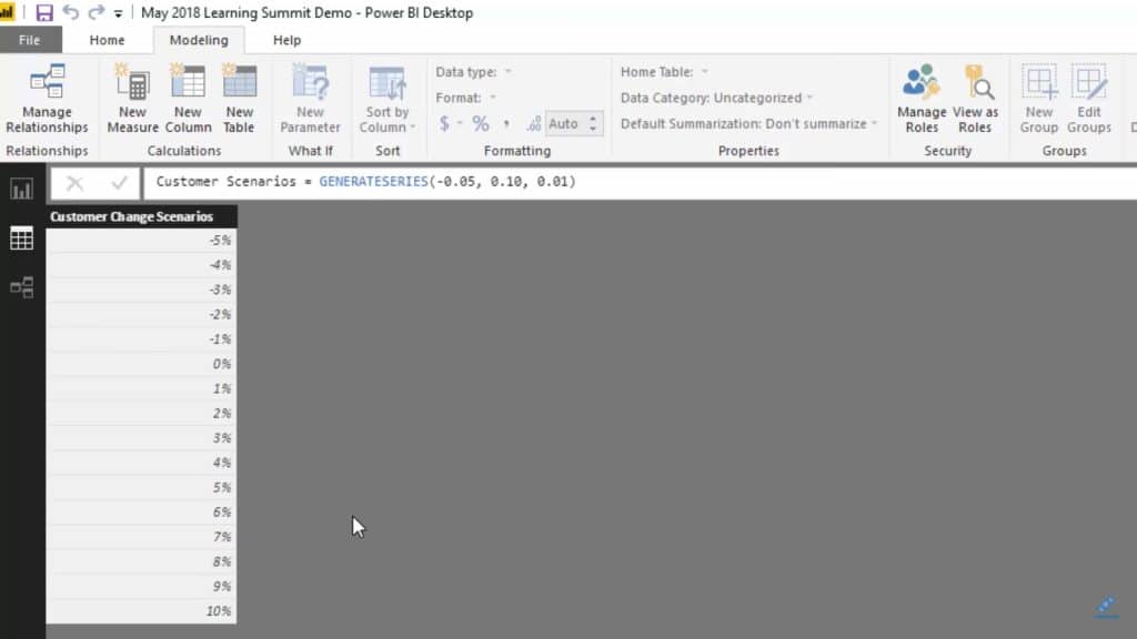
These scenarios are based on the assumption that you can increase your customers, maybe through some marketing. Additionally, another thing to consider is the commodity prices or exchange rates for the vendors – the effects of all these scenarios to the overall profits are what I want to demonstrate here.
Checking The Core Model
After generating the scenario tables, you can then see what it looks like when it comes to model relationships. What I want to drill here are the models for Cost Scenarios and Customer Scenarios. You can notice that these models don’t actually have an impact in the core model.
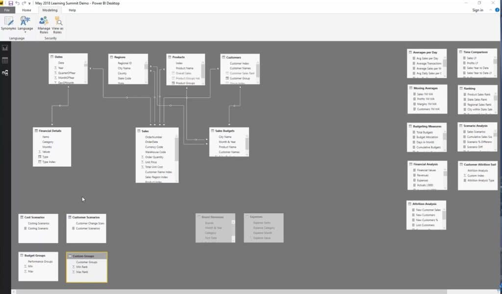
I just put them on the side to make it clear that they are just supporting tables. I just have to integrate it into this predictive type of analysis that I’m going to do using some advanced logic.
Once this happens, the measure actually creates connection and that’s the key reason why scenario analysis works really well inside Power BI. The goal here is to forecast and compare different scenario results.
You can utilize columns, like the one below, that comes from those two supporting tables that I previously mentioned.
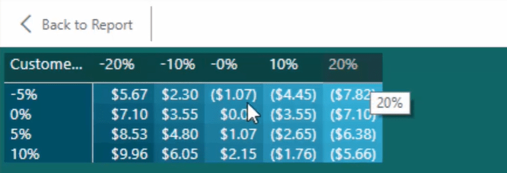
It is also possible to create multiple sensitivity analysis examples like this table because it’s the measure that generates this action. You just have to bring in the “what-if parameters” that are set into the matrix and connect them via measures.
Working On The Connection
Now, I’ll show you how to work through the formula and show you how the different measures are connected.
First of all, I have Profit Forecast up in the sample report and this is for the original profit forecast. I also have the Profit Scenarios number that is adjusted based on the “what-if parameter” that I had.

For instance, there’s a customer increase of 10 percent (10%) and cost decrease of 10 percent (10%). As you can see, the numbers in the Profit Scenarios proportionally increase to $27 million. The said number is way above my forecast and in the Profit Scenario Diff. number; you can see the difference between my original forecast and the scenario forecast.

Now, the mentioned measures are what can be seen in the Scenario Sensitivity Analysis table. To summarize, the number in the Profit Scenario is determined by the parameters for the customer and cost scenarios.
In the Customer Change Scenarios vs Cost Change Scenarios table, you can see that the $6 million difference in the results actually coincides with this part of the table.

I’m sure you can see the connection right there. That’s just some of the sensitivity analysis examples that you can really learn from.
***** Related Links *****
Running Sensitivity Analysis For Power BI Using DAX
Developing Sensitivity Analysis Logic Using DAX in Power BI
Scenario Analysis Techniques Using Multiple ‘What If’ Parameters
Conclusion
I hope this works and operates well within your model. If you want to learn more about how to set all of this up and how to derive your forecast, overlay your scenarios, and work out the differences, check out the session below.
If you have some thoughts or feedback on these sensitivity analysis examples, let me know in the comments.
Best of luck!
Sam


