In today’s post, I’d like to present some Power BI report examples and best practices. In my own Power BI learning over the years, I’ve consumed many online resources which have been instrumental.
However, I quickly became overwhelmed by the content that I ended up making my own notes, which I will show in this post. I’d like to take this opportunity to present part one of volume 4 of my own series on best practices. You can watch the full video of this tutorial at the bottom of this blog.
This is by no means an exhaustive list nor even the top practices. These are merely some of the ones that I’ve incorporated into my own development. I’ve discussed this topic with other Power BI users to get their input. So again, these are my own takeaways.
The best practices evolve over time as new and enhanced capabilities are introduced both in the Power BI application and by the Power BI community.
A Recap Of The Four Pillars
According to the teachings of the Power BI community in general and the Enterprise DNA family in particular, there are four pillars of Power BI development: data loading and transformations, data modeling, DAX calculations, and reports and visualizations.
To this, I’ve added a pre-pillar (if you will) for setting up items that can be done before the start of your development effort.

Here are some selected Power BI report examples and best practices for the fourth pillar: reports and visualizations. These cover a wide range of topics and are presented in no particular order.
Using The General Section Of The Format Pane
Some tips I’ve incorporated into my standard Power BI development practice include making liberal use of the general section of the format pane to adjust the XY width height of all visuals.
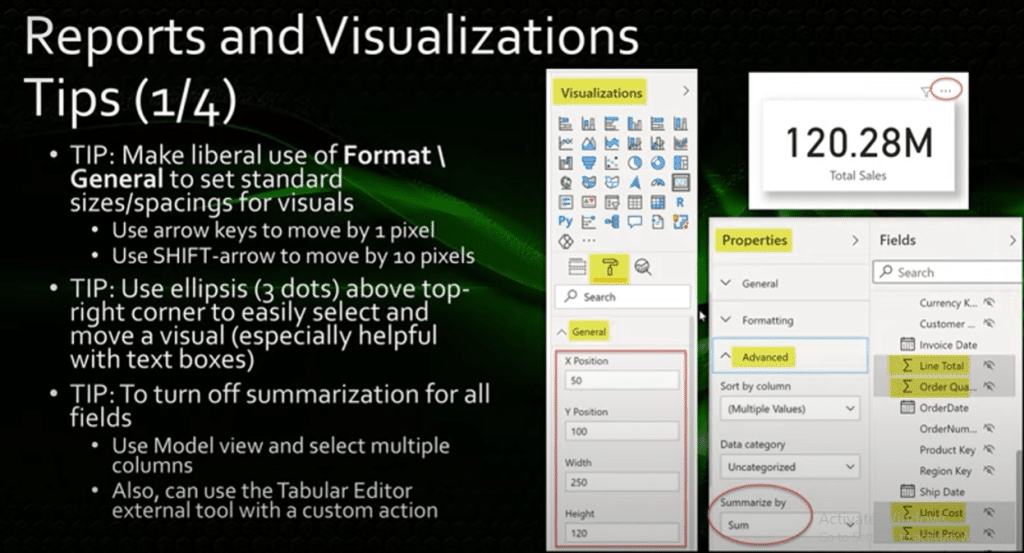
My preference is to set all values to multiples of 10, because I find it easier to align things, and it stands out when things are misaligned. You can also make small positioning adjustments using the arrow keys to move the visual by one pixel, and use the Shift + Arrow to move the visual by 10 pixels.
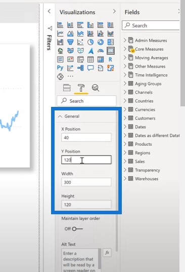
Let’s go and see some Power BI report examples. If we select the Total Sales card, go to the formatting pane, and then go to the general section, you can see all the values are in multiples of 10.
If I want to change them, I can change it to multiples of 10. Once I select the card visual, I can use the arrow keys to move it.
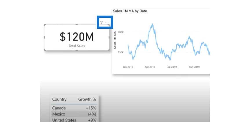
I also use the ellipsis or the three dots above the top right corner of a visual to easily select and move the visual. Most of the time, the ellipsis is in the top right corner. However, when the visual is located at the top of the canvas, the ellipsis is placed at the bottom right corner.
Turning Off Summarization For Multiple Fields
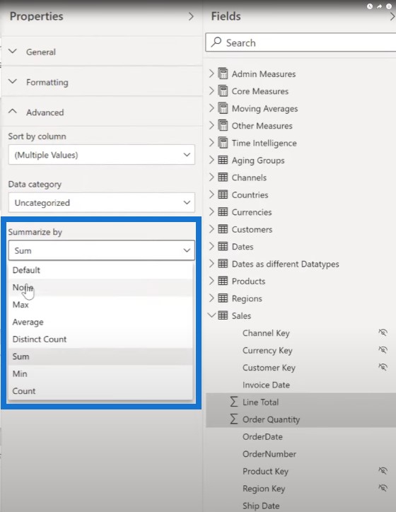
The next thing I do is to turn off summarization for multiple fields at once. To do this, switch to the model view, select the columns of interest, and then select none under Summarize by.
In this example, I’ve gone over to the model view and expanded the sales table. I selected Line Total, Order Quantity, Unit Cost, and Unit Price.
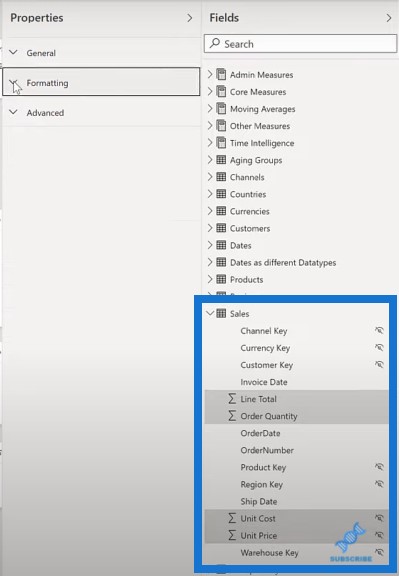
I collapsed the General and Formatting sections and expanded the Advanced section to change the Summarize by to None. As a result, you’ll see that the summation symbol has gone away.
Keeping The Selection Pane Visible
I also make extensive use of the Selection pane, and I like to keep it on the screen at all times.
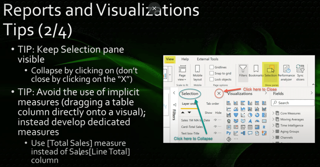
One of the first things I do when opening a Power BI report session is to show and then collapse the selection pane so that it’s front and center for me all the time.
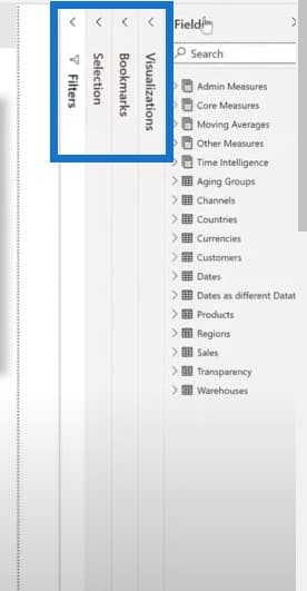
I click on the word Selection itself to expand and collapse the pane as necessary, instead of clicking on the X and closing the pane and having to reopen it multiple times per session. The bookmarks pane also operates in exactly the same manner.
Let’s have a look at more Power BI report examples. Go to the View menu, select Selection then Bookmarks, and then collapse each one of them. I just click on the word if I want to expand and collapse them again.
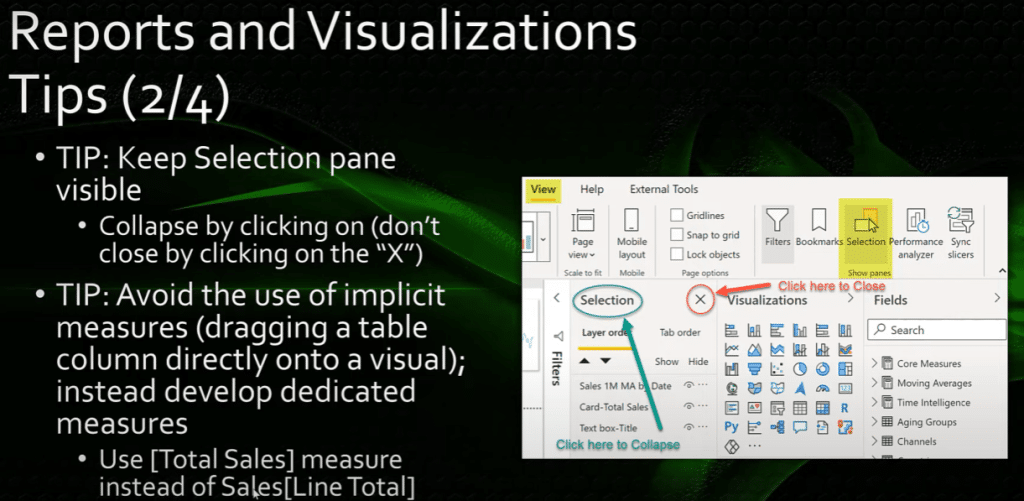
I also avoid the use of implicit measures, which is the practice of dragging a column directly onto a visual. Instead, I develop a dedicated measure for each field. For example, I use the Total Sales measure instead of the Sales[Line Total] column.
Using Custom Format Strings
If the built-in data format strings don’t give you the flexibility you want, you can use custom format strings to specify exactly how you’d like your data to appear in your reports. I use this all the time and often specify a custom date format as dd-mmm-yyyy.
It’s confusing to users what a date value like 4 07 2021 means. Is it April 7th or is it July 4th? This is why I use the dd-mmm-yyyy date format, which is unambiguous.
Another common use is to enclose negative values in brackets. This can be done easily with percentages by using a semi-colon separator between the positive and negative formats and then closing the second format string and brackets.
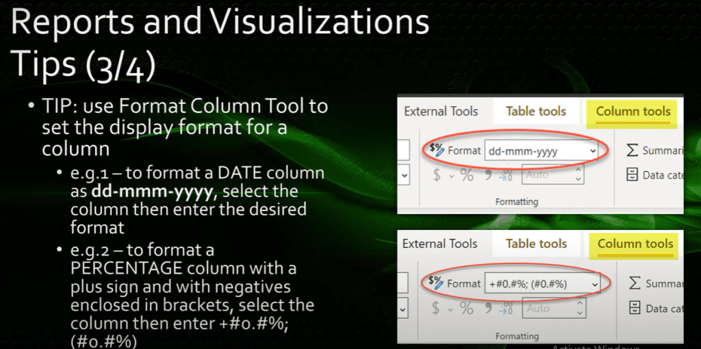
You can even add a plus sign before the positive values if you want. There are many format strings available, and there are abundant resources available online to help you develop the format string you want.
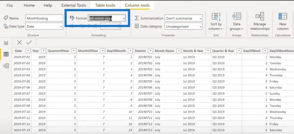
Let’s just go to Power BI and have a look. Click on the data view and the dates table, and then see the month ending column and go to the format to change it.
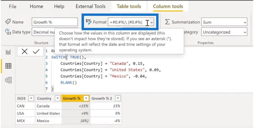
If I go to the Countries table to look at the growth percentage, you can see that I used a format string. I’ve typed in a plus sign for positive values and negative values in brackets.
When using a matrix, one is often presented with different column widths, which can make the matrix look not consistent. To make a matrix, have a consistent column width. A neat technique is to use a dedicated measure that uses the repeat function or REPT function to achieve consistency.
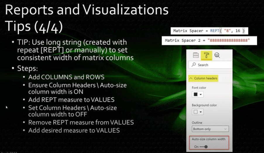
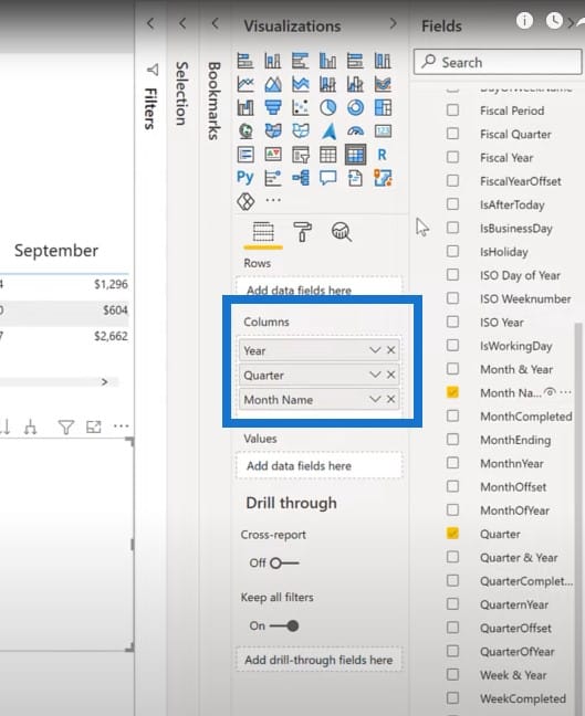
To set this up, let’s create a new matrix. Put Year, Quarter, and Month Name. And then we’ll put Channel to the rows and leave Values blank for the moment.
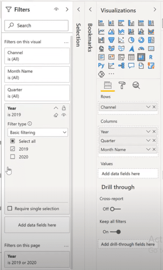
Let’s go to the filter pane and filter for 2019.
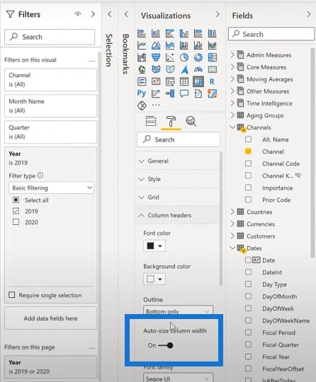
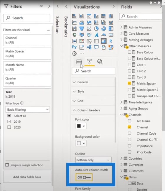
Let’s go to the format pane, go to Column headers, and make sure that the Auto-size column width is set to on.
I’m going to get my Matrix Spacer measure, which uses the REPT function, and put that in the value of the matrix.
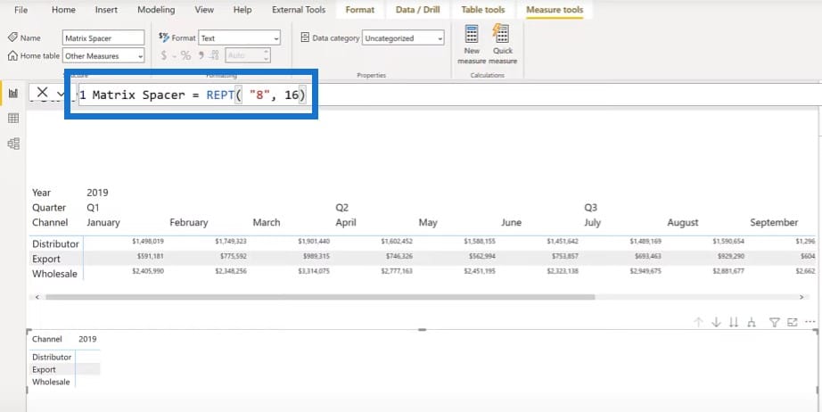
Let’s just expand down one or two levels in the hierarchy so that we can see everything.
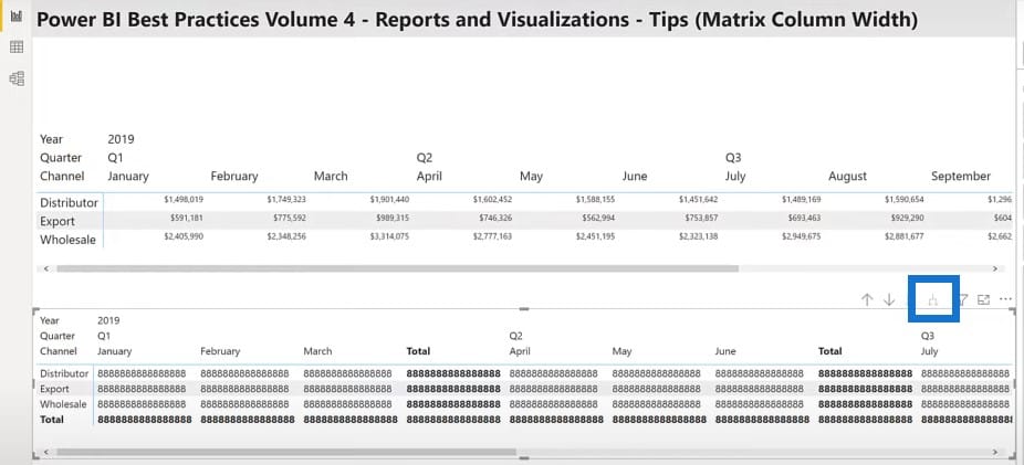
I’ll go back to my column headers, but this time around, I’m going to turn the Auto-size column width off.
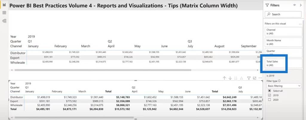
Then, I’ll remove my Matrix Spacer measure and replace it with the Total Sales measure. Once I’ve added that you’ll see all the columns have the width already. I can change the font size of those columns, and you’ll see that the spacing stays the same.
Thinking In Grids
When it comes to the layout visuals on a Power BI report page, make sure to have consistent placement, size, and spacing of your visuals.
Thinking in grids is an excellent foundation on which to build your layout organization for effective report structure.
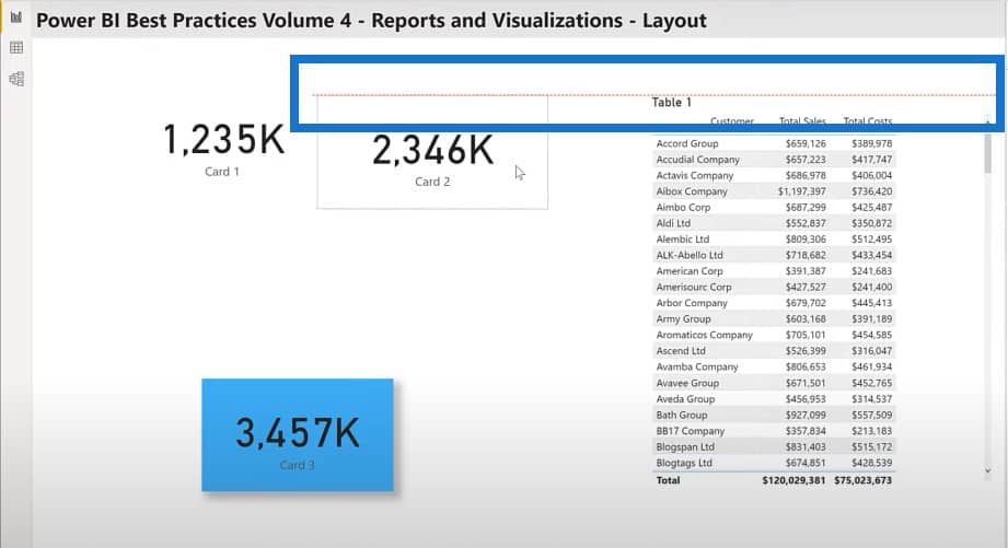
The size and spacing of your visuals are also extremely important, and not that hard to enforce. If you have several card visuals on your report page, for example, you can ensure they’re all the same size by starting with the smart alignment guides.
Once I grab a card and move it around, the red alignment serves as a guide to make sure it matches the top, middle, or bottom.
Aligning Your Visuals
As mentioned earlier, use the general section of the formatting pane to set the XY width height to consistent values.
I almost always use multiples of 10. Since your canvas size is large, the sizes will be close to multiples of 10 anyway. This makes the errors really stand out so that they’re easily spotted and corrected.
Using multiples of 10 also makes it easy to set consistent border spacings for all your visuals. I typically use a 10-pixel spacing for regular visuals, and a 20-pixel spacing for visuals with standard shadows. This way, you can see both the shadow and the background color.
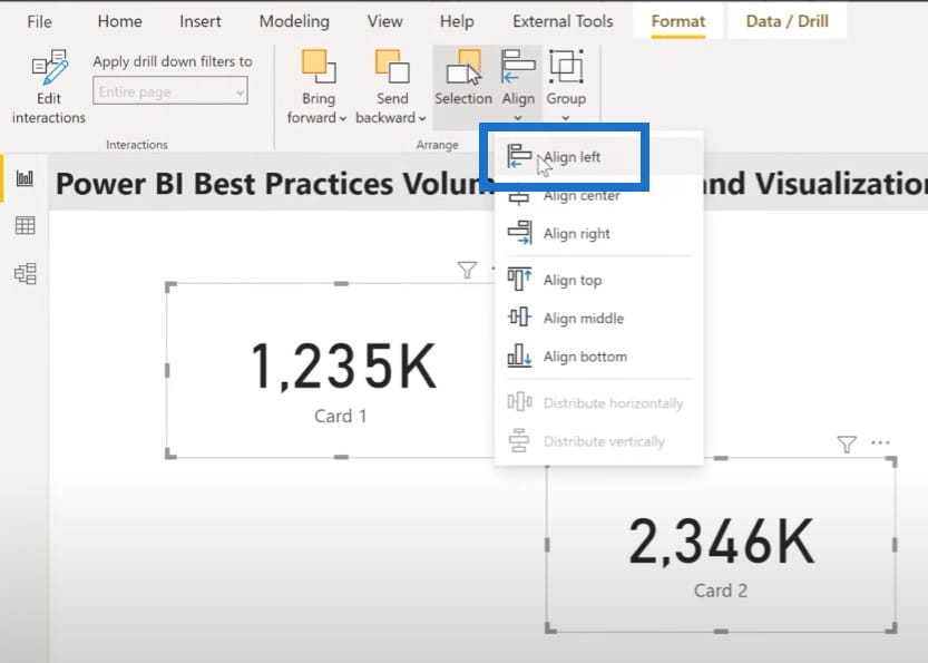
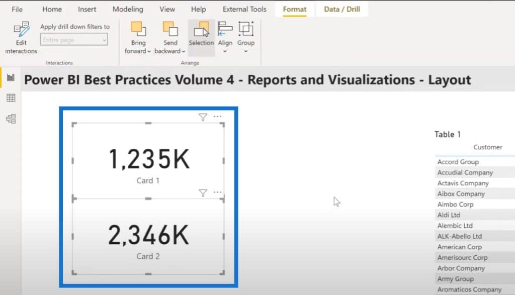
Another way to align your visuals is to use the format align menu. This will be familiar to users of other graph cloud applications like SQL server integration services or SSIS.
Let’s select these two card visuals and then from the format pane, click Align and Align left.
To make similar visuals look alike, focus on a single visual to get the formatting just as you like it. Then use the format painter to apply the formatting to the other similar visuals on your page.
This step can be obviated by doing all your desired formatting on the first visual you add to the canvas. Then use copy and paste to create additional visuals, then replace the column or measure as necessary.
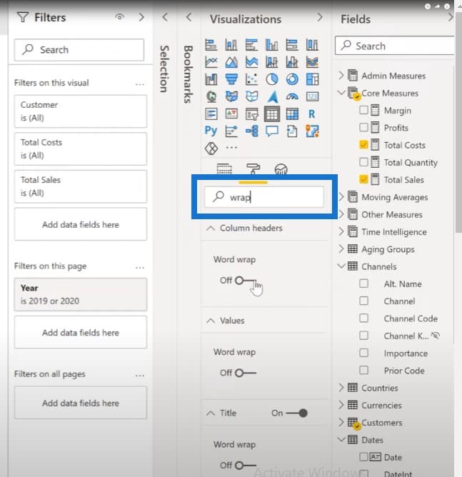
Another trick is to easily find format settings. You can make use of the search bar in the format pane. Let’s say I want to do something on the word wrap to my Table 1 visual. I’ll just select the visual and then type in wrap in the search bar. I’ll be able to see all the three-word wrap values and set them easily.
Selecting The Colors
When it comes to selecting the colors for your report, you can generate a JSON theme file and import it to ensure consistency across your report pages and across reports in your organization.
There are many tools available to help you automatically grab specific color codes from images, like the Enterprise DNA Analyst Hub‘s color theme generator which has the image to colors function.
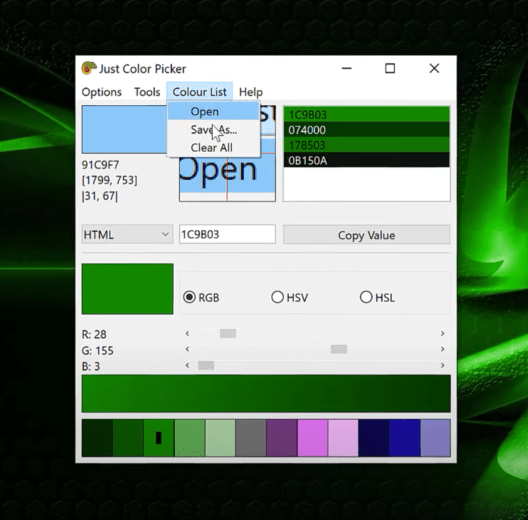
But the one I’m going to discuss here is Color Picker, which can be used to manually grab a set of hex codes from an image. Let’s go to an image and grab the Color Picker. When you find a color that you’re interested in for your Power BI report examples, just click on Alt + Ctrl X for the hex code.
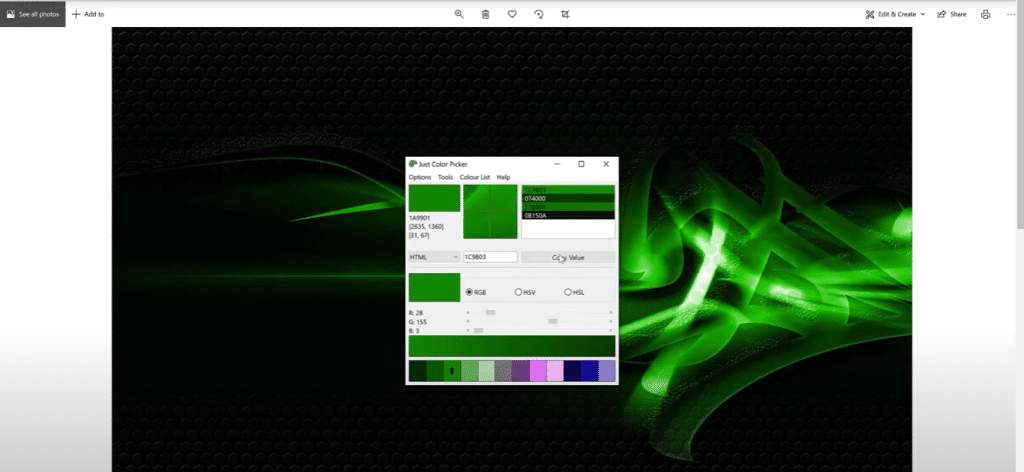
Now that we have a number of values selected, choose Colour List, click on Save as, and give it a name.
And then if we go to File Explorer and look at the file, we’ll see the hex codes.
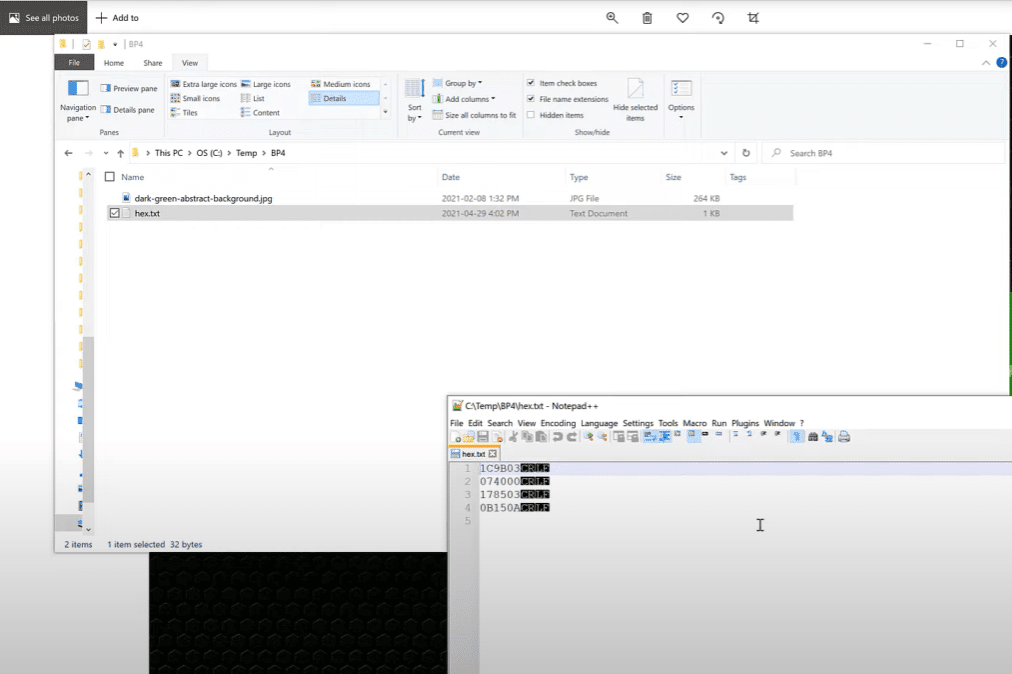
From here, we can use the Powerbi.tips advanced theme generator to paste the hex codes into the multiple input field, click Add, then download the theme.
In Power BI, you can browse for themes to import your custom theme. You can check out this tutorial from Jarrett Moore on how to do this and also enrol in his excellent mastering report development course on the Enterprise DNA membership site.
If you’d like the colors to be transparent, you can just add a 00 onto the end of any hex code so it will be 8 characters instead of the standard 6.
Using Transparency In Color
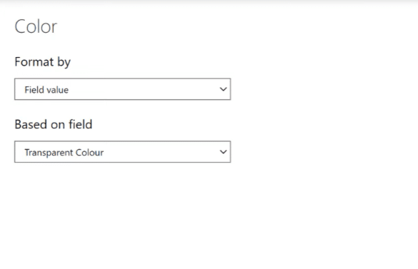
I also like to keep a measure in my reports called Transparent Color so it’s easy to grab whenever I need it. In fact, the two added hex codes enable a full range of transparency and can be used to implement partial transparency as desired.
Let’s select Card Visual 3, then go to the formatting pane, and click Category. You can see it has a color.
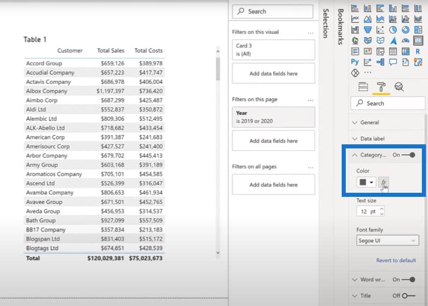
Click the fx button, choose Field value, go to other measures, and then click on Transparent Color. You can see that the category has disappeared as well.
Setting Variable Transparency
You can set variable transparency with the final two characters of the hex code. You can go anywhere from 0 to 100.
As Sam has noted frequently in the many resources available from Enterprise DNA,
A Power BI visual is really just a table that is being rendered as a graph.
Remember that in the ellipsis menu above the top corner of any visual, the first option is to export data. That is if your Power BI administrator has not disabled it. Even if you select a column chart, you see a table of values when you export the data.
Let’s check out these Power BI report examples. lf we go on the TFD table and click on the ellipsis, the first option is to export the data.

The same goes for the donut chart as well.

Once we open their files in notepad, we can see both are actually just tables.
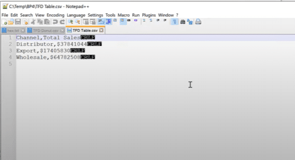
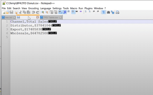
As an aside, if you give your visuals titles before you export them, the export function will actually name the file appropriately, instead of it always being called data.csv.
As Sam has said many times, start your visual development first with a table and ensure you have the data and calculations presented as you want. Once the table is satisfactory, you can then create the desired visual.
I often do a copy and paste of the table visual first, and then change the pasted table to the type that I want. I find it useful to see the original table beside the new function as a verification.
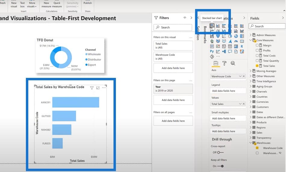
First, we’ll create a table containing the Warehouse Code and Sales.
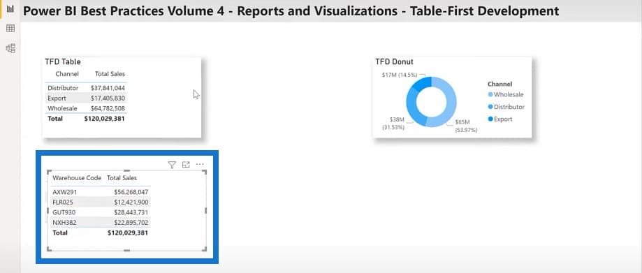
I’m going to copy this table and paste it to the canvas.
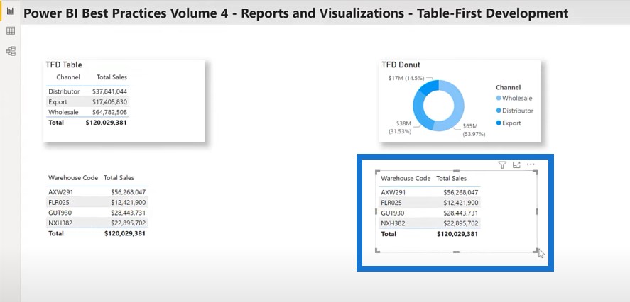
I’ll then transform it into a stacked bar chart.
Conclusion
Hopefully, you can add some of these Power BI report examples and best practices to your Power BI toolbox and that they will prove to be useful in the future. I’ll continue the presentation on some of the best practices for the fourth pillar of Power BI development, which is reports and visualizations in part two of this post.
Greg
***** Related Links *****
Data Loading And Transformation Best Practices
Data Modelling In Power BI: Tips & Best Practices
DAX Calculations In Power BI: Best Practices
***** Related Course Modules *****
Dashboarding & Data Visualization Intensive
Power BI Super Users Workshop
Mastering DAX Calculations
***** Related Support Forum Posts *****
Which Custom Visuals Should I Use?
Map Visual With Drill Down
Passing A Visual-Level Filter Via A Dynamic Measure
For more on reporting and visualizations, please see here…


