In today’s blog post, I want to show a segmentation technique inside Power BI. I also want to discuss the considerations that you need when using it across your entire Power BI report. This is a way of bringing additional insights to your data that you may not have been able to do so in the past. You may watch the full video of this tutorial at the bottom of this blog.
This particular example was actually from one of the Power BI challenges that we have through Enterprise DNA.
Just to give you a brief background, we’re looking at the effectiveness of our marketing on our customers.
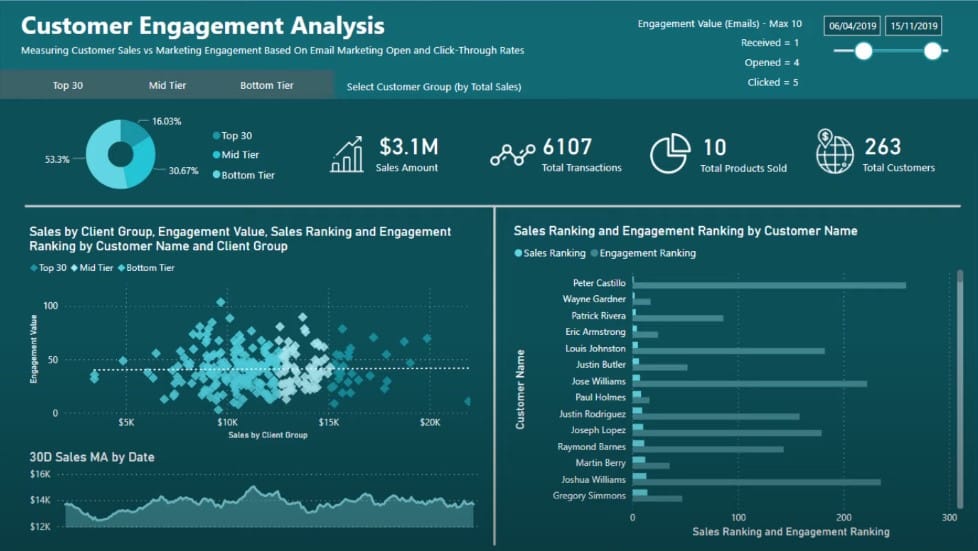
I already have information about my customers, but I also want to break it down and determine how my Top 30, Mid Tier, and Bottom Tier customers are performing based on their sales ranking.
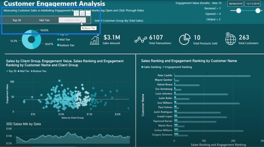
This is a legitimate piece of analysis that ordinarily might not be inside your data. In most cases, you won’t have this breakdown in your data, but you can create it inside of Power BI.
The great thing about Power BI is that this report can be totally dynamic. For example, the Top 30 customers shown here will be different for every different timeframe that I select. The calculation will update based on the selection.
Creating A Secondary Table For Your Power BI Report
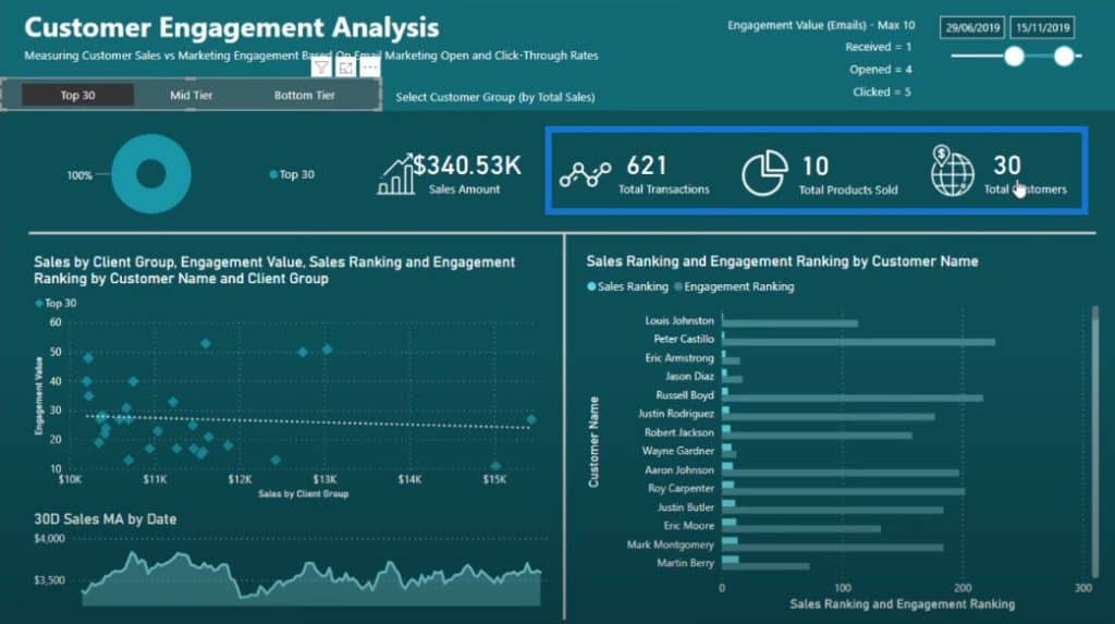
When I select my Top 30 customers, how do I make sure that every single metric changes for that segment? How do we make sure that this particular selection flows onto every single insight? The change should reflect not just in the donut chart visualization, but also on the card visuals, scatter chart, and bar graph.
You have to remember that when we use this dynamic grouping technique, we use a secondary table.
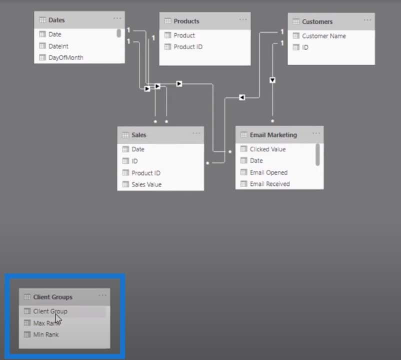
This particular table has no connection to the rest of our data model. We need to figure out how we can connect it to the calculations that we’re doing, such as sales or transactions.
So let’s just quickly go over the techniques. This is the dynamic grouping DAX formula pattern that you can use in different ways.
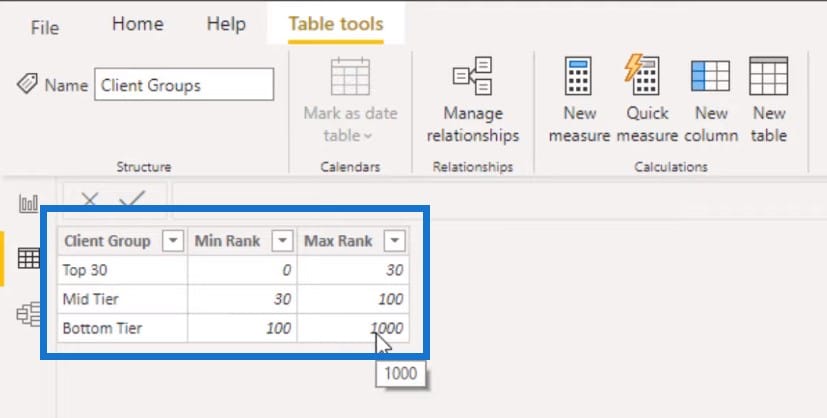
I’ve created a secondary cable for my three customer groups: the Top 30 clients, the Mid-Tier which is 0 to 30, and the Bottom Tier which is 100 to 1000.
Sales By Client Group
The first thing I did was to create my Sales by Client Group measure. With this measure, we want to calculate our Total Sales and group them based on the new secondary table that we just created.
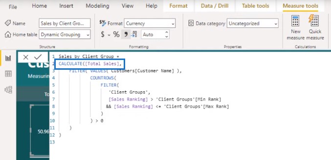
As you can see from the model view I’ve shown earlier, the secondary table is sitting on the side, but we can integrate it in our calculations.
We can manipulate our calculations if we integrate the secondary table into the formula. This is where the FILTER portion of this grouping technique formula comes in.
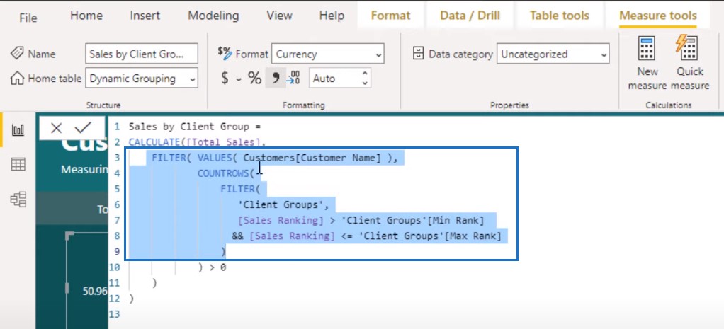
Remember that with the CALCULATE function, we change the context of the calculation. But how do we change the context of the calculation? Well, we can do this by iterating using the FILTER function.
The FILTER function enables us to iterate through a table. In this particular case, we’re iterating through a list of customers. We’ll iterate through every single customer and work out their Sales Ranking. And then we’re going to iterate through the Client Groups table comparing the ranking if it is greater or less than the MIN and MAX values at each rows of the secondary table.
There’s quite a bit of logic involved here. For every single customer, we’re going to iterate through every single row in the Client Group table and compare whether the Sales Ranking is between any of those MIN and MAX numbers. When it evaluates to TRUE, we’re going to calculate the sales for that particular segment.
Let’s have a look at our visualizations. If you look at the Fields pane, remember that the client Groups table is a secondary table; hence, there’s no relationship to anything else in our model.
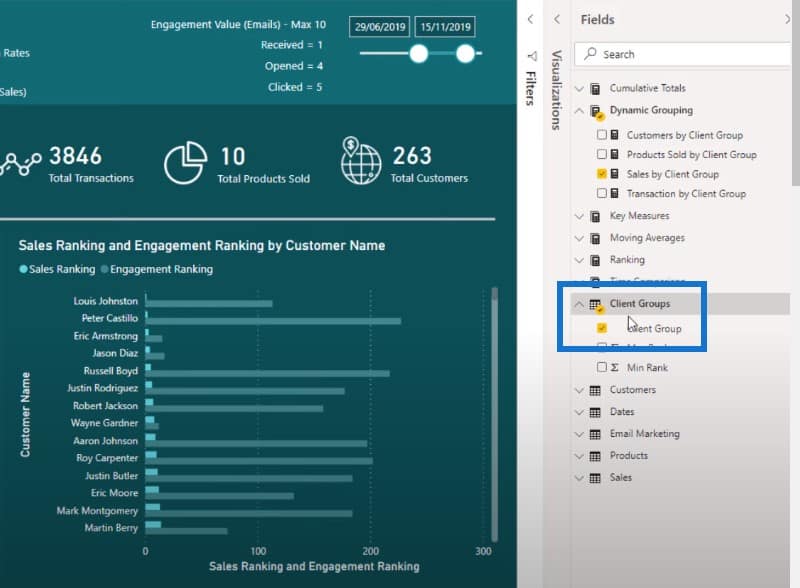
But we can now filter sales even though it has no relationship to our model because we’ve inserted it into the formula pattern. This enables us to create the filtering within the formula itself.
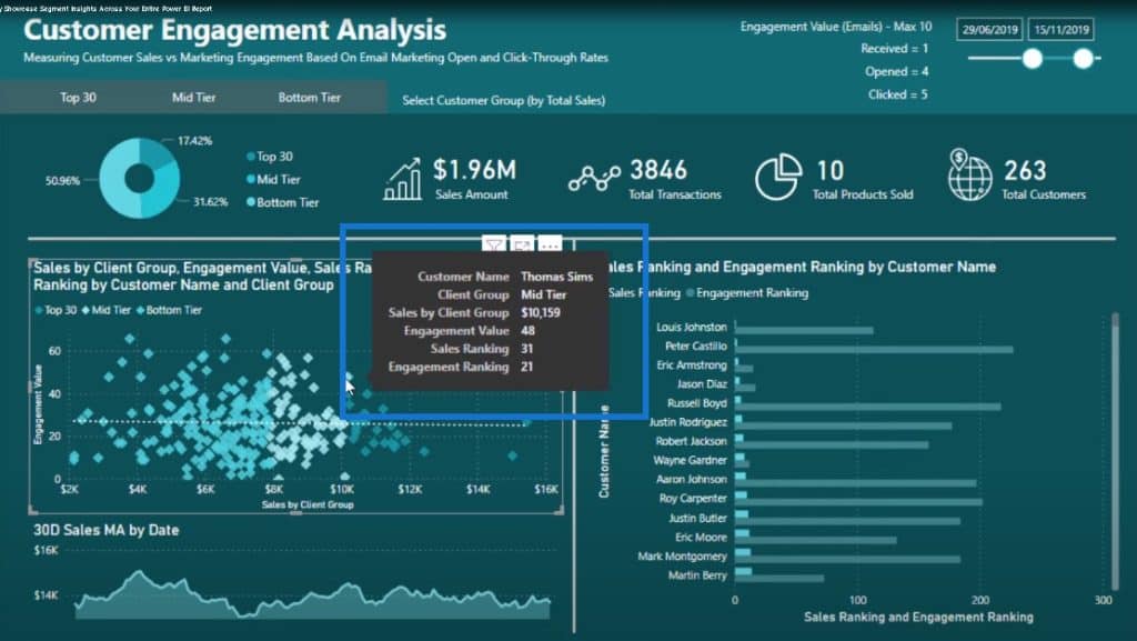
And then if we check out the scatter chart visualization, you’ll see that once again, we have used the Sales by Client Group measure in this visualization, and we have also filtered it by Client Group.
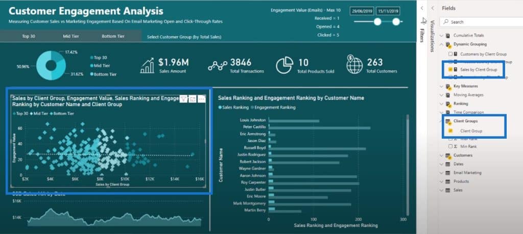
We also have the Tool Tips, where if we hover the scatter chart, we’ll get more details about the results.
Other Considerations For Your Power BI Report
You already have a value in each of the cards filtered by your selections. But if you don’t update your individual metrics, these cards might not update and then you won’t see the specific metric you selected.
If you want to filter across your entire report for this particular insight, you need to redo all of the initial calculations or core calculations, such as your Total Transactions, Total Products Sold, and Total Customers.
For Total Transactions, we used exactly the same technique by copying and pasting the original formula. All I did was to change a part of it by inserting the original core calculation in the highlighted portion:
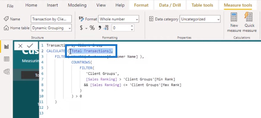
So now this is going to be filtered by the slicers. Remember that the slicers come from the secondary table that we created.
Then we’ll do the same thing for Total Products Sold, and for Total Customers. If I click on Total Customers, you’ll see exactly the same technique but now I’ve inserted a different measure after CALCULATE.
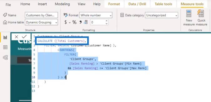
We’re counting the Total Customers but making sure that we can filter by the Client Group column in our secondary table.
You might think that by creating just one formula, everything will flow from there. Well, if you want to insert the column into a slicer, make sure that every calculation in your report can be filtered by that particular slicer.
If you used only the original core measure of Total Transactions, it’s not going to understand that some context is coming from the selection.
You need to embed the pattern you’re using across all of the things that you’re showcasing in your report.
If you do this well, it will result in a very compelling report because these customer segments or groups didn’t even exist in your original data. You literally made them up and dynamically calculated the sales from a particular time selection then you ranked your customers based on those sales. After that, you dynamically dived into a segment of those customers.
***** Related Links *****
Group Customers Dynamically By Their Ranking w/RANKX In Power BI
A Deep Dive Into How The ALLSELECTED DAX Function Is Used In Power BI
How To Control The Interactions Of Your Visuals In Power BI
Conclusion
This is a powerful technique if you can bring it all together and visualize it well. You can access this particular Power BI report and play around with it in the Enterprise DNA Showcase. This is actually one of my submissions into the Power BI Challenge #3.
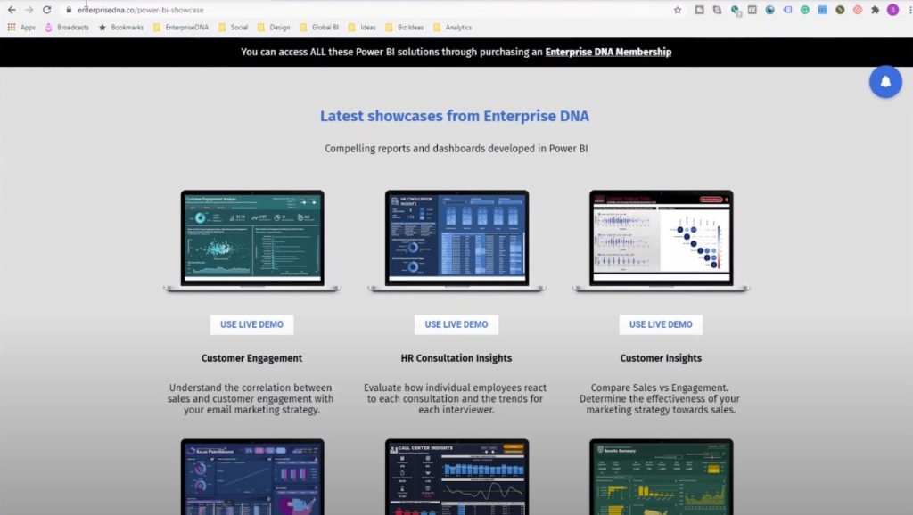
I’ve put my showcase up on the Showcase page so you can use the live demo and play around with it. If you want to download this particular resource, you can join our education platform through our membership program.
This was a tricky technique that I embedded in this particular report, but it made the insights more compelling. It differentiated my insights compared to the other submissions in the challenge because no one thought about what will happen if we don’t have the data initially.
I’ve thought about how I can showcase this differently. Some of my consumers have probably never seen this dynamic segmentation and breakdown.
This technique prioritized our most important customers. We were able to drill into an important subset of our customers that will drive the bulk of our revenue or profits going forward.
These are some of the great things that you can do within Power BI: you can break out and highlight the most high-value insights that will make the most difference in your business.
Best regards,
Sam


