In this blog, I’m going to show you one of the visuals that I like best for Power BI interactive data. It’s the smart narrative text box feature in Power BI that I use to display dynamic narratives. You can watch the full video of this tutorial at the bottom of this blog.
I love how I can customize it and have interactive insights. And it’s not difficult to do at all. I’ll go through the steps on how to set this up in your reports. But first, let’s have a quick look at what I’m talking about here.
Using Smart Narrative For Power BI Interactive Data
What this feature does is that when I make some slicer selections, the text updates automatically in the text box here.
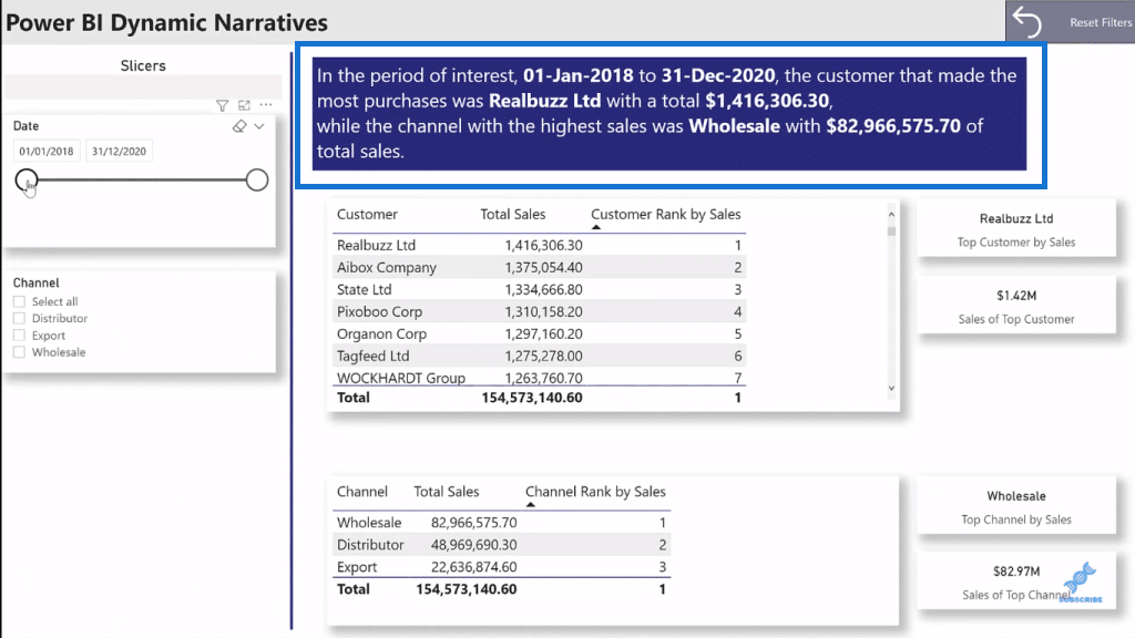
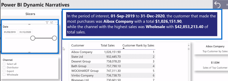
Here I made some changes on the Date slicer, and you can see that the text box updates and changes as well.
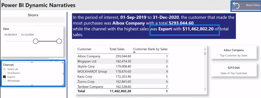
When I select the channel, it is also shown in the text box. I also have a reset button here in the upper right corner of the page if I want to go back to the default display.
Creating Dynamic Narratives
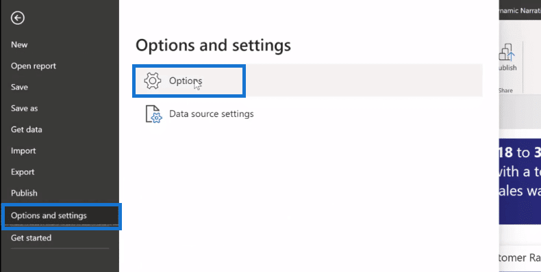
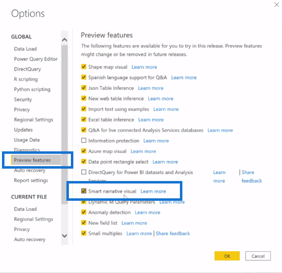
Before you start creating some dynamic narratives, you need to make sure that the Smart Narratives preview feature is enabled. Go to File, then Options and settings, and then click Options.
And then, go to Preview features under Global. Here you should see the Smart Narrative Visual. Make sure that that’s enabled.
Now let’s go ahead and start building a dynamic narrative.
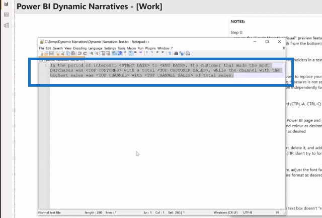
The first thing that I do is grab a text editor and compose the text that I wanted to display. I’m using Notepad++ here. Anything will work, depending on what you have and what you’re comfortable using.
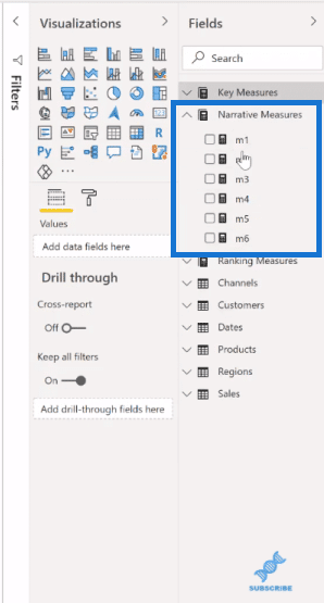
Next, I compose all the measures that I want to display in my dynamic visual. I often use specific measures. I find it easier to choose the formatting exactly the way I want it for the dynamic narrative, which may not be the case when measures are used in different visuals in the report.
Then, I’ll grab a text box here, and simply copy and paste the text from my notepad.
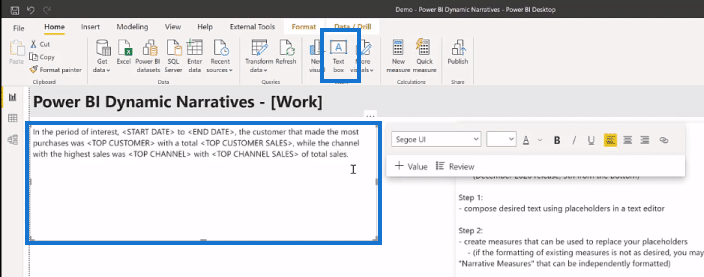
I can adjust the font, size, and color as I want.

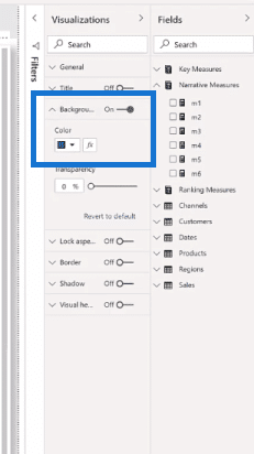
I can also select a background color that I want for the text box from the Visualizations options. I’m going to go with dark blue for this report.
So now, I’ve got a regular text box that I want to display in the font and the color that I wanted. Now it’s time to start updating with metrics. So I’ll select the first placeholder and delete it.

Then, I’ll insert a value here and type in the measure that I want. I also give it a name that’s unique to that text box
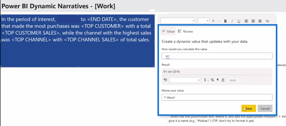
Once the measure is in, I can select it and adjust its font, size, and color.

I’ll repeat the process for my End Date.
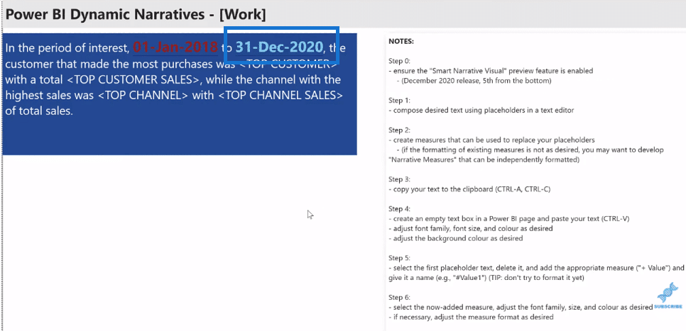
Basically, you do that for all the measures that you want to add in and replace all the placeholders when you’re done.
***** Related Links *****
Interactive Reports In Power BI | Enterprise DNA Tutorial
High-Quality Power BI Report Navigation Experience
Power BI Reports Design – Unlimited Possibilities
Conclusion
This is an easy-to-do technique that you can use in your reports for Power BI interactive data. This will make your reports more compelling and insightful.
However, I found with this method that even if you delete a value, a text box doesn’t seem to release that name, so don’t try to reuse value names. Use new names all the time. Also, don’t try and format the value as you add it. I do find that the results are more predictable if you do it afterwards.
Nonetheless, the Smart Narrative Visual is a great feature that could help you create compelling dynamic visuals.
All the best!
Greg


