
I want to go over a Power BI dynamic grouping technique. I’ll show you how to dynamically showcase segments of your bands of information. This is a powerful technique to build upon your data model. You can watch the full video of this tutorial at the bottom of this blog.
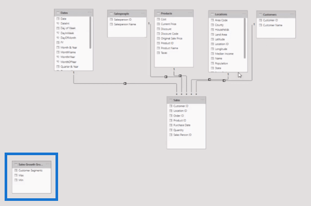
I have a really simple data model here. It’s a bit of a mess because of the way that Microsoft set things up inside Power BI, which I don’t like; so, I’d like to rearrange it using the waterfall technique.
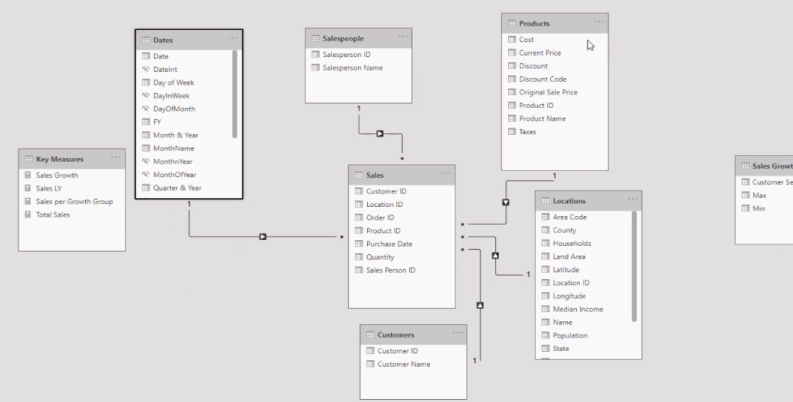
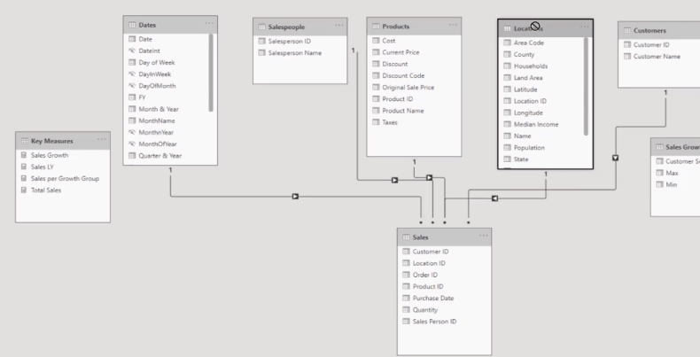
I want my Sales table at the bottom and all my lookup tables at the top.

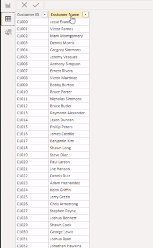
However, in many cases, your lookup tables don’t have that much information. For example, I have my customer data here, but I want to be able to group my customers based on a metric, and I want to do it dynamically.
Depending on my selection, the grouping will be different. For instance, I’m selecting a different year or say a different product, I want to be able to analyze my results in the grouping based on those selections.
When you combine this technique with a good model, there are multiple ways that you can filter your data.
Now let’s go through the theory of how this actually works.
DAX Formulas & Measure Branching
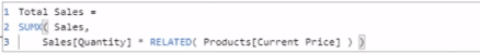
I have a simple calculation here for my total sales. In this measure, I used SUMX and I’ve retrieved the price from a different table, and then multiply that by the quantity sold at every single transaction.
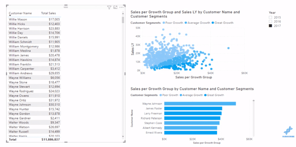
Now within the visualization, I want to be able to break out which of my customers are what I consider as good growth customers, average growth customers, or poor growth customers. The key is to recognize the year selected on the slicer.
I have my Sales LY (last year) calculation here as well, where I used the CALCULATE and the DATEADD functions.


From this calculation, I can then work out the percentage growth (Sales Growth).
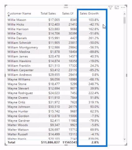
This is how you can build niche banding calculations. In this case, I’m branching out into this calculation (Sales Growth), and then I’m going to create my segments based on that.
Note that none of this data sits within any of my raw data tables. I’m creating this with measures and then I’m going to segment and dynamically band based on this calculation.
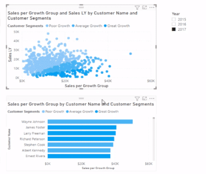
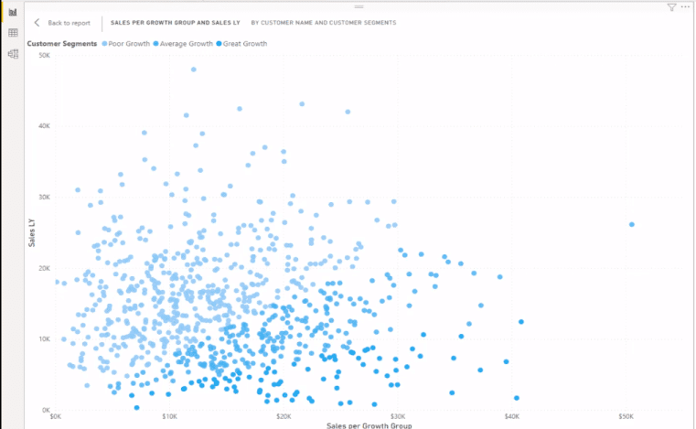
You can see on the scatter chart visualization is where the segment or grouping really breaks out. This visualization has the same measure as the bar chart visualization down here. It’s just representing things in a slightly different way. And it’s still a dynamic calculation or a dynamic segmentation technique.
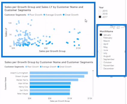
I can also break this down by month and year by simply adding a slicer filter.
Power BI Dynamic Grouping Using DAX
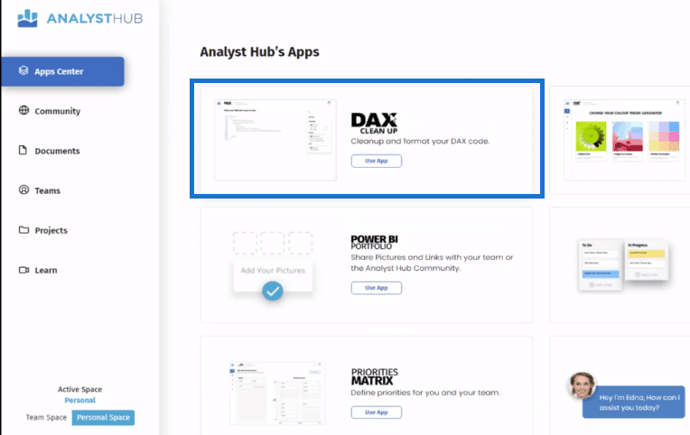
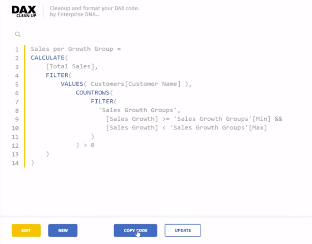
I usually get my formulas from the Analyst Hub, using the DAX Clean Up web-based application. You can save all your formulas here.
I have my banding example saved in the Analyst Hub and I can just copy the code and paste it into my model. You might need to change a few parameters inside the formula, but in this case, I’ve already got this one set up perfectly.
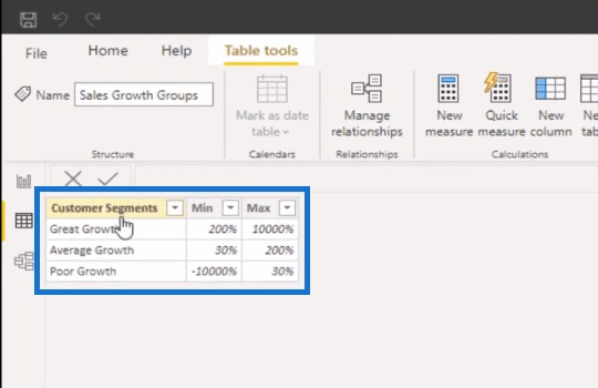
Another thing that you need to remember when doing some dynamic segmentation is that you need to create a supporting table. In this example, I want to be able to segment based on this growth factor. So I broke out my segments for that particular growth factor.
And note that I’m building on top of my core model. None of this data is being physically implemented in any table at all, which makes this technique so flexible.
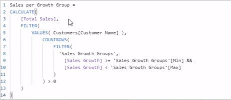
Now let’s have a look at the formula that I used here, Sales per Growth Group.
In the formula, you see that I want to calculate total sales, but I want to be able to filter that sales result by that supporting table I created.
I want to evaluate what the customer’s growth was. And so, with the VALUES function, this formula is going to iterate through every single customer and work out the sales growth of each customer. This goes on the entire list of my customers virtually and then it returns the sales based on whatever evaluates to true.
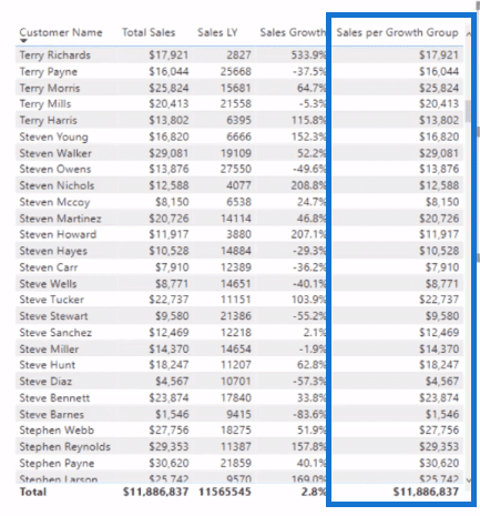
Now what’s interesting about this is that when I drag this formula into the table, you’ll see that everything evaluates to true at some point. This is because the filter is not in the context at all in this table.
However, you can see the bands or groups on the scatter chart visualization. With the supporting table that I created (customer segments table), the filter within the formula, Sales per Growth Group, is in play in this visualization. As a result, many will evaluate to false. And that’s how we get the segments, these bands within the visualization.
***** Related Links *****
Power BI Banding & Segmenting Example Using DAX
Use DAX To Segment & Group Data In Power BI
Segmentation Example Using Advanced DAX in Power BI

Conclusion
There’s a bit to unpack in this Power BI dynamic grouping technique, but it’s not that difficult if you really understand the pattern and the supporting table that you need to use.
You can input this pattern over and over again, for whatever banding you want. The supporting table can be totally dynamic and flexible and can be based on any metric that you want. Just make sure that you actually input the correct metric inside this evaluation through the table. This is totally dynamic to whatever you put in here. You can have profit margins here, for example.
For more related content, check out the links below.
Cheers!
Sam


