I’m going to talk about how the Power BI conditional formatting feature can take your reports to the next level. It’s a really useful feature, but not a lot of people use it mostly because this function is buried under Power BI’s other tools. You may watch the full video of this tutorial at the bottom of this blog.
The conditional formatting feature in Power BI holds a lot of value from a visualization point of view. It can also potentially simplify the way you model your data.
Using Color Scale For Customer Ranking Based On Revenue
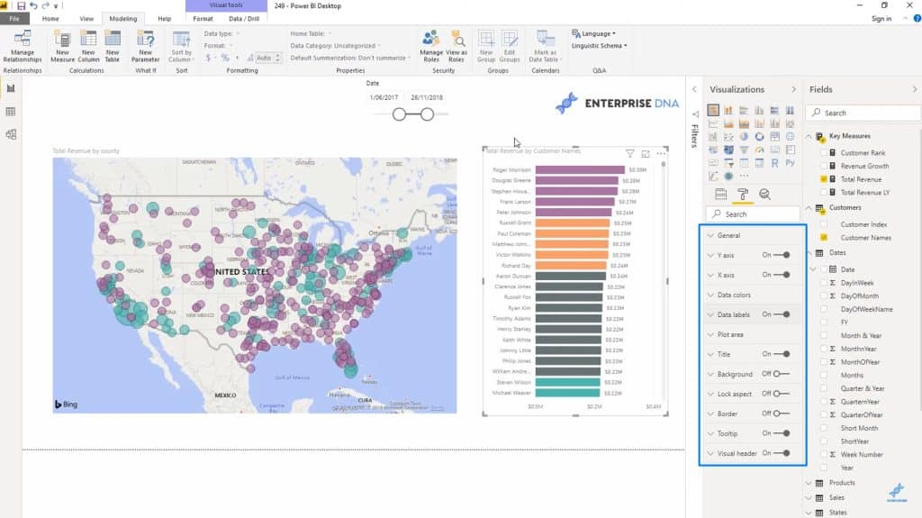
I’ll start off with something simple. This is a visualization of all my customers and the amount of revenue they brought in.

Let me add a date slicer here to show you later on how flexible this approach is.

What I want to do here is to color code the customers based on their Total Revenue.
Normally, I would use dynamic grouping to change the visualization based on a calculation. But with the conditional formatting approach I’m going to use I can customize this chart without the need for dynamic grouping.
Even more amazing is the fact that the actual conditions or the rules that would determine these color codes are not even included in the visual itself.
How do I do that?
First, I calculated my Customer Rank.

I used the RANKX function on ALL of the Customer Names. Then I used Total Revenue and arranged them in DESC order.
After that, I’ll go into my Data Colors inside my formatting tools.

I’ll click on the 3 dots beside the Default color under Data Colors.

That will show me the button for conditional formatting.

Once I click on conditional formatting, this window will pop up. This is where I can change the colors on my chart based on the rules or conditions that I’ll be setting.

I’ll start off simply by applying a color scale based on my Total Revenue.

Once I set those two areas, it’s going to ask me to choose colors based on the Minimum (or the lowest value in my data set) and the Maximum (which is the highest value in my data set).

I’ll apply this formatting to my chart, so my high value data would now look like this:

And as I scroll further down, the color will change based on how each customer is ranked.

Setting Data Colors Based On Rules
This time, I’m going to set specific colors based on the rules or conditions I’ll be setting.
Inside the conditional formatting pane, I’ll choose Rules under the first dropdown. Then, I’ll base the formatting on Customer Rank again.

This is what’s different between this approach and the previous one. I’m going to create subsets out of my entire data set by assigning specific values for each color.
So I’m going to start with a group that ranks greater than or equal to 1 up to those that are less than 6.

Once I click on Add, I’ll be given the chance to set another rule. I can keep on adding rules (and colors) depending on how many subsets I need.

For the 2nd set of rules, I’m going to group together those that ranked 6 to 10 (which means I’m setting the upper limit to less than 11). Then, my 3rd set will include those that ranked 11 to 20.

Once I click on OK, you’ll see that the visualization I come up with will be very different from the example I did earlier.

I can also filter the data using the date slicer I added earlier. This will add a different context to the data being shown.

You can also use the other visualization options available in this pane depending on what you need to put emphasis on and how you want to showcase them.

Using Conditional Formatting On Location-Based Data
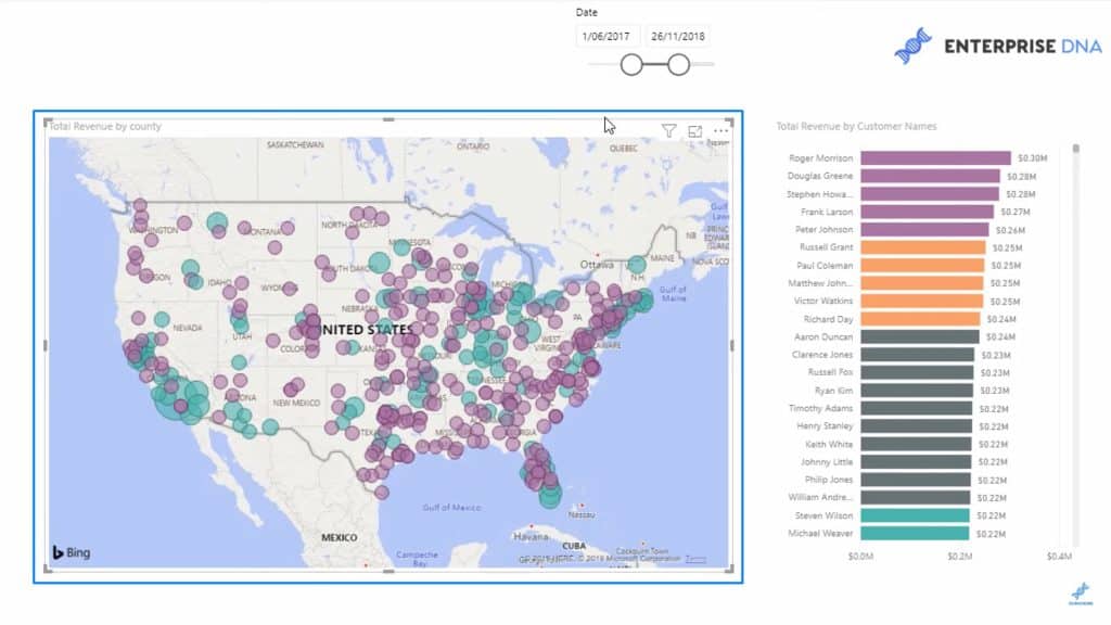
This is a little simpler than the last example I showed, but is also a great way of displaying data based on the location. This time, I’ll be using a map.

Once again, I’m going into the conditional formatting pane to set a rule using my Total Revenue. I’m also going to use a more absolute number this time.

I chose the color purple for all values below 500,000. Anything else that does not meet this requirement will retain the default color that was initially set before I applied my conditional formatting.

Now, one look at this map and I can immediately see which areas are my highest-selling and my lowest-selling regions.
Showing Revenue Growth Per Region
Here’s another way to showcase the data on this map. This time, I’m going to look at Revenue Growth. Was the growth in revenue for each area positive or negative?
This is where measure branching comes in. I’ll start off with my Total Revenue which uses the SUM function for all my Sales.

Then, I’ll calculate the Total Revenue for last year. This time, I’ll use the CALCULATE function and reference Total Revenue, then add SAMEPERIODLASTYEAR using the Date.

I’m also using one last measure for Revenue Growth. This is going to be the difference between my Total Revenue and Total Revenue LY. I’m going to use the DIVIDE function for this as well.

Note that Revenue Growth is dynamic. I can adjust the time frame I need and the data is going to change depending on that time period.

To make it easier to understand the data on the map, I’m using green for positive and red for negative.

Once these rules are applied, this is the visualization I’ll get.

Again, this gives us so much insight at a single glance. I can easily check which regions are in trouble and which ones are doing well.
The Downside To Conditional Formatting
There’s one downside of using conditional formatting instead of doing dynamic grouping. There isn’t a good way to add labels to what you’re doing.
When you use dynamic grouping, you can create a legend that shows what each part of the chart is about. But conditional formatting does not allow you to create legends.
There’s actually a simple solution to this. You just need to make your chart’s title more obvious. In this example below, for example, I named the map “Total Revenue By County, positive versus negative growth”.

With a title as obvious as that, I wouldn’t need a label at all.

***** Related Links *****
Custom Conditional Formatting Techniques In Power BI
Tracking Trends in Power BI Using DAX Formulas
Extracting Unique Insights In Power BI Using Ranking DAX Measures
Conclusion
Hopefully, I was able to show you how much insight you can get once you learn the ins and outs of the Power BI conditional formatting feature.
It’s not perfect for every scenario, especially since it doesn’t let you have legends or labels. But if the data you want to present is pretty straightforward, there should be no problem in using it.
All the best,
Sam


