
In today’s data-driven world, the ability to effectively communicate information through visuals is crucial. This is where the art and science of data visualization comes in.
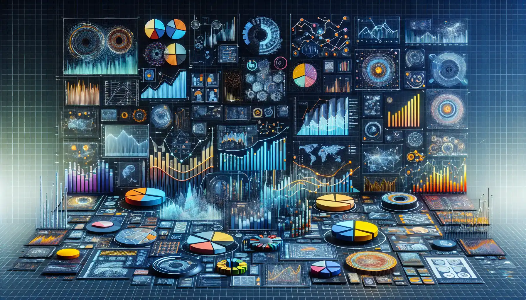
Data visualization is the graphical representation of information and data. By using visual elements like charts, graphs, and maps, data visualization tools provide an accessible way to see and understand trends, outliers, and patterns in data.
Data visualization can help organizations make sense of large and complex data sets, improve decision-making, and drive positive change. But, how do you ensure that you are navigating this world correctly?

In this article, we’ll explore the art and science of data visualization, giving you the tools and knowledge you need to unlock the full potential of your data. So, let’s get started and dive into the exciting world of data visualization!
The Importance of Data Visualization

The art of data visualization lies at the intersection of design, statistics, and communication. It’s the process of turning numbers and raw data into an engaging, accessible, and informative visual story.
In today’s data-rich environment, data visualization is more important than ever. Here are some of the reasons why:
- Clarity and Understanding: Visualizing data makes it easier to understand complex information. It allows people to see patterns, trends, and relationships that may not be apparent in raw data.
- Effective Communication: Data visualization is a powerful tool for communication. It can make a compelling case, tell a story, or convey a message in a way that words alone cannot.
- Decision-Making: Visual data analysis can help people make more informed decisions. It can provide insights and evidence to support or challenge assumptions and help people prioritize actions.
- Engagement and Buy-In: Visuals are more engaging than tables of numbers or text. They can capture people’s attention and help them connect with the information, increasing their interest and understanding.
- Quick Insights: Visual data analysis allows people to quickly identify patterns, outliers, or areas of interest. It can save time by focusing on what’s most important and avoiding unnecessary details.
- Identify Trends and Patterns: Data visualization helps organizations identify trends, patterns, and opportunities that can be used to drive growth, innovation, and success.
Now that we’ve discussed the importance of data visualization, let’s look at the different types of data visualization techniques you can use.
Data Visualization Techniques
Data visualization techniques are visual methods used to represent data in a way that allows viewers to easily and quickly understand the information being presented.
These techniques can help make complex data more accessible and can often reveal patterns, trends, and insights that might otherwise go unnoticed.

1. Charts and Graphs
One of the most common data visualization techniques is the use of charts and graphs. These visual representations can quickly convey relationships and trends within the data.
Some of the most popular chart and graph types include:
- Bar Charts: These are used to compare different categories of data.
- Line Charts: These are used to show trends over time.
- Pie Charts: These are used to show parts of a whole.
- Scatter Plots: These are used to show the relationship between two variables.
- Histograms: These are used to show the distribution of data.
- Area Charts: These are used to show the relationship between two or more variables.
- Box Plots: These are used to show the distribution of data along with a median and outliers.
2. Maps
Another powerful data visualization technique is the use of maps. Maps can be used to represent geographic data and can be especially useful for showing spatial relationships and patterns.
Some common types of maps used in data visualization include:
- Choropleth Maps: These maps use different colors or shading to represent different values in different areas.
- Bubble Maps: These maps use different-sized circles to represent data values in different areas.
- Flow Maps: These maps show the movement of people, goods, or ideas between different locations.
3. Infographics
Infographics are a combination of text and visuals that are used to present data and information in a way that is easy to understand and visually appealing.
They can be a powerful way to communicate complex data in a more engaging and accessible format.
Infographics are often used in areas such as journalism, marketing, and education to present data in a way that is more likely to be understood and remembered.
They can be created using various tools, such as graphic design software or online infographic makers, and can be shared digitally or printed out.
6 Best Practices in Data Visualization
In the vast ocean of data, the ability to effectively visualize data is a superpower. Just like any superhero, to wield this power responsibly, one must follow a set of guidelines.
In this section, we’ll share some of the best practices in data visualization to help you create more effective and impactful visuals.
1. Choose the Right Visualization Type
One of the most important decisions in data visualization is choosing the right type of visualization for your data. Each type of visualization has its own strengths and weaknesses, and choosing the right one can make a significant difference in how your data is understood.
For example, if you want to show the distribution of a single variable, a histogram or box plot may be more appropriate than a bar chart. If you want to show the relationship between two variables, a scatter plot may be more useful than a line chart.
2. Keep It Simple
While it can be tempting to create elaborate and flashy visualizations, simplicity is often the key to effective data visualization. Your goal should be to convey your message as clearly and quickly as possible, and unnecessary complexity can make this more difficult.
Try to use as few colors, shapes, and labels as possible while still effectively conveying your message. If you find yourself adding elements that don’t directly contribute to your message, consider removing them.
3. Use Color Thoughtfully
Color can be a powerful tool in data visualization, but it can also be a double-edged sword. When used thoughtfully, color can help draw attention to important elements, convey meaning, and make your visualizations more aesthetically pleasing.

However, overusing color can lead to confusion and make your visualizations difficult to read. When using color, it’s important to keep a few things in mind:
- Accessibility: Make sure your visualizations are accessible to all viewers, including those with color vision deficiencies. Use color combinations that are easy to distinguish for everyone.
- Consistency: Use a consistent color scheme throughout your visualizations. This can help your audience quickly understand the meaning of different colors and reduce confusion.
- Emphasis: Use color to draw attention to the most important parts of your visualizations. This can help guide your audience’s eyes to the most critical information.
4. Provide Context
Data doesn’t exist in a vacuum. It’s essential to provide your audience with the necessary context to understand your visualizations fully. This can include things like labels, titles, and annotations.
When providing context, consider the following:
- Labels: Make sure to label your axes, data points, and any other relevant elements. This will help your audience understand what they’re looking at.
- Titles: Give your visualization a clear and descriptive title. This will help your audience understand the purpose of your visualization and what it’s trying to convey.
- Annotations: Use annotations to highlight important features or trends in your data. This can help your audience quickly understand the most critical information.
5. Tell a Story
Data visualization is a powerful tool for storytelling. Instead of simply presenting data, try to craft a narrative with your visualizations.
Consider the following tips for storytelling with data:
- Start with a question: What do you want to know? What do you want your audience to know? Frame your visualization around a question or a message.
- Lead your audience: Guide your audience through your visualization, pointing out important features and explaining their significance.
- End with a conclusion: What does the data tell us? Make sure your visualization leads to a clear and compelling conclusion.
6. Iterate and Refine
Finally, remember that data visualization is a process of iteration and refinement. Your first attempt at a visualization may not be perfect, and that’s okay.
Don’t be afraid to create multiple versions of a visualization, gather feedback, and make improvements. The more you work on a visualization, the more effective it is likely to become.
So, be prepared to iterate and refine your visualizations to ensure they effectively convey your message and tell your story.
How to Create Effective Visualizations

While there are many tools available for creating data visualizations, two of the most popular ones are Tableau and Power BI. Let’s take a look at how you can create visualizations using these tools.
1. How to Create Visualizations in Tableau
Tableau is a powerful and intuitive data visualization tool that allows you to create a wide variety of visualizations from your data. To create a visualization in Tableau, follow these steps:
- Connect to your data source: Open Tableau and connect to your data source, such as a CSV file, Excel spreadsheet, or database.
- Drag and drop fields: Once connected to your data, drag and drop the fields you want to visualize onto the Columns and Rows shelves.
- Choose a chart type: Tableau will automatically generate a view based on the fields you’ve selected. To change the chart type, click on the Show Me panel and select a different chart type.
- Customize your visualization: Use the formatting options in Tableau to customize your visualization. You can change colors, fonts, and labels to make your visualization more visually appealing.
- Publish and share: Once you’re satisfied with your visualization, you can publish it to Tableau Server or Tableau Public to share it with others.
Tableau offers a wide range of visualization options, from basic bar charts and line graphs to more advanced visualizations like heat maps and tree maps.
2. How to Create Visualizations in Power BI
Power BI is another popular data visualization tool that allows you to create powerful visualizations from your data. To create a visualization in Power BI, follow these steps:
- Connect to your data source: Open Power BI and connect to your data source. Power BI supports a wide variety of data sources, including CSV files, Excel spreadsheets, and databases.
- Drag and drop fields: Once connected to your data, drag and drop the fields you want to visualize onto the Values, Axis, or Legend shelves in the Visualizations pane.
- Choose a chart type: Power BI offers a large selection of chart types. To change the chart type, select the desired visualization from the Visualizations pane.
- Customize your visualization: Use the formatting options in Power BI to customize your visualization. You can change colors, fonts, and labels to make your visualization more visually appealing.
- Publish and share: Once you’re satisfied with your visualization, you can publish it to the Power BI service to share it with others.
Like Tableau, Power BI offers a wide range of visualization options, from basic bar charts and line graphs to more advanced visualizations like maps and gauges.
Final Thoughts

We live in an era of data, where every click, like, and share is recorded and analyzed. Data visualization is the key to unlocking the stories hidden in this data.
In this article, we’ve explored the fundamentals of data visualization, from its definition to its importance in our data-driven world. We’ve also discussed the different types of data visualization techniques and the best practices you should follow.
Remember, data visualization is a skill that can be learned and improved with practice. So, keep experimenting, keep learning, and keep telling compelling stories with your data!
Frequently Asked Questions

What are the best tools for data visualization?
Some of the best tools for data visualization include Tableau, Power BI, QlikView, Looker, and D3.js. These tools offer a range of features and capabilities for creating interactive and visually appealing data visualizations.
What are the most common types of data visualization?
The most common types of data visualization include bar charts, line graphs, pie charts, scatter plots, histograms, heat maps, and area charts. Each type of visualization is suitable for different types of data and can help in understanding trends and patterns within the data.
What are the best practices for data visualization?
Some best practices for data visualization include choosing the right type of visualization for your data, keeping visualizations simple, using color thoughtfully, providing context, telling a story, and iterating and refining your visualizations.

What is the role of data visualization in business?
Data visualization plays a crucial role in business by helping companies make sense of large volumes of data and identify trends, patterns, and insights that can be used to make informed decisions. Visualizing data also makes it easier to communicate complex information and can help in identifying areas for improvement and growth.
How does data visualization help in making data-driven decisions?
Data visualization helps in making data-driven decisions by presenting data in a format that is easy to understand and interpret. Visualizations allow decision-makers to quickly identify trends, patterns, and relationships within the data, enabling them to make more informed and effective decisions based on the evidence presented.
What are the key elements of a data visualization design?
The key elements of a data visualization design include the title, labels, axes, and grid lines. These elements help in providing context and making it easier for the viewer to understand the information being presented. It is important to use these elements thoughtfully and to keep the design clean and uncluttered.


