In this example, we’ll run through a unique insight you can discover in Power BI. What we need to do is to combine a range of different formula techniques to get the intended result. If you do this inside your own models with your own customer segmentation analysis, you will discover high-quality insights that will generate an immense value for the work you’re doing. You may watch the full video of this tutorial at the bottom of this blog.
Here, we will analyze which customer groups are experiencing the greatest growth. But we don’t have any groups in our data so we need to create them.
Segmenting Customers Into Groups
We want to group our customers into Top Clients, Ok Clients, and Small Clients. We want to know who is experiencing the most growth and impacting our growth the most. We also want to look at it from a percentage and absolute basis.
I have put together a few visualizations to showcase this customer segmentation insight, and I’m also going to run through the logic I used to determine which groups experienced the most growth.
First of all, we have to work out how to segment these clients. What I did is to create a table by clicking ‘Enter Data’ and entering all of these variables in the supporting table.

I wanted to have a look at what my customer sales are and establish which group these customers belong to, based on the range provided by the MIN and MAX numbers.
Growth Grouping
The next step is to look at the growth grouping from last year. We want to know what group our customers belonged to last year, and what was the percentage growth for that particular group?

This is how I came up with the formula above. I calculated the % YoY Growth for each different group.
To work out which customers are in which group, I iterated through every single customer and evaluated if their sales last year were above the MIN or below the MAX in any single row within that table.
If they are, then it’s going to deliver the % YoY Growth for that particular subset of clients.
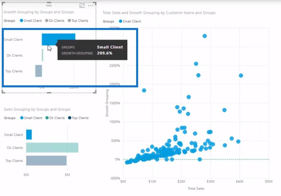
We can then put this into a chart. You can see on my example that our Small Clients have dominated with a significant YoY growth.
Total Sales From Last Year
However, customer segmentation that shows up in percentages does not really tell the whole story, right? Because if this number is from a really small base, it won’t really matter to our overall revenue.
So what I have done is to look at the Total Sales for each of those different groups.
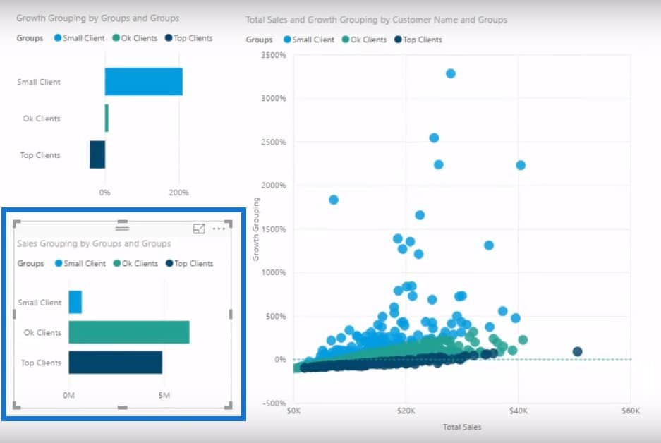
To come up with the second table, I had to create another formula that tells me the Total Sales Last Year of these customers based on what group they are in.

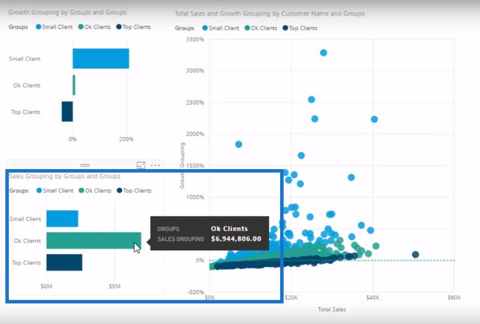
As you can see, our Small Clients made a little bit more sales than they did last year because of this outstanding growth. On the other hand, our Ok Clients formed a small growth basket at 9% but still made up a large portion of our sales.
Visualizing The Data
I also put everything in our customer segmentation into a scatter chart where you can see the breakdown of Small Clients, Ok Clients, and Top Clients. The y axis shows the growth per client or the Growth Grouping while the x axis shows the Total Sales.
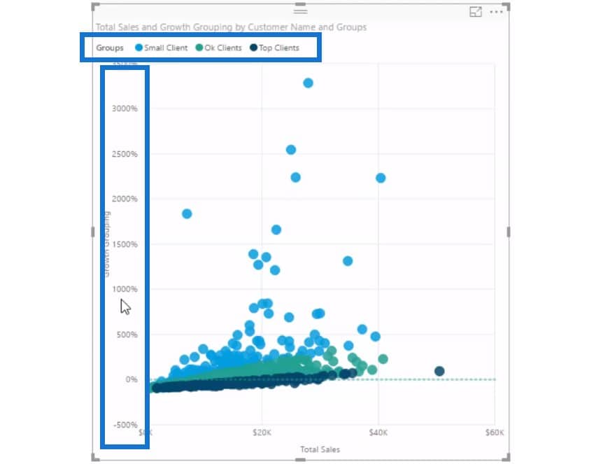
Based on last year’s figures, all our Top Clients experienced a 41% decrease in growth. This is a scary development, and we definitely want to see why my Top Clients are down by 41%.
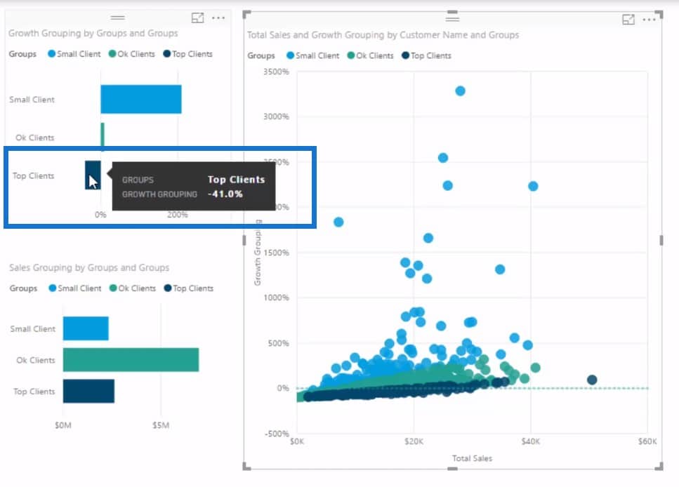
When I click on Top Clients, I can see the reason why.
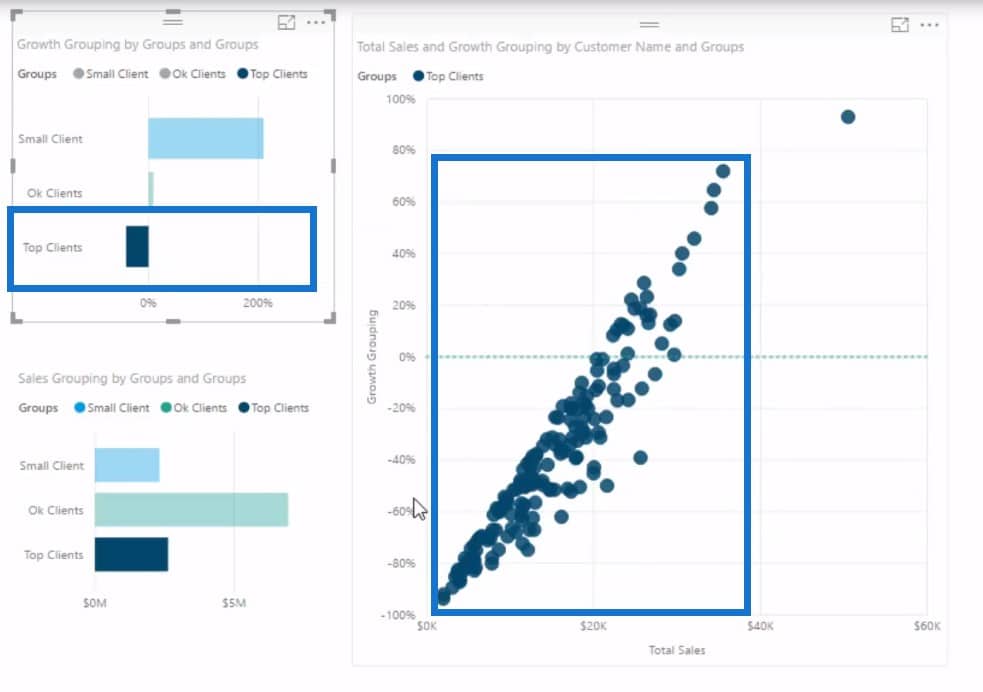
We can dive in further and have a look at everyone that is below 0%. I can use the filtering section and put less than 0%.

We can also add our customer names in the scatter chart to get a clearer picture.

All of these customers were in our Top Client group last year and then all of a sudden these customers have really fallen off the cliff. Why is that? We can have a look at where they are regionally based, who their sales person is, and so on and so forth.
Conclusion
To come up with this insight, I was able to combine multiple techniques. I used time intelligence calculations. I utilised the CALCULATE function, as well as the dynamic segmentation technique. I used scatter charts and then made use of the analytics function to put lines in the scatter chart.
Our goal is to make these groups dynamic, so we can segment them based on region or time period, and then evaluate through every customer and see which grouping they land in.
This makes this unique analytical work so powerful in Power BI. We are able to create this brand new analysis and showcase unseen insights that will represent our data in a way that was not possible before and in a much more valuable way.
If you enjoy learning about these techniques, then check out more course modules at Enterprise DNA Online. There are well over 20 unique modules focused on many techniques and ways you can use Power BI effectively.
Cheers,
Sam
***** Learning Power BI? *****
FREE COURSE – Ultimate Beginners Guide To Power BI
FREE COURSE – Ultimate Beginners Guide To DAX
FREE – 60 Page DAX Reference Guide Download
FREE – Power BI Resources
Enterprise DNA Membership
Enterprise DNA Online
Enterprise DNA Events


