
Data is everywhere and it tells a story. But sometimes, the story can get lost in all the numbers. This is where data visualization comes in. It takes raw data and turns it into an engaging, easy-to-understand narrative.
The art of data visualization lies in the ability to transform complex information into an intuitive, visual format that can be easily grasped and interpreted by its audience. The success of this process hinges on the use of effective visualization techniques that enhance the story being told by the data.
The key to crafting compelling stories with data is through effective visualization techniques. By implementing these techniques, you can bring your data to life and communicate your message in a powerful and memorable way.

From choosing the right visualization type to using colors and sizes to your advantage, this article will provide you with the tips and tools you need to make your data stand out and speak volumes.
Let’s get into it!
The Power of Data Visualization

Before we jump into the world of data visualization, let’s take a moment to appreciate its power.
Data visualization is the art of transforming raw data into compelling and informative graphics. When done well, it can make data more accessible, understandable, and memorable.
There are countless benefits to using data visualization in your work, no matter your industry or field of expertise.
Some of the most notable benefits of data visualization include:

- Better Decision Making: Visualizing data can make it easier to spot trends, patterns, and outliers. This allows you to make more informed decisions based on evidence, rather than gut feelings.
- Increased Understanding: Data visualizations can simplify complex information, making it easier for your audience to understand the data and the story it tells.
- Improved Communication: Visuals can often convey information more effectively than text alone. They can help you communicate your findings and ideas more clearly and persuasively.
- Memorability: Visuals are more memorable than plain text. They can help your audience retain and recall information more easily.
- Increased Engagement: People are naturally drawn to visuals. Using data visualizations can make your work more engaging and interesting.
By harnessing the power of data visualization, you can unlock these benefits and more.
Now that we’ve explored the what and the why of data visualization, let’s dive into the how.
In the next section, we’ll look at some key visualization techniques that will help you create stunning visualizations that truly speak volumes.
Key Visualization Techniques

When crafting compelling stories with data, it’s important to implement effective visualization techniques. The key to successful data storytelling lies in the ability to communicate complex information in a clear and engaging manner.
Let’s go over the key visualization techniques you need to know to make your data truly stand out:
1. Selecting the Right Visualization Type
The first and most crucial step in crafting compelling stories with data is to select the right visualization type. The choice of visualization depends on the type of data you have and the story you want to tell.
Common types of visualizations include:
- Bar Charts: Great for comparing categories or showing changes over time.
- Line Charts: Perfect for showing trends or relationships between variables.
- Pie Charts: Useful for displaying parts of a whole or percentages.
- Scatter Plots: Ideal for showing the relationship between two variables and identifying clusters or patterns.
- Maps: Great for showing geographical data and regional trends.
When selecting a visualization type, always consider your audience. Choose the type that will be most accessible and easy to understand for them.
2. Using Color to Your Advantage
Color is a powerful tool in data visualization. When used effectively, it can draw attention to key points, make patterns more apparent, and create a visually appealing presentation.
Here are some tips for using color effectively:
- Choose a Color Palette: Select a cohesive set of colors that work well together and are easy on the eyes. This will make your visualization more visually appealing and easier to understand.
- Use Contrasting Colors: To highlight differences or create emphasis, use colors that are opposite on the color wheel. For example, use blue and orange or green and red.
- Avoid Using Too Many Colors: Stick to a small number of colors in your visualization. Too many colors can be overwhelming and make it difficult for your audience to focus on the most important aspects of the data.
- Consider Color Blindness: Approximately 8% of men and 0.5% of women have some form of color blindness. Ensure your visualization is accessible to all by using colors that are distinguishable for those with color vision deficiencies.
3. Harnessing the Power of Size
In data visualization, the size of visual elements can be a powerful storytelling tool. It can be used to emphasize certain aspects of your data, making it more compelling and easier to understand.
Here’s how you can use size to your advantage:
- Emphasize Important Data: Use larger sizes for the most important or interesting data points. This will draw your audience’s attention and make your story more engaging.
- Show Relationships: Use size to show the relationship between different data points. For example, the size of a circle in a bubble chart can represent the value of a particular variable.
- Create Hierarchy: Size can be used to show the relative importance of different elements in your visualization. Larger elements will be perceived as more important, while smaller elements will be seen as less important.
- Simplify Your Story: Using different sizes can help you simplify your data. It can make it easier for your audience to understand the most important points and the relationships between them.
Size is a versatile tool in data visualization that can help you craft a more compelling story with your data. By using size effectively, you can make your data more engaging and easier to understand.
4. The Role of Text in Data Visualization
While visual elements like color, size, and shape play a crucial role in data visualization, text is equally important. It serves as a guide for your audience, helping them understand the story your data is telling.
Here are some tips for using text effectively in your data visualizations:

- Choose the Right Font: Use a clean, easy-to-read font for your text. Sans-serif fonts are generally a safe choice.
- Use Appropriate Sizing: Text that is too small can be hard to read, while text that is too large can be overwhelming. Find a balance that makes your text easy to read without dominating the visualization.
- Be Selective: Don’t overload your visualizations with text. Use it strategically to highlight key points or provide context.
- Consider Placement: Think about where your text should go. Should it be directly on the visualization or in a separate key or label? Place your text where it makes the most sense and is easy to find.
- Be Consistent: Use the same font, size, and color for all your text elements to create a cohesive look.
By using text effectively, you can guide your audience through your data visualizations, making the story your data tells more accessible and compelling.
5. Mastering Animation in Data Visualization
Animation can be a powerful tool in data visualization, but it must be used thoughtfully to avoid overwhelming your audience.
Here are some tips for using animation effectively:
- Focus on Transitions: Use animation to transition between different states or views of your data. For example, you can use a fade effect when updating a bar chart or a line that moves across a map to show a change over time.
- Keep It Simple: Avoid unnecessary movement or flashy effects. Your animation should serve a purpose and make your visualization easier to understand.
- Be Mindful of Timing: Adjust the duration of your animation to be long enough to be noticed but not so long that it becomes tedious. A general rule is to keep it between 200 and 500 milliseconds.
- Test on Different Devices: Make sure your animation works well on different devices and screen sizes. Some animations that work on a computer may not work as well on a mobile device.
When used thoughtfully, animation can enhance your data visualization and make your story more engaging and memorable.
In the next section, we’ll look at some common mistakes in data visualization and how to avoid them.
Common Mistakes in Data Visualization
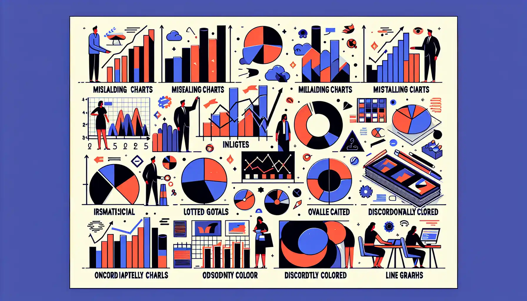
In crafting compelling stories with data, there are some common mistakes that you should be aware of.
By understanding these mistakes, you can ensure that your data visualization will be effective and engaging.
Some of the most common mistakes include:
- Choosing the wrong visualization type: Not all data is best represented by a bar chart or a pie chart. Choose the right type for your data.
- Overloading the visualization: Too much information can overwhelm the viewer and dilute the main message.
- Misrepresenting the data: Ensure your visualizations accurately represent the underlying data and avoid misleading viewers.
- Ignoring accessibility: Design with all users in mind. This includes considerations for colorblindness, screen readers, and other accessibility needs.
- Failing to provide context: Always include a title, labels, and a brief explanation of what the data means.
- Poor color choices: Using colors that are difficult to distinguish, or that clash, can make your visualizations hard to read.
- Not focusing on the story: Your data should tell a story. Make sure your visualizations are designed to convey a clear, compelling narrative.
Remember that the key to crafting compelling stories with data is to avoid these mistakes. Keep your visualizations clear, accurate, and engaging, and you’ll be well on your way to successful data storytelling.
Final Thoughts

As we wrap up our exploration of data visualization and storytelling, it’s important to remember that the true power of data visualization lies in its ability to tell a compelling story with data.
From choosing the right visualization type to using color, size, and animation to your advantage, effective data storytelling is all about creating an engaging and memorable narrative.
The art of data visualization is a journey of continuous learning and improvement. It requires both technical skill and creativity, and the more you practice and experiment with different techniques, the better you will become at bringing your data to life and making it speak volumes.
Embrace the challenge, keep honing your craft, and let your data tell the stories that matter!
Frequently Asked Questions
How can I use data visualization to craft a compelling story?
To craft a compelling story with data, you need to choose the right type of visualization, focus on the key message, and make it engaging for your audience. You can use tools like Tableau, Power BI, or ggplot in R to create your visualizations.
What are some key techniques for effective data visualization?
Some key techniques for effective data visualization include selecting the right type of chart or graph for your data, using colors and shapes strategically, and ensuring your visualization is clear and easy to understand.
What are the most common mistakes to avoid in data visualization?
The most common mistakes in data visualization include choosing the wrong type of chart, using misleading scales or axes, and overcrowding your visualization with unnecessary information.
What is the importance of storytelling in data visualization?
Storytelling in data visualization is essential to making your data understandable and relatable to your audience. It allows you to convey complex information in a way that is easy to understand and memorable.
What are some tools for data visualization?
There are numerous tools for data visualization, including Tableau, Power BI, R (with packages like ggplot2), Python (with libraries like Matplotlib and Seaborn), and D3.js.
What is the role of color in data visualization?
Color plays a crucial role in data visualization as it can be used to represent different categories, emphasize certain data points, or create visual hierarchies. However, it’s essential to use color thoughtfully to avoid overwhelming your audience.


