
Today, I’ll show you how to connect Power BI to R and showcase the things you can do with the R script visual in Power BI. In order for this to work, you need to have R installed in your computer since it comes completely independent from Power BI.
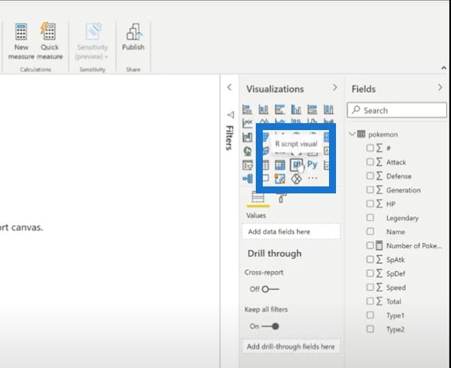
To get started, let’s click on the R script visual from the visualization pane.

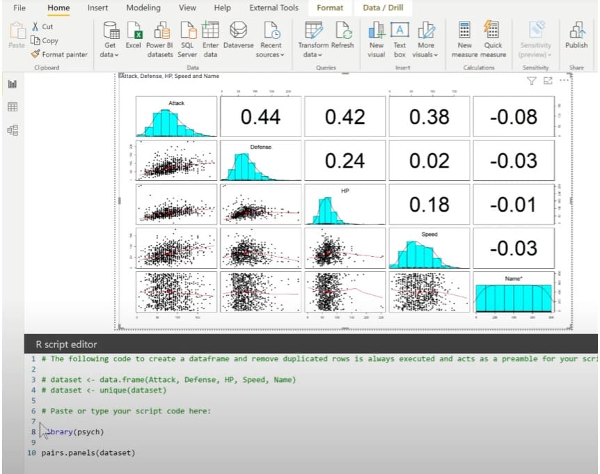
For today, we’ll be using what people call the correlation matrix plot. We will also be using a Pokemon data set. The reason I selected this is because it has a lot of numeric information like defense and attack, and will work quite well when showing a correlation.
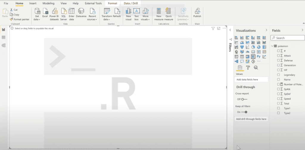
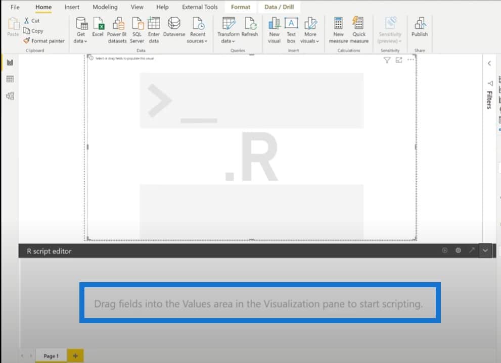
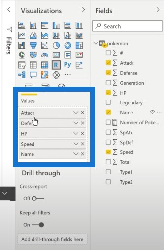
After we’ve dragged the visualization into the canvas, we need to start adding fields.
What type of fields can we display? We want to see Attack, Defense, HP, Speed, and Name of the Pokemon.
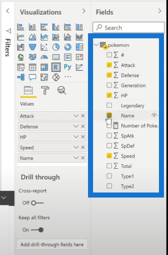
Now, you will probably notice that right below the visualization pane is the values pane where everything has been added under the same field. Both the text and numeric information is being added here.
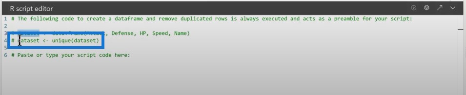
Consequently, here in the R script editor, we can also see that there is some code that’s already been laid out. This one is called dataset, which is a data frame that contains the Attack, Defense, HP, Speed, and Name. We don’t have to write this; Power BI does it automatically as soon as we populate things in our visualization canvas.
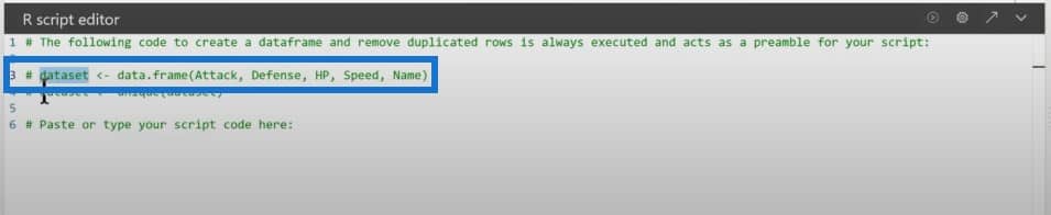
The first mistake that I did (which I can also imagine a lot of people will be doing) is deleting the comments here so that we can see it as a normal code. This is not going to work, because it really has to be laid out.
This line right here that says unique has to run. There is no way around it.

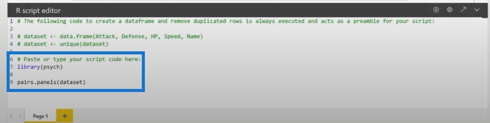
We’ll start writing our script down here. The correlation plot that we’re doing today comes from the psych package. It is very easy to do this. It’s just a matter of writing down pairs. panels and then passing the data set on the argument.
And there we have it. We have our visualization.
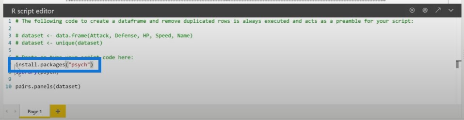
For those of you that don’t have the psych package installed, you can of course install it this way, but this process is going to install it every single time, even if you already have it.
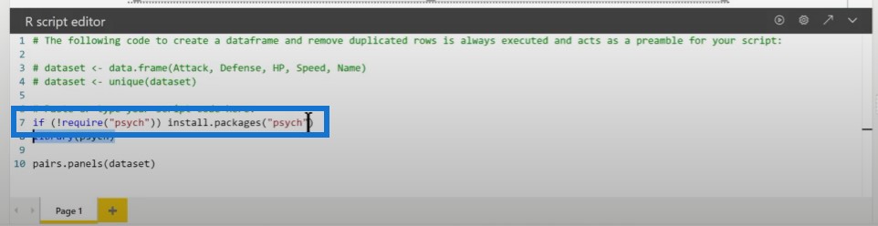
If we want to go one step beyond, we can create an IF statement that checks if the package is available and if it’s not, it installs it. Otherwise, it will not do anything.
One more thing that we might need to do in order for this not to fail is to populate the repository argument inside of the installed package.
In this example, I’m just copying and pasting the CRAN webpage. This technically works. But depending on where you’re located in the world, you might want to choose a mirror that is closer to you.
Taking The Visualization To Another Level
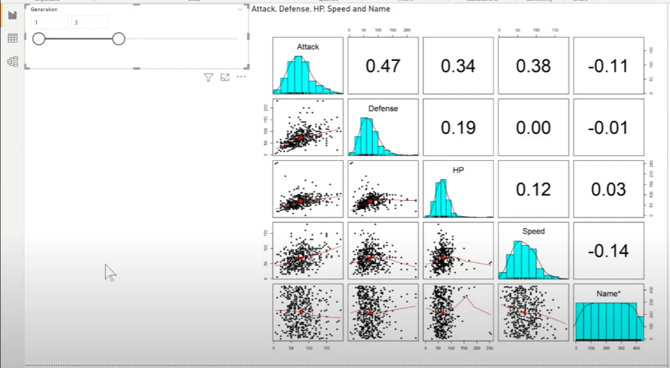
This is the code that we’ll want to implement. It runs well, and it displays the visualization. There are a couple of things that will take this visualization one step further. The first thing to do is add slicers. Slicers work perfectly with this type of visualization.
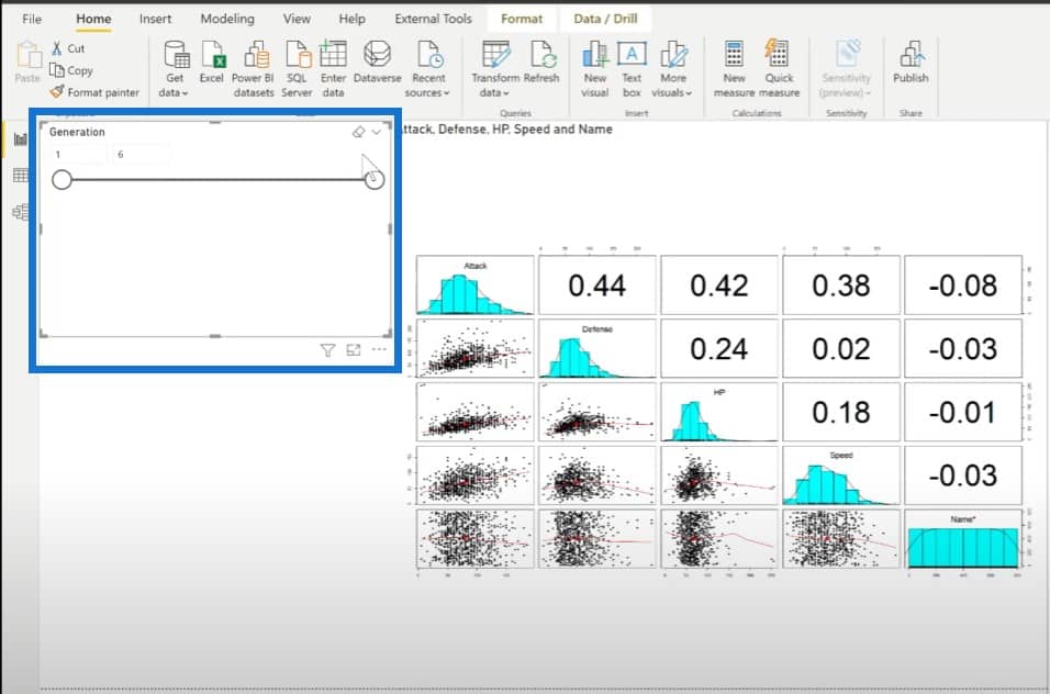
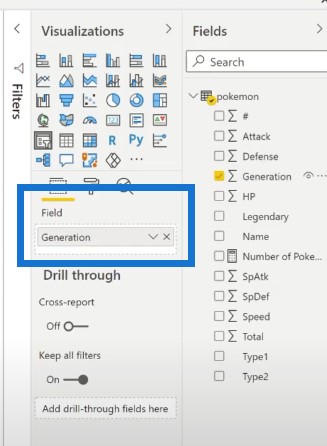
So let’s put a slicer into the report, and then put Generation in the fields pane.
Look how neat the visualization changes depending on what we choose on the slicer.
Interacting With Other Visualizations
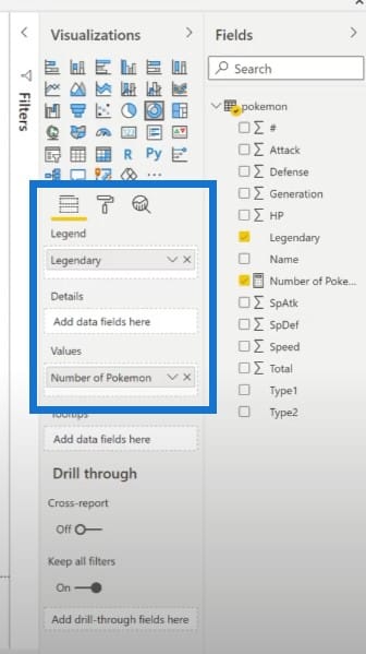
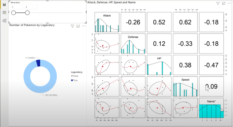
In case you’re wondering how this will look like when interacting with other visualizations, let’s create a donut chart, put the number of Pokemons, and determine if they are legendary or not.
As you can see, the first visualization is able to interact with the second visualization.
***** Related Links *****
R In Power BI: Downloading R And RStudio
Python In Power BI: How To Install And Set Up
Data Frames In R: Learning The Basics
Conclusion
These R scripts can be challenging and difficult to use when you have a really big data set because Power BI has to send all of that data to R and then wait for a response.
But in some cases, like our example here, building a visualization like this from scratch when you connect Power BI to R will take a lot of time.

So if you’re currently using R or Python and you prefer to import a visualization instead of building from scratch, this is a really neat solution.
Sam


