In this tutorial, we’ll look at a unique technique inside Power BI that allows us to create dynamic ranking tables using the RANKX function. You may watch the full video of this tutorial at the bottom of this blog.
What are Dynamic Ranking Tables?
Dynamic Ranking Tables showcase a range of information dynamically in a table, but the information shown is based off a specific ranking on a singular calculation.
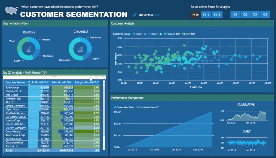
We can look at the Top 20 Customers, based on Sales, across a range of other metrics, like Profits, Margin, Growth, etc. This technique will also automatically update the table after any change of context to the report page.
In creating dynamic ranking tables, there is a need to implement advanced DAX formulas along with the RANKX function.
Filtering Customers Using The RANKX Function
Let’s have a look at the Top 20 Customers in the table.
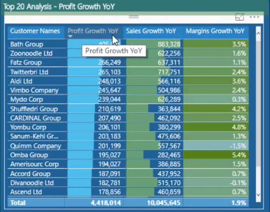
You can see the Profit Growth Year On Year table which requires the development of a few formulas to arrive at this measure. You can achieve these complex insights by overlaying the same techniques you would use when doing something relatively simpler.

In the formula for Profit Growth Year On Year, you can see that in evaluating a particular customer, it becomes ranked between a certain value based on a particular metric.
The filtering is done by using RANKX. The customer ranking is based on the Profit This Year versus Profit Last Year which will show the Profit Growth.
Ranking this particular measure will help you know which of these particular customers are within the Top 20 together with the specific results you want to highlight based on this metric.
Isolating The Top 20 Customers
You can see that the table only shows 20 results when there are, in fact, hundreds of customers. But because the customer data is isolated based on a specific metric, only 20 customers appear in the table.
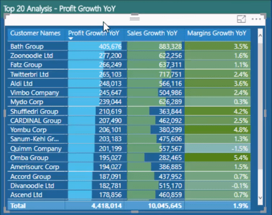
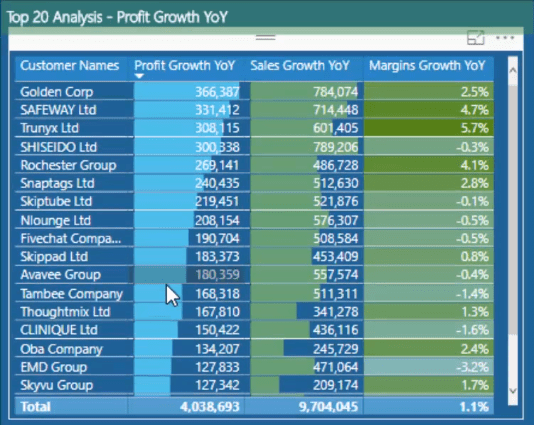
Jumping to a different time frame will update the results but will still continue to show the Top 20 Customers.

Profit Growth Insights
You can also show the Top 20 Customers together with their Profit Growth and show other metrics to try and identify what caused the growth.
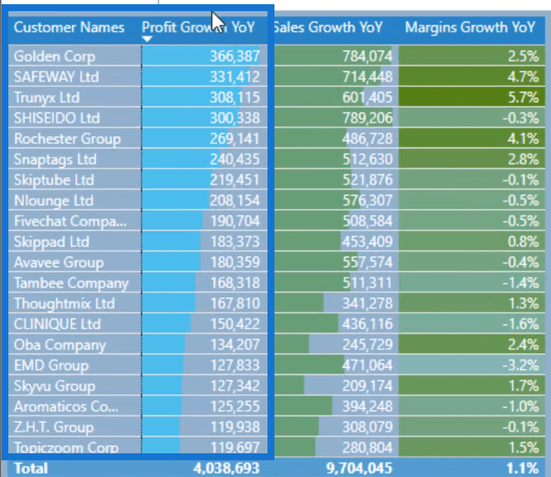
This growth in Profit could be due to an increase in Margins or an increase in Sales.
Adding Sales To The Dynamic Ranking Table

In the formula for Sales Growth Year On Year, you can see that the FILTER function has exactly the same structure as the previous formula, but instead of showing the Profit, it will display the Sales This Year versus Last Year.
This is going to evaluate to TRUE, which in this case is our customers. Then the same logic will play out so that profits between last year and this year stay within in the Top 20 metric.
That’s how you can isolate that particular insight and only show it for the most valued customers.
You can put Sales and Profit Growth in the Dynamic Ranking Table alongside The Top 20 Customers to gain better insights in your reports.
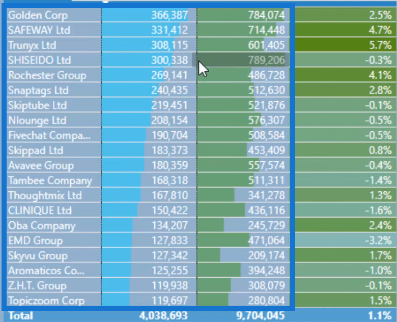
You can also do the exact same thing for Margin Growth.
Margin Growth In The Dynamic Ranking Table
You can see that the filtering done inside of CALCULATE is exactly the same as how it was done in the previous formulas.

Before, the Top Customers were only identified based on their Profit Growth. But now, the Margin metric can be isolated to see if the reason for the increase in Profit is due to the increase in Margins.
If you look at this table, you can see that the customer (EMD Group) has a negative Margins Growth.
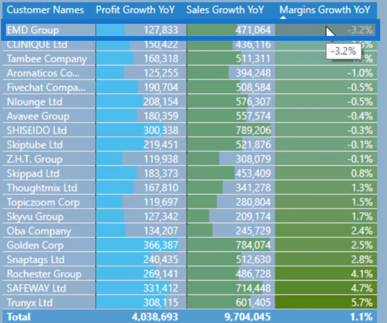
However, you can see that despite having a negative Margins Growth, the customer continues to belong in the Top 20 because of its high Sales Growth resulting in high growths in Profits.
Simply looking at the table can give you more valuable insights into your reports and business.
***** Related Links *****
Find Your Top Clients Across Different Measures In Power BI
Find Top Customers Using RANKX In Power BI
Group Customers Dynamically By Their Ranking With RANKX In Power BI
Conclusion
When you set all this up in Power BI, you’ll see that it’s a great way of drilling into your top and bottom results.
This is a great way of incorporating a number of different measures and visualization techniques to create compelling reports that your consumers are going to love.
All the best,
Sam
[youtube https://www.youtube.com/watch?v=CwbHypQmBz0?rel=0&w=784&h=441]


