
In this tutorial, I’m going to show you some detailed DAX measure analysis on how I put together one of my favorite pages in the report I submitted for the 10th Power BI Challenge.
The Rankings page uses a lot of challenging DAX measures. But with the help of one of our Enterprise DNA experts, Antriksh Sharma, plus some measure branching, I was able to get the results I wanted.

Rankings Page Overview
Before we jump into our DAX measure analysis, I want to show you the different parts of the page that we’re working on today.
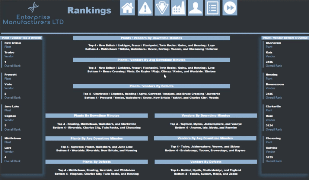
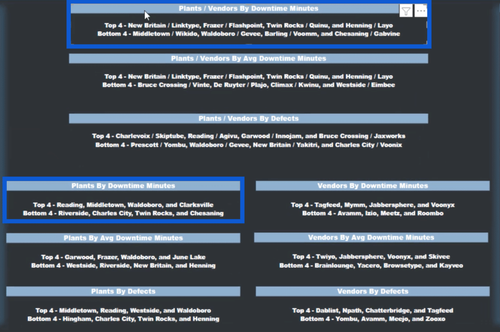
This is how the Rankings page looks like. Unlike the other pages in my report, this contains mostly cards.
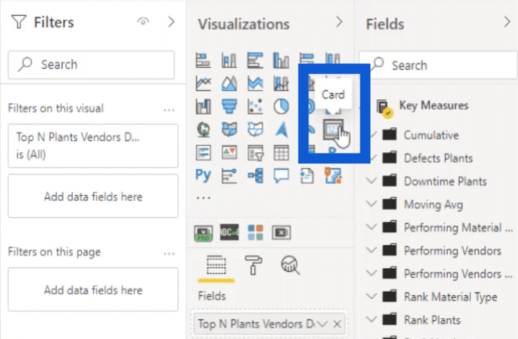
Each of these cards were made using the built-in card visual in Power BI desktop under the Visualizations pane.
It allows you to navigate back to other pages in the report through these icons here on top.
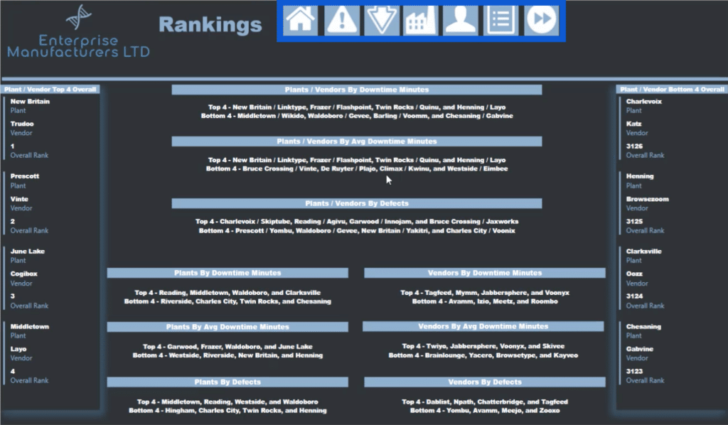
I discussed the other pages of this report in the other tutorials. If you see the other pages in this report, you’ll see that they also have icons leading to this Rankings page.
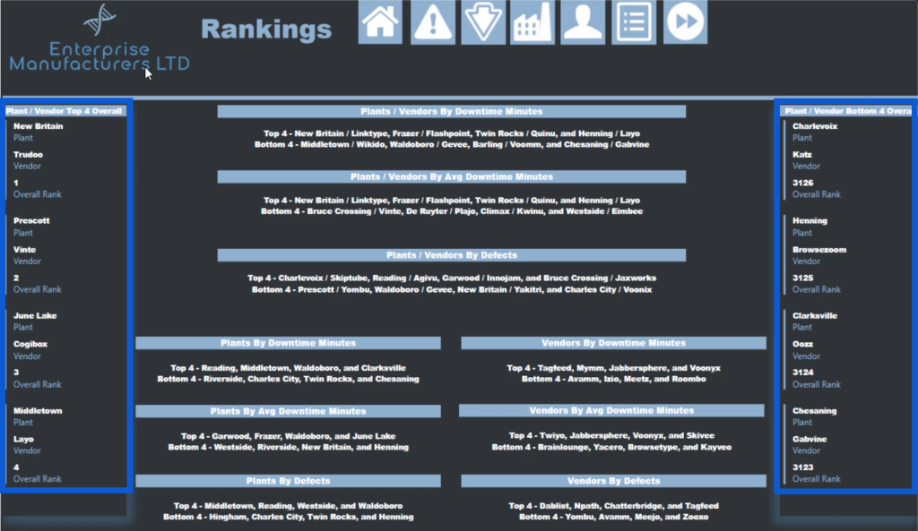
The left side of the page shows the overall top four plants and vendors while the right side shows the bottom four.
I also created individual DAX measures to get more specific results. These three on top, for example, show the top four and bottom four plants and vendors based on the downtime minutes, average downtime minutes, and defects.

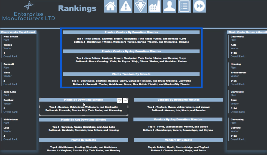
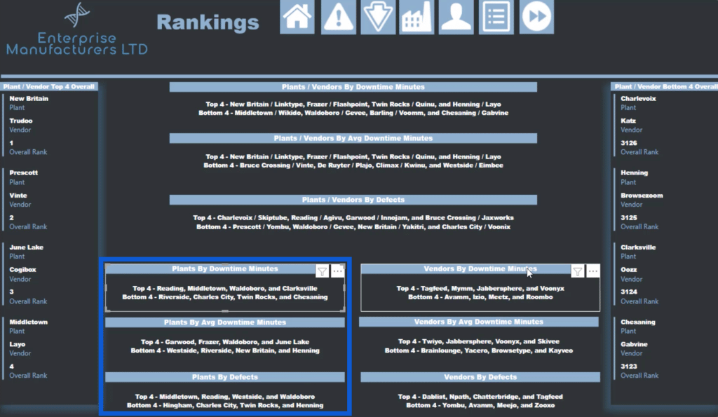
I went even more specific on the bottom part of the report page. On the left side, I got the top four and bottom four plants based on downtime minutes, average downtime minutes and defects.
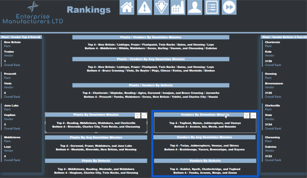
On the right, I did the same thing but based it on the vendor details this time.
As I go through this tutorial, I’ll tell you the story of how I came up with the idea for this page. Then, I’ll give you a step-by-step breakdown on how each of these measures were created.
Getting Ideas For The DAX Measures To Use
I got the idea for the DAX measures in this slide from one of our Enterprise DNA experts, Antriksh. He’s a DAX guru and is great at optimizing measures. It was fun working with him on this DAX measure analysis.
Around two weeks before the 10th Power BI Challenge was announced, we had a conversation on Skype about a PBIX file he posted on the Enterprise DNA Forum.
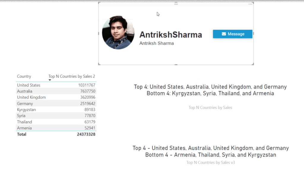
As you can see, I included a picture of Antriksh because he was the inspiration behind the page that we’ll be discussing here. I told him I’d give him credit when I got around to completing this tutorial.
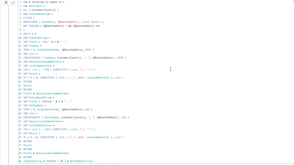
The model is simple and uses some basic data like Customer, Products, and Sales.
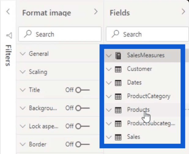
It has a short list of countries on the left side.
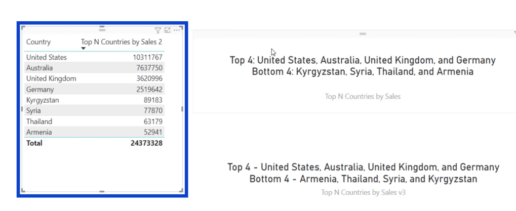
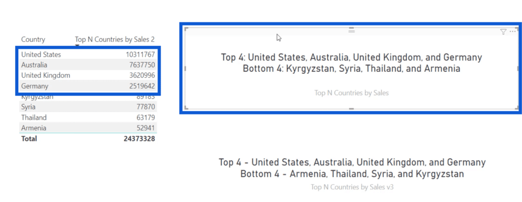
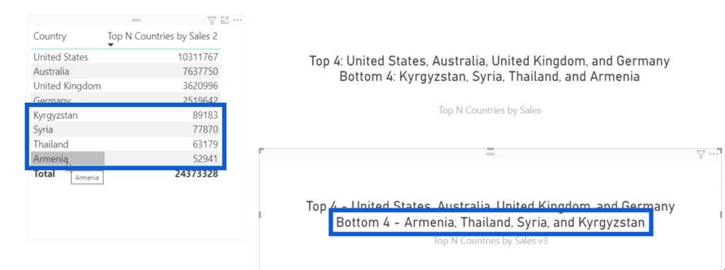
Antriksh created a measure for Top N Countries by Sales. I have the list sorted from highest to the lowest, as indicated by the downward arrow.
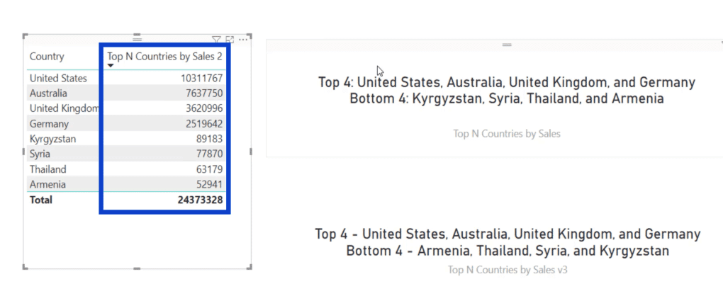
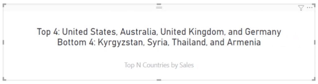
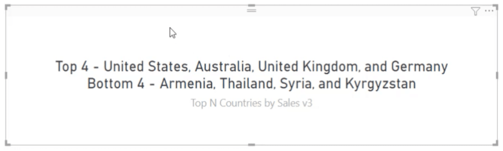
On the right, there’s a card that shows the top four and the bottom four countries. The top four list shows the United States, Australia, the United Kingdom, and Germany, which match the top four on the list.
However, the bottom four is showing up in the opposite order. Instead of going from the bottom, which is Armenia, it started on the 5th on the list, which is Kyrgyzstan.
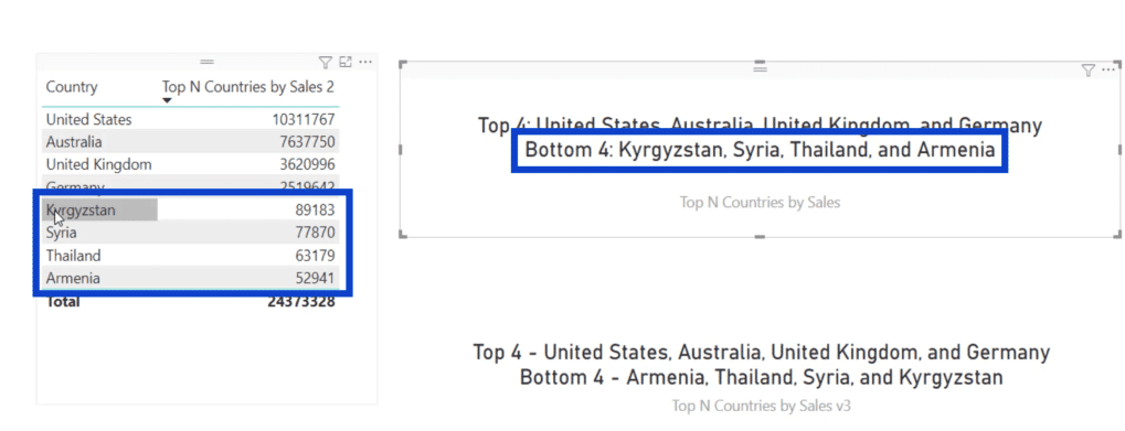
This is why I made another card at the bottom that uses a revised version of the measure used above.
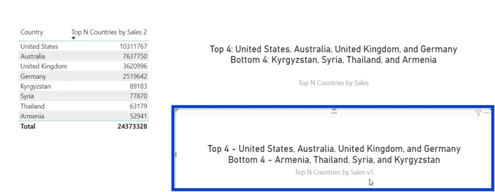
Notice that the bottom four now matches the order that I wanted – Armenia, Thailand, Syria, and Kyrgyzstan.
Let’s go into the DAX measures behind these cards. I’ll start off with the measure that Antriksh created for the 1st card.
The original measure has over 97 rows to get the results we saw on that first card.

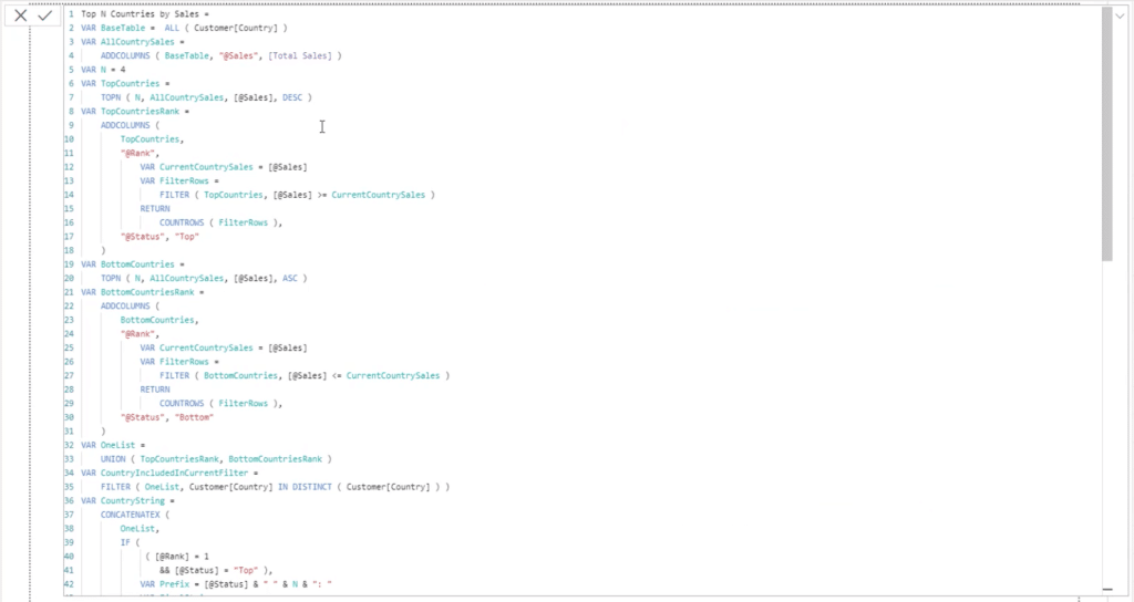
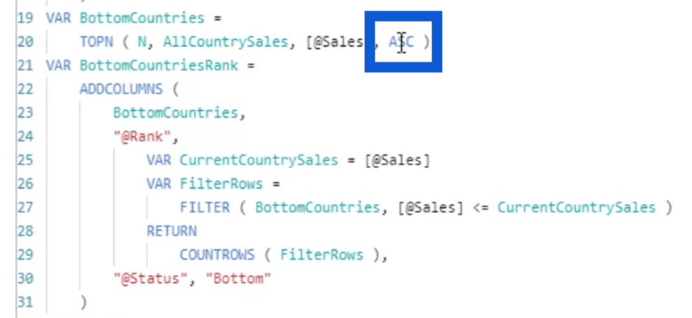
When we scroll down to the 20th row, we can see that Antriksh used ASC. That’s the reason why the bottom four showed up the way it did.
Now that I know where the problem started, I’ll show you how my revised measure looks like.
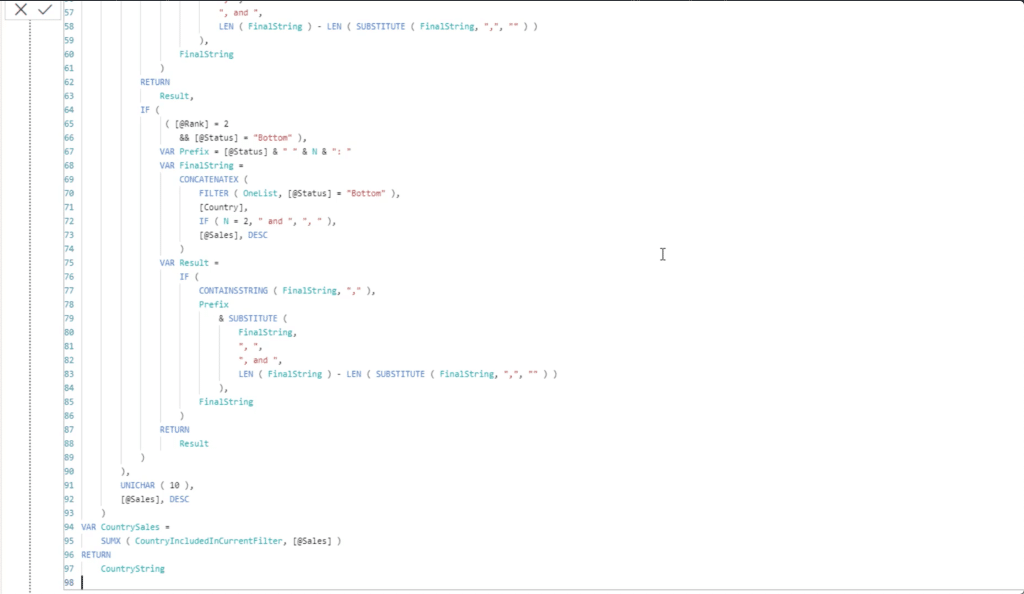
Let me highlight the second card so that I can show you the measure behind it.
As you can see, there are only 41 rows in my revised formula.
I worked with Antriksh to shrink it by 60% or 70% than the original measure. Not only is it less complicated, it also gives me the results I need – with the top four starting from the 1st to the 4th, and the bottom four starting from the 8th to the 5th.
A couple of weeks after my discussion with Antriksh, the 10th Power BI Challenge was launched. Part of the requirements involved a ranking system, which made me think back to Antriksh’s DAX measure. I realized that I can copy and paste the measure, then apply some measure branching to come up with the results I need.
Dax Measure Analysis: Building The Measure Step By Step
Now, I’m going to break down the measures I used for the Rankings page to get the results that I wanted. This DAX measure analysis can help me explain how the measure works, considering how many rows it took to complete it.
In my other tutorials, I’ve shown how I like grouping my measures to make things more organized. So I created a sub-folder for Top N v2.
Within this folder is my measure for Top N Plants Vendors Downtime Minutes. You’ll see that it has the same 41 lines of code that I showed you earlier while discussing Antriksh’s measure. Basically, all I had to do was to replace some items to get the results that I want.
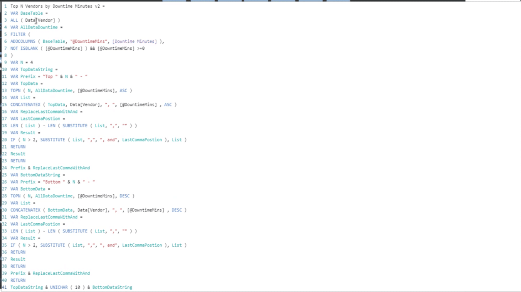
To break this down better, I split this whole measure into 9 different parts. I will go over each of these steps from one to nine and explain what each of these is accomplishing.
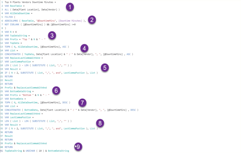
The measure uses a number of variables so that I can get clearer results. Setting these variables helps the end user see how the measure comes together and explains the details of how I got each result.
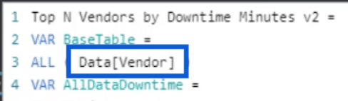
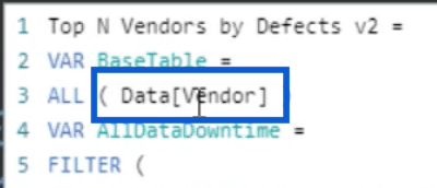
Let’s start with the first step, which sets the VAR called BaseTable.
In this BaseTable, you can see that I’m referencing ALL data for Plant Location and Vendor.
When you go back to the PBIX file, you’ll see the top card that references both the Plants and Vendors. This is why I need all the data here, as opposed to the card further down, which is also for downtime minutes, but only uses plant location data.
Since the first step is straightforward, let’s move on to step two.
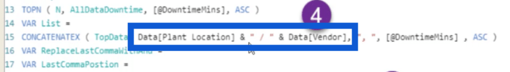
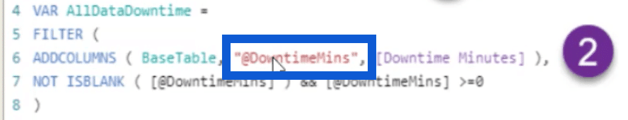
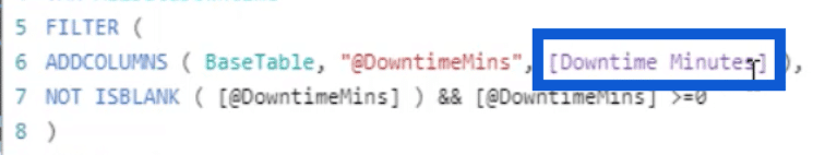
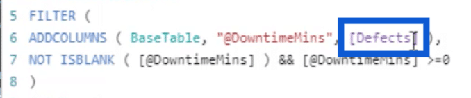
The second step starts off with the ADDCOLUMNS function.
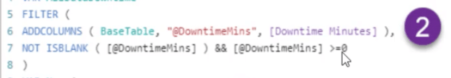
This function references the variable that I created in step 1 and the downtime minutes.
It makes sure that a value shows up by putting together the NOT and ISBLANK functions. I also want the results to be greater than or equal to zero. That’s because the data set used for this report included some combinations where either the plant or the vendor is blank. There are also entries where the value is zero.
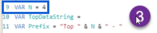
The third step involves yet another set of variables, starting off with the value for N.
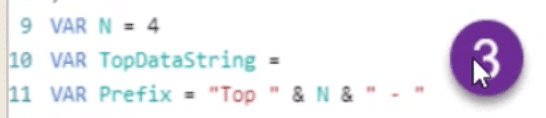
Here, N is equal to 4 because I want the top four and the bottom four to show up.

It also sets a prefix for Top & N, plus a dash.
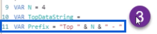
When put together, it simply wants to show “Top 4 -“, which is how the corresponding card starts off before enumerating the expected results.

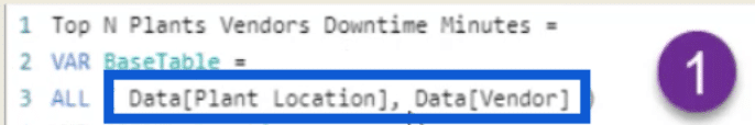
Now, let’s go to the fourth step. This is where I start to come up with the expected results.
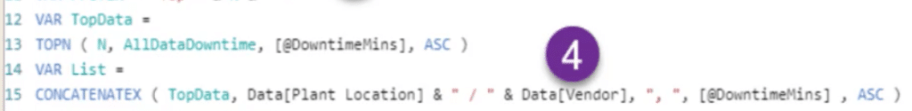
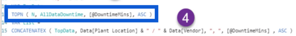
Some would think about using RANKX in this case. After all, I’m trying to rank the entries and come up with the top results. However, Antriksh and I felt that TOPN would be more appropriate in this case since we only need the top four in ASC order.
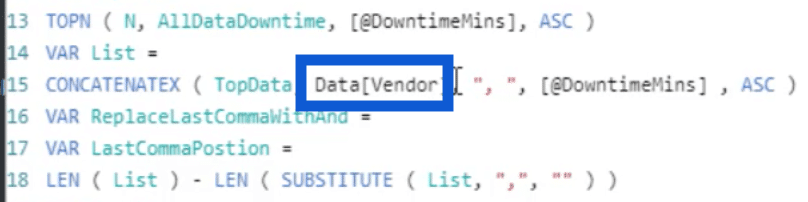
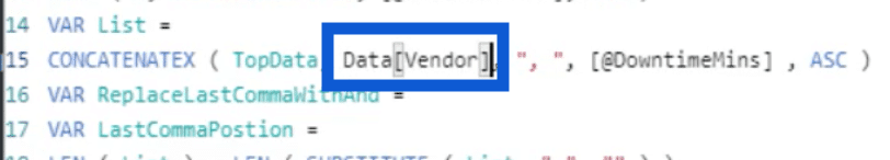
Next, I used the CONCATENATEX function, which uses the Plant Location data.
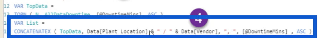
It also sets the format on how I want the list to show up. That’s why you’ll see that it has a backslash and a comma, plus quotation marks to signify spaces. It is also set to ASC order so if I go back to the PBIX file, you’ll see the list of the top four with backslashes and commas in between the results.
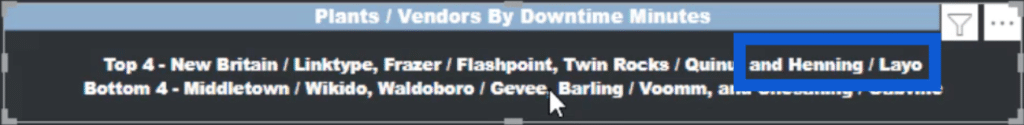
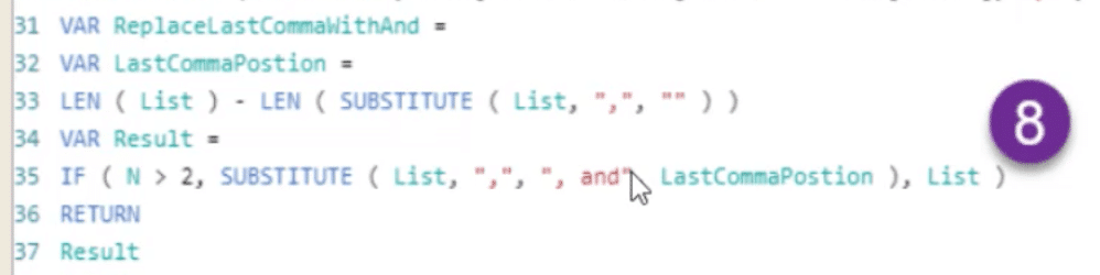
The fifth step of the measure starts by replacing the last comma on the list with an And.
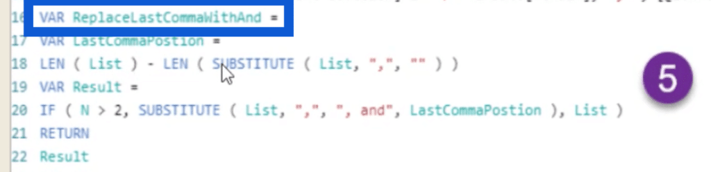
When you go back to the slide, you’ll see that the last entry does have an “and” before the vendor and plant location.
This is what’s being accomplished in step five. It’s creating a list and using the SUBSTITUTE function for the LastCommaPosition.
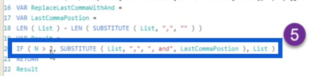
Notice that this says that N is greater than 2. This means that the substitution happens after the 3rd string.
The sixth step will look familiar because it basically copies the same thing I did on top to start the list with “Top 4 -“.
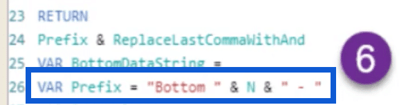
The only difference here is that I want it to show up as “Bottom 4 -” instead of “Top 4 -“.
The part I previously discussed about using CONCATENATEX is once again used here at the bottom, but now I’m calling the variable BottomData instead of TopData. Again, this part inserts the backslash and comma in between the names of the plants and vendors.
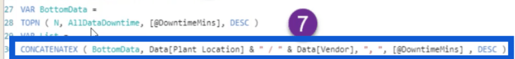
When we look back at Antriksh’s original measure, this is also the same part where he used ASC, which resulted in the list coming out not as I expected. That’s why I’m using DESC here instead.
So basically, at this point onwards, most of it is just copied and pasted from the earlier parts of the measure. I’m just replacing the word “Top” with “Bottom” in most cases.
For step 8, I want to change the last comma with the word And.
The ninth step wraps up this measure.
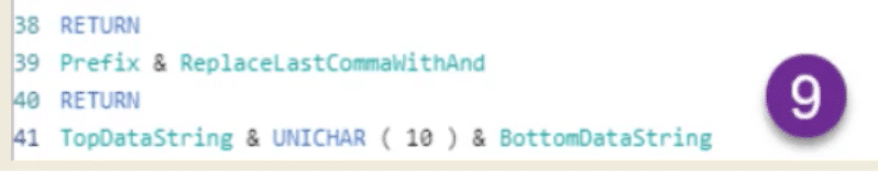
This uses the UNICHAR function with the number 10. This ensures that the Top 4 and the Bottom 4 are showing up on separate lines. Think about it as the return key on your keyboard. It makes you go down to the next row so that the top and bottom four don’t show up on a single line.
Verifying The Results
Antriksh and I were able to trim down the original 90 plus rows of DAX into 41 lines. However, 41 lines might still be a lot for some users. Breaking down that measure the way we did was a great way to understand why the measure had to be written that way.
Now that I’ve explained what each step was all about, it’s time to verify whether that measure really does what it’s supposed to do. Let’s go to the Rankings page and verify the results with the other part of the report.
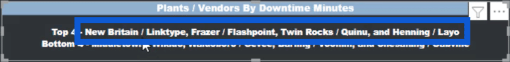
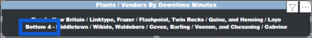
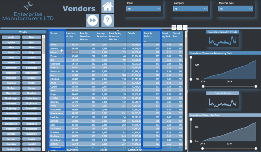
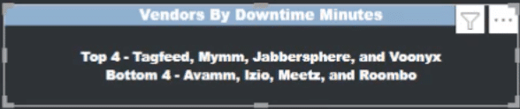
I’ll start with the Plants/Vendors By Downtime Minutes.
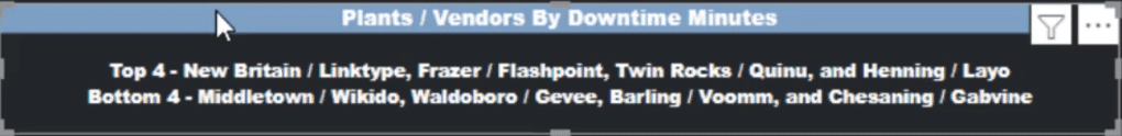
This shows the top four as Linktype in New Britain, Flashpoint in Frazer, Quinu in Twin Rocks, and Layo in Henning. As for the bottom four, it shows Wikido in Middletown as the worst overall.
Now, I’ll head over to the page for Vendors and Plants Combined to see if the results will match.
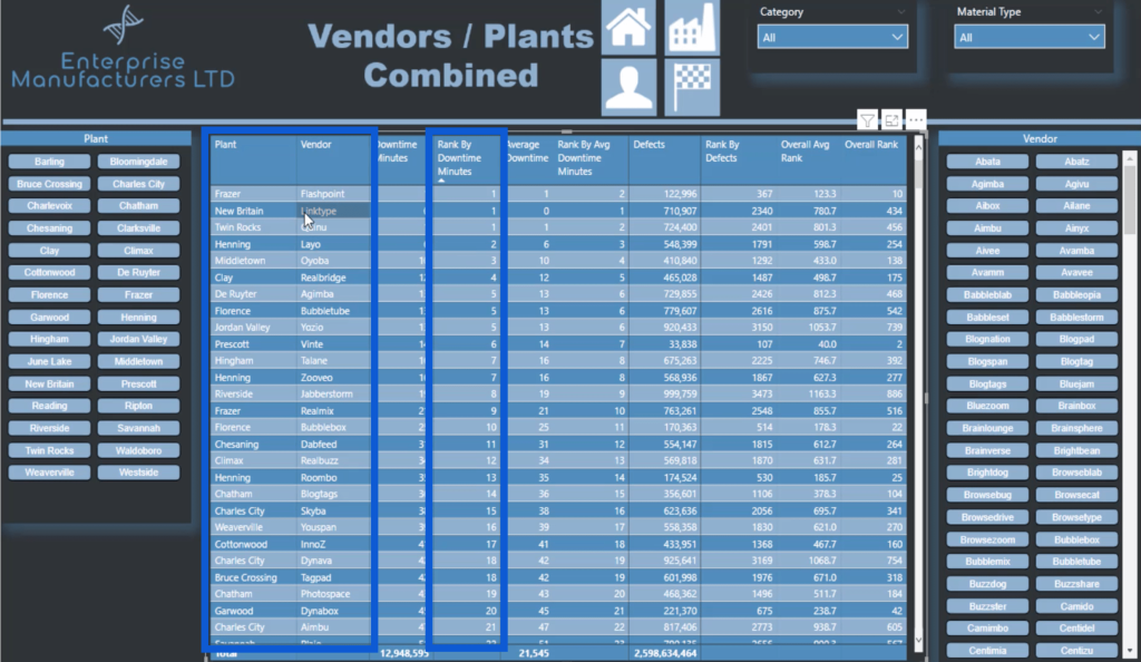
With the Rank By Downtime Minutes column sorted from top to bottom, it does show the correct result for the top four.
Some of you might wonder, however, why New Britain is showing up second on this list, when it comes up on top of the Rankings page card.
Notice that the ranking shows three entries as top 1. These were ranked using RANKX.
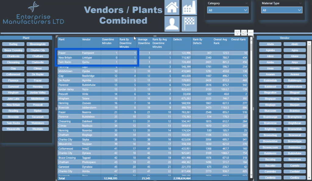
However, if you look at the column for Downtime Minutes, it shows that New Britain shows 0 while Frazer and Twin Rocks each show 1. That’s why on the card in the Rankings page, New Britain still came out on top of Frazer and Twin Rocks even if they were all ranked as number one.
Now, let’s check if the bottom four are correct. Just sort the Rank By Downtime Minutes in descending order.
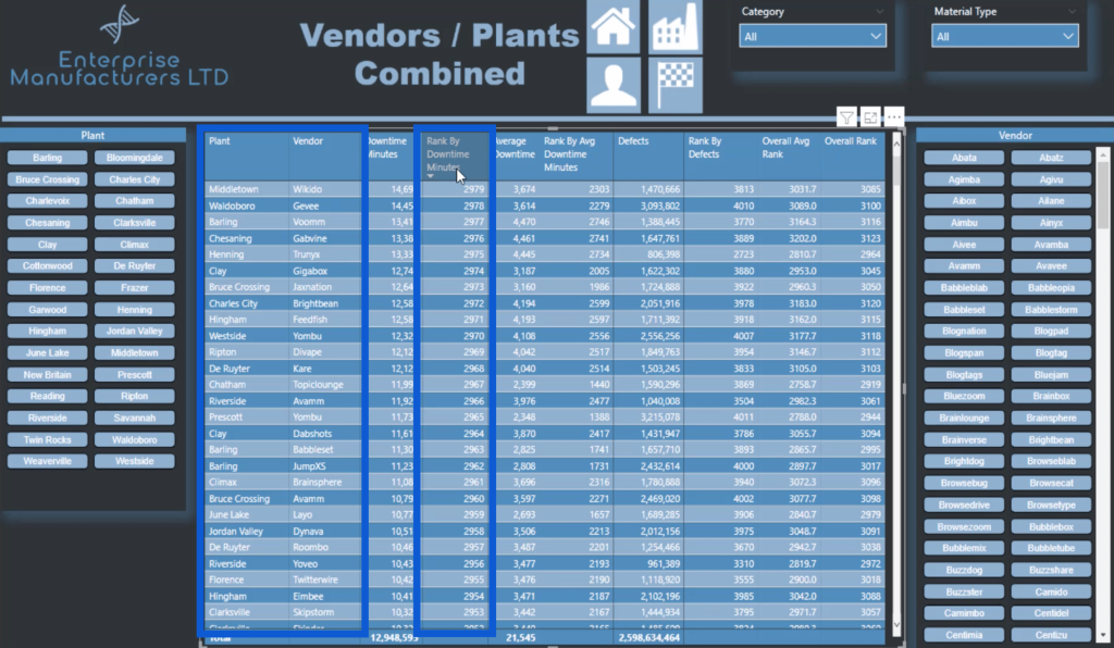
As you can see, it does show Middletown, Waldoboro, Barling and Chesaning as the bottom four on the card. This means that the measure for Plants/Vendors By Downtime Minutes is correct.
Now, let’s look at the card for Plants By Downtime Minutes.
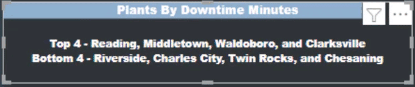
This shows that the top four are Reading, Middletown, Waldoboro, and Clarksville. The bottom four are Riverside, Charles City, Twin Rocks, and Chesaning.
To verify these results, I’m going to check on the Plants page and see if the results match. The biggest difference here is that the card we previously verified was based on both the Plants and the Vendors data, whereas this one only looks at Plants data.
When we sort the Rank by Downtime Minutes from top to bottom, it does show that the top four are Reading, Middletown, Waldoboro, and Clarksville.
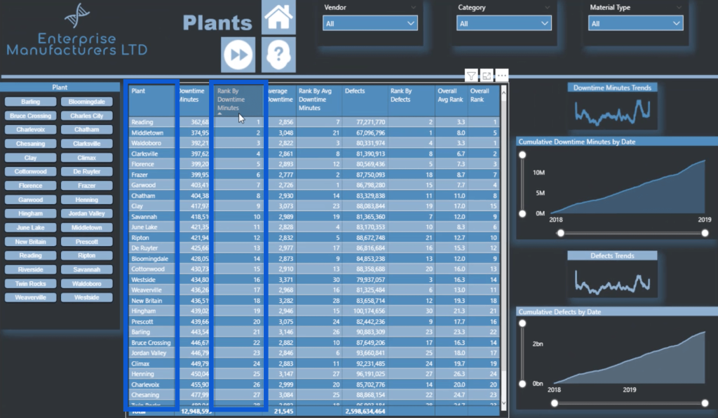
Now, let’s reverse the rank this time to see if the bottom four match. You’ll see that out of the 30 plants on our list, Riverside, Charles City, Twin Rocks, and Chesaning get the bottom ranks.

This means that we’re seeing the correct results for plants.
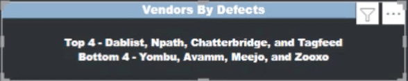
This time, let’s look at a card that ranks Vendors By Defects.

I’ll go to the Vendors page this time to see if Dablist is the top vendor and Yombu is the worst based on defects.
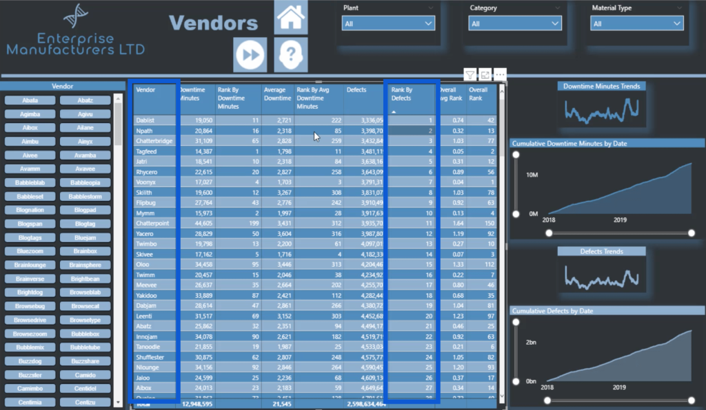
When we sort the vendors from best to worst, it looks like the top four are a match to the card on the Rankings page.
Let me switch the rank from worst to best and see if the bottom four match, too.
You’ll see that Yombu is indeed the worst, along with the other three included in the bottom four list on the card.
Dax Measure Analysis: Applying Measure Branching
The DAX measure analysis that we did earlier only looked at the measure behind Plants / Vendors By Downtime Minutes. But how did I work on the measures for the other cards? This is where measure branching comes in.
Measure branching involves the use of an existing measure to derive other results.
In this report, I simply copied and pasted the measure we discussed earlier and changed some of the elements to fit what I need.
The name of the measure is obviously the first thing that I’m going to change. But more than that, I also need to change the data I’m referencing. For example, we used both the Plant Location and Vendor data for our original measure.
But if I’m going to use the same measure for Plants By Downtime Minutes, then I’d have to remove the Vendor data and just focus on Plant Location.
I will have to change that for all the other parts of the same measure that also references both sets of data, like when I used CONCATENATEX.
The same is true for the Downtime Minutes. If I were to work on a card that looks at Average Downtime Minutes or Defects, then all I have to do is change this part.
As for the part where it says “@DowntimeMins” in the measure, it wouldn’t hurt to keep it that way even if I’m referencing my Defects or my Average Downtime Minutes.
But if you’re the type who likes to keep things in a certain order, you could go in and change this as well. Just remember that if you change this, you’d have to change it all the way throughout the page. That means putting in some additional effort for the same results.
You can just imagine how much time I saved by using measure branching. Doing it this way means that I won’t have to keep creating new measures for every part of the report I work on. I just need to tweak the existing measure based on the results I want to see, cutting my report development time by a great deal.
To show you how I did that, let’s look at Vendors By Downtime Minutes.
When I pull up the measure, you’ll see that it has the same 41 rows as Plants / Vendors By Downtime Minutes.
However, on step 1, I only referenced Vendor data and removed Plant Location.
I changed the data in other places where it’s applicable as well.
I retained Downtime Minutes since this is what I’m basing the results on.
So those are quick fixes to the measure so that it can be applied to the other areas of the report.
Let me show you another example here. This time, let’s look at Vendors By Defects.
Once again, we’re just looking at the vendor here.
What I did change here is the reference to Downtime Minutes. Instead, I used Defects.
I also made sure that the other rows are still using the data for Vendor.
***** Related Links *****
DAX Measures In Power BI Using Measure Branching
Implementing DAX Measure Groups Into Your Reports – A Power BI Modeling Review
Extracting Unique Insights In Power BI Using Ranking DAX Measures
Conclusion
That was some powerful DAX work by Antriksh. I definitely enjoyed working with it, branching it out, and applying it to the different parts of my report.
The in-depth DAX measure analysis we did was also a great way to understand every aspect of the process. Working on a long measure may seem daunting at first, but a thorough DAX measure analysis like this can help sort things out.
Working on this page also emphasized the importance of having a collaborative community like the one we have here at Enterprise DNA. It’s great that everyone has the opportunity to work with people like Antriksh, as well as other members and experts who also have a few tips and tricks of their own.
All the best,
Jarrett


