In this demonstration, we focus on a Power BI Showcase that contains reports presenting key business metrics for a transportation company. You may watch the full video of this tutorial at the bottom of this blog.
The reports in this Showcase use simulated data that came from the bookings received by the company from a variety of clients in different channels.
The data spans five months and is spread throughout the major cities and towns in New Zealand.
This Power BI Showcase is broken up into five reports.
Bookings Summary
The Bookings Summary is the first report, which allows an executive or manager to analyze key business metrics, such as Profit Margins, Bookings, Sales, Discounts, and Data on new customers.

By linking the data model in the report, we’re able to interact with the charts. This allows us to drill into different key metrics within our data.
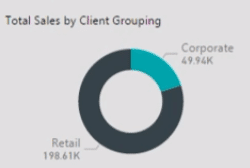
For instance, this chart shows the Total Sales by client grouping.

We can see how the Total Sales is distributed throughout the country.

Bookings Analysis By Location
The second report focuses on location analysis.

This enables us to analyze our data from a spatial perspective.
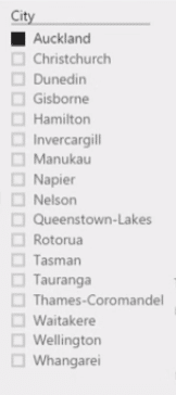
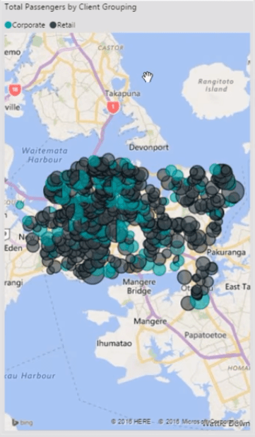
For instance, we can navigate to Auckland and analyze all the bookings per client grouping.


The black represents our retail clients and the blue for our corporate clients.
We can also use the filters to make the charts show data for a specific month.

We can also make a selection on the destination type.

By doing this, we’re able to look at the trends in our data.
Booking Channel & Type
The third report shows the booking channel and type.

It has a similar layout to the second report where the filters are located on the left-hand side, and the summaries are shown in pie charts located at the top of the report.
These charts enable us to filter the other visualizations.

Loyalty & Client Groupings
The fourth report shows the Loyalty and Client Groupings.

The key business metrics are summarized into various visualizations which can be manipulated as desired.

Age, Gender & Passenger Type
The last report focuses on age, gender, and passenger type.

In this report, the charts are dynamically linked to each other which makes it easier for us to filter the metrics and work around the analysis.
***** Related Links *****
Custom Dynamic Segmentation Using DAX In Power BI
Tips For Power BI Report Design – Best Practices
Create Reports In Power BI To Show Deviations And Insights
Conclusion
The five reports within this Power BI Showcase give us a good overview on the key business metrics of a transportation company.
With this, we’re able to gather valuable insights related to the logistics aspect of our business and see the trends in our data.
All the best,
Sam


