
Data visualization is a powerful tool that allows you to communicate complex information in a way that is easy to understand.
As a data visualization professional, you have the opportunity to create visual representations of data that can help businesses make informed decisions and solve real-world problems.
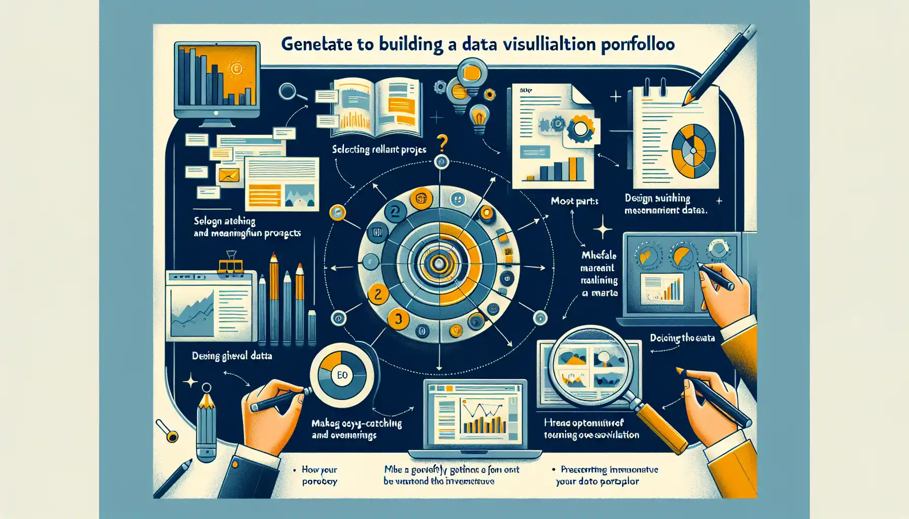
To stand out in this competitive field, having a strong data visualization portfolio is essential. It is your opportunity to showcase your skills and insights.

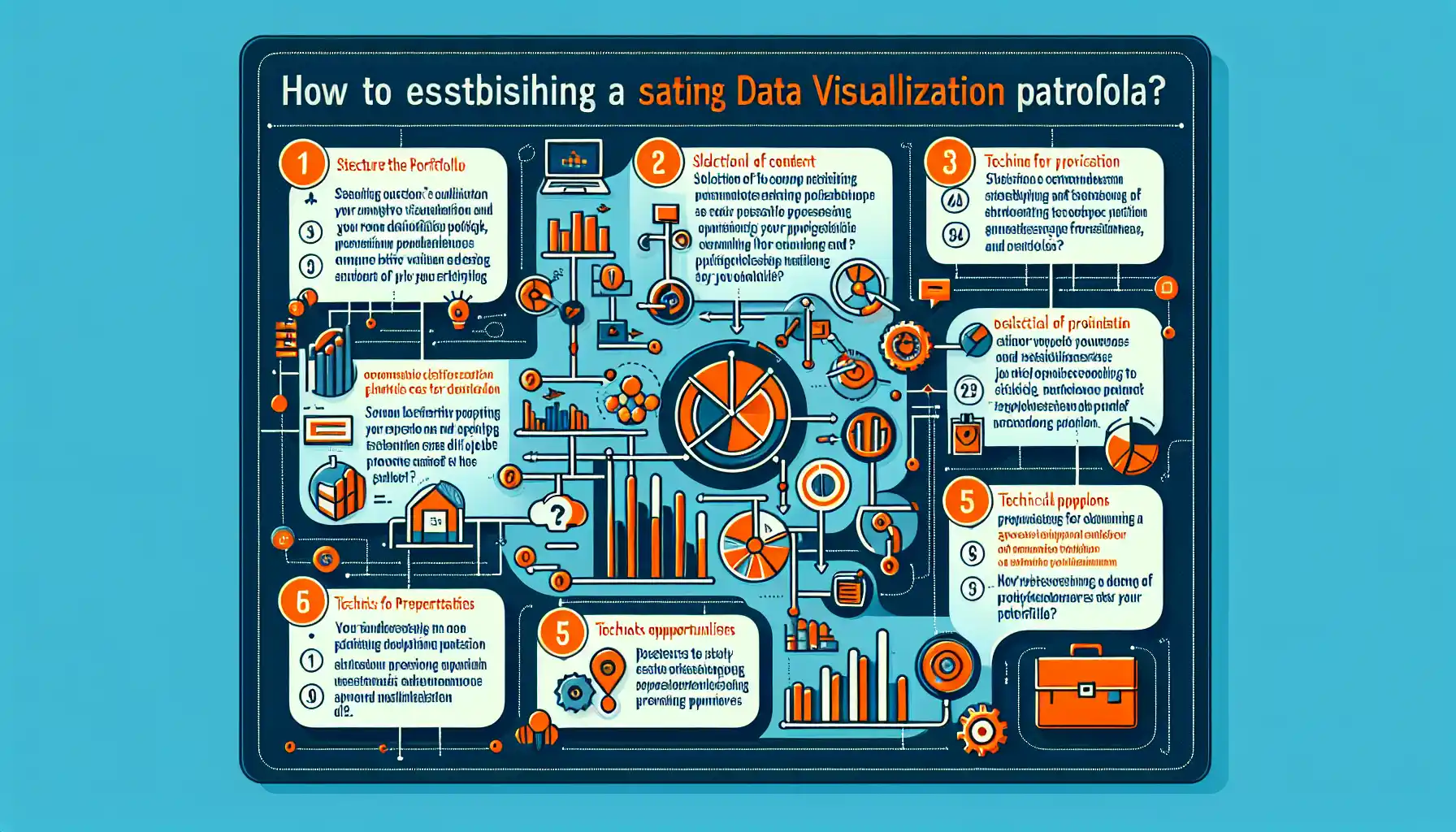
To build a data visualization portfolio:
- Identify your audience and tailor your portfolio to showcase your relevant skills
- Select your best work and organize it into a coherent story
- Use a variety of tools and techniques to create compelling and interactive visuals
- Make your portfolio accessible online
- Keep your portfolio up to date and continually improve it with new projects and insights
In this article, we will dive into the key steps and strategies to build a strong data visualization portfolio. We will also provide tips and examples to help you create a compelling portfolio that showcases your expertise in the field of data visualization.
So, let’s dive in!
Understanding the Purpose of Your Portfolio

Before you start building your portfolio, it’s essential to understand its purpose. Your data visualization portfolio is not just a collection of charts and graphs; it’s a reflection of your skills, insights, and ability to communicate complex information effectively.
Here are a few key reasons why having a data visualization portfolio is important:
- Showcasing your skills: A well-curated portfolio allows you to showcase your abilities to potential employers, clients, or collaborators. It’s a visual representation of what you can do and the value you can bring to their projects or organizations.
- Demonstrating your expertise: Your portfolio is an opportunity to highlight your expertise in specific tools, techniques, and data domains. This can help you stand out in a competitive field and attract opportunities that align with your strengths.
- Building your personal brand: A strong portfolio can help you build a personal brand as a data visualization professional. It can establish you as a thought leader and go-to expert in the industry.
- Networking and collaboration: A portfolio is a powerful networking tool. It allows you to connect with like-minded professionals, share your work, and collaborate on projects that interest you.
- Continuous learning and improvement: As you curate your portfolio, you’ll be constantly learning and improving your skills. It’s a way to track your progress and set new goals for yourself.
Your data visualization portfolio is more than just a collection of visuals; it’s your professional identity in the field.

As you build your portfolio, keep these key reasons in mind to ensure that it effectively serves its purpose.
Key Elements of a Data Visualization Portfolio
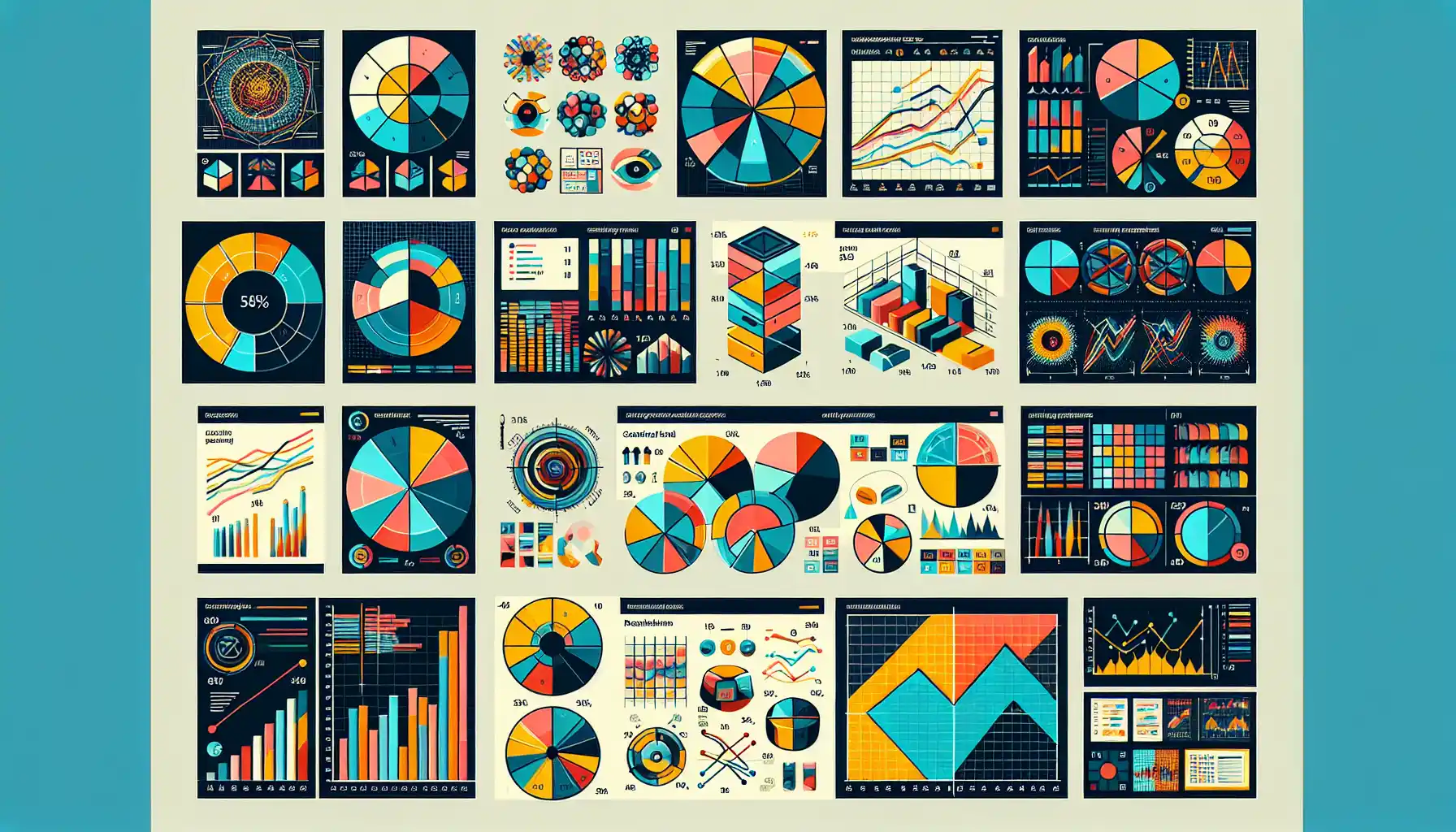
A strong data visualization portfolio is more than just a collection of charts and graphs. It’s a well-crafted narrative that showcases your skills, insights, and ability to communicate complex information effectively.
In this section, we will delve into the key elements of a data visualization portfolio.
1. Storytelling
The most effective data visualization portfolios are those that tell a compelling story.
They take the viewer on a journey, starting with a question or problem, and ending with a clear and actionable insight.
A good data visualization portfolio is not just a showcase of technical skills; it’s a demonstration of your ability to extract meaning from data and communicate it in a way that is easy to understand and act upon.
How to Tell a Compelling Story:
- Identify your audience: Before you start creating your data visualization portfolio, think about who will be viewing it. What do they care about? What are their pain points? Understanding your audience will help you tailor your story to resonate with them.
- Start with a question or problem: A good story begins with a question or problem. What are you trying to answer or solve? What is the purpose of your data visualization? This will provide the context for your entire story.
- Introduce your data: Once you’ve set the stage with a question or problem, introduce your data. What data did you use? Where did it come from? How did you collect it? This will give your audience a clear understanding of the foundation of your story.
- Reveal your insights: This is the “a-ha” moment of your story. What did you discover in the data? What are the key insights or trends? This is where you show your audience that you’ve found something meaningful.
- Provide context: Insights can be powerful, but they need context to be truly valuable. How do your insights relate to the original question or problem? How do they fit into the bigger picture?
- Recommendations and Conclusion: Based on your insights, what actions should be taken? What are the next steps? This is where your story becomes actionable. It’s also important to include a brief conclusion to summarize your findings and their significance.
- Craft your visuals: The visualizations you choose are crucial. They should support your story, not distract from it. Make sure your visuals are clear, easy to understand, and visually appealing. If you have any interactive features, include those as well.
- Iterate and get feedback: Crafting a good story takes time. Don’t be afraid to iterate and refine your story. Get feedback from colleagues, mentors, or friends. Ask them if your story is clear, if it resonates, and if it’s compelling.
A strong data visualization portfolio is one that tells a story.
It’s a narrative that takes the viewer on a journey, from a question or problem to a clear and actionable insight.
As you craft your portfolio, keep the elements of storytelling in mind to ensure that it is engaging, compelling, and effective.
2. Selecting the Right Projects
Choosing the right projects to showcase in your data visualization portfolio is crucial. Your goal is to present a diverse range of projects that highlight your skills, creativity, and problem-solving abilities.
Here are some tips to help you choose the right projects for your portfolio:
- Showcase a variety of data sources: Choose projects that involve different types of data. For example, you might have worked with sales data, survey results, or social media data. This will demonstrate your ability to work with various data sources and tailor your visualizations to the specific context.
- Choose projects with real-world impact: Highlight projects that have had a real impact on the organization or audience. For example, you might have created a visualization that led to a significant increase in sales, improved customer satisfaction, or helped make a key decision. This will show potential employers and clients that your work is not just visually appealing but also drives real results.
- Demonstrate a range of skills: Your portfolio should include projects that demonstrate a variety of skills, such as creating static and interactive visualizations, working with different tools and software, and adapting your work to different target audiences.
- Incorporate feedback: Consider including projects that you have improved upon based on feedback. This will demonstrate your ability to learn and grow from your experiences.
- Tell a story with your projects: Choose projects that tell a compelling story. Think about the insights you gained from the data and how you communicated them to your audience.
- Explain your process: Don’t just showcase the final visualizations; also explain the process you went through to create them. This can include data cleaning, analysis, and design decisions.
- Focus on quality, not quantity: You don’t need to include every project you’ve worked on. Choose the projects that best demonstrate your skills and the impact of your work.
Your data visualization portfolio is your chance to showcase your skills, creativity, and problem-solving abilities.
By carefully choosing the right projects to include, you can create a portfolio that impresses potential employers and clients.
Steps to Build a Data Visualization Portfolio
Now that you have a good understanding of the purpose and key elements of a data visualization portfolio, let’s dive into the steps to build a strong data visualization portfolio.

Step 1: Identify Your Audience
The first step in creating a data visualization portfolio is to identify your audience. Who are you creating this portfolio for?
Are you looking for a job? Are you trying to attract clients? Or are you simply trying to showcase your work to the data visualization community?
The answers to these questions will help you tailor your portfolio to your specific audience.
For example, if you are looking for a job, you might want to include projects that are relevant to the industry you are applying for.
Step 2: Select Your Best Work
The second step is to select your best work. You don’t want to include every project you’ve ever worked on in your portfolio.
Instead, focus on the ones that best showcase your skills and insights.
Ideally, you should aim to have around 5-10 projects in your portfolio.
If you have a lot of work, consider creating a separate section for additional projects.
Step 3: Organize Your Work
The third step is to organize your work. Think about the story you want to tell with your portfolio.
What is the message you want to convey to your audience?
Then, organize your projects in a way that best tells that story.
For example, you might want to start with an introduction that explains who you are and what you do, followed by your best work, and ending with a call to action (e.g., “Contact me for more information”).
Step 4: Use a Variety of Tools and Techniques
The fourth step is to use a variety of tools and techniques. Data visualization is a broad field, and there are many different tools and techniques you can use.
To showcase your skills, try to use a variety of tools and techniques in your portfolio.
For example, you might use Tableau for some projects and D3.js for others.
This will show potential employers and clients that you are versatile and can adapt to different tools and techniques.
Step 5: Make It Accessible Online
The fifth step is to make your portfolio accessible online.
There are many platforms you can use to host your portfolio, such as GitHub Pages, WordPress, or Wix.
Choose a platform that best suits your needs and make sure your portfolio is easy to find and navigate.
Step 6: Keep Your Portfolio Up to Date
The final step is to keep your portfolio up to date. As you work on new projects, add them to your portfolio.

Also, regularly review your portfolio and remove any projects that are no longer relevant or do not showcase your best work.
By following these steps, you can create a strong data visualization portfolio that showcases your skills and insights.
Tools for Building a Data Visualization Portfolio
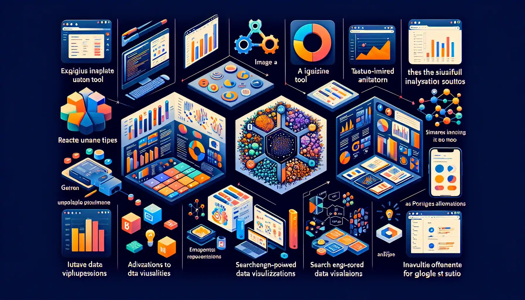
In this section, we will go over the tools you can use to build a data visualization portfolio. The right tools can make your portfolio more interactive and visually appealing.
1. Tableau
Tableau is a popular data visualization tool that can help you create interactive and dynamic visualizations for your portfolio.
With Tableau, you can easily connect to your data, create a wide variety of charts and graphs, and customize the appearance of your visualizations.
2. Power BI
Power BI is another powerful data visualization tool that you can use to create interactive dashboards and reports.
It also offers a wide range of visualization options and allows you to connect to multiple data sources.
3. D3.js
If you are comfortable with programming and want to create custom visualizations, D3.js is an excellent choice.
D3.js is a JavaScript library that allows you to create highly customizable and interactive visualizations.
It’s more advanced than Tableau and Power BI, but it gives you full control over the appearance and behavior of your visualizations.
4. Microsoft Excel
If you’re just getting started with data visualization, you can use Microsoft Excel.
It offers a range of basic visualization options and is easy to use.
5. Google Data Studio
Google Data Studio is a free data visualization tool that can help you create interactive and shareable dashboards.
It allows you to connect to a wide variety of data sources and offers a range of visualization options.
6. GitHub
If you want to create a more custom and interactive data visualization portfolio, you can use GitHub.
GitHub allows you to host your portfolio for free and provides version control for your code and data.
By using these tools, you can create a compelling and interactive data visualization portfolio that showcases your skills and insights.
Final Thoughts
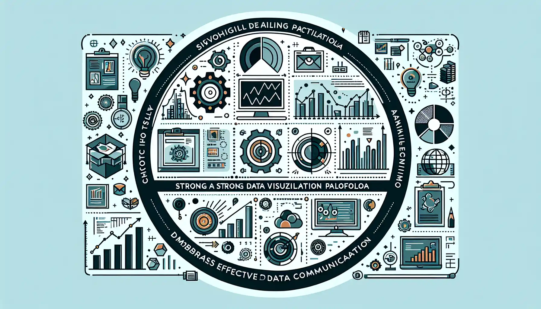
A strong data visualization portfolio is an essential tool in today’s data-driven world. It allows you to showcase your skills and insights, stand out in a competitive field, and attract the right opportunities.
By carefully selecting your projects, telling a compelling story, and using the right tools, you can create a portfolio that not only impresses potential employers and clients but also helps you grow and learn in the field of data visualization.
Frequently Asked Questions
In this section, you’ll find some frequently asked questions you may have when building a data visualization portfolio.
What are some good data visualization projects to include in my portfolio?
When building your data visualization portfolio, you should include a variety of projects that showcase your skills and expertise.
Choose projects that are visually appealing and informative.
Some examples of good data visualization projects to include in your portfolio are:
- Creating a dashboard to visualize company sales data
- Mapping COVID-19 data to show infection rates
- Visualizing the performance of a stock portfolio over time
- Analyzing survey data and presenting the results in an interactive format
- Tracking and visualizing website traffic data
- Showcasing the results of a predictive analytics model
How can I showcase my data visualization skills in a portfolio?
To showcase your data visualization skills in a portfolio, you should focus on creating visually stunning and informative projects.
Use a variety of charts, graphs, and interactive features to engage your audience.
Demonstrate your ability to turn complex data into easy-to-understand visuals.
Ensure your portfolio is well-organized and easy to navigate, and highlight the impact of your work in each project.
What tools can I use to build a data visualization portfolio?
There are many tools you can use to build a data visualization portfolio. Some popular choices include:
- Tableau: A powerful data visualization tool with a user-friendly interface
- Power BI: A Microsoft tool for creating interactive visualizations and dashboards
- Google Data Studio: A free platform for creating data visualization reports and dashboards
- D3.js: A JavaScript library for creating custom and interactive data visualizations
Choose a tool that aligns with your skill level and the requirements of your projects.
How should I structure my data visualization portfolio?
A well-structured data visualization portfolio should be organized and easy to navigate.
Start with an introduction that explains your background and expertise in data visualization.
Next, showcase your best projects, providing a brief description and the tools and techniques used for each.
Highlight the impact of your work and any notable insights.
Finally, include a way for visitors to contact you or learn more about your services.
What are some data visualization portfolio examples I can look at for inspiration?
There are many data visualization portfolio examples available online that can serve as inspiration for your own portfolio.
Search for “data visualization portfolio examples” in your preferred search engine to find a wide range of portfolios.
You can also explore websites like Dribbble, Behance, or Tableau Public to discover exceptional data visualization work.
Study these examples to get a better idea of what makes a great portfolio and how you can showcase your skills effectively.
How can I make my data visualization portfolio stand out?
To make your data visualization portfolio stand out, focus on creating visually stunning and informative projects.
Use a variety of visualization techniques, such as color theory, typography, and composition, to engage your audience.
Demonstrate your ability to turn complex data into easy-to-understand visuals.
Ensure your portfolio is well-organized and easy to navigate, and highlight the impact of your work in each project.


