
In today’s Power BI DAX tutorial, I want to go over quite an interesting technique that uses DAX really effectively. I had to work on a scenario where we were running some analysis on our email campaigns. I wanted to know how many emails we receive in a day, compare it on a monthly basis, and also compare the current month to the best month. You can watch the full video of this tutorial at the bottom of this blog.
A Cumulative Comparison Between Best Month & Current Month
I have a dynamic dataset data coming in on a current month and would like to always compare it to whatever the best month was, so I can track how I’m doing versus my best month.

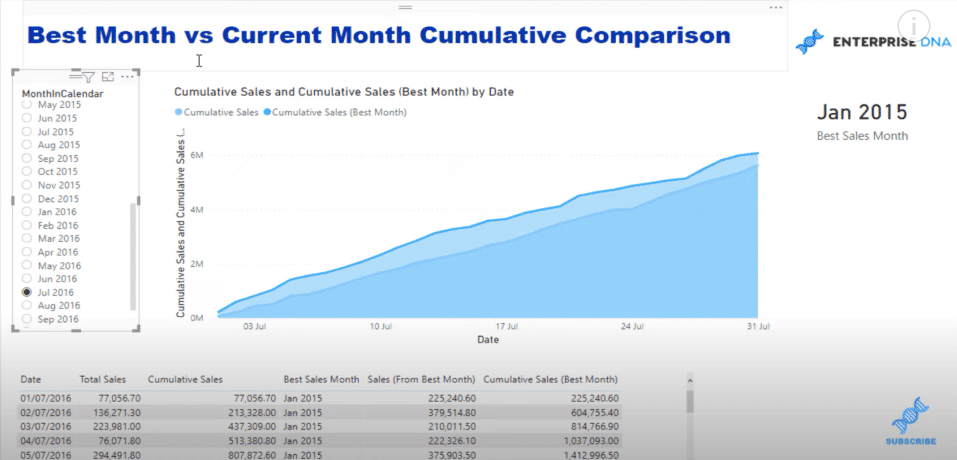
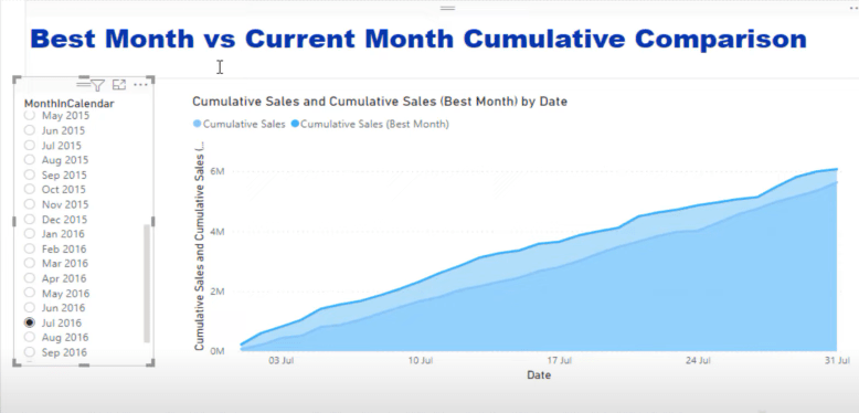
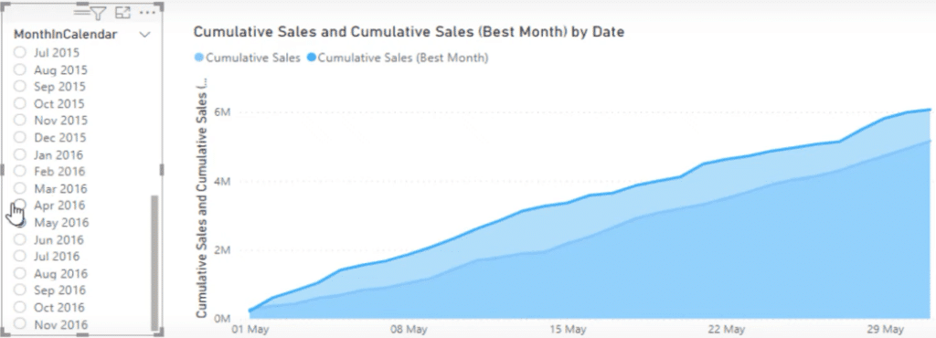
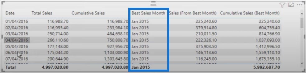
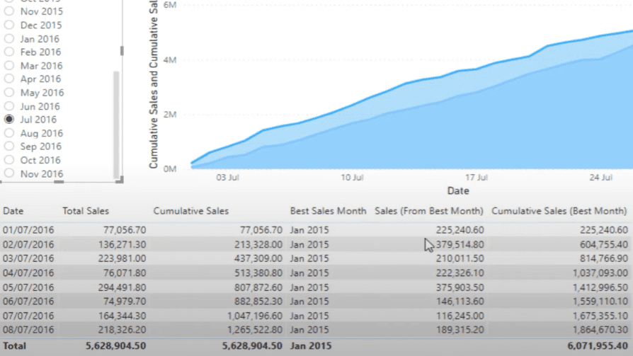
To start off this Power BI DAX tutorial, I’ll show you the functionality first. When I click through the MonthInCalendar slicer (left table), you’ll see that my best month always stays the same.
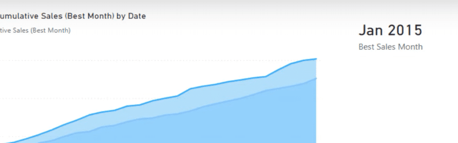
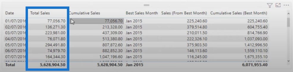
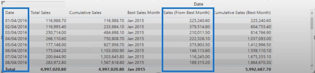
My best month within this data was January of 2015.
I can click on any month in the MonthInCalendar slicer and see how I performed versus my best month.
Cumulative Sales Calculation
The first thing you need to do is to set up your comparison calculation. When I click through MonthInCalendar, you’ll see that the context in the table is changing as I select different things in the filter.
Obviously, context is key here. It is important to understand what is the context of the calculation, which in this particular case is July 2016.
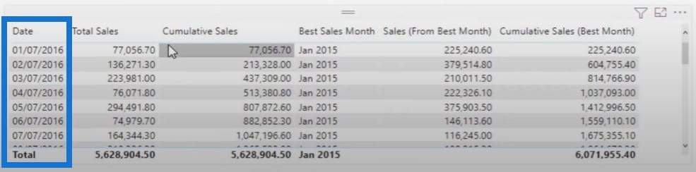
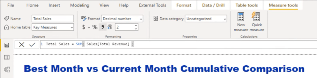
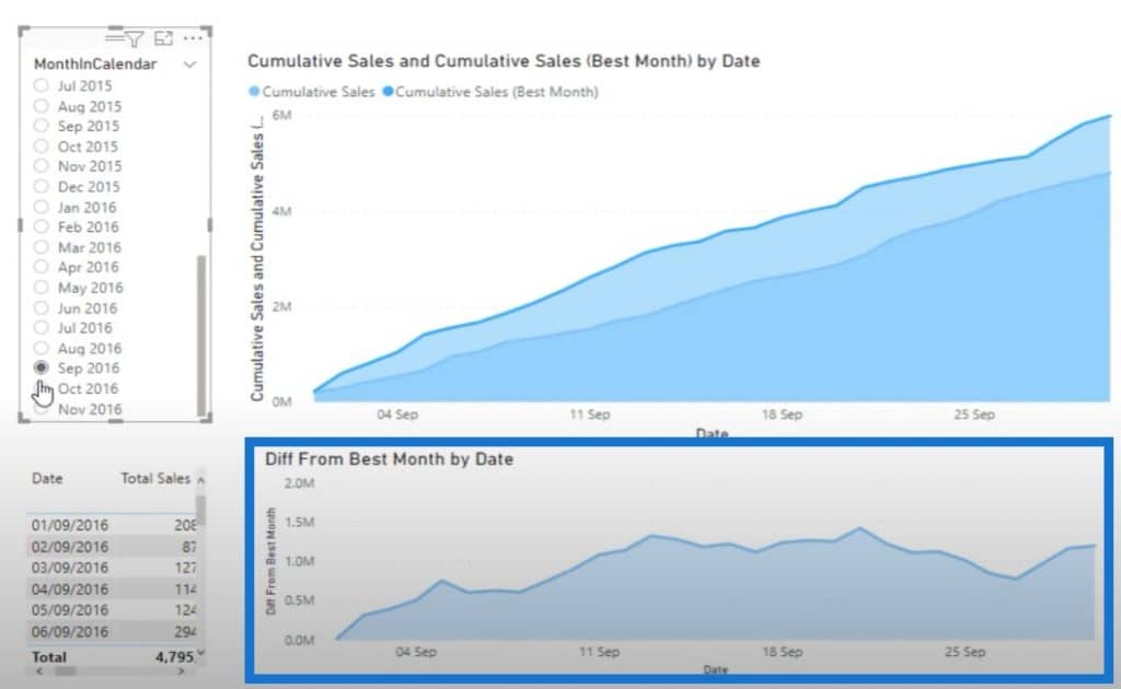
As you can see from the image below, for July 2016, I calculated my Total Sales, which is a simple sum of the revenue column.
And then I used a cumulative sales pattern that can be reused over and over again.

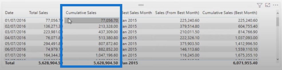
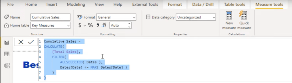
I used the ALLSELECTED function so that the calculation always starts out at the beginning of my selected context. The cumulative sales calculation is the one in the lighter blue line below, and it’s always changing every time I change the filters in the MonthInCalendar slicer.
Now I want to compare this to the best. To do so, I’ll use measure branching where I branch out from one measure to the next.
Best Sales Month Calculation
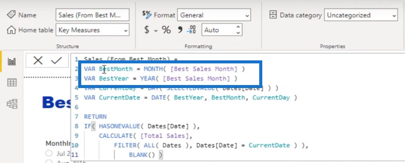
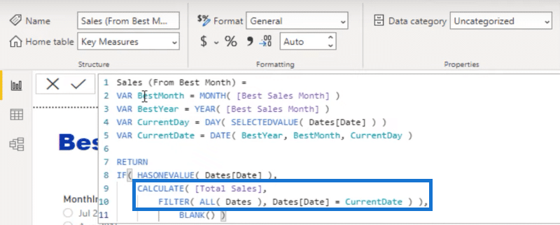
The first thing I need to work out is my best sale month. I’m going to feed in the data points from this month into my next calculation, which is going to work out the sales on every unique day of that month.
I went with a formula using the MAXX iterating function, which allows you to return a text value, but what I needed to do is isolate one result. Unfortunately, formulas can’t return two text values. They can only return 1. If you do more than 1, it’s going to return an error.
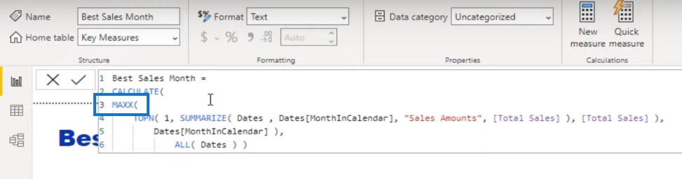
If we go with TOPN 1, it’s only going to create a table of one row or one value. I created a table of all of my months and years, then worked out the Total Sales for those particular months. The TOPN function is going to rank them so that I get my highest month by sales at the top.
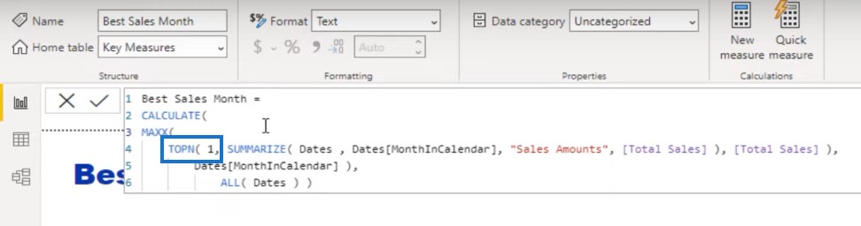
Then I’m going to return the name of that particular month, which is what MAXX does.
The other thing I need to do if I want to see the best month in this table is to remove the context of dates.
So we are basically disregarding any context coming from Dates, and isolating the top month. And then we’ll put that top month and year on every single row.
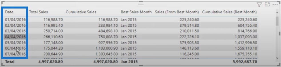
So this is the first stage. The second stage is to work out the sales on each of those days. We want to compare on a daily timeframe, and know the difference in sales from one month to another month.
I used variables effectively to lay it out and make it as easy as possible to understand. I used the calculation that we just created, the Best Sales Month measure. Because this measure is on every single row, I can extract the information from that particular result.
I’m going to extract the results for the month and year using variables.
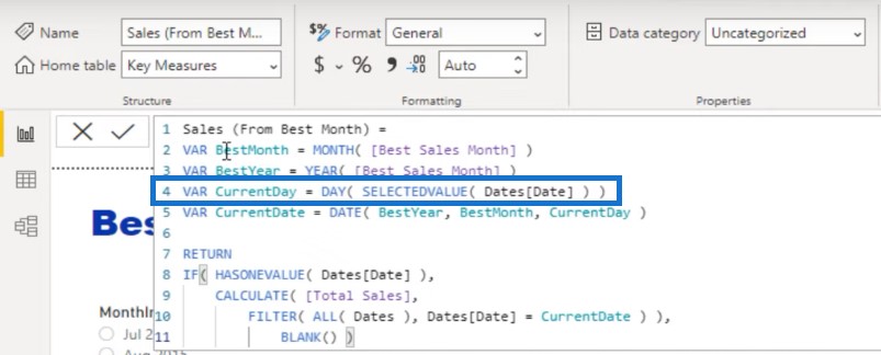
Then I’m also going to work out the results for each day by using the DAY and SELECTEDVALUE functions.
Then I can set up the actual date that we need to choose from.
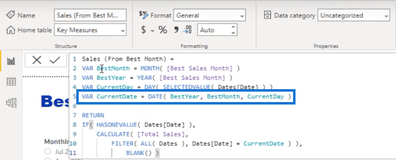
I’ve also done a simple calculation where I’ve placed a filter on Dates so I can find what the actual sale was from every single day.
Daily Results Comparison: A Power BI DAX Tutorial
A cumulative calculation is the best way to showcase different trends.
When you’re looking at trends over time, cumulative totals are the best thing to do. But if you want, you can also do daily calculations and compare daily results.

We already have our sales from the best month on every single day now. The next step to do here is to calculate what the cumulative is of that. Now, this is where things can get a little trickier. We can’t use the cumulative pattern we used earlier. We need to use a different pattern that allows us to create a virtual table of these results.
This time around, we’re using a common pattern used for calculating the cumulative total of a more complex number, and not for a simple core measure. Instead of using the CALCULATE filter, I used SUMX, which creates a virtual table of all the results.
Then we are going to calculate if the data is less than or equal to the current date.
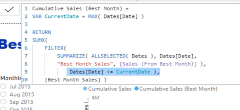
In theory, we’ve isolated the Date column and the Sales from the Best Month column put them into a virtual table and ran calculations over that virtual table.
At the end of this calculation, we’re iterating through every single result through the virtual table, accumulating results as we go. Lastly, we’re calculating the ultimate end result using the Best Month Sales, below the SUMX function.
So now I have my Best Month showing up as January 2015 while using a different context. The context changes by clicking around the MonthInCalendar slicer. However, the results from Sales from Best Month always stay the same because they’re referencing back to the dates that we have specified, while the Cumulative Sales total is happening off the back of it.
Difference From Best Month Calculation
We can obviously go further than this. We can find out the difference and create another insight using this simple calculation.
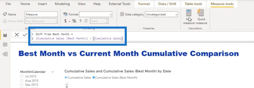
Measure branching is the absolute key here. I can turn the Difference from Best Month calculation into another line chart so that we can quickly identify how we are actually tracking on any particular timeframe.
***** Related Links *****
DAX Measures In Power BI Using Measure Branching
Use Measure Branching To Speed Up Report Development
DAX Calculations In Power BI: Best Practices
With the bottom line chart, you can see over time how our current sales are versus the best month.
Conclusion
To summarize this Power BI DAX tutorial, I showed you how to compare your current trends with your best sale trends using DAX techniques and measure branching.
Hopefully, you learned some of the best practices when it comes to using DAX and implementing them into your own report development.
If you enjoyed the content covered in this particular tutorial, please subscribe to the Enterprise DNA TV channel. We have a huge amount of content coming out all the time from myself and a range of content creators, which are all dedicated to improving the way that you use Power BI and the Power Platform.
Sam


