This idea around data visualization with Power BI came up purely from a client requirement, and by implementing it I thought wow, this actually has many applications. It’s also not that difficult to implement in Power BI. You may watch the full video of this tutorial at the bottom of this blog.
I know this happens everywhere in organizations, so I’m sure you can relate, but have you ever created a PowerPoint presentation and then had to fill in some space with commentary that no one likely will read or remember after the meeting you go to?
In this blog post, we are going to run through how we can create some dynamic commentary in your reports and incorporate this type of data visualization with Power BI. I don’t think Power BI is the best use for commentary because we want to visualize things here as much as we can, but occasionally there will be times when a commentary will be a requirement.
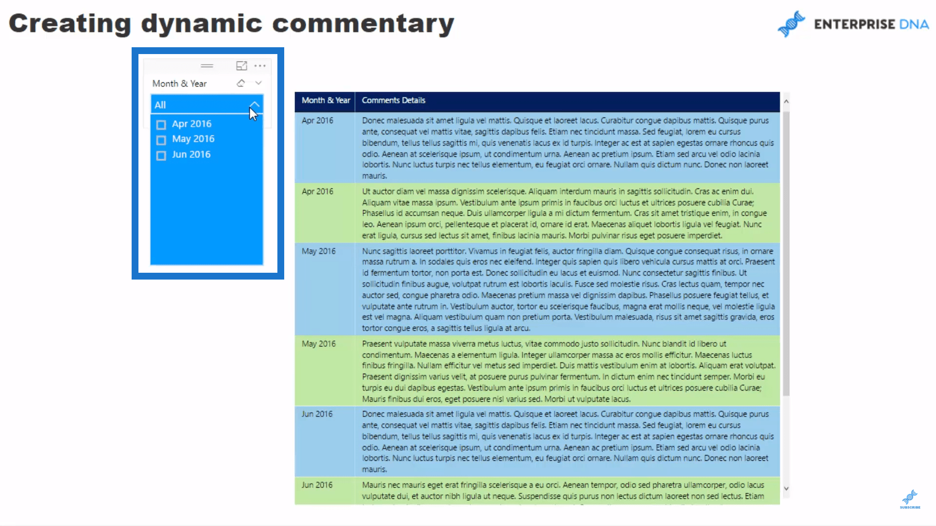
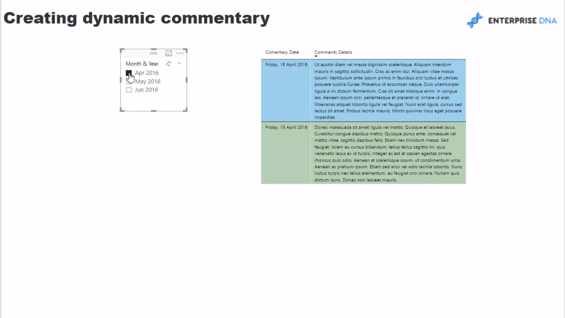
It is great that you can create dynamic commentary in Power BI. Aside from filtering and slicing visuals, you might want to slice the commentary inside of your report pages so that they are aligned to the visuals. In this example, I have a commentary and a slicer based on a month.
If we click on April, we can see that the table changes to reflect the commentary made on April. When we click on May or June, the table will also change to reflect the commentary made on those months.
This could be a very common requirement in reporting, especially when there is a lot of commentary at the time and you want to look back at not only visuals historically but also what was going on at the time. This feature is a great way to retrace your steps and learn more about data visualization with Power BI.
You can actually log all of the commentary that is coming in and change an entire report page based on what you selected. I’m going to show you how you can do this in Power BI. It’s not really that difficult; it is just a matter of setting things up well in the background.
Key To Making Commentary Dynamic
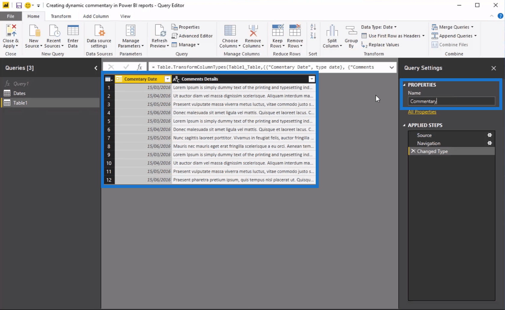
Let us start with a blank sheet and a simple date table filled with dimensions we’re going to use. We need to connect to the table we have set up for this example. This is just an Excel table filled with two columns: the dates on when the commentary was entered and the commentary details. We’ll call this table Commentary and then add it to our data model.
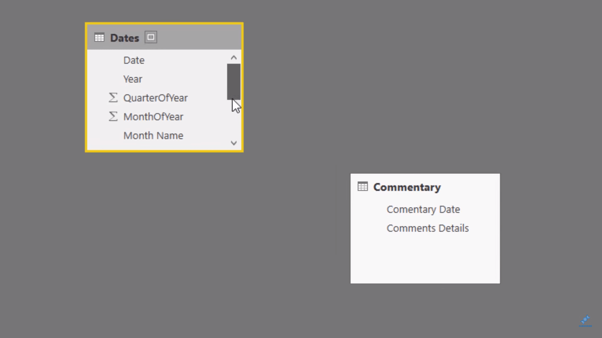
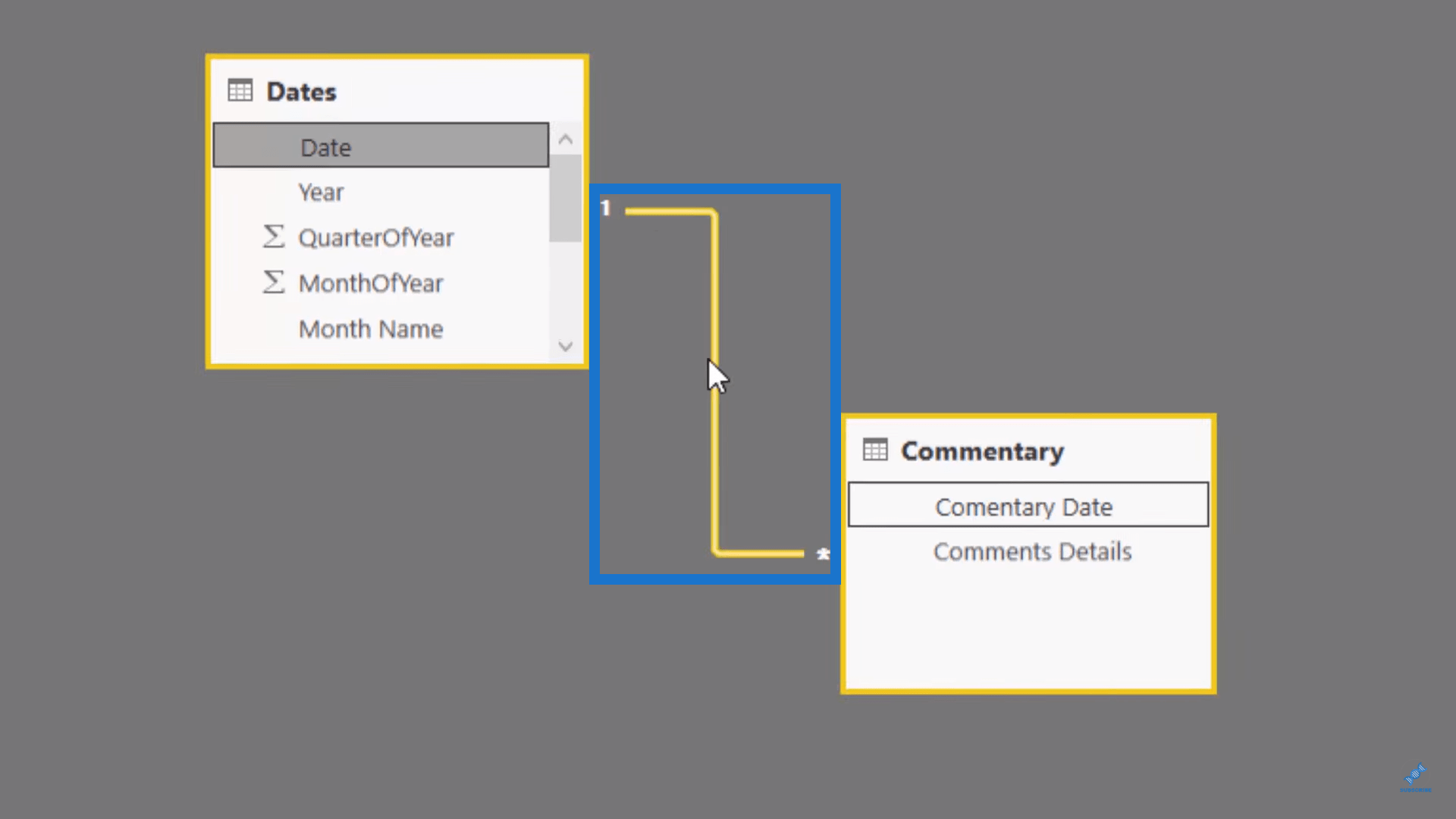
Once it has been loaded, we have to remember that we need to make the connection or establish the relationship between the date in the Commentary table and the date in the Dates table because this is what is going to open up Month & Year dimension.
We need to make sure there is a relationship between these two tables so that this filter can actually work. So, what we are going to do is drag the Date to the Commentary Date. Now that the relationship has been made, we can go about creating the table.
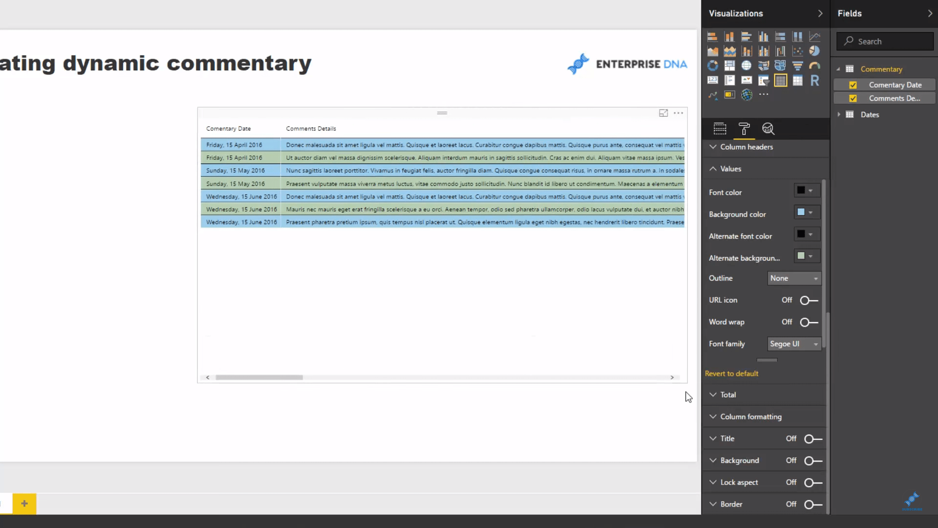
Let’s jump back into the report and drag the Commentary Date into the canvas. We can change the colours a bit to make the Commentary table visible.
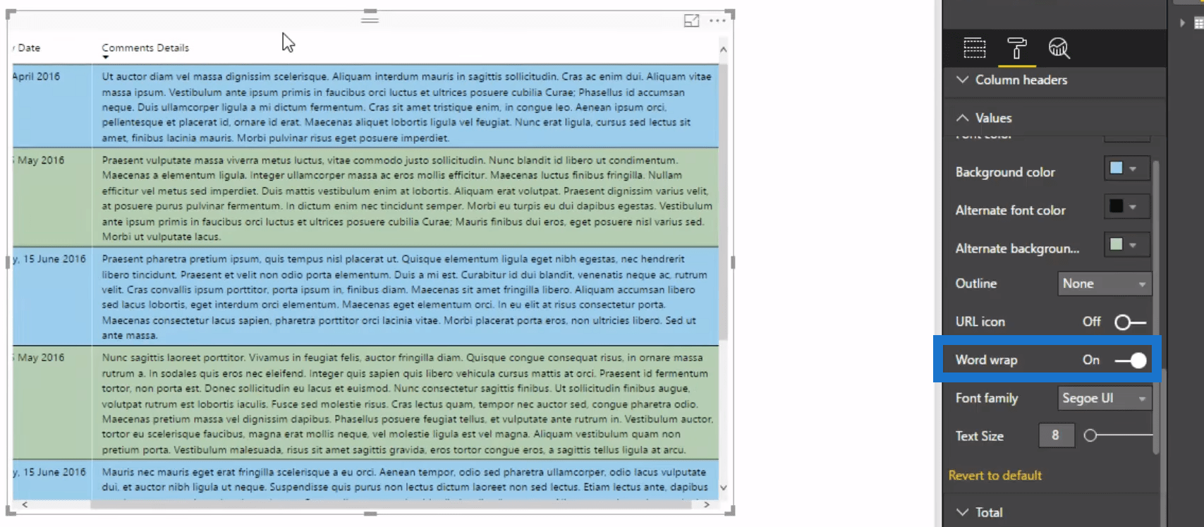
You may have noticed that the Commentary is all in one line so we can turn on Word Wrap and arrange the table so it can fit quite nicely with the rest of the report page.
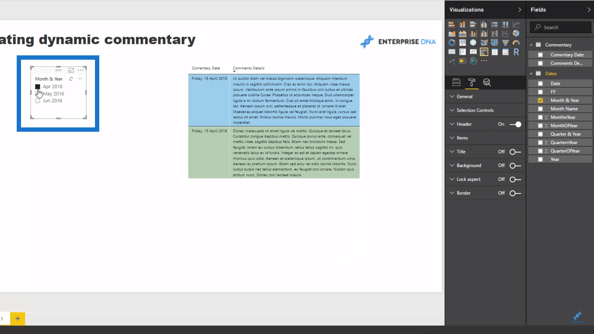
The last thing to do is to drag the Month & Year into the canvas, then turn it into a slicer.
Now we can click any of the selections on the slicer. Since this is a dynamic text, you can set it up in a variety of different ways to achieve historical commentary.
***** Related Links *****
Build A Comprehensive Date Table In Power BI Really Fast
How To Work With Multiple Dates In Power BI
Show Days Before Or After A Selected Date Using Power BI
Conclusion
The best thing about using this type of data visualization with Power BI is that you will always have a record of the commentary and you can dynamically refer back to it if you want to know why something happened in the past. It also makes people much more accountable for what commentary they write. Maybe that’s a good thing, maybe bad – it depends how your organization operates. Accountability can sometimes be a slightly dirty word within organizations.
Anyways, this is a great technique that works mostly with the data model. So you need to understand how that all works well, but there’s many ways you can swing this, so as you’re reviewing it, certainly think about other types of filters you could place on your data tables.
Any thoughts on how you could apply this? Let me know in the comments.


