In this tutorial, you’ll learn how the Performance Analyzer works in Power BI. Specifically, this blog will discuss the query generated by the Performance Analyzer tool and how it changes depending on the visuals in your report.

Performance Analyzer is a Power BI tool that measures and displays the duration required for loading or refreshing the visuals. This allows users to determine which visuals or elements have the most impact on a report’s performance.
Power BI Performance Analyzer: Overview
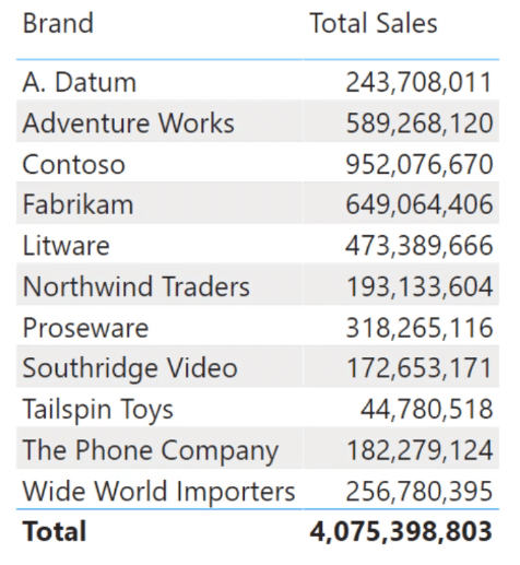
To demonstrate what the Performance Analyzer feature does, start by creating a simple Power BI report.
Once done, go to the View tab and click Performance Analyzer. This opens the Performance Analyzer tab found on the right-hand side of the Power BI desktop.
Click Start recording and then Refresh visuals. This displays a new set of information in the Performance Analyzer pane.
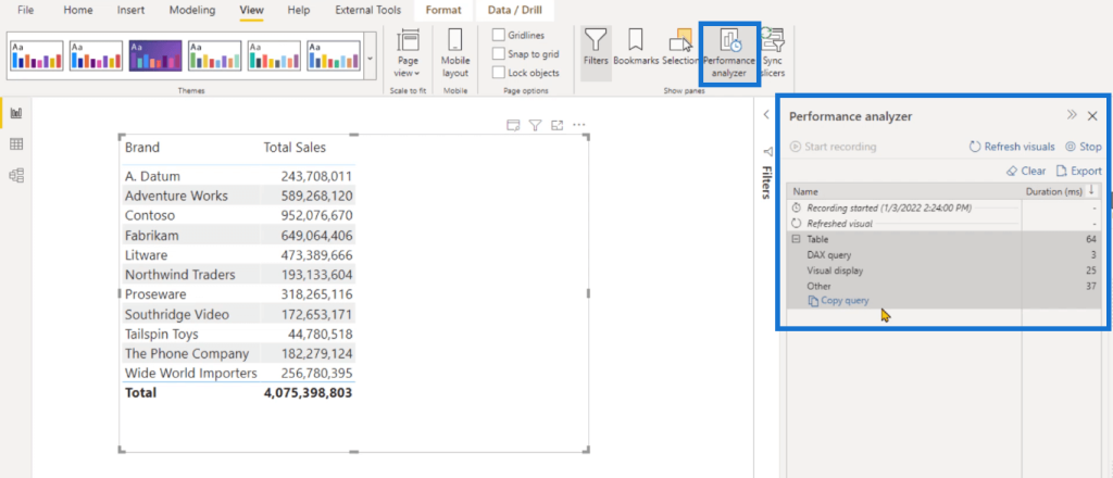
The DAX query entry shows the amount of time it takes to execute the query in Power BI.
Visual display shows the amount of time it takes to render the table so that it can be displayed back to the end user.
And Other shows the amount of time a particular visual has to spend in waiting while other visuals are still rendering.
Power BI Performance Analyzer: How It Works
What Happens Behind the Scenes
Sometimes, your DAX code can be extremely slow. To investigate the cause and what’s happening behind the scenes, it’s important to understand the query generated by Power BI.
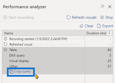
To do this, click Copy query and paste it in DAX Studio.
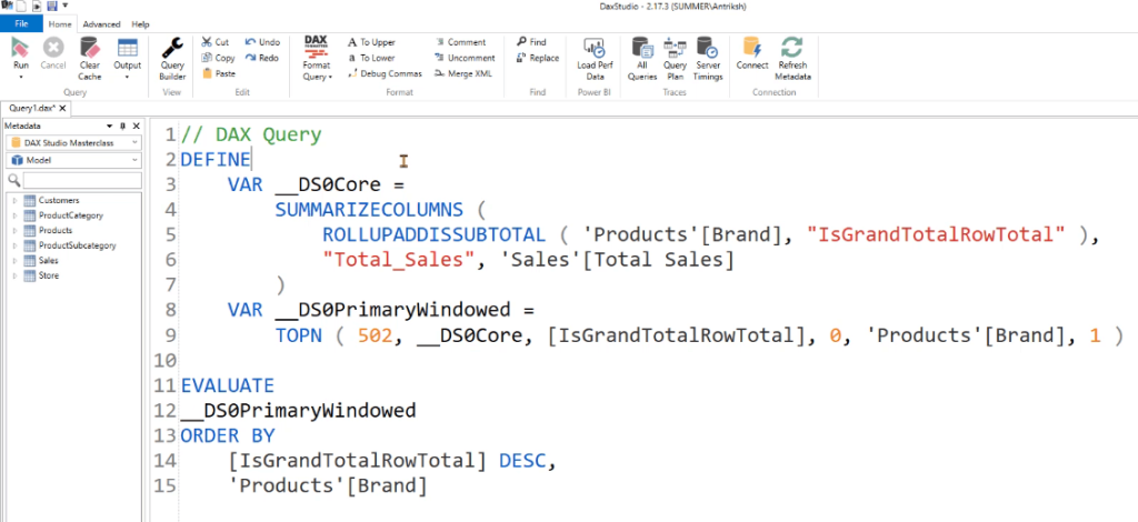
You can see that the DAX query used the DEFINE keyword and declared two variables. It then used the EVALUATE and ORDER BY keyword to get the result in a particular order.
When you run the code, you’ll get the same table that you have in Power BI.

What Happens When You Add New Columns
If you go back to Power BI and add a new column, the Performance Analyzer pane automatically refreshes the visual.
Copy the DAX query after scrolling down the table for a few seconds.
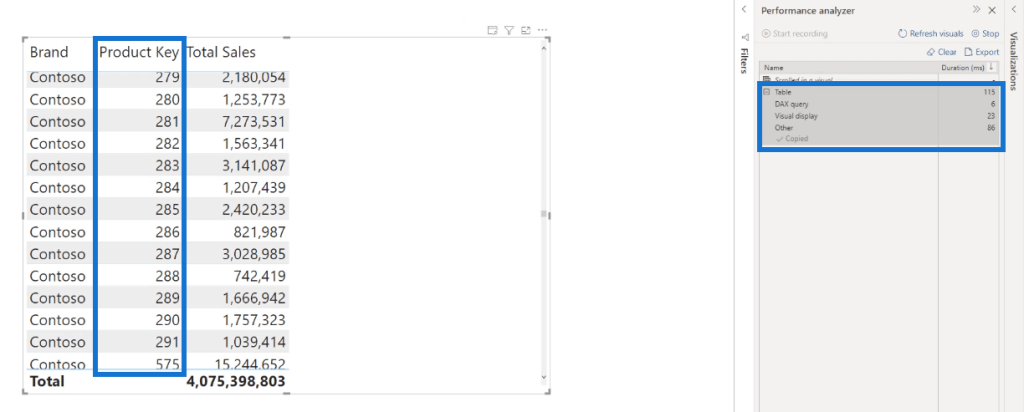
Open DAX Studio and paste the code in the Editor.
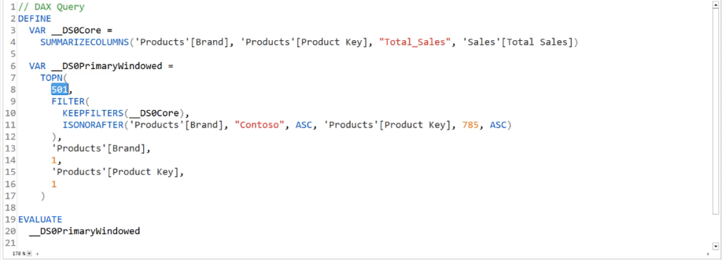
Whenever you scroll down on a matrix or any other visual, Power BI sends another query to SSAS. The DAX code retrieves a list of all the products that appear after the initial 501 rows.
The DAX code is different for visuals that remain stationary. For this instance, if you don’t scroll the visual before copying the query, the code will only be restricted to show 502 rows at a time.
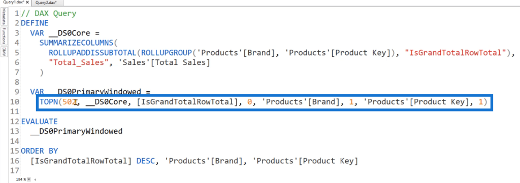
This is how power BI optimizes the report you’re currently interacting with.
Power BI Performance Analyzer: Difference Between Table & Slicer
Let’s look at how slicers interact with a given query. Create a simple slicer. In this case, the Gender field is used as the slicer for the matrix.

Clear the Performance Analyzer then click Refresh visuals. This time, you’ll see that you have two queries; one for the slicer and another one for the table.
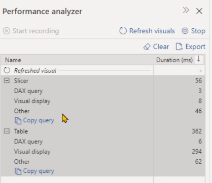
Copy the query of the slicer and go back to DAX Studio. Paste the query in the editor.
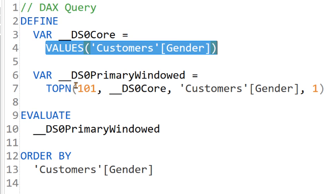
The TOPN function is used to display the first 101 rows. But in this case, it’s not actually useful since Power BI is only using the TOPN function to display the required number of rows.
If you execute the code, you’ll only able to see the three distinct values of the gender slicer: blank, M, and F.

But if you copy the query of the Table and Run it in DAX studio, you’ll see that Power BI automatically creates variables for the filter context coming from the slicer.
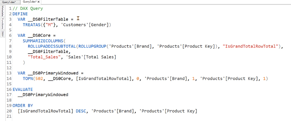
Once the code retrieves the values from the slicer, it injects those values inside a SUMMARIZECOLUMNS function. In the second argument, it’s applying the result of the variable.
***** Related Links *****
Optimizing Queries For A Faster DAX Performance
Performance Issue In DAX Studio: CallBackDataID
Tips In Using The Performance Analyzer Feature In Power BI
Conclusion
This tutorial showed a quick overview on the Performance Analyzer feature in Power BI. Specifically, you learned about the varying DAX queries it generates depending on the available visuals.
This lesson helps you to better comprehend which visuals are more resource intensive. By understanding the queries behind each visualization, you’re able to make inferences into which aspect of the report you need to review to improve performance.
Enterprise DNA Experts


