This blog post is the second in a series I’m doing on innovations in Power BI. The first one was about how you can level up your external tools menu. For today’s topic, we’re going to use a number of tools on the enhanced toolbar to come up with a custom color palette, so I highly encourage you to look up that post. You may also want to take a look at my video on hex code wrangling for Power BI using a tool called Just Color Picker. You may watch the full video of this tutorial at the bottom of this blog.
Custom Color Palette Using The External Tools Menu
This is a bar chart I created using the Practice Data set on the external tools menu, and it uses the default Power BI color theme.
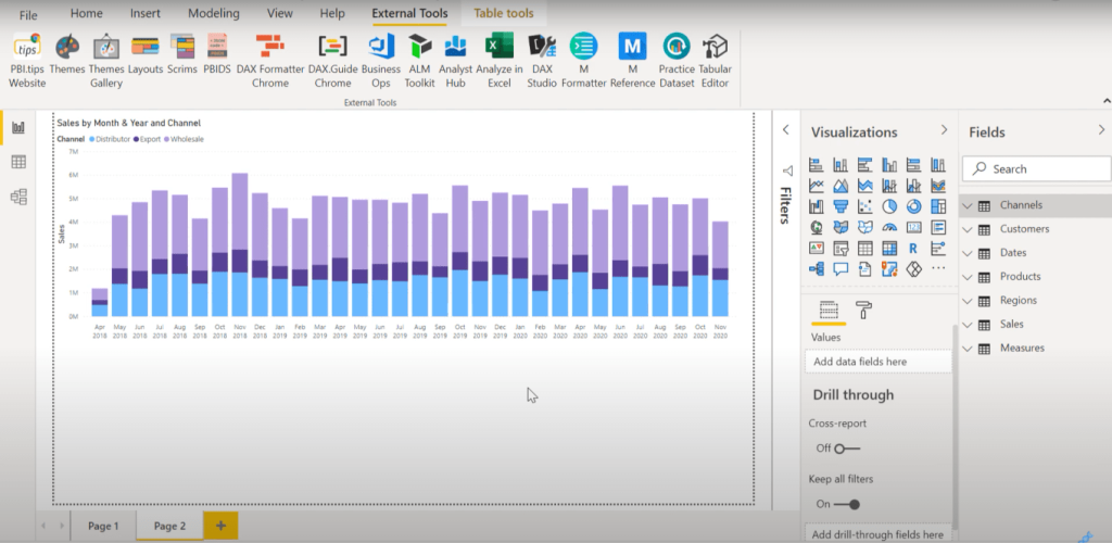
To be honest, it doesn’t look that good. Color theme is one of the things that I struggle with. This is why I’m always looking for tools that will help improve my design game.
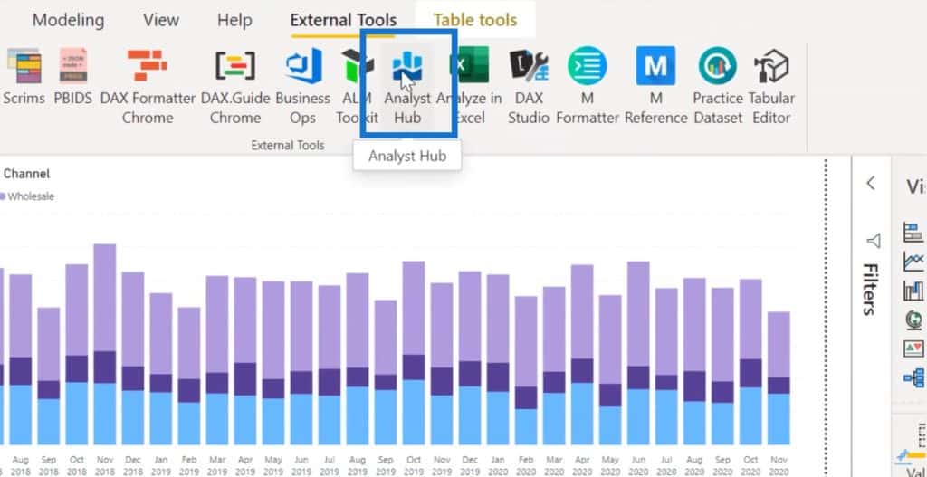
If we click on the Analyst Hub tool, it has a series of tools under this color theme generator.
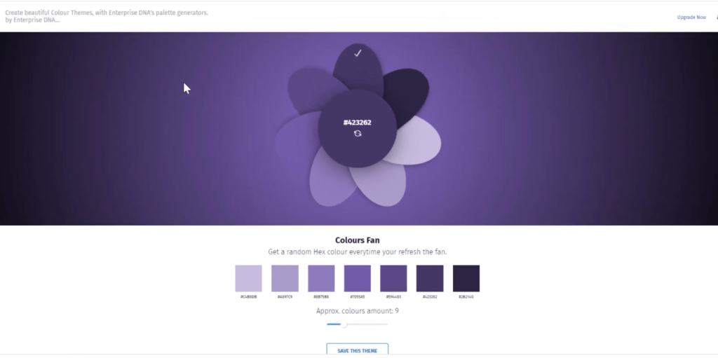
This really helps you to develop good-looking color themes. This is the Colours Fan, which you can refresh until you get to a theme you like and save it in Analyst Hub.
It also has a feature that allows you to bring pictures and create a color theme out of them.
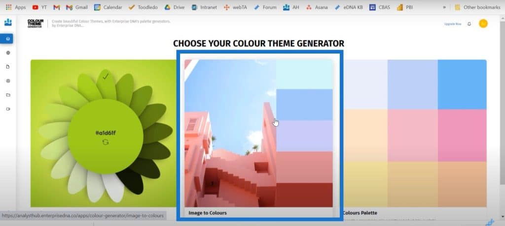
It also has this color palettes tool which lets you lock in certain colors and customize your color palette.
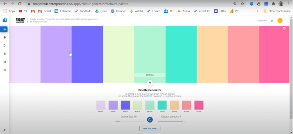
Custom Color Theme Using The Analyst Hub
But that’s not really what I want to talk about today.
What I want to talk about today is the Analyst Hub’s community feature. If we go to the community feature in the Analyst Hub, we’ll see that there are people posting color themes publicly.
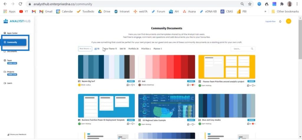
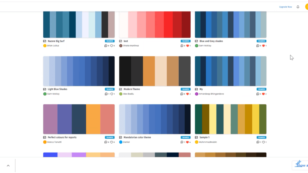
Some of the folks who are posting color themes are tremendous designers like Alex Badiu and Greg Philps, who have won Enterprise DNA’s data challenges.
You can basically borrow the themes that they’re posting.
I like this autumn color theme that Alex has posted. I clicked on it to open the document and clicked the Copy icon.
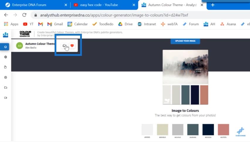
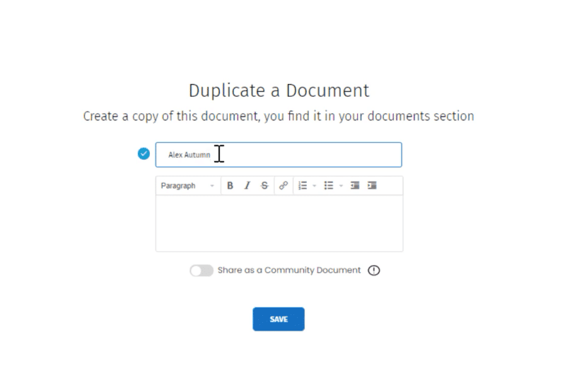
I’ll be prompted to duplicate this and enter a name for it. I clicked on Save to save it to my personal document library.
One of the cool things about this is it will show you not just the colors that the designer used, but the way they got to it.
If you have a screen capture tool like Snagit, you can take a snapshot of the picture that the designer used to create this.
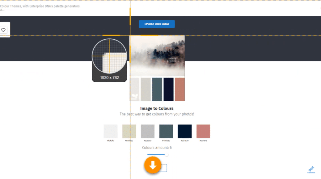
The one thing that is currently missing in Analyst Hub is an easy way to get these colors into a JSON file for your theme. Sam and his development team are working on this.
In the meantime, the Just Color Picker tool that I referred to in the wrangling video lets you easily put that into a JSON file. Let’s open this color picker, which we use to snap the colors right into the picker list.
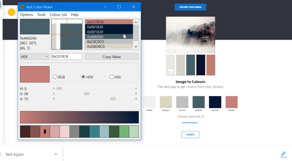
Once I have all the hex codes in the theme, I’ll close this up. This will automatically create a text file called jcpicker. If we go to the desktop, we can open that jcpicker file and see that the hex codes are not in the right format.
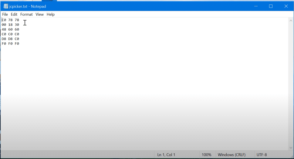
I used Control A, clicked on Edit, and Replace. Then I replaced the spaces with nothing.
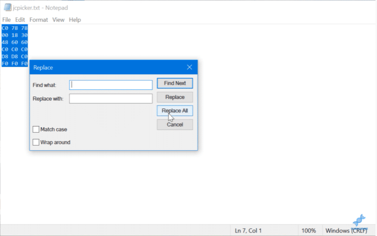
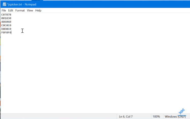
I copied these codes and went back to the external tools menu in Power BI. Then I go to the Power BI Tips themes tool and enter the multiple hex codes.
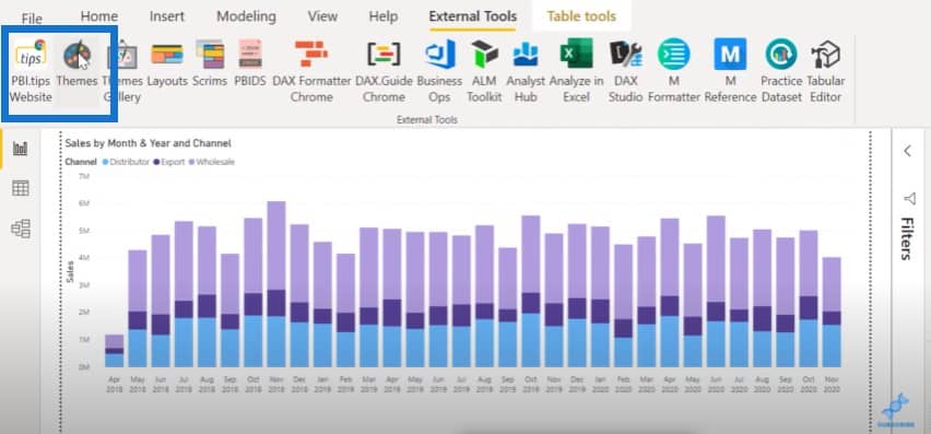
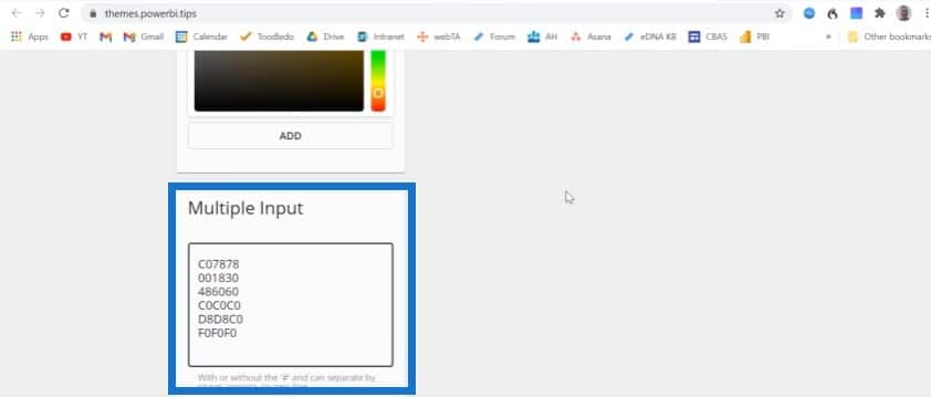
Once I click on Add, I already have the palette from Alex’s autumn theme in there.
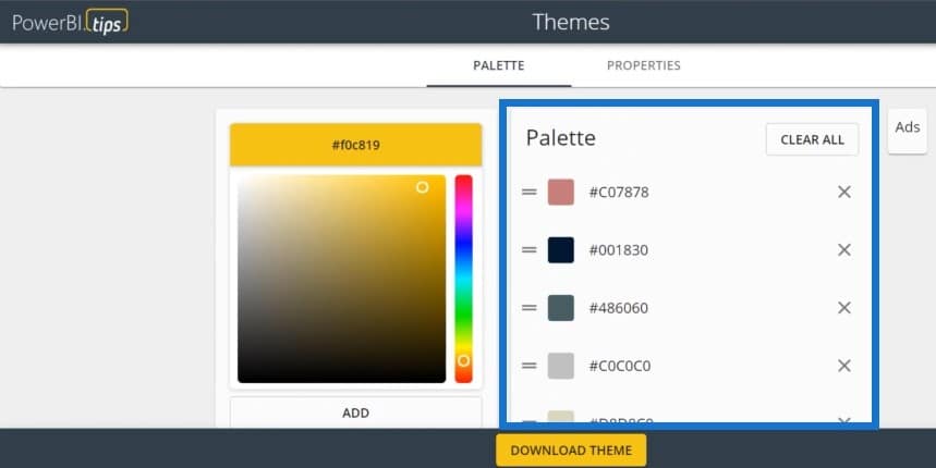
I think the palette looks great as it is, but if you want to add another color, you can choose one and click Add, and then it will be added to the palette.
We can already download this theme now, but we can go even further with this tool. If we click on Properties, you’ll see that this tool has a fully-fledged JSON editor. If we click on the bar chart, we can see all the properties for that bar chart.
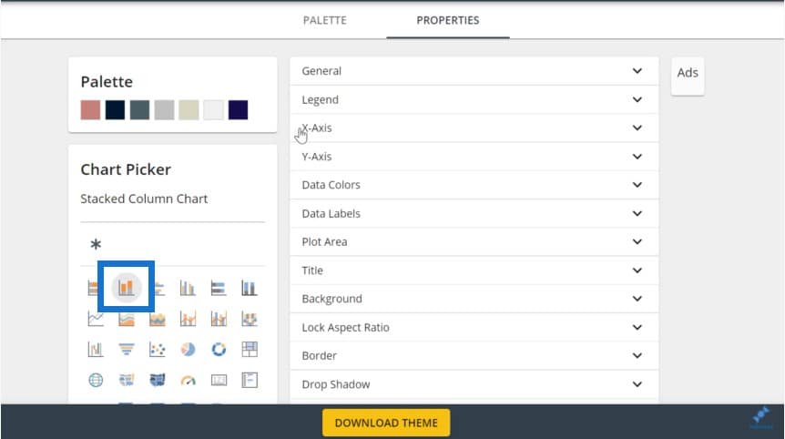
We can set the legend color, the dimensions of the X and Y axis, and much more.
But for now, let’s go in and select our data colors. We’ll also turn on the title and select a background color for that.
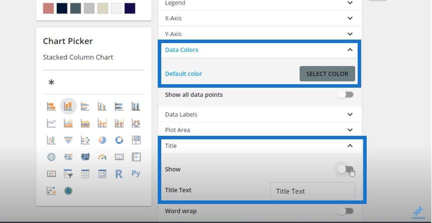
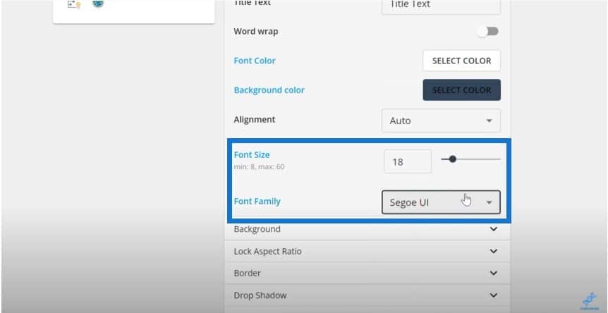
And then we’ll change the font size and font. This is just to give you an idea of all the different dimensions you can change using this tool.
If we click on Download Theme, we’ll be asked to name this file.
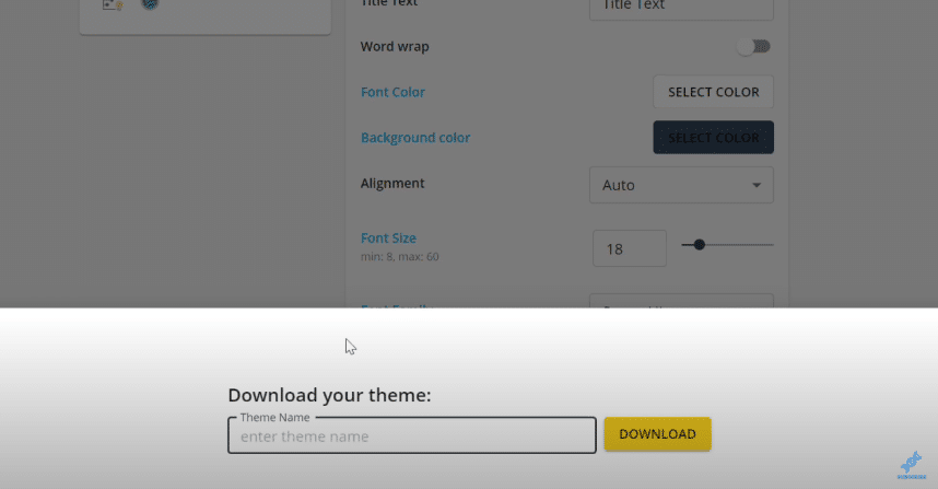
Let’s put a name here, go back to Power BI, click on the View tab, and then browse themes.
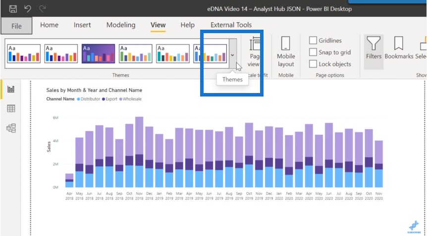
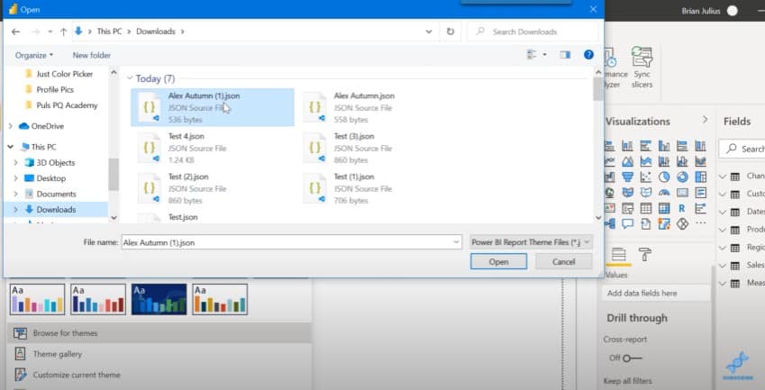
We can pull up the theme that we just created out of the download directory.
We can see that it imports properly.
It uses white for one of the data colors, so we’ll need to change that.
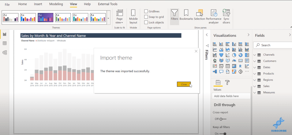
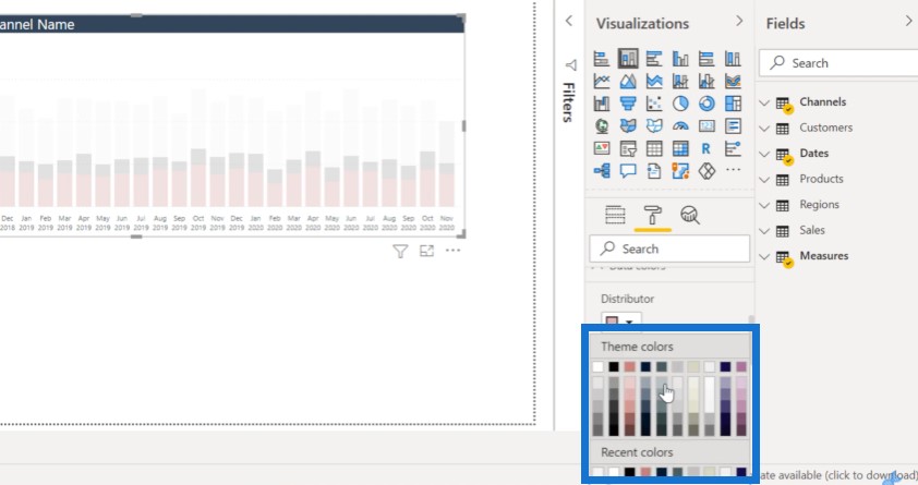
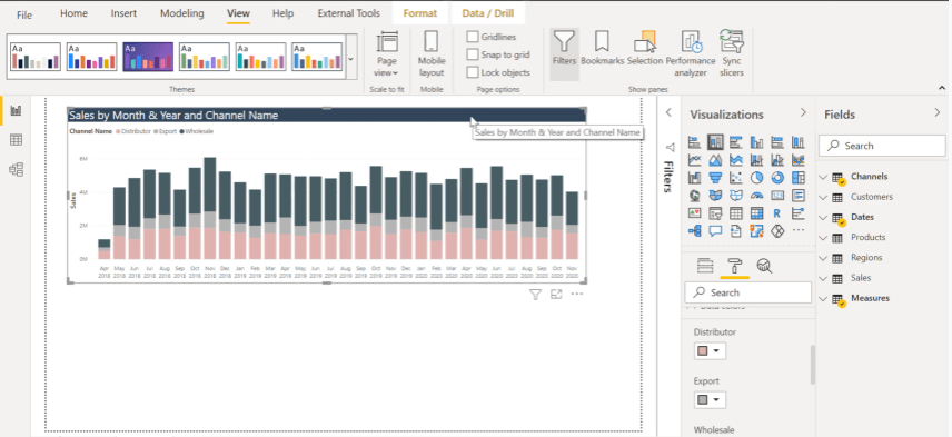
You can see that we have the dimensions of the title that we created. This looks a lot better than what we had before.
***** Related Links *****
Color Theme In Power BI Reports – Tips and Techniques
How To Create Compelling Power BI Color Palette
Color Hex Codes Picker For Power BI Reports
Conclusion
We can go through the JSON editor and change all the dimensions in the Power BI Tips theme. So any bar chart we create in the course of this report is going to have those dimensions, which we can use across other reports as well.
The Analyst Hub is a great way for you to improve your design capabilities and to leverage the expertise of some of the best designers out there.
If you learned something from this blog post, be sure to subscribe to Enterprise DNA TV as we have more content coming out soon.
Brian


