
In this blog post, I’m going to show you how to do customer segmentation techniques via the data model in Power BI. You may watch the full video of this tutorial at the bottom of this blog.
Sometimes your raw data will not have all the information you require to showcase something in Power BI. But don’t let this stop you.
All you require is an imagination around how you can build out your data model or use some additional logic within your lookup tables that can enable far greater insights than you may have thought possible with the raw data you have in its current form.

I will walk you through a detailed example of how you can segment your customers by evaluating if they are good customers, okay customers, or poor customers.
Segmenting Customers Based On Performance
Essentially, we’ll work on how to segment your customers based on performance.
You can utilize this technique to segment just about anything, but I wanted to show how effective it can be to showcase insights on your report based on a real-life scenario.
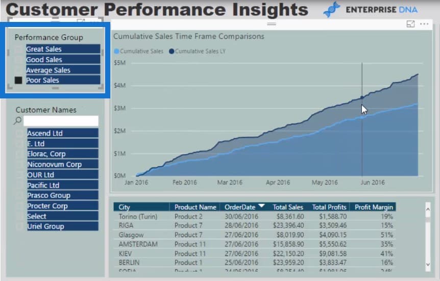
Using the data model, we can quickly isolate each specific segment for analysis. We can see the underlying drivers that will distinguish our customers as great, good, average, or poor in terms of sales.
I’ve created a slicer or filter which enables me to analyze customers as great, good, average, or poor based on the visualizations we have put inside our report.

The visualization will show us when the divergence started (February 2016) and why there is a divergence.
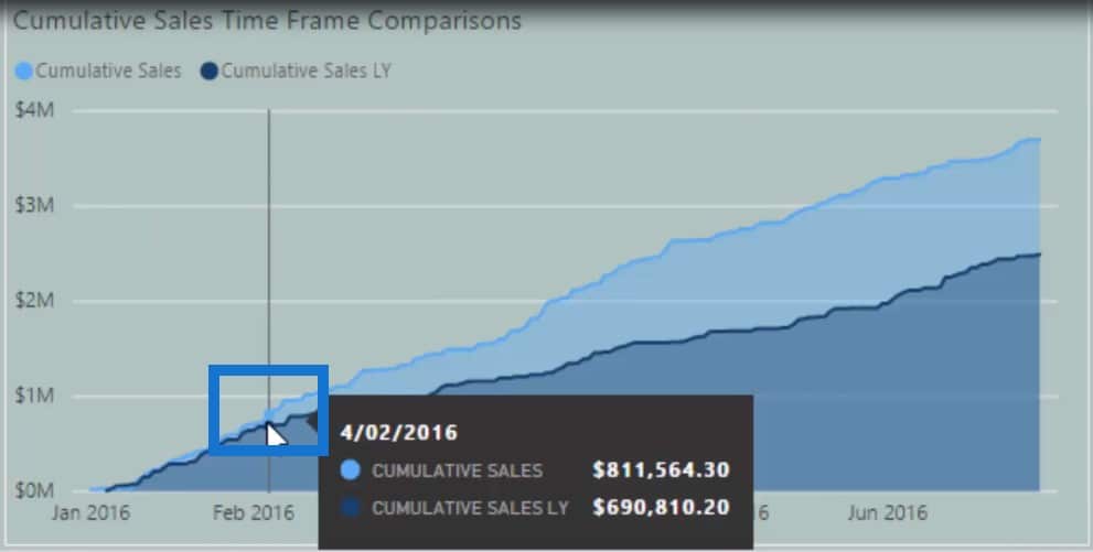
It is important to show the why with the visualizations in your reports.

At the bottom part of our report, we can see exactly when the divergence happened.

We can also look into our products to determine which products caused this divergence and made these customers great. We can find out what products enabled customers to buy more from us than they had previously.

What’s also cool are the slicers in our visualizations. They will filter based on what we’ve integrated into our model, and then they are also going to filter based on whatever performance grouping or segment we have selected.
Let’s have a look at our poor clients by clicking Poor Sales on the slicer. We can then see which clients have performed poorly on the column below the slicer.
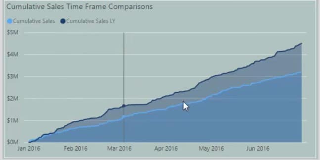
By looking at the Cumulative Sales Time Frame Comparisons chart, we can look at sales this year versus sales from last year. Why is there a big difference between the two? Does it have something to do with the products or the margins?
All of these questions can be answered and showcased by utilizing the customer segmentation techniques I will show you.
Creating The Customer Grouping Table
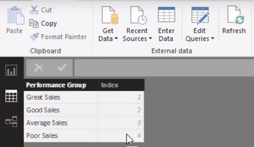
So, how did I do this technique? First, let’s jump back to the model. I created a table called Customer Grouping.

This is something you don’t have to do, but I like to create it because it gives me a separate table that showcases the customer groups. I’ve also put an index beside the groupings so we can filter or sort them from great to poor.
Obviously, we’re going to need a connection from the Customer Grouping table down to the Customers table because we need to group our customers in a specific way.

Let’s jump in and have a look at my customers I need to segment.
This is where the calculated columns inside of these look-up tables come in.
Lookup Tables And Calculated Columns
The tables inside the blue box are what we call lookup tables.

This is where we can put our calculated columns.
Now some of you might think that you can make this dynamic using measures. Well, you absolutely can.
However, I wanted to do this from a certain point in time. This is situation-dependent, and you can use either calculated columns or measures.

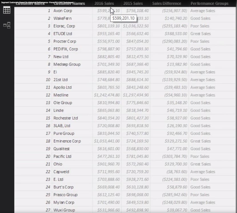
Using calculated columns, I wanted to look at our sales from a specific point in time. In this case, I wanted to specifically look at the 2016 Sales and 2015 Sales.
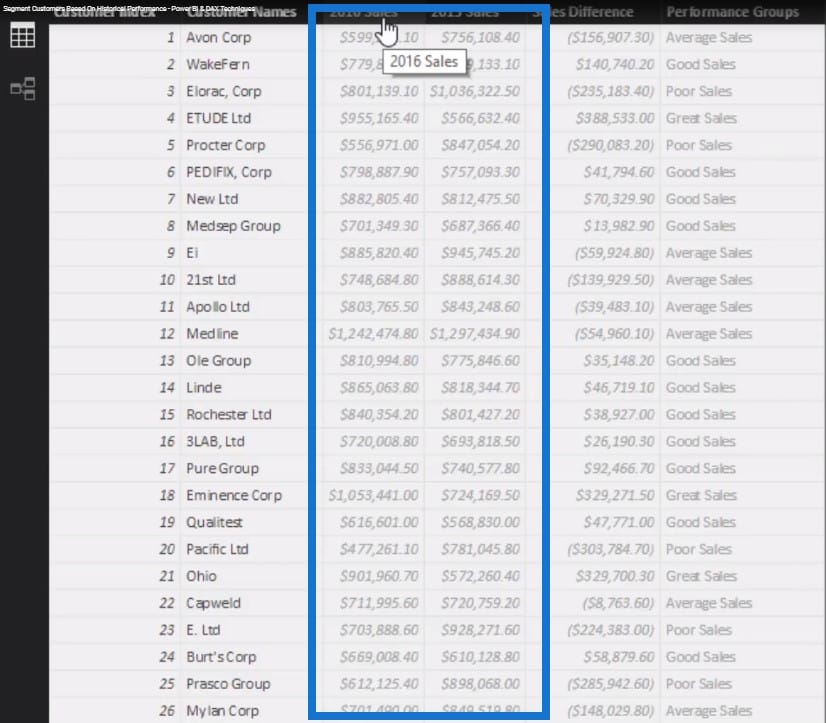
To do this, I used the CALCULATE function and placed a filter inside of it so I only get sales for a particular time period.

Calculating The Sales Difference
Then from the 2016 Sales and 2015 Sales, I can derive the Sales Difference using this formula:

The Sales Difference is where we can start segmenting our customers based on the sales.
Using The SWITCH Logic
The Sales Difference between 2016 and 2015 will determine which performance group our customers are going to sit in. This is where the SWITCH logic comes in.

The SWITCH TRUE logic allows you to create additional dimensions which look like nested IF statements that look better.
We can make statements that say if a customer’s sales difference is greater than or equal to $200,000, then he or she is a great customer.
This is how we determine what segment or group to put our customers in. This technique is highly adaptable and can be put across any dimension and any lookup table.
You can simplify this even further by not using the 2016 and 2015 sales columns and the Sales Difference column. You can just put all of the logic inside of the measure.
But in this case, I wanted to show you how to use calculated columns in lookup tables to create these segments of information.
If we go back to our final visualizations, this particular slicer

is coming from this table.

The Customer Grouping table then filters the calculations and logic we’ve done in the Customers table. Then that relationship filters down to the other tables.
This is how all of our visualizations can update based on the customer segment we select on the slicer.

Through this tutorial, we were able to showcase customer segmentation techniques and show different ways to slice and dice our data.
The wonder of it all is that it didn’t exist in our actual model; we had to create it using logic.
***** Related Links *****
SWITCH True Logic Explained For Power BI
Segmentation Example Using Advanced DAX in Power BI
Dynamic Segmentation: How To Segment Customers Into Groups Using Advanced DAX
Conclusion
In most cases, you want to focus on your top customers because that’s where most of your good results come from. So, you want to identify trends around performance and conduct an in-depth review of this specific segment of your data.
By using this technique, we can isolate our good customers and figure out why they are good. We can understand why they have performed well and try to replicate it across all the other clients who have performed poorly.
This is what this tutorial is about. You can reuse these customer segmentation techniques across a variety of analytical scenarios. It doesn’t have to be just about customers but that’s the item that I focused on in this particular instance.

For more practical ways to utilize Power BI to find powerful insights that matter, check out this course module at Enterprise DNA Online. Plenty to learn from with this one course.
Sam
***** Learning Power BI? *****
FREE COURSE – Ultimate Beginners Guide To Power BI
FREE COURSE – Ultimate Beginners Guide To DAX
FREE – 60 Page DAX Reference Guide Download
FREE – Power BI Resources
Enterprise DNA Membership
Enterprise DNA Online
Enterprise DNA Events


