Here, we’re going to dive into Advanced DAX in Power BI. The idea behind this tutorial is to show you how we can get to a very unique insight with Power BI, but do it in an intuitive way. You may watch the full video of this tutorial at the bottom of this blog.
In this example, I’m going to focus in on margin growth in the sales of an organisation, but take it even further and rank all the salespeople on how they performed on this one metric.
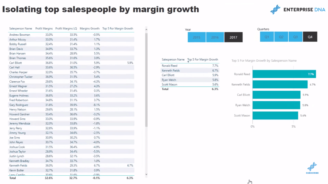
This may be an important one for a business if they thought that sales weren’t going to grow, so they needed to increase margins to get the profitability growth they were after.
To achieve this, we have to branch our DAX measures out a number of times just to get the margin growth. Once we have completed this, we can overlay a ranking technique to discover our top salespeople.
With this particular insight, we are able to narrow down the scope of our analysis and be able to reward the sales people that are growing the accounts by a margin versus just sales.
Inside The Data Model
To start with, we have a very general data model here, which I use a lot of times for my demos. It has a few lookup tables, such as our Customers, Sales People, Products, Location, Dates. And we have our Sales table down here.
We can drill into all these information so easily and quickly.
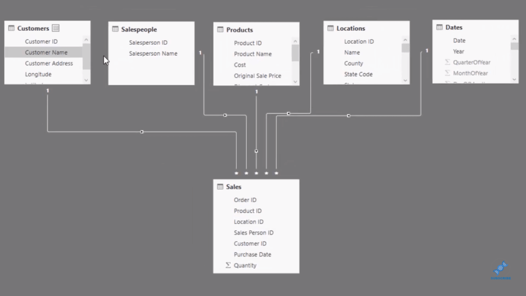
In our Sales table, we hardly have any information here. So from this without doing anything to model, we will be able to extract the insight and really drill into this very specific piece of insight.
In the past without Power BI, this would be very difficult and take a long time to generate.
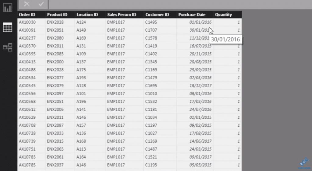
The great thing about this is that it’s also dynamic. We can look historically and extract easily significant insights fast. Now, we dive in to some Power BI Advanced DAX formulas.
Steps To Implement Ranking Logic
First of all, we have to calculate our Total Sales and Total Cost to get the Total Profits. We use iterating functions with these measures.
The Total Sales formula looks at the Sales table and multiply every single row by the Quantity in the sale, by the actual Price, which is actually sitting on the Products table in our model.

We do exactly the same for Total Costs. We multiply Quantity by every single item that we’ve sold.

Then, this is where the measure branching comes in. We work out our Total Profits, which is equal to Total Sales minus Total Costs.

Now we need to work out our Total Margins. So we branch out again, and go Total Profits divided by Total Sales.

The same as our Total Profits, Profit Margins can be used on any dimension because we have our data model in the background.
We can place filters from the Date table that will isolate margins for every sales person we have here.
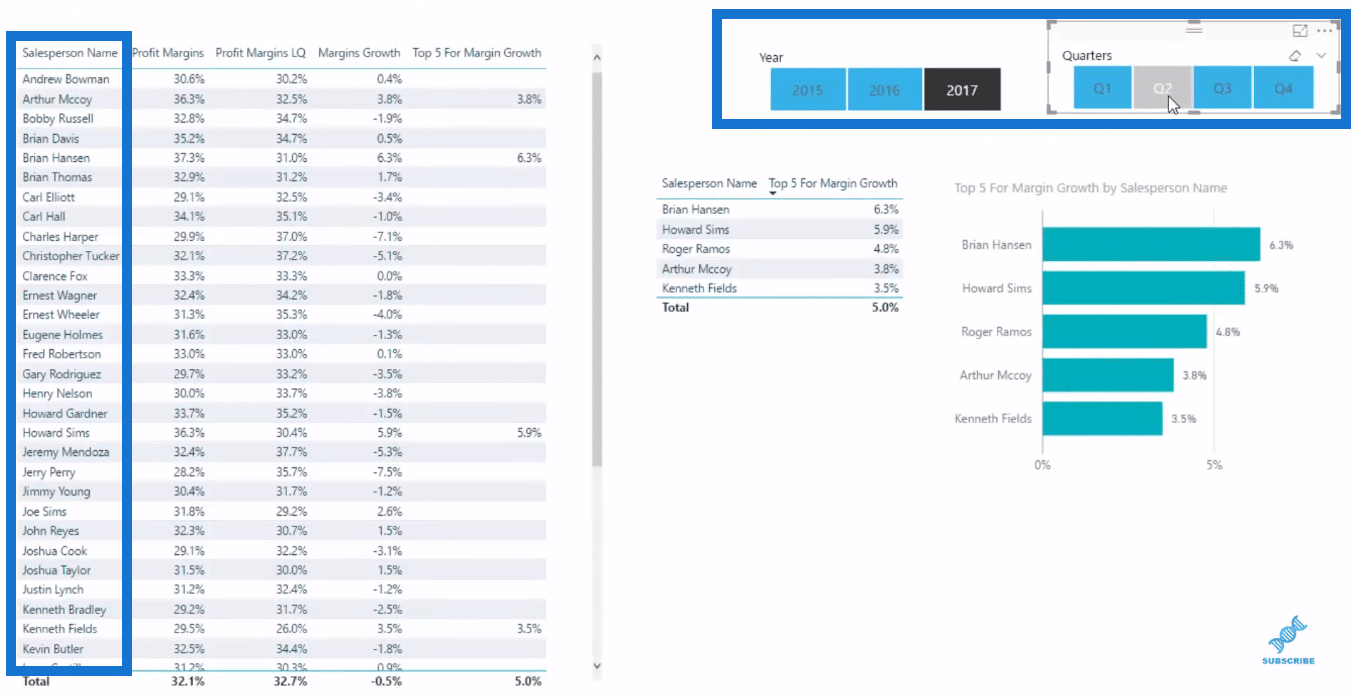
Next, we work out all our profit margins last quarter. So from whatever quarter we have here, say quarter 3 of 2017, we will be able to calculate in that quarter our margins in the previous quarter (Q2).
To do that, we use the DATEADD function, which I showcase many times in my other demos. This is one of my favorite Time Intelligence functions because it just makes these calculations so easy.

To identify the growth in our margins, we simply branch out again.

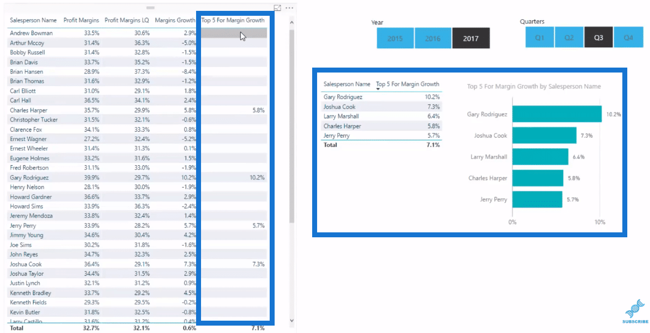
Now we go one step further because if we look down this table, there’s a number of different sales people. We might want to see just our top five. It makes it a lot easier to place a visualization inside a report page or a dashboard.
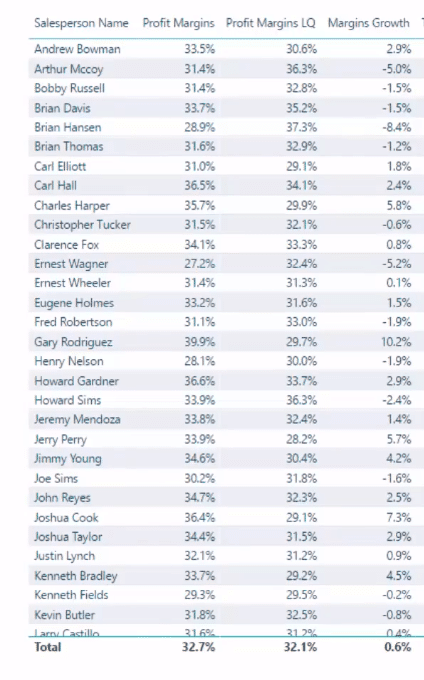
So we use this logic to achieve that. We use the CALCULATE function to our Margin Growth, but only calculate it for the top five sales people. And that’s what this TOPN function is doing. Then VALUES brings back the sales person which is our top five.

This formula blanks out everything that is not on top five. That’s how we create these visualizations, which only have the top five.
***** Related Links *****
Ranking Insights Using TOPN In Power BI
Measure Branching – The Most Important Concept When Using DAX In Power BI
Extracting Unique Insights In Power BI Using Ranking DAX Measures
Conclusion
With Power BI, we can start with quite simplistic data and branch out one after the other, where we could really isolate things right at the end.
The Margin Growth didn’t even exist anywhere. It was nowhere in any data. We needed to use DAX formulas to create it. The key is to branch out one on top of the other, and then eventually get to the result. We then put it inside a visualization, which gives us a really good insight.
Moreover, within Power BI, we have it dynamic. We can change for whatever time frame we want to, then evaluate it.
This is a really powerful technique and there is plenty to learn here about DAX formula, and how you can apply it in your own Power BI models.
Review this entire tutorial on Power BI Advanced DAX . There’s so much to learn about measure branching and DAX formula patterns, and by combining these you can very quickly achieve substantial insights into your data.
Cheers!
Sam


