Budgeting in Power BI is just not that easy to implement. I wish it was as easy as bringing in your actuals and budgets and then like magic you would be able to see the insights you need visualized in a compelling way simply by using Power BI forecasting. You may watch the full video of this tutorial at the bottom of this blog.
That’s why I created this blog post to show you how to put it all together. Don’t worry if it takes a little while to settle in; it did for me too. Once you have some time to practice and implement this, you’ll get it just like *that*.
This is something that can be achieved by structuring the correct data model and implementing the correct Power BI forecasting technique. That’s why there is a bit to this, and probably why this shouldn’t be the very first thing you jump into if learning Power BI. You really need to have a decent grounding on how all the different parts of Power BI fit together.
Actual Results Vs Budgets: How To Make A Comparison With Power BI Forecasting
In this blog post, we are going to go over something that a lot of people in the community have been asking me to showcase: how to actually compare actual results to yearly budgets. This is such a common scenario that you may find this in your own environments quite often. To achieve this, we need to bring some budgeting information into our model so that we can visualize it versus the actual results, which could be from sales happening every day.
The problem is that budgets usually do not come on a daily basis; they usually come in a monthly or a yearly basis. In this case, we just look at it from a yearly perspective.
Modelling Different Granularity
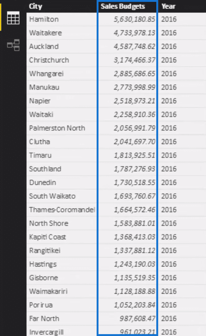
The budget has one number for the entire year. The technical term for this in Power BI is called different granularity. This data is in a different granularity compared to a fact table data.
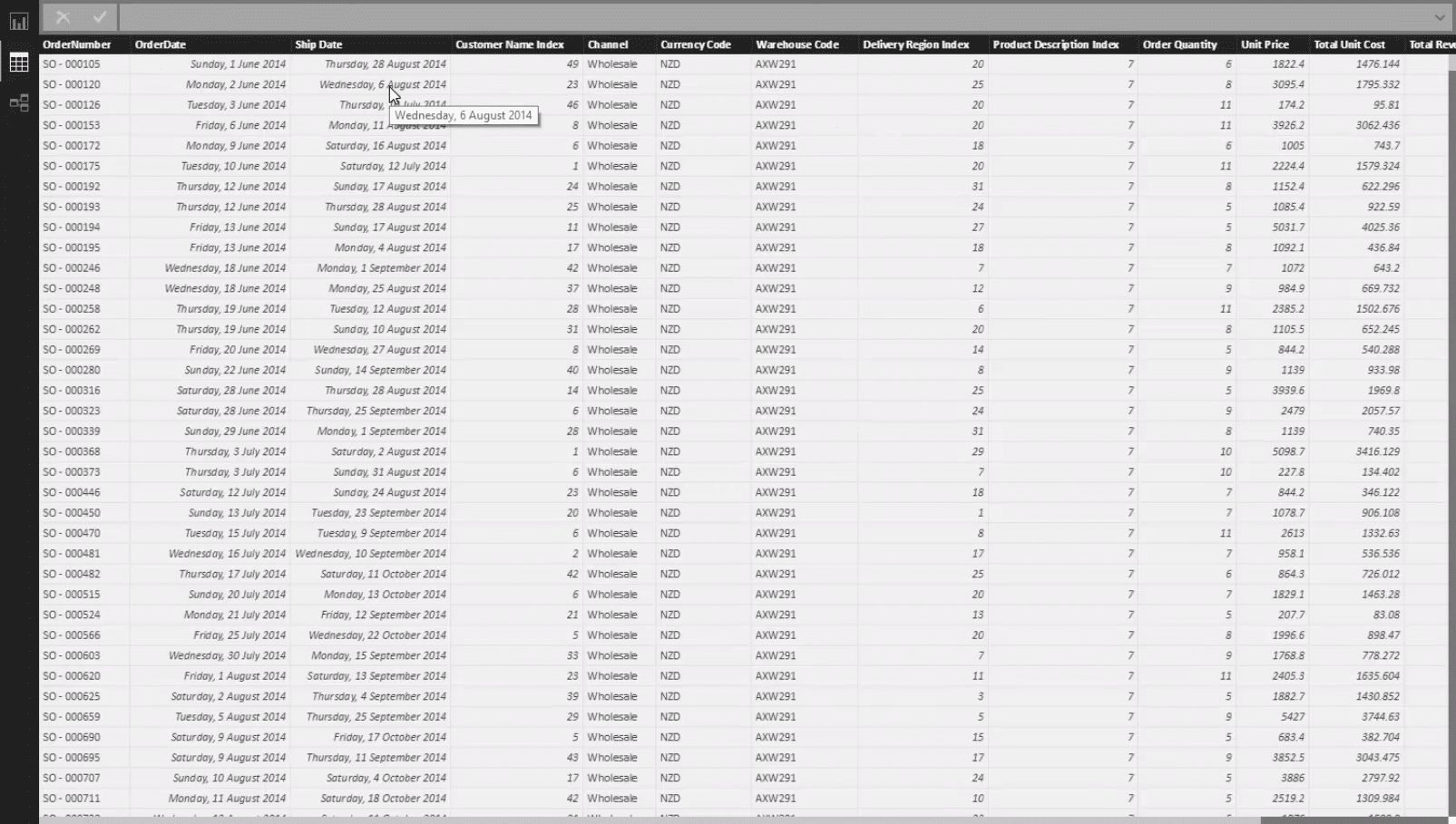
If we click on our Sales data, we can see that every single transaction has a sale, so we are making sales on different days for different products and customers.
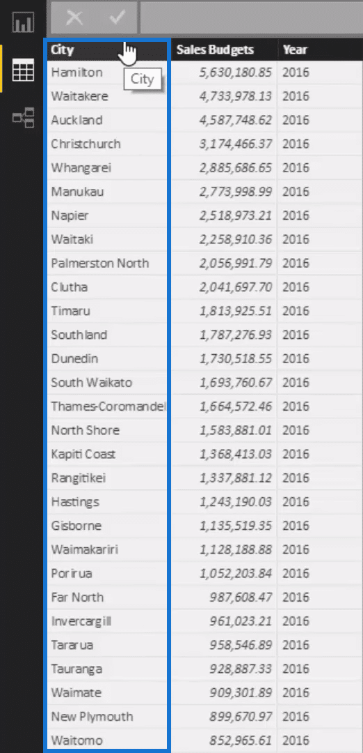
We also have our Budgets for each particular City.
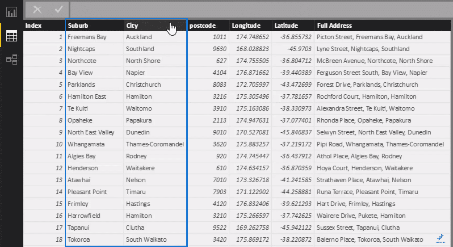
The other intricacy here is that the granularity of our Regions table is for the Suburb while City is just another dimension inside this table.
So there are two things we have to contend with here, and I am going to show you how you can solve both of these things so that we can effectively analyze this in one visualisation.
Creating The Cities Table
Let’s take a quick look at the data model. We have our LOOKUP tables at the top (Dates, Customer Data, Products Data, and Regions Table). We also have our Fact table, which is our Sales Data, at the bottom.
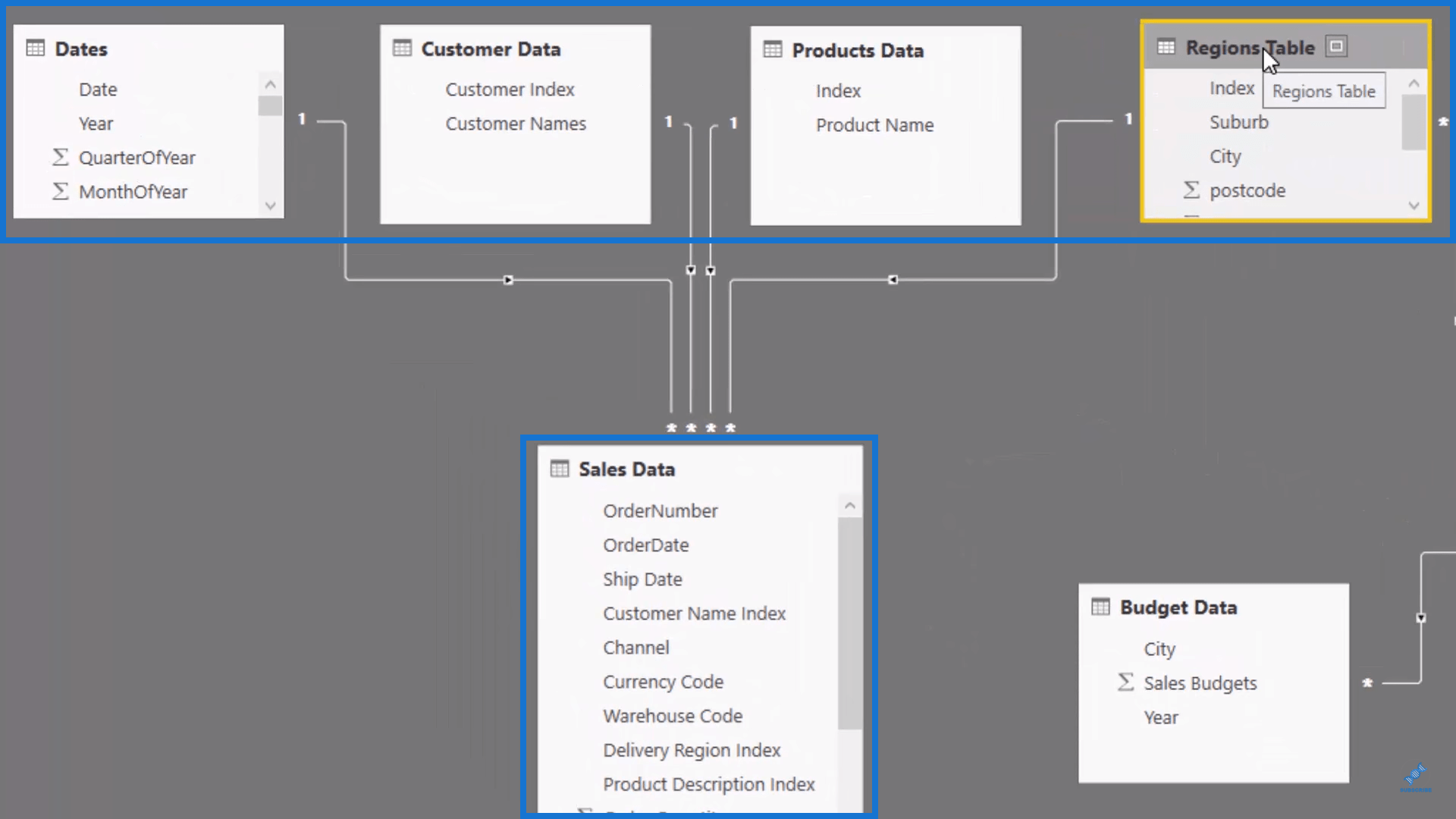
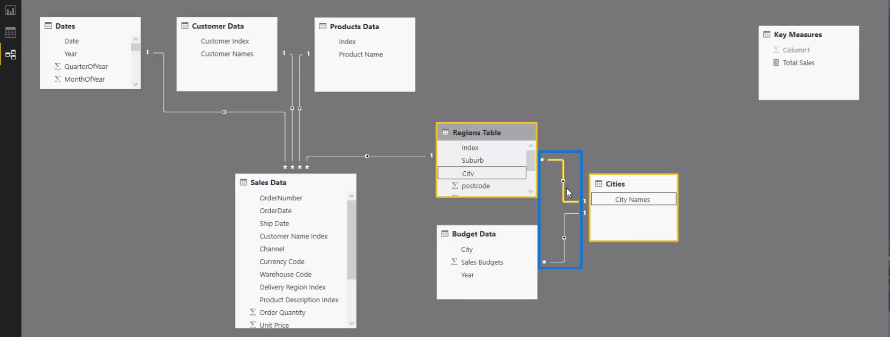
Because the City dimension in our Regions Table is not the Index column but just another dimension of the Suburb, we need to break out our Cities into a different table.
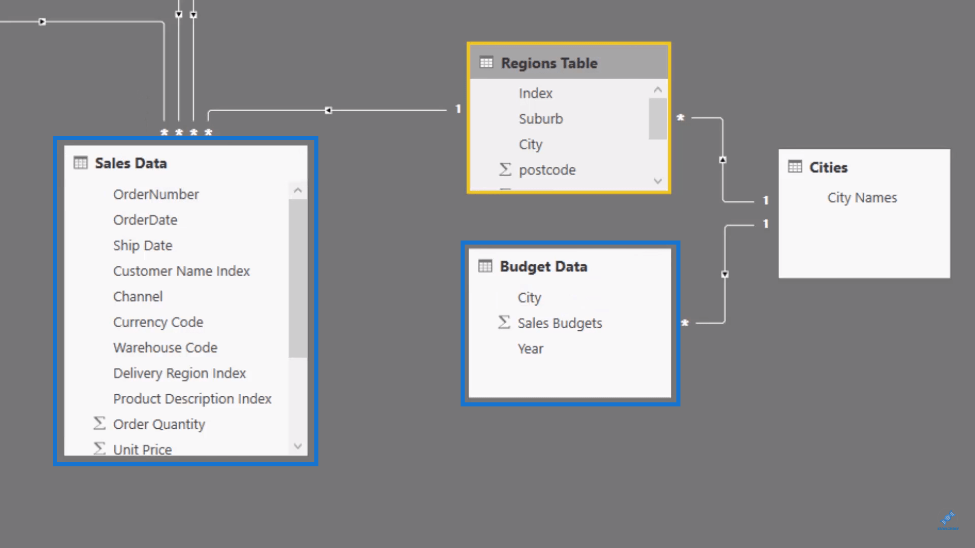
So what I have done is to create a table with just the cities which can filter both of those. We want to be able to select a city, flow down the relationship, and filter not only our Sales table but also our Budget Data table. So we need to break it out into a separate table so that we can create these two relationships that will flow down this way:
Building The Relationship Using Measures
One interesting thing to note here is because this is a different granularity compared to our Sales table, there is no connection between the Sales Data and the Budget Data. What we are going to do instead is to build the connection through measures.
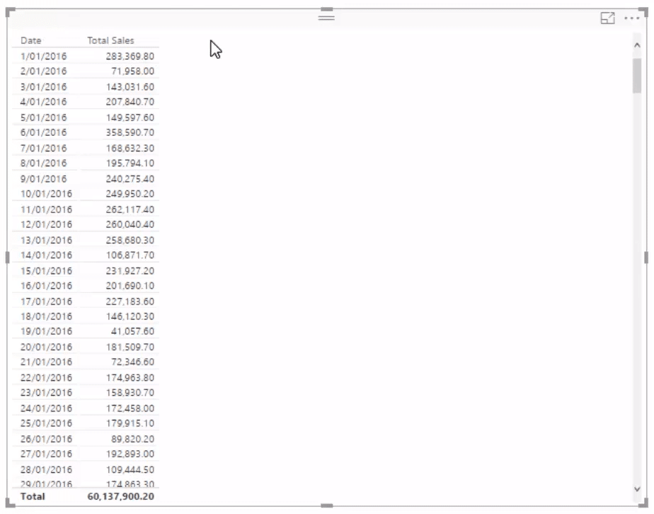
We need to always put the results into a table to understand what the calculation is actually doing. If you try to do this kind of analytical work inside of visuals, it would be virtually next to impossible to understand what is going on.
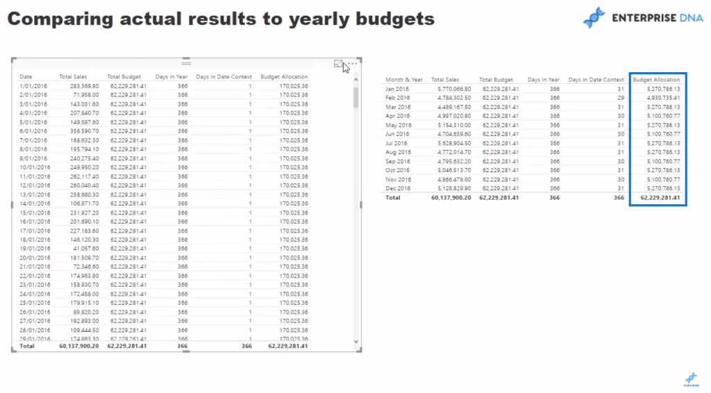
Let’s create a table of our dates using a filter on the year 2016, then drag our Total Sales calculation into it. So what we have is the sales per day. We have to divide up the budgeting information which is in a yearly level so that there is a portion that can be attributed to every single day.
Getting The Total Budget
We are going to create a new measure and call it Total Budget, and then get the SUM of the Sales Budgets column.
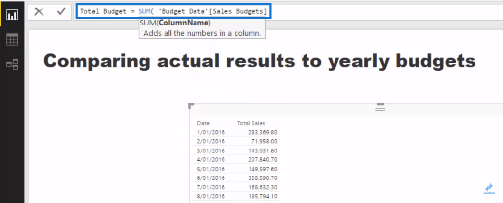
Let us then bring it into our table so we can see the total for every single day, which is around $62 million.
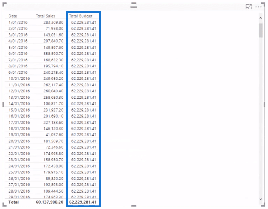
The next step is to create some form of logic which will allow us to divide the whole thing up. The first thing we need to do is divide the 62 million by 365 or 366 days, which is going to give us a ratio to multiply the Total Budget by.
Determining Days In A Year
So let’s figure out how many days are in this particular year using this formula. We will do this by counting up the Date table with COUNTROWS and isolating each individual year using ALLEXCEPT.

We will drag the measure we just created into our table. We can now see the Days in Year but we still need to figure out how to put 1 and then divide it by 366, and then multiply it with our Total Budget.

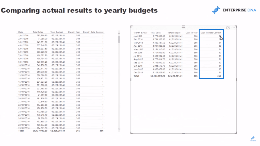
This isn’t too difficult; we just need to make things dynamic. Instead of looking at it from a daily perspective, we can look at it from a monthly perspective. Let’s create a new measure and call it Days in Date Context. We’ll use COUNTROWS and Dates, press enter, and then drag the measure into our canvas.

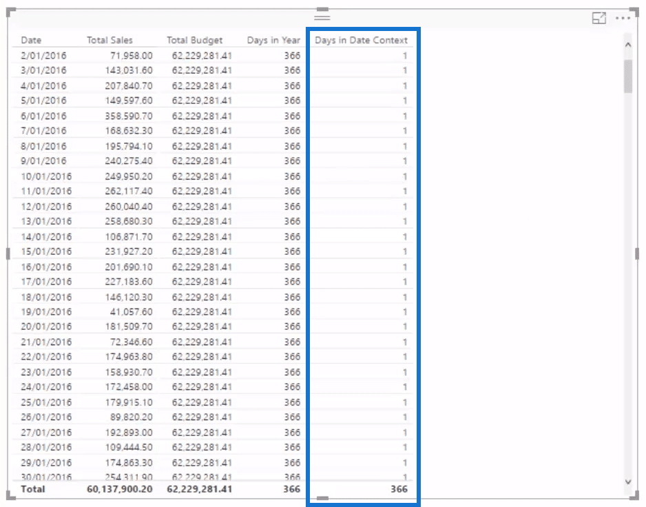
If we turn Dates into a Month, the numbers under the Days in Date column will change from 1 to either 30 or 31 depending on what month it is.
Determining Budget Allocation
Now that we have the correct logic on the table, the next thing we need to do is to write the master formula that will divide up this Total Budget. Let’s create a new measure and call it Budget Allocation, add the Days in Date Context and divide it by Days in Year, then multiply it by the Total Budget.

Once we drag this measure into the canvas, we now have a daily allocation.

Check out what happens when we put this into a monthly context; we can see that the numbers will automatically adjust for the month.
Visualising The Table
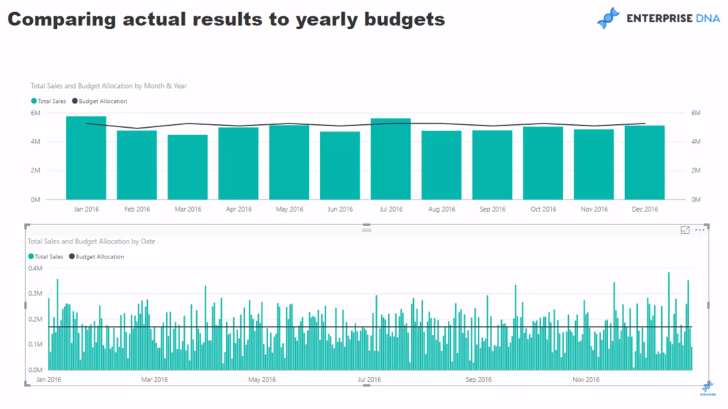
Now that we have the Total Sales versus the Budget Allocation, we can now remove our intermediary calculations and turn this into a visualisation. Let’s use the column chart for the Total Sales and the line chart for the Budget Allocation for both our tables. We can now clearly see the monthly budgets and daily budgets.
***** Related Links *****
Showing Actual Results vs Targets Only To Last Sales Date In Power BI
Compare Cumulative Information Over Different Months In Power BI
How To Calculate Budget Or Forecast Results Cumulatively In Power BI
Conclusion
It all comes down to creating the right allocation algorithm for your budgets. What I mean by this is your actual results will more than likely be at a daily level, but your budget could be at a monthly, quarterly or yearly level, or even a combination of many of those. The technical term for this is data at different ‘granularities.’
Once you get your mind around how to implement Power BI forecasting, you will be so amazed at the insight and visuals you can create off the back of it. It’s really great stuff that is going to impress your ultimate Power BI consumers, and the best thing about it is you can virtually automate the reporting of it.
For more details around both the advanced data modeling and budgeting scenarios, check out Enterprise DNA Online. There’s comprehensive coverage on all aspects of Power BI in the courses I have created.
Good luck with implementing this Power BI forecasting technique or a derivative of it in your own models.
Leave me a comment with any thoughts or feedback.


