When analyzing data, we want to know the next steps on how to find the missing values because most things in analytics are determined by different factors. To help you with this, we will tackle visualizing missing data in R using the ggmice package. You can watch the full video of this tutorial at the bottom of this blog.
“What do I do about missing values?” This is an essential question to ask when you’re analyzing data. We all hope they are easy to find since they are coded as nulls or NAs.

We’ll take a look at some general rules of thumb and next steps. We’ll learn how to answer questions such as such as how many missing data are there? How big is the problem? Can we find any patterns in the data?
There are a lot of ways to do this but we’re going to use visualizing missing data in R as the first exploratory start.
When To Drop And When To Find Missing Values
If there’s no pattern in how they’re missing and it’s affecting less than 5% of the observations, whether it is in the column or the dataset, then you could drop those missing values.
However, if it turns out that it’s more widespread and you can find some significant patterns based on the visualizations, then you may need to do something with that data.
So, instead of dropping them, we can impute these because there’s probably a story about why those values are missing in the pattern as they are.

In this demo, we will use a package that will impute the missing values. This is a new package for visualizing missing data in R and it’s called ggmice.
The idea is to find the pattern and how many missing values are, hence we will look at the plot pattern and then the plot predictor matrix.
MICE stands for multivariate imputation by chained methods. We are not getting into the mechanics but we will learn how this algorithm will impute our data if we use it.
Another thing to know about visualizing missing data in R using ggmice is that it’s really meant to be ggplot2 compatible, so we’re able to build some visualizations on the back of ggplot2, the famous visualization package.

Steps In Visualizing Missing Data In R w/ GGMICE
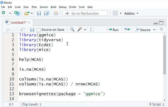
Let’s go ahead and boot up RStudio. The first thing we need to do is import all the packages that we need by typing in library (ggmice), library (tidyverse) which includes ggplot2, and library (Ecdat) datasets.
The library (Ecdat) package has a lot of good data sets to practice on. That’s why we are using and importing it.
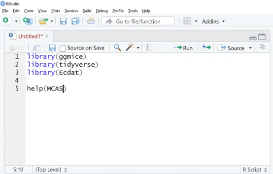
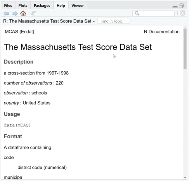
One of the data sets is help (MCAS). Let’s run the help function on this.
As we can see, this is from Ecdat, and it’s a test score data set. This help documentation describes each of the columns and tells us about where it came from.
We are going to use this to learn if there are missing data and what pattern they form if there’s any.
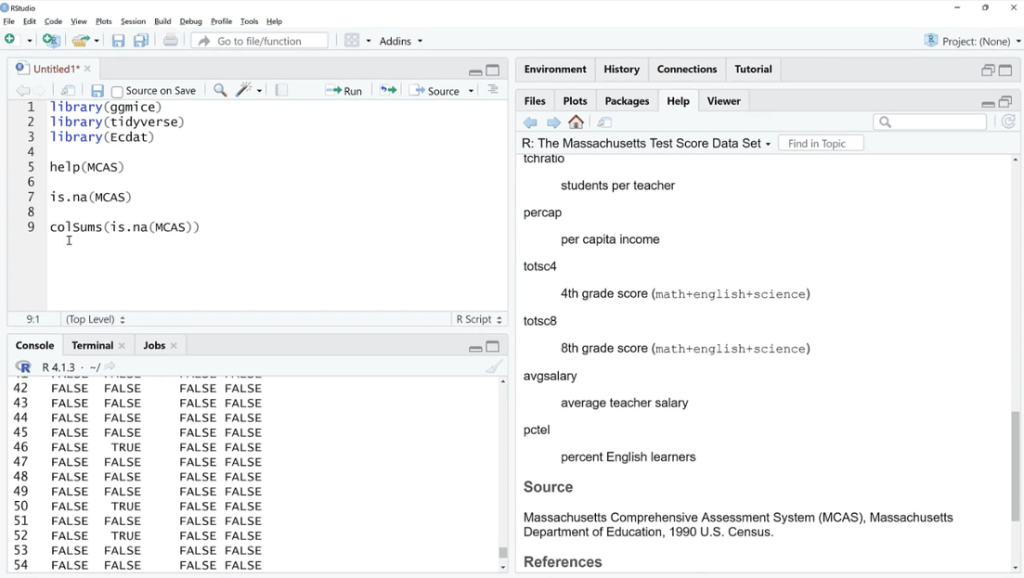
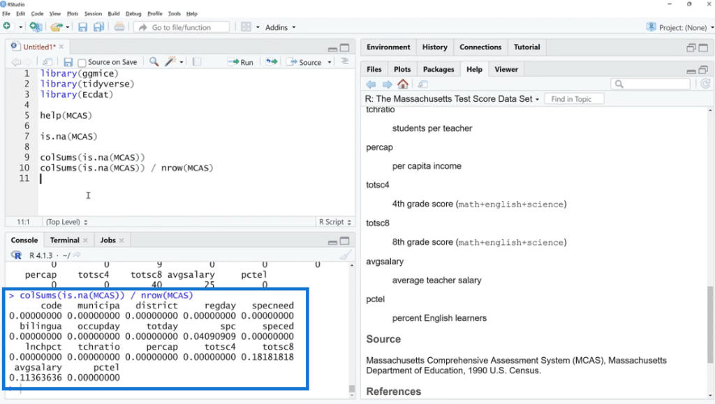
Let’s use is.na (MCAS) and click Run. As we can see, there are a bunch of TRUE and FALSE. What we can do is sum these up by using the colSums (is.na(MCAS)) function because FALSE and TRUE are zero and one in disguise. This is our way of checking if the value is missing or not.
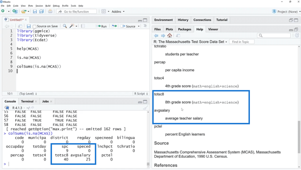
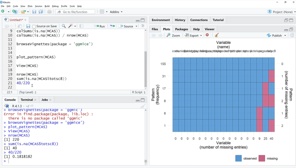
As shown below, the missing values are found in three columns such as spc, totsc8 and avgsalary. We can see the description of these columns in the help documentation section.
Also, by using colSums (is.na(MCAS)) / nrow (MCAS) the number of rows will turn into percentages. This is one way to look at it, but not the easiest thing to do.
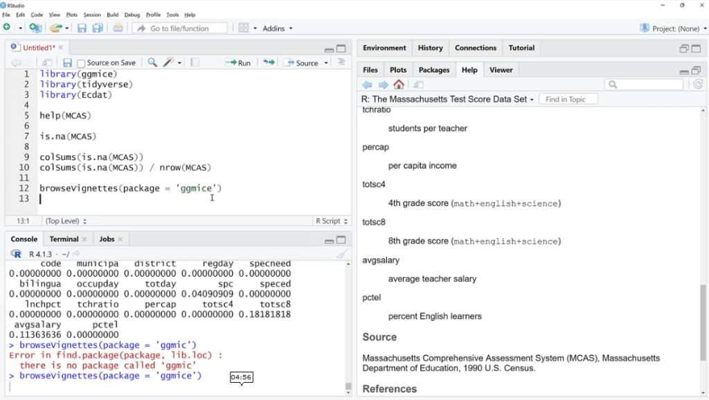
In this case, let’s look at what ggmice can do for us. We will use the browseVignettes (package = ‘ggmice’) function, then click Run.
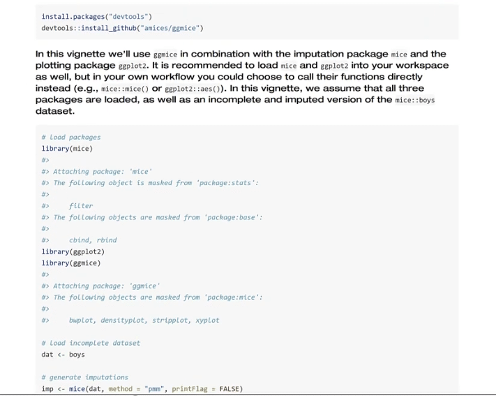
There are some vignettes found for this function, so let’s choose ggmice and click the HTML link to see some helpful tutorials that might help.

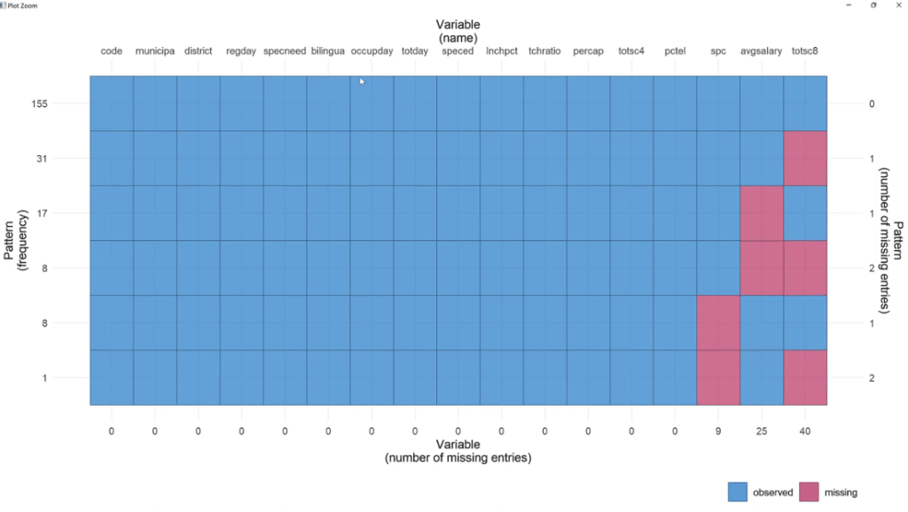
Going back to the script, let’s use the plot_pattern (MCAS) function to pass the data set.
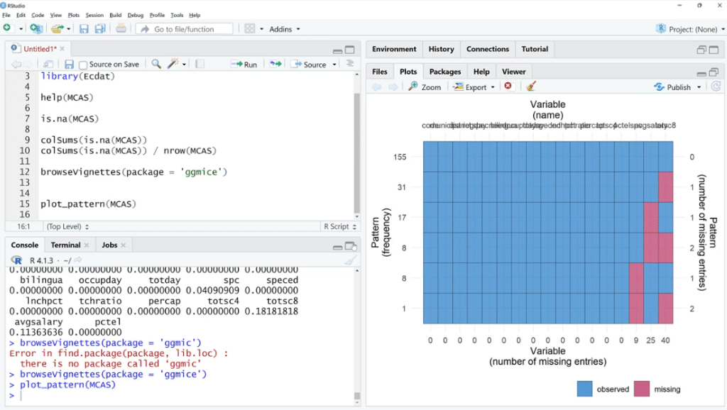
In order to visualize it better, click the Zoom button. As illustrated, out of 155 observations, spc has 9 missing values, 25 for avgsalary and 40 for totsc8.
We’ll try to find out if any of these coincide, how many are there, and if they tend to be in a cluster.

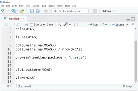
To cross-check this, we can try the analog way by using the view (MCAS) function and then clicking Run.
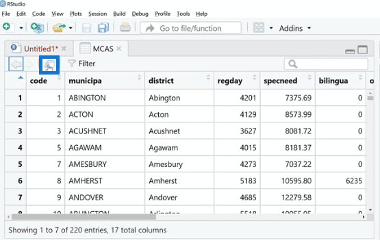
This is kind of a spreadsheet viewer where we can see all the missing values. We can also expand this by clicking the Source Editor button.
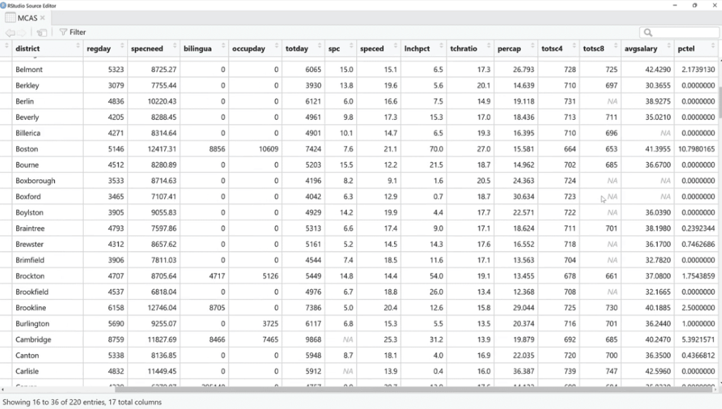
Similar to Power Query, we can see the total entries and the NAs are the missing values. Noticeably, the total entries on the view (MCAS) are 220, and only 155 for the plot_pattern (MCAS) because there were probably complete values that were not plotted per se.
Also, we can see that they do tend to cluster together based on the variables and rows. However, in a lot of cases, only one or the other is missing. The reality is, it’s tough to do this visual row by row, so this is where the visualization comes in.
Imputing The Missing Data
The next thing to do is to go back to our script, then type in nrow (MCAS) and then sum(is.na(MCAS)$totsc8)).
In this case, we know that 40 are missing values out of 200 observations. Let’s use R as a calculator by putting 40/200. Therefore, we have about 20% missing values, which is a lot.
Ideally, we want to know why so many are missing. Maybe it’s just how the data was collected which is why we can impute this.
To do that, let’s import the library (mice) package. This is one of the imputation methods.
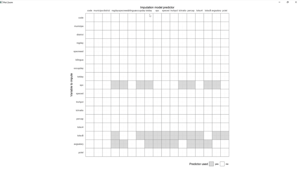
Then, let’s use MCAS_pred < – quickpred (MCAS) and plot_pred(MCAS_pred) functions. Make sure to save these, click Run, and click the Zoom button.
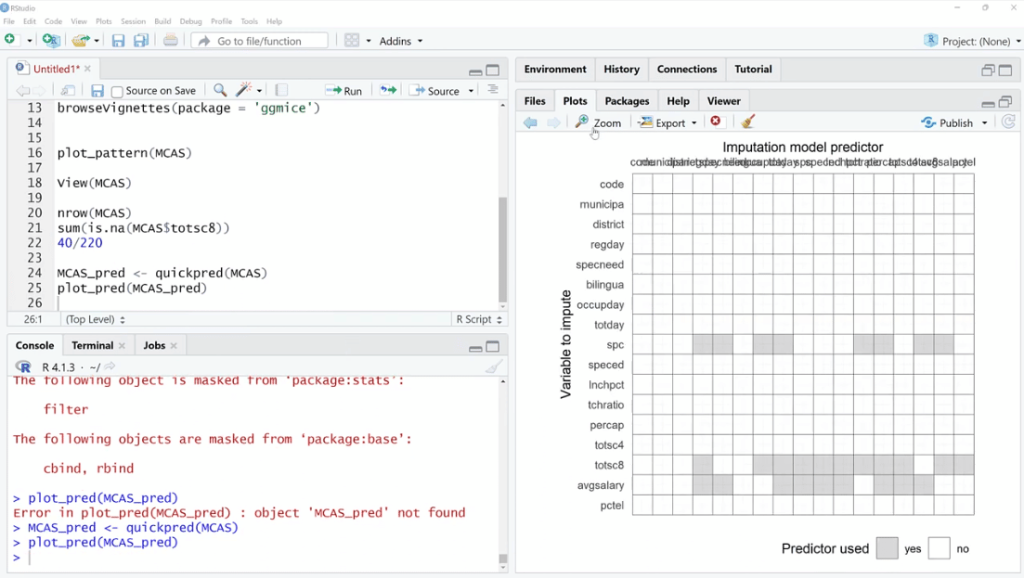
If we are to use multivariate imputation, this algorithm will find observations and data points that are similar to the ones that are missing, and then try to fill those in.
For example, the spc columns. These will be helpful for predicting the missing values same with totsc8 and avgsalary. At this point, we’re not doing it, but we are seeing what values and variables are related that might be helpful to impede those values.
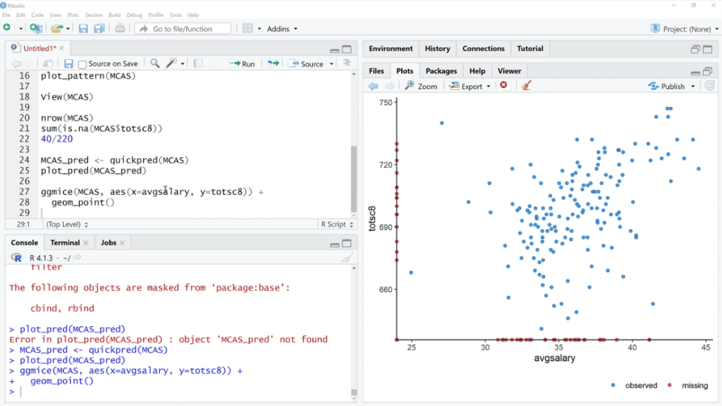
Let’s try one more thing. We are going to use ggmice (MCAS, aes(x=avgsalary, y=totsc8)) + geom_point ( ), then click Run.
This is a scatter plot, except we are using ggmice. Basically, the idea is we can see the relationship between these two variables that have quite a few missing values. When one of them is missing and the other is available, we can see where those points are.
In this situation, both of these are observed in one of these cases. One is missing and the other is not. If both are missing, it’s not going to be on the plot.
***** Related Links *****
Edit Data In R Using The DataEditR Package
Power Query Best Practices For Your Data Model
How To Install R Packages In Power BI

Conclusion
When we work with missing values, it’s tempting to use an algorithm like MICE because it’s very powerful to impute values. However, it is better to explore the data for yourself and understand what’s going on.
Ideally, if we have a lot of missing data, we want to figure out why and maybe we can try to get some more data or we can impute it. Going straight to the source is always preferred.
If we end up wanting to impute the missing values, we can do some simple imputation methods with the tidyverse package such as the mean or the median.
Without a doubt, the MICE package is powerful. It can be overkill for things that are very computationally intensive, but we are focused right now on just the visualization element of it.
I hope you learn something and feel free to use this package. Be sure to share it and try to get the word out because it’s a nice package to work with missing values that are ggplot2 compatible.
All the best,
George
[youtube https://www.youtube.com/watch?v=BQAk5aA8NJc&w=784&h=441]


