In this tutorial, I’m going to show you how I maximized a technique called measure branching to speed up my report development process on my submission for the 10th Power BI Challenge.
The Power BI Challenge is a series of scenarios where a data set is provided and participants are asked to deliver the set of requirements provided in each project brief. It’s a great way for Power BI users to find creative ways to apply their knowledge and skills in real-life scenarios.
This submission comes with several pages, two of which I’ve already discussed in another tutorial. In this blog post, I’m going to discuss how I created three more pages that are a bit more complex. Despite the complexity, I was able to make the process more efficient.

Creating The Plants Report Page
I’ll start off with the Plants page. This is how the end result looks like.
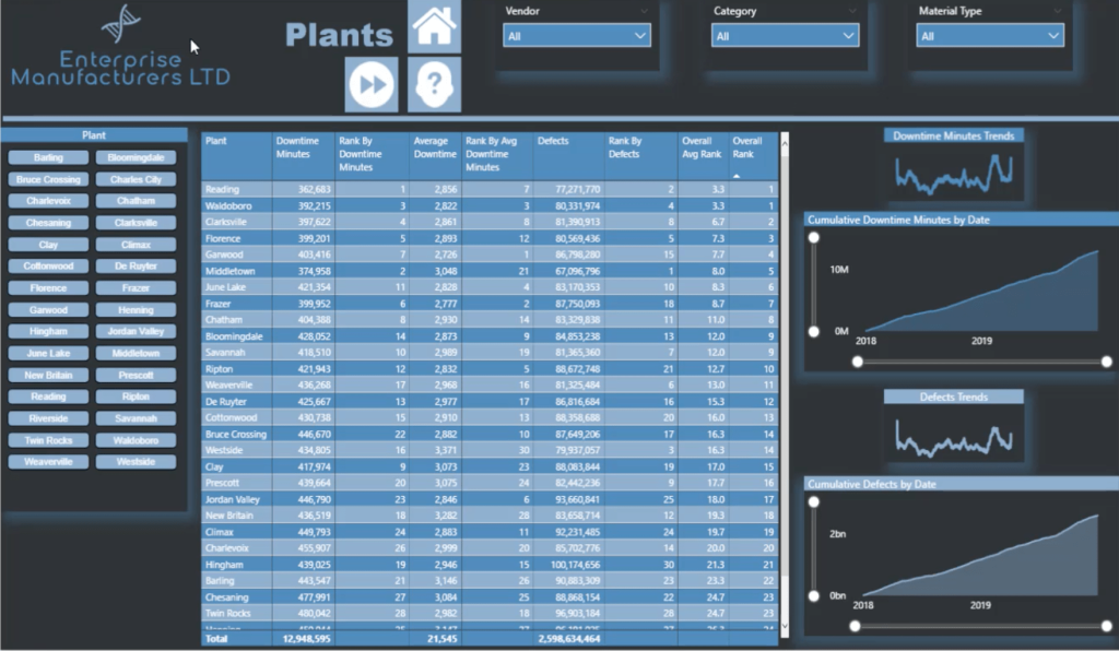
If you’ve gone through the other tutorial I mentioned earlier, you’ll see that the background is a bit similar. That’s because I created the backgrounds for my entire report in PowerPoint using a single template. I just changed the heading for each page.
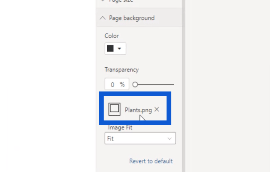
Then, I uploaded this background on every page. Since I saved the background slide for this page as Plants.png, you’ll see that same filename under Page Background in my visualization pane.
I also used these slicers for the Vendor, Category, and Material Type, which also appear in other pages.

The home button is a constant across all my pages. It’s a great navigation tool that makes it easy for users to go back to the homepage in one click once they’re done with this page.

What’s unique about the Plants page is the button here that allows users to view the combined information for plants and vendors.

The data for vendors has an entire page on its own, but combining the data for these two pages is helpful especially if the user wants deeper insights.
I have one more icon here on top which allows users to view plant anomalies.

Anomalies are fairly new and were introduced in the November 2020 update for Power BI.
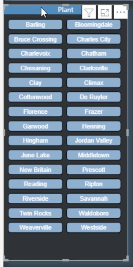
On the leftmost part of this page, I used what is called a chiclet slicer.
I created that slicer using this icon highlighted under my visualization pane on the right.
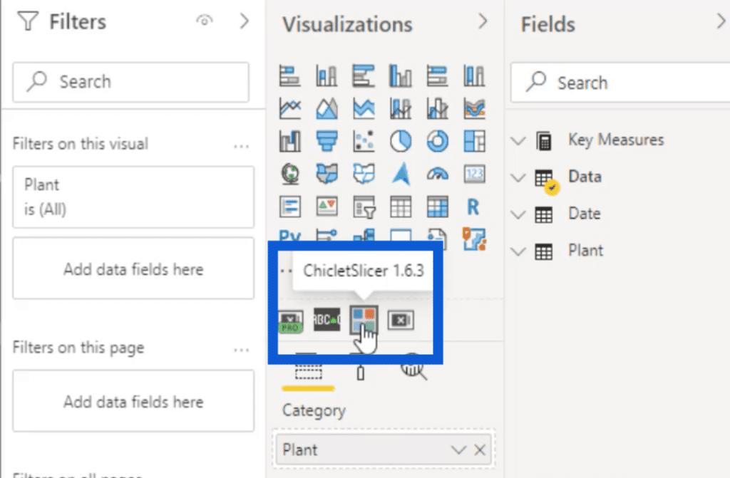
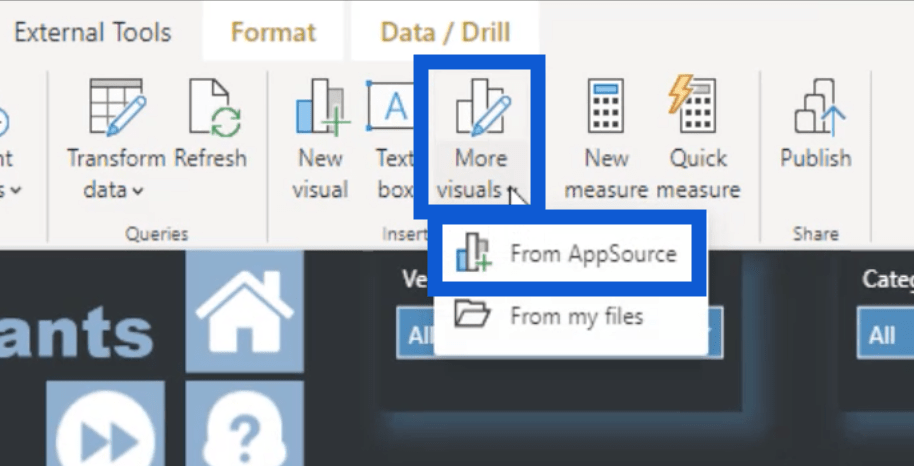
If you don’t see the chiclet slicer from your end, it means that you’ll have to get the app first. Simply click on More visuals under External Tools, then choose From AppSource.
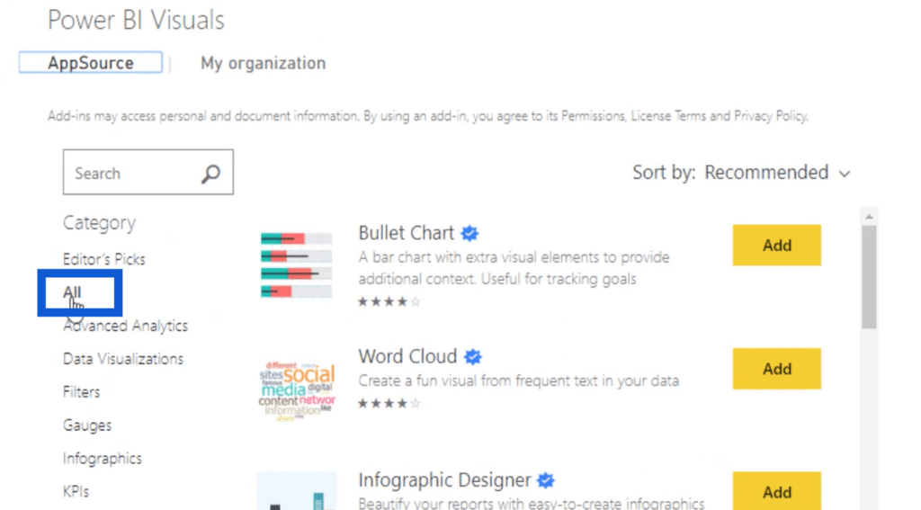
This will open a window that shows a list of different applications you can use for your report. Make sure that you have “All” highlighted on the left pane.
Using the search bar, just type in “chiclet” then hit the search button. The slicer you’re looking for will come out in the search results.
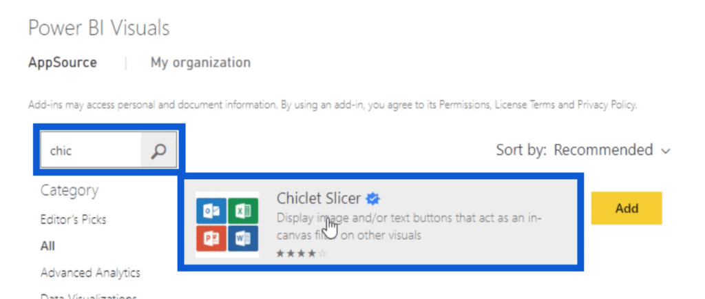
Once you hit Add, the slicer will show up on your visualizations pane on your Power BI desktop. This slicer is a great way to add variety to your reports especially if you want to go beyond the default options that come with Power BI.
Creating Visuals & Using Measure Branching On Downtime Minutes & Defects Trends
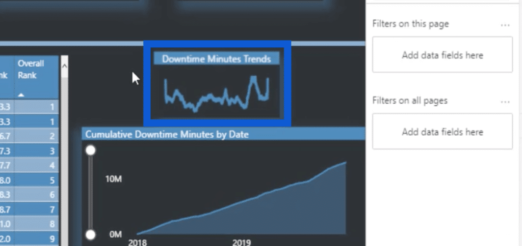
The visual on the right side of my page shows the Downtime Minutes Trends, the Cumulative Downtime Minutes by Date, the Defects Trends, and the Cumulative Defects by Date.
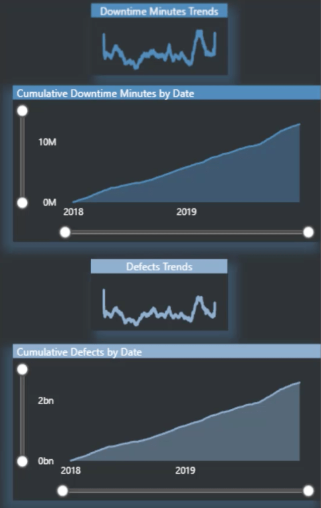
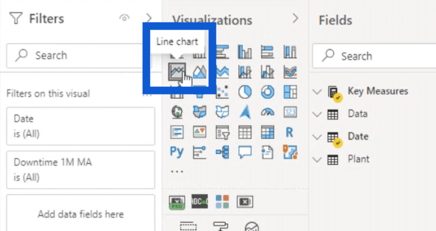
For the Downtime Minutes Trends, I used a line chart.
I created that using this icon under my visualizations pane.
As for the measure I used, that can be found under my Key Measures folder under Moving Avg.
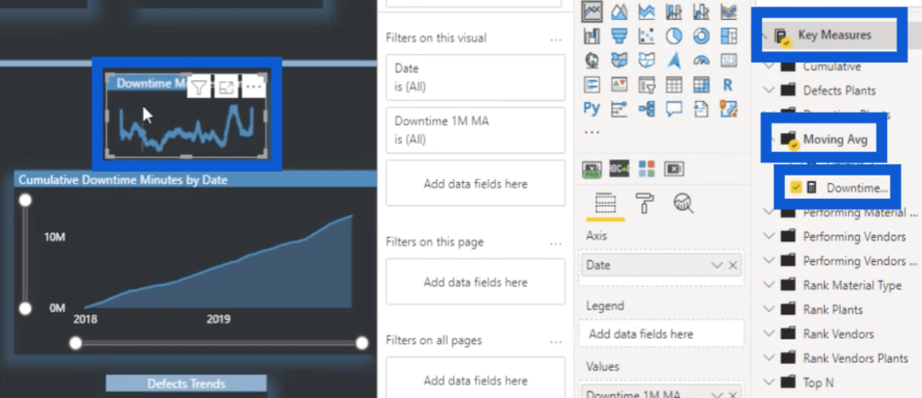
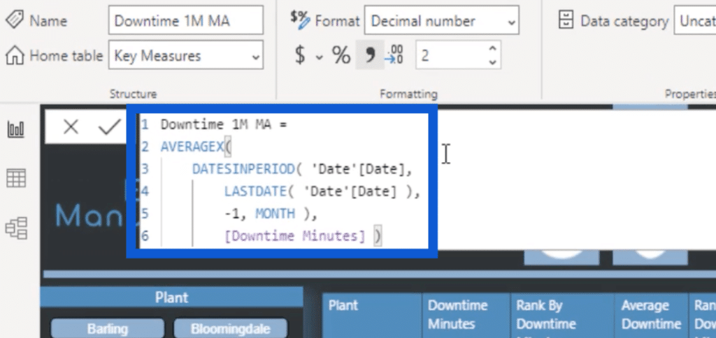
This measure is a calculation of the downtime one month moving average trend.
For those of you who read a lot of the Enterprise DNA tutorials or watch any of our tutorial videos, you’ll find this approach to be familiar. Our CEO, Sam McKay, uses this one month moving average technique in a lot of his videos.
It’s a straightforward DAX measure that uses AVERAGEX with the DATESINPERIOD from the LASTDATE minus one month. All of that is done over the Downtime Minutes.
This measure is already formatted. But I also know that a lot of us format our DAX measures in different ways. Regardless of how you format your measures, I use a great tool that could also be helpful for you.
If you visit the Enterprise DNA Forum, you’ll notice that if you scroll to the very bottom of any post, you’ll see various tools and resources that could be helpful to your report development process. To format my DAX measures, I use the DAX Clean Up tool.

I know that there are other sites out there, but I choose to use this tool because it’s tied to a number of other Enterprise DNA tools within the Analyst Hub. It’s also very straightforward and easy to use.
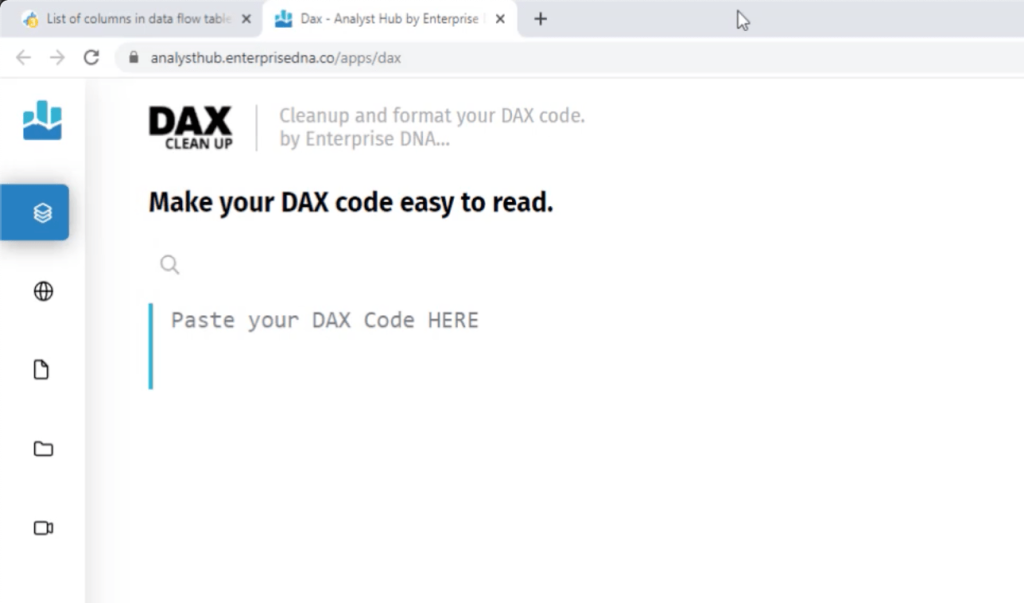
To show you how it works, I’ll paste the measure I showed you earlier into the space. Then, I’ll click on the Format button found at the bottom of the page.
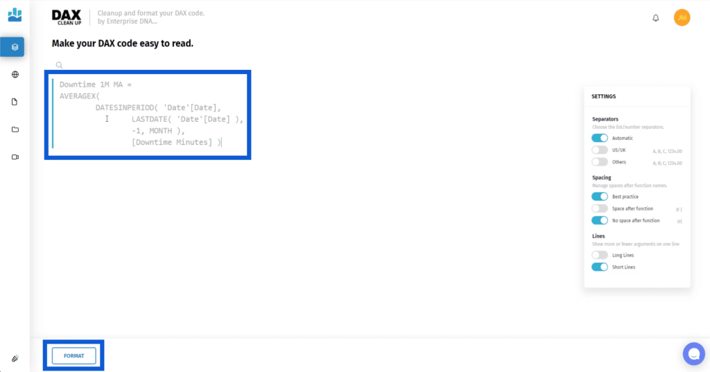
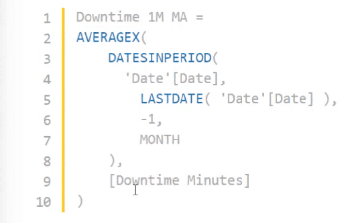
This automatically fixes the measure, giving it the cleanest format possible while considering your preferences.
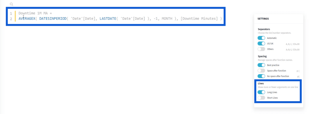
You can set your preferences on the Settings at the right side of the page. For example, if you’d rather have long lines instead of short ones, you can toggle the option for that under Lines.
Personally, I prefer using multiple short lines for my measures.
You also have the option to add a space after every function you use on the measure. As you can see, the space makes the measure easier to understand.
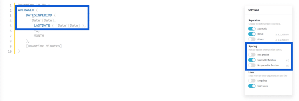
Once you’re satisfied with how your measure looks like, just click on Copy Code at the bottom.

Then, go back to the Power BI desktop and paste the formatted measure.
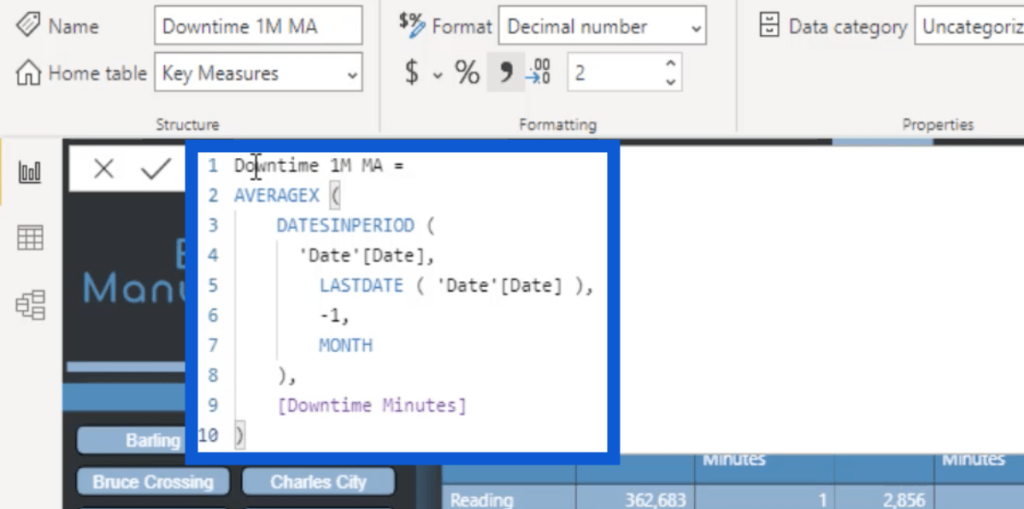
In my opinion, it’s highly important to keep your DAX codes clean and properly formatted. So make sure to also take the time to do that when you’re working with comparative measures.
Now that you’ve seen how I created the Downtime Minutes, it’s going to be easy to work on the Defects page. Sam always talks about measure branching and that’s the concept that I applied here.
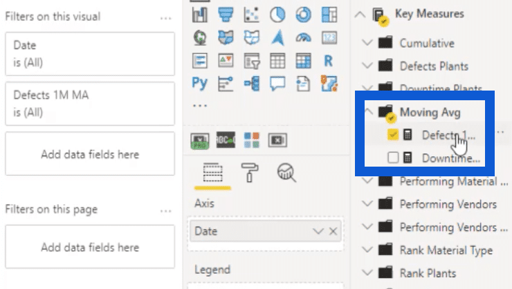
Measure branching means starting off with a simple core measure, and then creating or branching off to other measures.
In this case, I simply copied the measure for Downtime Minutes and converted it into Defects.
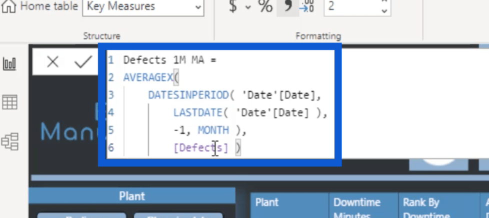
Now that the measures are in place, I’ll go back to my visuals.
When I’m working with line graphs like this one, I like the lines to be thicker than usual. This makes the trend more visible. The default is usually pretty thin, which means that the trends aren’t emphasized well enough.

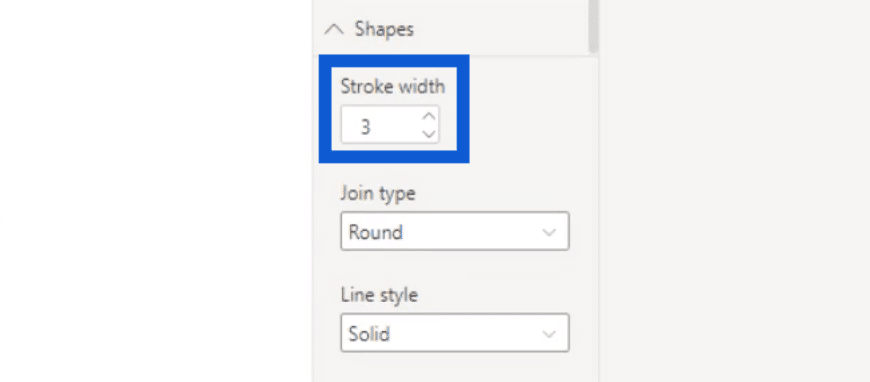
To tweak the weight of the lines, just go to Shapes under visualizations and increase the Stroke Width. The higher the number is, the thicker the line gets. For the visual above, I set it to 3.
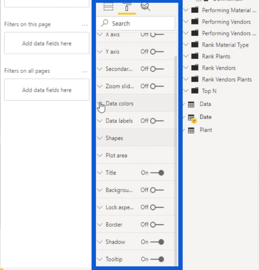
You’ll see that there are a lot of options here on how you can improve your visuals further. You can choose data colors or add data labels.
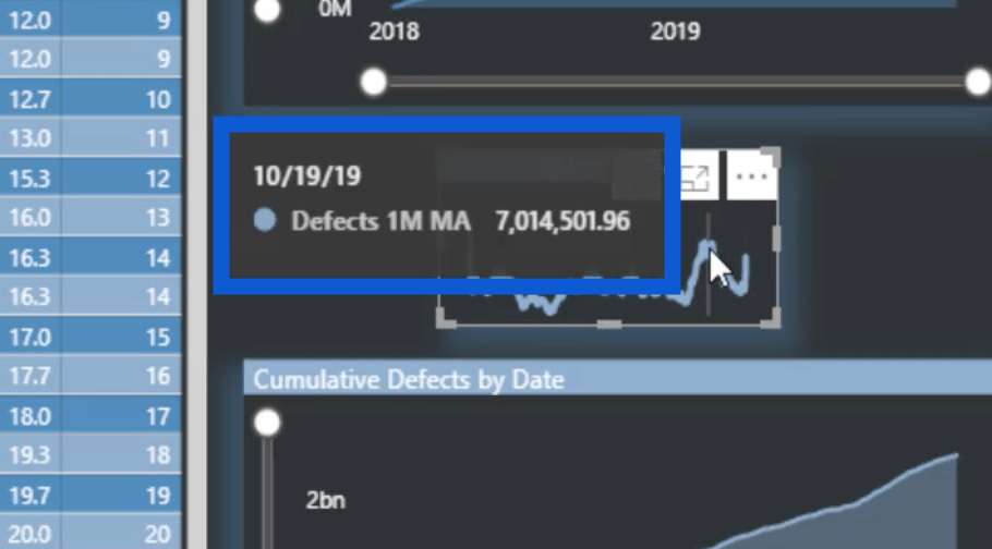
When it comes to this type of visual, I don’t normally use data labels. However, I like using tool tips. That’s why when you highlight your pointer over any point in the visual, you will see the one month moving average for that particular date.
Creating Visuals & Using Measure Branching On Cumulative Downtime Minutes & Defects
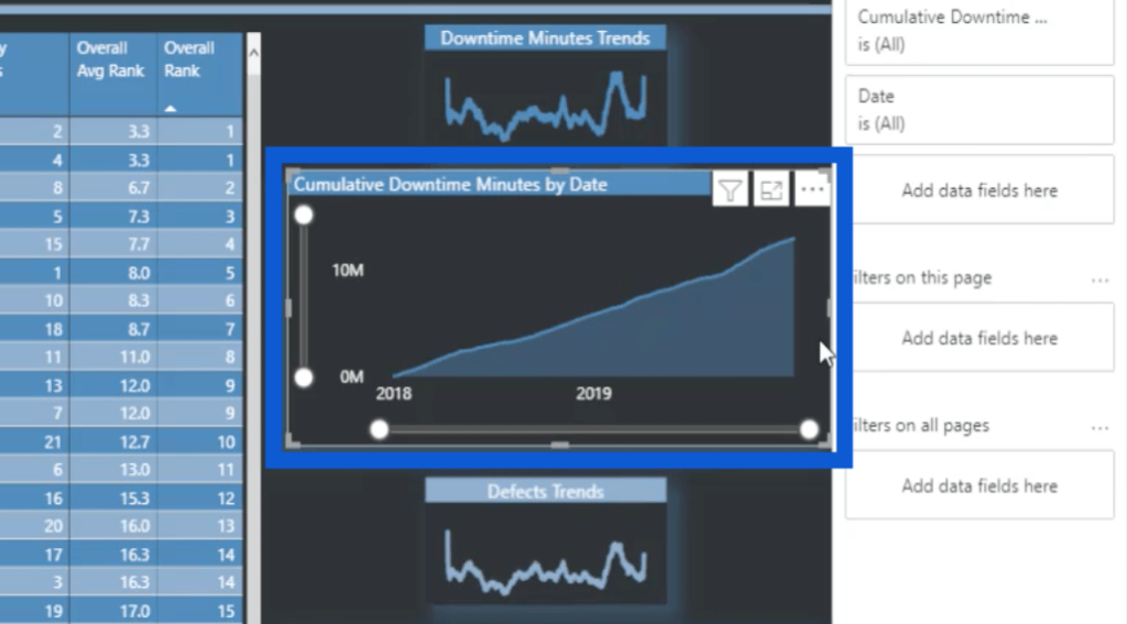
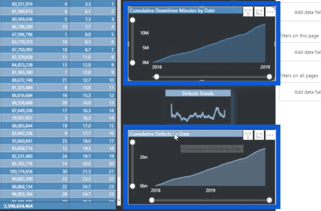
Once we move on to the visual for Cumulative Downtime Minutes by Date, you’ll see that it’s a basic area chart. Again, I just used the visual that comes with Power BI by default.
These were the cumulative measures that I created. I organized them by grouping them in the Cumulative folder.
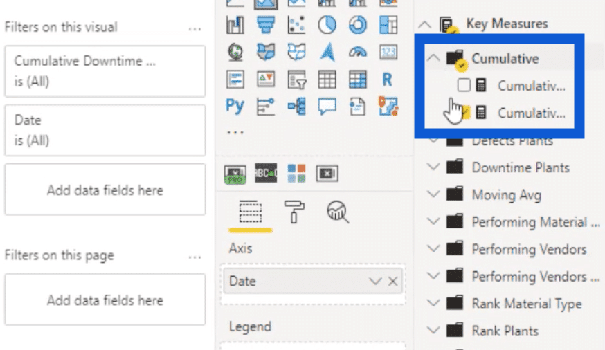
This is the measure that I used for Cumulative Downtime Minutes.
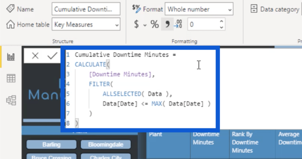
As you can see, the Cumulative Downtime Minutes measure was calculated using the CALCULATE function applied to the Downtime Minutes. Then, I used FILTER over the ALLSELECTED Data table with the Date being less than or equal to the MAX Date. This calculation gives me a cumulative total over time within this chart.
Sometimes, I include secondary values in these charts. For example, I can use an element like Downtime Minutes.
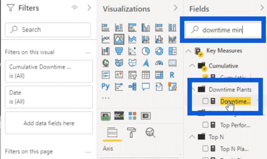
So I’ll search for Downtime Minutes under the Fields pane.
Then, I’ll put that as a secondary value.
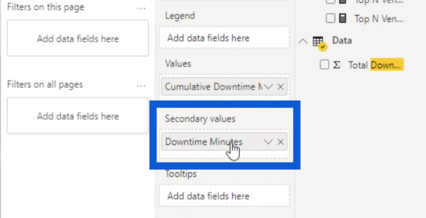
But when we look at the visual now, it doesn’t give us a clear picture of the data.
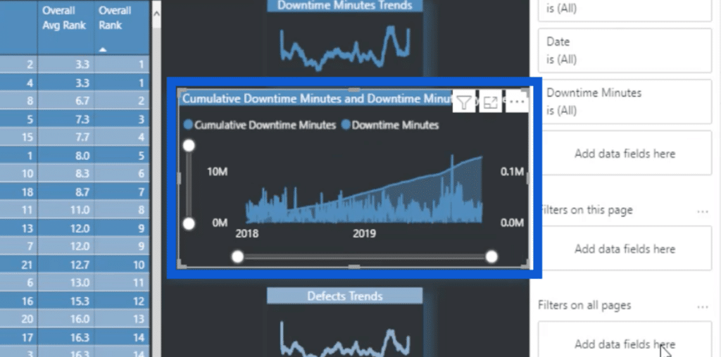
This is why I chose not to use a secondary value here. So I’ll take out that secondary value and then bring it back to how it was before.
What I did use in this visual are the zoom sliders. I used them on both the X and Y axis.
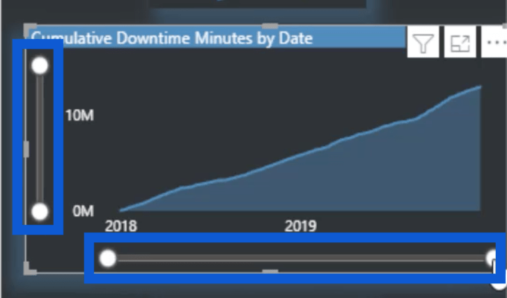
Zoom sliders were introduced in the November 2020 Power BI update. It’s a cool feature that allows users to zero in on more specific details.
The zoom sliders can be activated under the formatting pane.
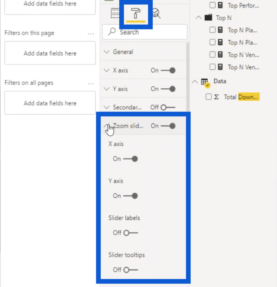
You have the option to use the zoom slider for either the X axis or the Y axis, or you can turn both on.
You also have the option to add labels and tool tips if you want to. But in my case, I don’t have as much space as I want, so I chose not to add them. But if I was working on a larger visual, then I would probably use them, too.
Basically, you just need to click on the slider and pull it up or down to zoom in and out of the visual. In the Y axis, for example, see how zooming in actually expands the numbers as well.
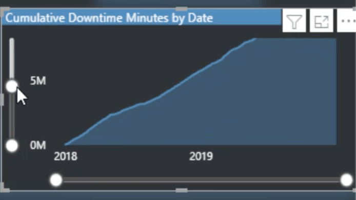
Zooming in on the Z axis does the same thing. When zoomed out earlier, it only showed the years. But when I zoom in, it starts showing narrower time periods, like months.
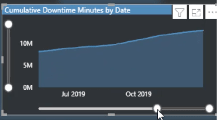
It’s a really cool feature, especially if you’re working with so much data and would like to allow users to zero in on the specifics of your visual. When you’re zoomed in like this, you can also see a larger view by clicking on this icon for focus mode.
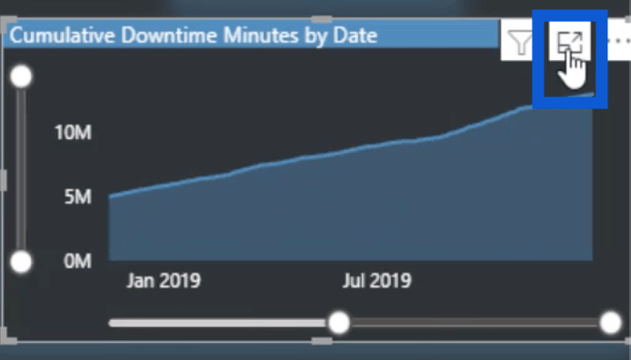
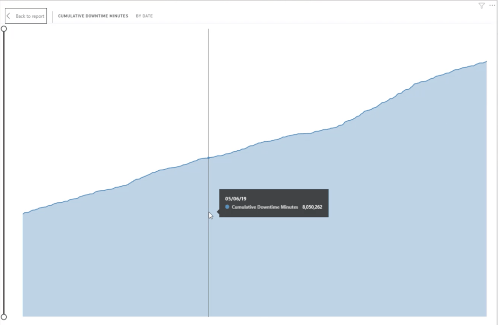
This expands that specific view to your entire screen, making it easier to check out data on specific points.
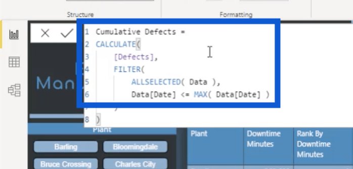
For the Cumulative Defects, I once again used measure branching to make my process more efficient. I copied the measure for my Cumulative Downtime Minutes, which I showed earlier.

Then, I duplicated it and switched out Downtime Minutes for Defects.
As for the visual, I did the same thing. I just duplicated the visual for Cumulative Downtime Minutes by Date, changed the color format a little by choosing a lighter shade, then I applied the measure for Cumulative Defects.
Using Measure Branching When Ranking Performance
The last visual I’m going to discuss for this page is the table in the middle. This is where I really did a lot of work, considering the number of measures that had to go into it.
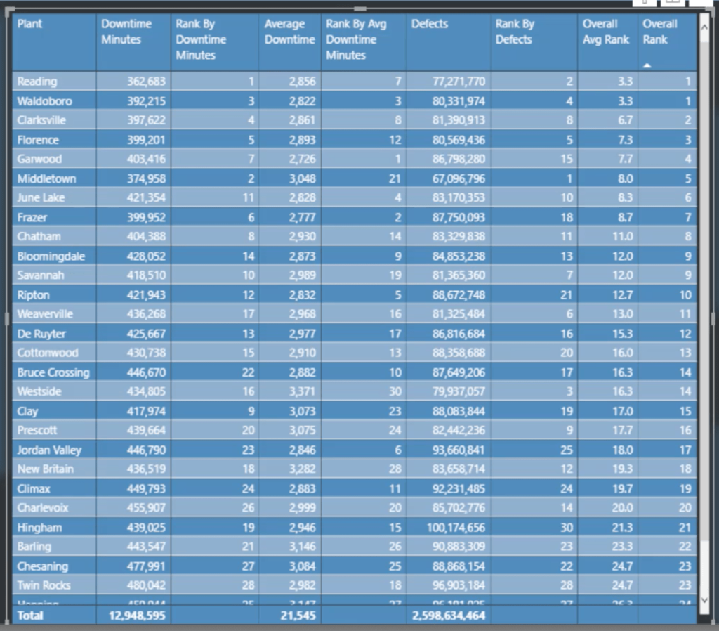
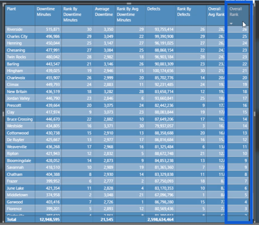
You can see that this visual shows the plant locations, downtime minutes, and defects, as well as some averages and rankings.
I’m going to start with the measure for Average Downtime.
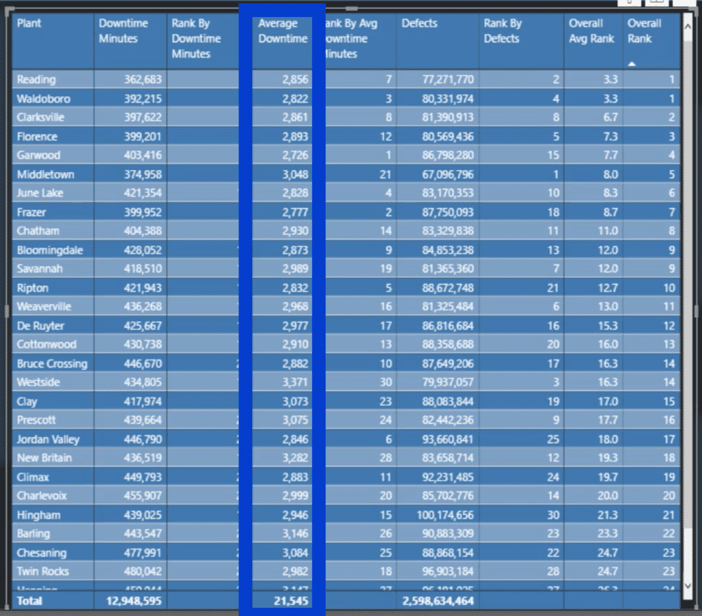
Here’s what that measure looks like.
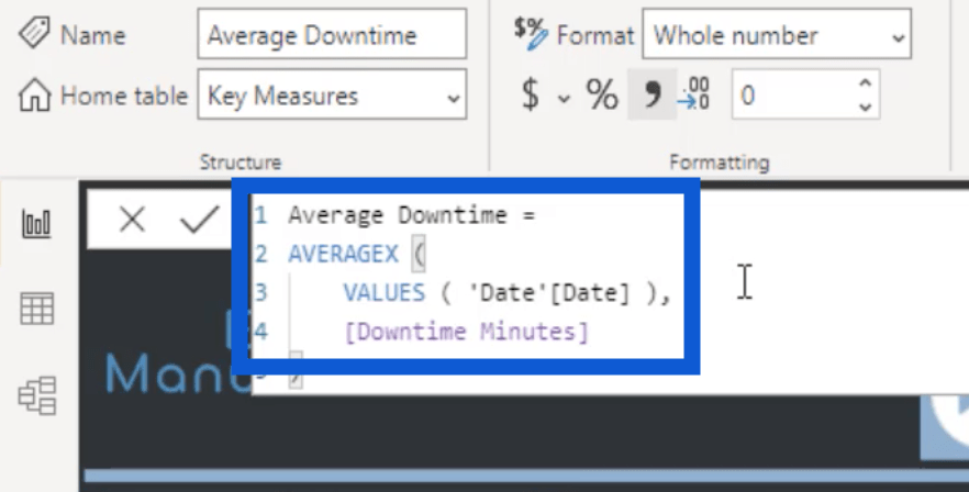
It’s a basic measure that uses the AVERAGEX of the Date VALUES applied on the Downtime Minutes for each plant. This is my primary basis when ranking the plants.
Next, I’ll show you how I did the ranking measures. I’ll start with the Rank By Downtime Minutes.
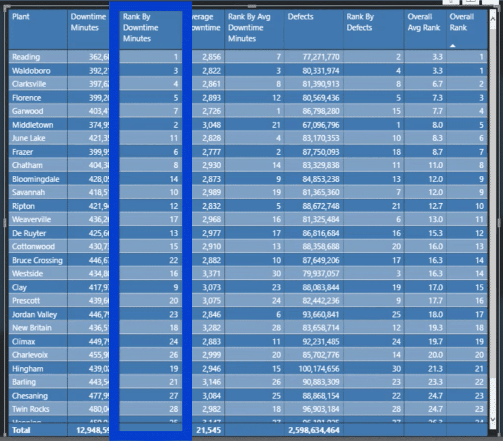
I called the measure Top Performing Plants By Downtime. Evidently, this name is too long to be used on the visual. That’s why I named the column Rank By Downtime Minutes instead.
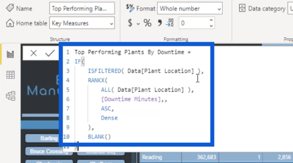
Basically, I used IF ISFILTERED for the Plant Location.
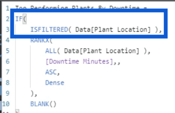
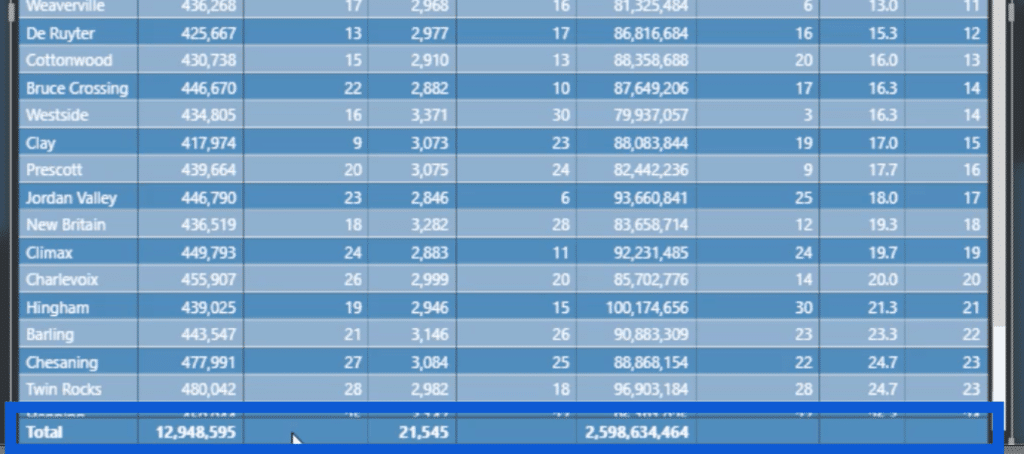
I used this combination because I didn’t need a total showing up at the bottom. I wanted the plant locations to be filtered out so that no total will come up. After all, there’s no sense in having a total when the column is merely ranking the data. That’s why you’ll see that the corresponding totals are blank.
Some may also use IF HASONEVALUE here instead of ISFILTERED. You can choose any technique that you feel comfortable using as long as it has the same outcome.
Next, I used the RANKX function applied to ALL Plant Locations.
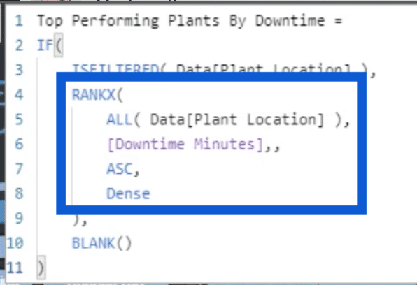
You can also use ALLSELECTED instead of ALL, depending on what results you want to see. The basic difference here is that ALL includes every piece of data regardless if I have filters in place.
Here’s an example that shows the difference. I’ll choose a specific vendor from the slicer here on top.
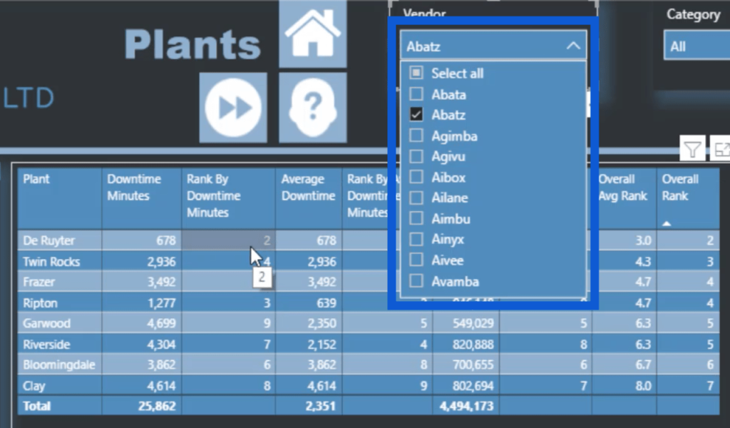
Once I do that, the data on the table will only show the applicable rows. Notice that under Rank By Downtime Minutes, it shows 2, 4, 5, and so on. This is how it looks like if you use the ALL function. It retains the same rank because the rank shouldn’t change if you filter some of the data out.
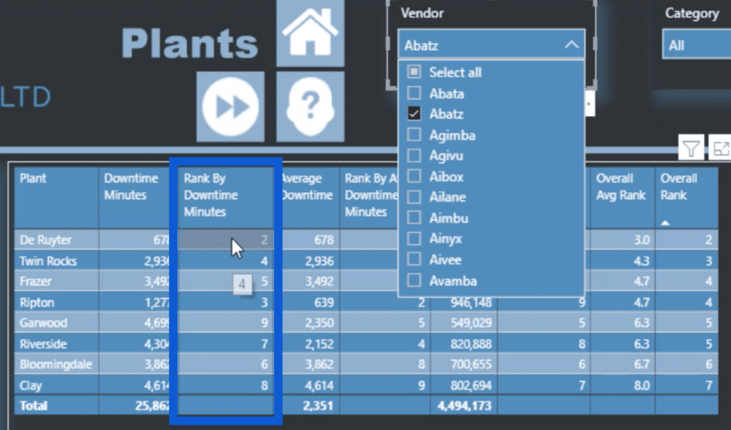
If I use ALLSELECTED in the same formula, these columns will then show 1, 2, 3, and so on. That’s because it will only rank the filtered results and will exclude the data that’s not showing up once the filters are in place.
Going back to the measure, that RANKX is also applied to the Downtime Minutes, with the data in ASC order.
At the end of that IF statement, I used the BLANK function.
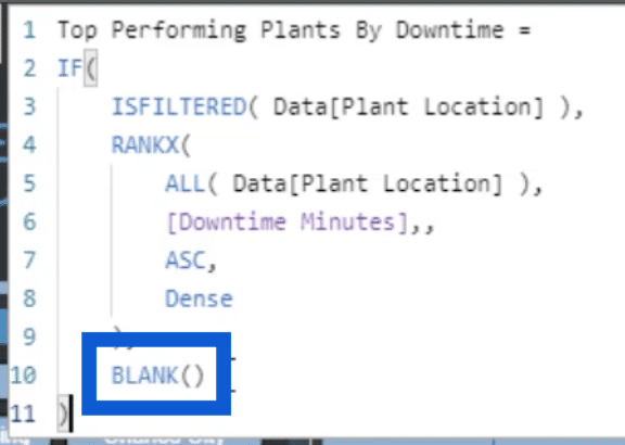
This ensures that if a plant location is being filtered, a rank will show up. If not, then it will leave the space blank.
Next is the Rank By Avg Downtime Minutes.
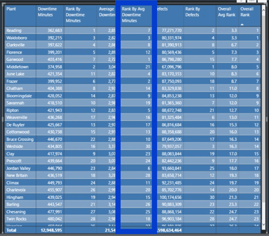
Once again, I’m going to apply some measure branching here. I’m going to use the same formula I used for the Rank By Downtime Minutes and use the Average Downtime measure instead.
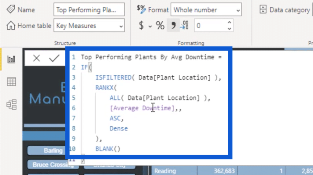
I did the same thing for Rank By Defects.

You can see that by using measure branching, creating Power BI reports is quicker and more efficient.
Now that I’ve done the measures for the ranks, I’ll work on the Overall Average Rank.

This one was a bit trickier and involved creating variables. I started off by creating a VAR for AddRank, which takes the three rankings — Top Performing Plants By Downtime, Top Performing Plants By Defects, and Top Performing Plants By Avg Downtime — and sums them up.

The next variable, which I called Result, just uses the DIVIDE function on the AddRank variable by three.

Then, I wanted a RETURN that applies the IF ISFILTERED functions again. Of course, if the Result isn’t filtered, then I want it to return a BLANK.

The next measure that I created was the Overall Rank.
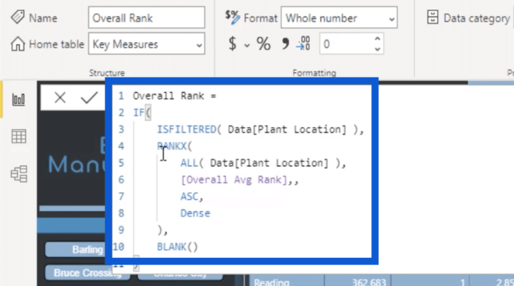
Once again, I used the IF ISFILTERED functions again. It also used RANKX based on that last Overall Avg Rank measure that I just did. It’s very similar to the first three formulas that I created.
When you look at the Overall Rank, you can see that there are ties.
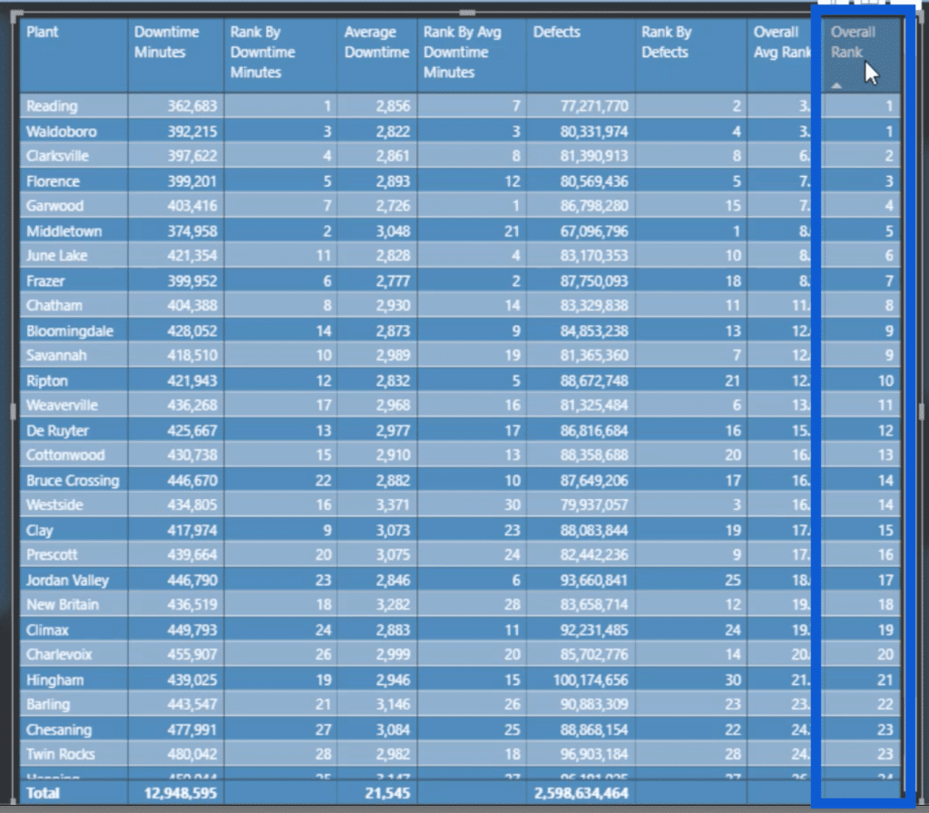
If I wanted to create a measure that would distinguish an overall rank and not have a tie, there are ways to do that with DAX.
Note that you can sort the Overall Rank from last to first by simply clicking on the arrow on the column name. This will put the worst performing on top.
Creating The Vendors & Material Type Pages
The Plants page may have required a lot of work, but the Vendors and Material Types pages contain the same elements. This means that I copied and pasted the measures for these pages.
For the Vendors slide, I just duplicated the Plants slide and subbed out the details specific to plants into details specific to vendors.
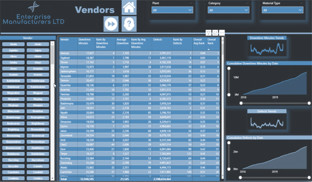
The chiclet slicer on the Vendors page just has more entries than the Plants page, but everything else is the same.
I did the same thing for the Material Type page.
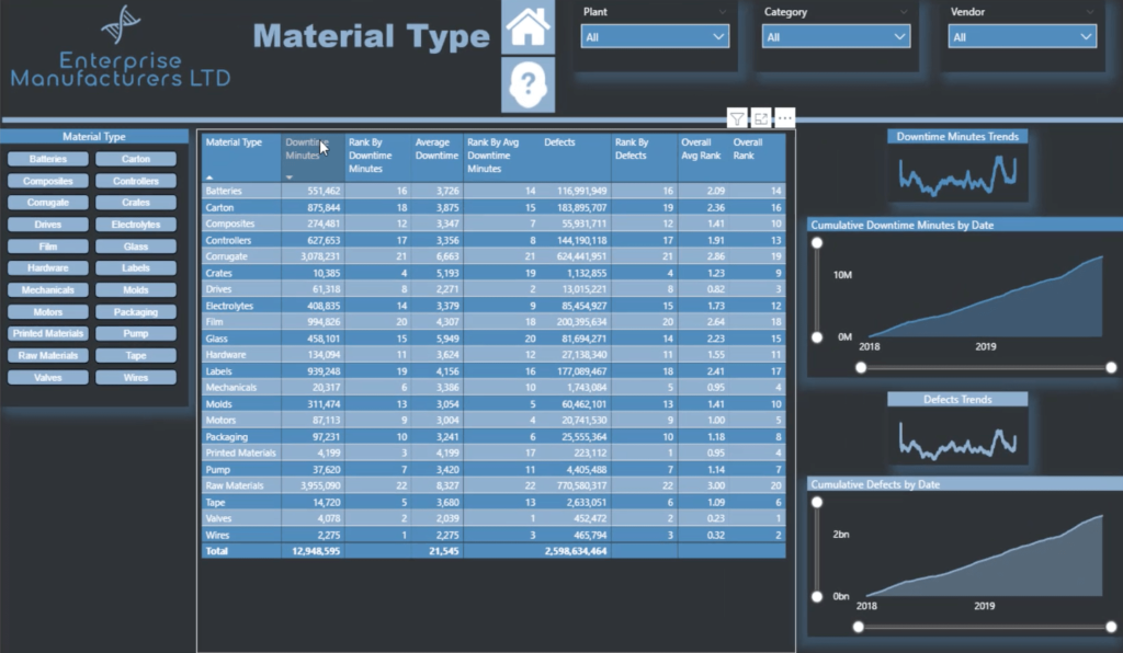
This shows that in multiple-page reports like these, you can just create one slide and turn that into three slides in a matter of minutes. All it takes is proper planning.
***** Related Links *****
Calculations In Power BI Using Measure Branching
Measure Branching: Power BI Development Strategy
DAX Measures In Power BI Using Measure Branching
Conclusion
Report development should be a thorough process because you want people to gain as much insights as they can. But it’s also counter-productive if you make it an overly tedious process because not everyone has the time to come up with complex reports.
This makes measure branching a great technique to make the process as efficient as possible without sacrificing results.
It also helps to have a clear plan and some design templates to work with. As you have seen in this tutorial, creating multiple slides in a short amount of time is possible in a well thought-out report.
I hope that you were able to pick up some of the techniques I used so that you can also start making your process as efficient as possible.
All the best,
Jarrett


