How to Use R In Power BI
There are three ways that R can talk to Power BI. This tutorial will teach you what these are and then show you how to connect Power BI to R script in the Power BI desktop.

The first step involves importing the data into Power BI via an R script. Then, you’ll be doing an applied step in Power Query. The demo will end with how to use R to create a data visualization.
1. Importing Data Using R Script
Open a blank Power Query report in Power BI. Go to Get data under the Home tab and choose More.
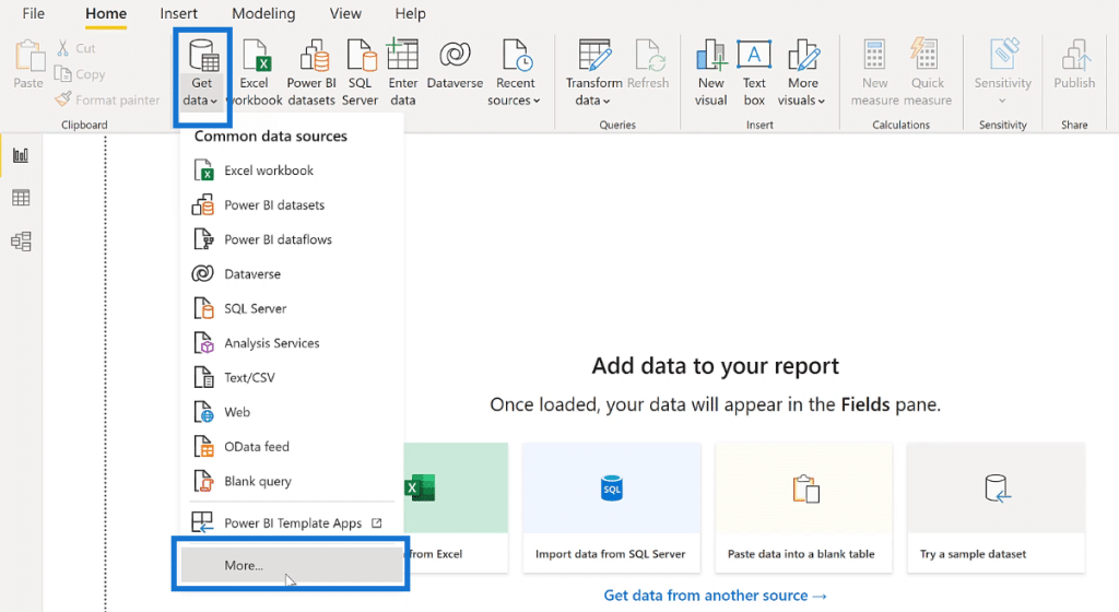
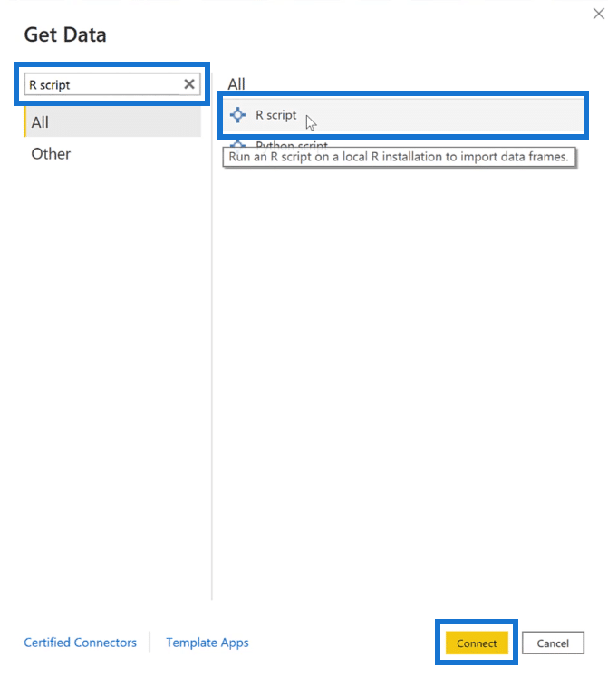
Once the pop-up window appears, type R script in the search bar and select it. Then, click Connect.
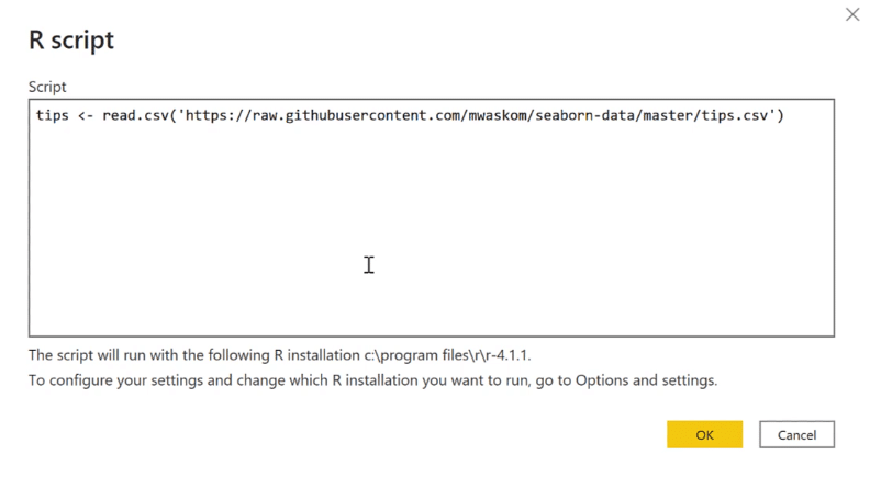
A blank box now appears on the screen. You need Power BI to read the .csv file and then turn it into a table. To do this, assign a name to the table using the assignment operator ( <- ). In this case, the resulting table is named tips. Then, use the function read.csv and place the .csv file’s url between the parenthesis and quotes. Press OK.
You’ll then see the Navigator pop-up window. When you select the name tips, the resulting table will appear on the right.
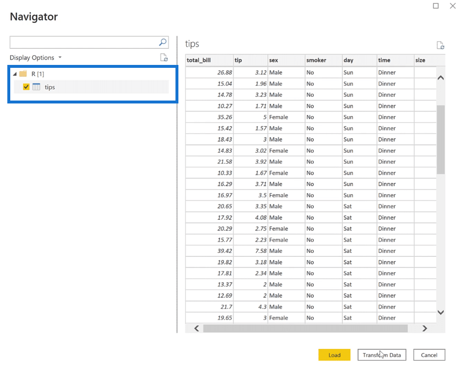
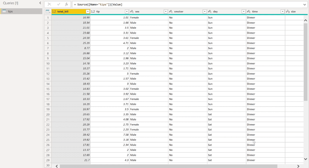
Since an R script is needed in the table, click Transform Data. You’ll now see the dataset and sources of the R script loaded into a table.
2. Executing An R Script In Power Query
Create a calculated column in the table. You can do this by clicking the Transform tab and then selecting Run R script.

The Run R script window will then appear. The blank box is where you input your R code.
It’s best to create all the R code in RStudio and then copy and paste them in the R Script in Power BI.
Dataset is the name of the table that you’re working with. In this case, you want to create a new dataset as shown in the image below.
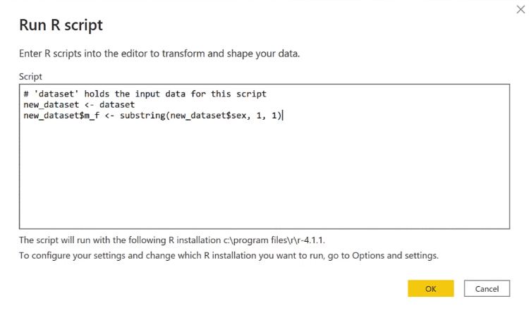
The first new_dataset is simply copying the original dataset.
The second line is a column. A dollar sign ($) after a dataset indicates that the succeeding input m_f is a column. This refers to the male and female data in the tips table. For this column, you need to use the substring function.
Once you’re done, press OK. You’ll then see in the Applied Steps pane that new_dataset has been placed under Run R Script. If you scroll to the right-most column in the table, you’ll see the result of the R script.
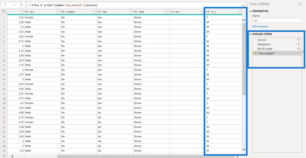
If in case you want to edit the R script, all you need to do is press the gear icon beside the Run R script in the Applied Steps pane.
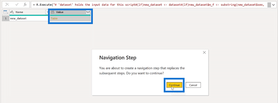
To get back to the table after you’ve made your changes, just click Table and then, Continue.
3. Creating Visualizations Using R In Power BI
Now, let’s go to the report editor to start building R visuals. Go to the Visualizations pane and select the R script visual icon.
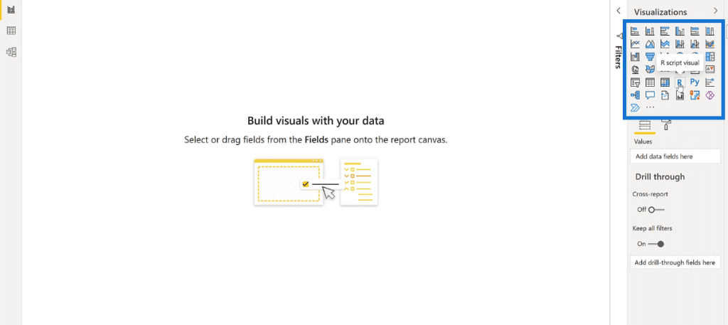
If you get a message asking to enable script visuals, just click Enable. You’ll then see that the report editor will now look like this:
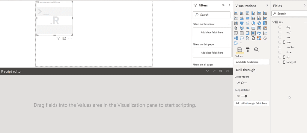
In the Fields pane, select the data you want to place in the report. For this demo, tip and total_bill were used. Once you select data, the R script editor will contain comments showing the R script used for each column.
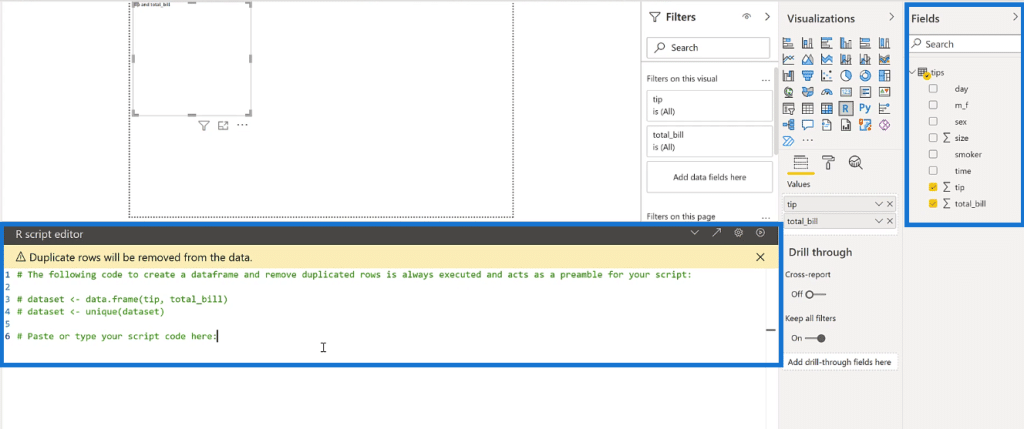
The first dataset creates a data frame and calls it tip and total bill. The second dataset uses the unique function to remove duplicated rows.
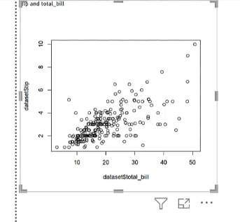
For the visualization, the plot function is used. You will create a scatter plot of the total bill and tip. For this graph, the total bill is on the x-axis while the tip is on the y-axis.

Once done, click the play button on the uppermost right corner of the R script editor. You’ll then see a simple scatter plot in the report editor.
Exporting From Power BI To RStudio
Again, it’s better to do your coding in RStudio since there are more features there when it comes to customizing visualizations using R. To bring your work in Power BI to RStudio, all you need to do is click the diagonal arrow found on the upper-right corner of the R script editor.

Doing so will redirect you to RStudio with all your progress intact. Highlight and run all the code in the R Script. This will give you the scatter plot you created in Power BI.
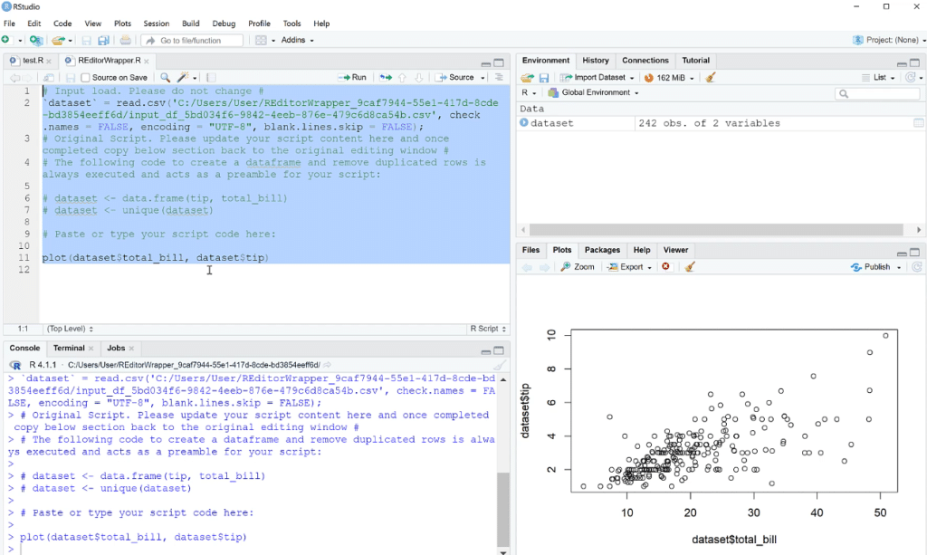
Now for the purpose of demonstration, let’s have a very simple example. In RStudio, interchange the data on the x- and y-axis.

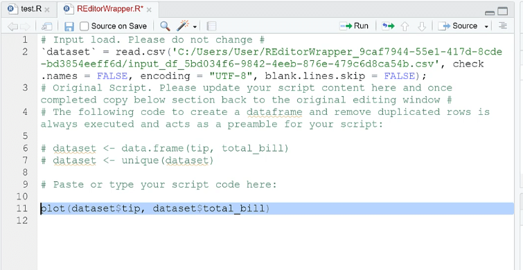
Then, copy and paste this in Power BI, replacing the old code. Run the code to see the changes.

Using Slicers In R Script Visuals
Similar to other Power BI visuals, you can change the scatter plot visualization using slicers.
Add a slicer in the report that changes the time.
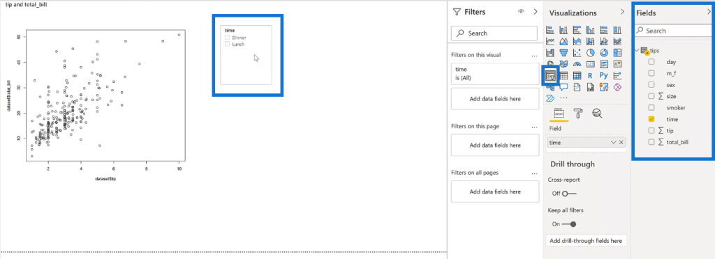
You’ll notice that as you click on an option, the data in the scatter plot changes.
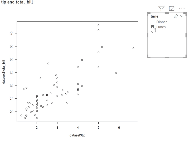
You should also note that as you deal with bigger data, showing the results on a visual after selecting a slicer option may have a bit of lag.
***** Related Links *****
Upcoming Course: Basics Of R For Power BI Users (Part 1)
R In Power BI: Downloading R And RStudio
Power BI With R And RStudio: How To Get Started
Conclusion
To summarize, the three ways that R talks with Power BI is through importing data, inserting steps in Power Query, and lastly, building visualizations.
R can handle big data sets such as analyzing audio or image data. Calling in from an API can also be made easier with R. In the next tutorials, you’ll deal more with building other visualizations and doing statistical analysis.
George


