In this tutorial, we’re going to look at how PowerApps charts and images can make our apps better.
Images and visualizations do not just add to the overall appearance of the app you are working on. They also make your app look more professional.
A lot of people also understand data better when presented visually. This means that your app is also more effective when charts, graphs and other forms of visuals are used.
Using Dynamic Images In PowerApps
Let’s start by looking at how we can use dynamic images in PowerApps. We’re going to apply these images to a gallery.
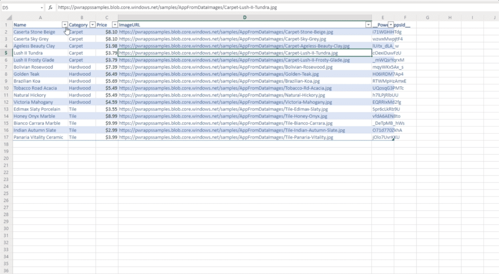
For this example, we’re going to use a reference material called Flooring Estimates. This table, which we’re going to use as a data source, has columns for Name, Category, Price and ImageURL.
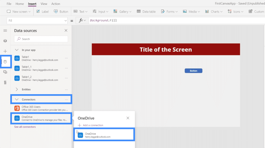
So let’s go to the data sources tab, click on Connectors, and go to OneDrive since that’s where the file is saved.
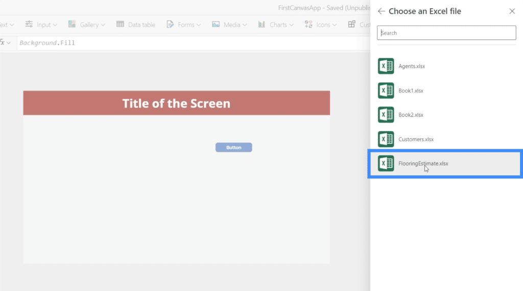
We’ll choose the correct file here.
Then, we have to make sure we’re bringing the right table in. In this case, we only have one table attached to that Excel file.
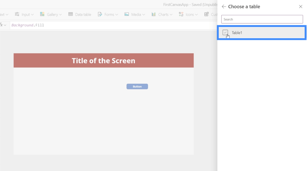
Since I have previously attached the other tables names as Table1 from other data sources, you’ll see that the one we just used now appears as Table1_2.
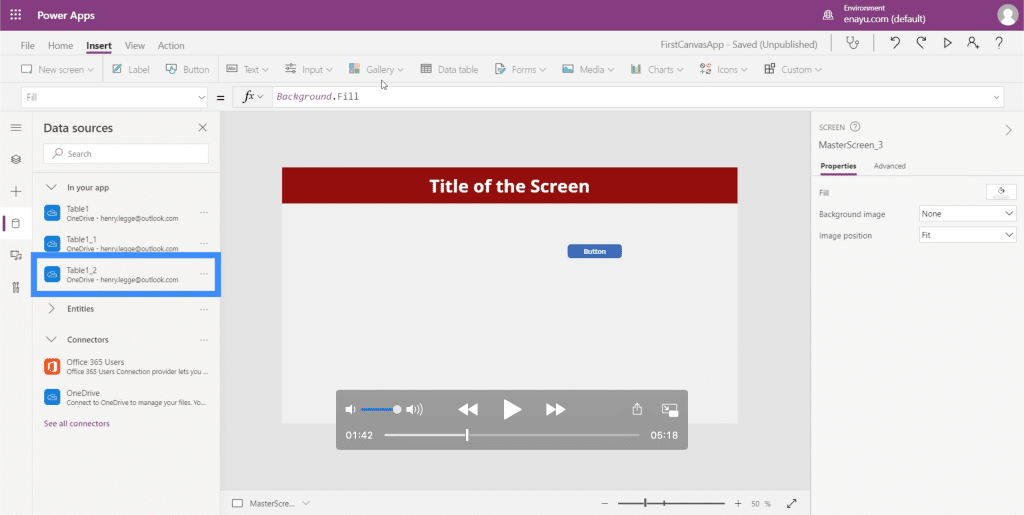
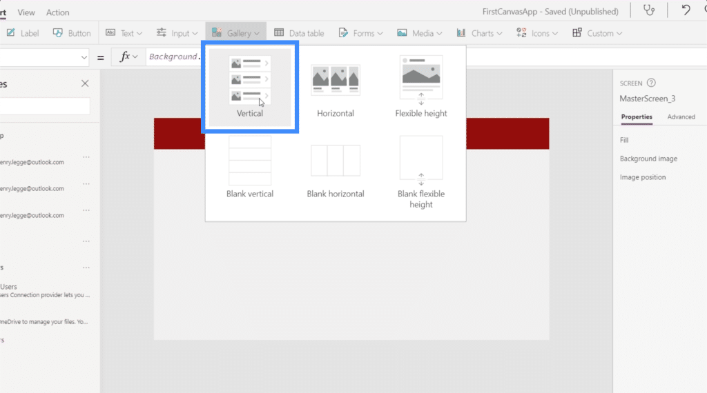
Now, let’s add a gallery and choose a vertical template.
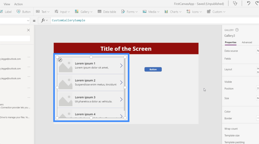
Once the gallery appears on the screen, we can move it wherever we need it be or resize it as needed.
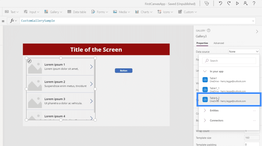
Since we’ve already attached Table1_2 to this app, we can now see it as an option under Data Source.
The data from the table now appears inside our gallery.
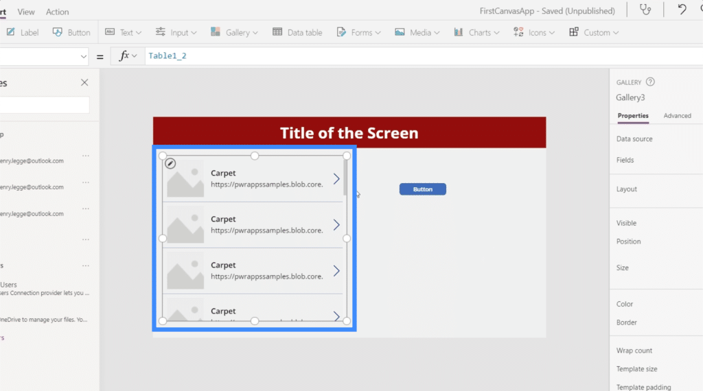
Note that it’s normal for users to get to this screen and not see any data inside the gallery. In cases like these, all we need to do is to refresh the data source.
To refresh the data source, we’re going to need a button that will use the Refresh function. As you can see, this references Table1_2.
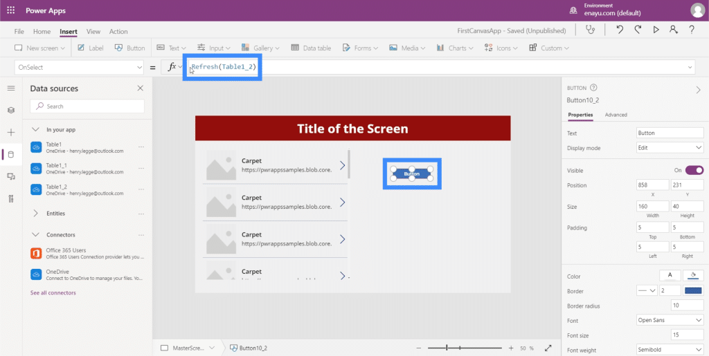
This simply means that the Refresh function will be applied to that specific table we’re referencing.
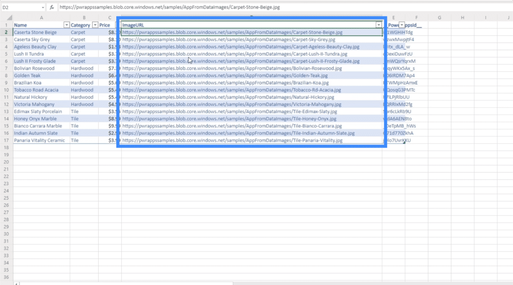
If we look at this gallery, we can see that the subtitle is currently showing the ImageURL column, while the title is showing the Category column.
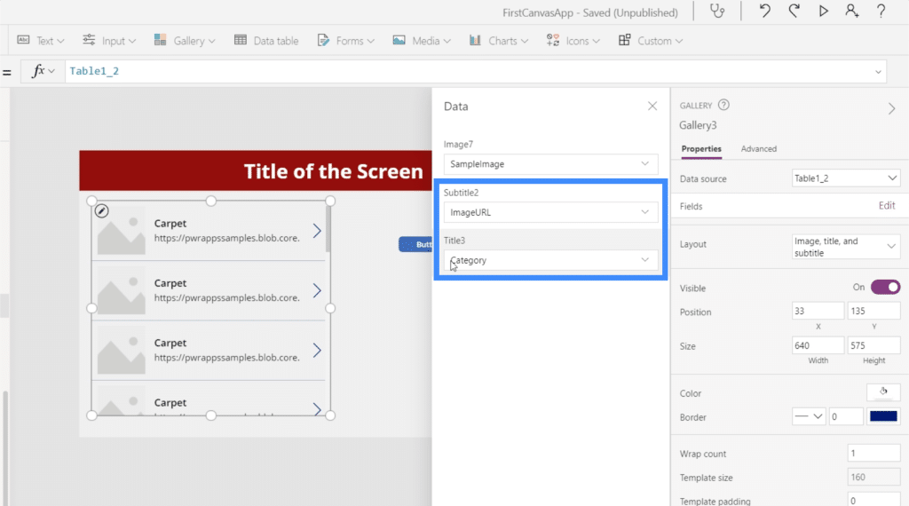
Let’s change the subtitle to Price and the Title to Name.
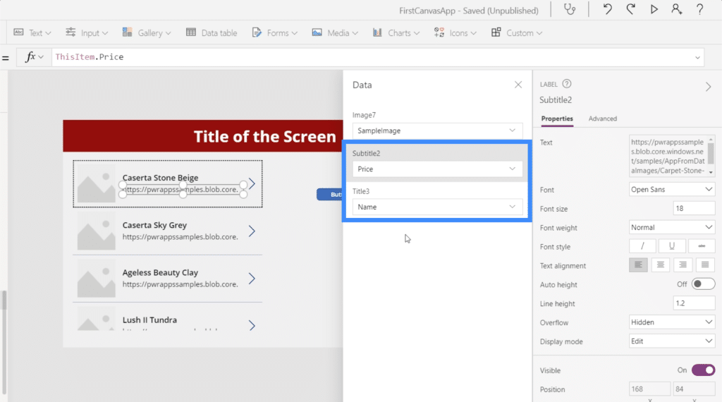
As for the image, you’ll see that there is no option to have our chosen image dynamically selected. The first option allows us to an add image file, but doing it individually for each item will be time-consuming.
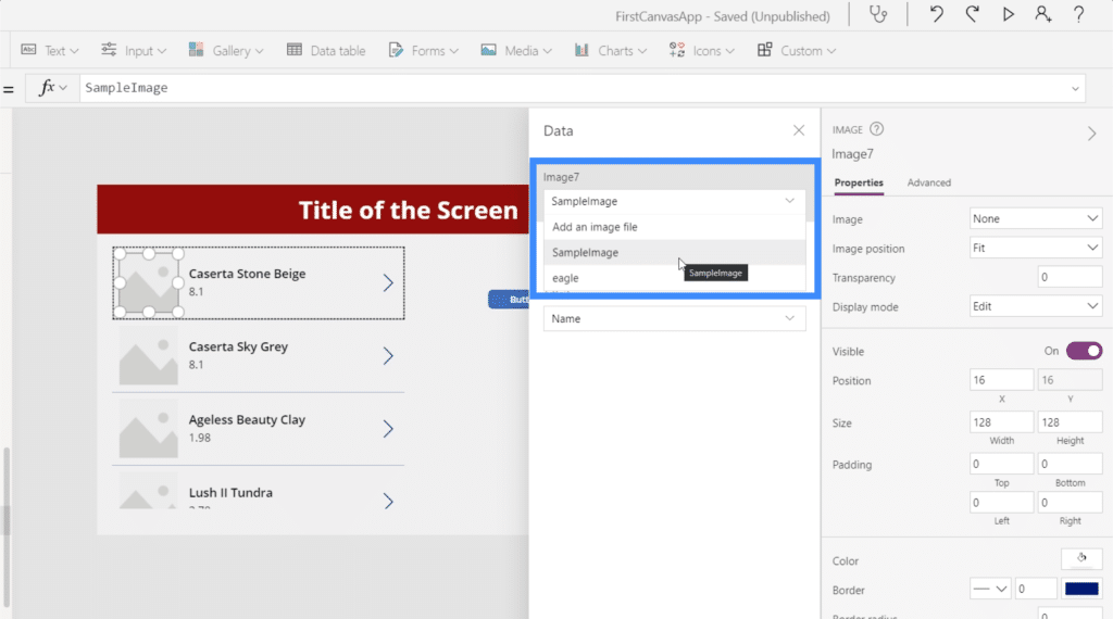
If we choose an existing file, like this picture of an eagle, it will populate all the image slots for the entire gallery. Evidently, we don’t want the same image to appear here.
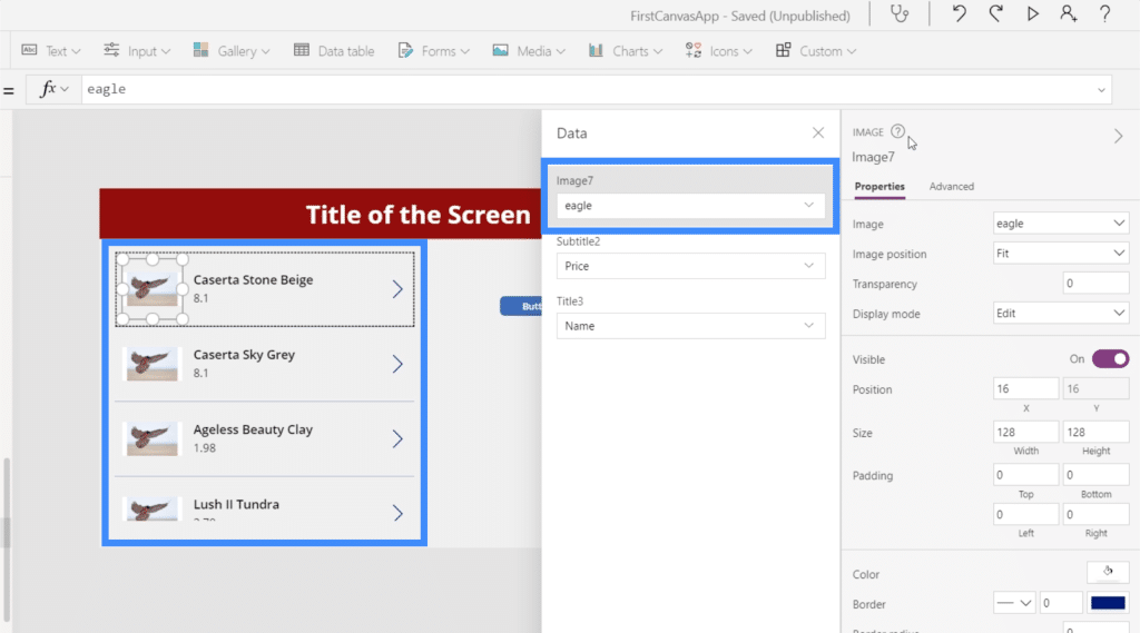
We want each item to show the specific image that these image URLs in our data source represent.
To make this dynamic, let’s select one item in the gallery and choose image from our property dropdown on top. At the moment, it’s equal to “eagle”, which is the file we chose earlier.
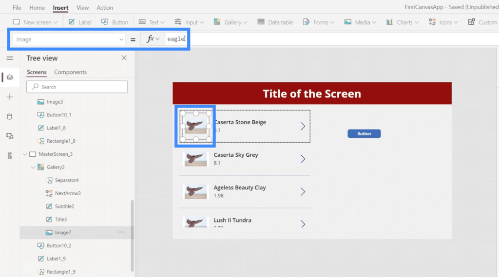
Instead, we’re going to use ThisItem.ImageURL.
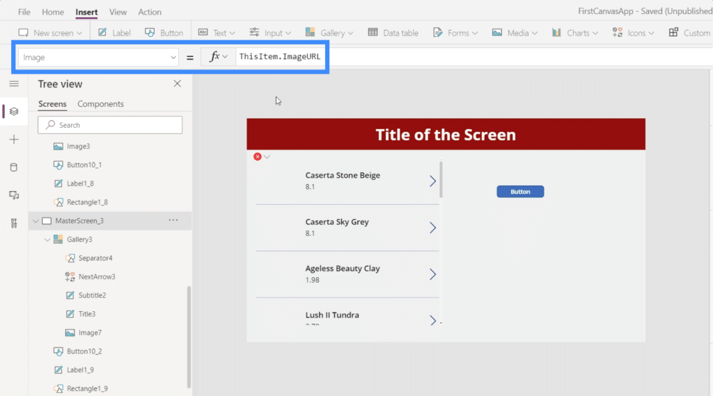
Basically, this references each specific item in the gallery and gets the image URL attached to it.
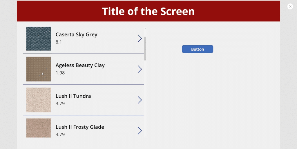
Now, the gallery shows the different images coming from the URLs in our data source.
This adds so much functionality to any app we work on. In this case, we’re seeing a product list where customers can see what each item looks like.
But if we’re working on an app that has a list of customers, for example, we can use the same approach and have pictures of each person showing in the gallery to make it easier to recognize them.
Using PowerApps Charts and Graphs
This time, let’s try to add charts to our app. This is another visual representation of data that can help make our app more engaging.
Without a doubt, using Power BI tiles is the best way to add PowerApps charts to any app.
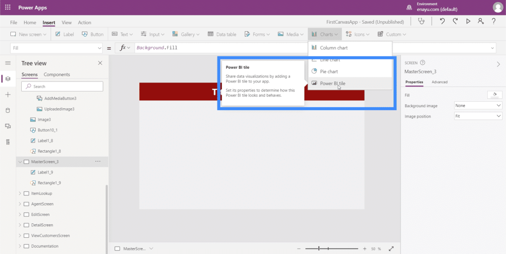
Any Power BI user knows that one of the platform’s strengths is the ease by which visualizations can be made. So it’s easier to create the chart in Power BI, then use it as a tile in PowerApps. This way, users can interact with the chart or graph as if they’re using it within Power BI.
Of course, there are built-in PowerApps charts that we can use as well. However, these charts are all static, which could impact engagement and functionality.
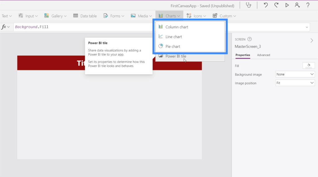
However, these built-in charts could still be useful if your only goal is to visualize a small dataset or if you’re not interested in using a more dynamic chart.
To do that, we need a data source. In this example, we’re going to use these two columns showing Location and Revenue.
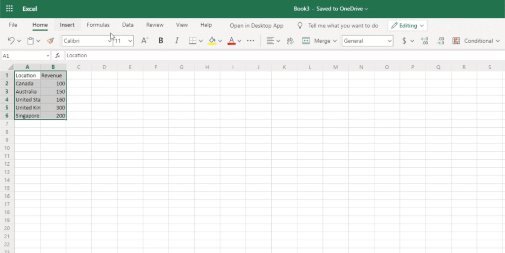
To use this as a data source, we need to convert it into a table.
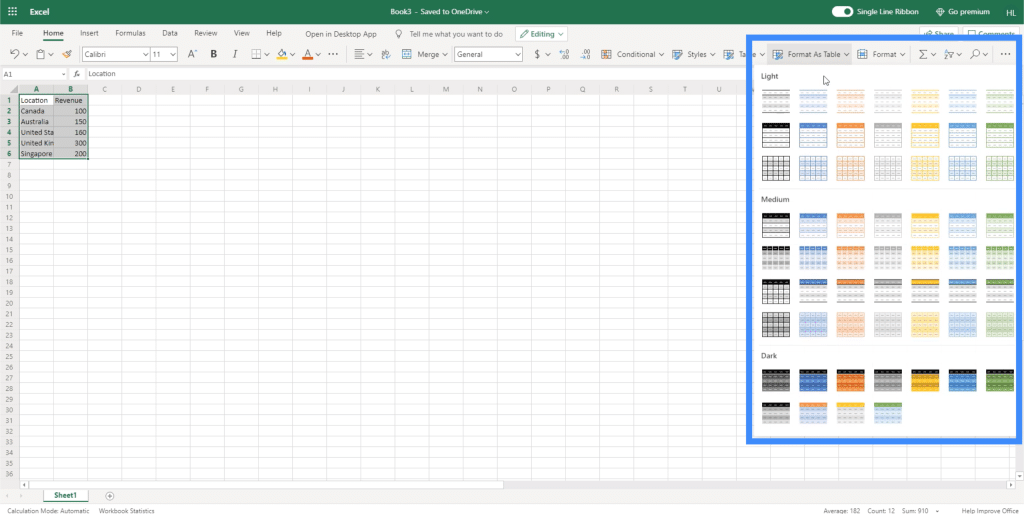
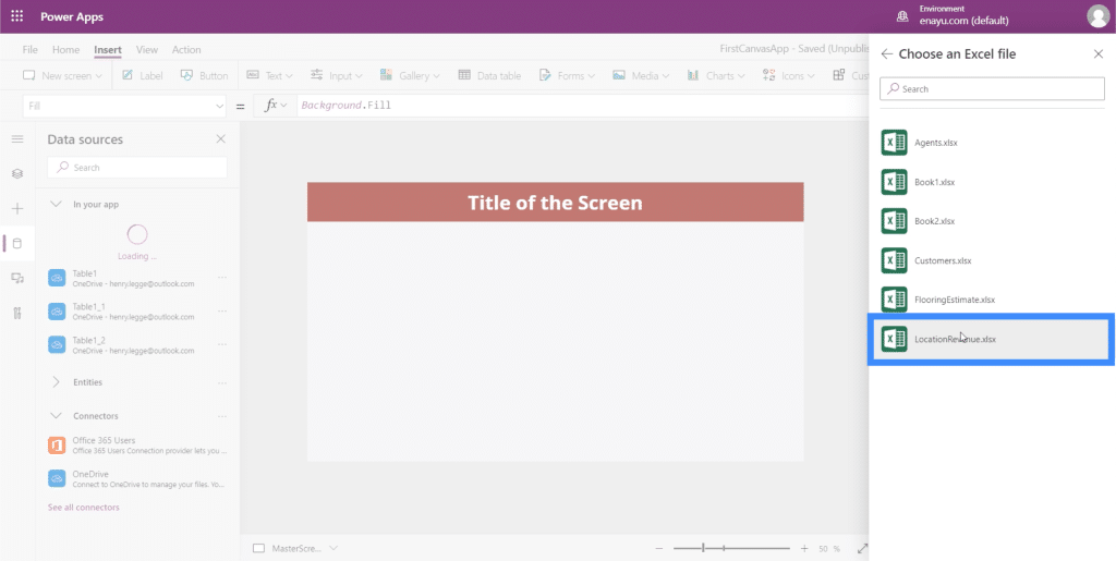
Now that we have a table to use, we just attach the file to PowerApps the same way we did earlier. Here’s the file called LocationRevenue.
As for the table name, this is called Table1 as well.
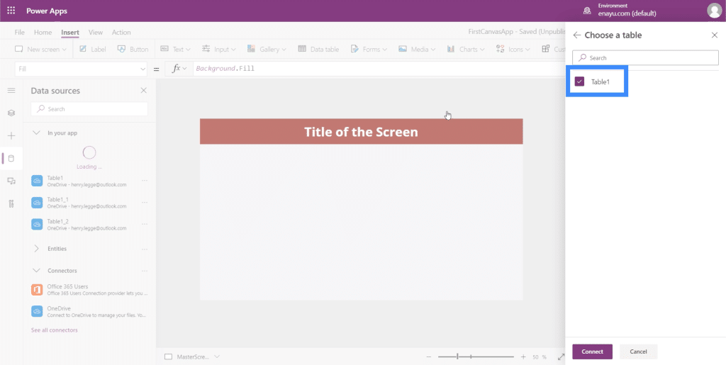
This means that once we choose it, it’s going to show up as Table1_3.
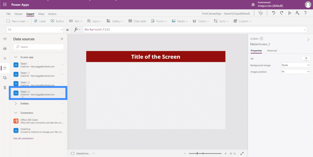
When we look at the data we’re working with, we can see that a column chart would be the best format to use.
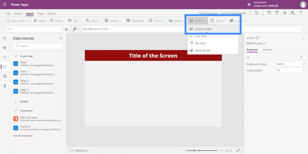
At the moment, it’s still showing the default sample data.
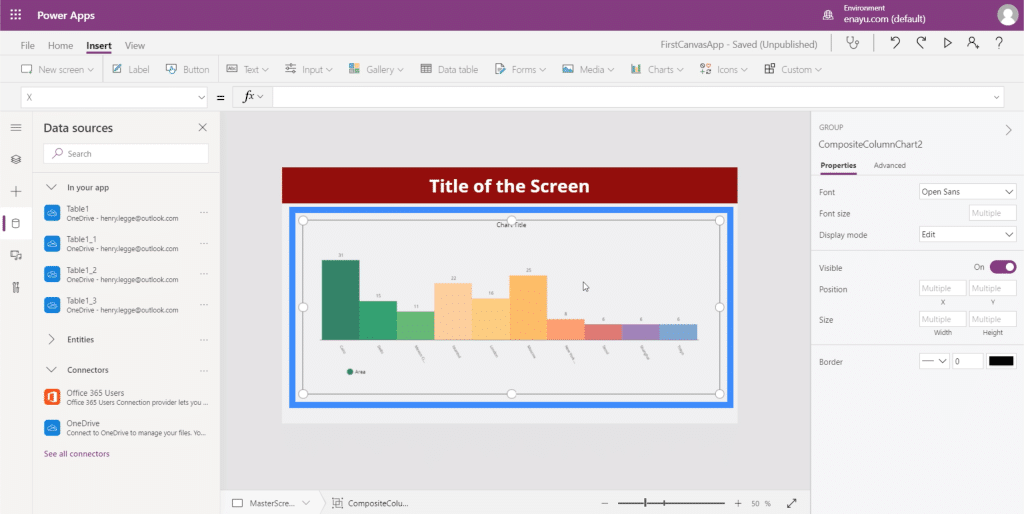
It will need a specific data source, which should show up under the Items property.
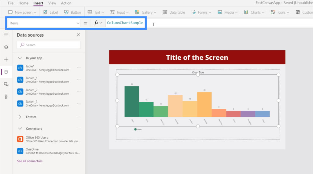
Let’s use Table1_3 for this chart.
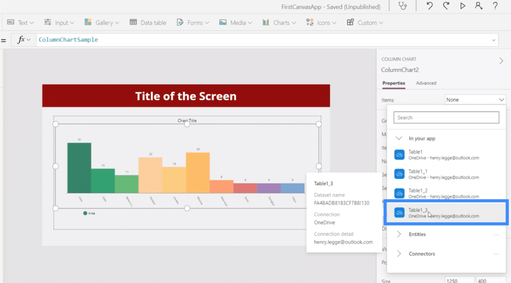
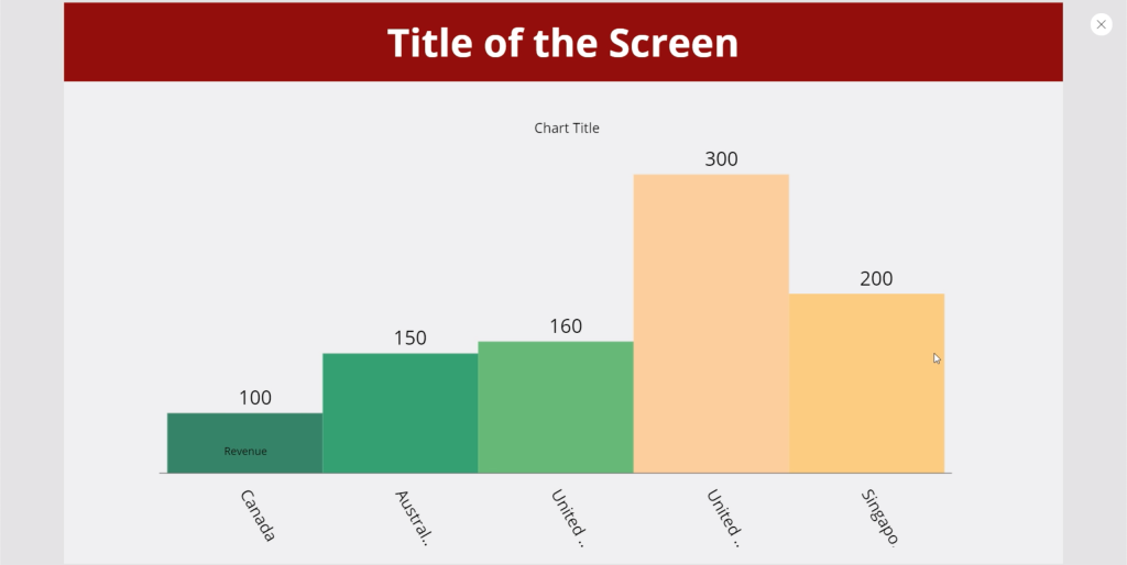
It now shows the data from the table that we used as a source.
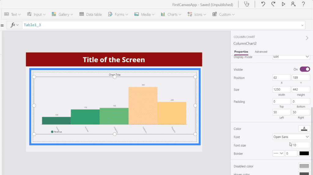
Like any other PowerApps element, we can customize the chart’s properties. For instance, we can make the font size a little bit bigger to make it easier for users to see the data.
Using Collection Variables In PowerApps Charts
Another way to display data in charts is to use collection variables. If we look at the Microsoft PowerApps documentation, it shows a sample formula.
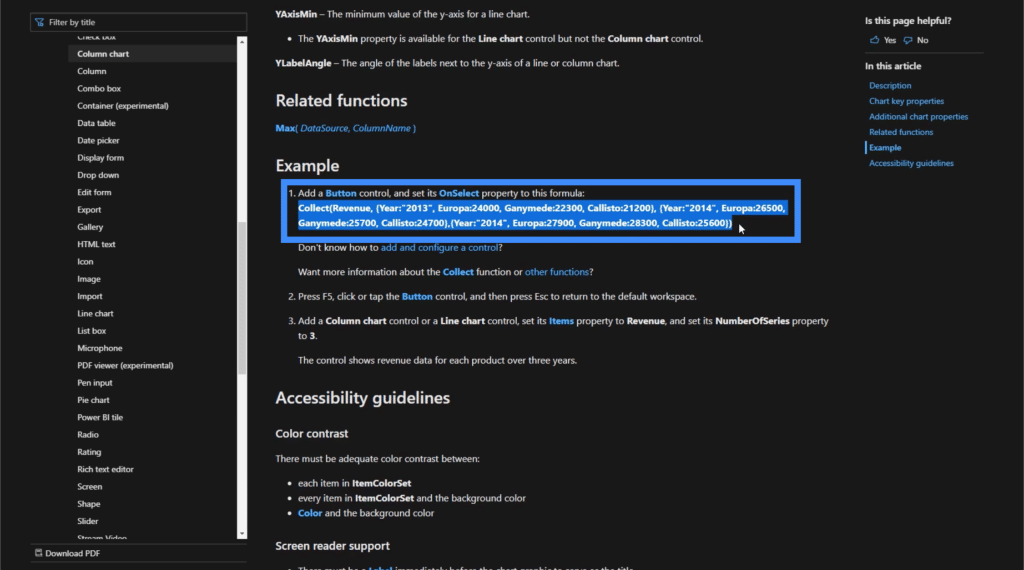
Before we use this formula, let’s add a button here first.
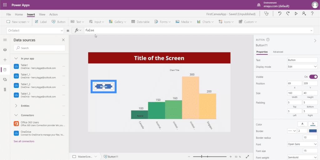
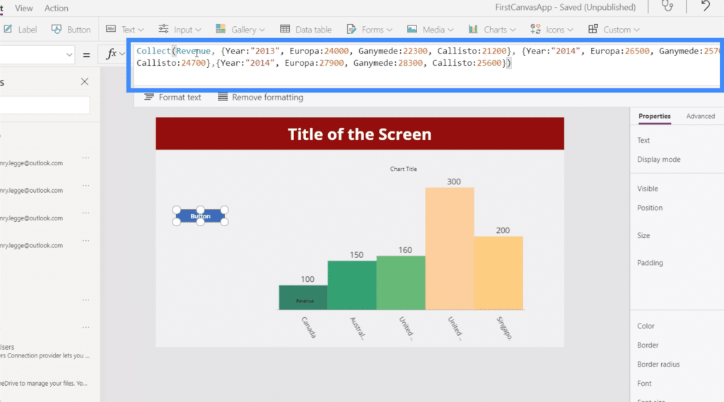
Under the OnSelect property, let’s copy and paste the formula from the MS document. As you can see, this formula uses the Collect function and references the Revenue variable. This variable is then followed by a list of items.
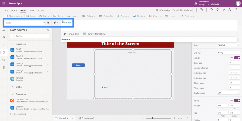
Let’s highlight the chart this time, go to the Items property, and equate it to Revenue.
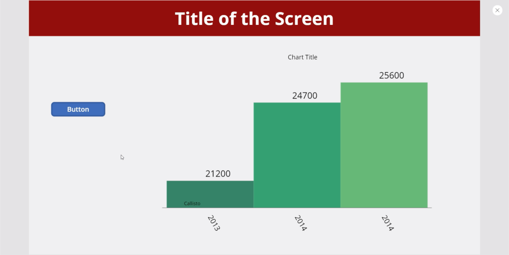
Once this is done, every time we click the button, it will display the list of items associated with the Revenue variable.
***** Related Links *****
Power Apps Introduction: Definition, Features, Functions And Importance
Power Apps Environments: Setting Up The App Elements Properly
PowerApps Functions and Formulas | An Introduction
Conclusion
Charts and images definitely add more value to any app, especially when they are dynamic. They can help make users feel more engaged when using the app.
But even if you decide not to make any of your charts or images dynamic, note that they add value just the same.
The mere fact that you are able to add some visual representation of data already improves any app by leaps and bounds.
All the best,
Henry


