To avoid falling into the trap of creating ineffective reports, I would like to share with you a selected number of Power BI tips and tricks that will definitely help when building your Power BI report.
There are three main reasons for ineffective reports: the lack of context, trying to communicate too much, and inability to tailor the message to your audience.

Today, I would like to focus your attention on the four main groups of Power BI tips and tricks that I prepared. The first category is an easy fix. It contains tips that you can include easily in your report immediately.
The next category contains Power BI tips and tricks around context, the third contains ideas to improve clarity, and the last category is on strategy.
Effective Power BI Tips And Tricks For Your Reports
These Power BI tips and tricks will help you create a better experience and avoid building ineffective reports.

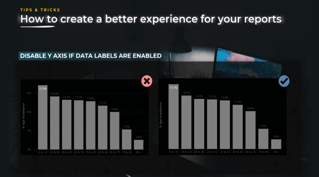
Disable the Y axis if data labels are enabled. If you want to declutter your reports, you need to pay attention to small details like this one. You do not need a Y axis if data labels are enabled as shown in the image on the right. The takeaway here is to keep only what you need and delete redundant information.
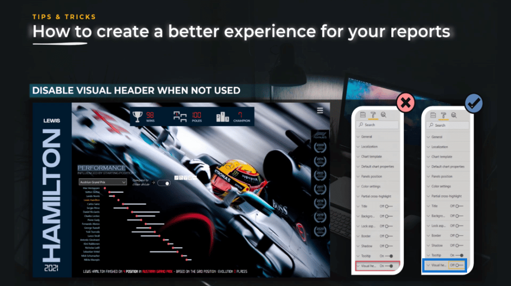
Disable visual headers when not in use. Visual header is an option that is activated by default in Power BI. If it is not used, it just adds noise to your report. Keep things simple, disable the things you are not using, and keep a full control of the experience you want to propose to the end user.
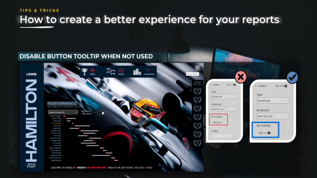
Disable button tooltip when not used. If you are using buttons and you do not use the tool tip, make sure it is disabled.
In order to do that, you need to switch the toggle on the No tooltips section. It is important because if you do not use this, an automatic Click here to follow link message will appear by default. It’s too general, and it reduces the clarity of the report.
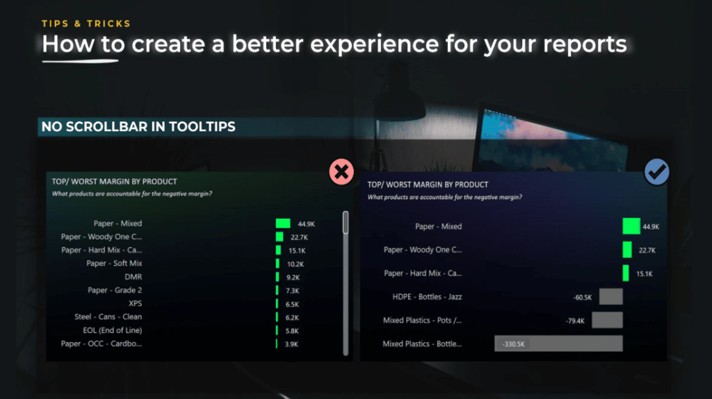
No scroll bar in the tooltips. If you use tooltips with a scroll bar, the user will not be able to scroll down. Worse than that, the user might get frustrated and lose confidence in your report.
You should always pay attention to this and make sure you do not have a scroll bar inside the tooltips. We need to be strategic in the choice of visuals we make on the page, especially in these tooltips.
As illustrated on the screen below, the audience was interested in explaining the main free variations. I chose to use the Top/Worst Margin By Product bar chart. In terms of message, it goes to show the essentials. Everything in between is not really important to the user and does not appear in the report.
Be careful with interactions. Interactions are very powerful when creating dynamic reports like the ones we can create in Power BI. They can replace filters, engage the user, gives the possibility to answer different questions, and even declutter your design.
As the report creator, you will be able to show many things with the use of fewer graphs. If you’re using graphs, you need to pay attention to interactions.
In this first example, you can see that when I select the Bike Racks subcategory, the donut chart is highlighted, not filtered. This interaction is not useful for the end user and provides a bad user experience.
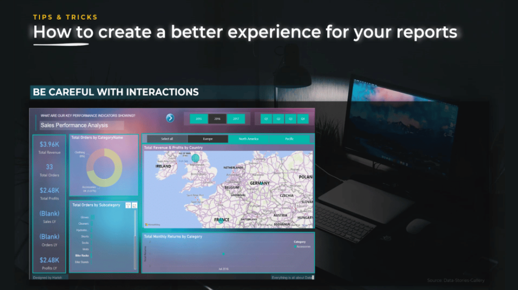
Moreover, we can see on the left side of the screen the “Blank” value appears. Even though it’s not catastrophic in the sense that the user will understand that there are no sales in orders last year, it does not give a professional look. In this case, maybe zero or a text saying no sales last year would be better.
In the second example, I’m showing you a report that has clearly a good design. Even though you have good design skills, it does not help you tell a better story or propose a better user experience. You need to pay attention to details.
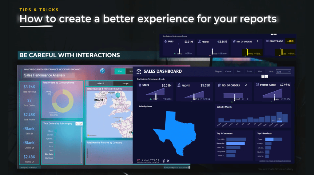
In this report, when I filter on a customer, some cards do not have enough space to show all decimals, three dots will appear, and other selections will show blanks or infinity values.
Because of these things, the user can become very easily disappointed and lose interest. It is better to cut out the interactions completely instead of not using them correctly.
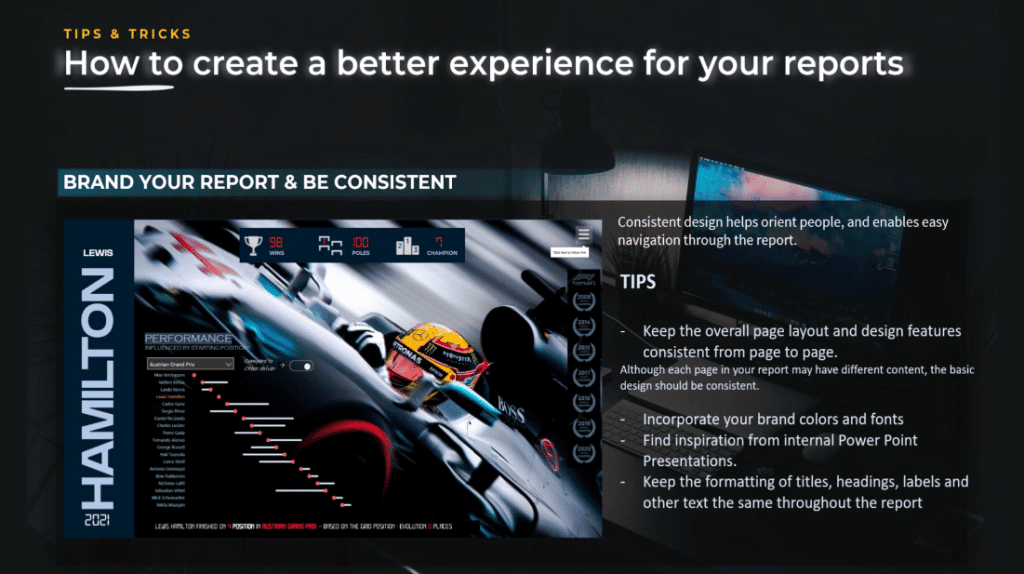
Brand your report and be consistent about it. Incorporate your brand colors and themes into your report so it’s obvious that it belongs to your company. Your company might already have branding guidelines that will help you understand how your colors and themes should be used in documents or presentations.
Even if it’s just a simple report that you share with only a couple of people, using your brand colors and logo can give your report a more professional look and feel, which can help add weight to the enclosed insights.
Keep The Layout & Designs Consistent
In terms of consistency, you need to keep the overall page layout and design features consistent from page to page.
One of the greatest tips is to create the first page and then duplicate it multiple times. You can keep the same format but adapt the navigation in the charts you include on those pages.
Next is to use templates that will not only help you with the consistency of the report but will help you accelerate the creation of your report.

Also, keep the formatting of titles, headings, labels, and other texts the same throughout the report.
Using breadcrumbs to communicate the current location will also create a better experience for your report.
Breadcrumbs are navigation added to help orient people within a website application or report, especially if they are deeper within the navigation. This clear visual cue can indicate how that page is nested within other pages.
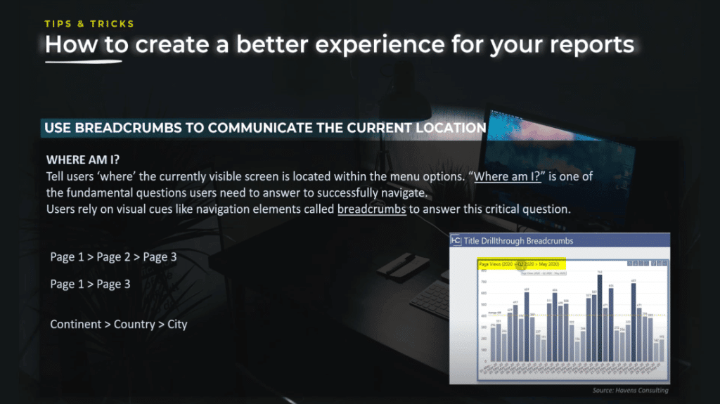
“Where am I?” This is one of the fundamental questions your users need to answer to successfully navigate. This technique is often used in ecommerce websites, but can be adapted to Power BI reports. You can help them through drill through navigation and hierarchy inside graphs.
Using Drillthrough Navigation
For instance, when you have at least two levels of drill through, that means that you create navigation where you give the possibility to the end user to drill down either to the highest granularity (page 1 to page 3), or an aggregated level (page 1 to page 2).
If you drill through to page two, you might want to offer the possibility for the end user to drill through from page 2 to page 3, with the most detailed clarity. When you are in a scenario like this, you need to use breadcrumbs for clarity.
Creating Hierarchy Inside Graphs
A good example of hierarchy inside graphs was given by Havens Consulting. You can see on the image below that based on the level of hierarchy chosen by the user, the breadcrumbs technique is showcased.
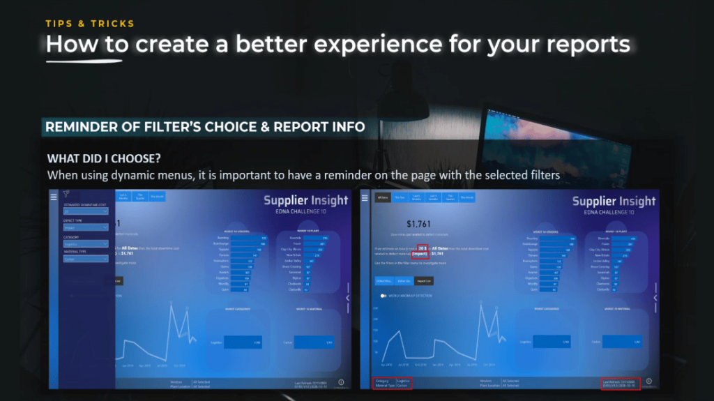
Show a reminder of the chosen filter and report info. This is particularly important when you are using dynamic menus.
When the user opens the menu and selects a filter, that filter needs to be shown somewhere on the page of your report. It is important because sometimes people will do a print screen of the report and integrate it into a PowerPoint.
In order to keep the context, they need to know what was the selection. It is equally important to show the version of the report, and the date and time the data was last updated.
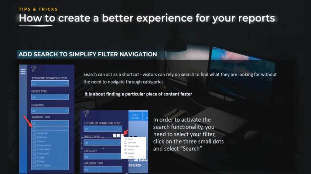
Add search to simplify filter navigation. Search can act as a shortcut and visitors can rely on search to find what they are looking for without the need to navigate through categories. It is about finding a particular piece of content faster.
To enable the search functionality inside your filter, select your filter, click on the three dots on the top right, and select search.
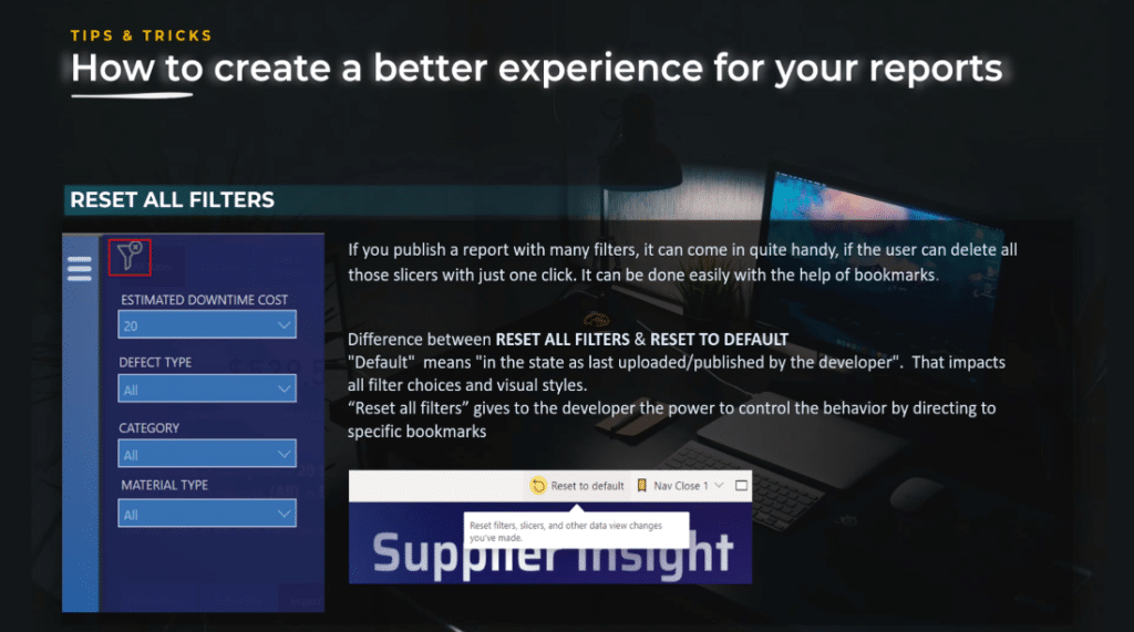
Reset all filters. This is a navigation functionality that every report with more than three filters should have. By using reset filters, your report will become more user-friendly. It will save multiple clicks for the user and improve the overall user experience.
In my opinion, it’s a great functionality to add because it is very easy to set up and has a great impact on the overall user experience.
Difference Between Reset All Filters And Reset To Default
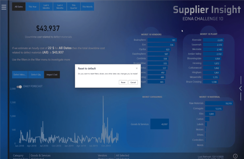
Another aspect I would like to tackle is the difference between Reset all filters and the Reset to default button that appears in the Power BI service.

The Reset to default button will change your report to the state the report was updated and published by the developer. It impacts all filters choice and visual styles.
On the other hand, Reset all filters button give the developer the power to control the behavior through the use of bookmarks.
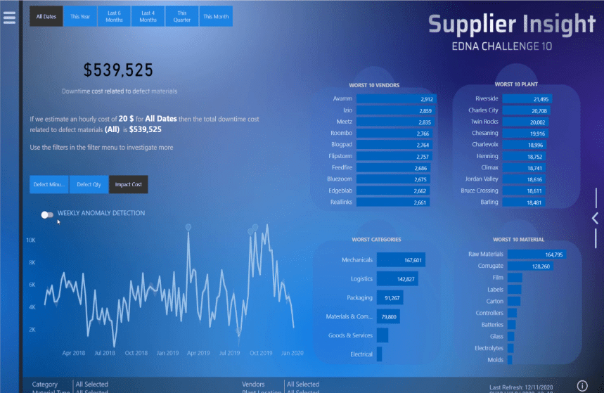
To illustrate, let’s take a look at this report and choose the filters 22, Impact, Logistics, and then Carton.
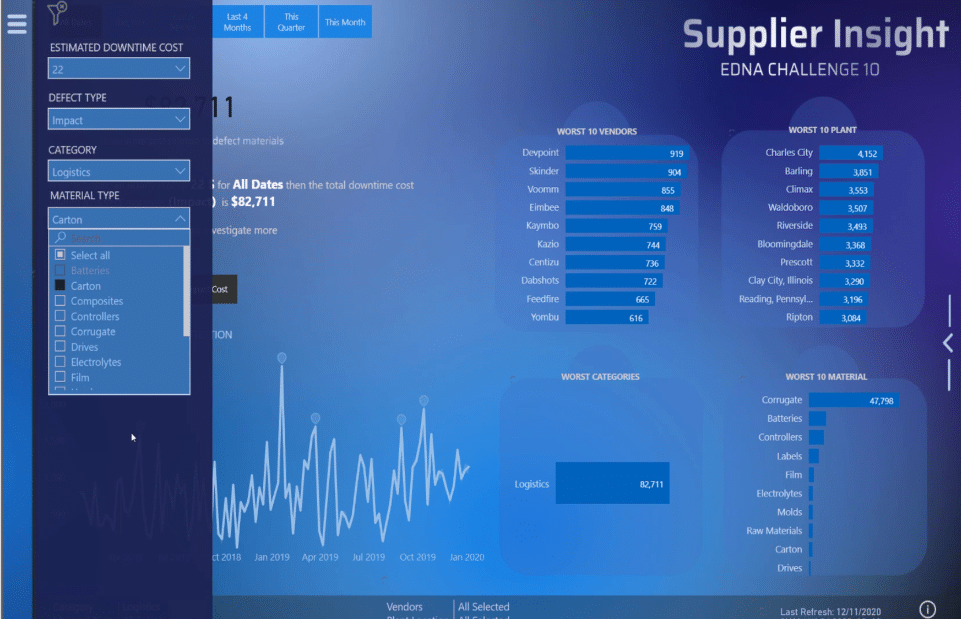
We can now see all the selected information on this page.
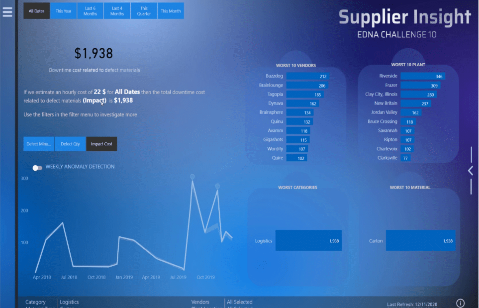
Then, if we click Reset all filters, it will reset all filters, and we can still see the screen that shows the Daily Forecast.
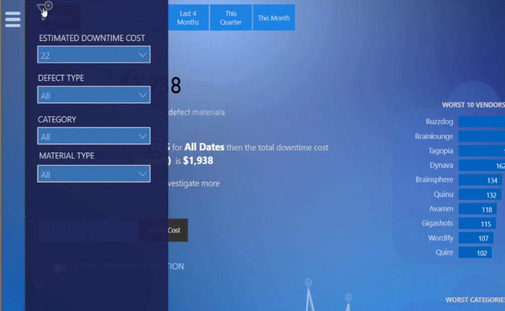
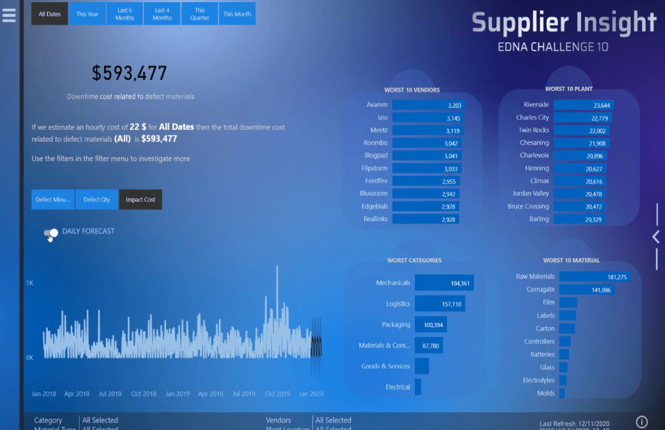
However, if we press Reset to default, not only all the selected filters will disappear, but also the page where we can see the Daily Forecast. Hence, use bookmarks and the Reset all filters button on your page to have more flexibility.
***** Related Links *****
Best Practices For Power BI Report Development
Dashboard In Power BI: Best Design Practices
Effective Data Storytelling: Asking The Right Questions
Conclusion
Without a doubt, creating an ineffective report can be avoided if the tips & tricks that we discussed here will be used appropriately when building your Power BI projects. Also, these are easy fixes that are effortless and easy to implement.
I hope you can use these techniques in a way that can be applied to multiple different scenarios and environments that you are working in.
All the best,
Alex Badiu


