For today’s blog, I want to showcase this report created by one of our Enterprise DNA experts, Brian Julius. I want to highlight this report to show you what you can do with Power BI custom visuals. You may watch the full video of this tutorial at the bottom of this blog.
Brian is a great contributor to the forum. I have learned so much from him and I have no doubt that if you want to learn about the different aspects of Power BI development then you should definitely see what Brian is doing on our platform right now.

I don’t believe that there is any other tool that is as versatile and flexible when it comes to analyzing and visualizing your data than with Power BI. You can build comprehensive reporting applications with this tool that costs you $15 a month, which historically would have cost you thousands.
It’s truly amazing how we have democratized the ability to create these reporting applications now. All it takes is a bit of creativity and inspiration. I hope you get inspired by what Brian did for this challenge.
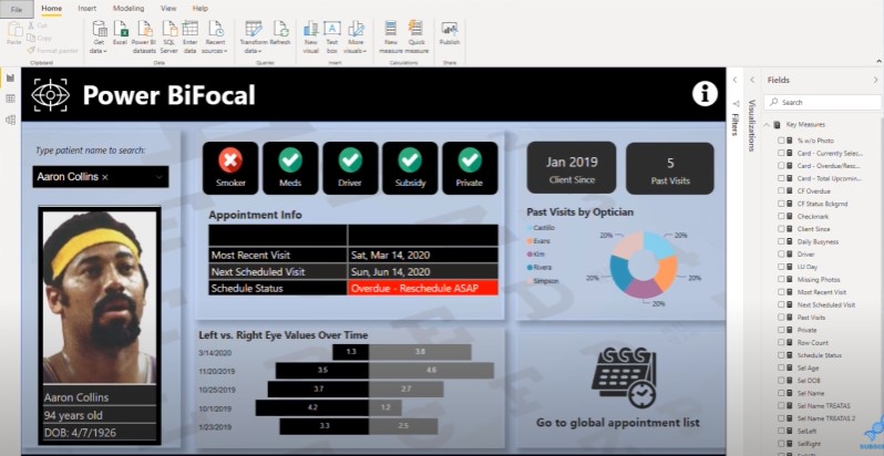
Brian used images of basketball players from the NBA as placeholders for the randomly generated names in the Power BI challenge.
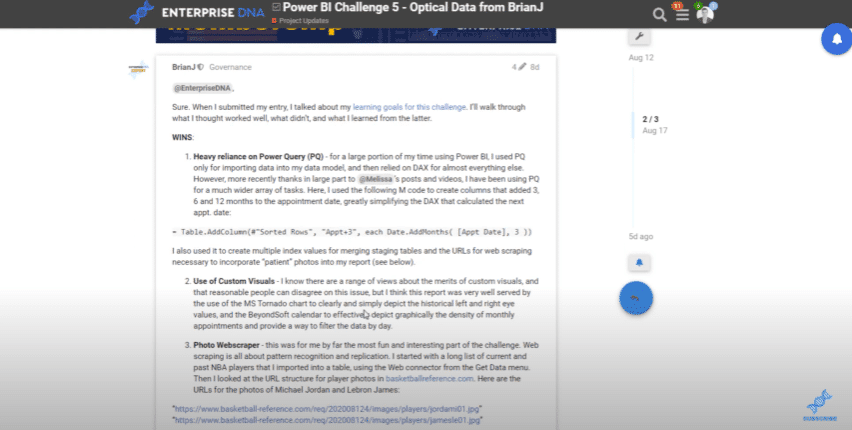
If you want to see a comprehensive writeup on how Brian created this from start to finish, check out the Enterprise DNA forum. Once you’re inside the forum, click on the Project Updates category, and search for this particular writeup from Brian.
For this report, Brian used different visualizations. The challenge itself was based on a patient data set for an optical company that does testing for the eyes.
The brief for this challenge states that the stakeholders want to see the patient data and appointment information. Brian decided to break out one page for the customer and then another page for all of the appointments.
There are so many techniques embedded into this. At first glance, it seems relatively simple and there’s nothing fancy about the visualizations. But there’s a lot of logic built-in to make this report look seamless and intuitive.
Let’s say that a patient named Adam Burns walks in to the front desk. Within this report, you can navigate to this person’s name and then all of the details for that person comes up straight away.
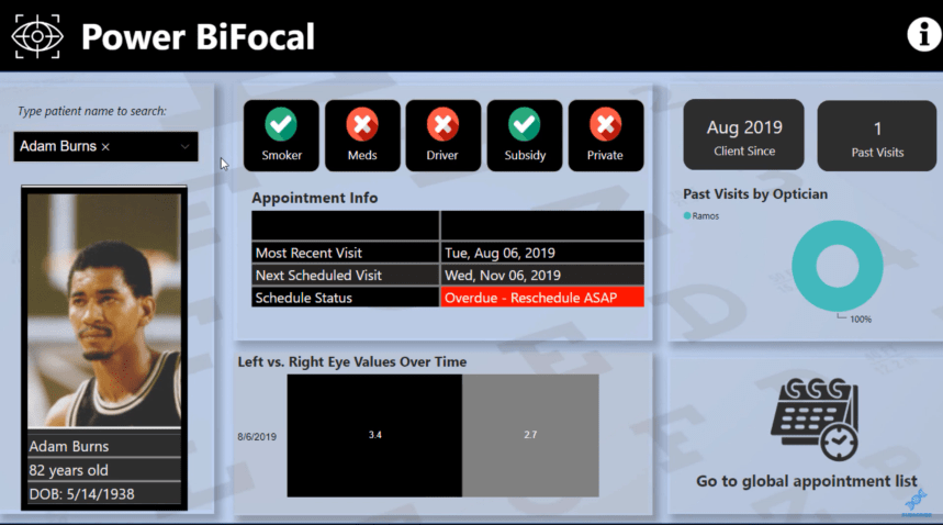
You can see all of their key metrics such as Smoker, Taking Meds, Driver, Subsidy, and Private. You can also view details about client visits and eye testing. You can also see a left eye value and a right eye value. This represents the historic tests that have been done for him in the clinic.
Not many people know that you can embed this image functionality within a Power BI report. I’m not going to show you how specifically this was done, but Brian did provide all the details within the forum.
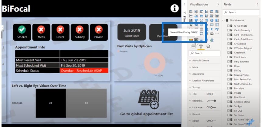
The filter with the name is a custom visual created by Smart Filter Pro by OKVIZ.
This is just a simple shape, but there’s a trick to embedding these dynamic images into your report. Even though this report looks relatively simplistic, if you look at the right side, you can see a bunch of measures that were embedded in some way to this report.
This particular insight Schedule Status is actually a custom logic done behind the scenes but is shown on the front end as a simple table.
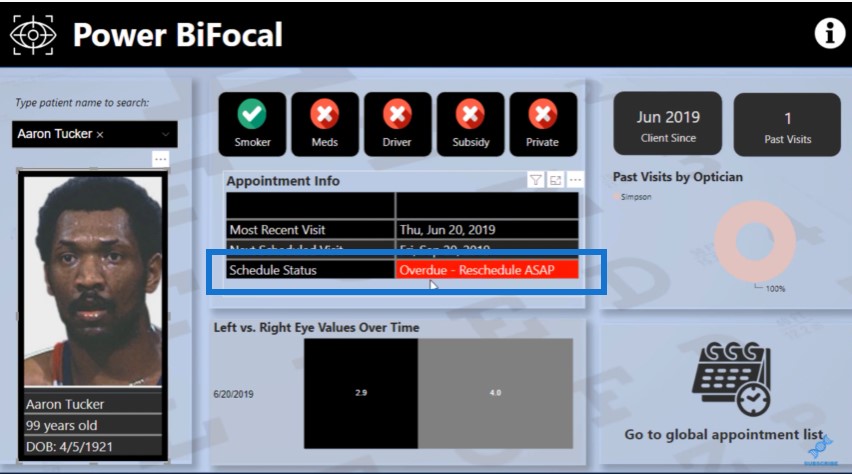
Let’s have a look at the actual table itself. You can see that there’s a lot of logic that has gone into this particular metric but it was shown in the report in quite a simplistic way.
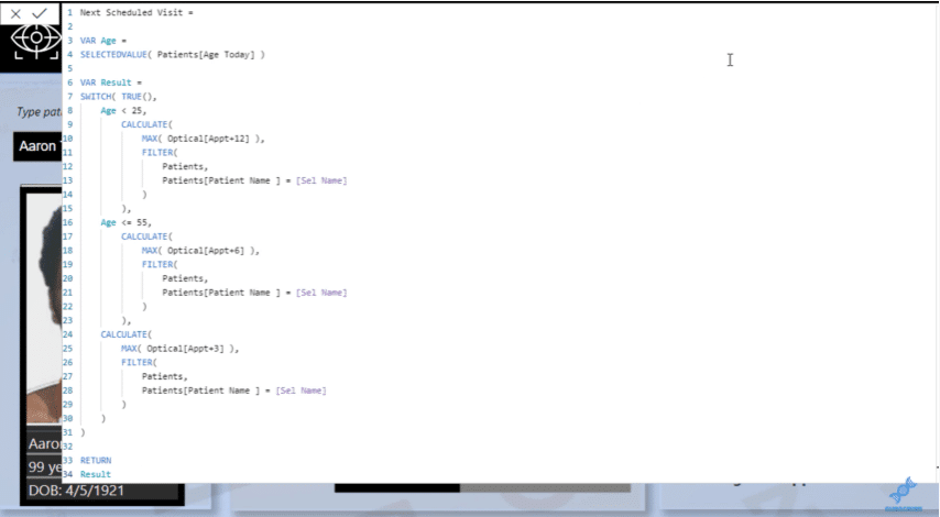
That’s one of the advantages of Power BI. The analytical logic that you can embed is incredibly comprehensive and you can visualize it in so many ways, which are almost limitless, and it’s only your imagination that is holding you back.
If we click on the Appointments page, there’s also a unique embedding of images within the table itself.
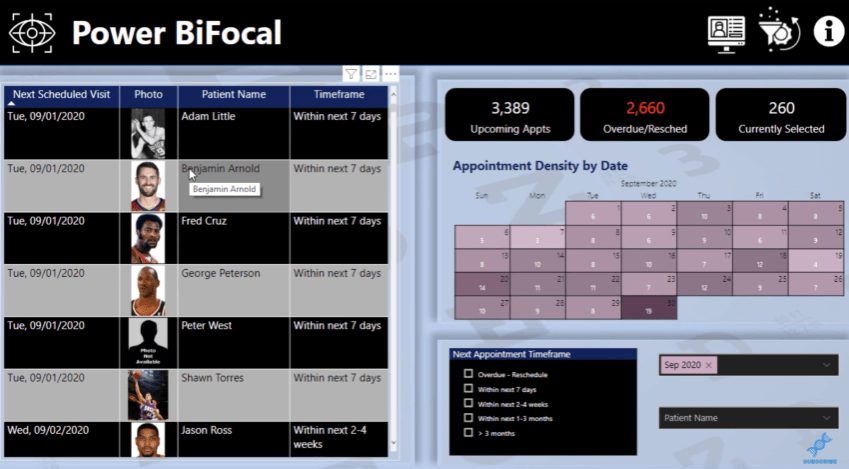
The calendar on the right side is another custom visual from BCI Calendar where Brian embedded the date field and included a calculation for the number of appointments.
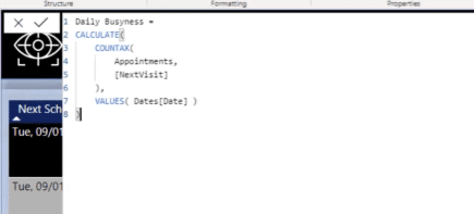
The Daily Busyness measure showcases how many patient visits are already locked in over a certain date time frame.
If we want it to look at a different date, we can use the smart filter on the bottom right.
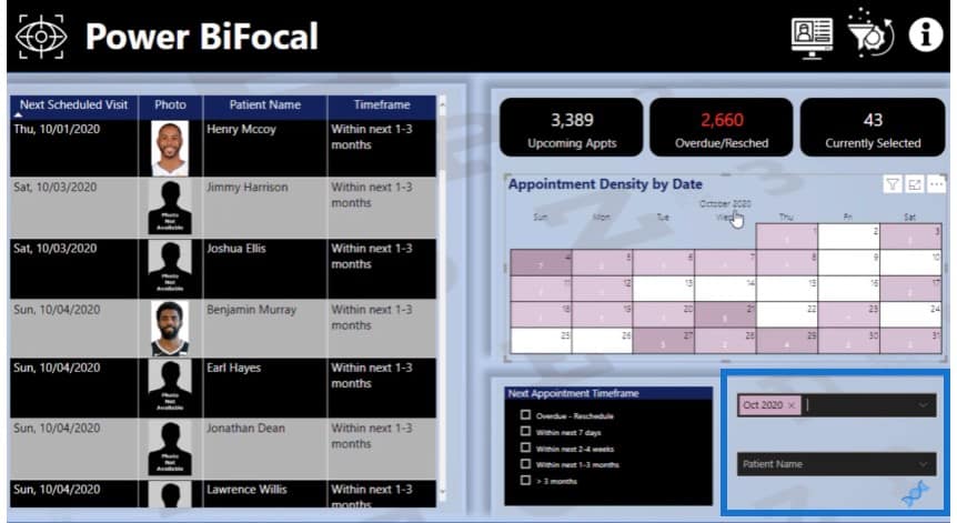
Another awesome thing that I’ve observed in the challenges is how everyone’s creating unique navigations around their reports. The reports show that you need to make it easy for your consumer to navigate around the report using simple techniques.
On the upper right of the page, we have some icons. This icon allows me to clear all filters.
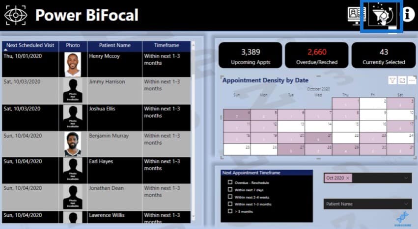
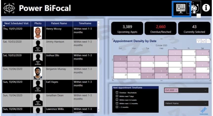
This icon allows me to navigate back to a different page.
The i icon takes me to the information page about the report.

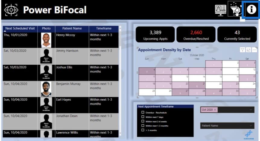
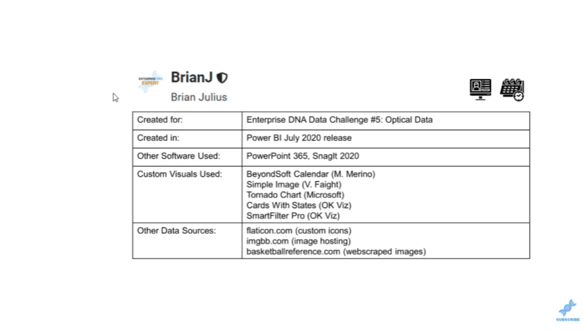
In this section, Brian mentions all the details of the different visuals, software, and data sources used in the report.
***** Related Links *****
Utilizing Custom Visuals For Power BI
Recreate A Visualization In A Power BI Dashboard
Data Visualization Tips For Your Power BI Reports
Conclusion
I’ve done a lot of videos and blogs about the challenges lately and I’ll continue doing so because they showcase different techniques like Power BI custom visuals, which will give you more inspiration when it comes to doing your own reports.
This is a really important thing about the challenges: they are a great way for you to challenge yourself to learn more. You can get better at Power BI by leveraging off what the others are doing, and by putting it into practice in some way.
[youtube https://www.youtube.com/watch?v=5q6h18YRIAg?rel=0&w=784&h=441]


