
If you’re a Formula 1 fan, the past few weeks were probably an emotional roller coaster ride for you with the mix of excitement and frustration (with a tinge of controversy here and there). But looking at these races from a data point of view, some of the Formula 1 numbers do make a great data set. That’s why this new batch of reports added to the Power BI Showcase is focused on Formula 1 analysis.

The Power BI Showcase is a collection of reports and dashboards that users can download for hands-on practice. These reports are also a great way to learn best practices from the other users who created the featured reports. Each batch of showcases focuses on different topics to show how dynamic Power BI truly is as a data tool.

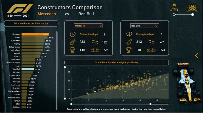
Formula 1 In-Depth Insights
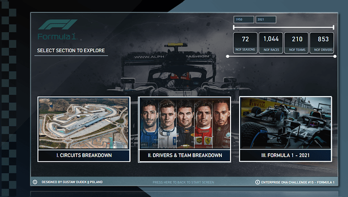
This report has that perfect mix of technique, insights and design. Although it seems to be a multi-page report, all of the details are actually found in a single page. All it took was the use of bookmarks, object groupings and a few extra ppt backgrounds to make the report even more impressive.
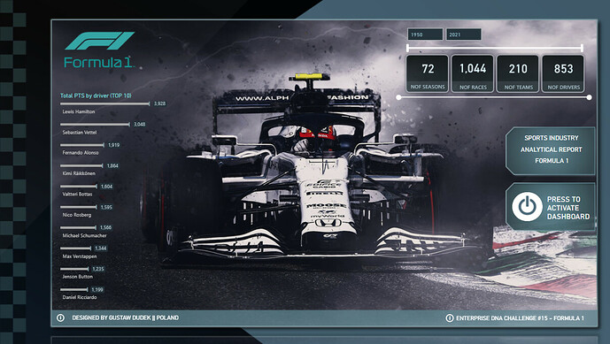
As you go from one sub-page to another using the bookmarks in place, there are also bookmarks that lead you right back to the main page.
There is one main ppt background used across all the sub-pages. However, additional images and other ppt backgrounds are also used as overlays to make each sub-page unique from the others.
In the page showing the circuit’s characteristics, every position posted has a tooltip with more details. The donut chart on top filters geographical data to make it easier to read. Gustaw Dudek, the report’s creator, says he chose this type of visualization because it’s possible to zoom into it without having too many additional labels showing up.
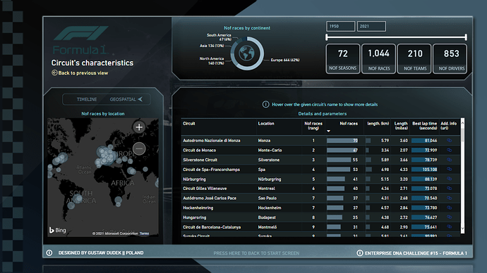
The timeline chart is also a great addition to the page. It shows how many races are done every year. This then shows the trends and gaps from one year to the next.
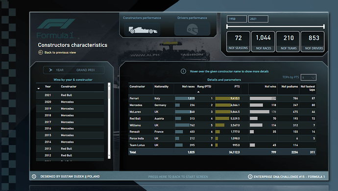
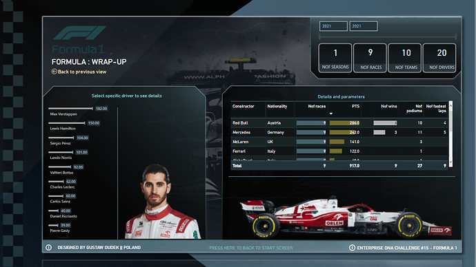
The next subpage allows you to switch from the constructor’s performance to the driver’s performance. Again, it shows tooltips as you hover on different parts of the page. It also features a TOPN slicer to filter data based on the highest points they achieved.
Every subpage is also based on the same date context. The only exception here is the last page, which shows a wrap-up. Here, it only filters data up to 2021, which resets each time the user goes back to the main page.
Formula 1 Dashboard
This Formula 1 dashboard’s compelling visualization does a great job of explaining the data at a glance. Joaly Bocher, its creator, delivered as much insight as possible in a single-page report through the use of various elements and visual techniques.
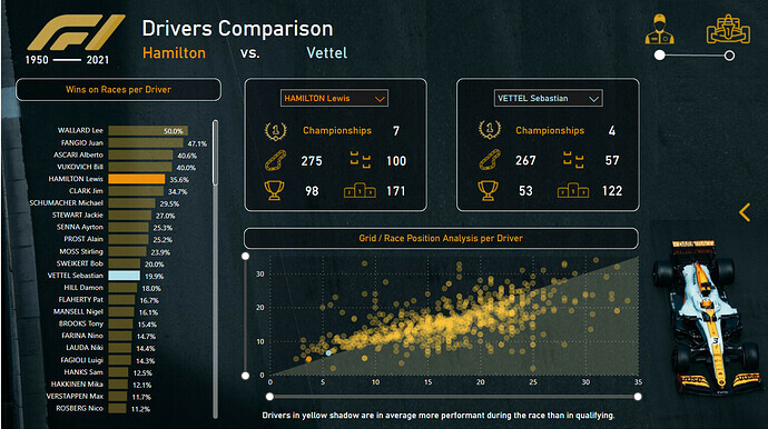
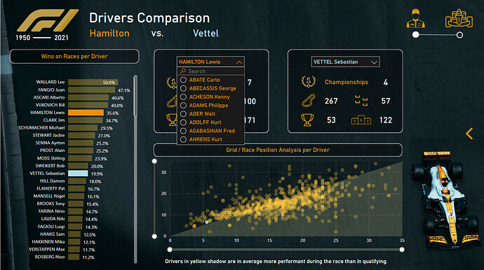
A dropdown filter in the middle allows users to compare different drivers’ stats, with data like number of championships, number of races joined, and number of trophies won, among others.
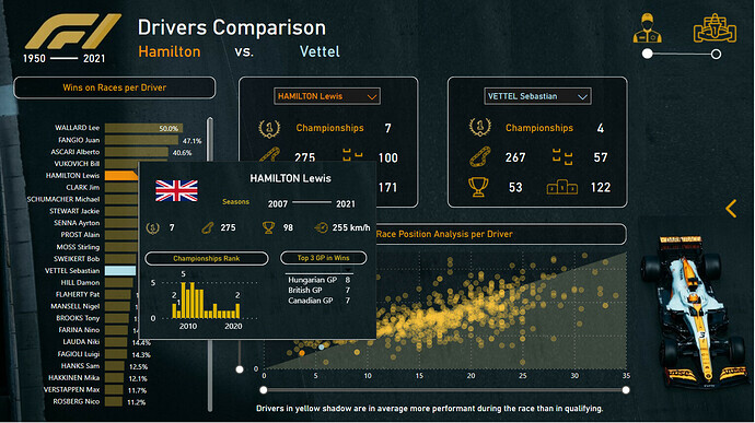
A chart showing each driver’s number of wins is seen on the left pane, with tooltips showing up as you hover over each name.
An arrow on the right side pulls out additional filters for the season, constructor, driver, circuit, and country.
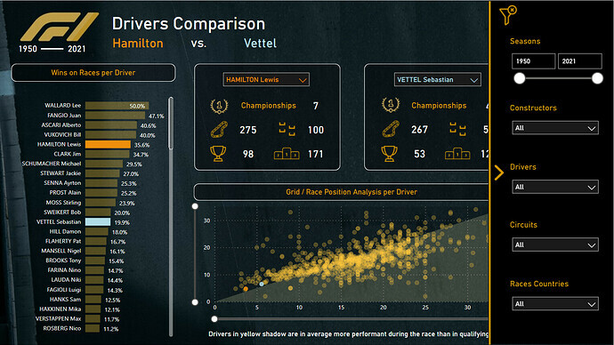
There is also a scatter chart that shows the grid and race position analysis per driver.
Formula 1 Performance Analysis
This simple but detailed analysis from Greg Philps features Lewis Hamilton’s 2021 Mercedes in the background. This is a perfect example of how one can deliver in-depth data in a simple and straightforward manner.
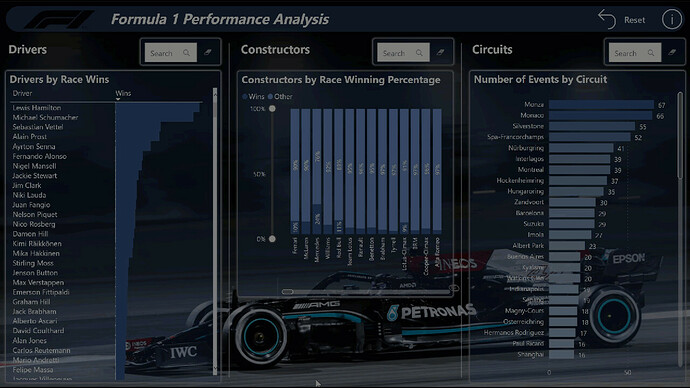
The 1st table shows a list of drivers and their number of wins, while a stacked column chart was used to display constructor data. Meanwhile, the number of circuits is displayed through a bar chart.
Each of these visualizations come with a search bar on top (done through a text filter) to allow users to quickly see specific data they’re looking for.
The Power BI Showcase
Trust Power BI to allow us to clearly deliver data from something like Formula 1. It’s a great testament to the fact that Power BI is useful regardless of industry or purpose.
The reports in the Power BI Showcase course can be downloaded as .pbix files, making them perfect tools for hands-on practice. It’s also a great way to learn a few tricks on how these reports were created.
But if you want the best value, make sure you upgrade to a full membership. A membership gives you full access to this showcase, as well as to exclusive resources, classes and events that can help you become the best data expert that you can be.
All the best,
Enterprise DNA Team


")