In data analysis, key influencers are variables that have a significant impact on a dependent variable. In other words, they are the factors that contribute the most to the outcome of interest. In Python, linear regression is used to identify key influencers in a dataset, and to measure the strength and direction of the relationship between different variables. You can watch the full video of this tutorial at the bottom of this blog.
Identifying key influencers can be useful for understanding the underlying relationships in a dataset and for making predictions about future outcomes.
Python libraries provide a range of tools and functions for performing regression analysis and identifying key influencers in a dataset.
Using A Linear Regression Model
In this article, I will show how you can use a linear regression model to mimic some of the Power BI key influencers. Our objective is to use all our variables to be able to describe what’s changing in another variable.
The Power BI key influencers is a linear regression model. Oftentimes we use this even though we don’t know exactly what’s under the hood. In this tutorial, I’m using this to identify the factors contributing to insurance charges.
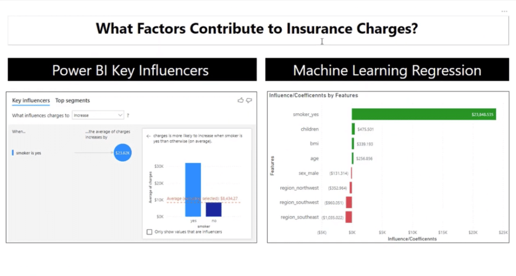
Let’s take a look at the data set of the insurance charges. I want this to be explained by smoker status, sex, region, children, BMI, and age.
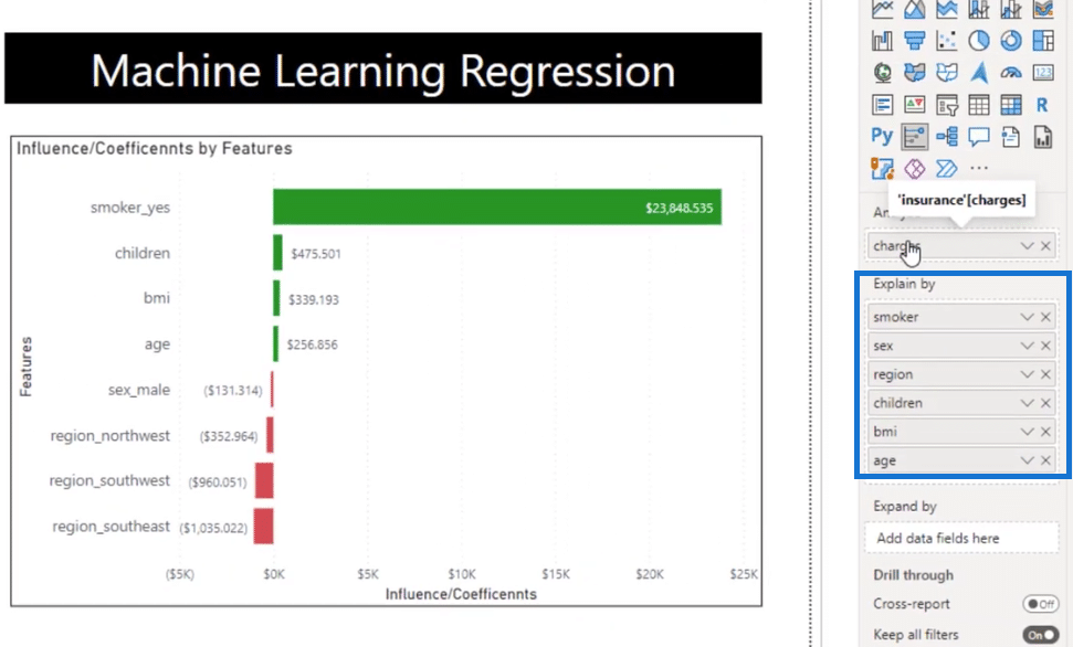
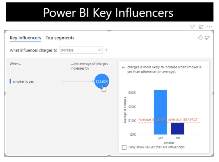
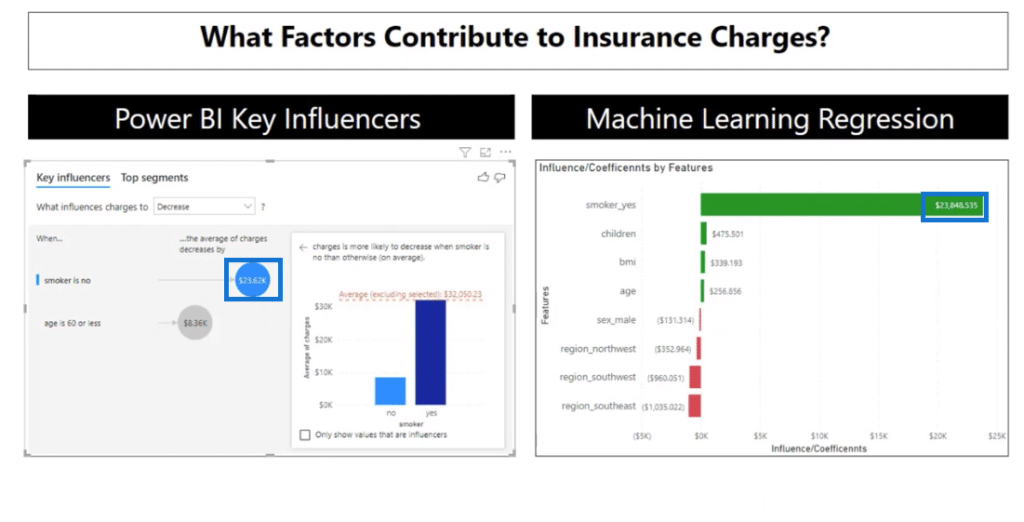
Currently, the key influencers show the most influential variable. When the smoker is yes, the average charge is $23,615 units higher compared to all the other values of a smoker.
It’s a great visual, but it does not give us any other variables that can affect the charges.
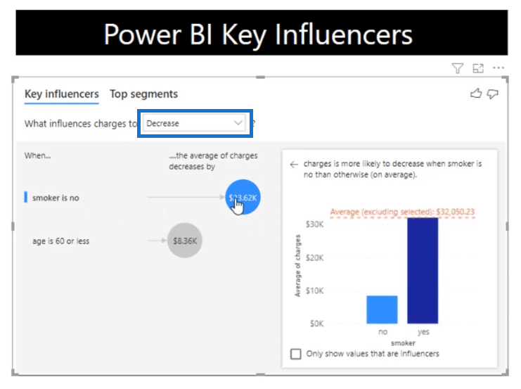
Let’s deep dive into it by changing the dropdown from Increase to Decrease.
This time around, it’s the opposite. If you are not a smoker, the average charge is $23,615 units lower compared to all the other values of a smoker.
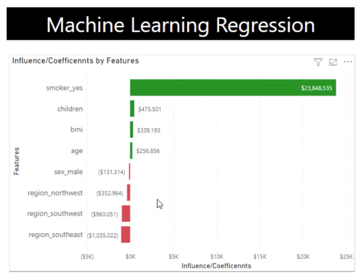
As you can see, this is a linear regression model that I built using some Python codes and piped into Power BI with minimal conditional formatting.
In terms of coding, we have complete control over it, and you will see how I built this as an alternative or a complement to the key influencers visual.
Let’s jump over to the Jupiter Notebook. For a better understanding, let me explain these part by part.
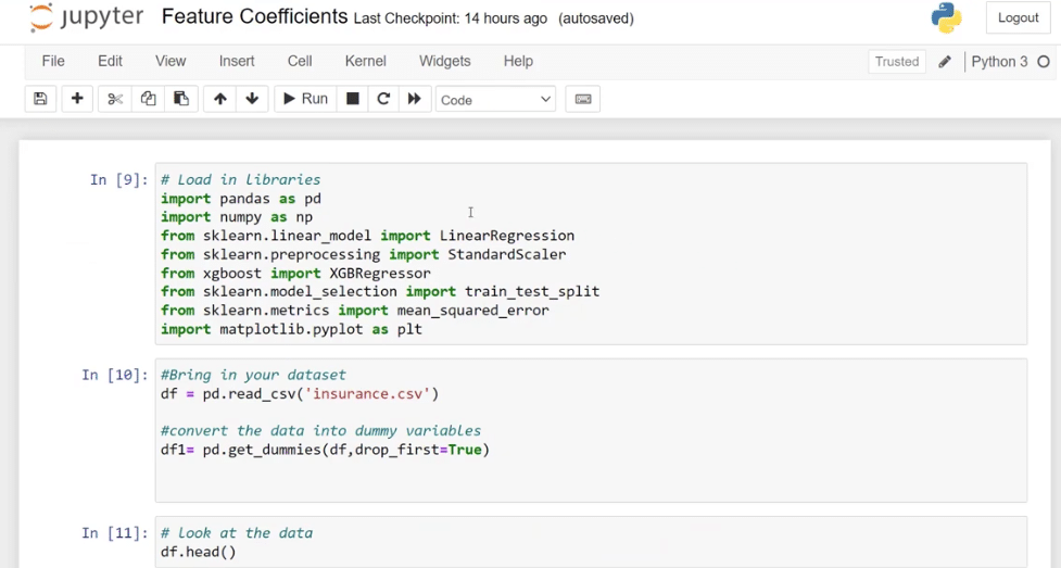
Python Libraries Used
The first part is where I loaded all the libraries that I want to use. If you are not familiar with libraries, they are collections of codes and functions that developers have built for us.
I imported pandas as pd which is a data manipulation library, and numpy as np to allow us to do linear calculations and conditionals.
Models Used
Let’s talk about the models that I used. I brought in sklearn.linear_model which is a machine learning library, and used a linear regression model. Just in case we need it, I also brought in sklearn.preprocessing import StandardScaler which will allow us to scale our data.
Another model that I use is called xgboost import XGBRegressor. It’s a regression model with a decision tree and other helpful aspects.
In addition, I also used train_set_split because I want to be able to split the data between a training set and a learning set. In Machine Learning, we need a set of training data for the algorithm to learn before it does any predictions.
I also brought in mean_squared_error to determine the model and matplotlib.pyplot library in case we want to do some visuals.
We might not use all of these, but it might be helpful, so I put them all in.

Dataset Used
Next, let’s take a quick look at the dataset. I used the df = pd.read_csv function to bring in the insurance dataset and then I converted the data into dummy variables by using df1 = pd.get_dummies (df, drop_first = True).
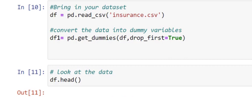
To do this, let’s create a new cell by pressing Esc + B on our keyboard and then type in df.head to evaluate the data.
We have the age, sex, BMI, children, smoker, region, and charges which we want to predict as our dependent variable. These are the data that come in unprepared for machine learning.
In machine learning, we won’t be able to use categorical variables such as female, male, southwest, and northwest. Hence, the first thing we need to do if it’s a typical regression model is to translate the categorical variables into numerical input.

To do that, I used pd.get_dummies function and then also change this into a numerical column by changing df.head to df1.head. Let’s click the Run button to show what it looks like.
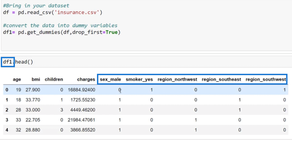
We can now see this new collection of columns such as sex_male, smoker_yes, region_northwest, and so on. The algorithm automatically knows that if it is 1 it means yes and 0 means no.
Noticeably, there’s no sex_female and region_northeast because we don’t want to over-complicate the model. We dropped those by using the drop_first = True function.
The next thing I did is bring in the LinearRegression function and saved it on the variable model.
I also created X and Y variables to predict our Y variables and then brought in all the other columns for our predictors by using the same dataset that we used earlier.

For the X variable, we used df1.drop (‘charges’, axis=1) to drop charges. On the other hand, we need charges for the Y variable that’s why we put in df1[‘charges’].
With the functions below, I created training and test sets for both X and Y by using the train_test_split function and passed them into the X and Y variables.
In addition, I used model.fit to fit the training data to our model. This means that the linear regression model is going to learn the training data.

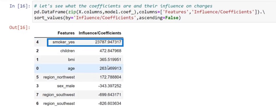
This time around, let’s take a look at our predictors. The way we see this is through coefficients because they describe how each one of these features or variables affect the charges.
It is also noticeable that the number of coefficient for smoker_yes is very close if you will compare it to the number of what we have for the key influencers and in our model.
To create a table where we have the features and coefficients, I used pd.DataFrame in order to bring in the coefficients into the table and create the visual.
Using Different Models For The Key Influencers Visual
It is also advisable to use different models to get the key influencers by bringing in XGB.Regressor.
When we represent the model, it’s just a simple linear regression; but when we brought in XGB.Regressor, there’s a lot of parameters that we can use to optimize the model.

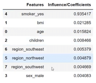
I also replicated these functions when I created the data frame below. These coefficients are very different compared to what we saw in linear regression.
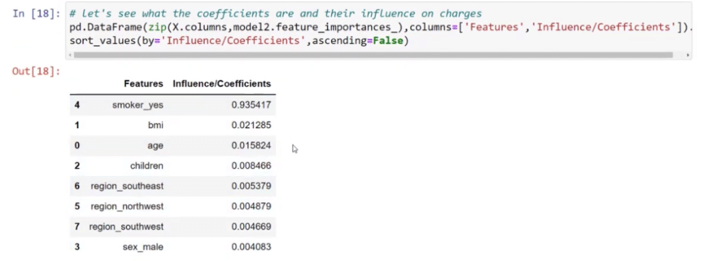
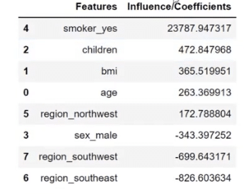
With this table, the numbers are exact. For example, if you’re a smoker, your charges will increase by $23,787. If you have one child, it’s going to increase by $472, and so on.
These influencers are important too because they mirror what we have on the linear regression table. It’s slightly different but very close because these influencers sum up to one. This is just a different way of looking at the influencers.
Testing The Accuracy Of The Linear Regression Analysis
After that, we want to see the accuracy of our model, which is why we’ve used y_pred = model.predict (X_test). It came up with a prediction that it was off by 5885.7.
This is just a test set of data and whether the prediction is good or bad, we still need to evaluate it. We are not going to do that right now since we are only focusing on our key influencers.

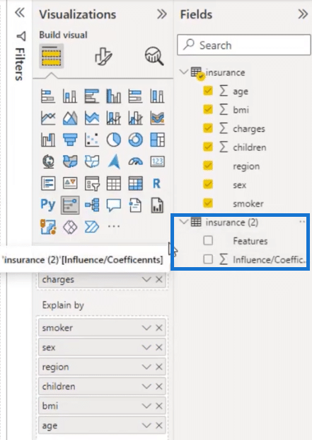
Going back to the Power BI, I will show you how I put this very easily. This is a separate table where you can see the features and the influencers.
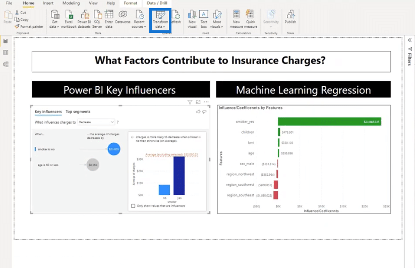
I did that by going to Transform data.
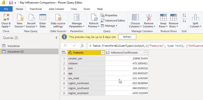
Then, I duplicated my dataset and was able to create this table. We can also go to the Applied Steps to see the Python code and to review the variables that we used.
Let’s open the Python script by double-clicking on it.
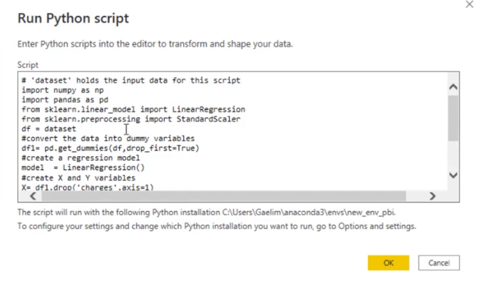
We brought in our libraries. We converted it to a machine learning, pre-processing dataset that was just zeros and ones.
Also, we brought in a regression model, created our X and Y to fit the data, and then saved the table as output. The model is good enough so I did not use a training test set.
Another thing that I did is to switch the dataset to df because it’s just easier to write. The dataset is the variable for the original data.
With this table, I saved it as output that’s why we have these coefficients.
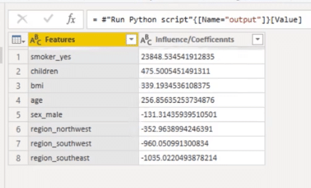
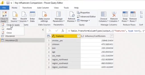
To bring this as a visual, click Close & Apply.
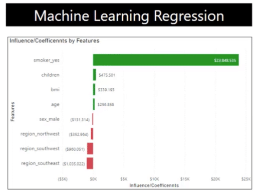
We now have a bar graph. I also used conditional formatting to show the positives and negatives.
***** Related Links *****
How To Install DAX Studio & Tabular Editor In Power BI
Configure Query Settings In Power BI DAX Studio
Power BI Parameters Via Query Editor
Conclusion
In conclusion, understanding key influencers and implementing linear regression in Python can be a powerful tool for data analysis and prediction.
By identifying the key factors that impact a dependent variable and using linear regression to model their relationships, we can better understand and predict future outcomes.
With the use of Python’s powerful libraries, it is easy to implement linear regression and extract meaningful insights from data.
All the best,
Gaelim Holland

