This tutorial will cover how to use the Multi Threaded Dynamic Visuals technique to create insights from dynamic data visualizations in your Power BI reports. You may watch the full video of this tutorial at the bottom of this blog.
It’s a valuable tool if you want to master Power BI because you can learn many important concepts using this single technique.
The example used in this tutorial is a resource that you can download from the Resources Page in the Enterprise DNA website.
Multi Threading In Power BI
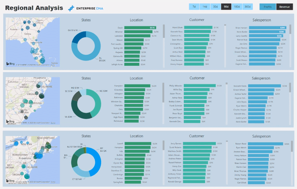
Multi Threading allows you to dynamically go through the visuals in Power BI. It enables you to select filters which can be used to change the information shown in your visualizations.
Here’s an example to better understand this concept:
This report contains three layers of visualizations about the sales for different regions in the east coast of the United States.
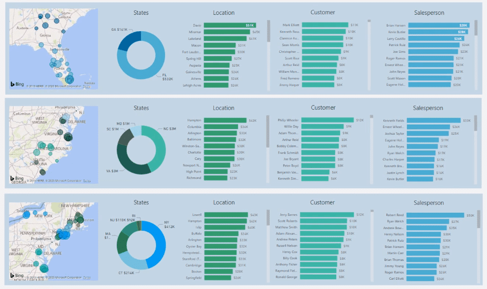
If you want to look at the Profit for the last 14 days, you can make a selection using the two slicers. These selections will change the content of the three charts.

There are different ways to present valuable insights in your report. It’s just a matter of having a broader perspective on the possibilities.
This is how the report was broken down into three layers:
It’s using the waterfall technique for the model:

It’s also using the Filters located at the right-hand side panels in Power BI:
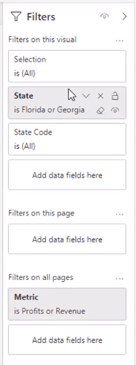
You can customize the Filters pane depending on the dimensions you want to showcase in your reports.
Creating Dynamic Data Visualizations
Instead of having only one chart showing the Sales information of all the regions, you can separate them into different visualizations containing specific information and data.
You need to figure out how to create one measure to place into each dynamic data visualization, along with how to dynamically make changes based on the filters you’ve selected.
For this example, each of these three layers of visualization used the same measure.


It’s a simple measure that uses the SWITCH TRUE statement.
If the selected value is Revenue, it will return the Total Revenue measure. If it’s Profits, it will return the Total Profits measure.
An alternative you can use is replacing the VALUES function with SELECTEDVALUE.
Using a simple SWITCH TRUE statement allows you to change between the measures you want to show in your reports. In this case, it’s between the Revenue and Profit.
However, this method can’t be used for the dates slicer. It requires a separate technique.
If you want to add different threads to the dynamic data visualizations, like Dates, you need to dive into each measure in the slicer for Revenue and Profit.
This is the formula for Total Revenue:

The context for Revenue has been changed using the FILTER function to determine the Total Days.
The Total Days is used in the date slicer.

If there’s a selection made in the date slicer, it will count the number of days within that specified date range.
Looking at the table for the Date Range, you can see that each time frame has a specific number of days.
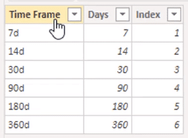
The formula is simply picking up how many days it should feed into the FILTER statement inside the CALCULATE function. It will change based on the selection made in the date slicer because the value of Total Days has also changed.
After you finish setting up the Multi Threaded Dynamic Visuals technique, you can easily place measures in any dimension coming from your lookup tables.
You now have dynamic data visualizations in your Power BI reports.
***** Related Links *****
Advanced Power BI: How To Create Multi Threaded Dynamic Visuals
Data Visualization Technique In Power BI – Multi Measure Dynamic Visuals
How To Create Automated & Dynamic Power BI Reports
Conclusion
Using the Multi Threaded Dynamic Visuals technique in Power BI allows you to create better visualizations in your reports. It’s a high-level method of analyzing the status of your stores across different regions.
This technique is perfect to use when doing a business presentation or creating an online service which automatically updates with the data gateway.
Multi Threading is also the best method to utilize when representing a user experience perspective. It’s a great way for consumers to have a look at your information and statistics.
All the best,
Sam

[youtube https://www.youtube.com/watch?v=0m3tv2xeCHc?rel=0&w=784&h=441]


