
Quick Measures Pro is a powerful external tool to streamline data analysis and visualization in Power BI. In today’s blog, we will learn how to create a quick measure to highlight the highest and lowest values in the dataset. We will use Quick Measures Pro to create a new measure in Power BI that can be reused repeatedly in the future. You can watch the full video of this tutorial at the bottom of this blog.

Creating The Quick Measure File
Open Quick Measures Pro.
If you haven’t created a quick measure before, start by saving a JSON template file (*.json). For our example, let’s call it Sample QMs and save it to any directory that we can easily access.
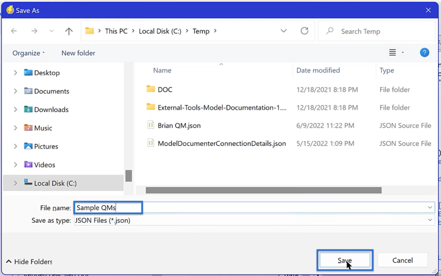
If you are working with multiple quick measures, you can change the default file in Quick Measures Pro. Simply click Set and open the JSON file that you want to save as your default.

Setting Up Quick Measure in Power BI
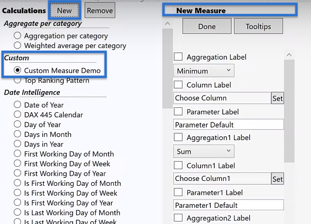
In Quick Measures Pro, go to the Custom section and click Custom Measure Demo. Click New to open a New Measure template.
To decide which parameters we need to modify for our new measure, let’s look closer at our code.
Overview Of The Code
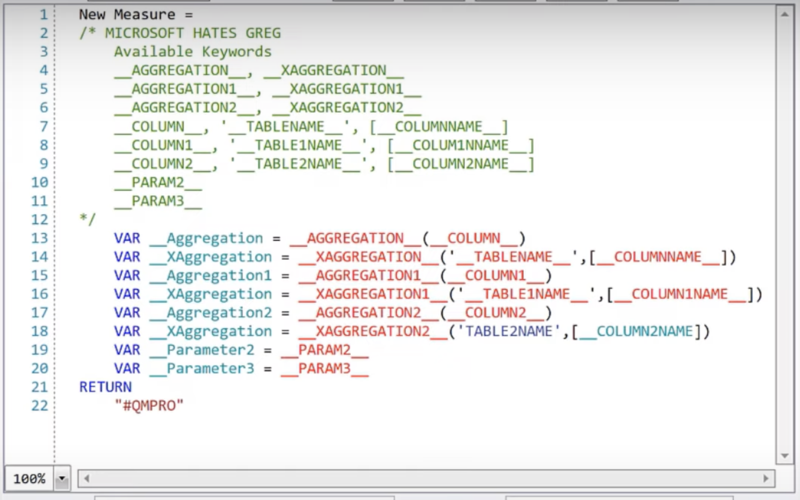
Below is a code from a custom measure in the Analyst Hub. This code conditionally formats and highlights the highest and lowest values in a field.
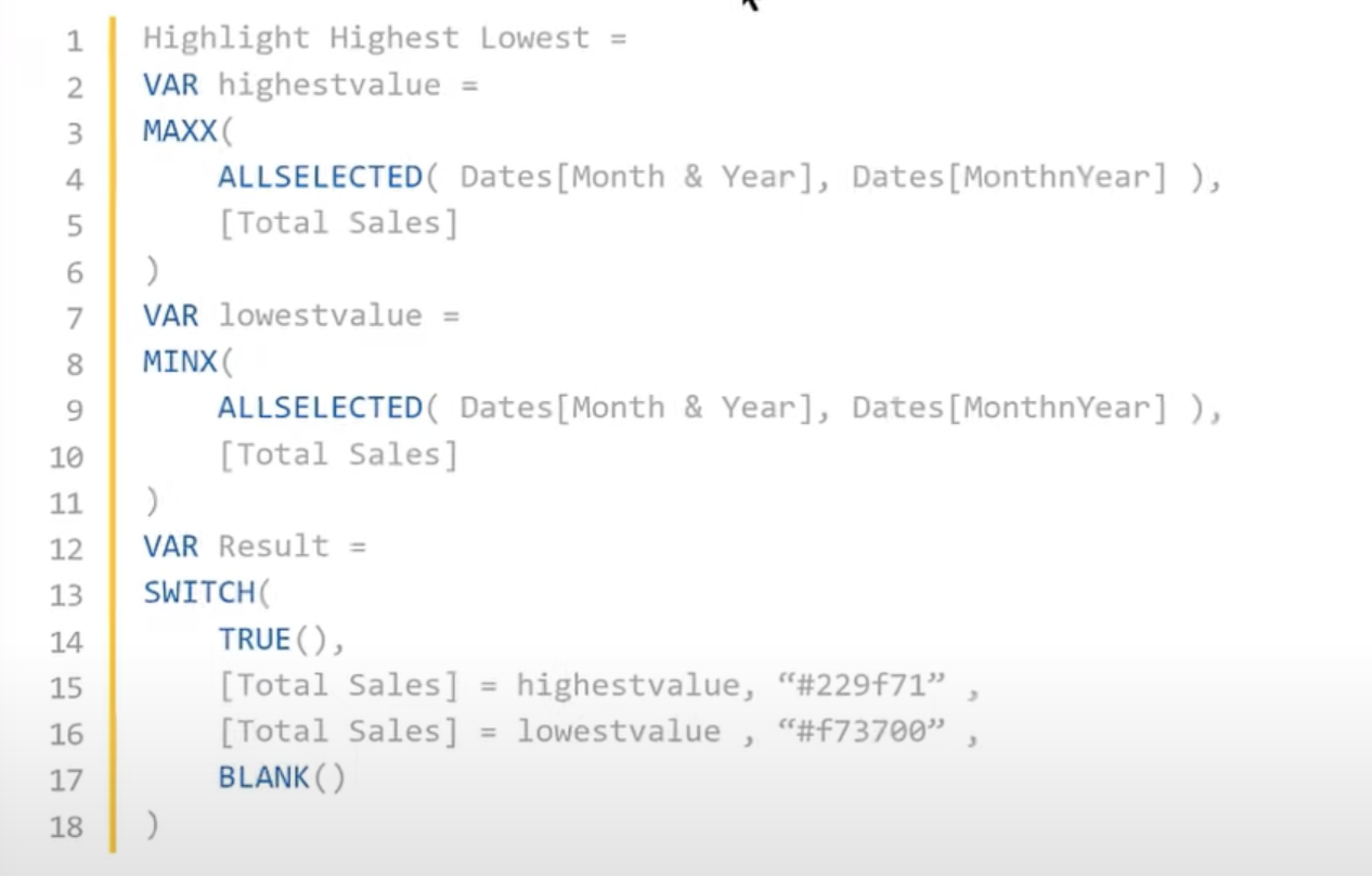
For this tutorial, we will use this code as a template for our quick measure. However, since it was made for a specific dataset, the parameters won’t apply to our datasets in most cases. So, there are five things we want to make flexible in this code.
First is the selected period, currently set as Dates [Month & Year].

Second, is the sort field, set as Dates [MonthnYear].
Third is the measure, currently saved as [Total Sales].
Fourth is the hex code, #229f71, the color used to highlight the high value.
Lastly, the second hex code, #f73700, to be used for the low value.
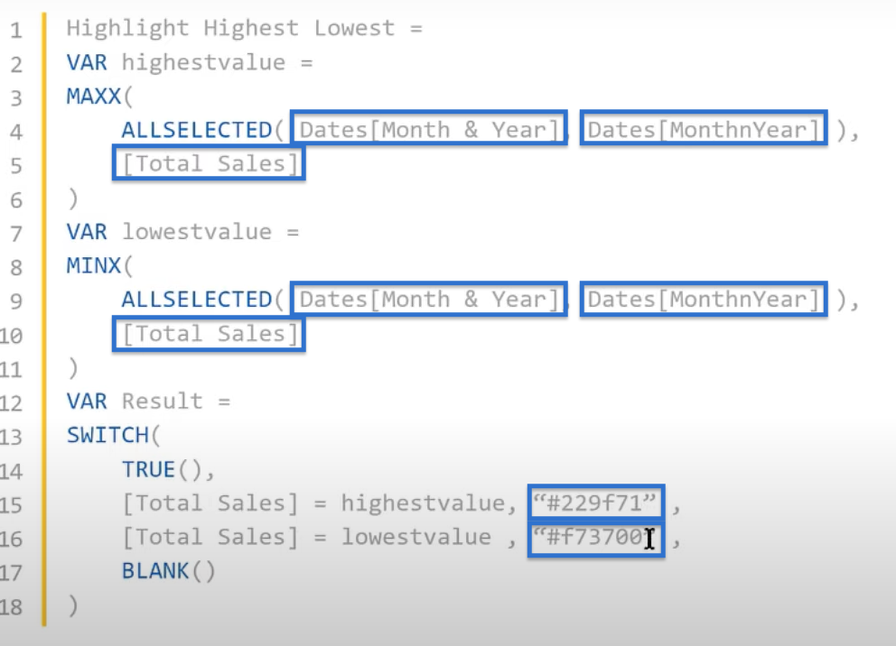
To modify the code, we’ll use aggregated columns for the period, sort field, and measure. Then for the two hex codes, we’ll use parameters.
Let’s put these changes together in quick measures.
Modifying The Quick Measure For Power BI
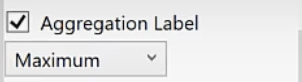
In the New Measure template, tick Aggregation Label to enable it and choose Maximum in the dropdown.
Tick the second parameter labeled Column Label by default, and rename it to Period. Click Set and choose Month & Year.

Also, enable the Aggregation1 Label and choose Maximum in the dropdown.

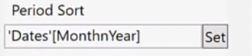
We will then include the Column1 Label and change its name to Period Sort. Click Set and choose MonthnYear. This will be our sort column.
For our measure, tick Aggregation2 Label and choose Maximum in the dropdown.

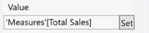
Enable Column2 Label and rename it to Value because this is the field value where the conditional formatting will be applied. Click Set and choose Total Sales under Measures.
After setting up our aggregators, we’ll then pick our two parameters. Note that since we are using text fields, we can use both color names and hex codes under the parameters.
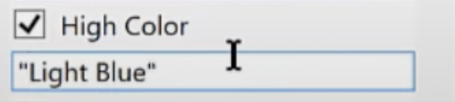
So, tick Parameter2 Label and change the name to High Color. Then, set the value to “Light Blue”.
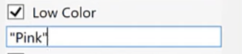
Do the same for the Parameter3 Label. Tick and rename it to Low Color, and set the value to “Pink”.

Click Done.

Custom Variables For The New Quick Measure
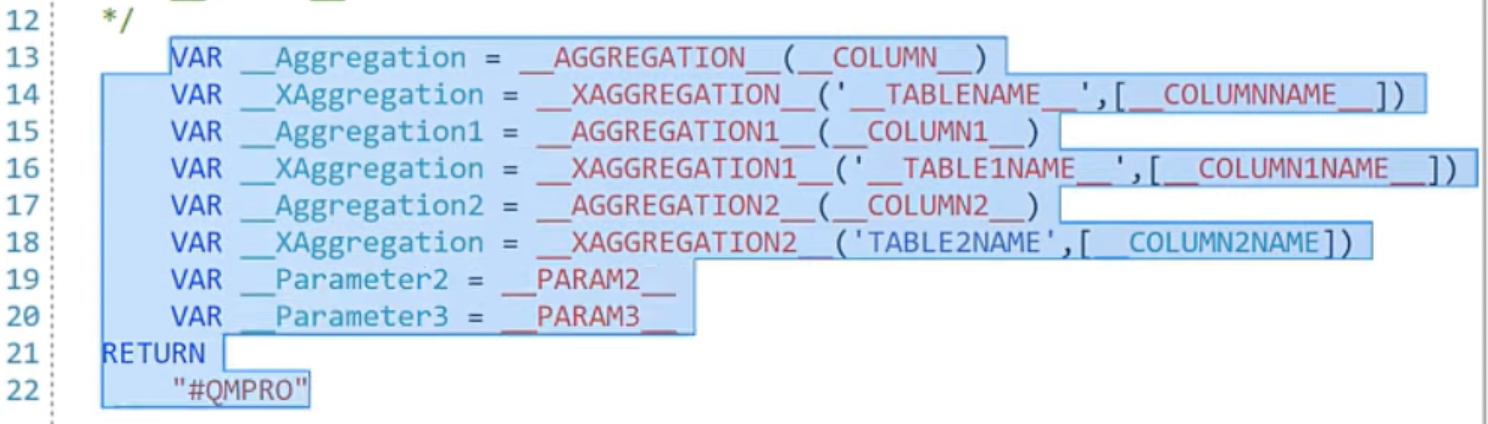
After setting up the measures, a list of variables for the new measure will appear.
To simplify the view, let’s remove the variables from lines 13 to 22.
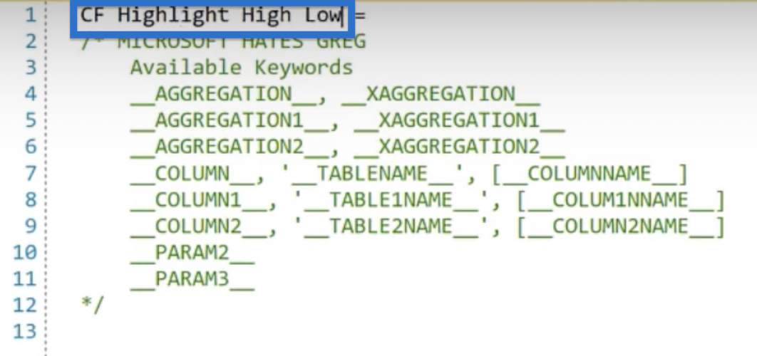
In line 1, rename the measure as CF Highlight High Low.
Then, go back to the Analyst Hub and copy our code.

Starting from line 13, paste the code back to Quick Measures Pro. Notice that we removed the code in line 13 because we’ve already named our measure in line 1.

The next step is to replace the fields with our flexible designations. We can use the Find and Replace feature to make the process easier.
Click Find. In the first text field, we input the variable that we want to be replaced. In this case, let’s put Dates[Month & Year].
In the second text field, we input the replacement text. Let’s copy __COLUMN__ from the Available Keywords and paste into the text field. Click Replace All.

Notice how the Dates[Month & Year] from the original code are replaced by __COLUMN__.

Next, replace Dates[MonthnYear] for our sort column. Input it in the first text field and replace it with __COLUMN1__ from the keywords. Then click Replace All.

Our code should appear like this:

For our measure, put [Total Sales] in the first text field and replace it with the measure function of COLUMN2NAME, written as [__COLUMN2NAME_]. Click Replace All.

This will update our code as shown below.
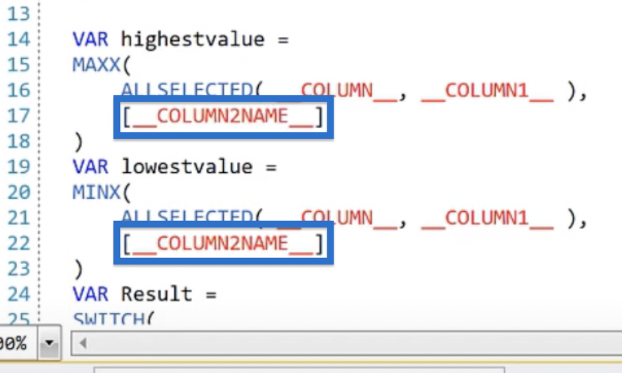
Finally, replace the hex codes with the appropriate parameters. For the highest value, change the hex code to __PARAM2__ and for the lowest value, use __PARAM3__.

The raw code is set up. Click DAX to view our DAX code.

Once satisfied with the DAX code, click Create. A pop-up window will say the measure has been successfully created. Click OK.

Quick Measure Visualization In Power BI
If we go back to Power BI, a new measure titled CF Highlight High Low should appear under Measures in the Fields pane.

We can then create a table for our months, years, and total sales. Under the Visualizations pane, click Table from the Build visual.

Once the table is created, search for month from the Fields pane. From the results, drag Month & Year to the table.


Do the same for Total Sales.

Then, let’s format our background color by going to Visualizations > Build visual > Columns. Click the dropdown arrow for the Total Sales, choose Conditional formatting, then Background Color.

In the Background color -Total Sales window, choose Field Value for the Format style. Then, select CF Highlight High Low for the field to base this on. Apply to Values only and click OK.

If we scroll through the table, we should see that our quick-measure formats are perfect according to our requirements. It highlighted the highest value in light blue.

At the same time, the lowest value is highlighted in pink.

***** Related Links *****
Power BI Quick Measure Feature
Pros & Cons of Quick Measures In Power BI
Custom Conditional Formatting Techniques In Power BI
Conclusion
Creating a quick measure with Quick Measures Pro can save you time and effort. You only have to write the measure once and then use it dozens or even hundreds of times in the future by simply clicking on the columns and the parameters you want to add.
In this tutorial, you have learned how to create a quick measure that highlights the highest and lowest values in your dataset. You can use it to conditionally format based on month, quarter, average sales, or any other variable. You may also tweak it further to make the formatting more aligned with your data and report.


")