In this tutorial, I’m going to break down how to effectively represent a budgeting analysis using segmentation and grouping techniques in Power BI. You may watch the full video of this tutorial at the bottom of this blog.
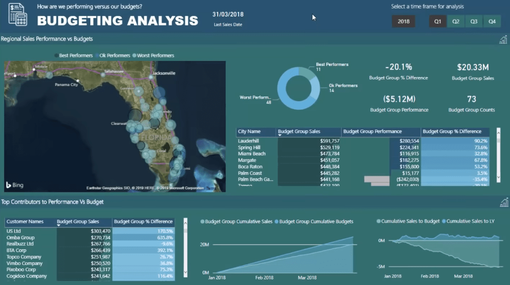
This is a breakout session from a Learning Summit course in Enterprise DNA Online.
This technique will benefit those who are working on budgeting analysis. This is also useful for work that uses segmentation, or when there’s a need to represent results broken down into a specific group.
For this example, I’m going to focus on budgeting results.
Looking At The Best And Worst Performers
When dealing with budgeting information in Power BI, there comes a point when we need to work out our Sales versus Budgets. This enables me to see who are and who aren’t performing well.
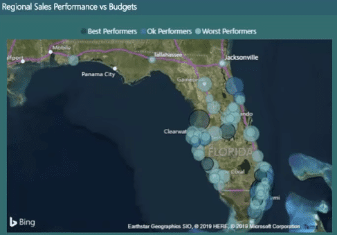
Using this technique, I can look at things spatially with a map:
Or I’ll be able to know who the best and worst performers are by looking at the breakdown of the number of stores or cities I’m selling to:
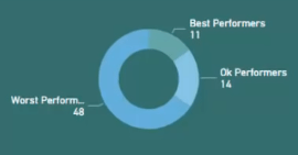
This grouping technique in Power BI allows me to break down my results and showcase them more effectively.
Instead of having only one color in the visualizations and looking at the difference between Sales and Budgets, I can showcase my good versus average or bad performers.
I can quickly dive in and see if there are any clusters for the Performance versus Budget.

Furthermore, when the model is set up well, I can drill into the information I have on my customers better.
If I don’t group these stores or customers based on their performances, it’ll be difficult to look for the best performer and get valuable insights from it.
This is what segmentation and grouping techniques in Power BI enable me to do.
How To Group Customers Based On Performance
For the example, I’m going to create a demo page.

I want to group my Cities based on how they performed versus the Budget.
1. Create A Supporting Table
The first thing I need to do is to set up a table in the model.

The table I’ve created is called Budget Groups.

It’s not connected to my model. It’s referenced using supporting tables. The Budget Groups table is simply going to support the calculations. It’ll also enable me to create different visualizations that ordinarily can’t be created using regular methods.
This is the actual table of the Budget Groups:

You can see that my Best Performers, within a certain time frame, are those who have an increase of 40% above. The Ok Performers are those who have a 0 to 40 percent growth. And the Worst Performers are those who have zero to negative percent growth.
2. Set Up The Formula
I’ll then set up a formula that will allow me to work through the Budget Groups table:

I used a Variable RankingDimension in the formula. I’ve also created the virtual table, Regions[City Name], because I want to know the City I am in for the current context.
I used CALCULATE to show the Total Sales of the Cities. But I want to show it based on the Group they are in. This is why I need to iterate through each different city.
This part of the formula performs the iteration:

However, remember that this function will only evaluate to one City.
Looking back at the table, the context for a City Name will always exist at different rows.
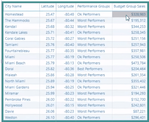
So, the Variable will always be one City Name.
For that particular City, I need to work through the Budget Groups table. Then, I’m going to work out if the Sales vs Budgets % is greater than the Min, or less than or equal to the Max.

The Min in the Budget Groups table were those who have no growth and 0 – 40 percent growth. The Max is the group with the 40% above percent growth.
If the formula evaluates to TRUE then that will be the Group where the City will be placed into. Once it has been assigned to a group, it will then return the City’s Total Sales.
3. Make The Model Dynamic
Also, always remember to make the model dynamic so that it will automatically update the calculation and results for every selection created.
Creating Effective Visualizations
Let’s look again at the demo.

If I look at things in a map, it’s very difficult to understand the advanced functions in DAX.
I recommend placing information and data into tables because this helps us understand how things are calculated.
In this case, I’m filtering every single context for a City called Kendale Lakes. Then, I’m going to work out if its Sales versus Last Year Percentage Growth is within one of the ranges in the Budget Groups table.
If it is, the table will display its Performance Group. For this example, it’s Ok Performance. I can also see the Best Performers along with their Total Sales.
In the map, there’s a breakdown of the Best and Worst Performers versus the Budget.
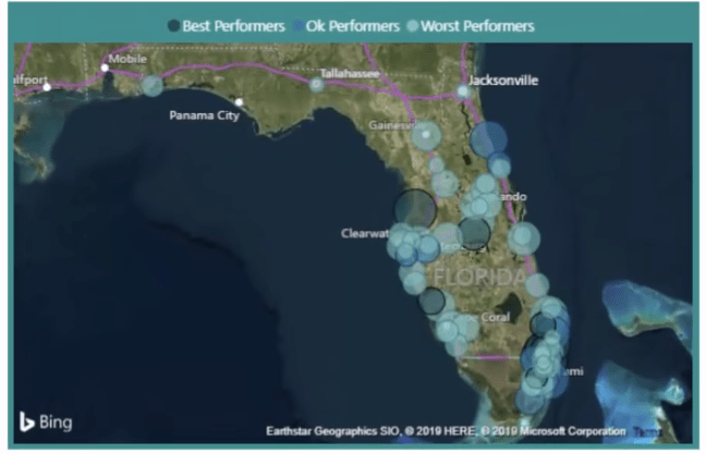
I can dynamically drill into each Performance, identify where the clusters are, and why they are occurring.
For this chart in the dashboard, there’s the percentage difference for each City Name:

I can dynamically change this chart and make it show the Best Performers.

You can also see the Budget Group % Difference. This is the Percentage Difference between the Current and Last Year Sales. Since these are all the best performers, their percentages are all above 40%. There’s also the Total Sales and Difference between Performance and Budget.
***** Related Links *****
Use DAX To Segment & Group Data In Power BI
Power BI Customer Segmentation: Showcasing Group Movement Through Time
Data Segmentation Based On Percentage Groups – Advanced DAX In Power BI
Conclusion
By exploring this model, many interesting things can be discovered in Power BI. We can get very valuable financial information from our data using insights we have derived from our DAX calculations.
Learning advanced DAX formulas will help you achieve great results, especially when they’re combined with segmentation and grouping techniques in Power BI.
I hope you have learned a lot from this tutorial.
All the best,
Sam
[youtube https://www.youtube.com/watch?v=MDAjt-yicDQ?rel=0&w=784&h=441]


