
In this tutorial, we’ll discuss how to use another custom visual in Power BI called Dot Plot by MAQ Software. A dot plot graph in Power BI is a simple visual that shows a number of dots for the value you wish to present. It’s a great choice if you want to include categorical data along the X-Axis.
Dot plot graphs are amazing because we can highlight a number of factors in one visual, which we can’t do in other visuals.

Advantages Of Dot Plot Graphs In Power BI
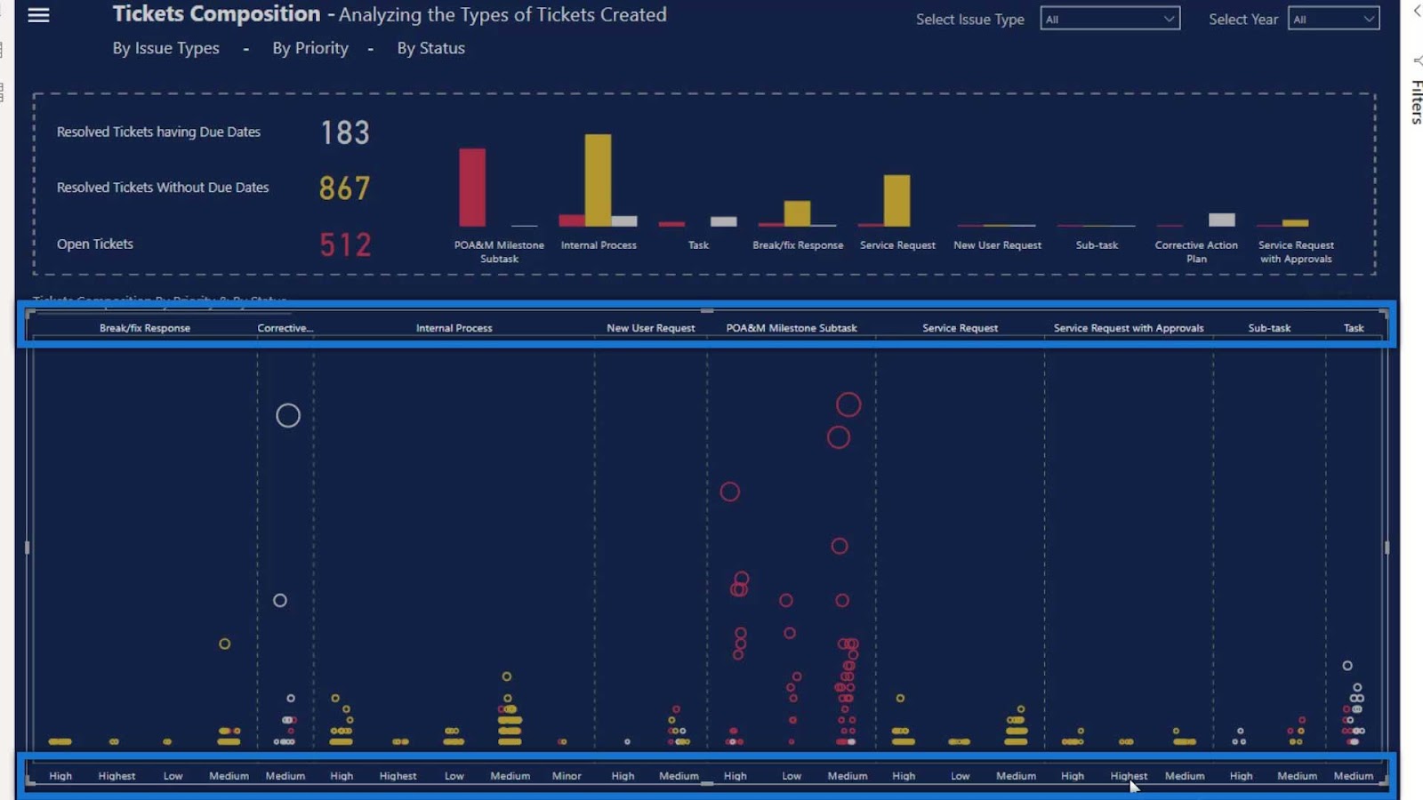
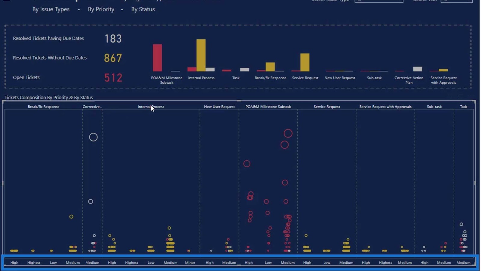
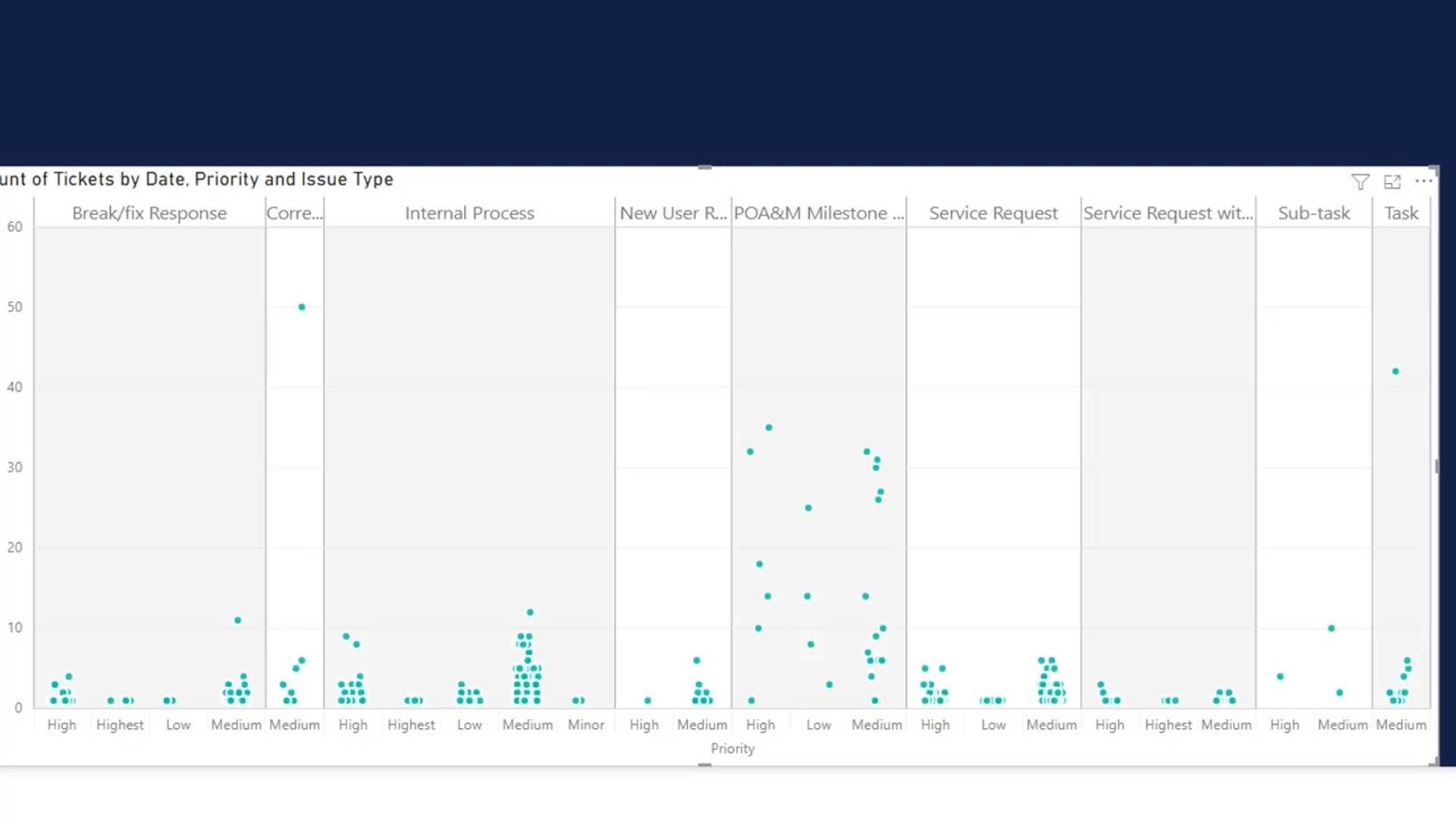
The best thing about a dot plot graph is that it has two axis categories. As you can see, we can show categories on top and at the bottom.
The second good thing about this visual is that we can create jitter effects without having to create complex calculations.
Another best thing about this visual is that some of the sections can be bigger in size than the others. In this example, it indicates that this bigger section has the highest number of values.
Understanding The Dataset
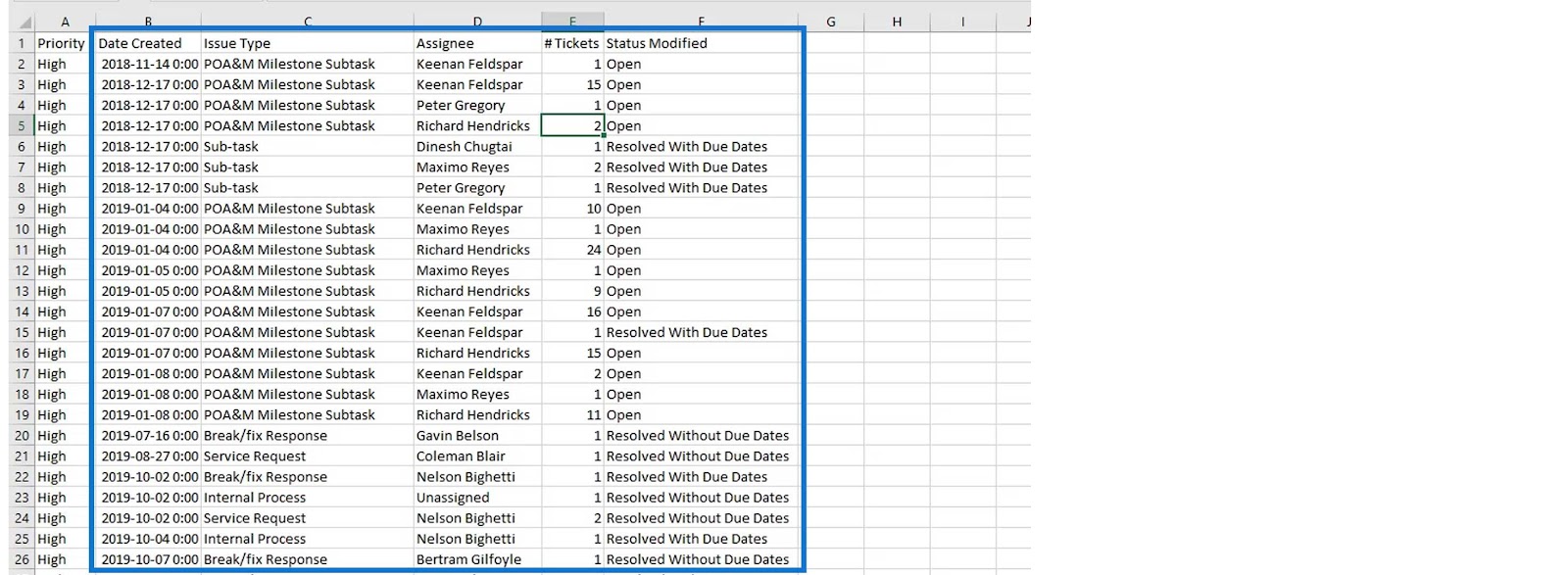
This dataset is related to Enterprise DNA Challenge #8, which was about the JIRA help desk service system.

Every organization has their own IT help desk system and IT department. Let’s say you’re unable to login to your system. Therefore, you’ll create a ticket and the IT department will resolve the issue.
When you create a ticket, you’ll also need to mention the priority of the issue. For example, if the issue needs to be solved urgently, then you should set the priority to High. For issues that are not urgent, you can set their priorities to Low or Medium.

In this dataset, we can also see the daily number of tickets created, the person assigned to solve the issue in the IT department, the number of tickets issued on a particular day, and the status modified.
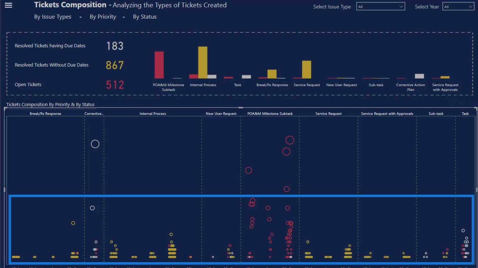
Let’s go back to our report section. This part is where we can see the issue types.

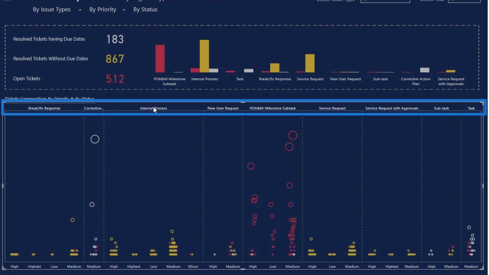
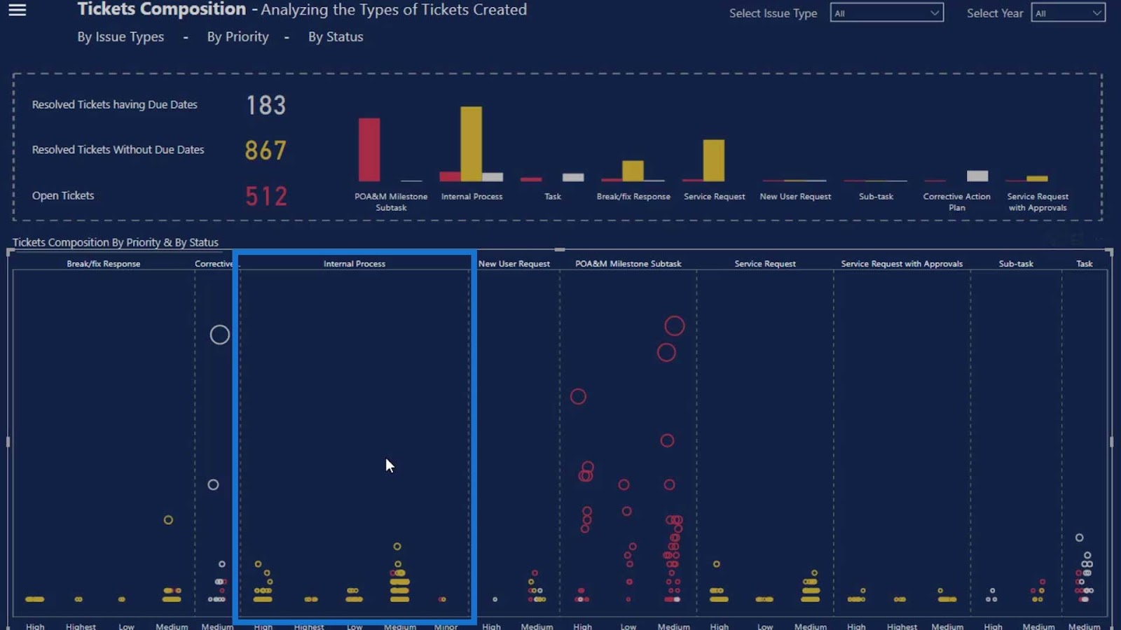
This part is related to internal processes. One example of an internal process is when you are unable to login to your system.
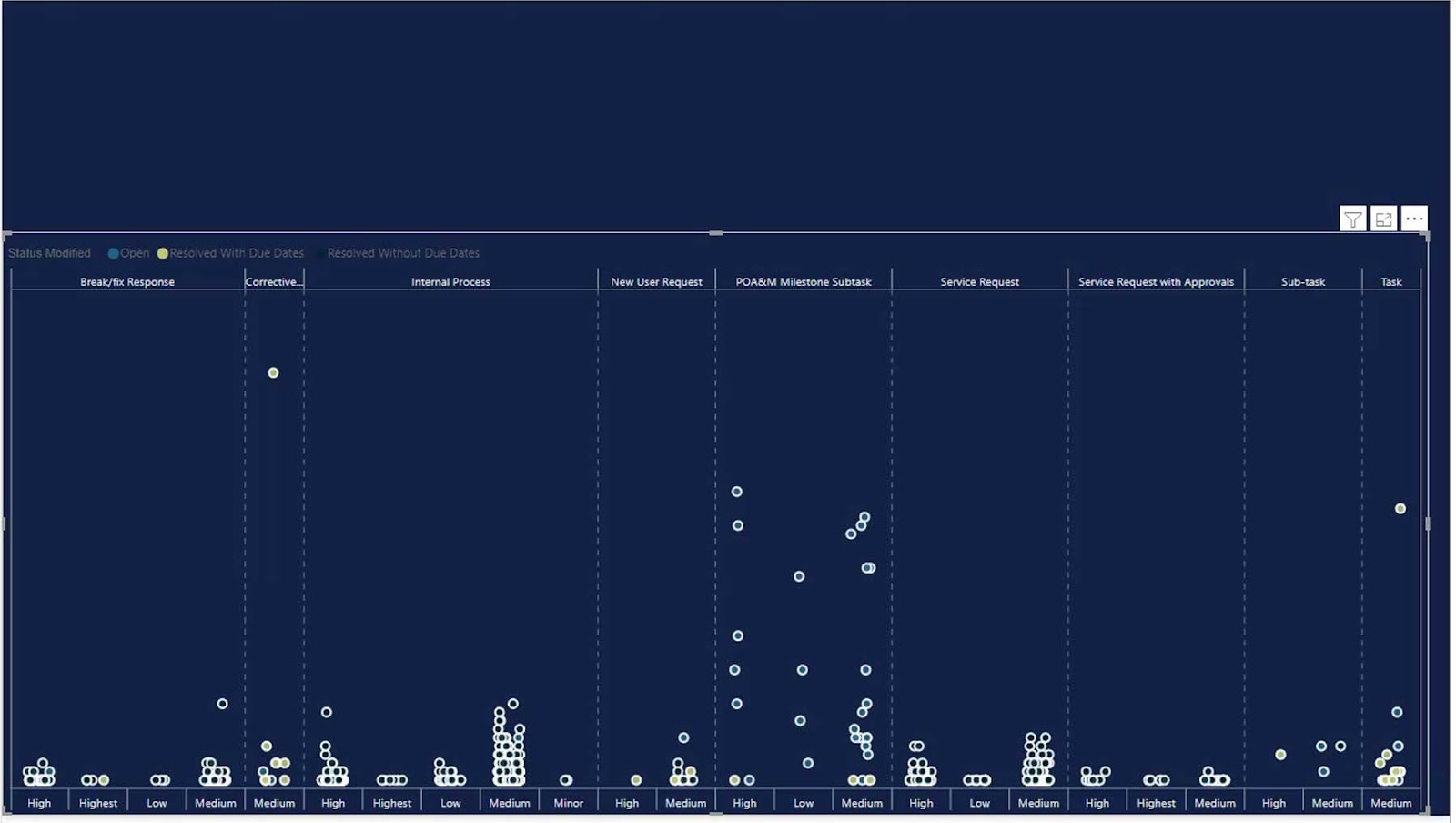
We also have the priority level on the issues. As you can see, there are issues with high, highest, low, and medium priorities in this internal process section.
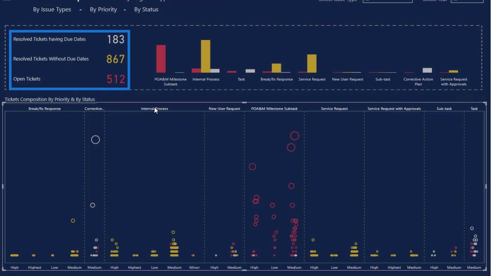
We have also set colors for the ticket issues. The yellow ones are the issues that were resolved without due dates, the red ones are open tickets, and the gray ones are resolved tickets with due dates. Because of these colors, it’s much easier for the end users to see and understand the tickets.
Let’s now create this report from scratch on a new report page.
Creating Dot Plot Graphs In Power BI
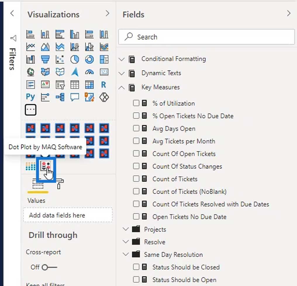
Let’s get the Dot Plot visual by clicking on the 3 dots, then select the Get more visuals option.
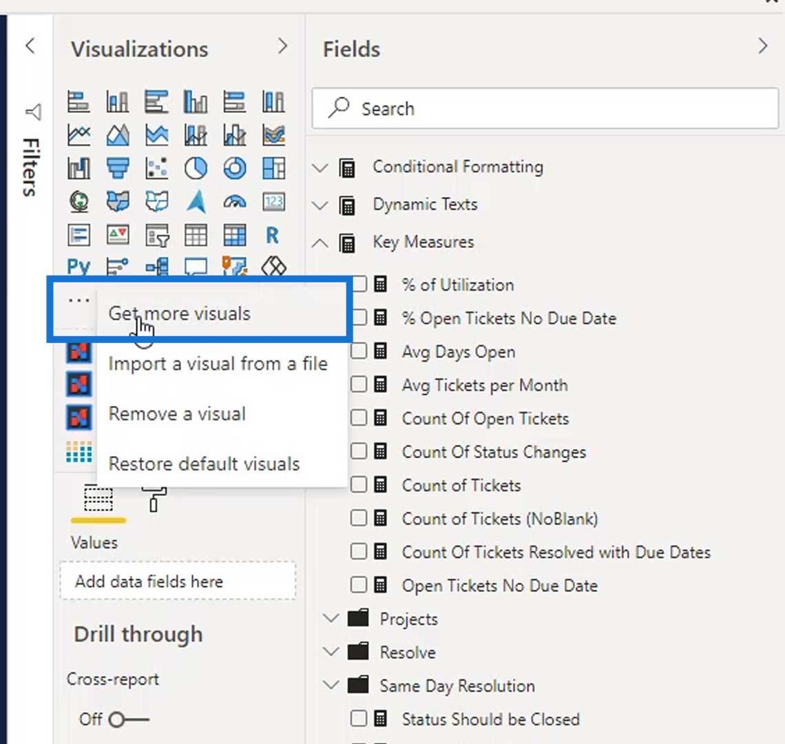
Search ”Dot Plot” on the search field and the Dot Plot by MAQ Software will appear. Then, click the Add button.

After that, it will be added to our available visuals. Let’s just click the Dot Plot by MAQ Software so we can use it on our report page.
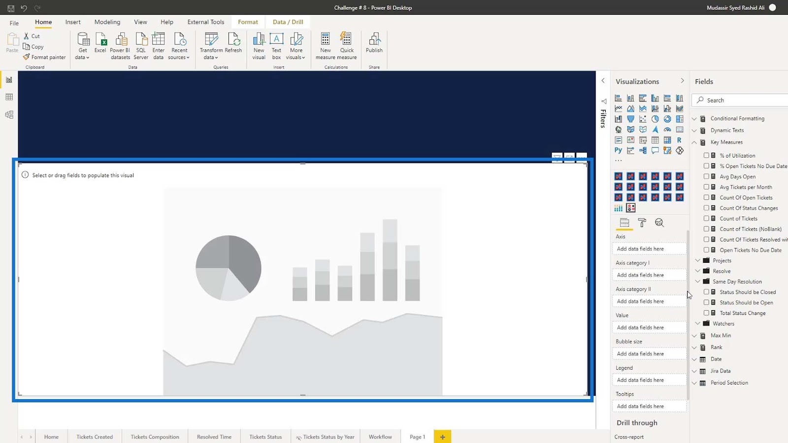
Resize it as shown from the image below.
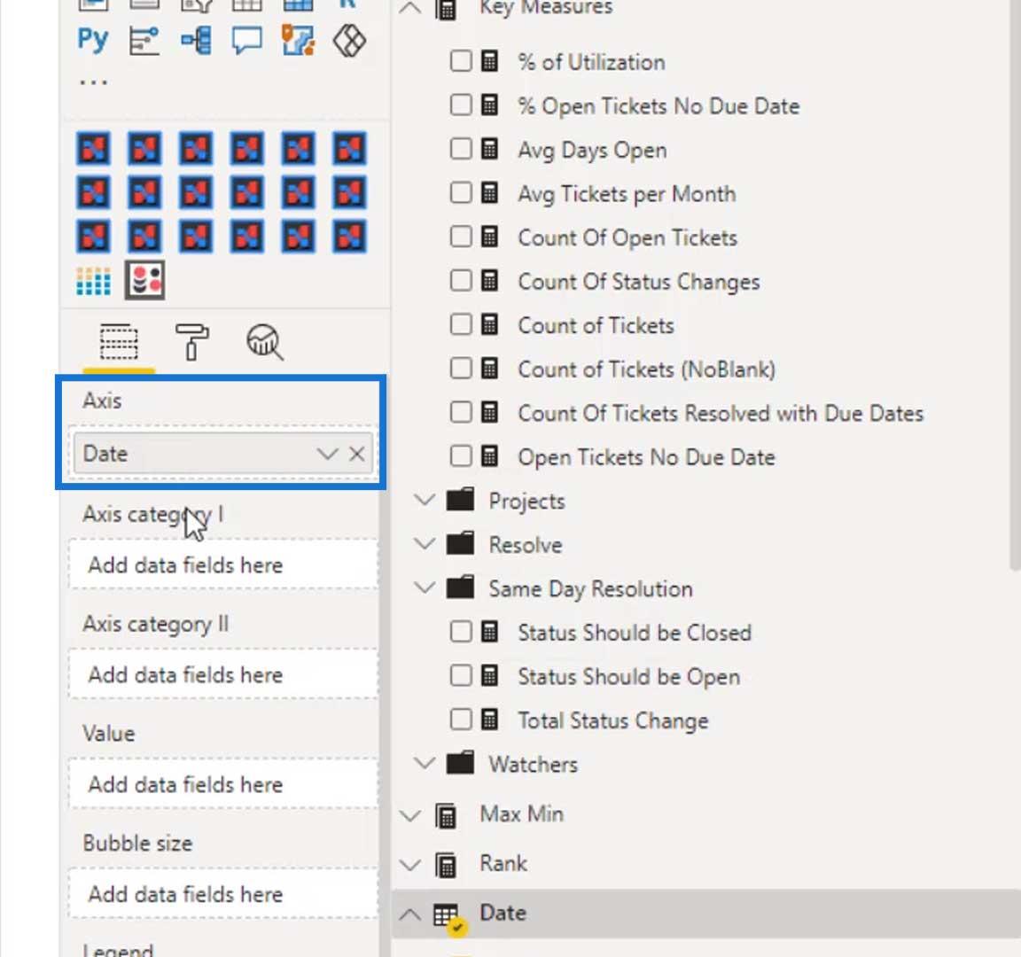
Under the Axis field, let’s add the Date. This is because we’ll be looking at the number of tickets that are created daily.
Add the Priority for the Axis category I field, and the Issue Type for the Axis category II field.

Since we are looking for the number of tickets issued, add the Count of Tickets on the Value field.

The output should now look like this. As you can see, we don’t have the jitter effects yet.

To create the Jitter effects, go to the Formatting tab, then turn on the Jitter effect.
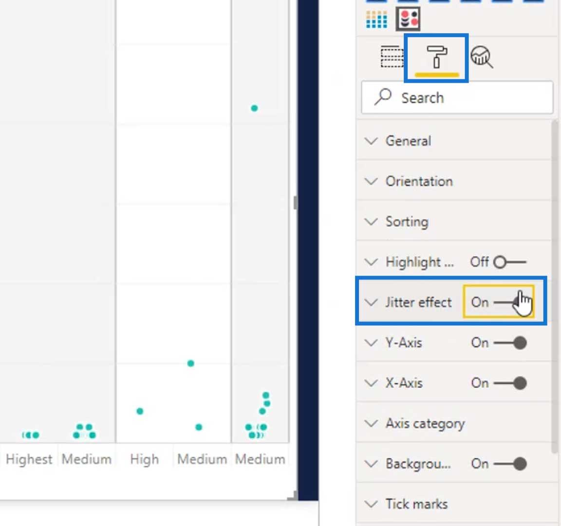
The output will then look like this.
Modifying The Dot Plot Graph Visual
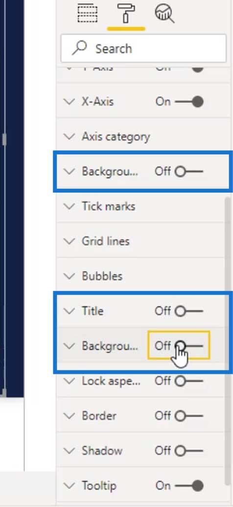
Let’s clean this up by turning off the Background for the column, and the visual’s Background and Title.

Let’s also remove these titles.
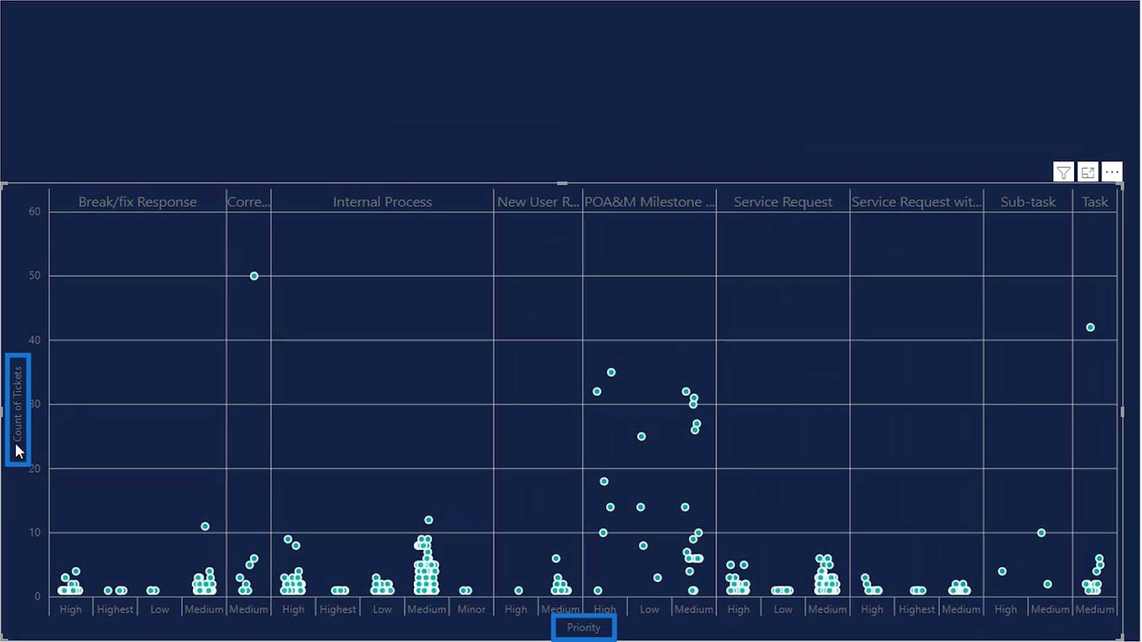
To remove them, just turn off the Title under the Y axis and X axis.

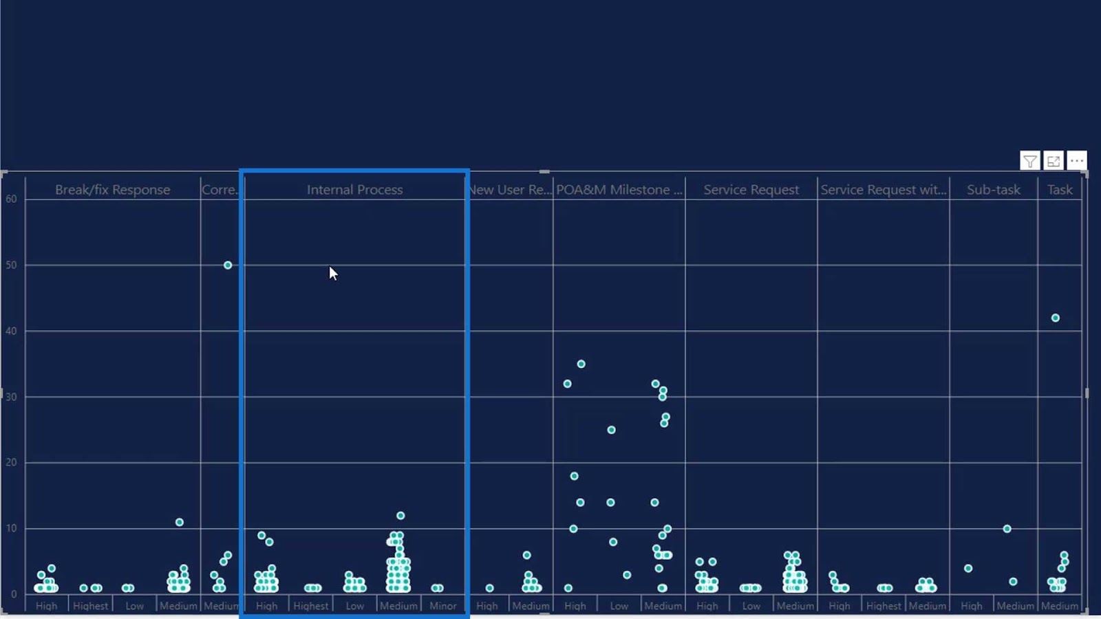
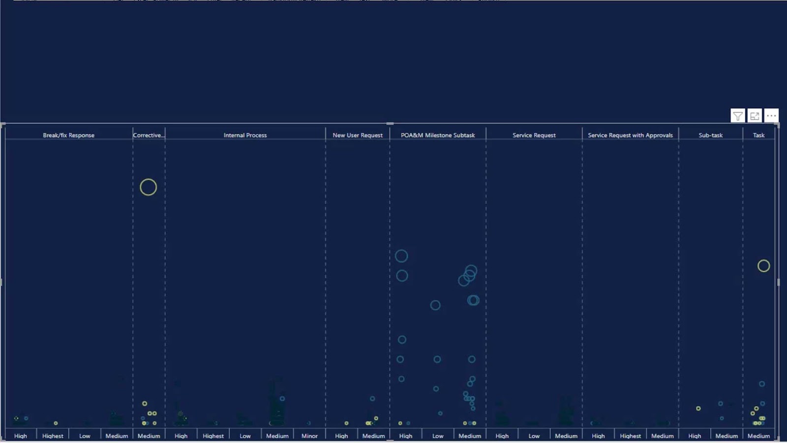
As you can see, the Internal Process column is bigger than the others. This is because it has a higher number of tickets.
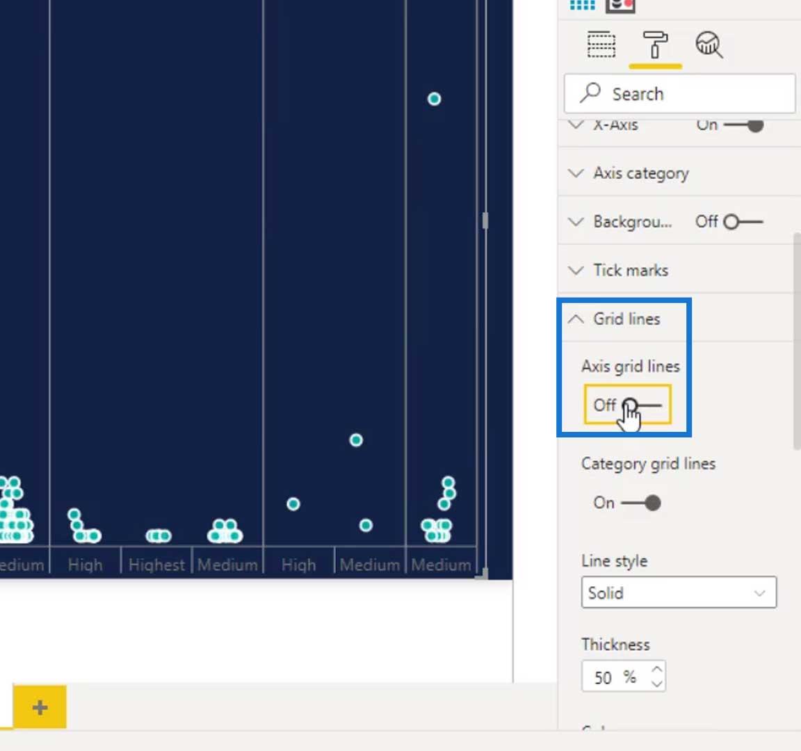
The next thing to do is to turn off the Axis grid lines under the Grid lines pane. This will remove the horizontal lines on our visual.
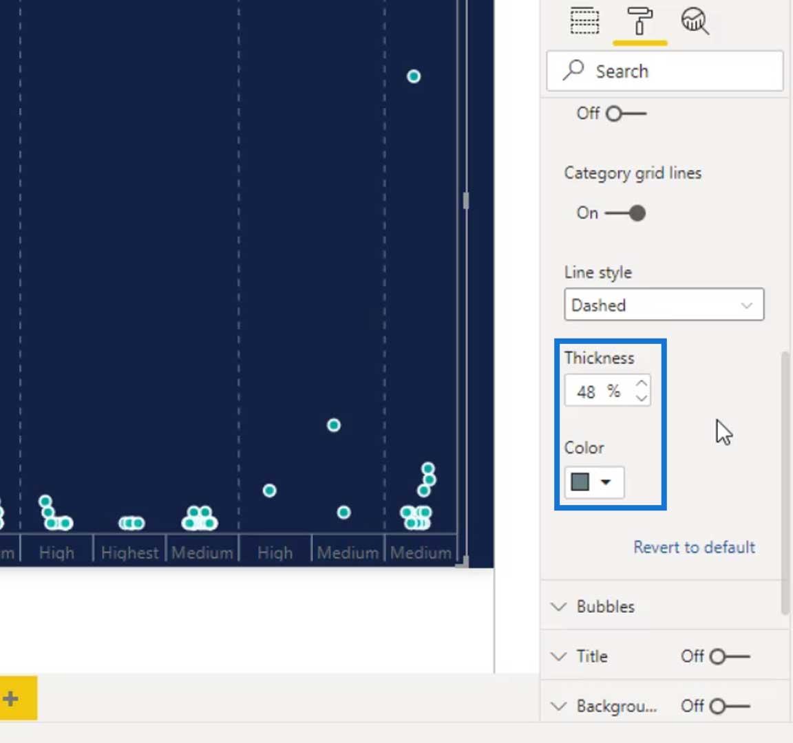
Then change the Line style into Dashed. This will change the style of the column lines.

Let’s also change the thickness and color of our column lines by changing the value of the Thickness and Color.
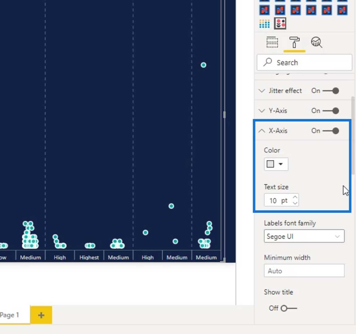
Under the X-Axis, we can change the text size and font color of our texts at the bottom.
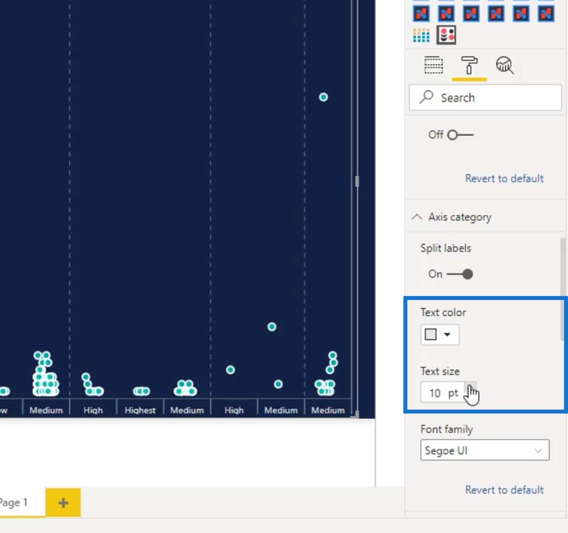
For the categories on top of our visual, we can change their color and text size under the Axis category.
We can also remove these numbers.

To remove them, just turn off this Y-Axis.

The next thing that we need to do is to bring in the legends because we also need to look at it by status modified. To do that, just add the Status Modified measure in the Legend field.
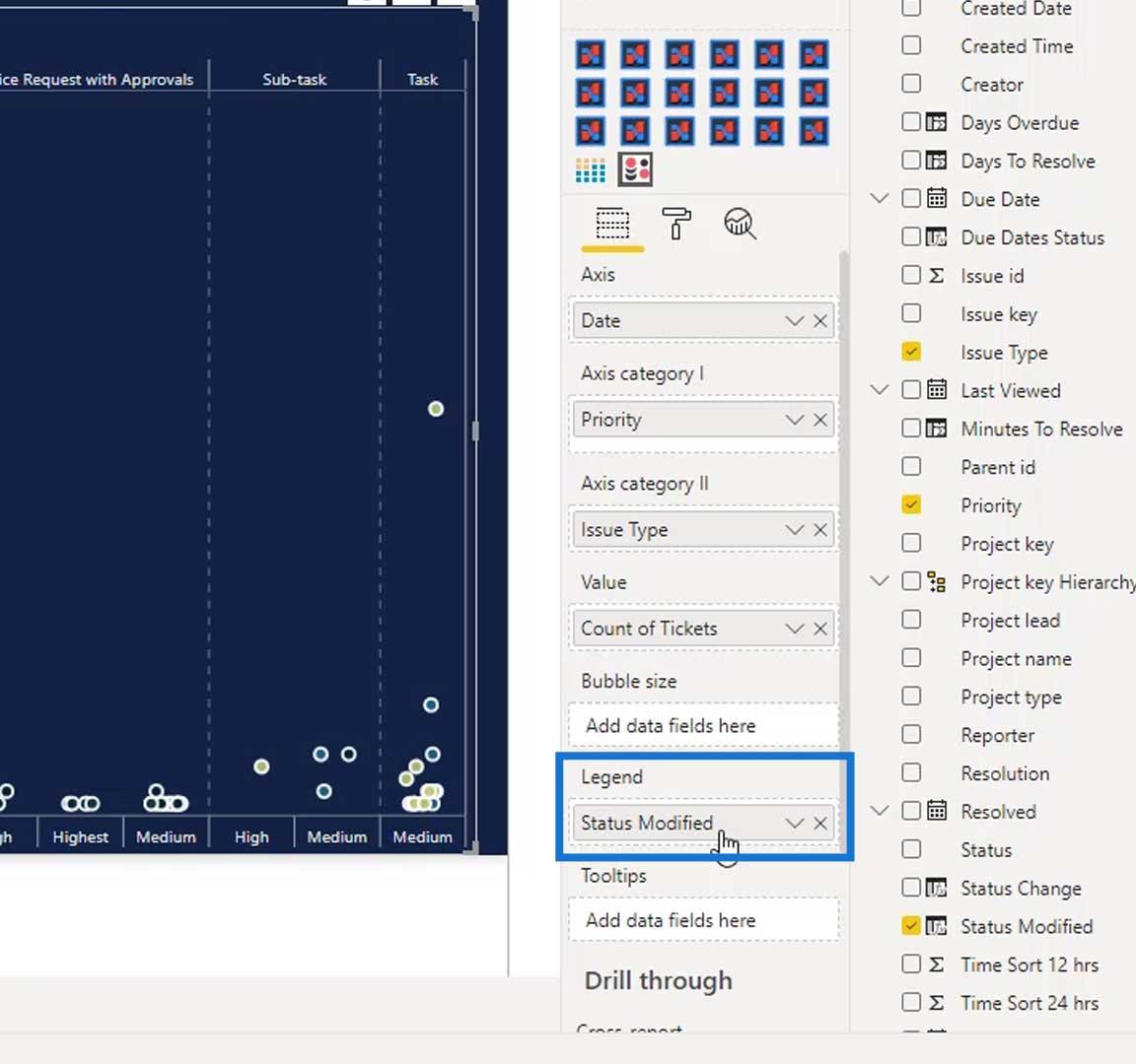
Now, the colors of the circles have changed.
Modifying The Bubbles
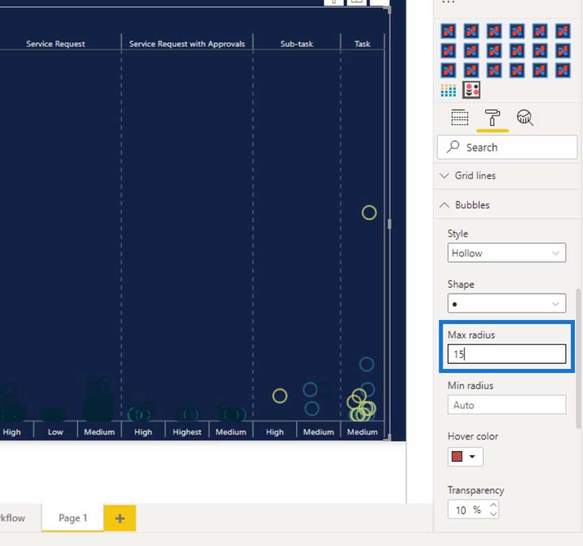
Let’s now change the style of the bubbles or the circles. Just go to the Bubbles, then change the style to Hollow.

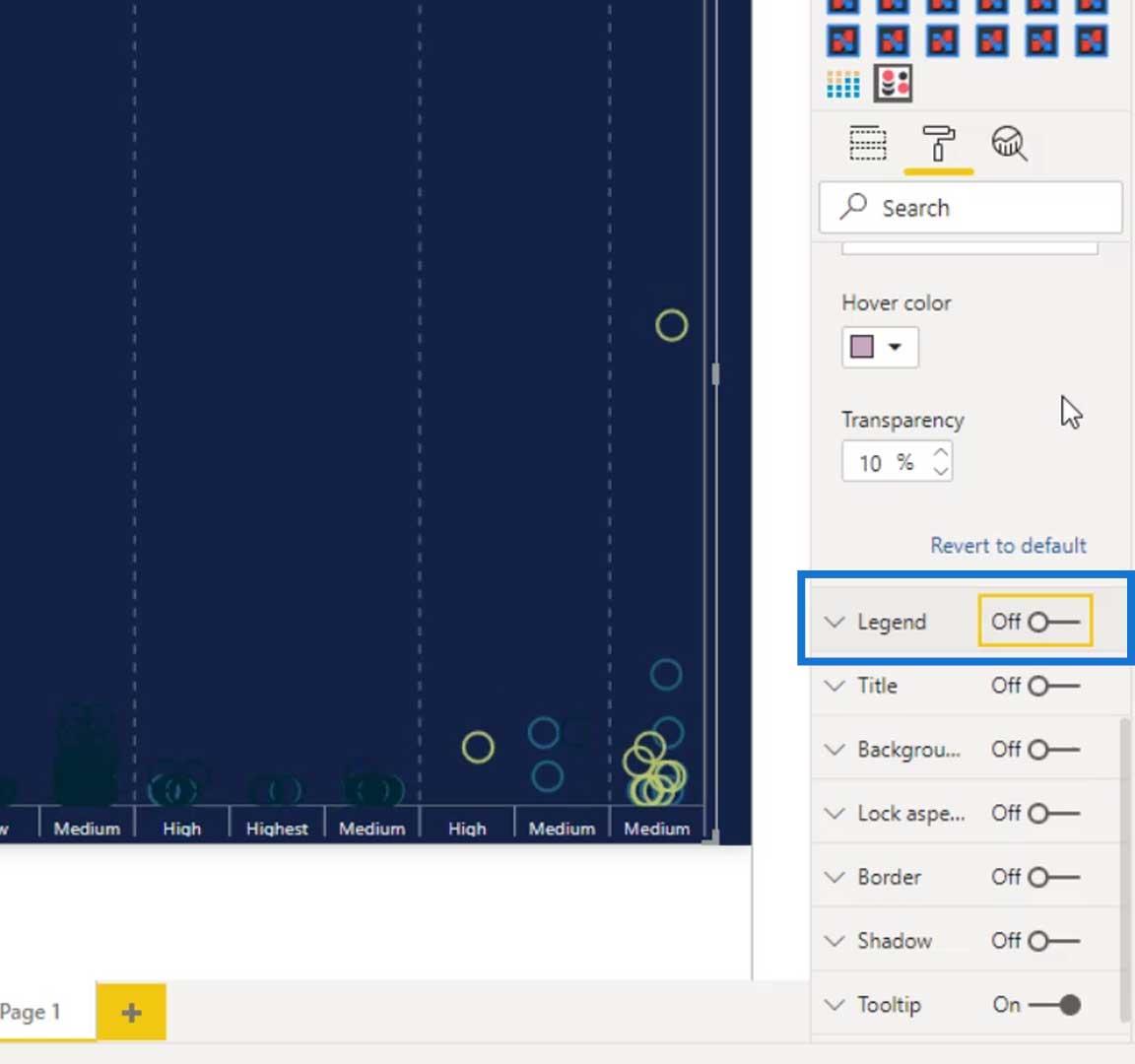
We can make the size of the circle bigger by changing the value of the Max radius.
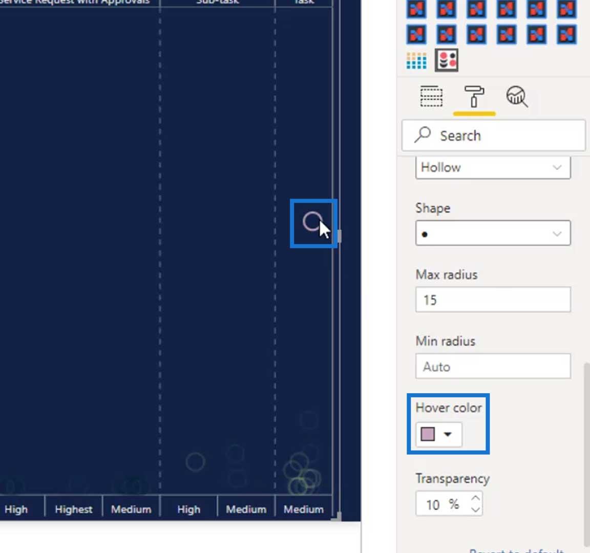
There’s also an option for changing the color of the circle when we hover over it. Just set the color for the hover effect. As you can see, if we hover over one circle, the color will be changed to purple.
We can also disable the text legend by turning off the Legend.
Another thing that we can do is to adjust the bubble size with a measure. For example, we want to have an output where the higher the number of tickets, the larger the size of the bubble will be. Therefore, let’s bring in the Count of Tickets measure to the Bubble size field.

As you can see, there are different sizes of bubbles in the output now.
We can also define the colors for our legends. We can do that under the Data colors. Here, we can change the color of the Open tickets, Resolved With Due Dates tickets, and Resolved Without Due Dates tickets.

Orientation Options For Dot Plot Graphs
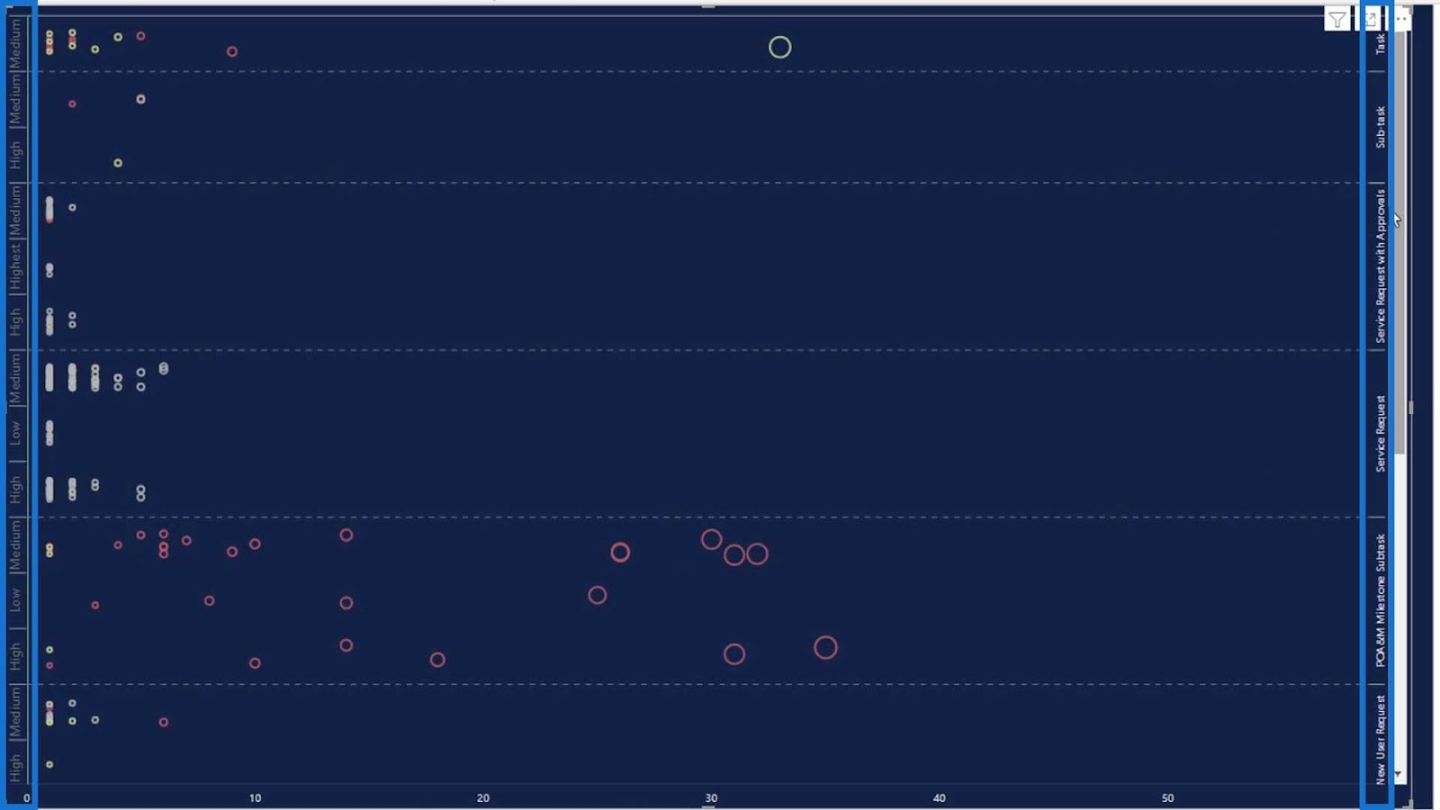
Another cool thing that we can do with this visual is that we can change its orientation to either vertical or horizontal. For this scenario, the vertical orientation is better than the horizontal. Nevertheless, we can still use the horizontal orientation for other scenarios.


If we use the horizontal orientation, this is how it will look like.

We can also sort the categories via ascending or descending order under the Sorting option.

Under the Orientation, we can also flip the Y-Axis labels and the Parent-Axis labels.
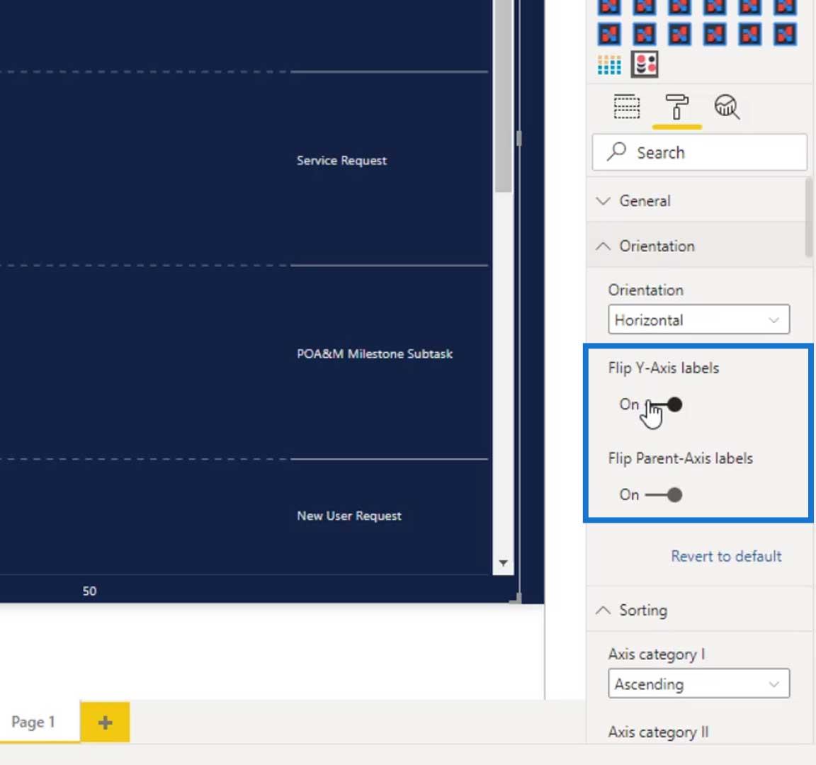
By default, our labels look like this.

If we flip the labels, it will look like this. We can use this visual with different orientations.
***** Related Links *****
New Enterprise DNA Course: Advanced Visualization Techniques
Custom Visual Reports In Power BI
Utilizing Custom Visuals For Power BI
Conclusion
In this tutorial, we learned how to use the Dot Plot custom visual and the different options that we can do with it. Use this visual when representing a group of data points plotted on a simple scale. The data points may also be labelled if there are a few of them.
Dot plot graphs are one of the simplest custom visuals in Power BI, and are suitable for small to moderate-sized data sets. They are useful for comparing the values of multiple measures brought to a scale. If this visual is created properly, it can make comparisons easier and more efficient.
Until next time,
Mudassir


")