I want to show you a data visualization technique that I believe is one of the best that you can do in Power BI. There are so many techniques now compared to when I first created this technique, but to me, this still has a lot of positives to it and it can really showcase huge amounts of insights within a report page in a really effective way. You can watch the full video of this tutorial at the bottom of this blog.
I’m talking about multi-threaded visuals – these particular visualizations you can look at it in many different ways. It doesn’t have to be a static visualization. It can dynamically change what you are showcasing in several different ways – I call this the multiple different threads data visualization technique.

This is what it looks like.
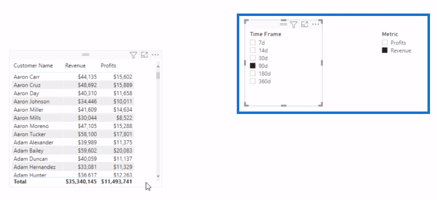
As you can see in the report page below I want to be able to look at my visualization here by a timeframe. For example, 90 days or even 7 days. I also want to be able to jump between different metrics, say to look at either my revenue or my profits. And so, you see I have my timeframe and metrics on the upper right corner of the page where I can click through them.
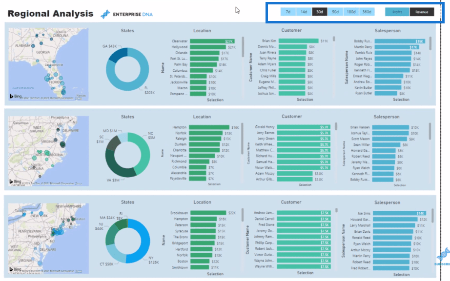
This is just the beginning of what could be possible because you could have multiple threads and/or multiple ways that you feed insights into visualization and make it dynamic. You can use filters, slices, etc.
This is a way of bringing additional insights into a report that aren’t naturally within your raw data. This to me is a data visualization technique that can really elevate your reports to another level.
It’s part of our resource package that you can actually download from the Enterprise DNA website and have a play around with it. Speaking of data models, I’ll also show you how to set your model efficiently.
The Data Model Set Up
This is how Power BI creates models. It’s setting it up in a way that I don’t feel is optimized, so this is a good time to show you how I would do it.
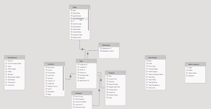
I want to put all my lookup tables on the top like so.
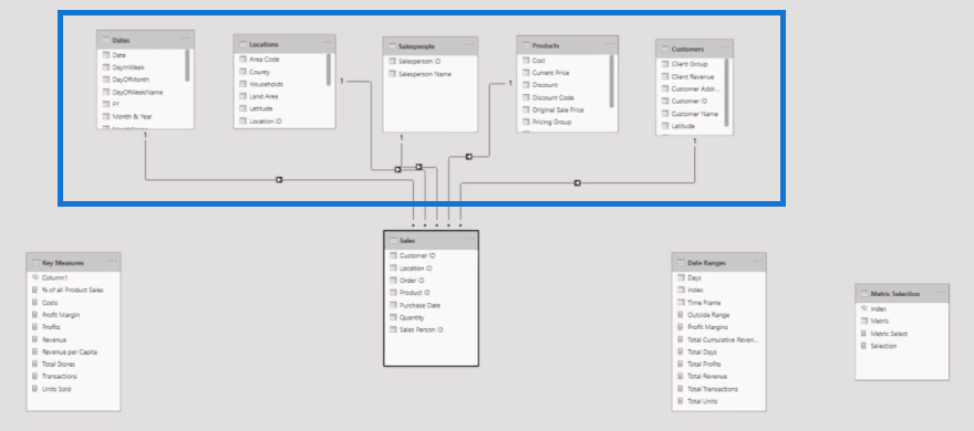
I call this the waterfall technique. With my model set up like this, I’m building a picture in my mind of how the filters will operate when I do something inside my report canvas.
I want to put my key measures on the right side and my supporting tables at the bottom.
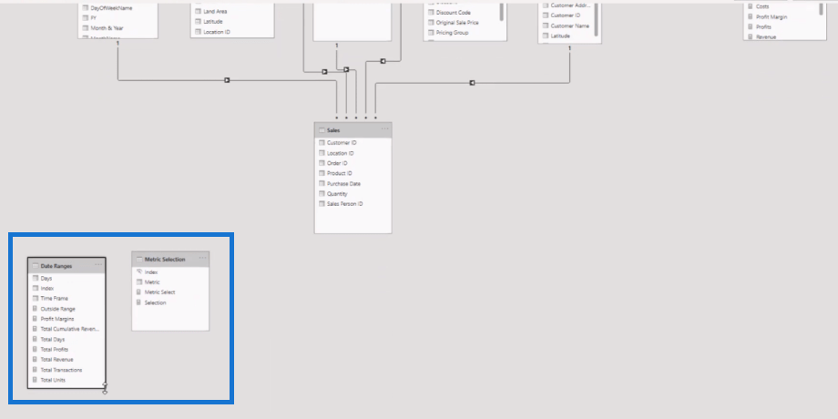
You can see how much more organized this is now. It’s like building the map in your mind of how your model actually works.
It’s important to do this when you’re working with advanced calculations like multi-threads – there are multiple layers to actually make this work.
So, let’s dive in.
Creating Supporting Tables
First, we start off with our normal metrics. We have Revenue here, which is a really simple calculation.
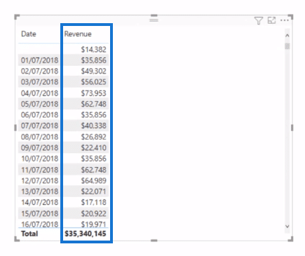
I used SUMX and have quantity multiplied by the current price. The price is in a different table, so I have to use the RELATED function.

I’ll bring in Profits here as well. So, we’ve got revenue and profits, and we want to be able to feed it through the same visualization.
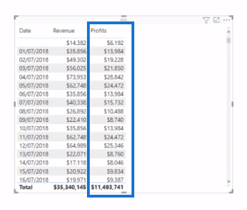
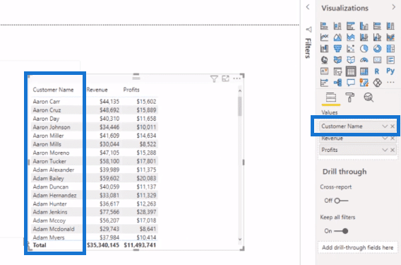
I have it by date, but with our model, we can also do this by customers easily. I’ll just create another table and replace date with customers in the values section.
From here, I would think about what ways I am going to thread different calculations into my report. How do I want to filter my data? In this case, I decided I want to do it by certain days and I want to do it by either metric (revenue or profits).
To do that, I created some supporting tables. You can create these tables really easily without having to do something in Excel or do somewhere else. Just go to Enter Data and input the details here of your table.
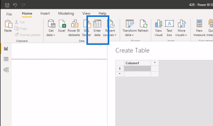
Let’s have a look at these tables that I’ve already created.
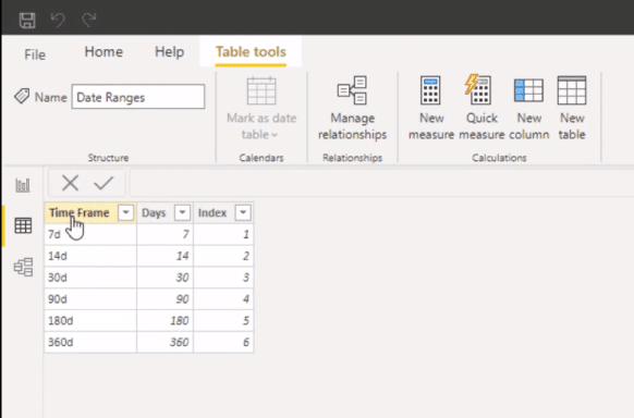
The first one is what I called Date Ranges. It has the Time Frame column, which is a text column, and it’s what I want to be in my slicer. The Days column is the actual number of days. Then I have an Index column, which enables us to sort the order of the days in the slicer. So, these are what we’re going to thread through the metrics.
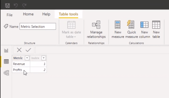
This is the second table (Metric) that has the metrics, revenue and profits.
You’ll see on the report page, the two slicers are in the right order (7 days, 14 days, profits, revenues, etc.). That’s what the Index column does.


Data Visualization Technique: Harvesting A Slicer Selection
Now we can bring in the Metric and turn it into a slicer. We need to somehow harvest whatever is selected here.
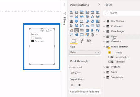
And so, we’ll bring in our Time Frame here as well. This is going to harvest what we’re selecting on the slicer, and then we need to feed it through into calculations so that we’re only calculating what is being selected. For instance, the revenue for a particular timeframe or profits for a particular timeframe.
The key calculation to get this done is the formula that I created, Total Days. We need to isolate the days that we have when we select the days from the Time Frame slicer.
Let’s take a close look at this formula.
I used IF HASONEVALUE in this formula, which means that if you have one value selected in the slicer, you need to recognize whether it is true or not. And so, if one value is selected, go SELECTEDVALUE that column that has just the days. If not, go COUNTROWS Dates.

Now, I’ll drag this measure in and turn it into a card to show us the number of days. When nothing is selected, I want a value to be input here, and that is the total number of days. And basically, that’s just going to show all the sales from the beginning of time because nothing is selected on the slicer.
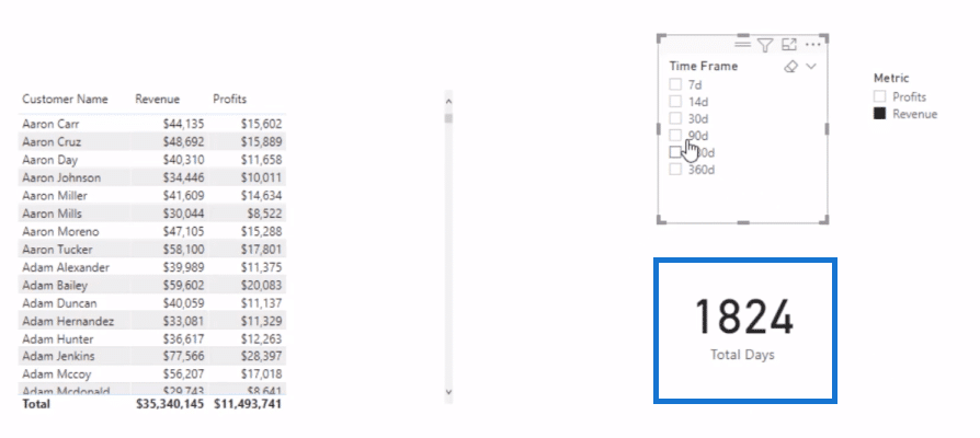
But if I click on 30 days, it’s going to give us 30 days.
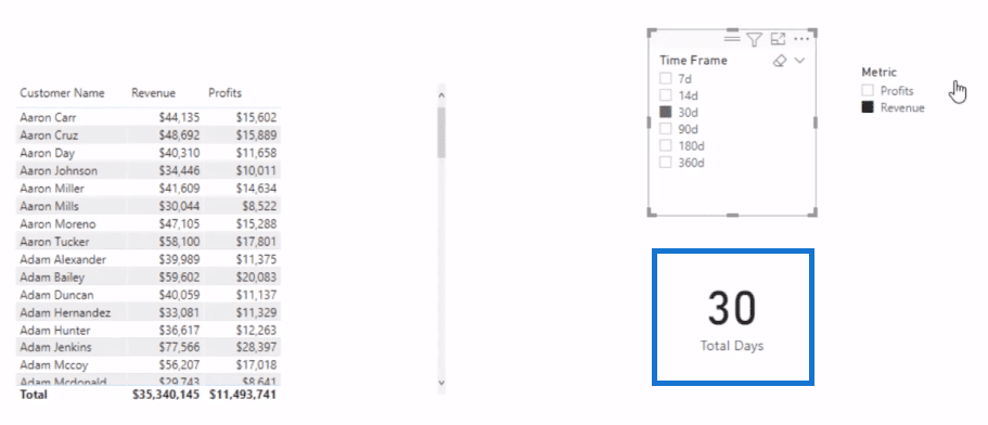
Now what we need to do is to calculate something that works out revenue and profits only over a specific timeframe. And I’ve created this Total Revenue formula to do that, where I’ve embedded the Total Days measure.
In this formula, think about what CALCULATE does. We still want to calculate revenue, but we only want to calculate over a specific timeframe. In this case that I’ve selected 30 days, then it’s working off today minus 30 days.

We only want to look at that time window from today and all the way back for 30 days. We’re calculating revenue, but then open a time window where the date is less than or equal to today and is greater than or equal to today minus the 30 days.
And remember that this can change. This could be 90 days or 180 days. It totally dependents on what is selected in the Time Frame slicer.
If I drag this measure Total Revenue in the table, you’ll see that it is showing the amounts determined by the date range that is selected on the slicer.
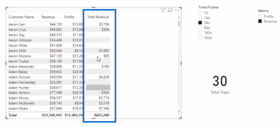
Then, I did exactly the same technique with the Total Profits formula. All I’ve done here is placed the Profits measure inside.

I’ll bring this in and we can look at profits over 180 days, 90 days, 7 days, etc., depending on the selection. We’re threading through to my measure dynamically my selection of time.
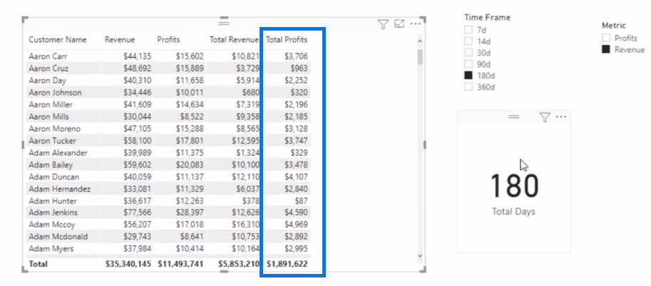
Now, I could just stop here and just show revenue and profits inside one visualization, but I want to add another thread to this calculation. I want to add it based on the Metric slicer selection.

Data Visualization Technique: Multi-threading Using SWITCH TRUE
This part is not actually that difficult and it is such a reusable technique. I use a formula that includes SWITCH TRUE. This technique enables us to thread through basically any measure into one measure.
This formula (Selection) is basically evaluating each line and trying to see if it’s true. You can return a value, but you can also return a measure.

Now, I can change this up a bit. Instead of doing VALUES here, we’ll have SELECTEDVALUE so we actually have an alternative result we wouldn’t get an error. And I put BLANK if there’s an issue. If Revenue is selected, we want to show the revenue. So this is saying, if Profits is selected, we want to show the total profits.

In the visualization below, you can see that it’s indeed showing the revenue results because Revenue is selected on the Metric slicer. If I select Profits, it will show the profits. This Selection formula got two threads sitting underneath or feeding up into it.
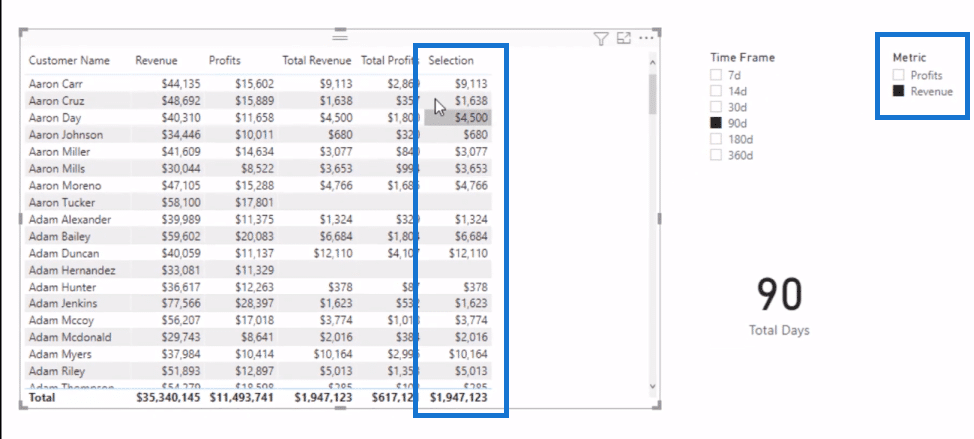
I’ll create another visualization so we can see this measure by itself.
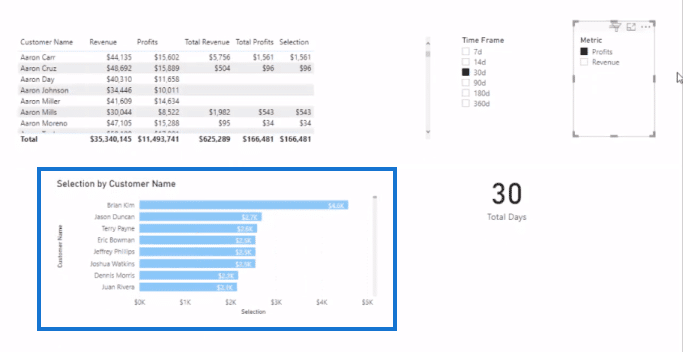
This is the data visualization technique that I call multi-threading. I’m utilizing measure branching and threading through these dynamic calculations based on my selections into one visualization.
And that is how I created this report. I have literally used the same measure in every single visualization. It’s exactly that same measure (Selection). Instead of just having by date, by the customer, or by location, this is a far more dynamic report – just think of how many different looks you can create here.
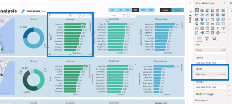
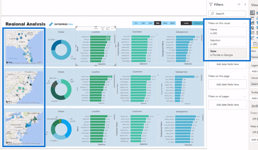
Within this page, I’ve also added some filters to break out the analysis. This enabled me to showcase a different look to what I would’ve done if I just showcased the board data.
Conclusion
Think about the versatility that you have at your fingertips with this data visualization technique. You can layer on all the other great techniques you can generate inside Power BI as well, such as custom tooltips.
There are so many different ways that you can use this multi-threading technique. I personally love it and utilize it when it makes sense. I highly recommend incorporating this into your own reports. Hopefully, you’ve enjoyed walking through a slightly more advanced technique.
Check out the links below for more examples and related content.
Cheers!
Sam
[youtube https://www.youtube.com/watch?v=-x-zm7baVis?rel=0&w=784&h=441]
***** Related Links *****
Showcase Insights Using The Multi Threaded Dynamic Visuals Technique In Power BI
Advanced Power BI: How To Create Multi Threaded Dynamic Visuals
SELECTEDVALUE DAX – Harvesting Slicer Selection
***** Related Course Modules *****
Data Visualization Tips
DAX Formula Deep Dives
Advanced DAX Combinations
***** Related Support Forum Posts *****
Slicer for Switching Analysis Dimensions
Multi Day Analysis Not Working
Combining Multiple Columns Into One
For more multi threaded visuals support queries to review see here….


