In this tutorial, you’ll learn valuable tips and best practices for data modeling in Power BI. You can watch the full video of this tutorial at the bottom of this blog.
Data Modeling is one of the four pillars of Power BI report development and is central to the design and purpose of every report. Improving your data modeling skills will greatly enhance the effectiveness of your reports and the clarity and usefulness of their outputs.
Layout
Setting up a data model starts with laying-out and organizing your tables. Two of the approaches commonly used are Star Schema and Waterfall.
1. Star Schema Approach
The Star Schema approach gets its name as it resembles a star with the fact tables at the centre of the star and the dimension (or lookup) tables at the points of the star.
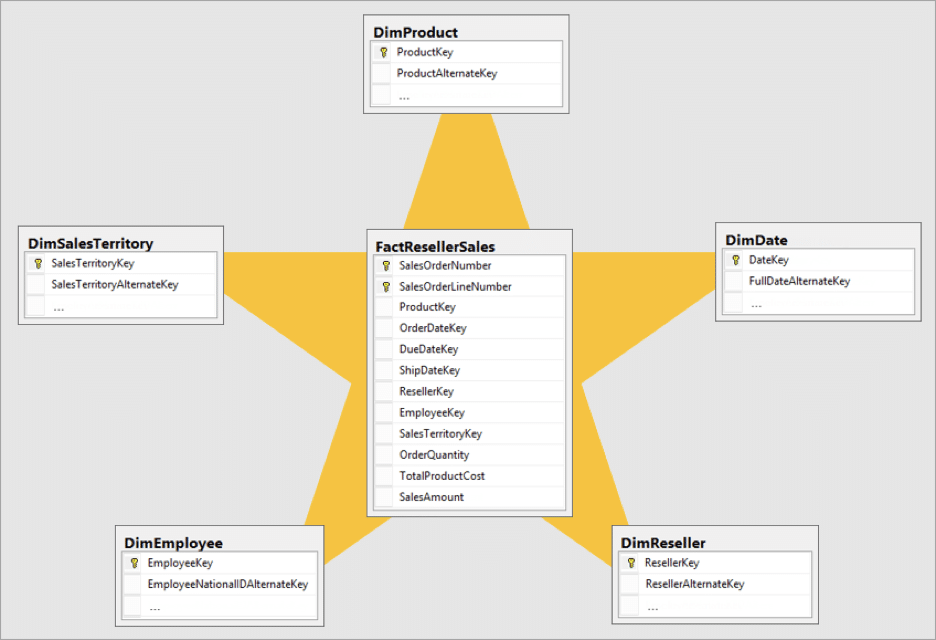
In this example, you can see that the fact table (Sales) is at the center while the dimension tables are positioned around it, making the layout resemble a “star”.
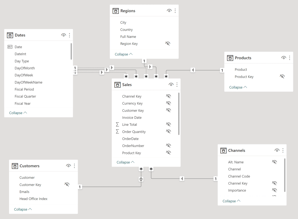
Here is an example:
2. Waterfall Approach
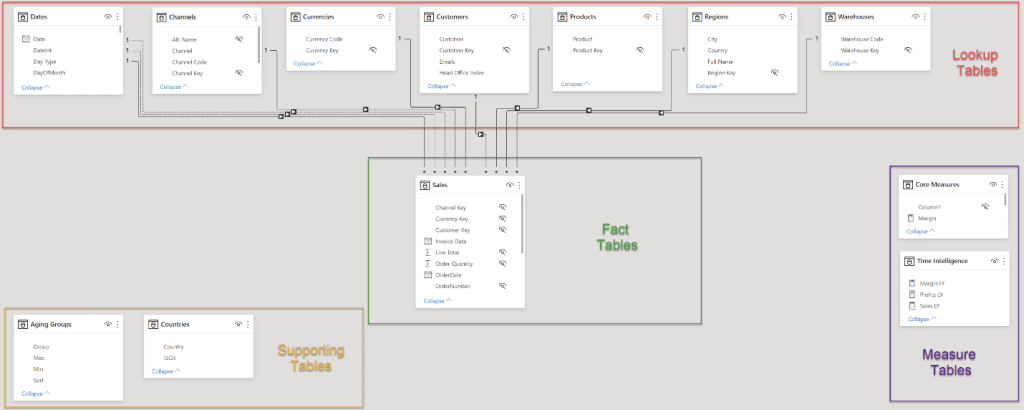
Another layout for the tables in a Power BI data model that still uses a star schema is the Waterfall approach. In this layout, lookup tables are placed at the top with the fact tables below.
Benefits of this approach include:
- Tables are arranged in rows (Dimension tables in the first row, Fact tables in the second row)
- Easy to visualize the dimensions “falling” to the fact table
- Relationships are displayed making it easier to see errors
Recommended practices when using this approach include:
- Delete any relationships autogenerated by Power BI
- Manually create all relationships
With the Waterfall layout, you’ll always see:
- Lookup tables at the top
- Fact tables in the middle
- Measure tables on the right
Relationships
To fully understand how relationships work when it comes to data modelling in Power BI, you need to know the following:
1. Use The Manage Relationships Dialog
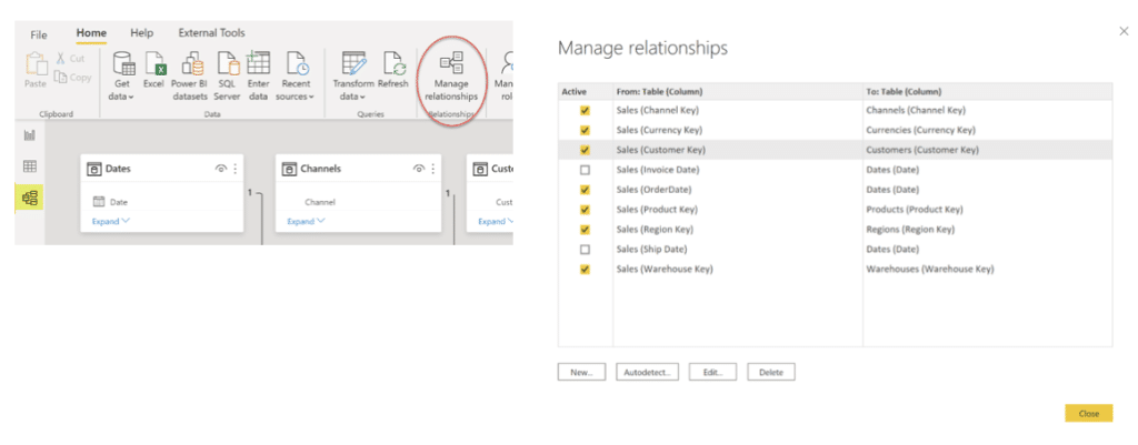
The Manage Relationships dialog allows you to see the full list of relationships between all tables and columns. Here you can easily spot and correct the keys (columns) used to join tables. You’ll also see (and can change) the state (active, inactive) of each relationship. To open this dialog box, click the Manage Relationships icon in the relationships section of the main toolbar in the model view.
2. Set The Key, Cardinality, And Direction
Power BI automatically chooses a common key between two tables and sets defaults for cardinality and cross-filter direction according to your data. You can use the Edit Relationship dialog to adjust the key, cardinality, and direction of each relationship.
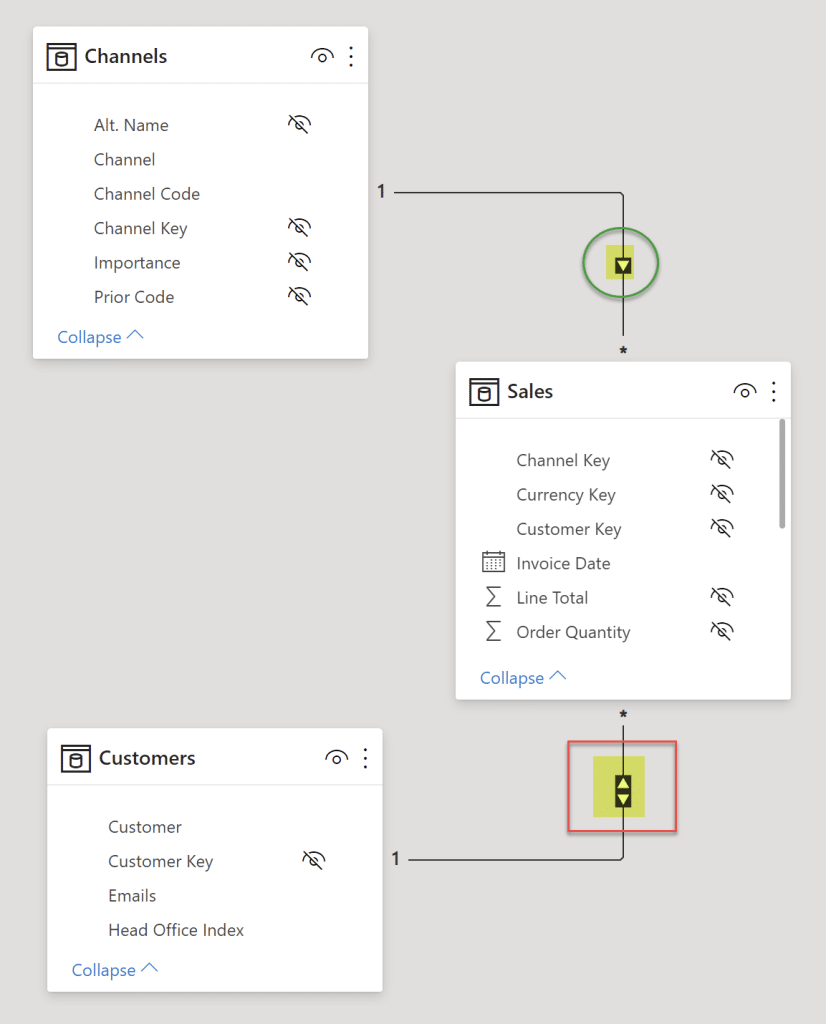
Note that each relationship will ideally have a one-to-many or many-to-one cardinality and single direction.
Here we see the relationship between the Sales and Channels tables:
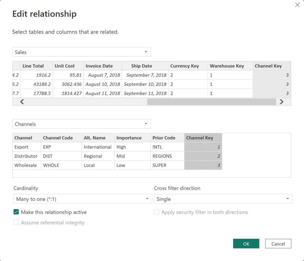
Power BI often selects “single” for the cross-filter direction, but in some cases, it will choose the “both” option. If you see that Both has been chosen, confirm that the data has been loaded and transformed as intended and change it to Single if possible in your particular situation.
One-to-many relationships are denoted by a single arrowhead from the “one” table to the “many” table. Bi-directional relationships, which are denoted by double-directional arrowheads, should be avoided if possible, as they can lead to inconsistent results and often require more complicated DAX code.
3. Set The Active/Inactive State
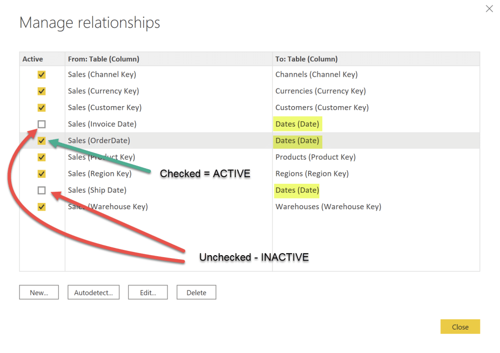
There can only be one active relationship between two related tables, but there can be many inactive relationships.
In the example below, the Sales (Invoice Date) ? Dates (Date) relationship has been inactivated and the Sales (Order Date) ? Dates (Date) relationship has been activated.
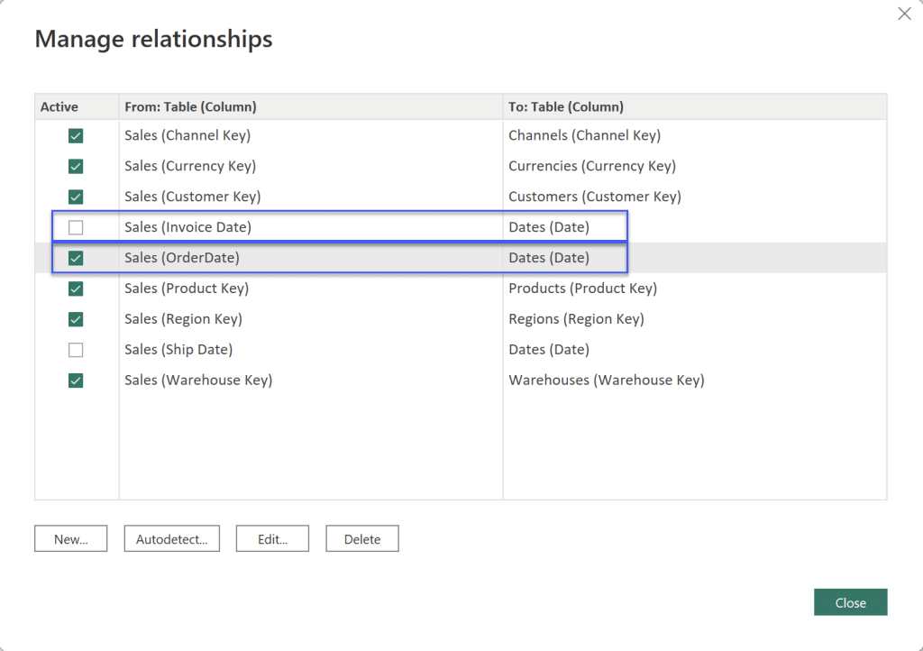
Note that you need to deactivate a relationship first before you can activate another relationship.
You can enable an inactive relationship on-demand in DAX measures by using the USERELATIONSHIP function.
Measure Tables
Measure tables are added using the Enter Data icon in the Data section of the Home toolbar.

To add a measure, right-click the desired measure table and click New Measure.
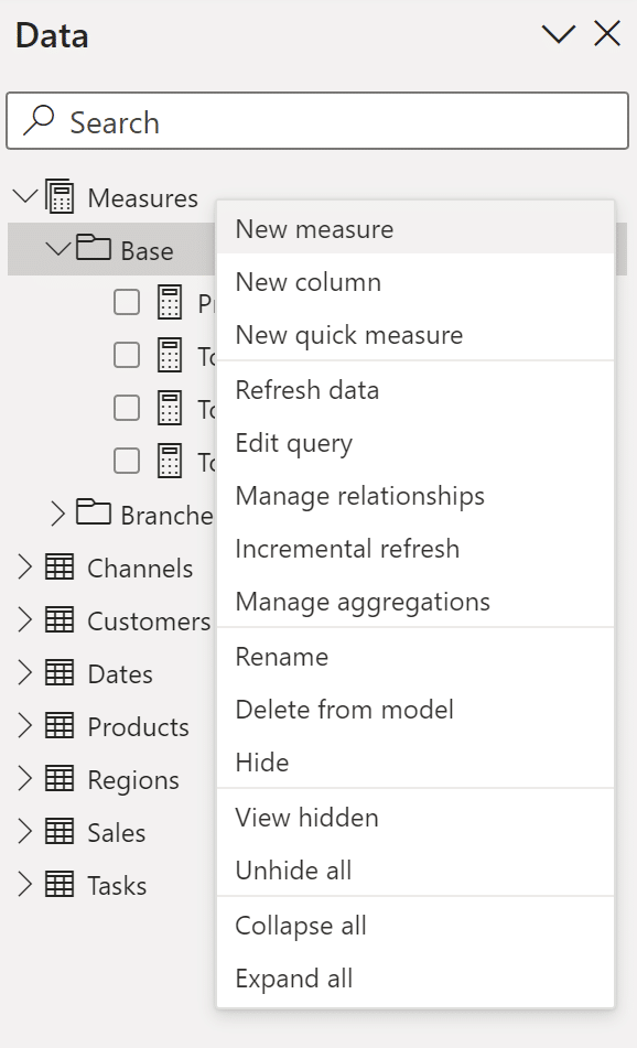
When there are many measure tables in your model, you can simplify identifying the desired measure in the Fields pane by collapsing and expanding each measure table or using the search box.
Key Columns
Columns that will be used in relationships are often given the suffix **Key** for easy identification. When doing your data loading and data transformation work, assign the same name and data type to linking columns.
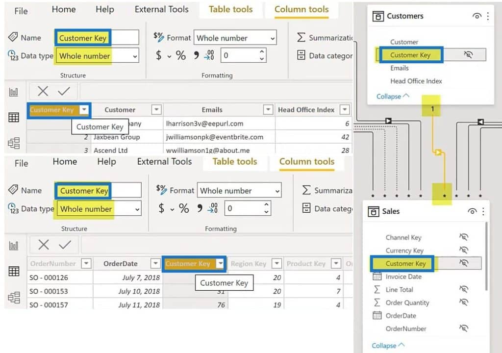
Link only columns that have the same name, such as Customer Key. Avoid columns that end with an ID or code as they may mean different things in different tables.
Another best practice is to use integers whenever possible as it leverages the storage format used internally by Power BI and is often faster.
Column Visibility
Setting the Column Visibility allows you to:
- Hide all linking columns
- Hide all columns that end-users don’t use in visuals, especially those in Fact tables
This helps to reduce errors by preventing users from selecting “naked” columns and instead selecting the measures that have been created in the model (e.g., those for all SUMs and COUNTs, etc.). This is especially useful if you plan to publish a report or data set for other people to use.
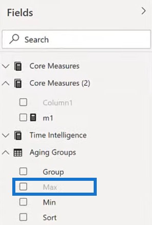
Hidden columns will appear grayed-out in the Data pane (formerly the Fields pane), an example of which is the Sales table below:

To hide a column, click the table of the column you want to hide. Then, right-click on that column and choose Hide.
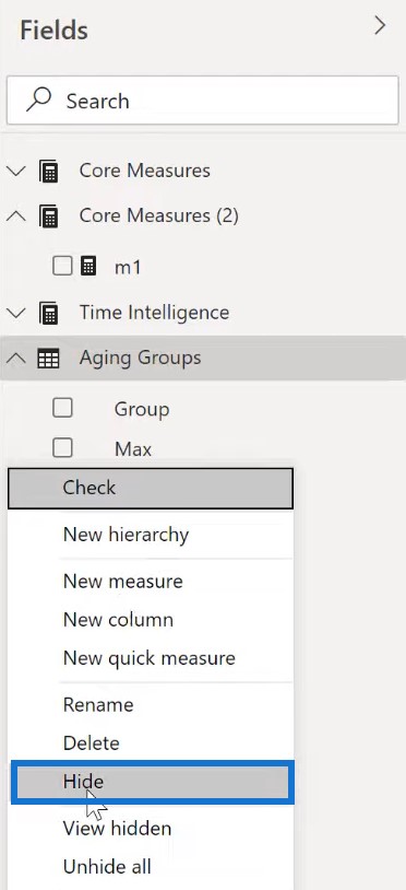
To view a hidden column, right click on the Fields pane and click View Hidden. You’ll then see the grayed-out column(s) among the list.
***** Related Links *****
Building Data Dimensions In Power BI
Active And Inactive Data Relationships In Power BI
Building Your Data Model Relationships In Power BI
Conclusion
This tutorial is very helpful to those who are having difficulty with data modeling in Power BI.
These tips will help you to create more organized layouts which make it easier to understand the relationships in your data set.
Once you’ve fully grasped how to set up data models, you can easily produce outstanding reports for end users in your organization.
Greg
[youtube https://www.youtube.com/watch?v=EocrvXatsd4?rel=0&w=784&h=441]


