In this tutorial, I’ll show you how to customize apps using the different tools and functions within the Power Apps platform. Customizing apps can help you come up with a unique look that perfectly aligns with your preferred themes or branding while effectively delivering the data you want to display.
If you’ve gone through the other tutorials about Power Apps, you’ll see that the biggest strength this platform has is its ease of use.
Customizing Apps: The Master Screen And The Documentation Screen
When starting an app from a blank canvas, it’s important to start off with a master screen and a documentation screen. Having these two screens will help speed up your entire process and will help you maintain a uniform look throughout the app no matter how many screens you end up with.
The master screen serves as a template for the entire app. It dictates how the rest of your screens will look like. For this example, this is what our master screen looks like.
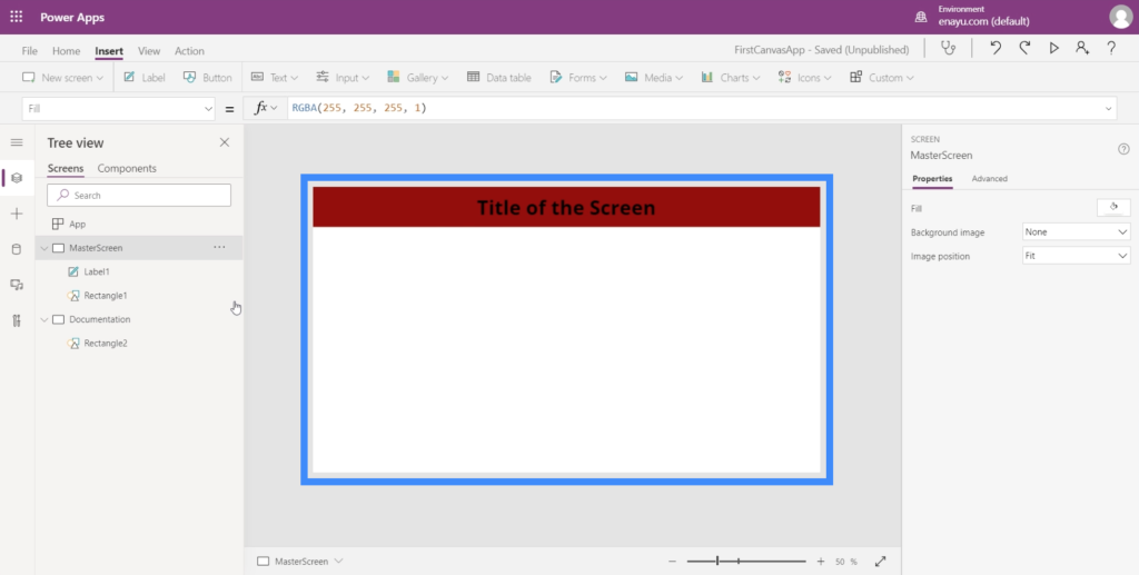
As you can see, we have a title across the top area lying on top of a red rectangle that also stretches across the length of the screen. This means that as we add more screens to the app, every page will always have that header.
As for the documentation screen, it serves as a reference point for all the elements to be used across the app we’re building. Since we already have a title and a top bar on the master screen, let’s have the same things on the documentation screen as well.
We already have a red rectangle here.
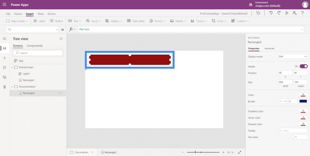
So we just need to add the title. To do that, just create a Label using the Text dropdown under the Insert ribbon.
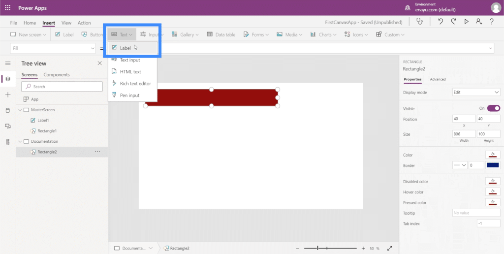
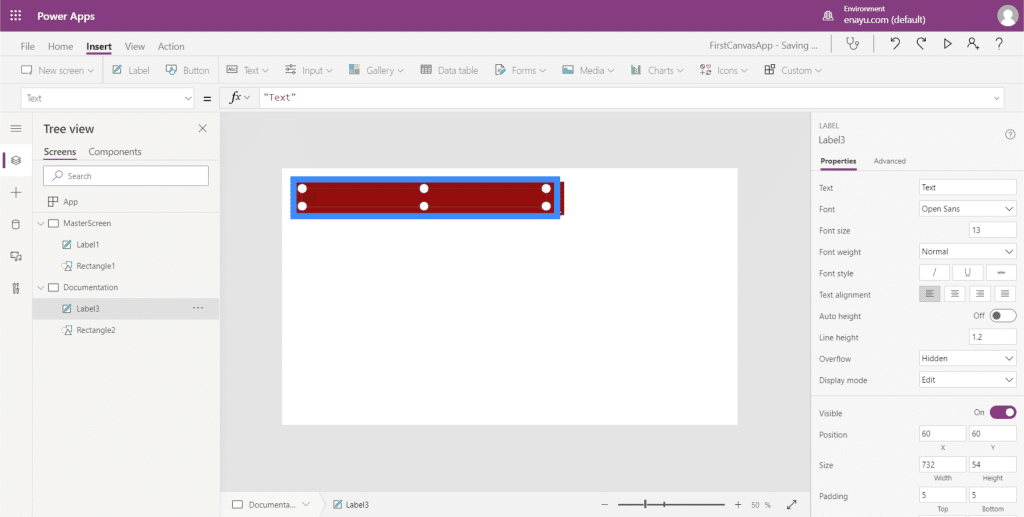
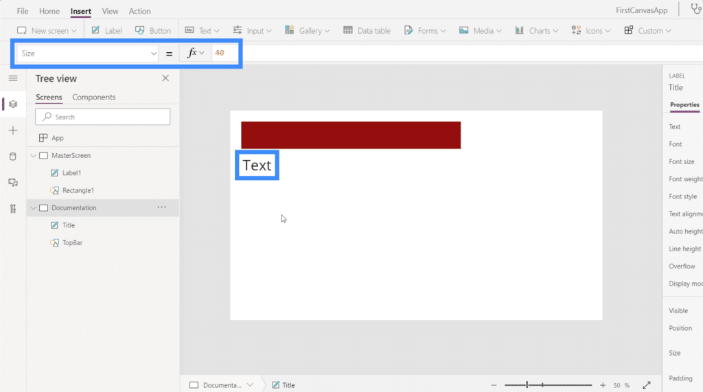
Now that there’s a text box here, we’d want to use the same font size as the one on the master screen.
Going back to the label on the master screen, it shows that the font size is 40.
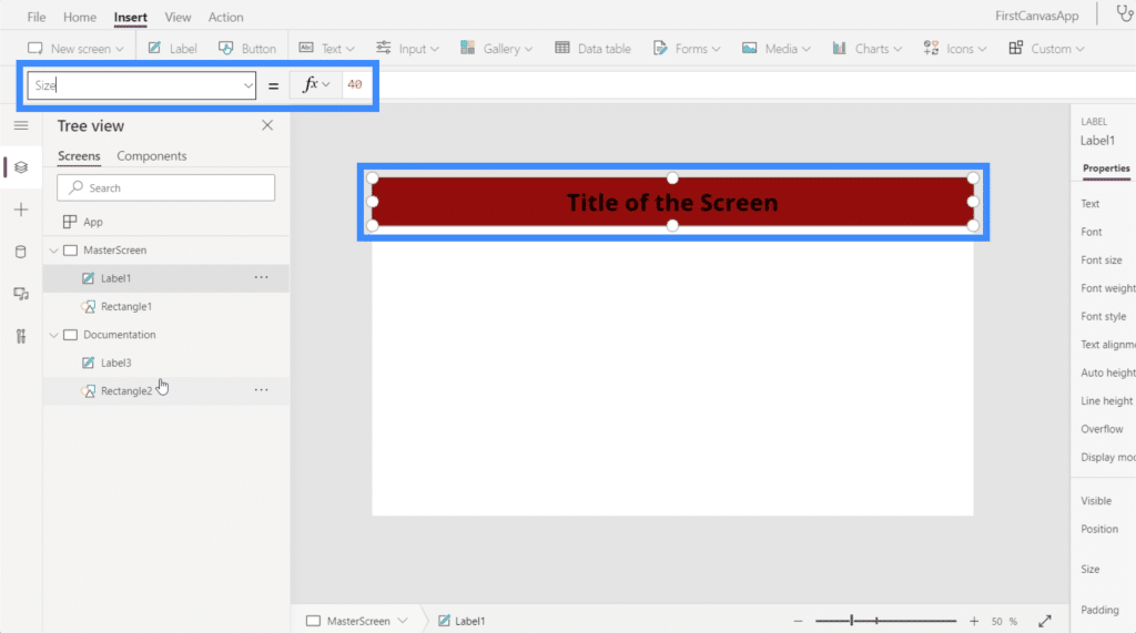
So I’ll make the text on the documentation screen 40 as well.
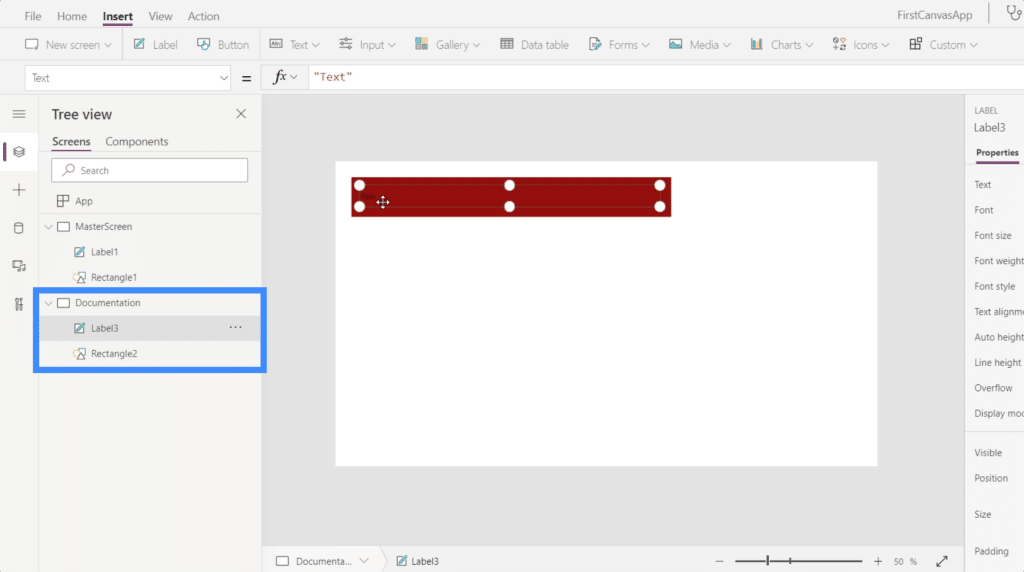
Since we will be using the documentation screen as a reference point, it’s important to properly label all the elements within it. At the moment, the elements here are named Label3 and Rectangle2, which are both pretty generic.
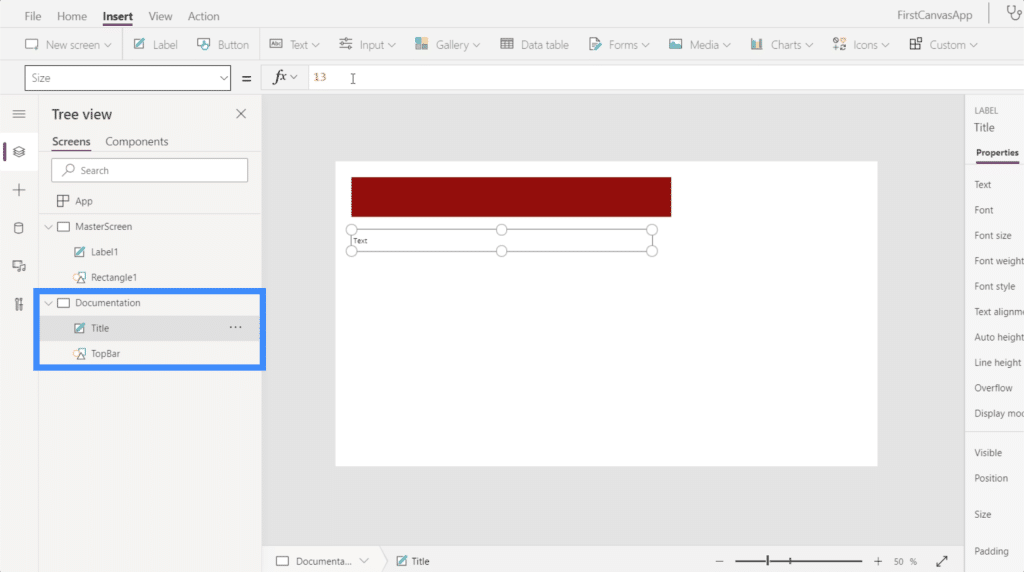
So let’s rename them and call them Title and TopBar instead.
Customizing Apps Using The Documentation Screen
Now that we’ve properly labeled the elements in the documentation screen, we can start customizing other screens. In this case, the only other screen we have is the master screen.
Let’s say the title on the master screen still isn’t the right size. All we need to do is select Label1 on the master screen. Then, choosing Size on the dropdown menu for properties, we’ll type in the name of the element we want to reference on the documentation screen (which, in this case, is Title) and follow up the property we want to mimic.
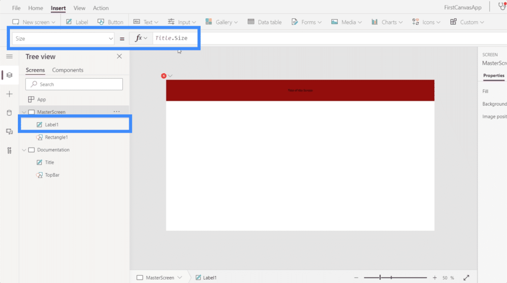
Once we hit Enter after typing in Title.Size, it should automatically change the element we customized.
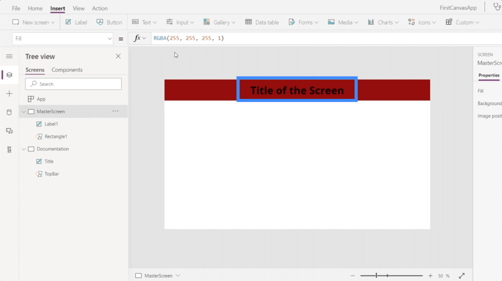
Aside from the size, we can also customize the label’s color. Let’s say I want to change it to white. So just highlight the element called Title, choose Color from the dropdown, then type in White.
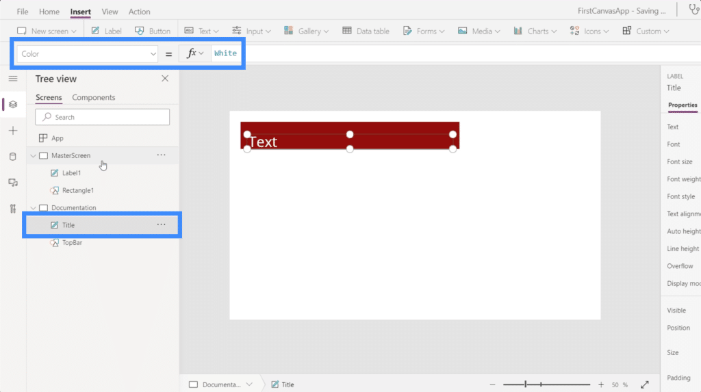
Now that the Title on our documentation page is white, let’s jump back to the master screen and see what happens if we also reference that property. Highlight Label1 under the master screen, then type in Title.Color.
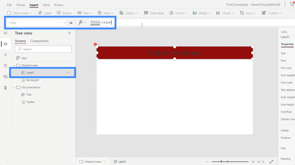
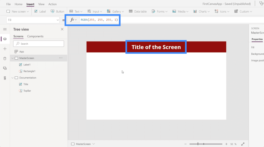
Once we hit Enter, you’ll see that it will not only change the color of the element we customized. It also shows the RGBA color code on the formula bar.
Now, I’ll show you another way to customize using the documentation screen. I’ll add a rectangle by looking at the dropdown menu under Icons.
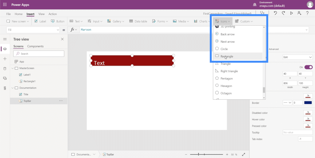
I want this rectangle to be the basis of my master screen’s background. So I’ll rename this element to Background.
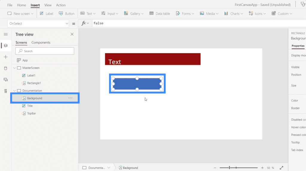
On the right pane, I can choose colors for this element under the Properties tab.
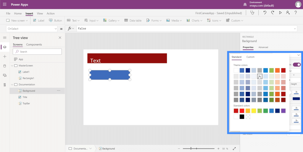
I’ll choose a lighter gray color so that it doesn’t interfere with the way other elements will appear as we add them on our screens.
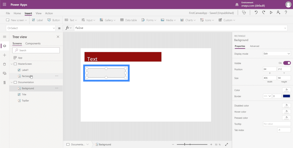
Now, let’s go to the master screen. We still have two elements here — the label and the rectangle. But for us to change the background color of the screen, we won’t need to add another element here.
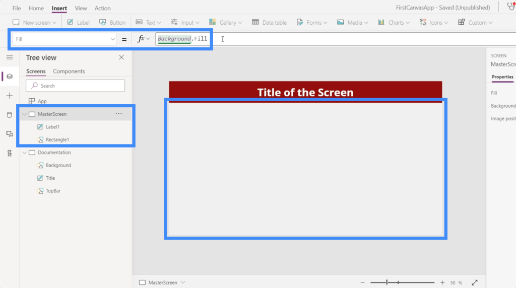
Making sure that the master screen is highlighted, I’ll just look for Fill under the dropdown. Then, on the formula bar, I’ll reference the rectangle we created earlier and its fill color. Once I hit Enter after typing in Background.Fill, you’ll see that the background on that screen now shows the same color as our reference.
Although we’re adding elements one by one and choosing their individual colors, it’s also possible to use the default themes under the Home ribbon. These should suffice especially if any of themes match your branding.
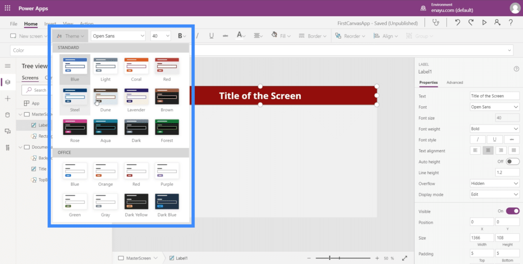
But if none of the themes matches what you need, then the documentation method would work perfectly.
Customizing Apps By Adding Buttons
One useful element that we can add to our app would be the buttons. Buttons are a great way to let users jump from one part of the app to another. This would be great on the app’s home screen.
So let’s create a home screen first. Since we already have a master screen, we can just duplicate that to save us the trouble of having to create a home screen from scratch.
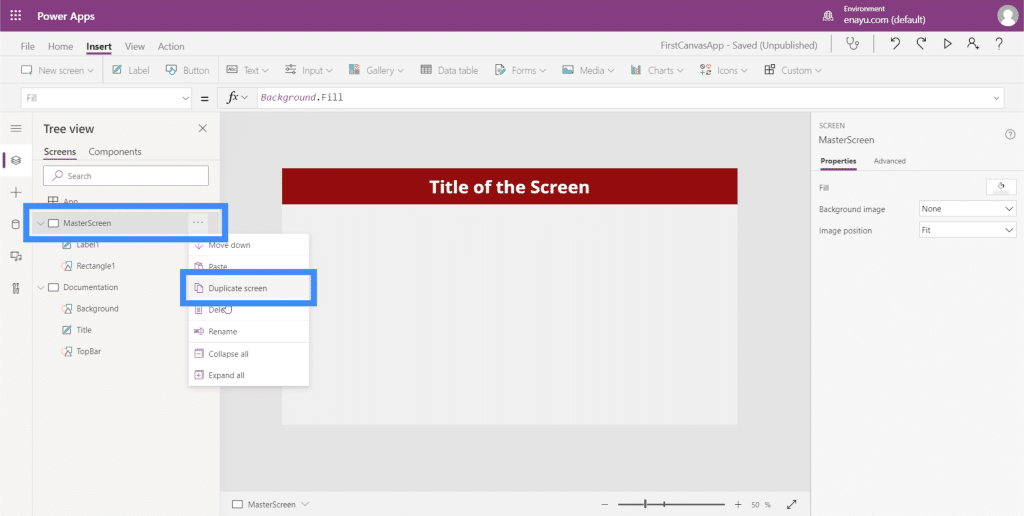
As you can see, both screens have the exact same elements on them.
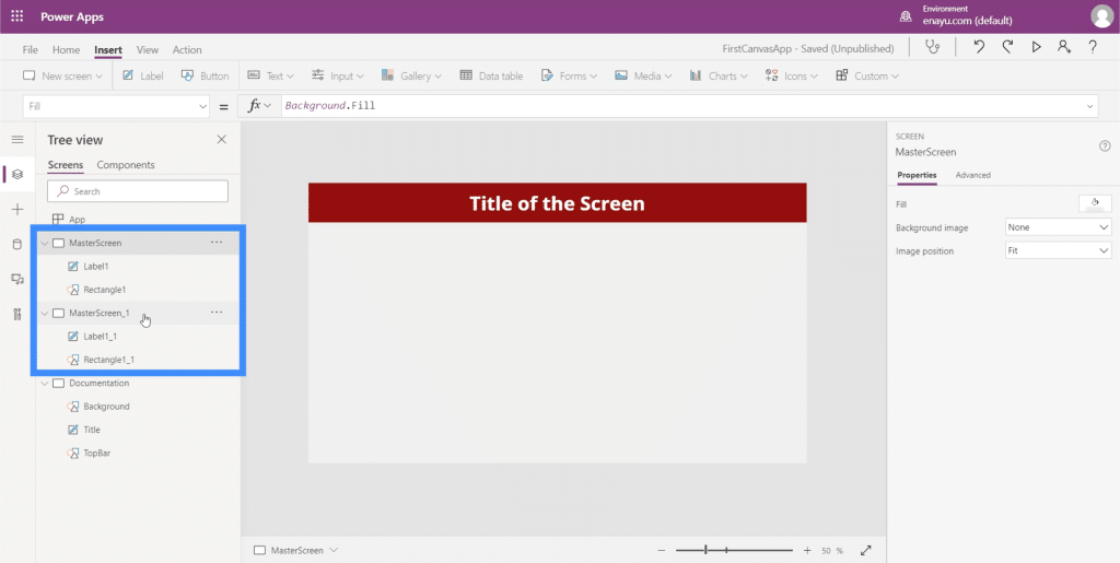
Let’s rename the duplicate master screen and call it HomeScreen.
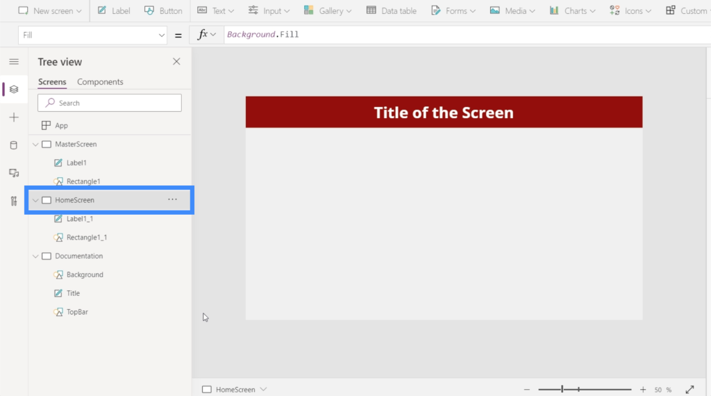
If you check on the elements under the home screen, you’ll see that it also carries the same references we made when we were customizing the master screen. If you look at Label1_1, for example, it still references the size of the title from the documentation screen.
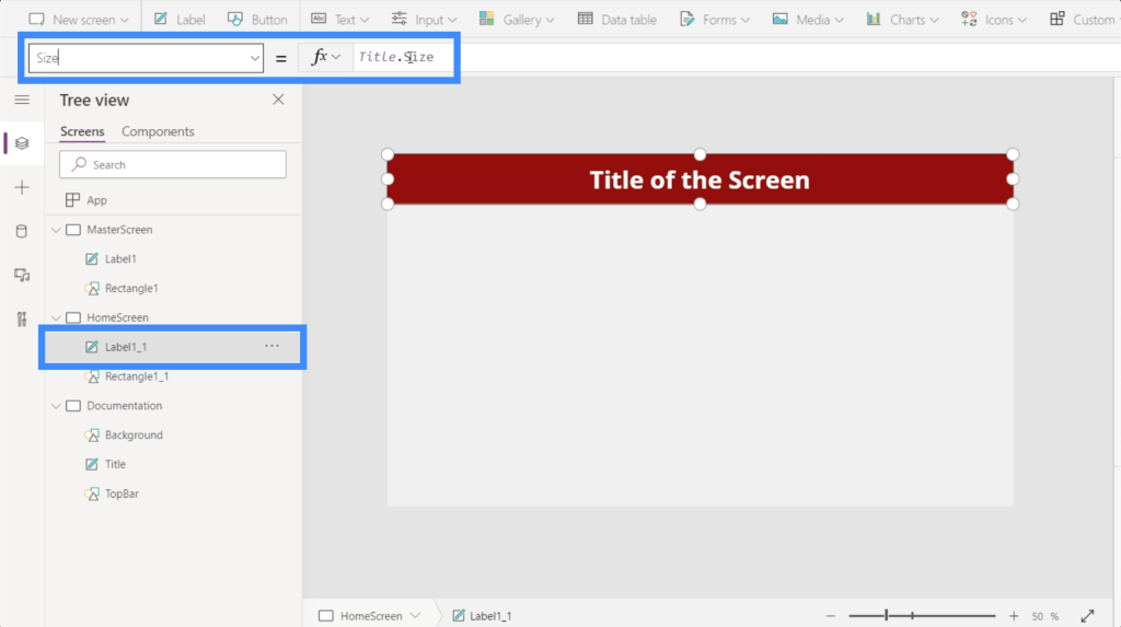
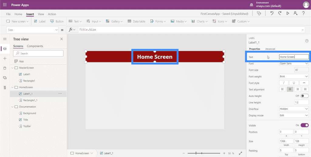
Since this is going to be our home screen, let’s change the text on that label. To do that, we can just type the new text under the Properties pane on the right side. Let’s type in Home Screen.
Now, let’s add a button on our home screen. We can do that by clicking on Button under the Insert ribbon.
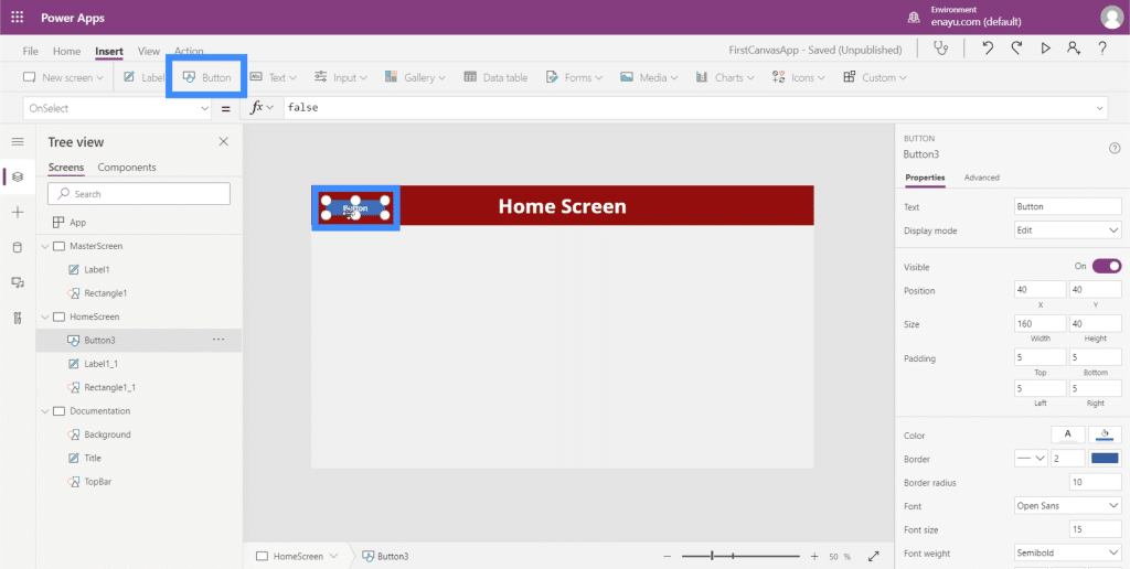
Just like any other element, we can drag the button anywhere we want and resize it by clicking and dragging the points around the element.
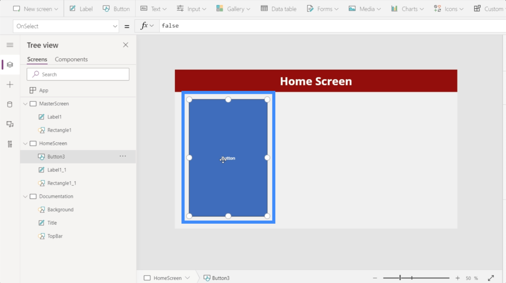
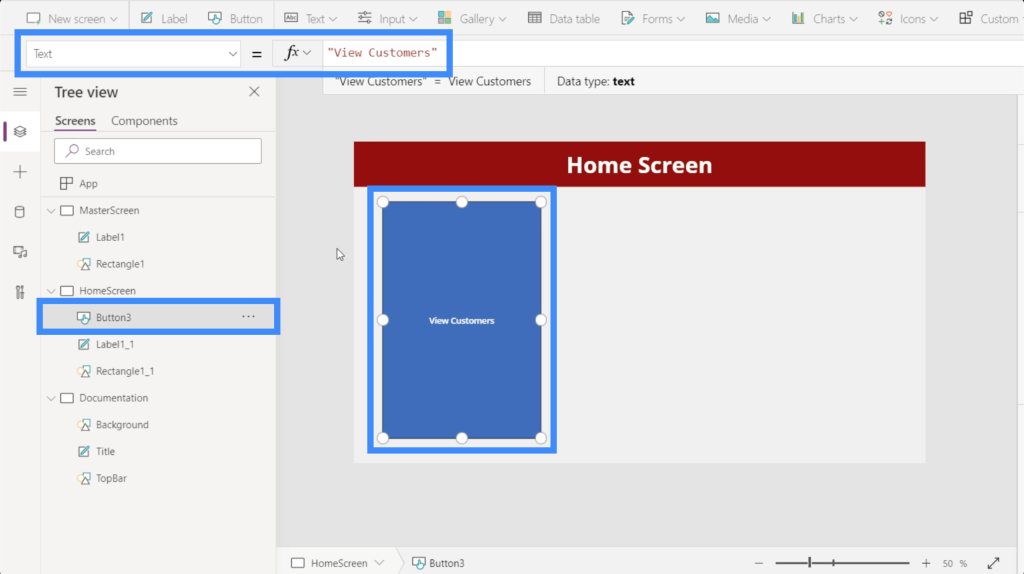
Next, let’s change the text on this button to “View Customers”. Just highlight the button, choose Text from the properties dropdown, then type View Customers directly into the formula bar.
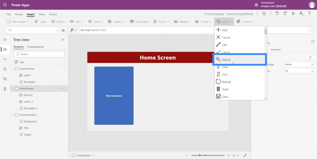
To give it a more professional look, let’s add a magnifying glass icon.
You can move the icon around and resize it. In this case, let’s just place it on top of the text on this button.
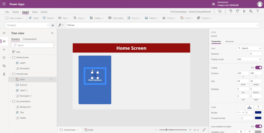
Then, let’s change the color of the magnifying glass to white by going to the properties pane on the right.
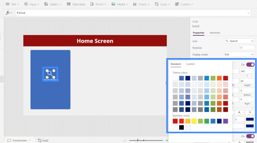
To make this more aesthetically pleasing, let’s also change the button’s colors. But we’ll have to do it from the documentation screen so that we can easily reference the same colors and settings when we build other screens.
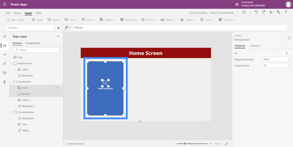
Let’s highlight these new elements we added and click Ctrl + C to copy them.
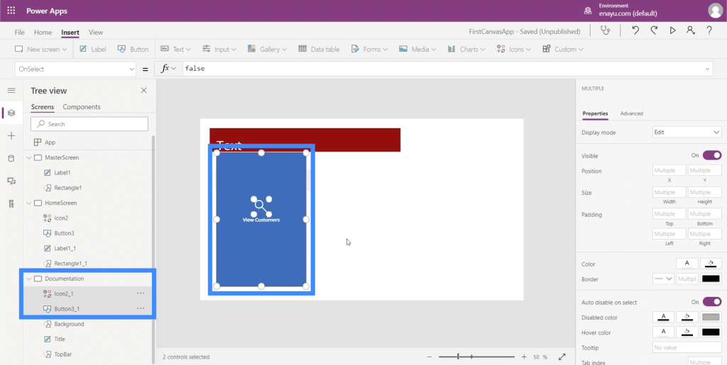
Then, go to the documentation screen and click Ctrl + V to paste the elements on this screen.
Since our TopBar is maroon, we want to make sure that the color of our button complements it.
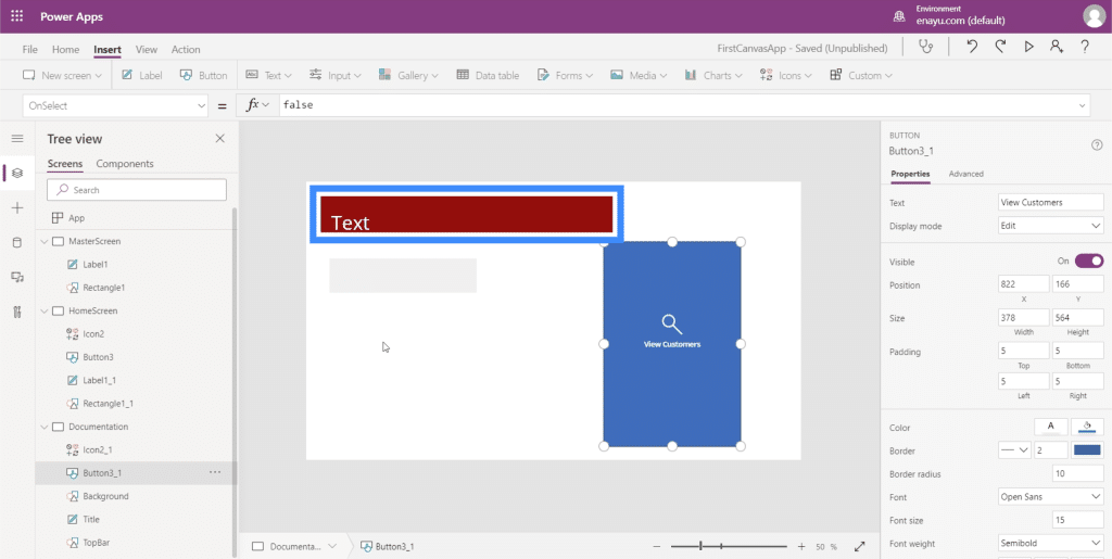
So let’s change the color to something that will look good with our theme.
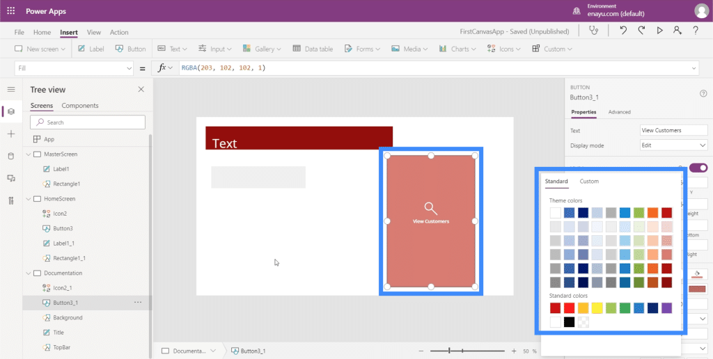
We have to make sure that the home screen button matches the properties we just set on the documentation screen. The first thing we need to do is change the name of this element to HomeScreenButton.
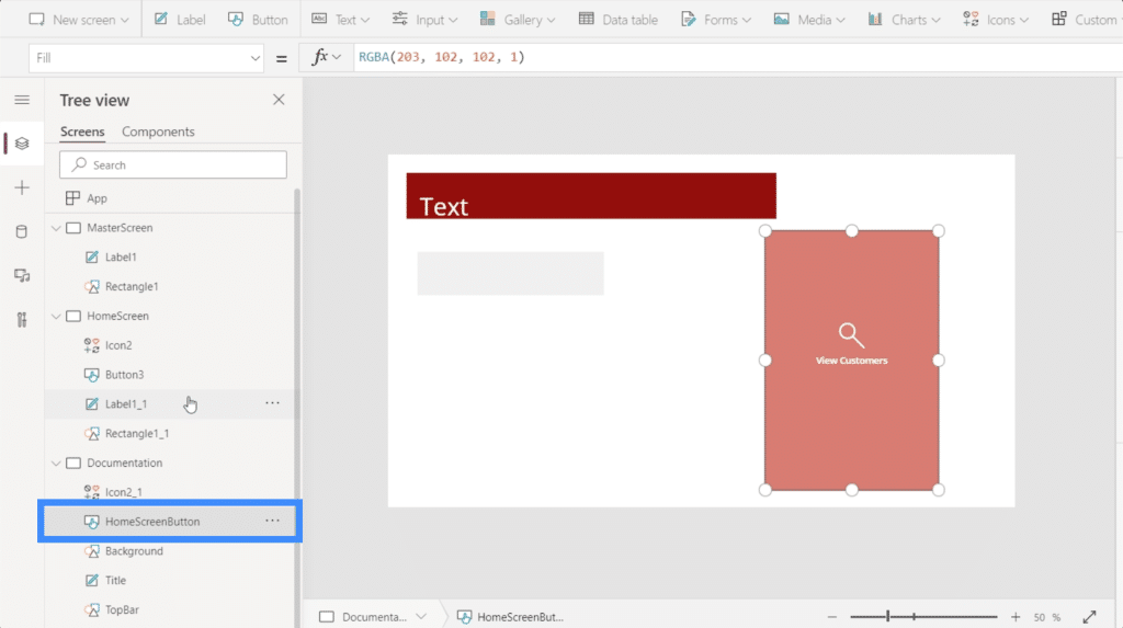
Then, let’s go back to the home screen and change the button’s Fill to match what we’ve set on the documentation screen.
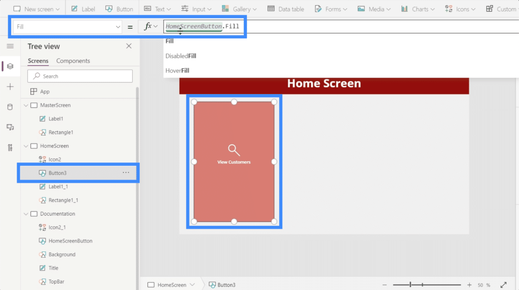
On the surface, the View Customers button looks good with the color we picked. But when we hover over it, you’ll see that it still goes back to the original blue color.
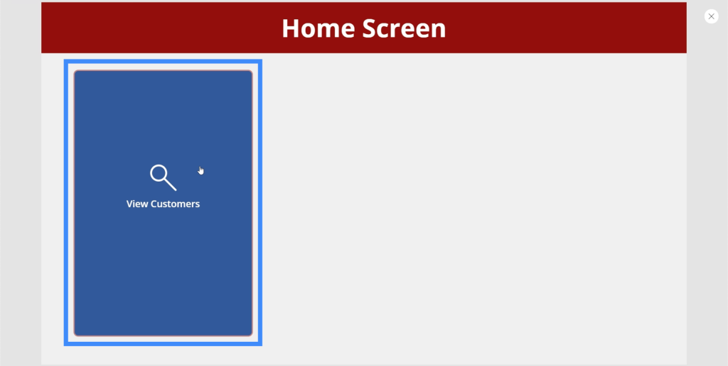
To change that, just look for HoverFill.
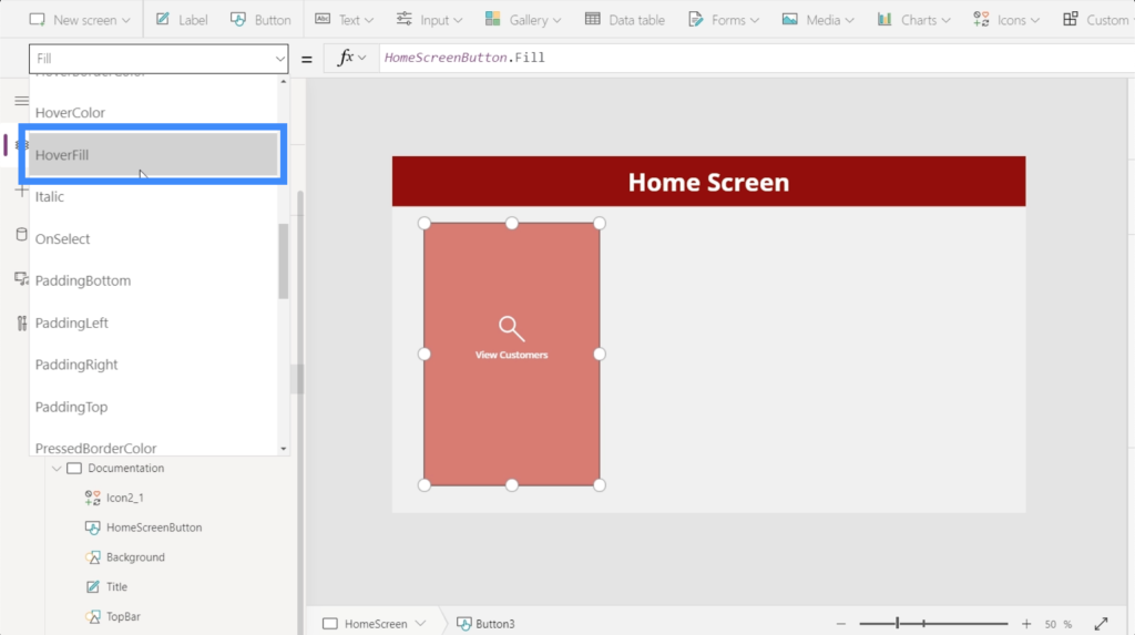
Looking at the hover fill’s current properties, it’s showing that the color is faded by 20%, but is also using a specific color as reference, which we don’t want.
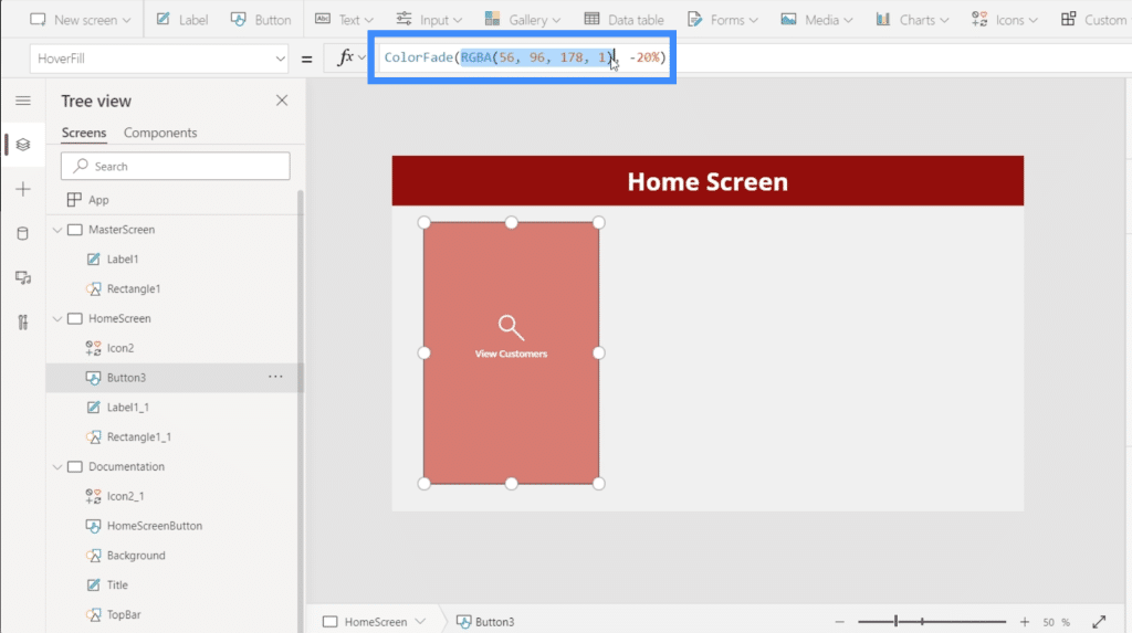
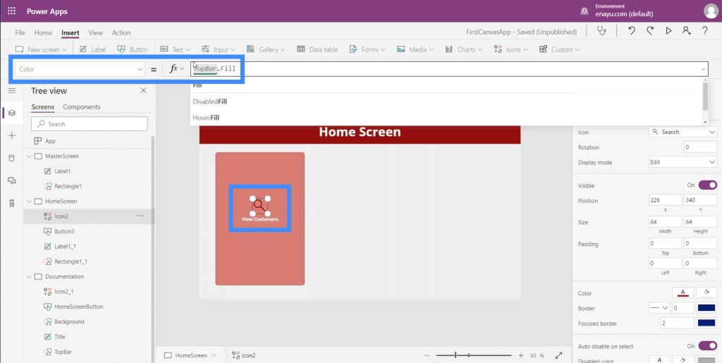
So instead of referencing a specific RGBA color code, let’s reference HomeSreenButton.Fill instead.
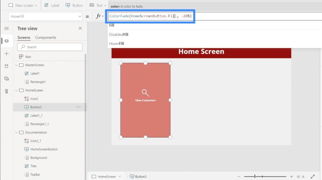
Once we hit enter, you’ll see that the button now uses the color we want.
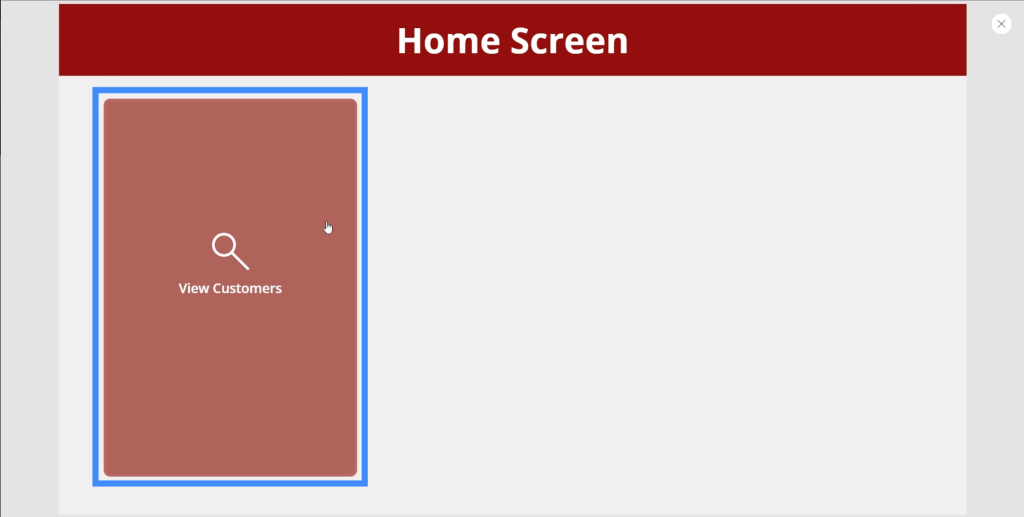
Another thing that we need to fix is the color that shows up when you click on the button. As you can see, it turns white when you click on it.
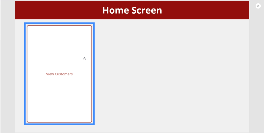
The best way to fix that is to make sure that the icon we used, which is the magnifying glass, does not become hidden whenever the button is clicked. We can do that by changing the icon’s color and setting it to the same color as the TopBar.
Since we need three buttons on the home screen, we’ll need to replicate this specific button two times. To do that, just highlight the elements and click Ctrl + C to copy them.
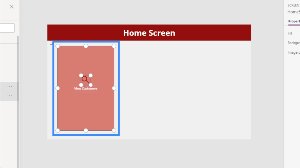
Then, just click Ctrl + V to paste the same elements on this screen. Do the same thing one more time to add a third button. Then, we’ll just drag them to the right spot to make sure the screen looks good.
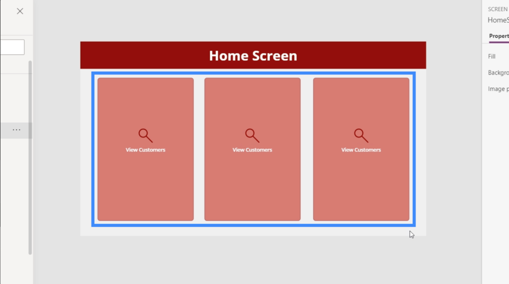
Now, let’s change the text. The second one will be Add New Customer and the third one will be See Agents.
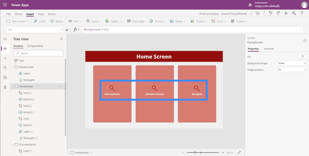
Now that we have three buttons here, let’s make sure they actually go somewhere. We need to prepare the screen where these buttons will land.
Customizing Apps By Adding Galleries
A gallery is a collection or list of items laid out a certain way. Think about your contacts on your mobile. That’s a great example of a gallery.
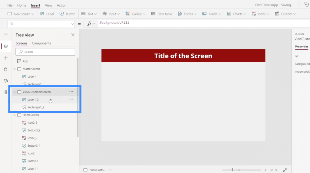
The first button on the home screen is for View Customers, so we’re going to create a new screen where this button is going to land. This screen is going to be a great place for a gallery.
Just like what we did with the other screens, we’ll duplicate the Master Screen and rename it to ViewCustomersScreen.
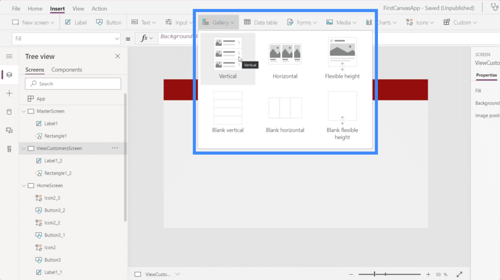
Next, we’ll click on Gallery under the Insert button. Galleries come in different formats, but for this specific app, let’s use the vertical layout.
This is what a vertical gallery looks like.
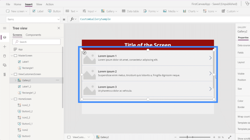
As you can see, it only shows three entries. But if you drag the gallery downward to fill the screen, it adds entries to fill up the space.
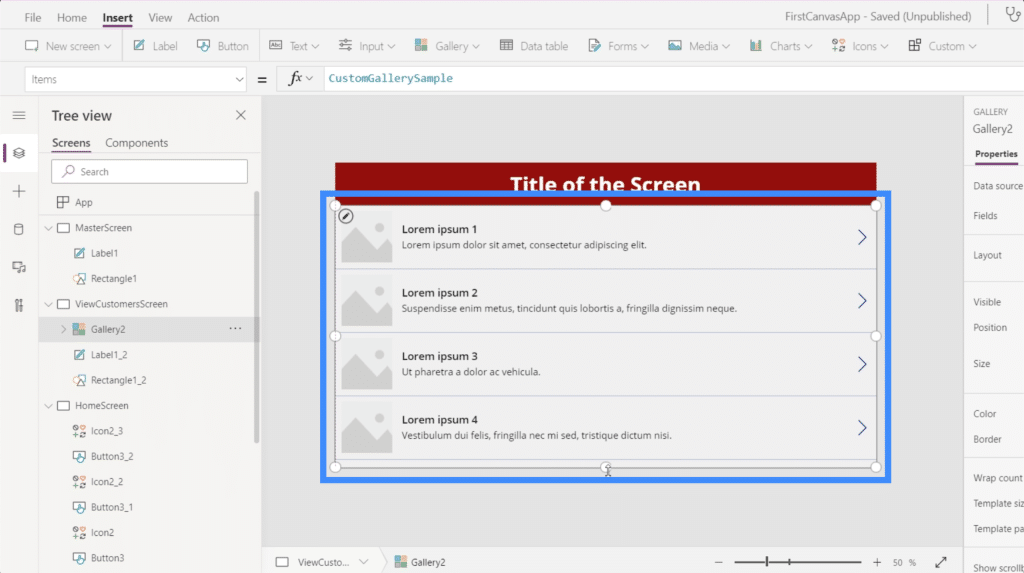
Even if the gallery is currently showing four blank entries, that doesn’t mean that we can only accommodate four sets of data here. In PowerApps, the galleries will automatically create the exact number of entries based on the data.
Since our data does not carry images, let’s change the layout to title, subtitle and body.
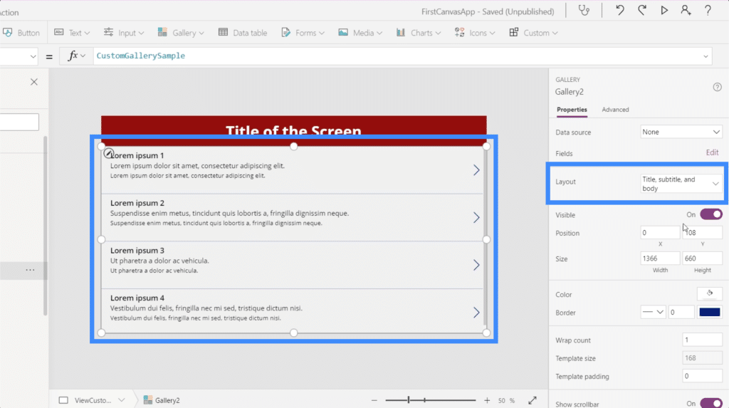
Our current gallery is not yet connected to a data source, that’s why it automatically asks us to select a data source when we click on the gallery.
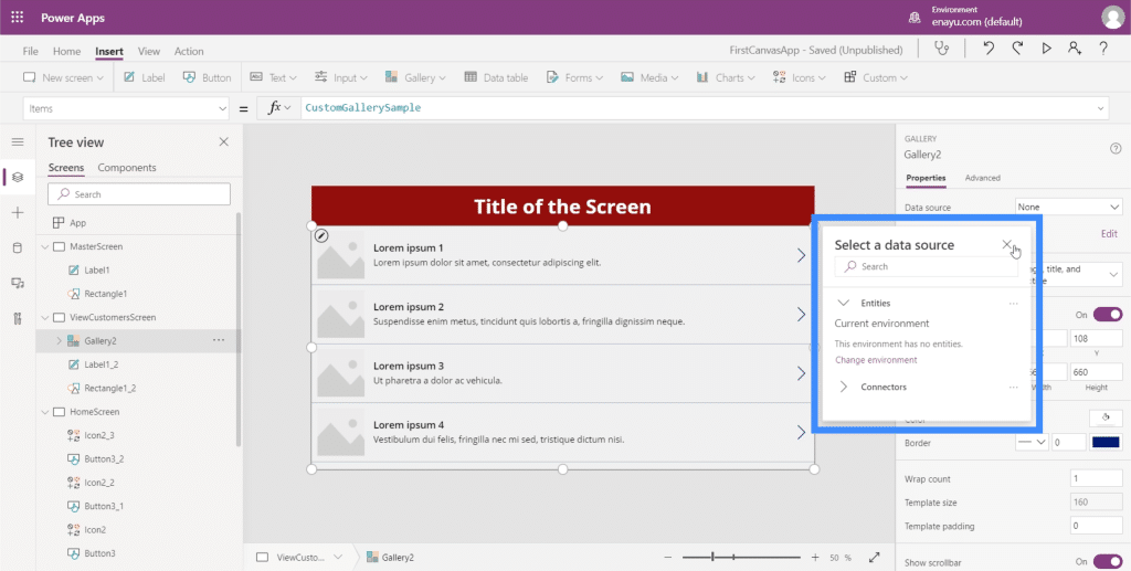
In case this pop-up does not automatically show up, you can add a data source through the properties pane on the right.
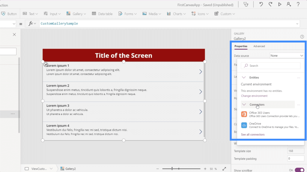
After choosing the source, just open up the folder where your source file can be found.
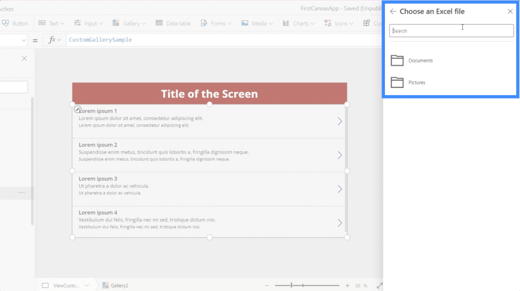
We’re going to use the data in this Customers file.
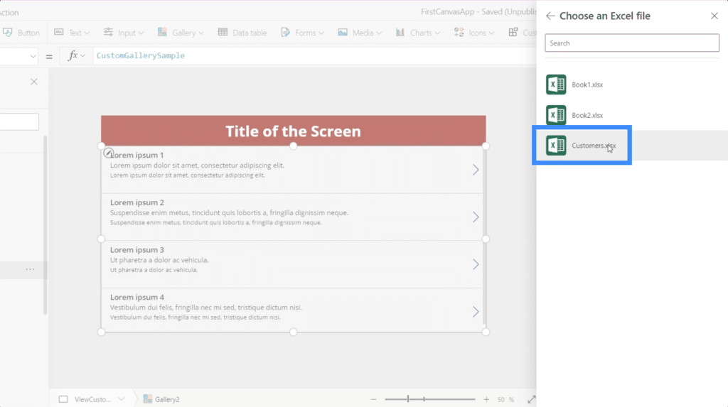
This is what’s inside that spreadsheet. It’s the data that we want to show up in our gallery.
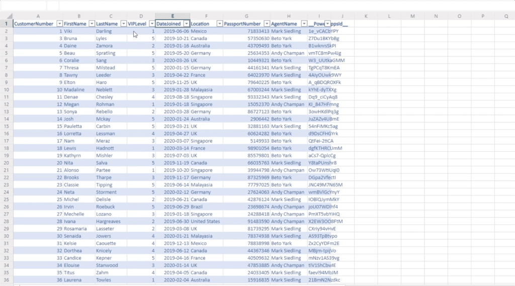
Once I click on that, it lets me choose a table.
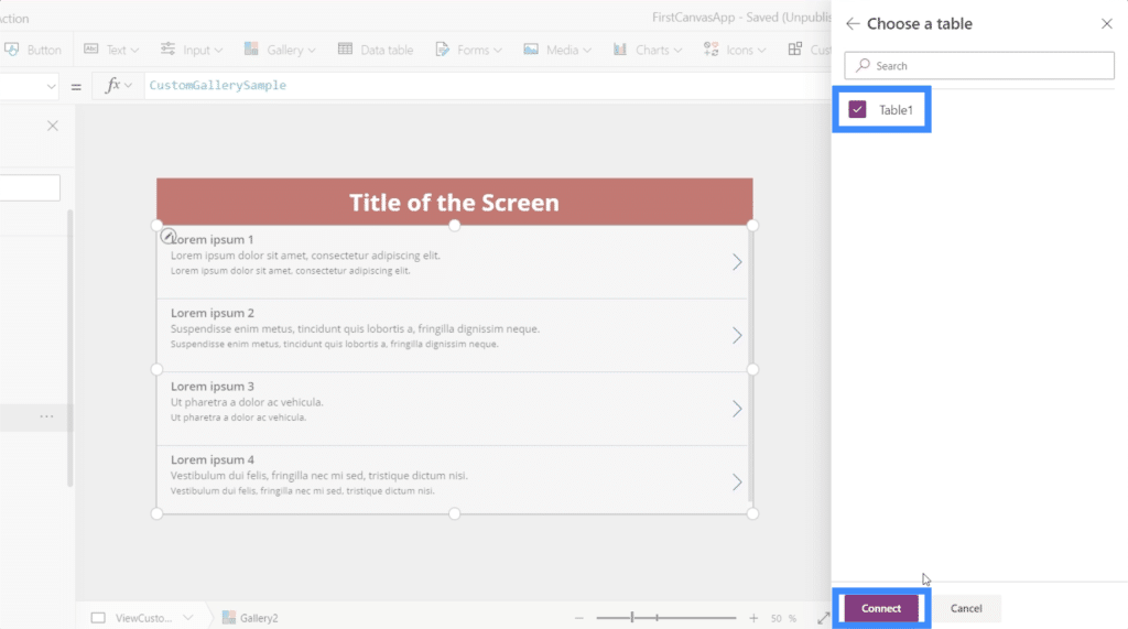
And once I choose that table, the data in it will then be displayed in the gallery.
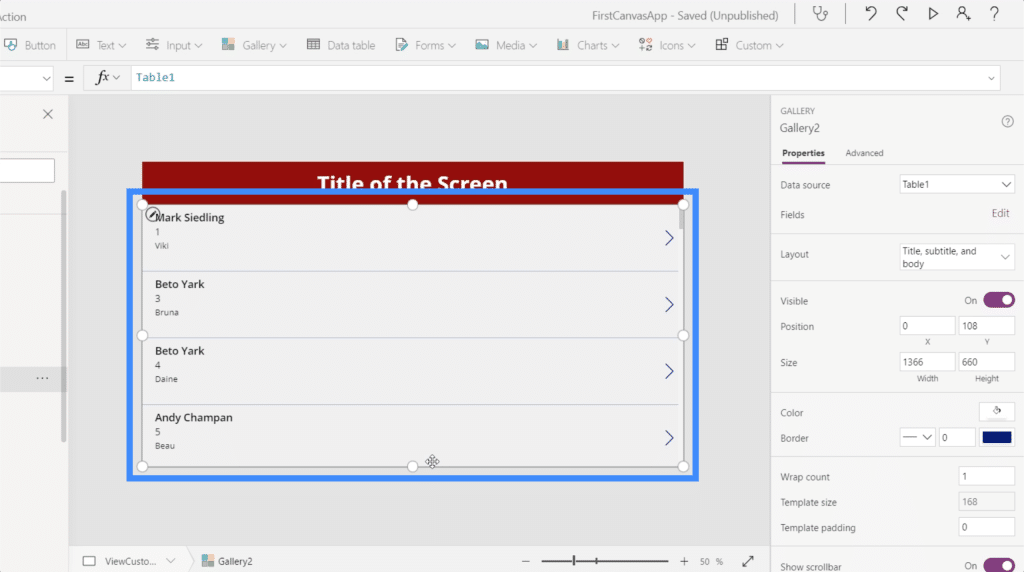
Right now, each item in the gallery shows the Agent Name on top.
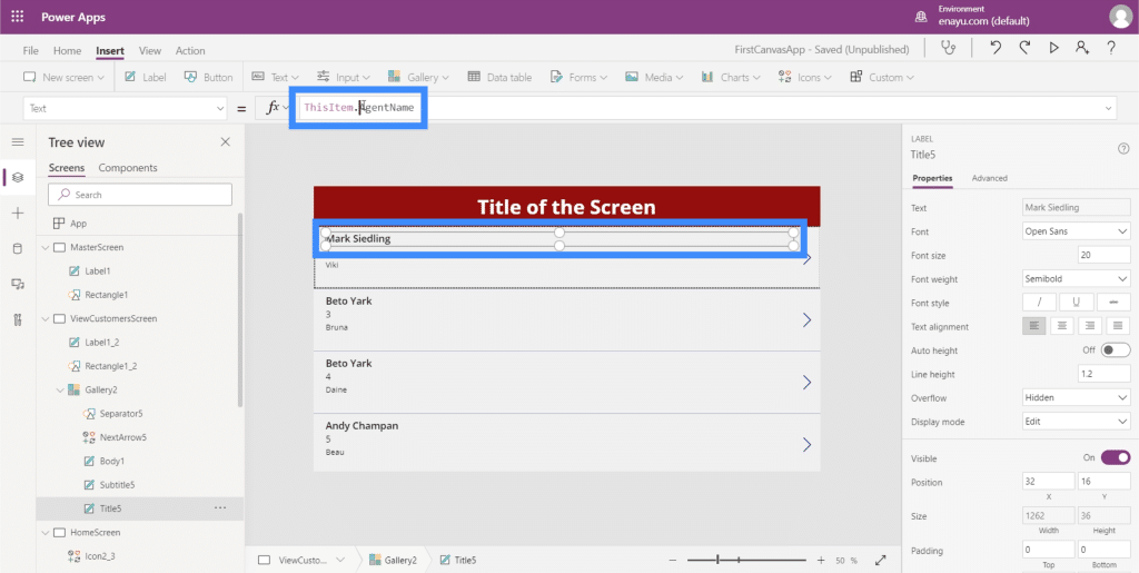
However, it makes more sense if we show the First Name and Last Name on top. So let’s change that by going to the formula bar. Since the first and last names are on two separate columns, we’re going to use Concatenate.
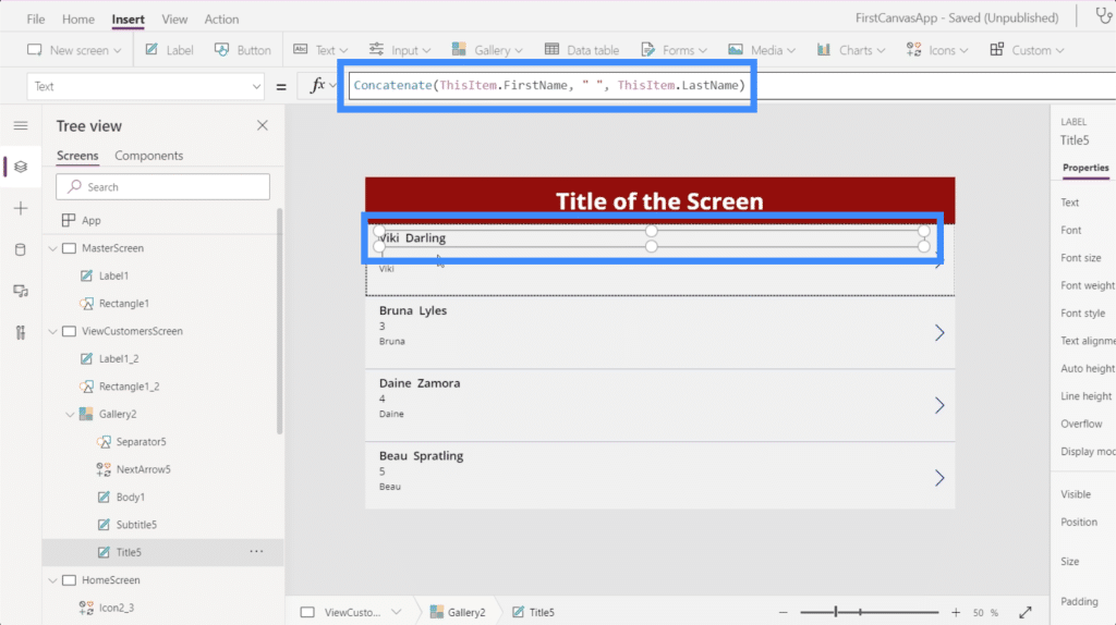
The great thing about the layout we chose is it gives us more space to put more information on each card. So we can put the customer location here on the second line.
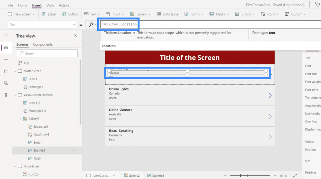
Then we can use the VIP level on the third line.
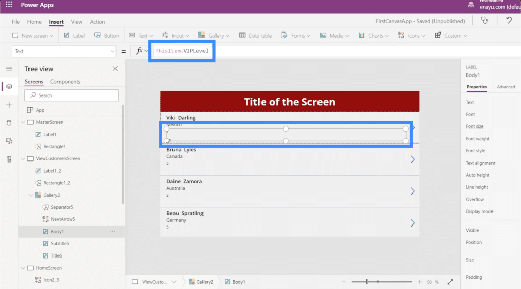
The advantage of creating a fresh canvas, especially on tablet mode is the amount of space that we can work with. For this gallery, for instance, we have so much space left even if we’re already displaying quite a bit of information on each card.
So let’s maximize the space by changing the wrap count. We can do that here on the properties pane.
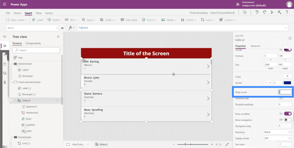
Let’s change that to 3 instead of 1 so that we can have a multi-column gallery.
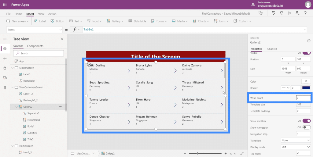
This makes it easier to see more at one glance.
Adding Navigation To Buttons And Icons
Now that we have a few screens to work with, we can start adding navigation that will take us from one screen to another.
To start with, let’s add the home icon by clicking on Icons under the Insert ribbon. We’ll place that on top of the View Customers screen.
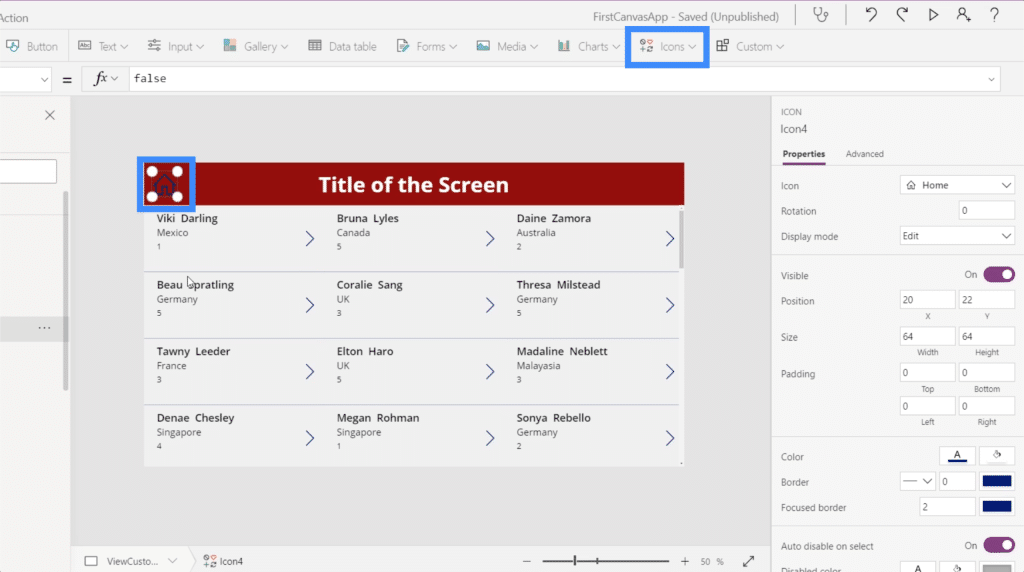
Let’s make this icon white since we have a dark background color.
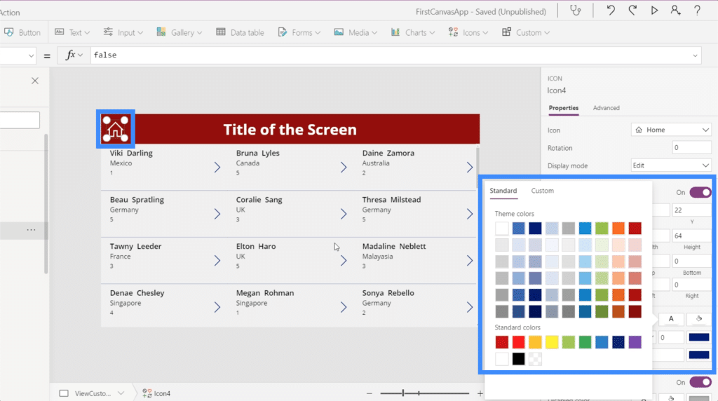
Once we add the navigation, clicking on that home icon will take us right back to the home screen. We’ll also add some navigation here on the View Customers button on the home screen that will take us to the View Customers screen.
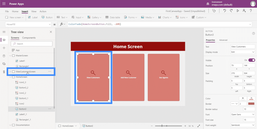
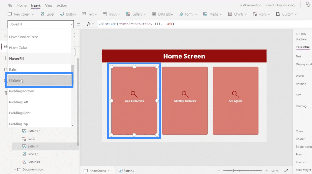
Let’s start by highlighting the View Customers button, then look for OnSelect under the properties dropdown. This will set the trigger for our navigation.
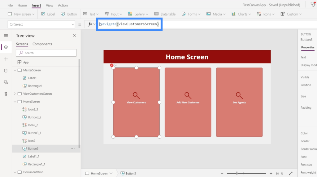
Then, on the formula bar, we’ll use Navigate and reference the screen we want to go to, which is the ViewCustomersScreen.
Once that had been set, we’ll be led to the gallery that we set up every time we click on the View Customers button.
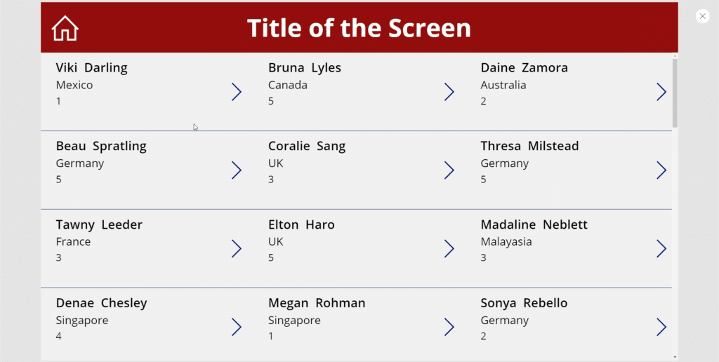
Now let’s go to the view customers screen. We need to make sure that when a user clicks this home icon, they’ll be taken back to the home screen.
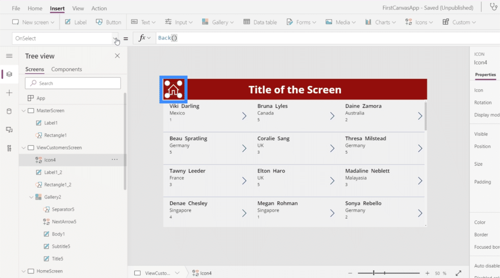
There are two ways to do this. First, we can use Back. This basically takes you back to the last screen you visited.
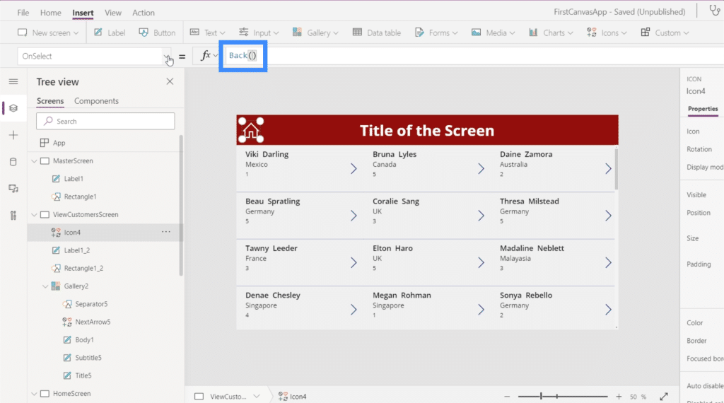
The issue with that command is that we have multiple screens in this app. That means that we won’t necessarily be coming from the home screen all the time. So this command would most probably be more suited if we had a Back button or icon here instead of a Home icon.
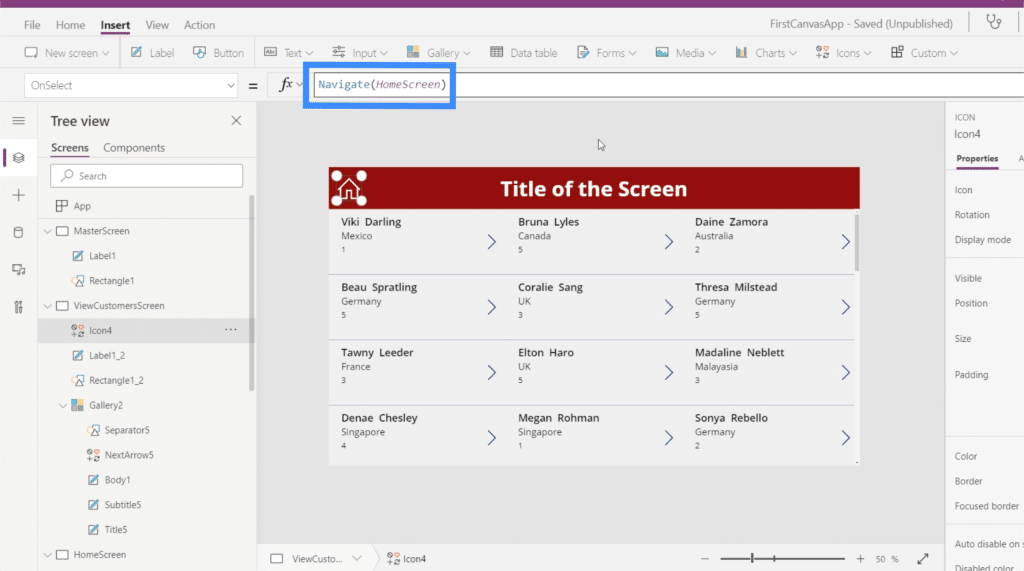
The more applicable command to use would be Navigate. We’ll also reference the HomeScreen to tell PowerApps where we want this icon to lead to.
Now that we’ve added navigation to this screen, the last thing we need to do is to change the text on the title to View Customers.
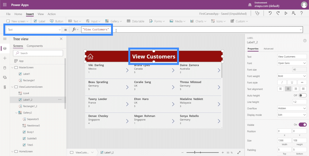
Now, our screens are all set with the right data being displayed in our gallery, and with navigational buttons taking us to different screens on the app.
Conclusion
Looking at the ease of customizing apps on Power Apps, it becomes even more evident how Microsoft designed this platform for efficiency. Everything is easy to edit and customize, and it won’t require a lot of time for anyone to create an app from scratch.
This is just a small peak at the things we can do through PowerApps. Aside from galleries and additional screens, there are other things that we can add to make our app more comprehensive. We’ll be discussing those in other tutorials.
All the best,
Henry
***** Related Links *****
Power Apps Introduction: Definition, Features, Functions And Importance
Power Apps Environments: Setting Up The App Elements Properly
PowerApps Functions and Formulas | An Introduction
***** Related Course Modules *****
Power Apps Masterclass
Power Platform
Power Automate Desktop Deep Dive
***** Related Support Forum Posts *****
Visualize Hierarchy View In Power Apps
Data Transformation In Power Apps
Power Apps – Comparing Different Data Types
For more Power Apps queries to review, see here…

