
A bar chart in Power BI is useful for data comparison. However, a custom bar chart is definitely better for presenting comparisons. In this tutorial, we’ll be looking at the different custom bar charts available on the marketplace. We’ll also discuss how to create them using examples.
Here’s a report I created where I used a custom bar chart instead of the available bar chart in Power BI.


It’s good to have options in a particular visual. This is because we might face some difficulties when we are creating a report using a particular type of visual. If we have other options, we can definitely complete our report without wasting a lot of time.
The dataset that I used here is related to the supply of defective materials. This is the same with the dataset I used in another tutorial about native visuals. For this example, I’ll show the different types of material defects and the downtime hours that occurred in different material types in a bar chart.
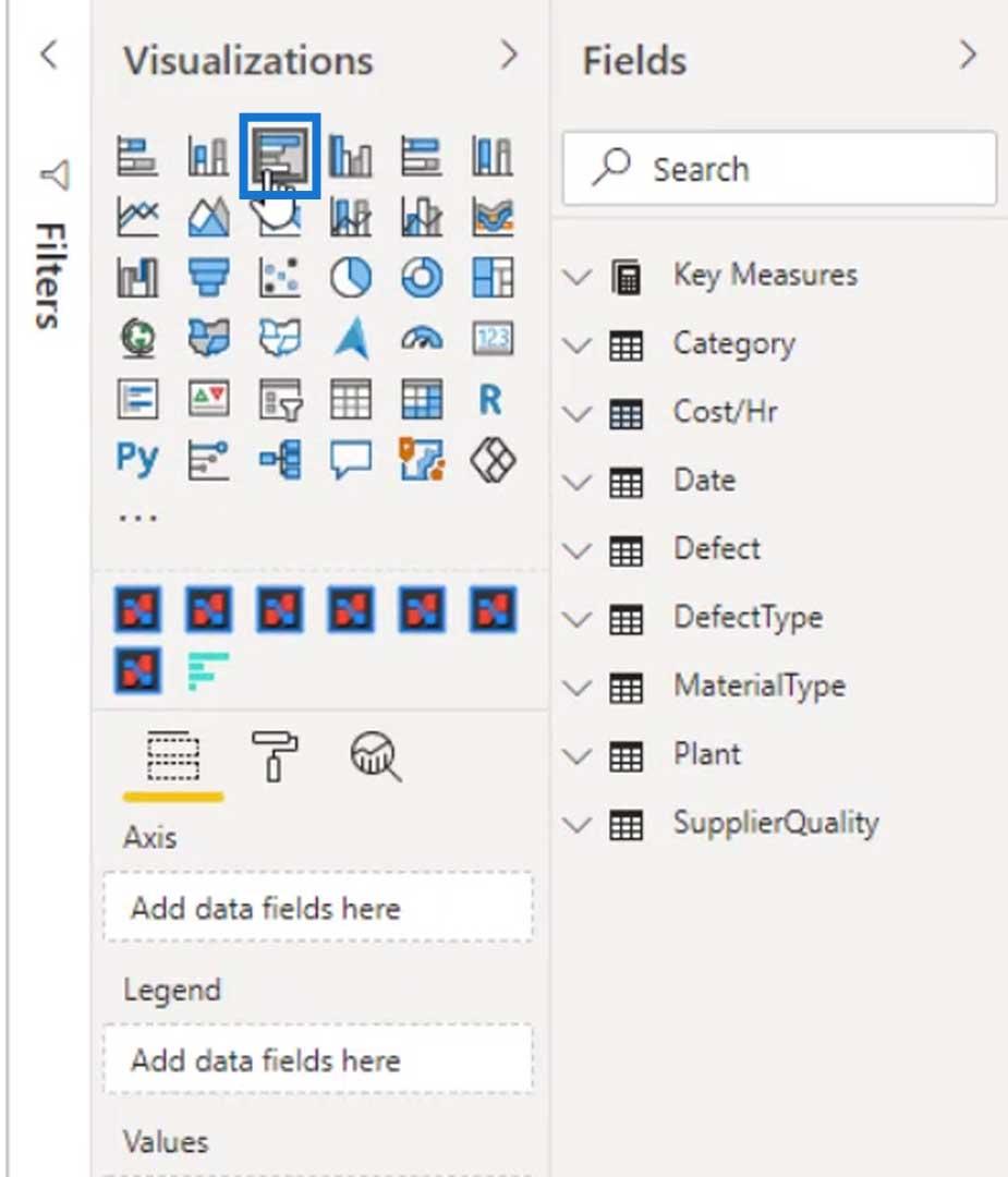
Using The Native Bar Chart In Power BI
First, let’s use the bar chart from Power BI.
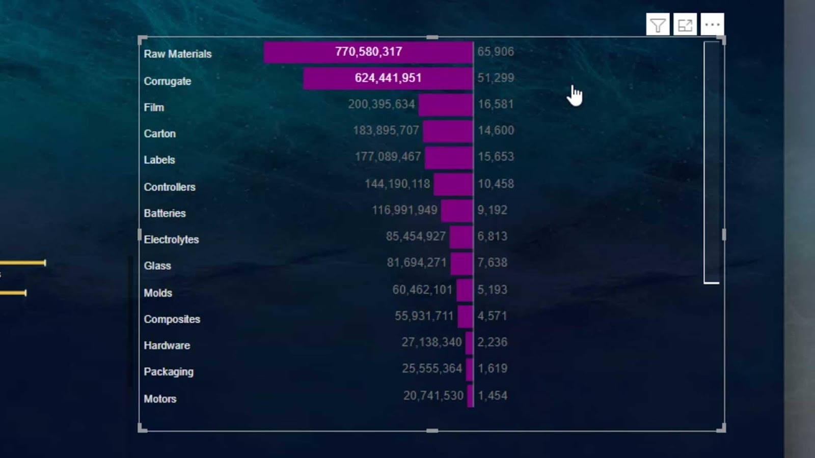
Bring the Material Type in the Axis field, and the Total Defects in the Values field.
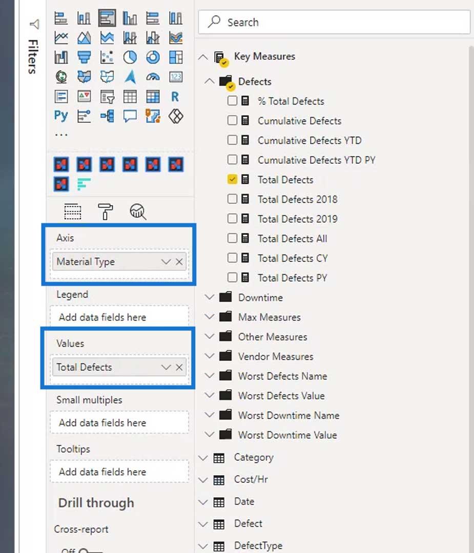
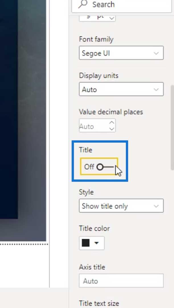
Remove the Background and the Title.
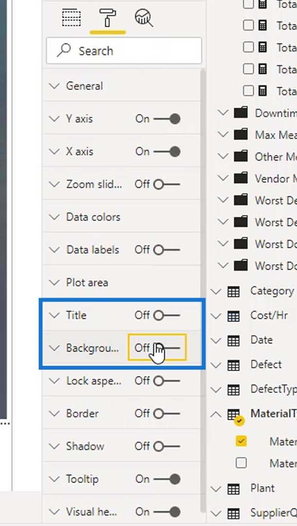
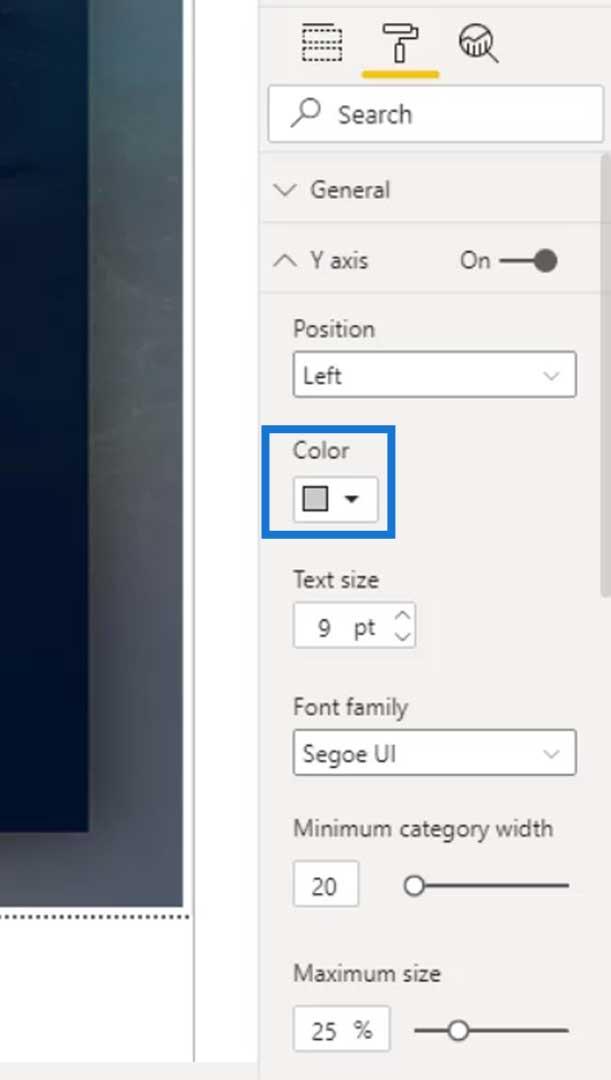
Then, remove the Title under the Y and X axis.
Under the Y axis, change the font color to white so we can see the labels more clearly.

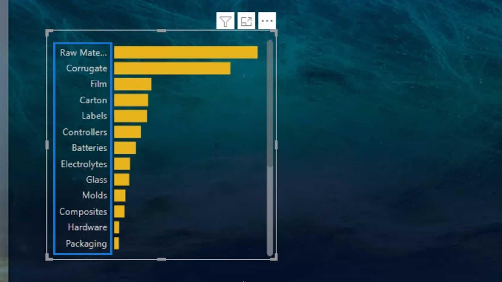
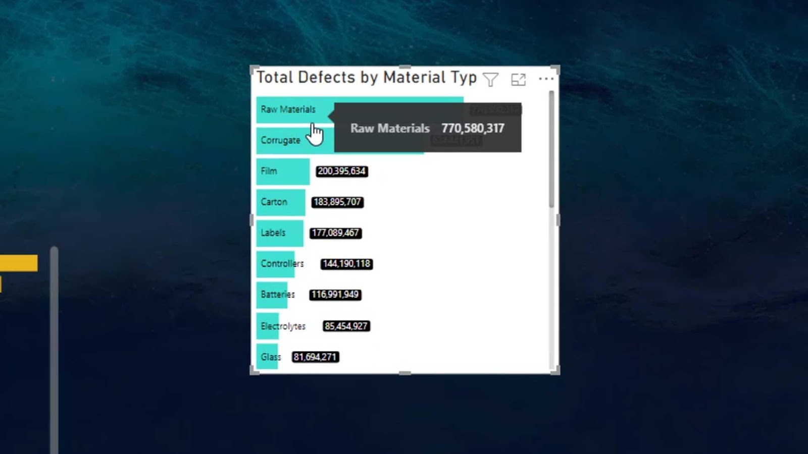
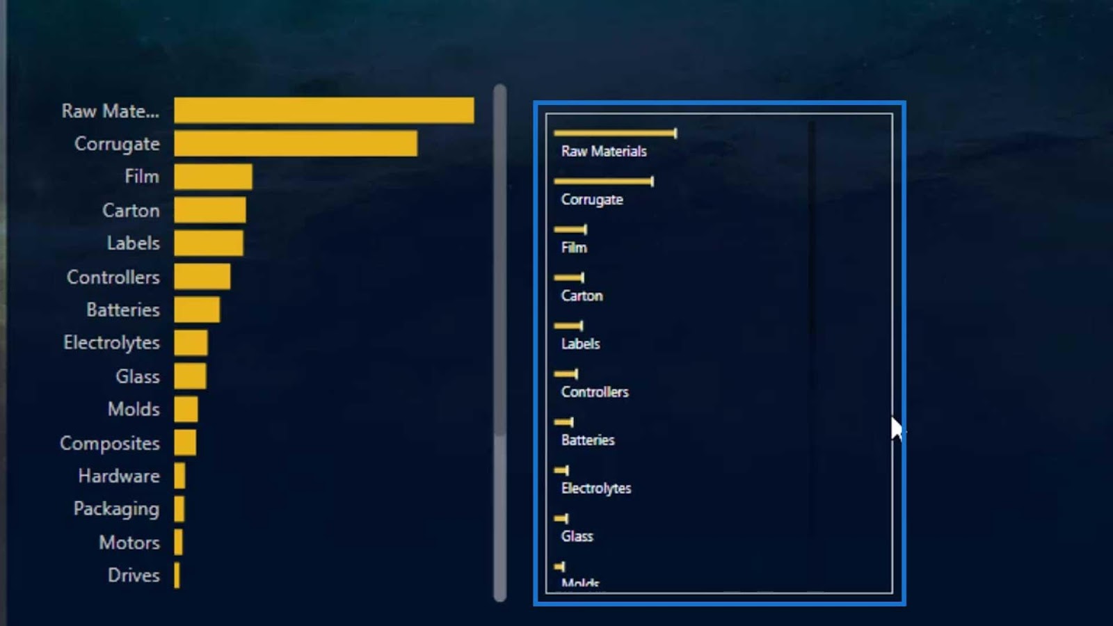
As you can see, if we collapse this visual, we won’t fully see the names on the Y axis.
However, in this sample report that I previously showed, the names are fully visible.
This is the reason why I used the Horizontal bar chart custom visual in the marketplace.
Creating A Horizontal Custom Bar Chart In Power BI
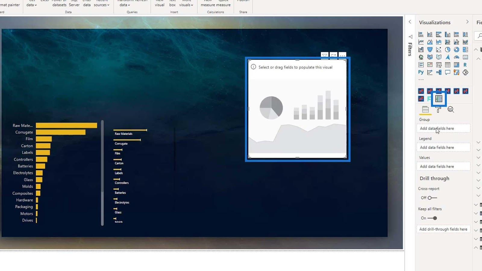
To create a custom visual, click the 3 dots, then select Get more visuals.

Then, search for the custom visual that you want. For this example, let’s type in “Horizontal,” and the Horizontal bar chart will appear.
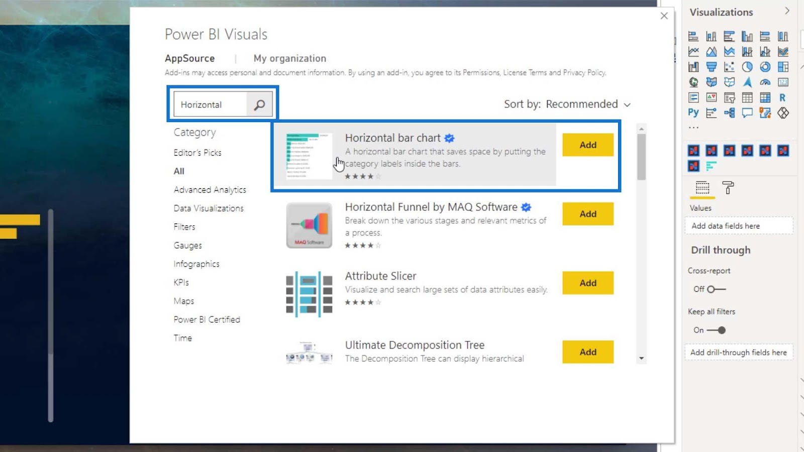
Just click the Add button for that visual, and it will be added in Power BI. Let’s use this custom visual by clicking on it.

Let’s use the same category. Drag the Material Type in the Category field and the Total Defects under the Measure field.
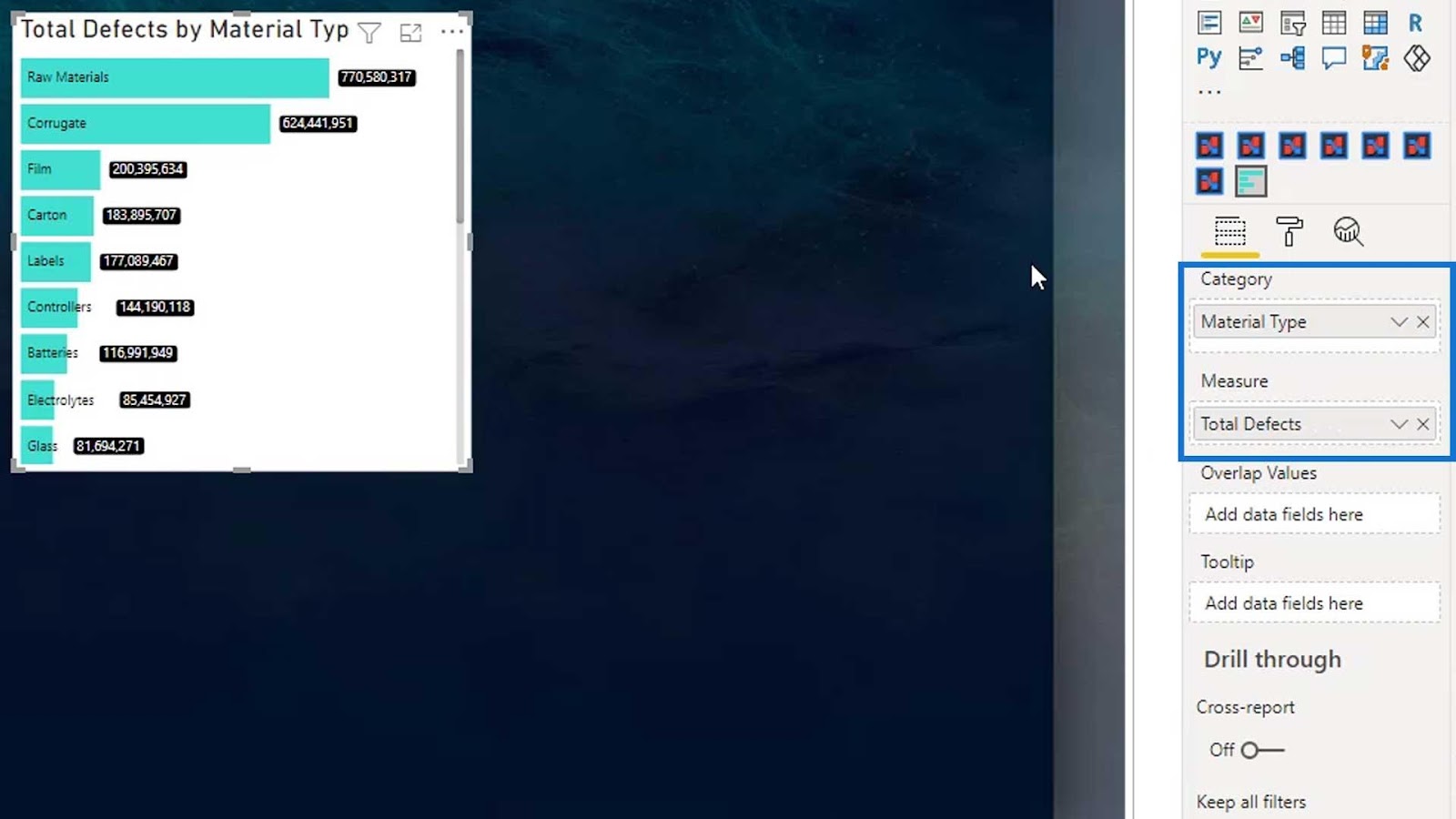
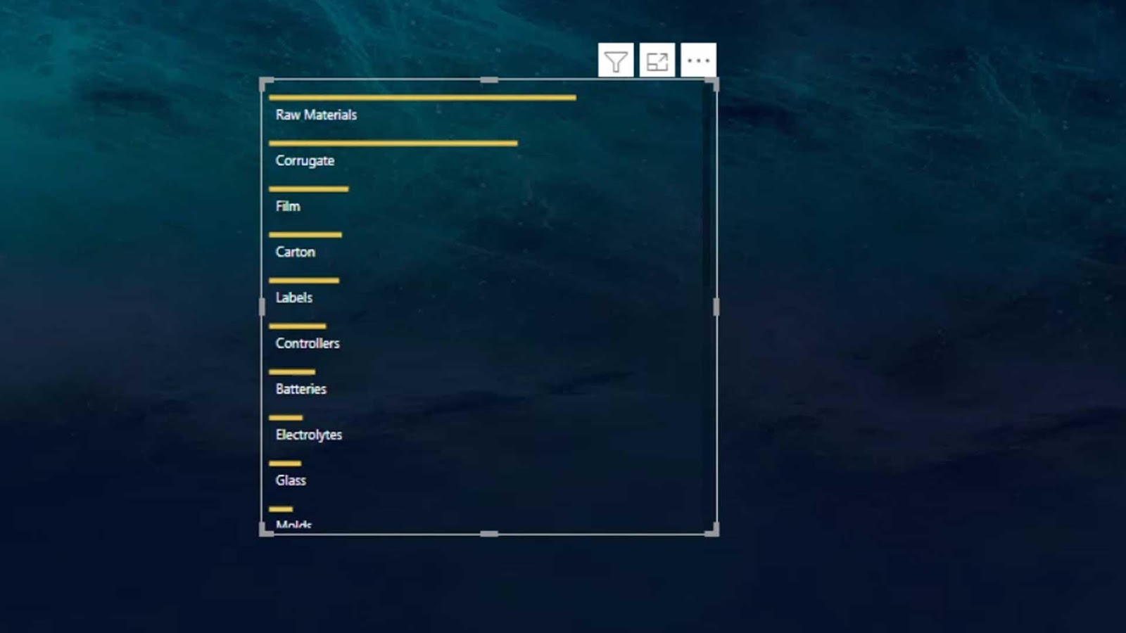
We should now have this output. By default, it will place the names in the bar itself.
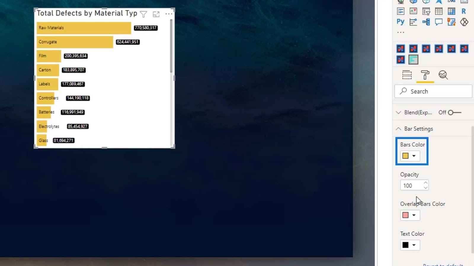
Modifying The Horizontal Custom Bar Chart
There are various available bar settings in Power BI. For example, we can change the color of the bar to yellow.
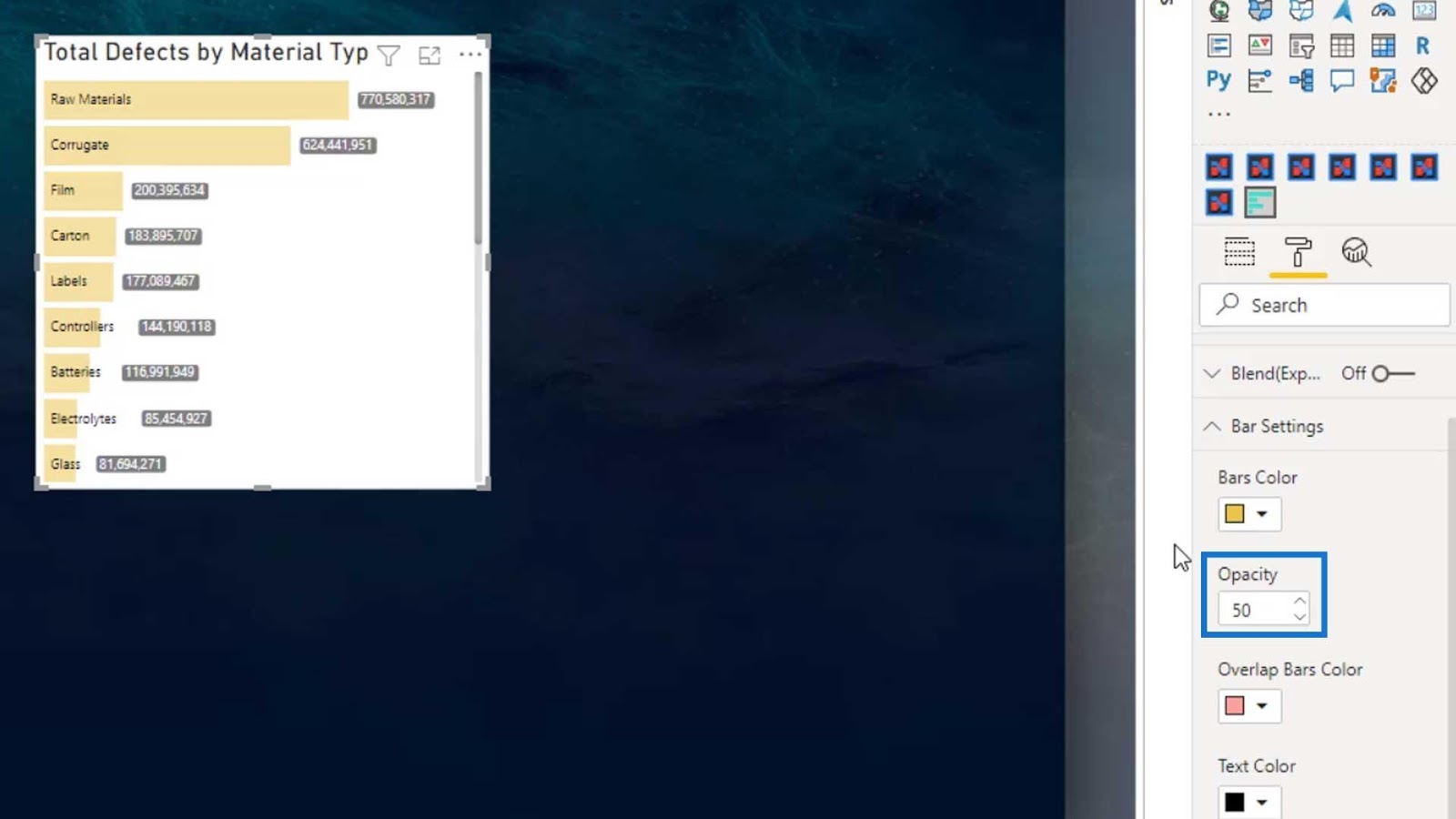
We can also change the opacity of the color by changing the value of the Opacity field.
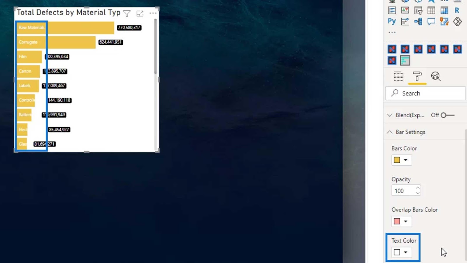
This Text Color option is used to change the color of the names or labels.
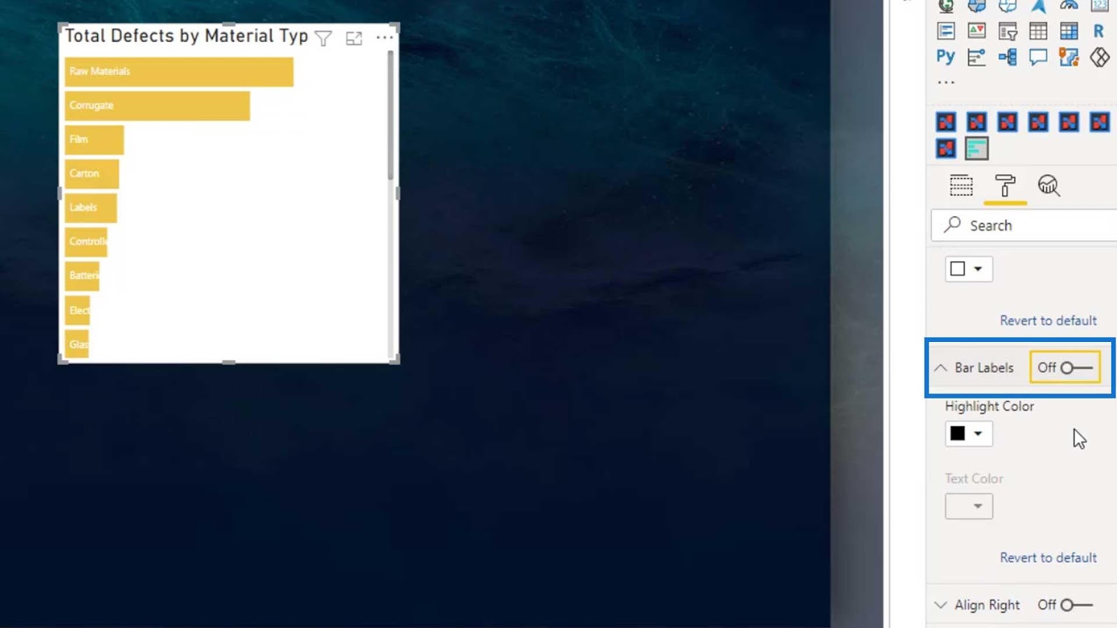
The Bar Labels is where we can change the highlight color and text color of the labels on the bar chart.

We can also disable the labels if we want.
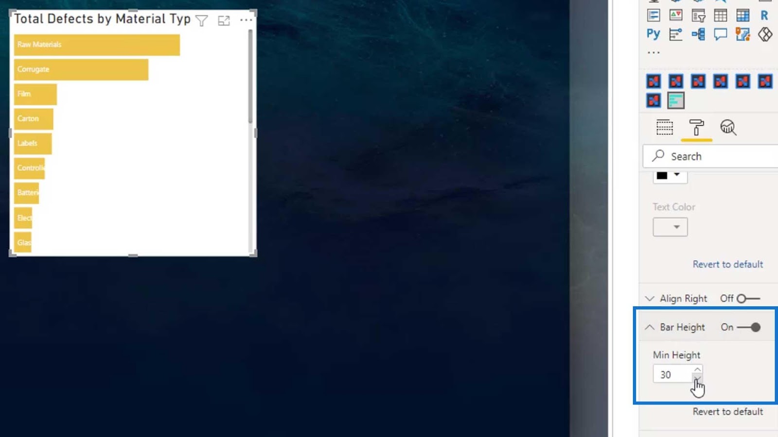
Then, we can change the bar height by changing the Min Height option.
We can turn off the Title and the Background as well.


The best feature of this custom visual is that we can change the shape of the bar. Just choose the shape that you want under the Shape dropdown.
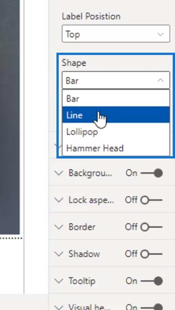
This is how the Line shape looks like.
There’s also an option called lollipop that looks like this.
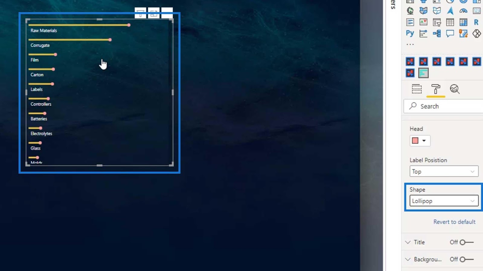
We can change the color of the lollipop’s head here.

For this example, I’ll use the Hammer Head shape.
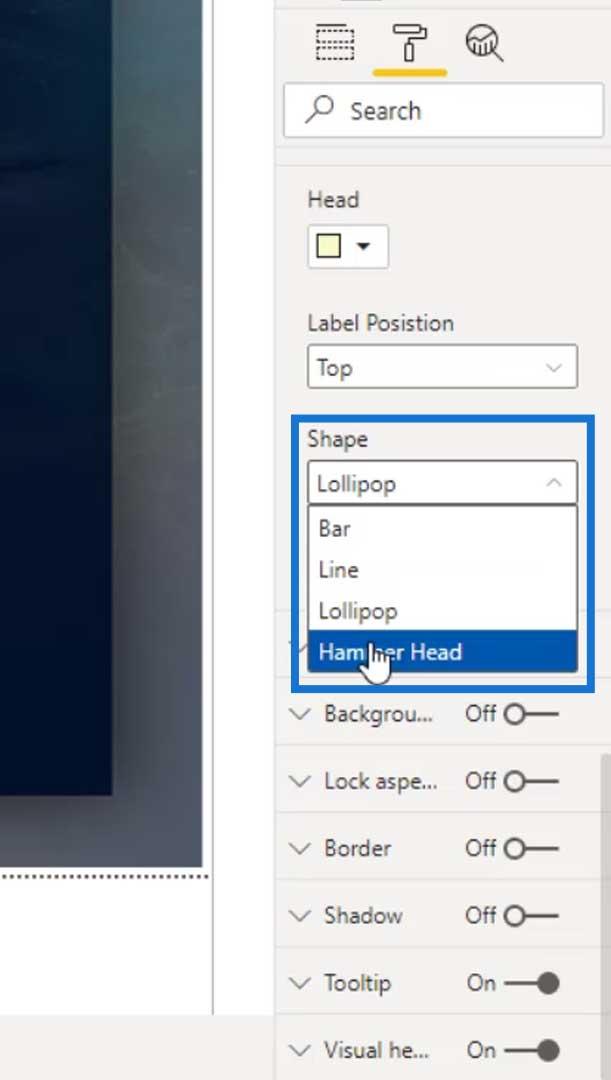
This is how the Hammer Head looks like, which is what I used on my report page.
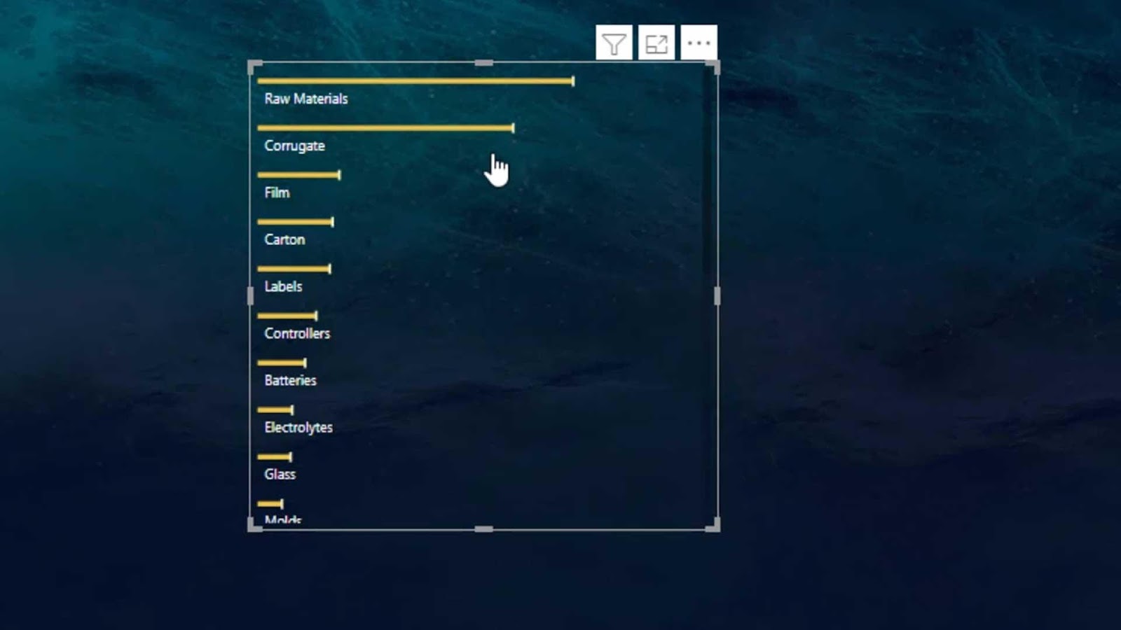
As you can see, even if I adjust the bars, the names are still fully visible.
Adding A Tornado Chart
Another good custom visual that we can use is the Tornado chart.
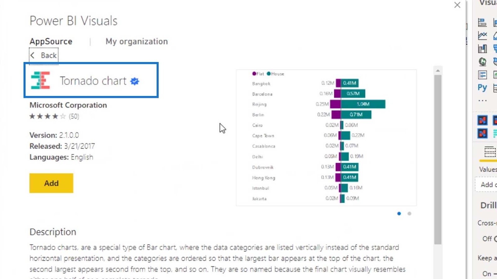
To show you an example of this custom visual, let’s add it on the page as well.
Let’s use the Material Type for the Group field and the Total Defects for the Values field again.
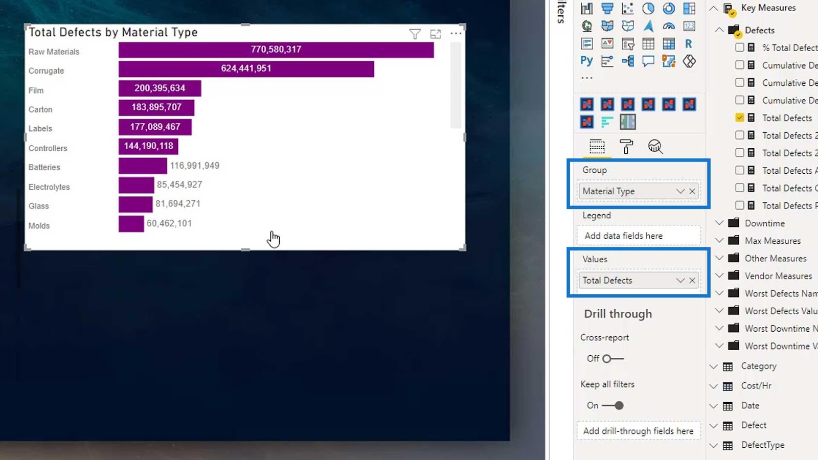
Then, toggle off the Title and Background.

We can change the names color by changing the Color value under the Group pane.

Then, add the Total Downtime (hrs) to create a comparison.
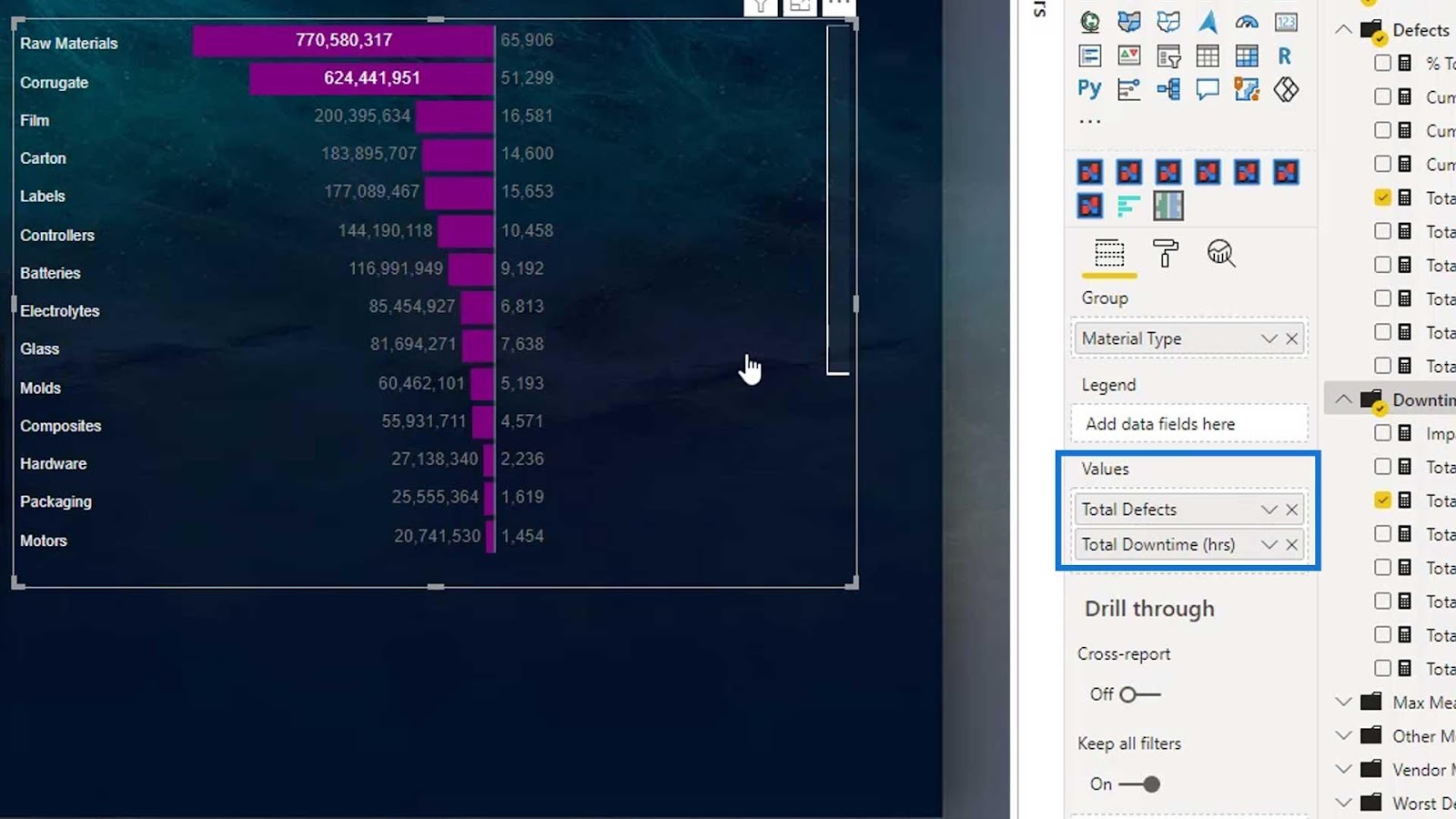
Obviously, we can’t see any bars for the total downtime hours.
This is because it’s placing the bar size relative to the total defects and not the downtime hours. That’s one of the flaws I’ve noticed in this visual.
However, this will work better in other scenarios. For example, if we want to put the Cumulative Defects YTD and Cumulative Defects YTD PY, it will now show a comparison bar chart. This is because it’s comparing the cumulative defects this year and the cumulative defects prior to this year.
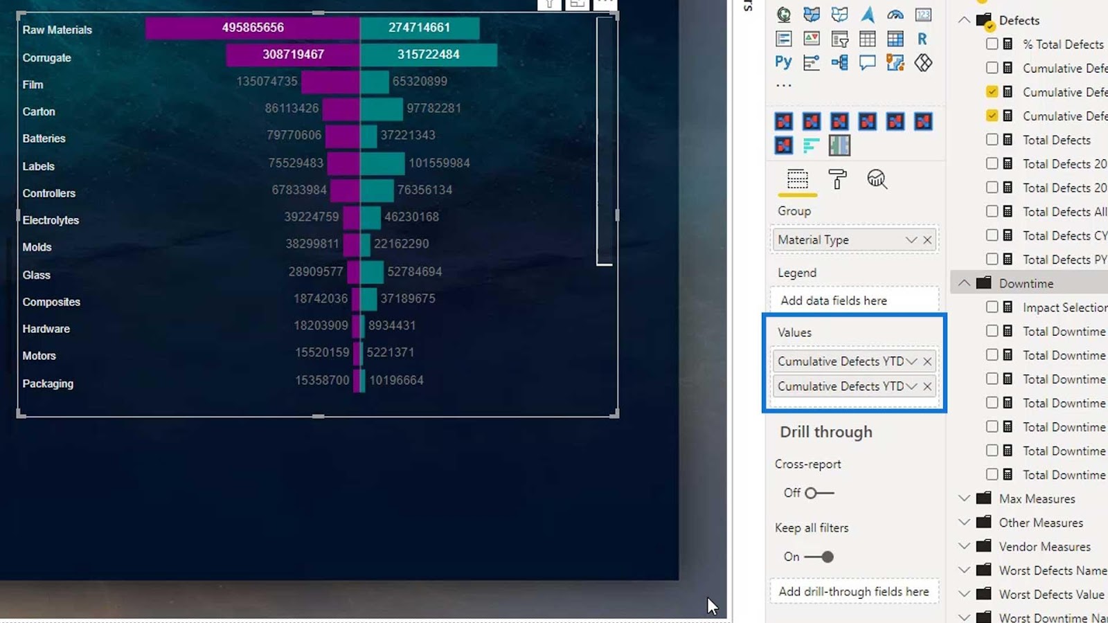
The other limitation of this visual is that we cannot put the names in the middle of the bars. We can only do that in the Charticulator.
***** Related Links *****
Custom Visual Reports In Power BI
Visualization Technique – Power BI Column Charts & Filters
Native Visuals In Power BI: Basic Charts
Conclusion
To sum up, we’ve learned how a custom bar chart solves one limitation of a native bar chart in Power BI. We’ve also discussed the various custom bar charts available in the marketplace.
Bar charts are the most widely used visualization when comparing two or more data. This is a great skill set to have as it is regularly used in various business intelligence sectors.

Check out the links below for more examples and related content.
Until next time,
Mudassir


")