A lot of you may know that we have an ongoing Power BI Challenge. One of our recent Power BI report example submissions from Challenge #5 was based on an optical data set. The submission was of such a high quality that I had to showcase it here in the blog to inspire you in terms of what you can achieve in Power BI. You may watch the full video of this tutorial at the bottom of this blog.
I’ll walk you through some of the amazing ways that the report was constructed to make it compelling and to highlight how good Power BI is, not only from an analytical perspective but also from a visualization perspective. It’s so versatile and flexible in terms of what you can do.
Within the Enterprise DNA forum, we have the Power BI Challenges category. The Power BI challenge 5 was all about optical data.
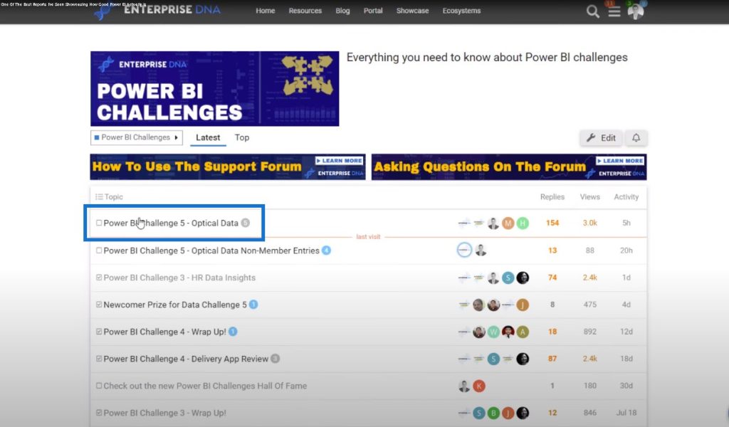
It’s a very popular challenge with thousands of views. It’s a data set from an optical shop, and the brief tells us about the scheduling of the appointments for customers as well as the testing is done within the stores.
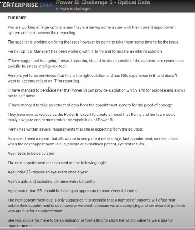
Melissa, one of our Enterprise DNA experts, won this challenge. I just want to go over her report and show you how good it is. First of all, it ticks all the boxes and it’s not complex. Its beauty lies in its simplicity.
Even though there are some good insights in the background, the logic is displayed in a simplified but interesting way.
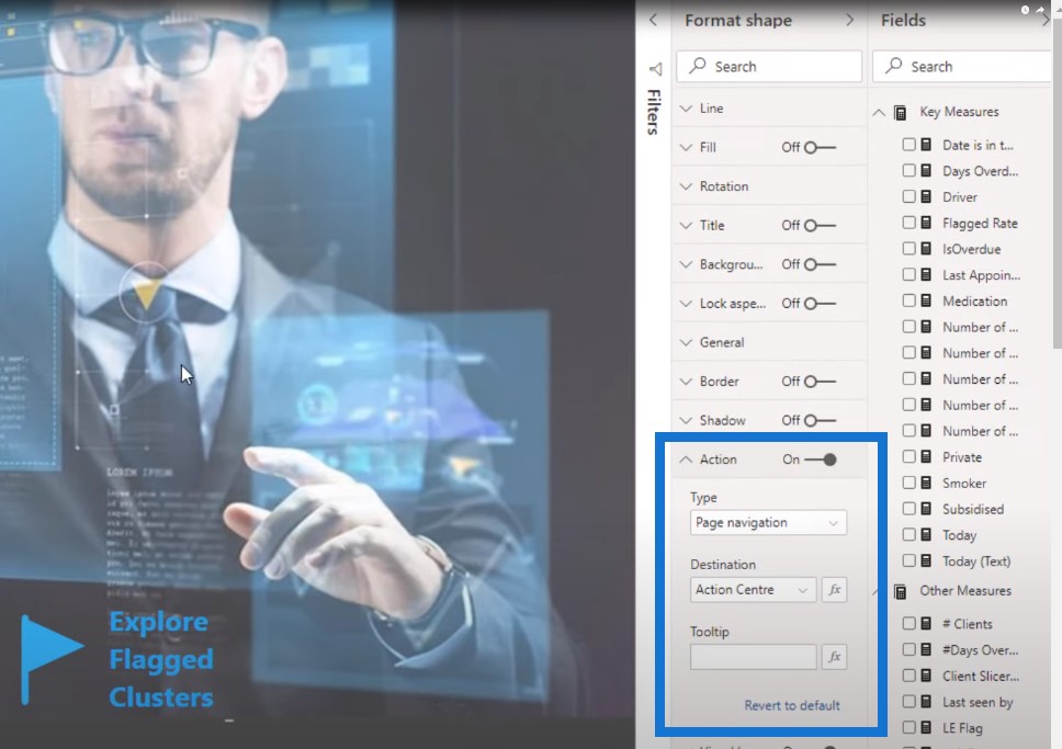
We have the navigation area in the report, which is really easy to do. This is just an image that has been added to this particular page.

All you need to do is to update the action to go to a different page when you make a selection.
I’m just going to select it and go inside the Power BI desktop. There are a few good things that I like about the Client Action Centre page.
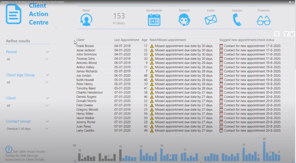
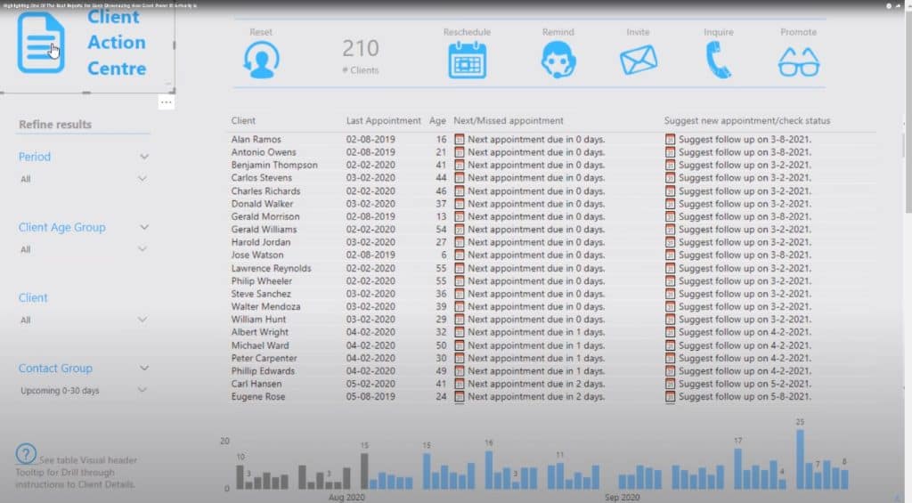
First of all, look at the colors. There’s nothing complex about it; it’s basically just two colors – blue and gray. You can represent things in a compelling way with just a couple of colors.
Always simplify the way you use colors in your reports. It makes a big difference.
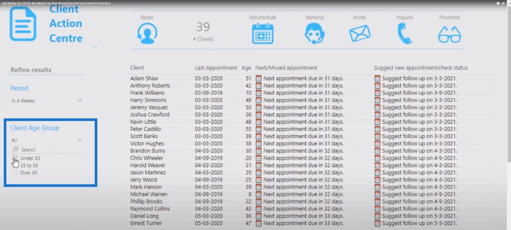
Then we have simple grids in the reports. We have a grid with all the filters on the left, and three grids on the right that take up the bulk of the page.
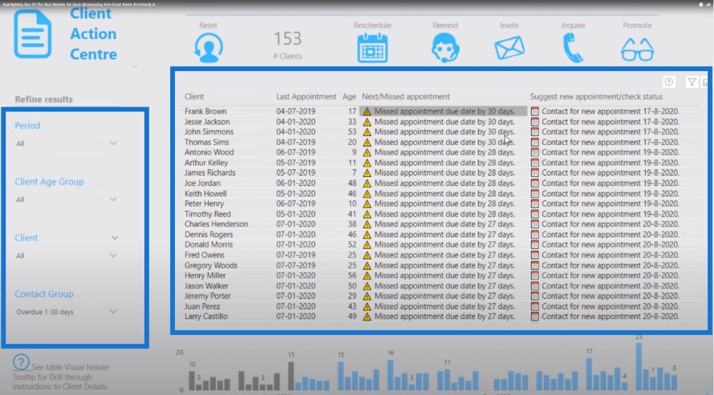
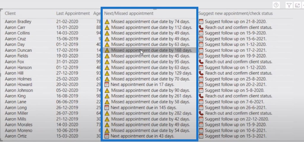
Within the table, instead of just having text, Melissa used an icon to highlight something important that needs to be followed up: the Next/Missed appointment. The icon makes things stand out from a visual perspective.
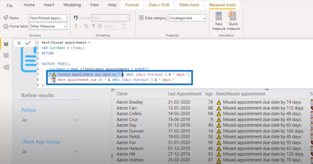
Let’s take a look at how this logic was done. As you can see, it’s an interesting formula. So what Melissa has done, instead of just putting text, is she has also placed icons right next to the text so that we can get that representation in the table.
This technique is so simple but it makes the table really stand out so that when the user looks at the document, they can quickly assess who they need to follow up with immediately or who missed their appointment.
The other thing I love about Melissa’s report is that she incorporated simple images on top of the table to sort it based on prioritization.
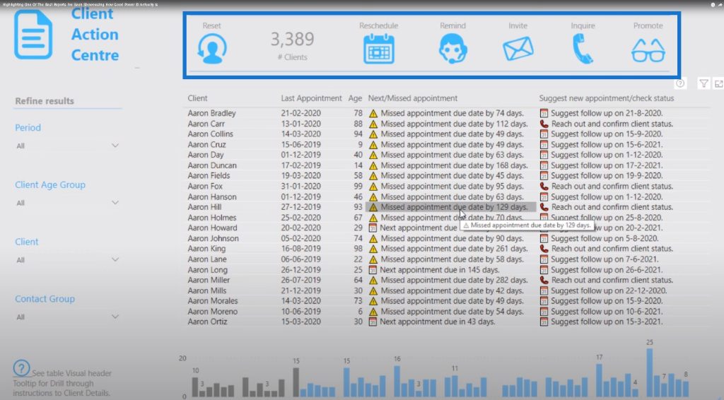
Let’s say for instance that you need to prioritize rescheduling appointments. You can click on the Reschedule icon and it will automatically sort the table.
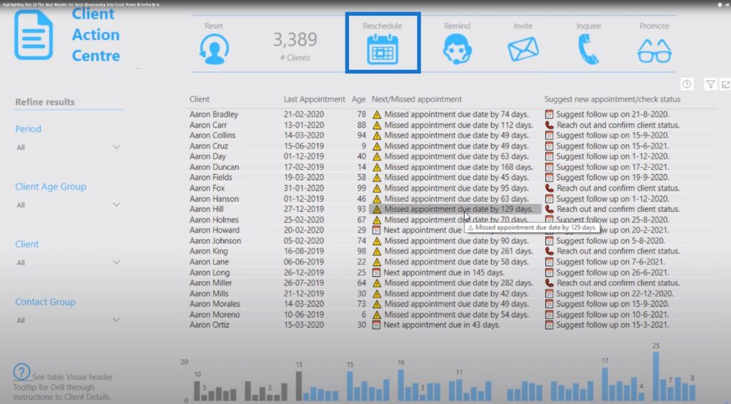
The same thing happens when you click on Remind. The icon will automatically sort it according to your reminders.
There’s nothing complex here, but it showcases everything you need to know to do all of your tasks as a staff in an optical clinic. You have the flexibility to manipulate this in so many ways.
What’s happening here in the report is that there are different bookmarks embedded into each icon. Let’s go and view those bookmarks here.
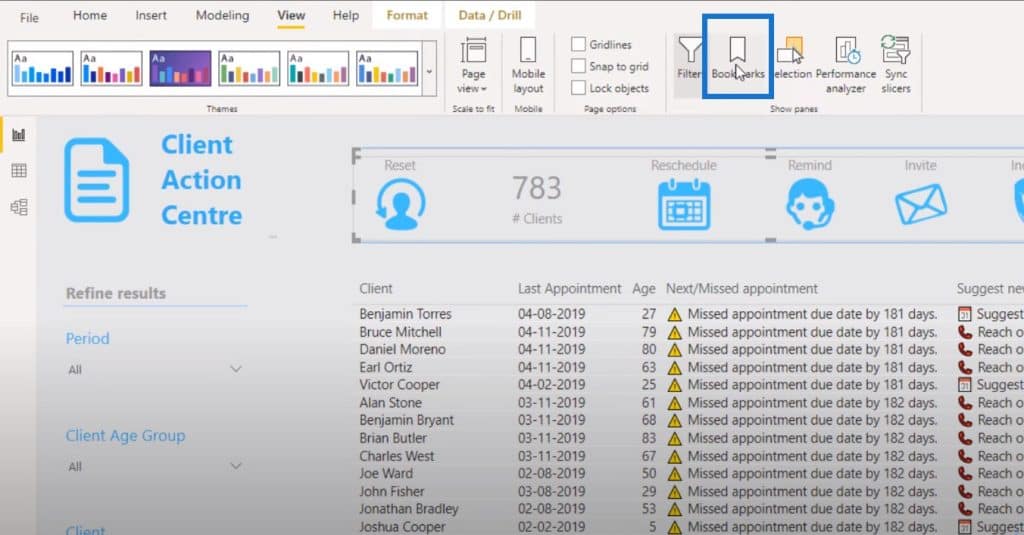
There are a couple of bookmarks, which are all the different ways that you can sort the table.
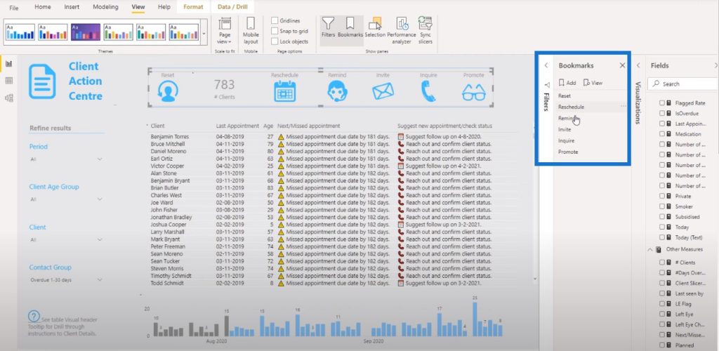
If you’re part of a sales team that works with a CRM database, you’ll want to see the key things that you need to do for the day first thing in the morning. This report will quickly show you that.
On the left side, you also have a range of different ways that you can filter things. This is an example of customized data filtering that has been embedded into the model.
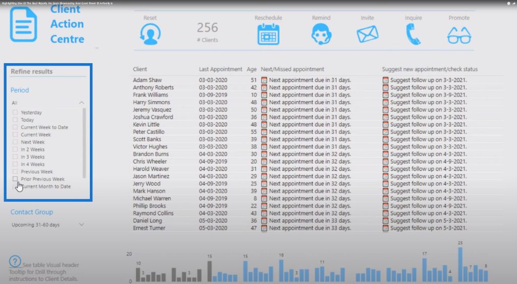
There are customized filters around the date range and a custom segment of age groups.
This report has been done within this model here. All of the techniques used were a combination of secondary tables in the model, overlaid with some common DAX formula combinations to make the filters work.
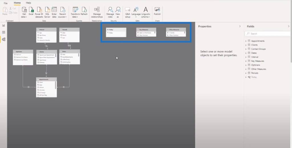
There is some interesting logic going on here, but it’s being represented in a really simple way. There’s nothing too complex about it. The report contains only a filter and a table, but there are so many ways that you can change what you’re looking at.
Another feature that Melissa has embedded in this Power BI report example is the ability to dive into the data of an individual customer. Included in the data set was the actual testing that each individual has done historically. In the report, you can right-click on a person’s name, click Drill through and then go to the individual client details.
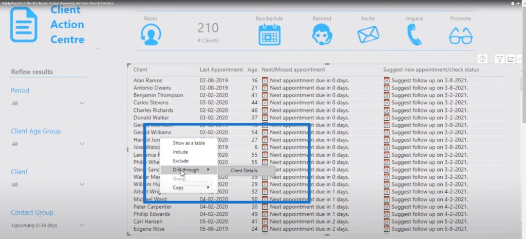
This action takes you to a different page that gives a detailed breakdown of the customer as well as the details of their eye tests.
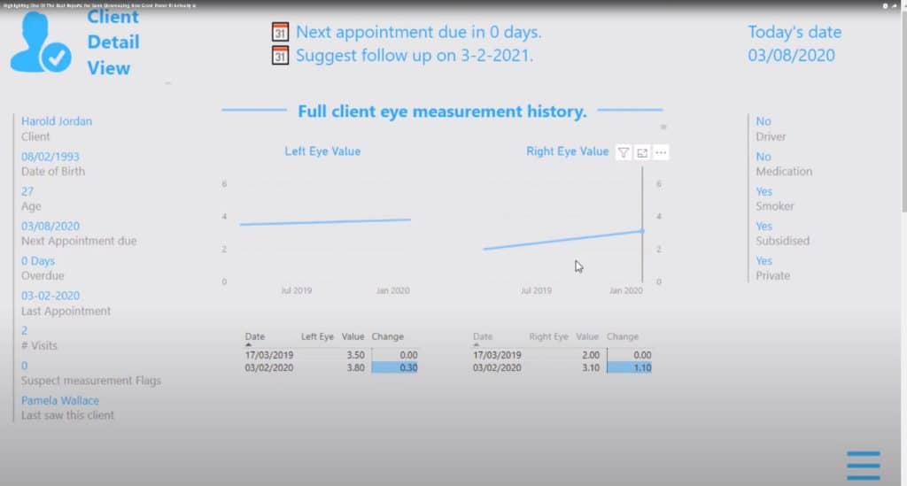
I just loved the simplicity of it, especially because it gave me the ability to quickly go through each customer. The drill through is brilliant because it captures which client you are selecting, then it comes to a new page to show details about that particular client. This is a great way to showcase information without having to overload report pages with visuals or navigational cues.
There is also great logic embedded in Flagged Customers. If a customer’s testing degraded from one level to the next, we need them to schedule an earlier appointment instead of having them on a regular cycle. There was additional logic added for the flagging that was done in this Power BI report example.
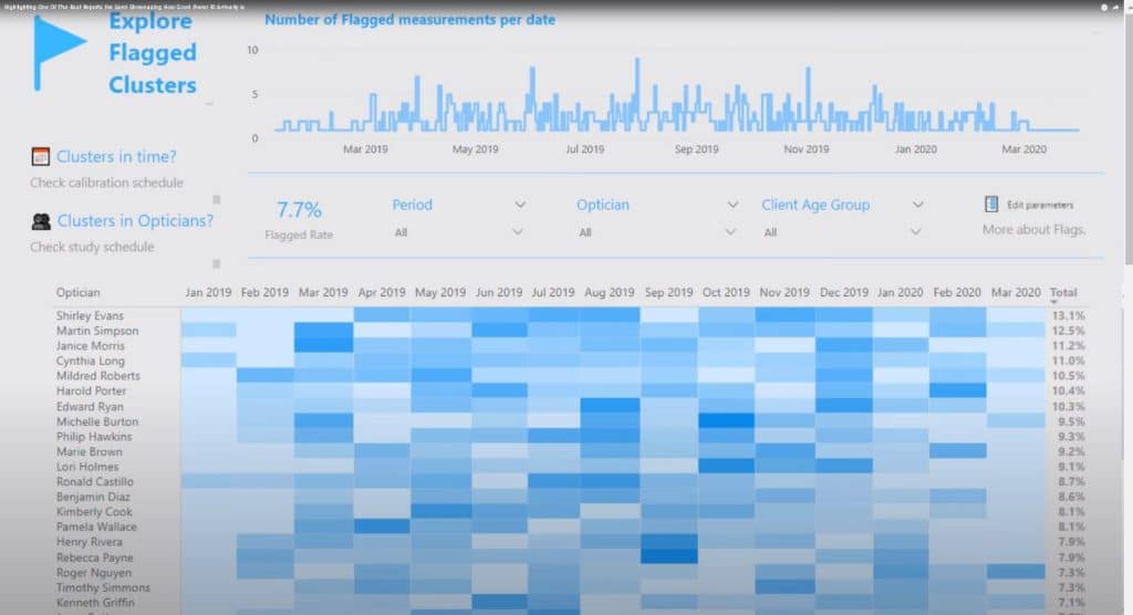
This was visualized in a really compelling way using a simple matrix, which I really liked as well.
It’s easy to go back and forth between the different areas of the report simply by clicking on the images.
***** Related Links *****
Data Visualization Tips For Your Power BI Reports
Visualization Technique – Power BI Column Charts & Filters
Building A Reporting System With Power BI
Conclusion
There are so many great ideas that were placed into this Power BI report example that I’m going to steal and use in my own reports. I love this report because it’s simple and not too complex. It’s not overdone with visualizations. It has everything that you need to know represented in a simple way.
This is a good reminder when you’re working in Power BI that you don’t need to use a lot of colors. You don’t need an overload of visualizations. The simpler, the better.
If you can tell your message in a really simple way, then that’s your best option.
I want to do more of this type of content in future blog posts because there is a lot of fantastic work going on in the challenges that we’re putting up at Enterprise DNA. If you want to check out the challenges and learn how you can participate, visit the Enterprise DNA forum. We also have a section within the forum for project updates, where we get updates from everyone who has submitted a report. This is where you can learn exactly how others do it.
All the best,
Sam
[youtube https://www.youtube.com/watch?v=pZ0omB–Ikw?rel=0&w=784&h=441]


