Once you get more and more into advanced DAX formulas, you will see the world of analytical opportunities immeasurably expand for you. In this example I will show you by just how much. You may watch the full video of this tutorial at the bottom of this blog.
In this blog post, I am going to explore some relatively advanced DAX logic and then build upon it by combining an initial calculation with another one. This blog post follows an existing video that enabled us to group our customers by their sales ranking.

It got me into thinking what else can we generate from this information. I realized it would be interesting if we looked at it from a percentage perspective instead of a total perspective.
For instance, if one year you make 20% of your sales from your Top 5 customers and then the next year you make only 5%. From a marketing perspective, you want to understand why this is occurring and take action to increase this percentage.
Determining Dynamic Ranking Per Customer Group
Let’s first go through how we grouped these customers in the first place. We created a measure and called it Customer Sales by Group using this formula:

Essentially, what we did was to dynamically rank within each year how many sales were made per customer using advanced DAX. We grouped them into three: Top 5, Top 5 to 20, and then The Rest.
But now what we want to do is to determine the percentage of these amounts in Total Sales. So we want to see all of these numbers as percentages so we can see if the percentage change is occurring through time.
This is not too difficult to do from where we are now. If you went through the previous blog post or video and understood it, then this one is going to be a piece of cake.
To get these results as a percentage, we need to work out how to get the numbers in the Total row to the numbers in the Top 5, Rank 5 to 20, and The Rest. For example, our Top 5 clients earned us $4,988,170.10 in 2014, which needs to be divided by our Total of $35,040,899.50 to get the percentage.

The first thing to do is to copy and replicate the table in the canvas, and then work out a measure that will retrieve the 35 million Total Sales in this context.

As you can see, we have viewed Total Sales from inside of the CALCULATE function, and then changed the context using a quite advanced DAX formula.
Total Sales and Customer Groups Tables
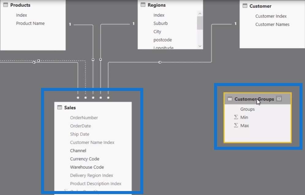
The Total Sales, by itself, has no relationship to the Customer Groups table that we created in the previous blog post. There is absolutely no connection between the two.

So if we try and filter Total Sales by the Customer Groups table, nothing is going to happen. But check out what happens when we bring this into the table.

There is a filter being placed in the 2014, 2015, and 2016 columns; so we are getting the total in every single iteration of the Groups table. However, the Groups dimension is not filtering because they are not connected to the data model. So we basically have the two key elements to this piece of analysis.
Determining Percentage of Customer Sales By Ranking Group
The next step is to create a new measure or use the existing measure and call it the % Customers Sales per Group. We’ll divide the Customer Sales by Group by Total Sales, with 0 as my alternative result.

Obviously, we will need to format this and change it to percentage.

The last step is to grab this measure and put it in the table to see the percentage. It looks like it is calculating the right result because we are getting 100% for all the totals. As you can see, this is a super cool technique built on top of an existing technique that we have used previously.

Visualising The Data
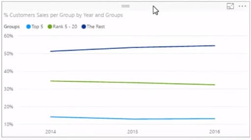
As a finishing touch, you can put this into a visualisation, especially if you are going to show more than the three years I have illustrated in this table. There are a number of different ways that you can slice and dice this information, like with this line chart:

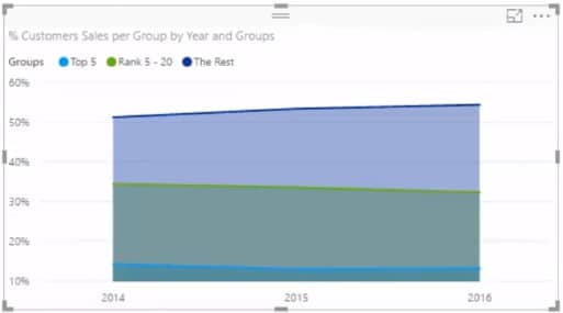
Or if you prefer, we can use an area chart instead:

There you have it: we have now dynamically calculated where our sales are coming from, and from which ranking groups they are coming from through time.
This is really powerfully advanced DAX analytical work that produces great insights. In many scenarios, having a strong understanding of the make up of your attributes is key to decision making and risk management. My mind goes to situations like bank loan books, insurance coverage, sales attribution and many others. Using a combination of these techniques, you can unearth those insights quite effectively.
***** Related Links *****
Calculating % of Totals
Calculating Percent Profit Margins Using DAX In Power BI
How To Harvest Power BI Slicer Selections To Use Within Other Measures
Conclusion
There are many elements involved in putting this type of calculation together. If you are just beginning with DAX, check out my online courses Mastering DAX Calculations and Solving Analytical Scenarios to get a good understanding of where to start and what you can achieve on top of this. The combination of techniques here open up a world of opportunities that you can use over and over in many models.
The key to understanding how to move this over to your own models is to think about the dimension or attribute you want to drill into, like customers, regions, or products. You will then have to iterate that attribute inside your measure. Sometimes you may even need a supporting table to create that logic to run through.

Good luck with this one. If you have any questions or feedback let me know in the comments below.
[youtube https://www.youtube.com/watch?v=knF3VbCkRig?rel=0&w=784&h=441]


