In this tutorial, I will run you through the built-in analytics functionality that we have available to us in Power BI Desktop. You may watch the full video of this tutorial at the bottom of this blog.
Already, you can create some compelling visualizations in Power BI, especially around scatter charts. But the analytics function allows us to overlay additional information into our visualizations, letting us illustrate results in many ways.

In this tutorial, I show you how you can incorporate gridlines or showcase outliers in your visualizations, as well as group certain results in your visuals.
By combining many of these different features that are available to you in power BI, you will be able to add a lot more color to the results that you are showcasing.
Before we get to the analytics for Power BI scatter charts, let me show you the data that we’re analyzing.
Analysis On Power BI Scatter Chart
I’ve run some simple calculations here, comparing Total Sales with the Difference in Sales between this year and last year. On the chart, we can see our good and poor performers.
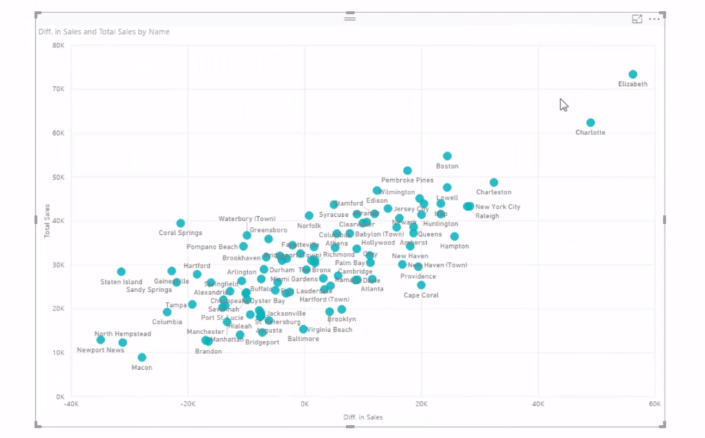
Along the X axis we’re seeing our good performers on the upper right-hand side, and our poor performers on the left-hand side. The Difference in Sales is below zero, as we can see in the chart. So Elizabeth and Charlotte are doing incredibly well. They have large sales and a big difference from last year.
What’s cool about this and Power BI, in general, is its ability to quickly change the selection, so we can jump to any quarter and see our outliers.
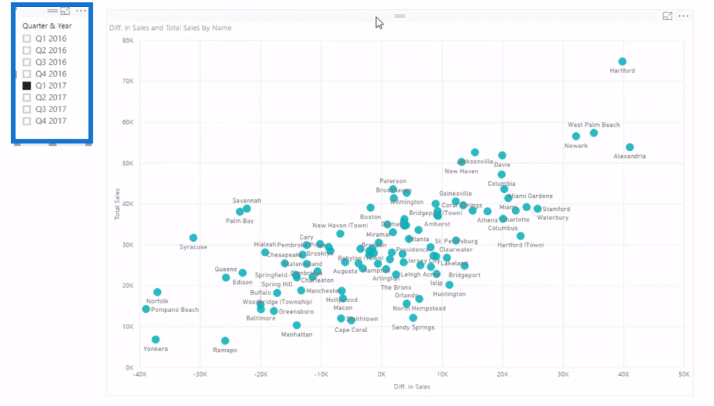
I’ve shown a number of examples where we could detect outliers, demonstrating who’s good and who’s bad. But now with this built-in analytics in Power BI, highlighting good versus bad results in our visuals is so much easier. So let’s jump into it.
Built-In Analytics For Scatter Charts
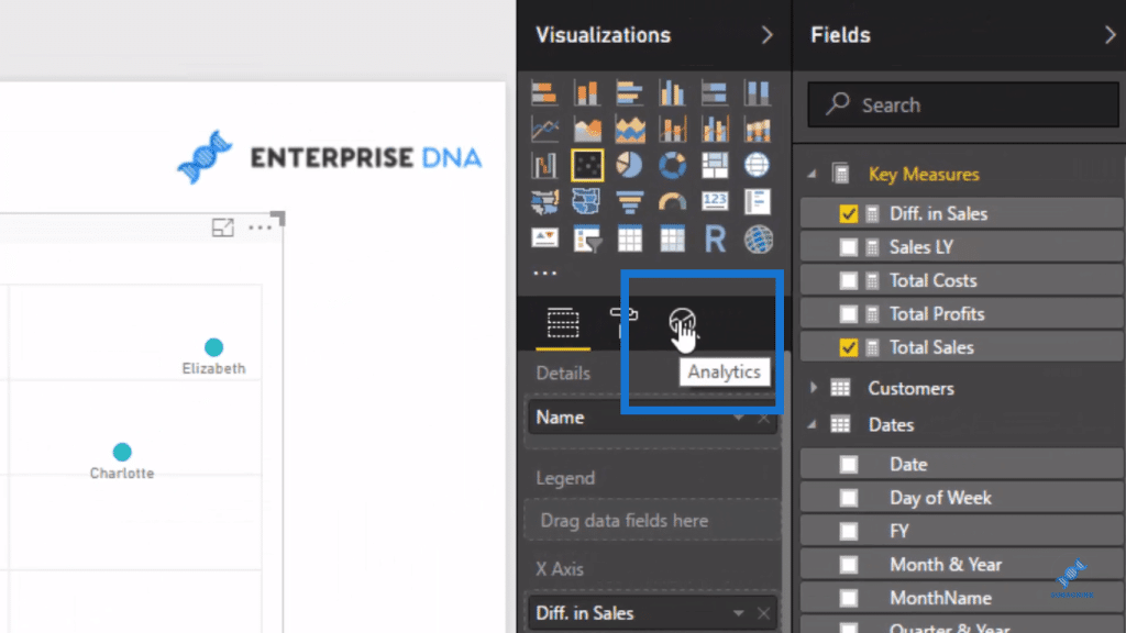
The analytics section is just on the right side corner of the Power BI Desktop and we can see heaps of options. It may depend on what context you have filtered in your results, but all these native analytics functions will always change for the context as well.
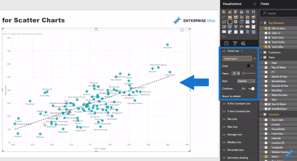
Trend Line makes it easy for us to see who’s up and who’s below the trend.
What I really like in the analytics function is that we can put a constant line in our chart so we can create a grid. When we have quite a lot of information in the scatter plot, we want to break it up into four grids.
To do this, we’ll put some values in the X-Axis Constant Line and the Y-Axis Constant Line.
We’ll keep the X-Axis at zero
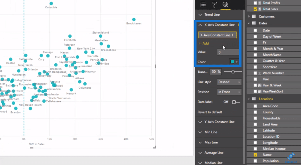
and forty thousand for the Y-Axis.
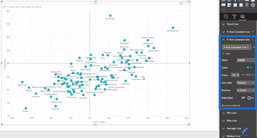
Once we get this grid, we can click through time to see who’s where.
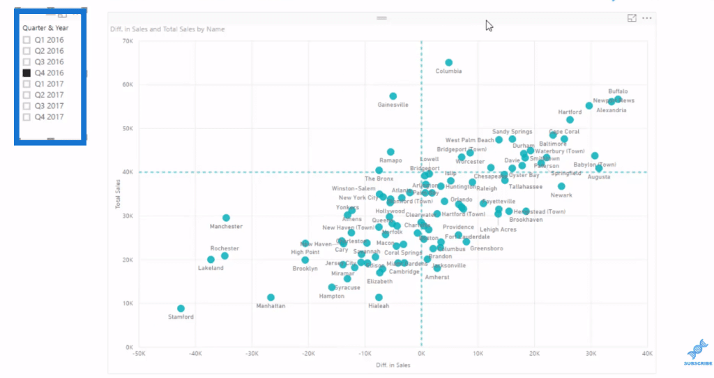
We could also set this up to find any outlier that we might want to showcase for a particular filter and context.
For example, if we want to drill into our worst performers, we simply adjust the values in our axles. We’ll have thirty thousand for our X-Axis, and negative twenty thousand for our Y-Axis.
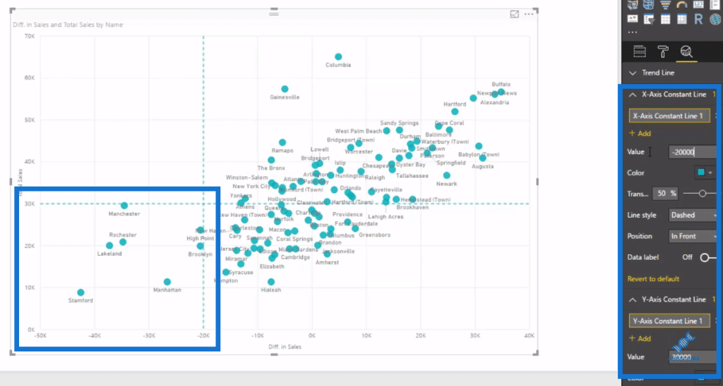
That will then give us this little sub-grouping at the bottom left side of the chart. These are our outliers or anomalies that we need to figure out. We can analyze what’s going with Stanford, for example, and why it dropped for this quarter versus the quarter before.
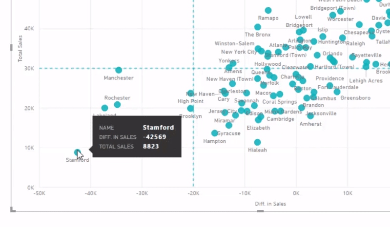
Furthermore, we can quickly go through time and the results are set in there. So this is a really cool addition to your scatter charts.
We can also add Symmetry Shading, which is pretty new as well. It’s a straight diagonal line from zero.
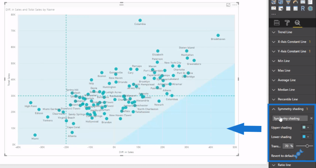
Obviously, my X-Axis is more dynamic. It starts from a variety of different numbers depending on how far below these regional areas are from the sale of last year. It doesn’t work in this example, but it’s definitely a good feature.
There’s a few other features here that are quite amazing and I’ll leave it up to you to explore.
***** Related Links *****
Finding Patterns In Your Data Using Internal Logic In Power BI
Using Filter Fields & Visual Interactions To Create Compelling Visualizations In Power BI
How To Evaluate Clusters In Your Data Using DAX Technique In Power BI
Conclusion
These analytics functions are certainly effective additions to Power BI. It’s also great that we don’t have to create all of these elements within visualizations ourselves with DAX formulas.
Additionally, they can automatically be created in a point and click fashion. There’s no doubt that the direction is good from the Power BI team and I’m sure that this functionality will be built upon substantially in the future.
Good luck learning about how to use these features!
Sam

[youtube https://www.youtube.com/watch?v=rSZ2NSz7DW8?rel=0&w=784&h=441]

